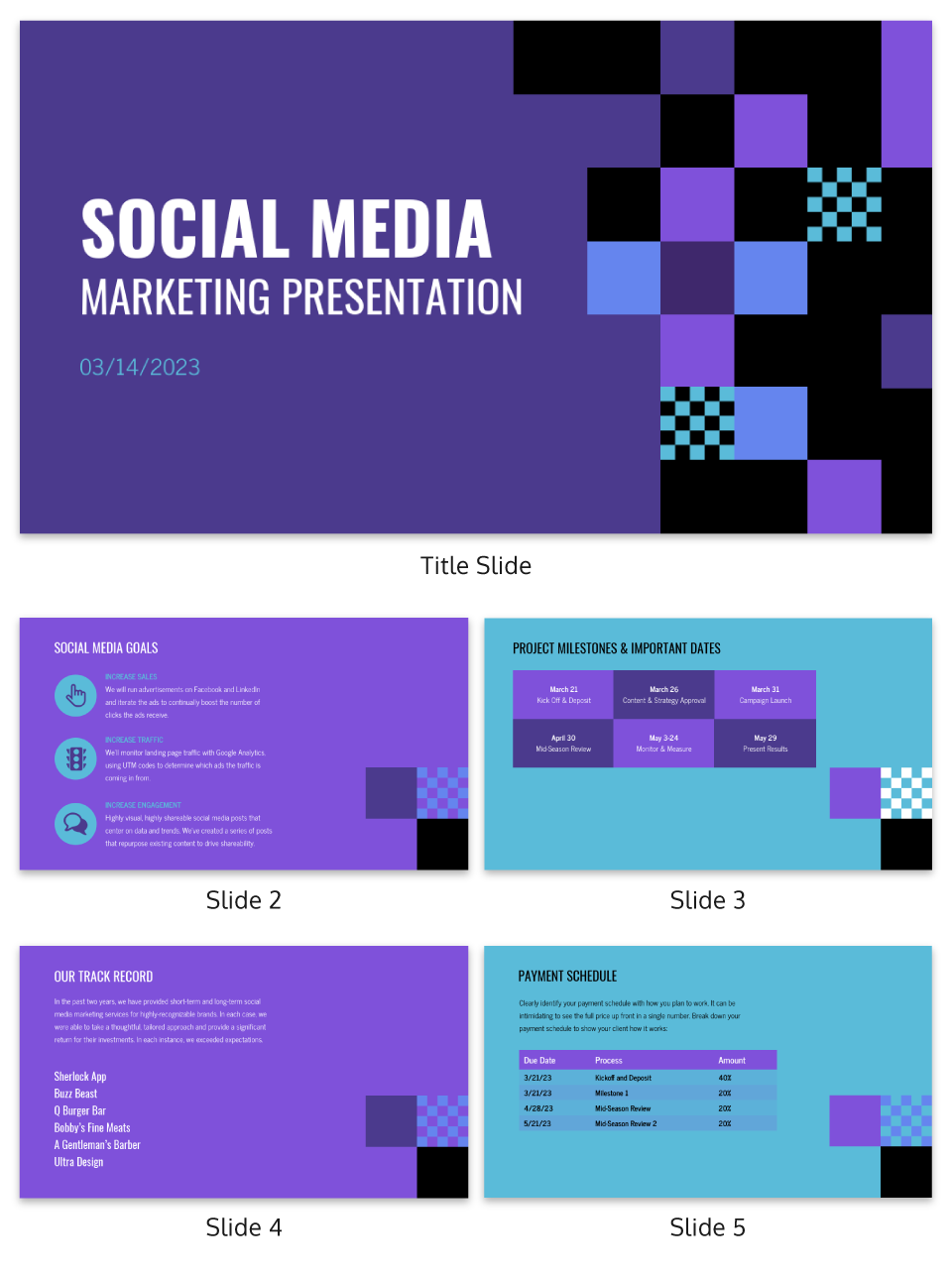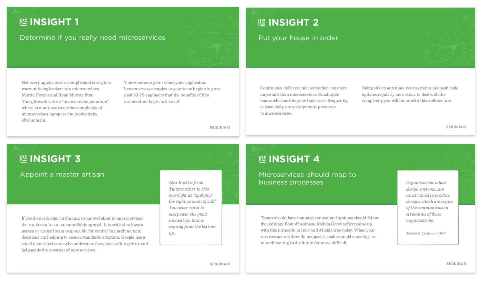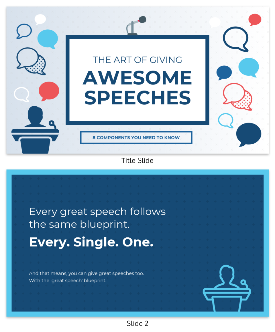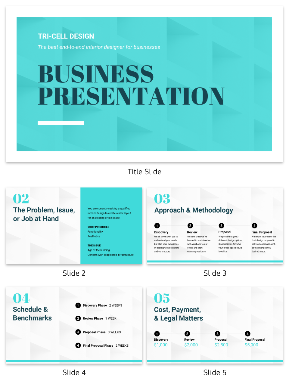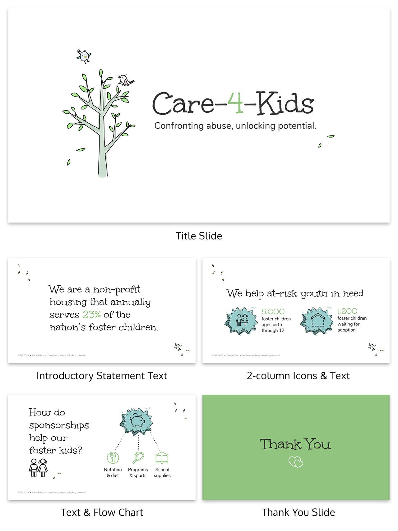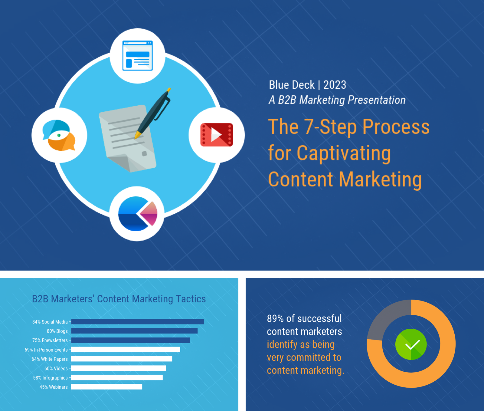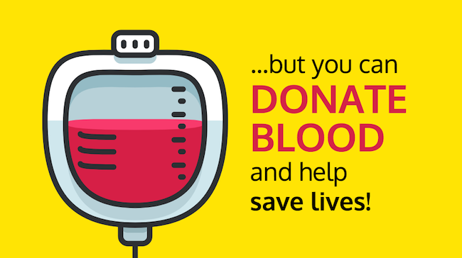
A persuasive presentation is a type of presentation designed to convince your audience to adopt a particular viewpoint, take a specific action, or support an idea. It relies on clear arguments, compelling evidence, and emotional appeal to influence your audience’s decision-making process. Using tools like a free presentation maker can help create visually engaging slides that enhance the effectiveness of your message, making it easier to capture attention and persuade your audience.
Here’s what you can do to make a persuasive presentation:
- Make the first 30 seconds of your presentation count
- Compare and contrast your solution with the status quo
- Use visual aids to summarize and clarify your big ideas
- Get your audience involved to build trust and rapport
- Use a clean, consistent presentation layout and design
- Eliminate extraneous detail to focus on core concepts
- Sign off with a persuasive call-to-action
These persuasive presentation strategies apply whether you’re leading a workshop, keynoting a conference, creating or selling an online course, or pitching a potential client.
Want to make a persuasive presentation fast? Try using our presentation templates.
Read on for plenty of persuasive presentation examples.
1. Make the first 30 seconds of your presentation impactful
The first 30 seconds of any presentation are far and away the most important of your entire presentation.
In those first 30 seconds, listeners are open to the ideas you’re going to present to them. They might even be enthusiastic and excited to hear what you have to say.
Inexperienced presenters often waste these first 30 seconds with things like introductions and agendas that will soon be forgotten. Seasoned presenters do something much more effective: state their big ideas right up front.
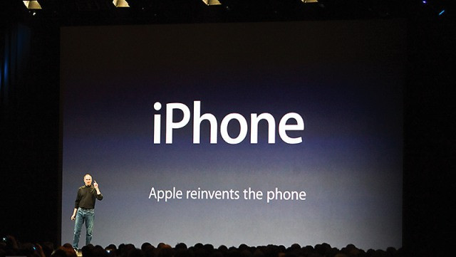
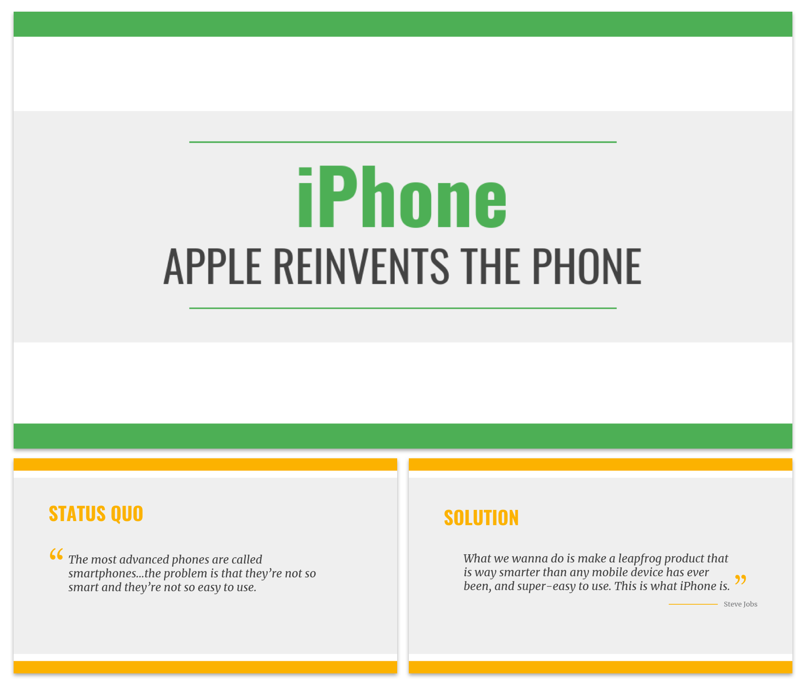
Like Steve Jobs did in 2007 with the iPhone (with “iPhone: Apple reinvents the phone”), try to state one big “headline” message within the first 30 seconds. A big idea for listeners to absorb and internalize.
Like an elevator pitch, you should be able to write this idea down in a single sentence, and it should be memorable and specific.
You can then turn it into the hook of your presentation. Use an opening story, surprising fact, joke, or personal anecdote to pique your listeners’ interest and lead into your big idea.
This will frame the rest of the talk and prep your listeners for what’s to come.
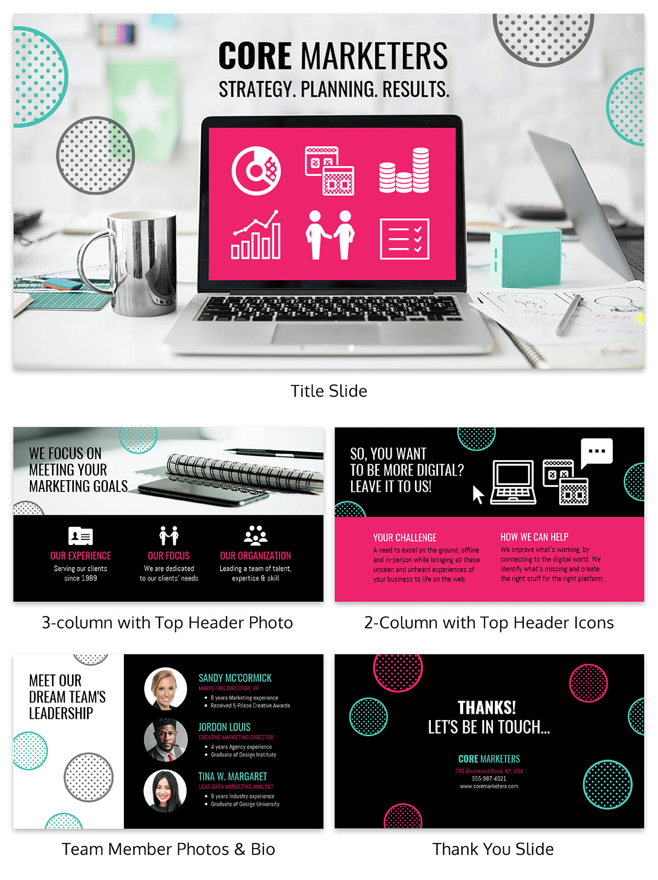
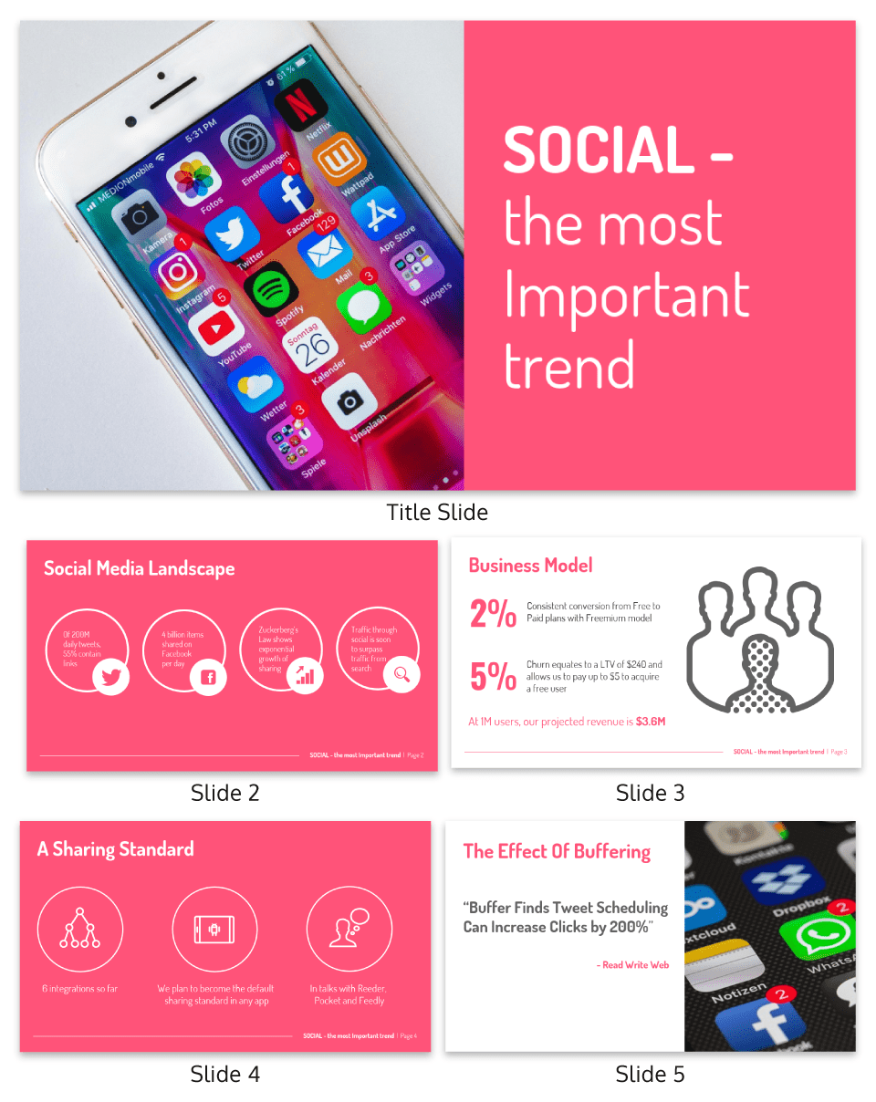
In this persuasive presentation example the importance of the message is outlined clearly on the title slide:
2. Compare and contrast your solution with the status quo
Most presentations share some information, strategy, idea, or solution that challenges the status quo. You can use this to your advantage!
By presenting the drawbacks of the status quo before suggesting your solution, you’ll help your audience understand the scope of the problem while building a case for your big idea.
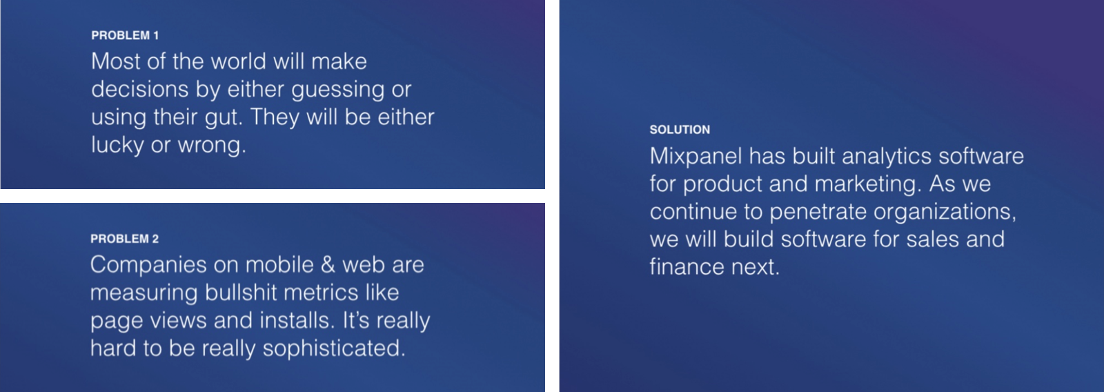
Mixpanel did this to great success in their first pitch deck (which got them a $865M valuation).
By comparing and contrasting these two states, you’ll make a much more persuasive case than you would with the solution alone. And when you get into the nitty-gritty details later on in the presentation, your audience will be more likely to stay engaged.
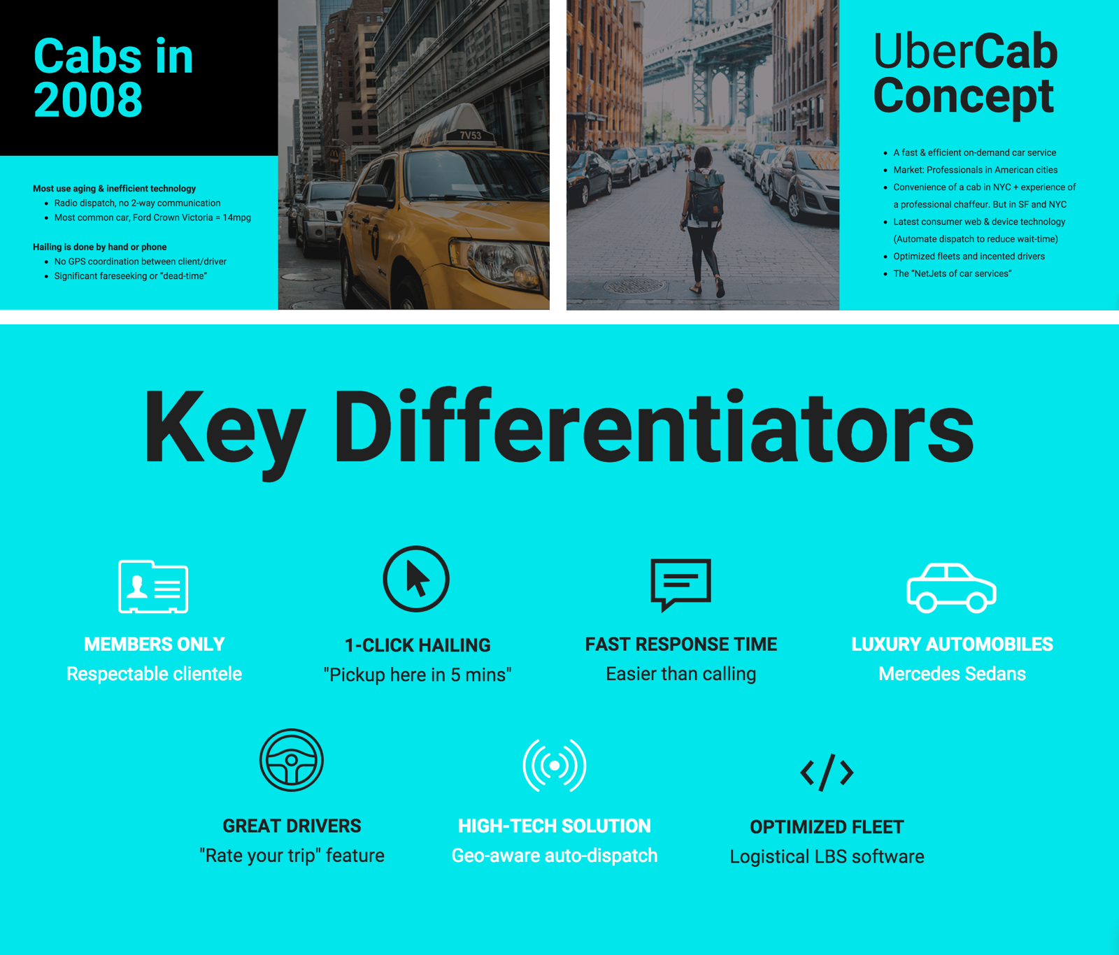
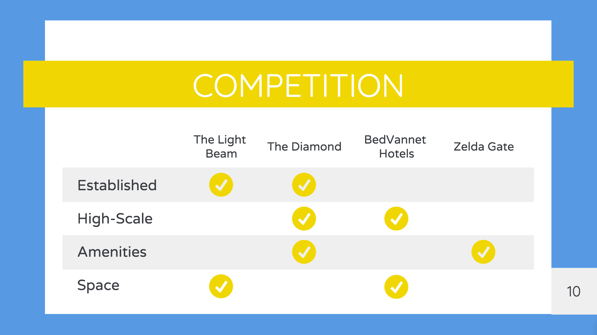
As always, the more visual you can be, the better (as seen in this Uber pitch deck template):
You could use a comparison infographic in your presentation to visualize your key differentiators.
Want to learn more about creating persuasive pitch decks? Read our pitch deck guide.
How to understand and address the struggles of your audience
To maximize the impact of this strategy, do your best to directly address the struggles of your specific audience.
Figure out what’s standing in the way of your audience performing the desired behavior, and tell them how your solution will improve that experience. If you can make a direct connection with your audience’s experiences, your argument will be all the more persuasive.
Taking a closer look at Steve Jobs’ 2007 keynote, we can see that he lays out the big problems for his audience (that smartphones that aren’t so smart and are hard to use) before proposing his solution (a smarter, easier-to-use device).
In this persuasive presentation example we can see that by studying the wants and needs of his audience, he frames his new device as the perfect solution. He understands what the audience needs to know, and structures the presentation around those needs.
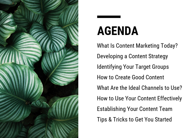
One final point on this – it can be incredibly useful to let your audience know what to expect in your presentation. If people are already expecting your idea, they will be more receptive to it. Consider including your persuasive presentation outline up front. You can either create a slide of contents, or you could print out an outline and share it with your audiences before the meeting.
Either way – sharing your persuasive presentation outline is never a bad thing.
3. Use visual aids to summarize and clarify your big ideas
More than ever, viewers expect engaging visual content. Creative, relevant visuals are no longer a nice-to-have addition to a persuasive presentation…they’re an integral part of an engaging experience.
Beyond that, visuals are great for explaining complex concepts in simple terms. You can use visuals to communicate big ideas without dealing with any jargon or technical terms.
Summarize your background research with charts and tables
Visual aids like tables, charts, and mind maps are perfect for summarizing any research you’ve done to back up the claims you make in your presentation.
I find these types of summative visuals are most helpful when I feel at risk of throwing too much information at my listeners. Forcing myself to transform that research into a digestible visual helps me organize my thoughts, and ensure my audience won’t be overwhelmed.
Visual aids should also be used anytime you’re communicating with data. Besides making insights more tangible, it’s been suggested that charts can make claims more persuasive and make information more memorable.
Let’s say, for example, that you’re trying to convince a client to hire you as a consultant. If you can show the financial impact you’ve made for other clients visually, your argument will be much more persuasive than if you mention a few numbers without visuals to back you up.
Learn how to customize this template:
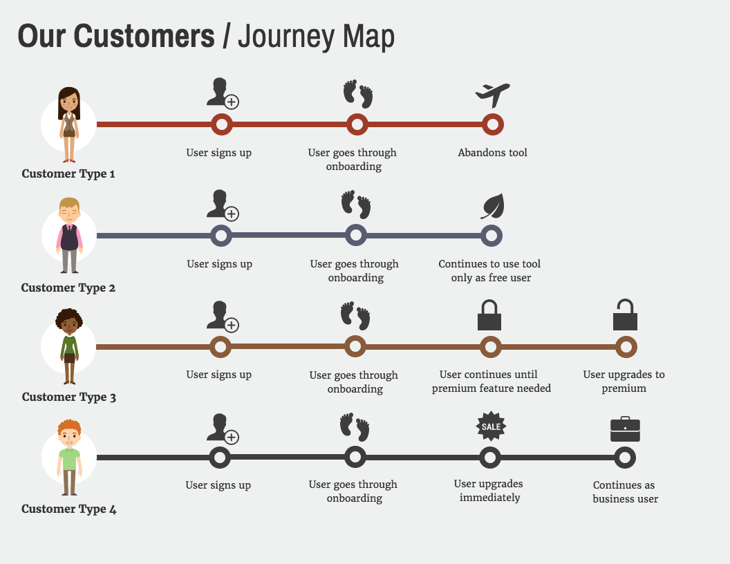
Organize information meaningfully with timelines and flowcharts
There are plenty of concepts that naturally lend themselves to structured visuals like Venn diagrams, flowcharts, and timelines.
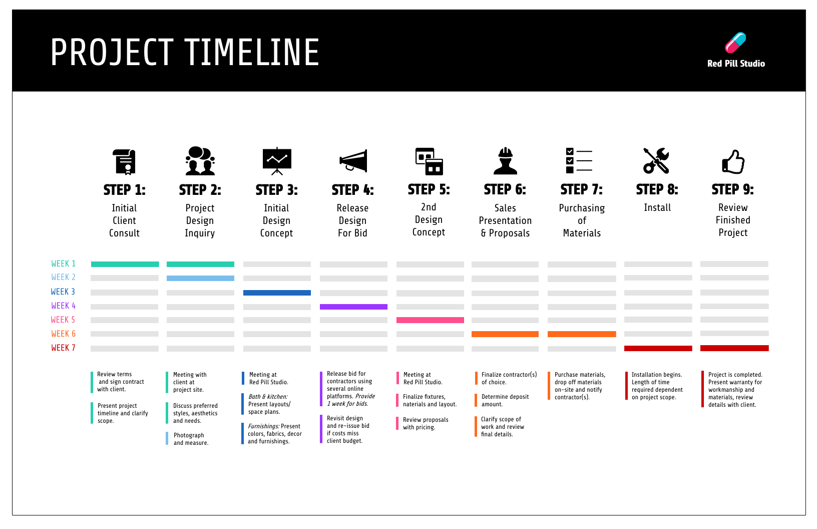
If you’re presenting a project plan you might include a Gantt chart-style product roadmap or project timeline:
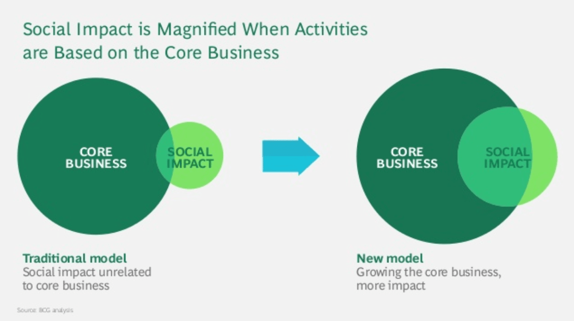
Or a more abstract Venn diagram like this one from Boston Consulting Group’s persuasive presentation pictured below.
Visuals like these can help you move past minor details so you can communicate directly about more fundamental ideas. Simple visuals can help make key ideas crystal-clear and easy to remember.
Entertain and engage with visual metaphors
I like to integrate visual metaphors into the denser portions of my presentations. This way, when I know I’m going to start losing my audience to boredom or confusion, I can jump into a fun example that will bring them right back on board with me.
Like a shortcut to understanding, visual metaphors are a great way to get everyone on the same page.
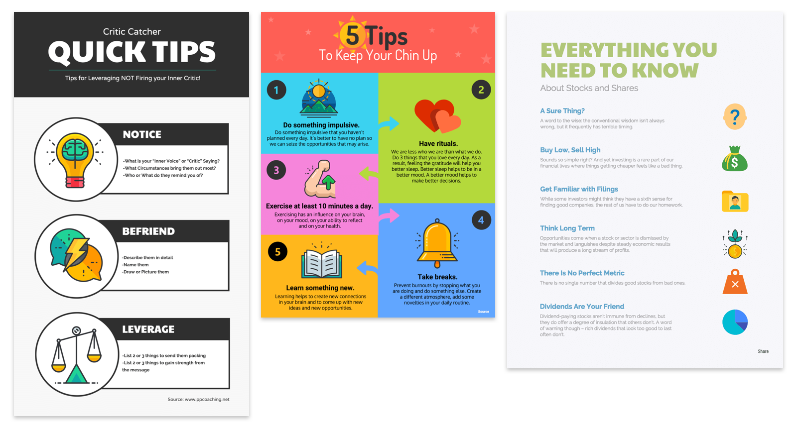
But it can be hard to come up with good visual metaphors that don’t feel cliché. If you’re out of design ideas, don’t be afraid to get some inspiration from our infographic templates.
I can’t stress enough that simple, visual slides are the best way to make your presentation understandable and persuasive. The right visuals keep the audience engaged, make your points memorable, and give your presentation impact.
For more tips on designing a persuasive presentation with impact, check out our presentation design guide.
4. Get your audience involved to build trust and rapport
No one likes to be talked at.
And most listeners will be more engaged and receptive to your ideas if they’re engaged in a dialogue instead of passively absorbing what you’re saying.
The top qualities of a good presentation include making your presentation an interactive experience by encouraging questions, fostering discussions and maybe even throwing in a fun activity.
Imagine you’re pitching a potential client who’s looking to hire a marketing specialist for an upcoming job. You could try to impress them with an extensive presentation that shows off all of your background research and past success stories:
Or, you could use the presentation as an opportunity to learn more about your potential clients by engaging them in a dialogue. You’ll build trust and credibility, all without making a gigantic slide deck.
You can put together a deck of 5-10 slides with your big ideas, then build a conversation around each slide.
Even if you’re speaking in front of a large crowd, a great persuasive presentation should feel like a conversation. There should be some give and take from both sides. Simply asking a question and getting your audience to respond can instantly raise the energy level in a room.
In this persuasive speech presentation the key points have been broken into powerful, punchy slides that engage the audience.
5. Use a clean, consistent layout and design
Why does it seem like every time I’m putting together a presentation, it’s at the last minute!?
When I’m rushing to get all of my content together and my presentation rehearsed, the layout and design of the presentation usually become an afterthought.
But when you’re presenting an idea and building a case for yourself or your business, the last thing you want is for the design your slide deck to get in the way of your success. And a big part of being persuasive is having a slide deck that shows your information in a clear, consistent manner.
Let’s say, for example, that you’re a financial consultant presenting a solution to a new client. When you’re trying to justify why your skills and knowledge are worth paying a premium for, you simply can’t have a messy, unprofessional-looking slide deck.
A professional presentation design should have:
- Consistent layouts with plenty of white space
- A simple color scheme with one highlight color
- Clear distinctions between headers and body text, with minimal font styles
With the layout and design locked down, you’ll have the confidence to hold your own with big clients and senior management. A polished presentation will go a long way toward reinforcing your credibility.
6. Eliminate extraneous detail to focus on core concepts
Take a second to think about the last presentation you sat through that didn’t hit the mark. What was it that made you lose interest?
Was there too much text on the slides? Was it bland, with not enough visuals? Was it disorganized, with no clear takeaways?
For me, it was that the presenter rambled on and on. They tried to cram way too much detail into their 20-minute talk, and I walked away without really learning anything.
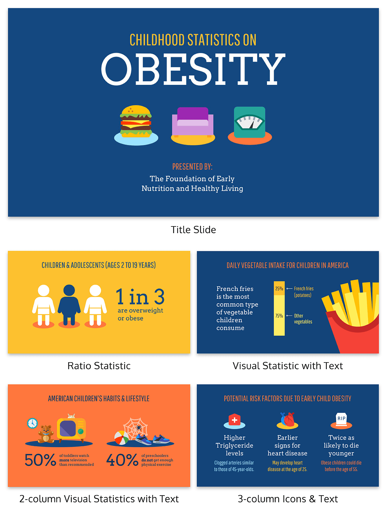
Like the persuasive presentation example below, a well-designed presentation should have no more than one takeaway per slide (with a healthy balance of text and visuals):
So cut the fluff! Eliminate everything that isn’t absolutely necessary for you to get your point across.
For me, this is the hardest part of making a persuasive presentation. I want to include every little detail that I think will help persuade my audience to change their behavior or accept my new idea. But when diving too deep into the details, I always end up losing my audience along the way.
And if you think about it, have you ever complained that a presentation was too short? I don’t think so. We really appreciate presenters who can get their point across quickly and concisely.
7. Sign off with a persuasive call-to-action
Most presenters’ go-to for the end of a presentation is a summary slide that reviews all of the main points of the talk. But these summaries are boring…they don’t tell the audience anything new, so listeners completely tune them out.
A better way to conclude a presentation is to give your audience something to do with the information you’ve just given them, in the form of a call-to-action (like the persuasive presentation example below).
Audiences must be prompted to do take action! Even if they’ve been given all of the tools they need to get something done, if you don’t prompt them directly, it’s not going to happen.
A call-to-action can be as simple as asking a question that encourages listeners to think about the topics you’ve raised, or posing a challenge that will change their behavior.
If it’s a simple ask, they’ll be likely to follow through.
Tips for improving presentation delivery
- Practice Public Speaking: Regular practice improves confidence and fluency, helping you deliver a more convincing presentation. Focus on clarity, tone, and pace to ensure your message is well-received.
- Use Effective Communication Strategies: Incorporate storytelling, rhetorical questions, and analogies as part of your communication strategies to create a more compelling presentation that connects with your audience.
- Prioritize Slide Design: Keep your slides clean, with minimal text and strong visuals, as slide design plays a critical role in delivering an impactful presentation. Use visual storytelling to make complex ideas easier to understand.
- Focus on Audience Engagement: Use interactive elements like questions, polls, or eye contact to increase audience engagement and make your presentation more dynamic. An engaging presentation keeps listeners attentive and responsive.
- Leverage Emotional Appeal: Connect with your audience on an emotional level to create a compelling presentation. Using personal stories or relatable examples enhances your emotional appeal and helps in influencing the audience.
- Master Presentation Skills: Refine your presentation skills by working on body language, posture, and facial expressions, which are key to delivering a convincing presentation. A strong stage presence can make a significant impact on the effectiveness of your delivery.
- Utilize Visual Storytelling: Instead of relying solely on text, let your visuals do the talking. Charts, images, and videos can enhance understanding and add depth to your public speaking while ensuring a more impactful presentation.
- Adapt to Audience Feedback: Pay attention to your audience’s reactions and adjust your delivery as needed. Flexibility is an essential aspect of effective presentation techniques and helps maintain audience engagement throughout the session.
Conclusion
Putting together a truly persuasive presentation is not an easy task.
The good thing is, if you’re here reading this article, you’re a few steps ahead of most people. Putting these strategies to use might just mean the difference between landing your next client and walking away empty-handed.
Choose a presentation template to get creating (and persuading) today!


