


As a designer, I’ve seen how the right chart can completely transform the way people connect with data.
Even the strongest insights can fall flat when squeezed into the wrong visual. That’s why I approach charts the same way I approach layouts. Every element should guide the viewer’s eye and support the story.
When used with intention, charts can:
- Turn complex data into something instantly understandable
- Strengthen the credibility of your message
- Make your key points impossible to forget
The best part? You don’t need years of design training to make this work. With tools like Venngage’s Chart Maker and its professionally designed chart templates, creating clean, effective charts takes just minutes.
Why choosing the right chart matters
I’ve seen how the wrong chart can quietly derail a solid insight. A cluttered bar chart can bury trends, a pie chart with too many slices can confuse readers and misleading axes can make results look more dramatic than they are.
And it’s not just how people understand your data. This also translates to slower decisions, misread conclusions, extra rework and stakeholders who start doubting the data.
The right chart has the opposite effect. It simplifies complex information, highlights what matters and helps your audience trust (and act on) your insights.
Here’s why it matters:
- Accuracy: The right chart aligns with your data type (e.g., lines for trends, bars for comparisons) and reduces misinterpretation.
- Clarity: Clean visuals with readable labels and consistent scales lower cognitive load so people can spot patterns fast.
- Credibility: Transparent axes, units and sources signal rigor and build trust in your work.
- Accessibility: Color-safe palettes and high-contrast designs ensure everyone can understand your message.
- Retention: Well-designed charts make key takeaways stick, helping audiences remember and act on them.
This guide will help you match your data to the right chart type, avoid common design traps, and apply simple visual principles so your charts strengthen your story instead of distracting from it.
Understand what you want your data to say
Before picking a chart, step back and think about the story you want your data to tell. Ask yourself: What insight do I want people to notice first? What’s the one takeaway they should remember? Having a clear message in mind will shape every design decision you make.
Next, make sure your data is accurate and complete. Even the most polished design can fall flat if the numbers behind it aren’t reliable. Remember, trust starts with clean data.
Once your message is clear and your data is solid, it’s time to choose the chart type that fits your story. Most data stories fall into one of four categories:
- Comparison: Use this when you want to show how values stack up against each other. For example, comparing monthly sales across product lines with a bar chart.
- Relationship: Use this to highlight how two or more variables connect, like showing how ad spend influences lead conversions with a scatter plot.
- Composition: Use this to show how individual parts contribute to a whole such as breaking down total revenue by region in a stacked bar chart.
- Distribution: Use this to illustrate how data points spread across a range, like visualizing customer ages in a histogram to see where they cluster.
How to choose the right chart using the ICCOR method
At Venngage, we’ve developed the ICCOR method to help you choose the best charts for your infographic. There are two steps to making the ICCOR method work for you:
Step 1: Determine your visualization goal
If you try to dive into visualizing your data without any clear goals, you’re never going to produce anything useful.
Garbage in, garbage out, right?
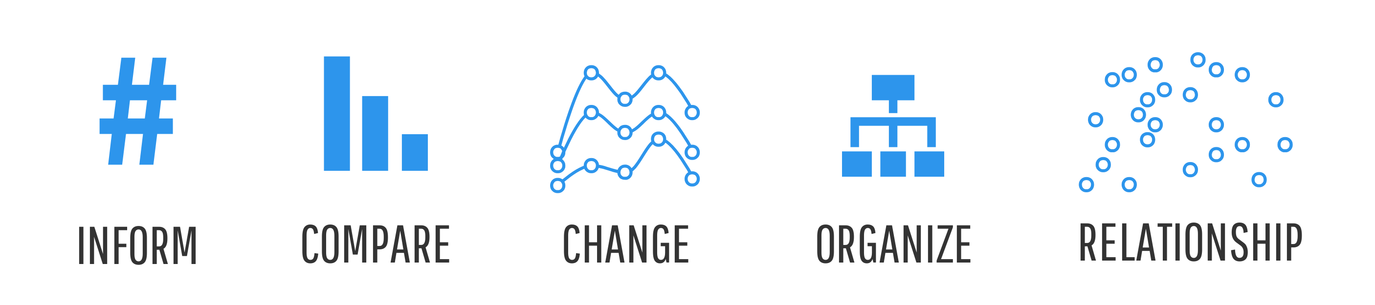
Instead, start by defining a single visualization goal for your chart. That goal should line up with one of our ICCOR categories, either to:
- Inform: convey a single important message or data point that doesn’t require much context to understand
- Compare: show similarities or differences among values or parts of a whole
- Show Change: visualize trends over time or space
- Organize: show groups, patterns, rank or order
- Reveal Relationships: show correlations among variables or values
Not sure what your goal should be? Spend some time getting to know your data. Look for patterns, groupings, trends, outliers and key data points. The things that stand out to you are the same things that you should emphasize to your readers.
Step 2: Choose the best types of charts to achieve that goal
With your goal in mind, it’s time to choose your chart!
There are a number of charts that can work for each ICCOR goal.
Let’s review each one with some chart design best practices for each.
Best charts for informing
So you have a single data point or key message that you want to hit your readers over the head with.
The easiest way to do that in an infographic is to simply use big, bold (colorful) text.

The nice thing about this strategy is it gets right to the point–there’s no room for misinterpretation. The drawback?
Sometimes a single number, without any context, might not seem very significant. This problem is easily remedied.
Use simple symbols or icons to add a bit more context–like an arrow or different sized backgrounds to emphasize growth or decline:

Or an icon chart (an icon with two fill colors, where the ratio is represented by the height of the main color) to make proportions more tangible.
A more accurate way of representing a proportion is by directly spelling it out in a pictogram, a matrix of icons in which one icon represents a unit or group of units.
When making pictograms, try to stick with nice round numbers like 10 or 100 that are easy to grasp:
Best charts for comparing
If you want to show similarities or differences among values or parts of a whole, you’ve got a lot of options.
While bar and column charts are the best choice in terms of data readability, infographics sometimes call for something a little more unique and engaging.
Enter: the bubble chart.
Use a bubble chart to compare independent values with clear outliers
In a bubble chart, values are represented by circle area instead of bar length. Since we’re not particularly good at making precise judgments of circle area, it’s only a good idea to use bubble charts when there are clear outliers or large gaps between each value. I’d also recommend explicitly labeling each bubble with its value.

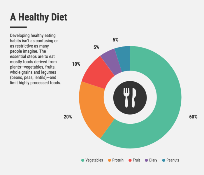
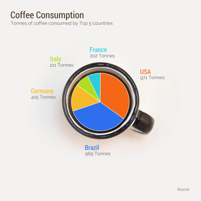
Use a pie chart to compare parts of a whole (composition)
The simplest way to visualize simple part-to-whole relationships is with a pie chart. Make your pie charts easy to read by:
- Ordering segments from greatest to least
- Starting the first segment at 12:00 and continuing clockwise
- Limiting the chart to a maximum of 7 segments
While pie charts are ubiquitous and easily understood, they do have their limitations (i.e. when comparing the composition of multiple values).
Make your own pie chart for free with Venngage’s Pie Chart Maker.
Best chart to show percentage changes
Use a stacked bar or stacked column chart to compare the compositions of multiple values

Stacked bar charts are best for showing ratio as it shows the numerator and denominator of each ratio separately, allowing for easy comparison of both absolute and relative values.
However, stacked bar charts are fairly limited in their uses. They only really work when you have very few bars and very few segments, or when differences between bars are very large.
If you’ve got lots of data or the differences within your data are subtle, a series of bar charts would be a better choice.
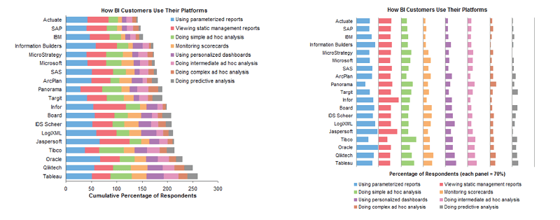
Basically–bar charts are the most reliable method when it comes to showing percentage changes and visualizing comparisons.
Best chart for multiple data points
Use a bar or column chart to compare independent values
We, as readers, are particularly good at comparing the length of bars in a bar chart (in contrast to the segments of a pie chart, for example), making bar and column charts the best charts for showing comparisons.
For the most part, bar charts and column charts can be used interchangeably. However, if you want to compare the change in some metrics over time, it’s better to stick with a column chart so that time is represented from left to right.

If you happen to have long labels for each data point (like when you’re charting survey results, for example), the horizontal bar chart is a better choice. It allows extra space for each label so that hard to read vertical or angled text can be avoided:

Note the order of the bars here–since the dataset has no inherent order, sorting the bars from greatest to least adds an extra dimension of information. Also, note the ratio of bar width to bar spacing. The space between the bars should be about half of the bar width for optimal readability.
Create your own bar chart online with Venngage’s free Bar Graph Maker.
Best charts for showing change
There’s a little more flexibility when it comes to visualizing trends over time or space.
Use a timeline infographic to visualize events over time

Use a choropleth map to show location data.
A choropleth map is a map crossed with a heatmap. They’re usually shaded in proportion to the value of some variable, and can be used to show location-based patterns:

Use a map series to show changes in location data over time

Make your own map for free with Venngage’s Map Maker.
Best chart to show trends over time
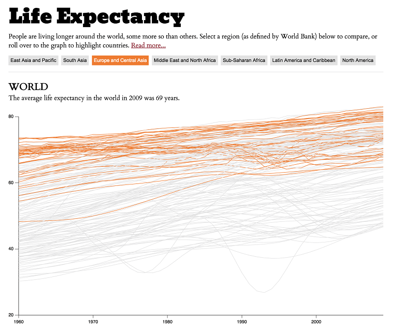
Use a line chart or an area chart to show changes that are continuous over time.
Line charts are the most effective chart for displaying time-based data. They can handle a ton of data points and multiple data series, and everyone knows how to read them. Just make sure your points are ordered such that time runs from left to right, and use consistent time intervals.
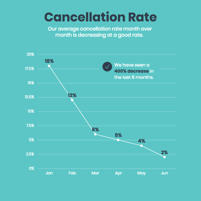

Make your own line chart for free with Venngage’s Line Graph Maker.
Area charts can be more aesthetically pleasing, but require some more finesse. They’re only really appropriate to use with less than four data series, and it’s a good idea to introduce some transparency to make sure each area is visible.

Best charts for organizing
Charts for organizing data or information in an infographic can take many forms, depending on whether you want to show groups, patterns, rank, or order. I’ll just touch on a few essentials.
The simplest form of infographic organization is a list.
Use a numbered list to show rank or order when you want to provide textual information about each element (for example, when describing a linear process)

You can also use pyramid charts to show hierarchies or rankings of information, especially those that don’t require as much text:

Use a table to organize when you want readers to be able to look up specific values
Tables are best when precise values are required, when viewers need access to individual numbers, or when the dataset contains a number of different units (which would be challenging to visualize on a single graph).

To emphasize the most important data in your tables, apply a few unique design touches.
When working with tables in the editor, you have a few options to customize the look of your table. On the top bar, you can customize the fonts and background colors.
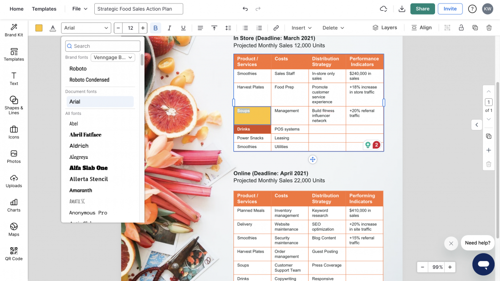
Here you can choose different fonts, font sizes, styles and colors. You can also select specific cells and apply a unique background color to make your information pop.
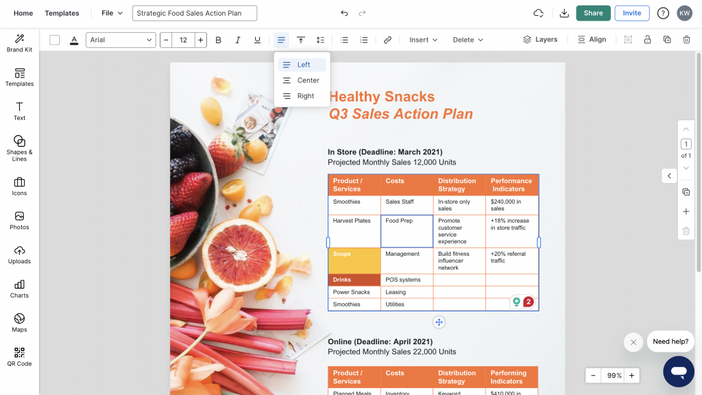
If you need to align your text, tap on the “alignment button” next to the “underline button” to alight your text either left, right or center.
While tables can provide a lot of detail, they don’t give you a sense of the shape of the data, so it’s often a good idea to include tables as a supplement to a more visual chart.
Use simple boxes, borders, arrows, and lines to visually organize groups (as seen in Venn diagrams, mind maps, and flow charts).
Most of the other methods of organizing information rely on two basic principles:
- Using shapes and borders to create groups
- Using lines and arrows indicate the relationship between groups (i.e. connect groups)
Some popular infographic charts that use these principles are the Venn diagram:
And the mind map:

With Venngage’s new Smart Diagrams, you can easily customize mind maps for a variety of needs. Add or remove branches or circles with the click of a button.
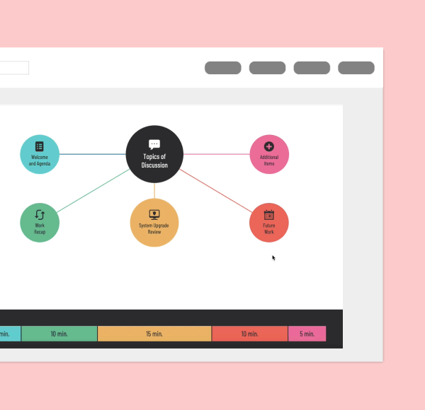
Swap out text, icons, images, and the Smart mind map automatically resizes for the changing elements. Use the Tidy feature to automatically realign all the shapes in your mind map.
To find the best organizational chart for your infographic, think about the structure of your information and find a chart that reflects that structure.
Our flow chart maker will simplify the design process for you. Or create a Venn diagram.
Best charts for revealing relationships
Two key types of relationships you might want to reveal within a dataset are correlation and distribution.
Use a scatter plot to reveal the correlation and distribution of a two-variable dataset
Scatter plots are the easiest way to explore a potential correlation between two variables, and can also reveal the distribution, clustering, and outliers of a dataset.

Scatter plots are handy because they don’t require the data to be aggregated or pre-processed to reveal the distribution of a dataset.
Make your own scatterplot for free with Venngage’s Scatter Plot Maker.
If you’re willing to do some preprocessing or you already have nicely aggregated data:
Best graph for age distribution
Use a histogram to reveal the distribution of a single variable
Histograms are the standard way to display age demographic data and are great for all kinds of distributions.

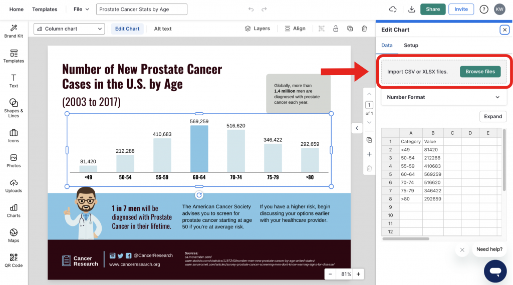
Adding data to your charts with CSV Import
Once you’ve selected your chart, you need to upload your data. In Venngage, it’s simple.
In the editor, double-click on the chart to open the widget. Under the DATA tab, click the green button labeled IMPORT and select your CSV file. The chart will instantly visualize your data once it’s imported.
12 Types of charts for data visualization
Still no idea which charts best fit your data? Here are 12 of the most common chart types to help you get started. Once you’ve applied the ICCOR method to clarify your message, this list will make it easier to pick the visual that brings it to life.
- Bar charts
- Line charts
- Pie charts
- Bubble charts
- Stacked bar charts
- Treemaps
- Word clouds
- Doughnut charts
- Pictographs
- Area charts
- Scatter plot charts
- Multi-series charts
Each of these charts has its strengths, some are perfect for showing trends, others for breaking down parts of a whole or revealing patterns in your data. Knowing what’s available gives you a solid foundation for choosing the right fit.
Want to explore them in more depth? Check out this guide on the different types of charts and graphs.
WATCH: How to pick the right types of comparison charts for your data
Quick tips for chart design
Now that we’ve covered how to choose the best comparison chart for each ICCOR goal, it’s time to talk chart styling.
At best, properly styled charts can make your infographics clearer and more persuasive.
At worst, poorly designed charts can be misleading, create confusion, undermine the credibility of the author. If you’re interested, check out how bad chart design was used in the media to skew data during the 2016 U.S. election.
To make sure you create charts that are clear, accessible, and 100% above board, let’s review some chart design best practices.
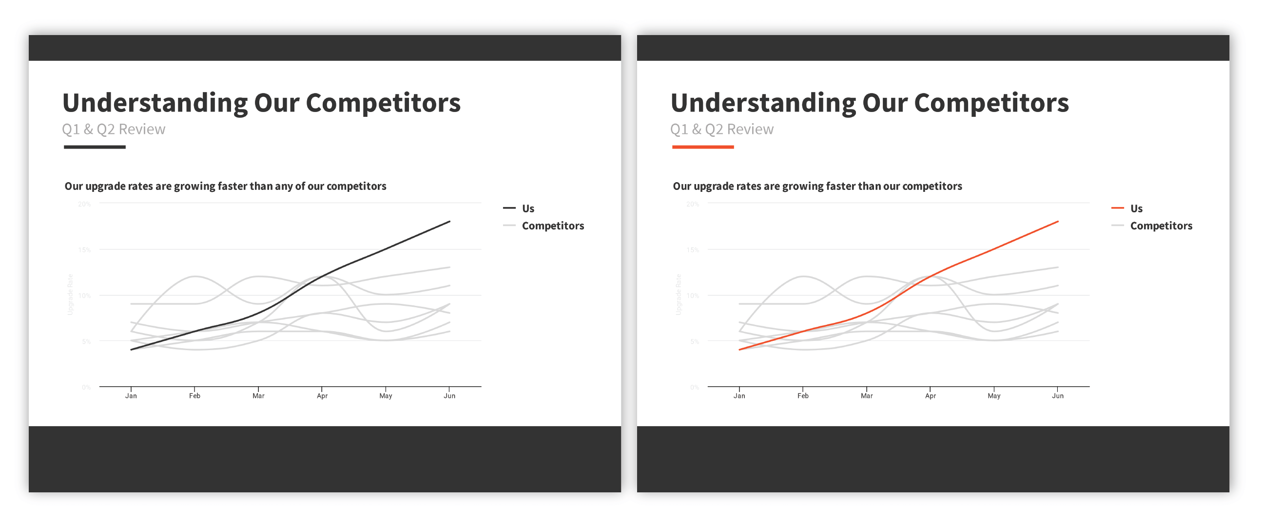
Start chart axes at zero, and use consistent intervals for tick marks
One of the biggest data visualization faux pas is axis truncation. Starting the axis of a bar or line chart at some value other than zero is a sure-fire way to distort your data.
In most cases, it’s best to start your axes at zero. If you choose not to, make sure you have a good reason for it. Similarly, make sure the scale of your chart is apparent by labeling your axes with regularly-spaced tick marks at logical intervals (such as every 5, 10, or 100 units).
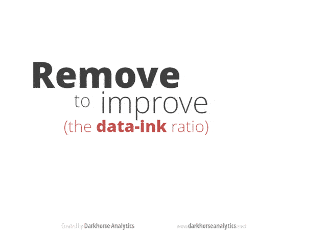
Reduce non-data ink
Your data should always be the star of the show.
Data visualization guru Edward Tufte coined the term “data-ink ratio” to emphasize the importance of minimalism in chart design. The general idea: a large share of the ink required to print a graph should directly represent data-information.
Basically, things like borders, gridlines, background colors, and other extra decorations should take a backseat to the points, bars, or lines that actually represent the data.
Do your best to lighten labels and gridlines, diminish colors, eliminate backgrounds, avoid borders and outlines, and above all…get rid of any 3D or other “special” effects.
Don’t forget labels, legends, and annotations
Labels are your friends.
Chart labels, headings, and annotations should be used to explicitly state the things you want your readers to take away from your chart, to eliminate the possibility of misinterpretation.
Don’t be afraid to be redundant, either. It’s okay to repeat key takeaways in both a subheading and an annotation, like the data visualization design example below.

When labeling lines, bars, or points, try to avoid relying on a separate legend. Place labels as close to their corresponding data points as possible, so that your reader doesn’t have to search to match up labels with data points.
Oh, and don’t forget to include your data sources. Link to your data source at the bottom of your infographic in small type (less than 10 pt size). Pro Tip: Use a link shortener to make your link easier to access.
Use color for function, not decoration
Color use plays a significant role in how “busy” your infographic will appear.
To make sure things don’t get too messy, don’t use more than six colors in any given chart. When you’ve got more than one chart in an infographic, use those colors consistently across all of your charts.

For more complex charts, choose one key color to distinguish more important values from less important values (and use gray to attenuate the data that you want to be less of a focus).

In contrast, don’t rely on color to make your chart legible–your chart should be just as meaningful in black and white as it is in color.
Order data logically
Present your data in an order that your reader will expect.
Have a time series? Order it with the earliest data point on the left and the latest data point on the right.
Have a pie chart? Starting at twelve o’clock, order segments clockwise from largest to smallest.
Representing categories that have no natural order? Consider ranking them from largest to smallest.

Keep it simple!
Finally, when visualizing data in an infographic, I urge you to exercise restraint. Don’t overload your charts with too much data.
Infographic data must be easy to understand at a glance. If there’s too much going on in the chart, your reader is likely to give up and move on.
Some rules of thumb:
- Use less than 6 lines in a line chart
- Use less than 10 bars in a bar chart
- Use less than 7 segments in a pie chart
If this means manipulating your data (by removing points, grouping points, or by looking at shorter spans of time), take time to consider the tradeoff between readability and data accuracy. Try to reduce your dataset down to its most essential pieces without introducing inaccuracy or skewing your data.
If you can’t get around including a ton of data, it’s not the end of the world. Contrasting a single bright color with muted greys can help your readers make sense of even hundreds of data points:
A good way to make sure that your chart is simple enough? Have a friend look it over, and resist the urge to explain it to them. If your friend can’t understand your chart without any verbal explanation, it’s too complex for an infographic.
Alternatively, do a squint test. Squint your eyes until you can’t read any text–do you still get something from the chart? If not, simplify your charts a little more.
So to sum all of this up:
-
- be diligent with your axes
- use color thoughtfully
- minimize the non-data ink
- don’t forget about labels and annotations
- cite your sources
- order your data logically
- don’t overload your chart with too much data
Luckily for you, the default styling of Venngage’s chart widgets takes care of a lot of this chart design stuff for you. Just click the chart you want to use, pop in your data, and you’re good to go!
So how do you go about choosing the best chart templates for your infographic?

Conclusion
The power of well-presented data should not be underestimated, and the right chart can make all the difference. Use the ICCOR Method to choose the best charts for your infographic data.


