


Line charts are one of the most common types of data visualizations, and they are incredibly useful for a wide variety of professionals.
In this article, I will draw from my experience as a senior information designer to share all you need to know about line charts, from basics to best practices.
You can then use Venngage’s Chart Maker with customizable line chart templates to create line charts that best visualize your data, in just several simple steps.
Table of contents:
- What is a line chart?
- What is a line chart used for?
- Common challenges or errors
- How to create a line chart with Venngage
- Best practices for creating a line chart
- FAQs about line charts
What is a line chart?
A line chart—also called a line graph—is a visual representation of numeric or quantitative data that shows the relationship between two variables.
A variable is basically anything that can change, like amounts, percentage rates, time intervals, etc. These variables are on the X and Y axes of the graph—or the horizontal line at the bottom and the vertical line at the left, respectively.
A line chart looks like points connected on one or more lines running from left to right on a graph. Each point represents a data value:

What is a line chart used for?
Line charts are often used to show continuous data, which is data that cannot be counted in whole numbers, such as numbers of products sold. Rather, it is always on a continuum and can have any imaginable value, including fractions or decimal points. This could be time, temperature, measurements, cost, etc.
Line charts are used to show how a change in one variable or number affects changes in another. They are often used to show, for example, changes that happen over time. In this case, time is on the horizontal axis, with older dates to the left and newer dates to the right.

For example, when used in a business report or plan, a line chart could describe how sales change from quarter to quarter, how the percentage of upgrades changes month-to-month, or how employee satisfaction has varied from year to year.
By visualizing these numbers in a line chart, you can spot trends and patternsmore easily and perhaps even make forecasts.

Some line charts contain more than one line, which allows for additional comparisons between categories or groups.

Common line graph challenges or errors
While two or three lines on a line chart can provide some additional information and clarity, too many lines can make the chart difficult to read. If you’re wondering how many lines are too many, check out the answer in the FAQ section.
You can use color to make the chart easier to read, but beware: using too many colors can render the chart confusing and make it hard for readers to follow all the data points.
This simple line chart is a good example of proper color use as it helps separate the most important data (the company’s upgrade rates) from the other data points (competitors’ upgrade rates), while managing to provide a good comparison between the two data sets at the same time.

Sometimes you won’t have all the data you need to “connect the dots” so to speak. For example, you may be missing data for some months or years. If you choose to use a line graph in these instances, it’s very important to make sure your audience is aware of these gaps, so they don’t misinterpret the information and draw erroneous conclusions.
This line graph displays information about employee engagement rates in the U.S. Notice how it presents data gaps really clearly:

When not to use a line chart
Sometimes a line chart just won’t be the best way to visualize the data. If you are working with data that is not numeric, you will probably want to use a bar chart instead. If you want to look at categories of any kind, even if the data is numeric, a bar chart is a great solution.
Here is an example of a histogram, which is a type of bar chart that shows how numbers or frequencies are distributed across a range of numbers:

How to create a line chart with Venngage
You can start making a line chart today using Venngage’s Chart Maker, even if you have very little experience. Just follow these easy steps.
1. Start with one of Venngage’s superb chart templates
You will be able to edit all of the visual elements in the template, so look for one that has a style you prefer or that has the components (text boxes, number of charts, etc.) that you need.
Customize the chart templates included in this post or check out the full line chart template library here:

2. Double click the chart and add your data to the table
You can upload a Google Sheet, CSV or XLSX file if you prefer.
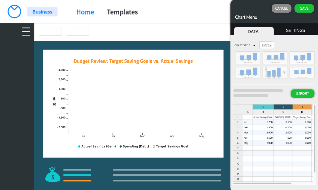
3. Edit the chart settings to make your design
This includes colors, fonts, labels, line width, point size, etc. Use the tips provided below to make sure your chart is easy to understand.
4. Complete your design with additional visual elements
You can change the colors and fonts in the templates to fit your company brand. You can also change or add icons or photos that help you tell your data story.
5. Download and/or share your finished chart
A free Venngage user can share their chart using a public link. Upgrade to a paid account in order to download your chart in PNG, PDF, Interactive PDF or even in PPTX format to be used in PowerPoint slides.
With a Business account, you can even share your chart with your team to get their comments:

Or collaborate with your team members to edit your charts in real time:

Best practices for creating a great line graph
It’s one thing to create a line chart, it’s another to create one that achieves your purpose or goal.
Whether you are wanting to help your team understand the progress being made towards goals, or your customers understand how your product is scientifically superior, these tips will help you make sure your line chart communicates what you need it to and doesn’t end up falling into the unfortunate category of a bad infographic.
Label X and Y axes
Help your reader know exactly what relationship you are explaining with clear axis titles. Indicate what’s being counted on each horizontal and vertical axis. Dollars? Percentages? Months in the year 2020?
If you are using multiple lines in your graph, the data should be similar for each, with each category you are comparing having the same unit and scale.
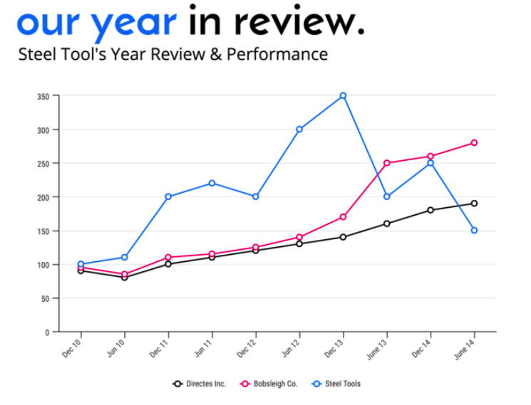
For example, this line chart uses different lines for different companies, but overall it displays information about how sales in dollars have changed over the years from 2010 to 2014.

Don’t use a dual axis, which is when you have an additional Y axis on the right of the chart. It’s incredibly hard to make them work and super hard for your reader to understand. If you need to show comparisons with different units, make two line charts instead.
Break axes into regular intervals
Both the X and Y axis should be segmented in a mathematical fashion, with regular intervals showing the spread of the data. The good news is that if you use Venngage, this is automatic.
Also, make sure the Y axis isn’t distorting the data and thus impeding accurate interpretation.

In general, you should use a zero baseline unless there’s a good reason not to (this video from Vox explains this in more depth). Again, this is the default in Venngage.

Don’t cherry-pick the data
This is another tip that is non-negotiable. If you are only using the data that supports what you want to believe or profess, then you are not only misleading folks, you are also depriving them of learning what all of the actual data has to say.

When you are communicating data, you have a responsibility to do so honestly. Doing so is the best way to turn these communications into “wins” for your company.
Related: 5 Ways Writers Use Misleading Graphs to Manipulate You
Remove unnecessary clutter
You can make it much easier for people to grasp the major trends or takeaways from your line chart by keeping it as simple as it can be, without losing any of the nuances of the data of course. This is especially important if you are including lots of data points or lines.
For example, use horizontal grid lines if it helps people better read the numbers, but make them light grey so they fade into the background.
Also, instead of a legend, you can label different lines directly on the chart.

Make your chart title useful to readers
People will spend a lot of time reading the text in your chart, according to research, so make that text something helpful to the reader.
Instead of a matter-of-fact title, like “Average Age of Customers” or “Revenue per Quarter”, use a descriptive title that helps the reader better interpret the data in the chart, like “Product Attracts Younger Customers” or “Revenue Declined Last Quarter.”

You can also go beyond the title and label or make notes about things like:
- Exact values for each data point on the line
- Significant values within the chart, such as the highest and lowest ones
- Points in time where significant changes happened
This simple line chart on world coffee consumption is a good example:

Speaking of notes, always, always, always cite the source and date of your data beneath the chart.
This may be a hyperlink to an external data source or a note about how the data was collected, like “Annual employee survey, 2020.”
Use color to highlight what matters
Color is not just a way to make your chart “prettier.” When it comes to communicating data, color is an important communication aid. You can use it to help people instantly:
- Recognize what matters most, be it points or lines
- Compare different categories or lines
- Connect with the content thematically and/or emotionally

FAQs about line charts
How many lines is too many lines in a line chart?
There is no hard and fast rule, because it really depends on your audience, the size of the chart, the shape of the lines, the style of the chart, etc. However, a good rule of thumb is that the lines should be far enough apart that they are easy to read individually, and each line should have a purpose.
Each one should allow your audience to answer a key question, like in this example:

When it comes to the chart you are making, it’s very easy to get the answer to this question: just ask your audience.
Asking for input and feedback is a critical part of the design process. You can ask a question such as, “What should I be rethinking to make this chart easier to understand?” and “Which of these lines is the most helpful and which are less helpful?”
What software should I use to make line graphs?
It depends on your audience, the complexity of the dataset, your skill level, and your resources (time and money).
If your audience needs a colorful design to draw them into the data, if you are working with a simple table of data, or if you are short on resources or skills, the best solution is Venngage.
Unlike some other easy-to-use alternatives, Venngage offers the design flexibility that’s needed to create charts well, plus hundreds of templates relevant for business professionals.

If your audience is highly technical, if the data set is complicated to work with (many data fields in different spreadsheets), and if you have the skills or resources, you can use a more robust software such as Tableau or Power BI.
There is some software that just isn’t ideal for making line charts, because it’s just too complicated or too difficult to learn how to use in a way that makes good line chart design possible. If you want to make a quick line chart strictly for your own use, Excel or Google Sheets is an option, but they are not ideal for high-quality design. Unfortunately, it can take a lot of work to make accurate and great-looking line charts with PowerPoint or Adobe Illustrator.
What is a slope graph?
A slope graph is a type of line chart with often a series of lines that have only a single starting point and a single ending point. They are often used to compare changes that occurred between two dates. Similar to any line chart, they are effective if the number of lines does not inhibit understanding.

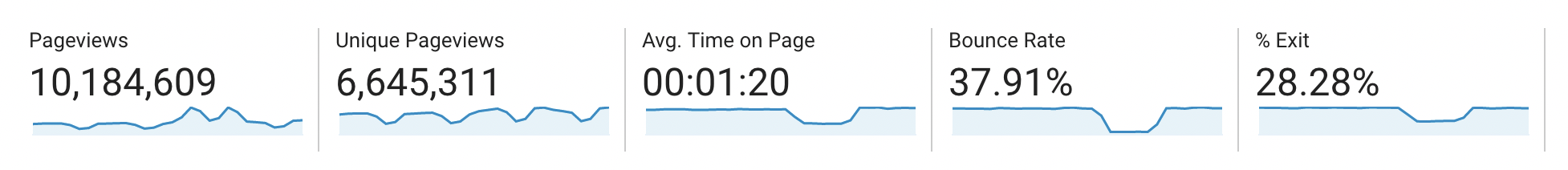
What is a sparkline chart?
A sparkline is a very small, very simplified line chart where there may or may not be labeled axes.
They are often part of a series of sparklines that can provide a high-level view of changes over time in different categories. They are not good for making precise comparisons, and they assume that the viewer has some pre-existing knowledge of the data set. They are more often seen in dynamic data dashboards than in print or digital infographics.
Here’s an example of a series of sparklines within a Google Analytics dashboard:
When can/should a line chart be an area chart?
An area chart is essentially a line chart with the area beneath the line colored.
Naturally, the colored area draws attention, potentially away from the shape of the line. For this reason, they are good for only very specific scenarios in which the chart is describing how percentage rates have changed over time.
Area charts can be great alternatives to pie charts if you want to show not only percentages but change over time.

Also read: Pie Charts and Other Ways to Show Percentages in Infographics
Again, it is wise to be careful about how many lines you include in an area chart. More than two lines is too many, and the lines should be spaced far enough apart that they can be read separately.

What is the difference between a line chart and a scatter plot?
Like a line chart, a scatter plot (also called a scatter chart) includes data points and allows for comparisons between two variables, each on an axis of the chart. However, the data points do not create a line because the relationships between the variables are more varied.
For example, here’s a scatter chart that shows relationships between park size and the number of visitors:

When can/should I use a bar chart and line chart together?
Like all of the others above, this is a good solution in very limited circumstances. The data used in both charts needs to be similar in unit and scale, for example all percentage rates or all dollars.
The best use of this combination is when the line can illuminate a target or goal and the bars can show the actual amounts. In this specific situation, the use of different types of visualizations calls attention to different things but rather than distracting from one another, they collectively tell a more comprehensive data story together.

In summary: Simple but effective, line chart is a versatile data visualization tool that helps display trends, present comparisons and more
Considering how useful and versatile the line chart is, it’s no wonder it’s one of the most popular ways to visualize data.
But like all chart types, they do require some thoughtful consideration to make them effective. You don’t need to be a designer or an analyst, but you do need to know what to think about.
With this article, you should be well on your way to becoming a pro!
Also check out our FREE course on Becoming an Infographic Design Pro, where you’ll learn how to create infographics that help you reach your business goals. There’s a module that teaches you how to choose the right charts and graphs for your data:


