


Words don’t always paint the clearest picture, especially when it comes to raw data.
The human mind is very receptive to visual information. That’s why data visualization is a powerful tool for communication. A simple chart can show trends, comparisons, and patterns that would take paragraphs to explain.
But if “data visualization” sounds tricky and technical don’t worry — it doesn’t have to be.
In this guide, I’ll break down the fundamentals of data visualization in plain language. You’ll also get plenty of examples of different chart types, plus guidance on when to use each one in reports, presentations, marketing and more.
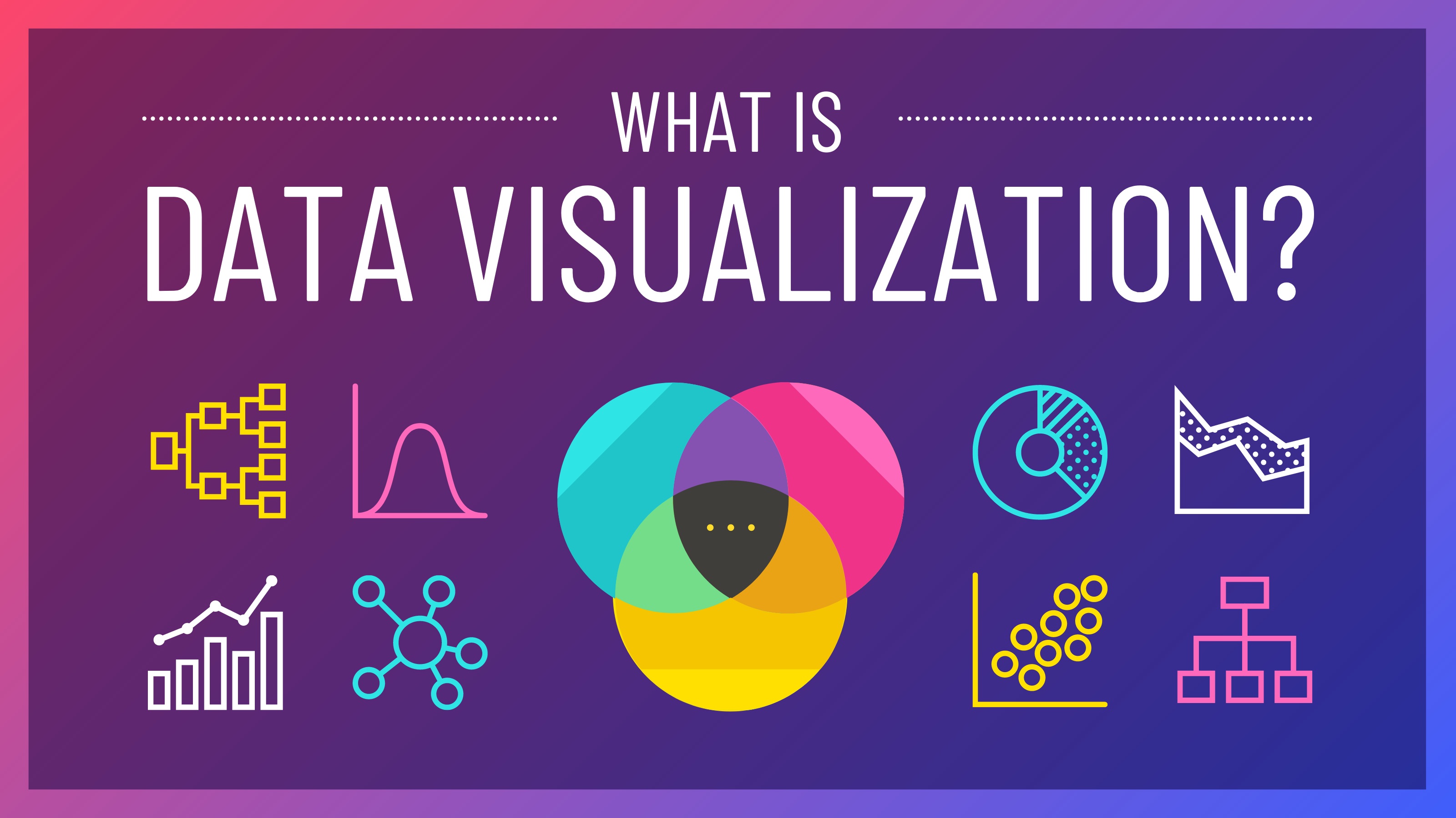
What is data visualization?
Data visualization is the visual presentation of data or information in the form of a bar chart, line graph, infographic, diagram or map. The goal of data visualization is to compare values, spot patterns and communicate data or information clearly and effectively to the readers.
Data visualization sits at the intersection of art and data science. A good visual can look polished and engaging, but it also needs to be effective.
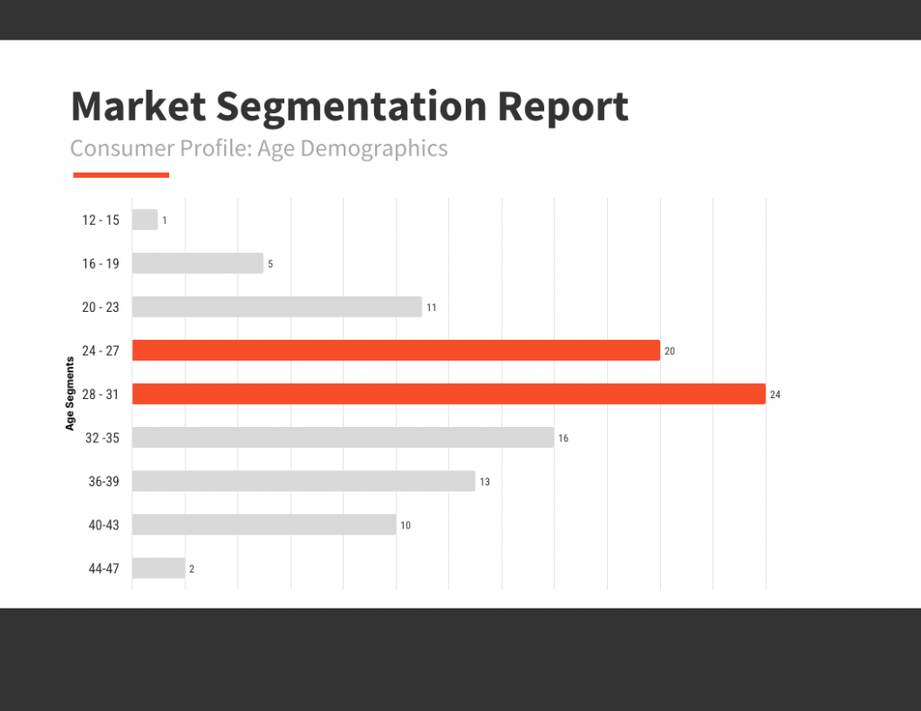
Data visualization is used everywhere. Businesses use data it for reporting, forecasting, and marketing. For example, this Market Segmentation bar chart is a quick way to show age demographics at a glance. Instead of listing percentages in a table, you can instantly see which age group is the biggest and how the audience is spread out, which helps teams make clearer decisions about targeting and messaging.
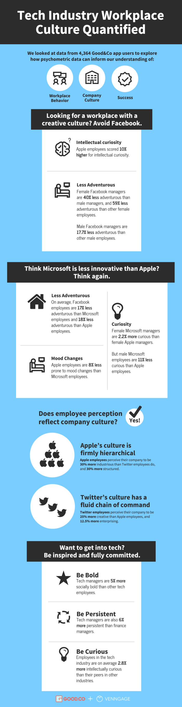
Nonprofits use data visualizations to put stories and faces to numbers.
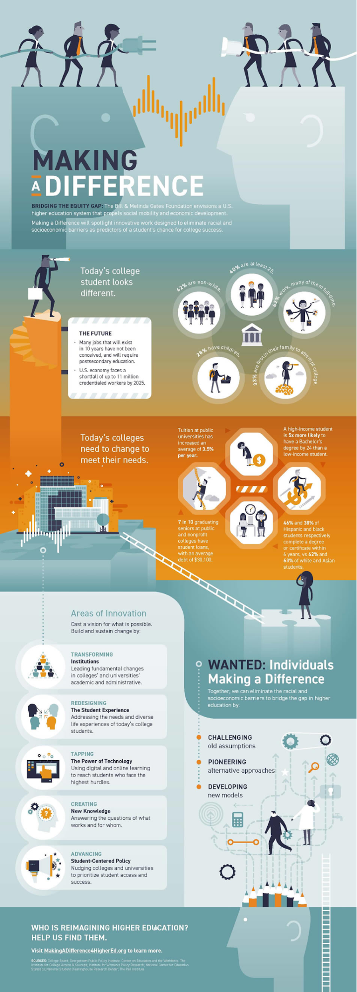
Source: Bill and Melinda Gates Foundation
Scholars and scientists use data visualization to illustrate concepts and reinforce their arguments.
Reporters use data visualization to show trends and contextualize stories.
While data visualizations can make your work more professional, they can also be a lot of fun.
11 amazing data visualization examples
Here are some of the best and helpful data visualization examples I’ve come across recently.
Bar chart to compare marketing trends
This bar chart from HubSpot’s State of Marketing Report 2025 is a clear example of how data visualization helps summarize survey findings quickly.
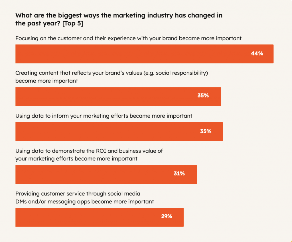
It shows the top five ways the marketing industry has changed in the past year, using horizontal bars to compare responses by percentage.
Instead of reading a long list of survey results, viewers can instantly understand which trends matter most to marketers and how they rank against each other.
Infographic to show emerging industry trends
This infographic from Venngage’s Design and Marketing Trends 2026 Report highlights emerging trends using percentages and simple icons to show adoption signals at a glance.
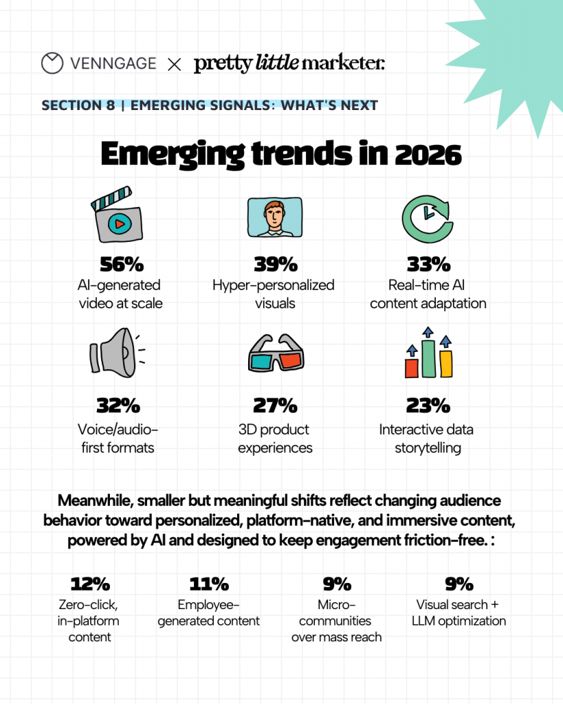
Instead of listing trends in text, it visually ranks what marketers expect to grow next, from AI-generated video and hyper-personalized visuals to interactive data storytelling. Grouping major and emerging shifts separately helps readers quickly understand both the biggest bets and early signals shaping marketing in 2026.
Graphic design trends infographic
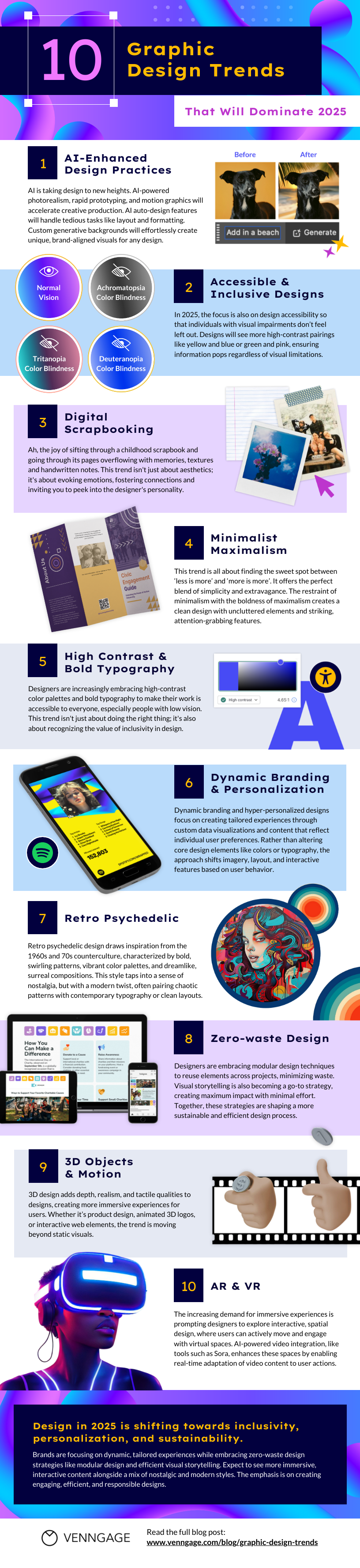
This graphic design infographic perfectly explains the different graphic design trends in 2020. The simple sections along with related visuals, make it easier to grasp the latest design practices.
Read More: 10 Graphic Design Trends That Will Dominate 2025
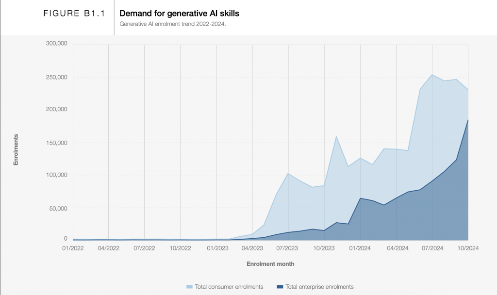
Area chart to show growth
This area chart from the World Economic Forum’s Future of Jobs Report 2025 shows how interest in generative AI skills grew from 2022 to 2024. The rising shape makes the trend easy to spot, and the two shaded areas let you compare consumer enrolments with enterprise enrolments at a glance.
Stop Shark Finning Nonprofit Infographic
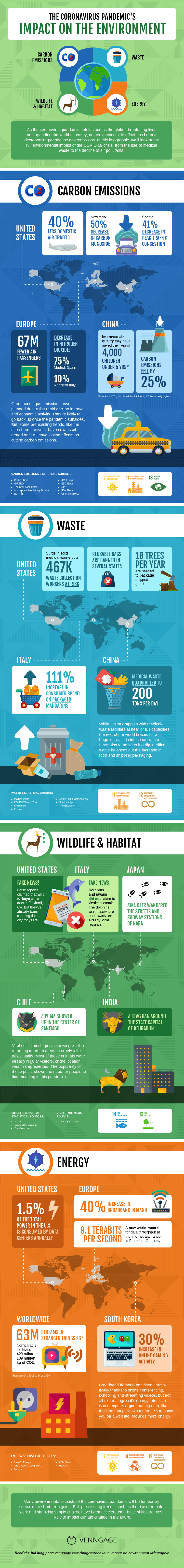
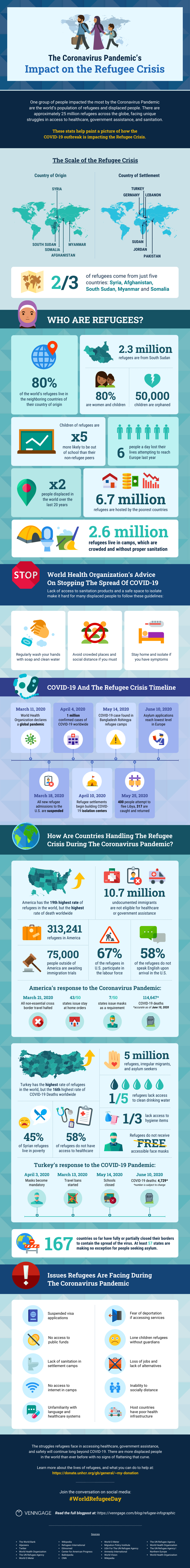
This infographic aptly explains the Coronavirus Pandemic’s Impact on the Environment. The figures for carbon emissions, waste generated, wildlife and habitat etc., make it easier to visualize and understand the overall impact of Coronavirus across different countries.
What Disney Characters Tell Us About Color Theory
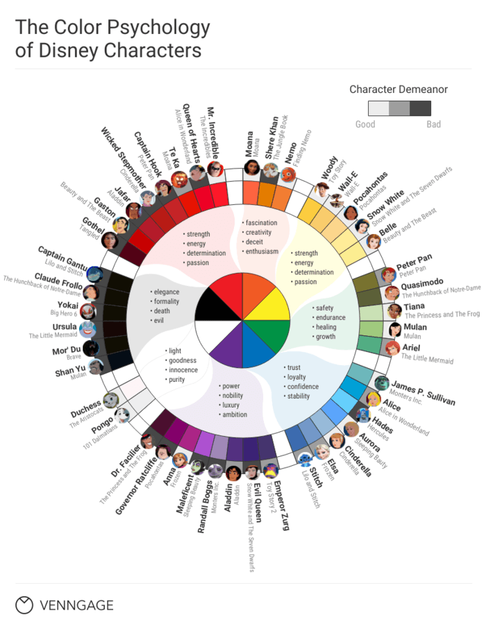
Ever wondered how companies use colors to allure their audience? This color theory infographic explains that. It creatively depicts what the different colors of Disney characters represents and how you can resonate with them.
Read More: What Disney Villains Can Tell Us About Color Psychology
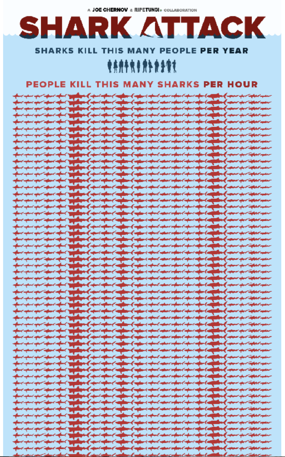
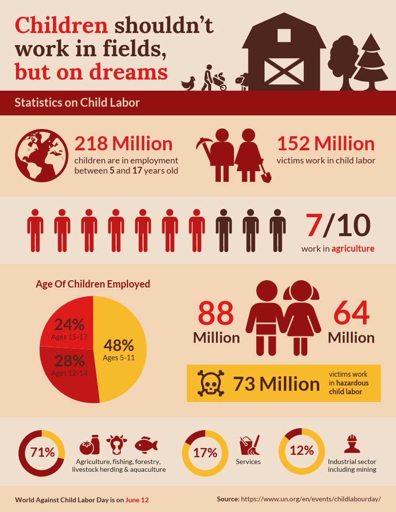
World’s Deadliest Animal Infographic
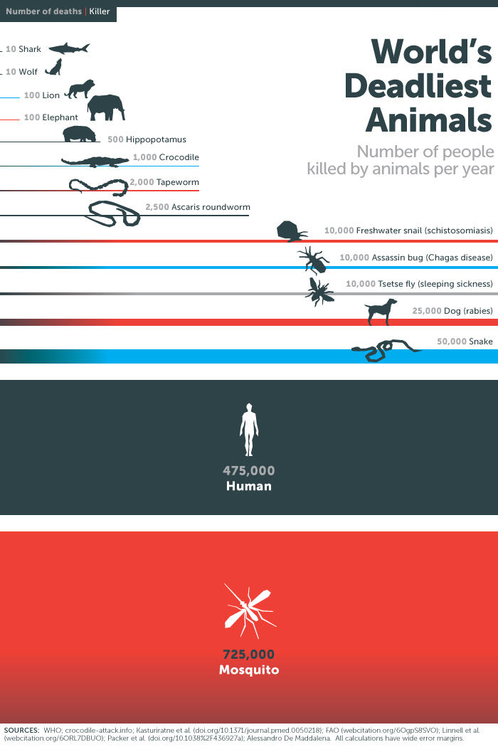
Source: Bill and Melinda Gates Foundation
This infographic explains how many people are killed by different animals each year. The increasing width of lines smartly depicts the rise in the number of deaths ny different animals. This way you can easily understand world’s deadliest animals without even looking at the numbers.
The Secret Recipe For a Viral Creepypasta
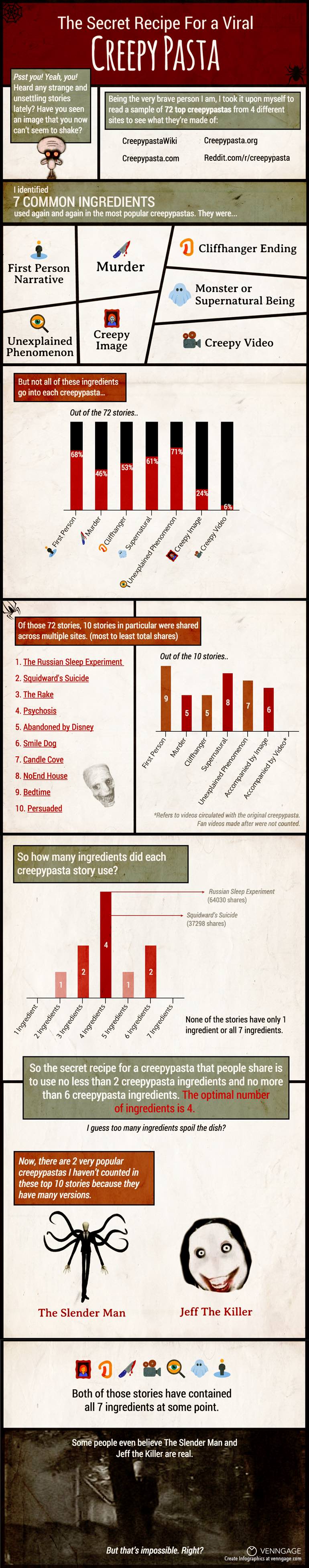
If you are into horror stories, you’d love this creepypasta infographics. It adds a dash of humor while explaining the seven elements of creepypasta stories.
The Hero’s Journey Infographic
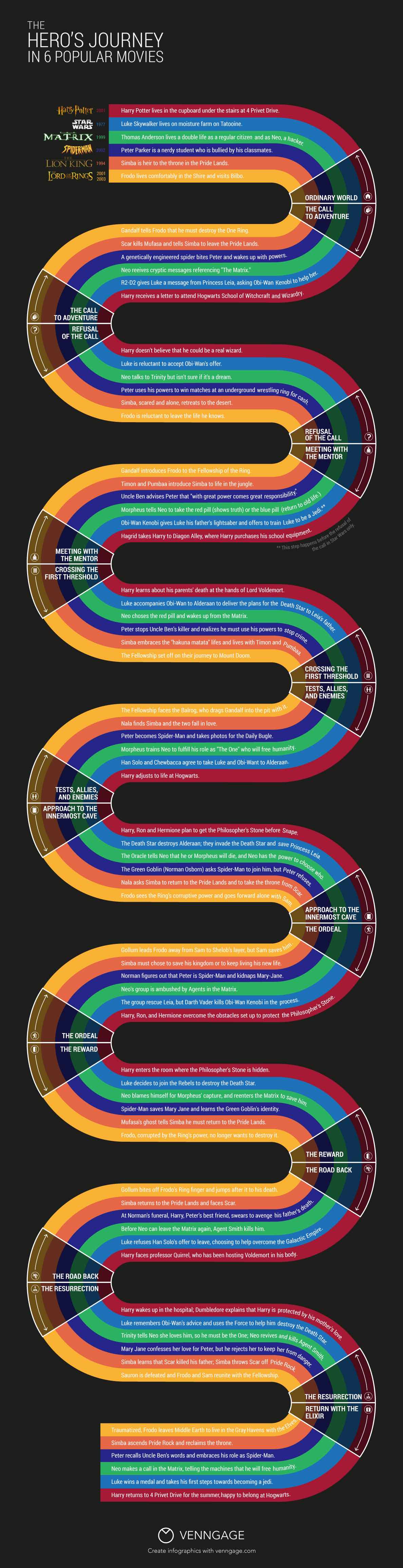
This infographic is for the movie buffs. It explains the how the journey of the hero evolves in six popular movies. The zigzag design beautifully denotes the journey from the starting point to the end point.
Read More: What Your 6 Favorite Movies Have in Common
Emotional Self Care Guide Infographic
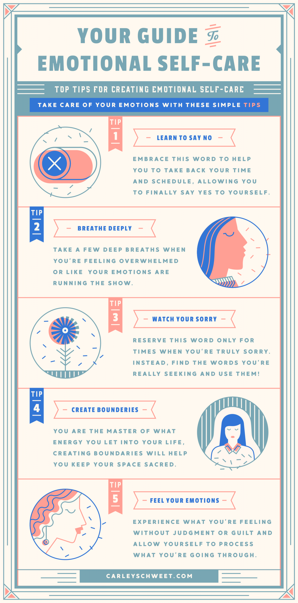
Source: Carley Schweet
This emotional self care infographic shares four useful tips on how we can take care of our mental health. The text and the visuals are aligned in an excellent manner to clearly convey the tips.
4 types of data visualizations
Data visualizations can come in many different forms. People are always coming up with new and creative ways to present data visually.
Generally speaking, data visualizations usually fall under these main categories:
Infographics
An infographic is a collection of imagery, charts, and minimal text that gives an easy-to-understand overview of a topic.
While infographics can take many forms, they can typically be categorized by these infographic types:
- Statistical infographics
- Informational infographics
- Timeline infographics
- Process infographics
- Geographic infographics
- Comparison infographics
- Hierarchical infographics
- List infographics
- Resume infographics
Read More: What is an Infographic? Examples, Templates & Design Tips
Charts
In the simplest terms, a chart is a graphical representation of data. Charts use visual symbols like line, bars, dots, slices, and icons to represent data points.
Some of the most common types of charts are:
- Bar graphs/charts
- Line charts
- Pie charts
- Bubble charts
- Stacked bar charts
- Treemaps
- Word clouds
- Pictographs
- Area charts
- Scatter plot charts
- Multi-series charts
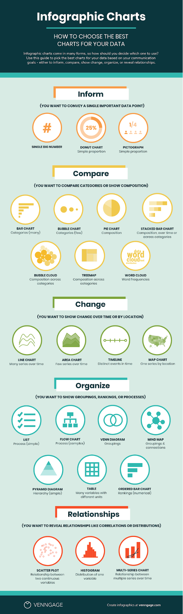
The question that inevitably follows is: what type of chart should I use to visualize my data? Does it matter?
Short answer: yes, it matters. Choosing a type of chart that doesn’t work with your data can end up misrepresenting and skewing your data.
For example: if you’ve been in the data viz biz for a while, then you may have heard some of the controversy surrounding pie charts. A rookie mistake that people often make is using a pie chart when a bar chart would work better.
Pie charts display portions of a whole. A pie chart works when you want to compare proportions that are substantially different. Like this:
But when your proportions are similar, a pie chart can make it difficult to tell which slice is bigger than the other. That’s why, in most other cases, a bar chart is a safer bet.
Here is a cheat sheet to help you pick the right type of chart for your data:
Want to make better charts? Make engaging charts with Venngage’s Chart Maker.
Related: How to Choose the Best Types of Charts For Your Data
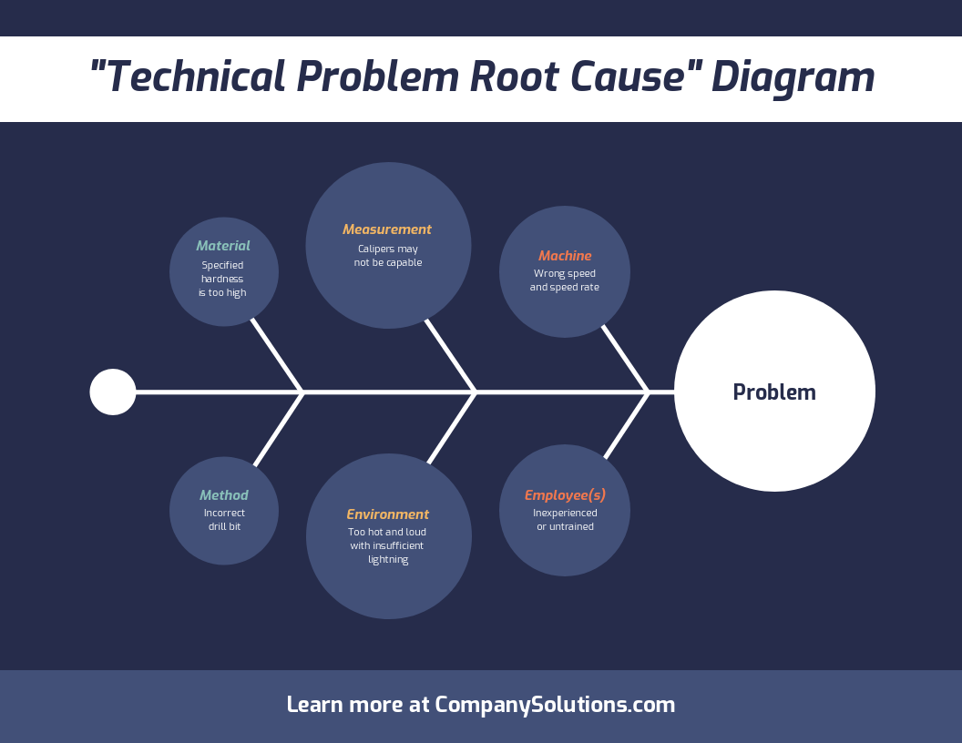
Diagrams
Similar to a chart, a diagram is a visual representation of information. Diagrams can be both two-dimensional and three-dimensional.
Some of the most common types of diagrams are:
- Flowcharts
- Mind maps
- Venn diagrams
- Tree diagrams
- SWOT analysis
- Fishbone diagrams
- Histograms
- Wireframes
- Site maps
- Use case diagrams
Diagrams are used for mapping out processes, helping with decision making, identifying root causes, connecting ideas, and planning out projects.
Want to make a diagram? Create a Venn diagram and other visuals using our free Venn Diagram Maker.
Maps
A map is a visual representation of an area of land. Maps show physical features of land like regions, landscapes, cities, roads, and bodies of water.
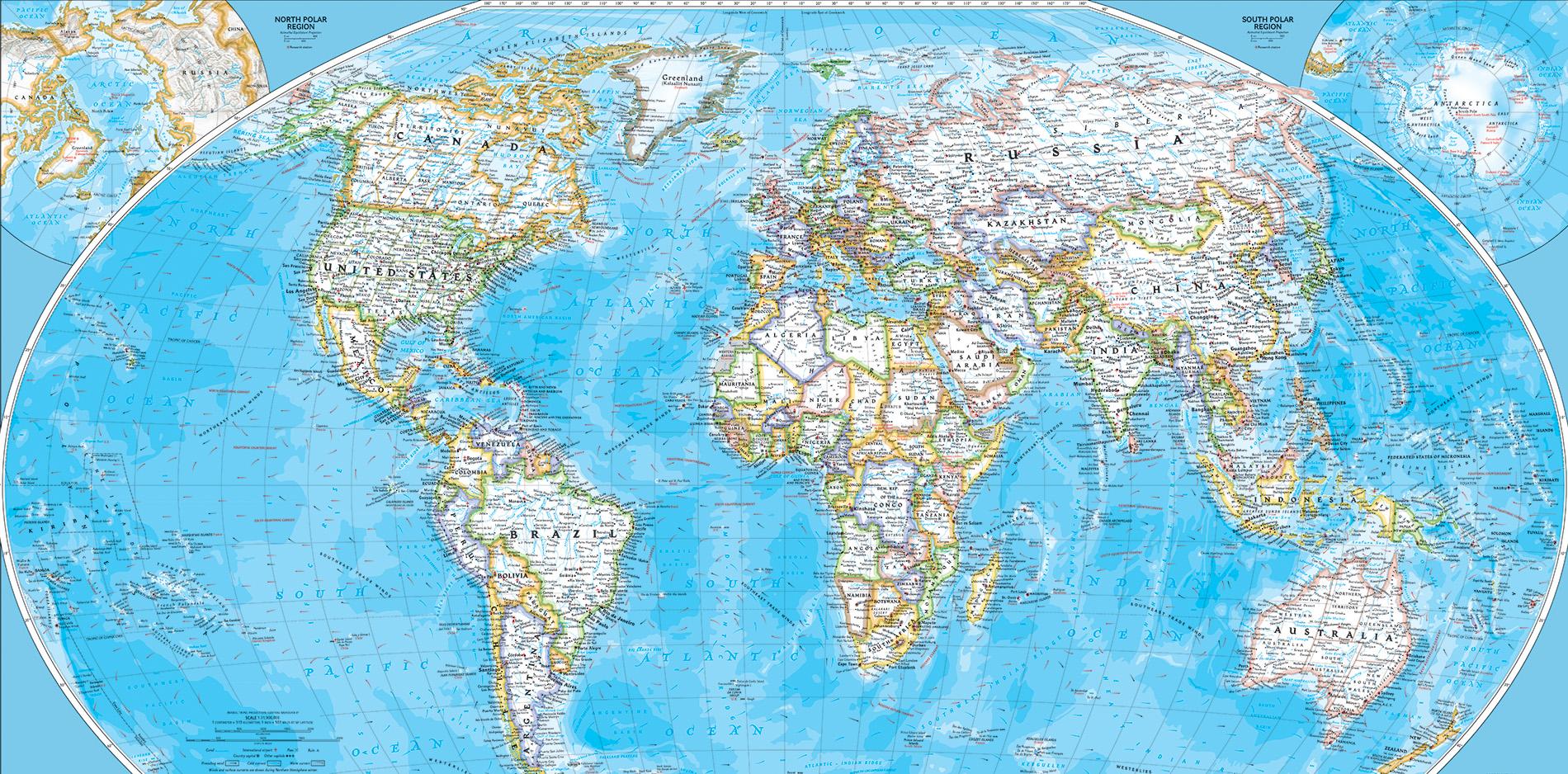
Source: National Geographic
A common type of map you have probably come across in your travels is a choropleth map. Choropleth maps use different shades and colors to indicate average quantities.
For example, a population density map uses varying shades to show the difference in population numbers from region to region:
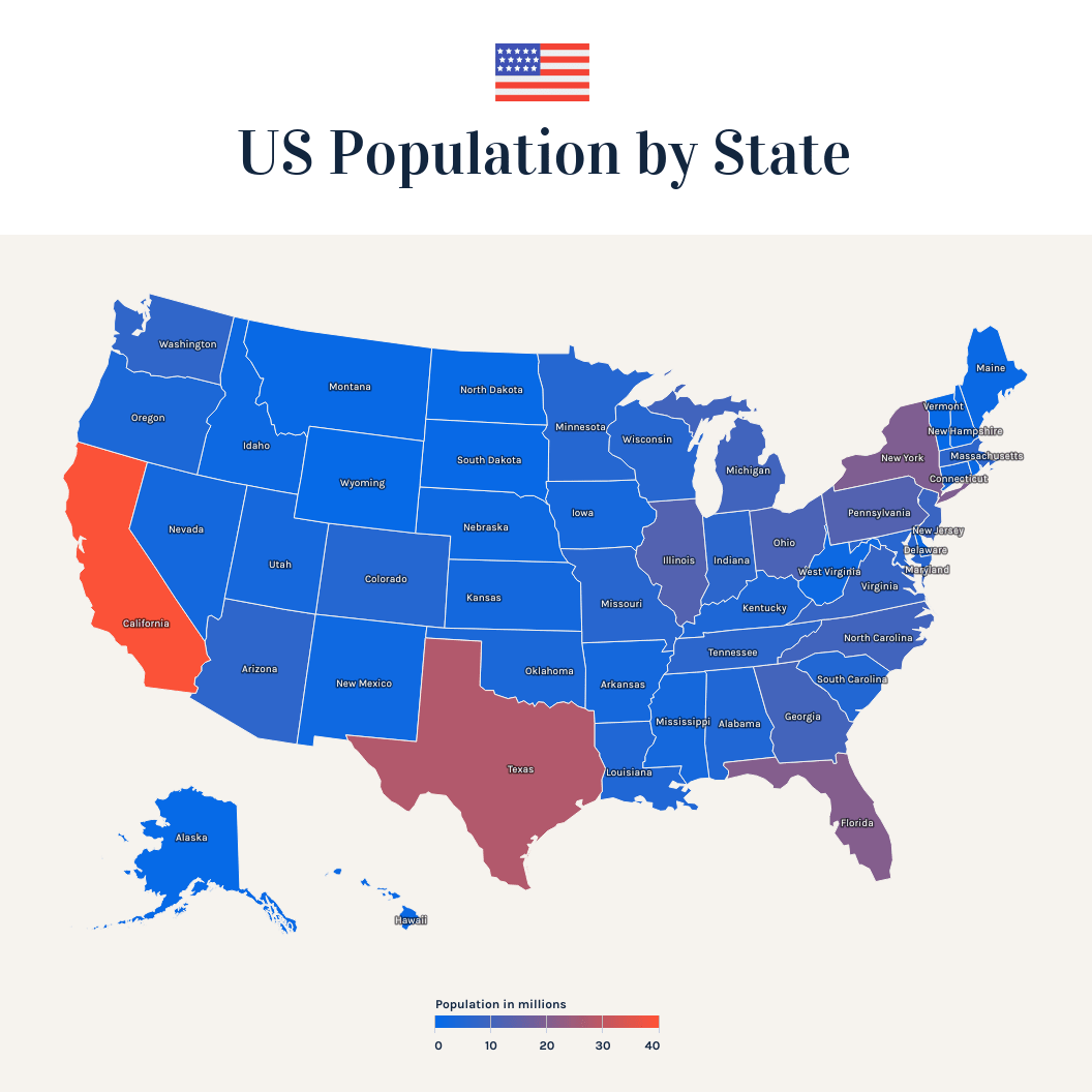
Create your own map for free with Venngage’s Map Maker.
What is data visualization used for?
Data, especially a lot of data, can be difficult to wrap your head around. Data visualization can help both you and your audience interpret and understand data.
Data visualizations often use elements of visual storytelling to communicate a message supported by the data.
There are many situations where you would want to present data visually.
Data visualization can be used for:
- Making data engaging and easily digestible
- Identifying trends and outliers within a set of data
- Telling a story found within the data
- Reinforcing an argument or opinion
- Highlighting the important parts of a set of data
Let’s look at some examples for each use case.
1. Make data digestible and easy to understand
Often, a large set of numbers can make us go cross-eyed. It can be difficult to find the significance behind rows of data.
Data visualization allows us to frame the data differently by using illustrations, charts, descriptive text, and engaging design. Visualization also allows us to group and organize data based on categories and themes, which can make it easier to break down into understandable chunks.
Related: How to Use Data Visualization in Your Infographics
For example, this infographic breaks down the concept of neuroplasticity in an approachable way:
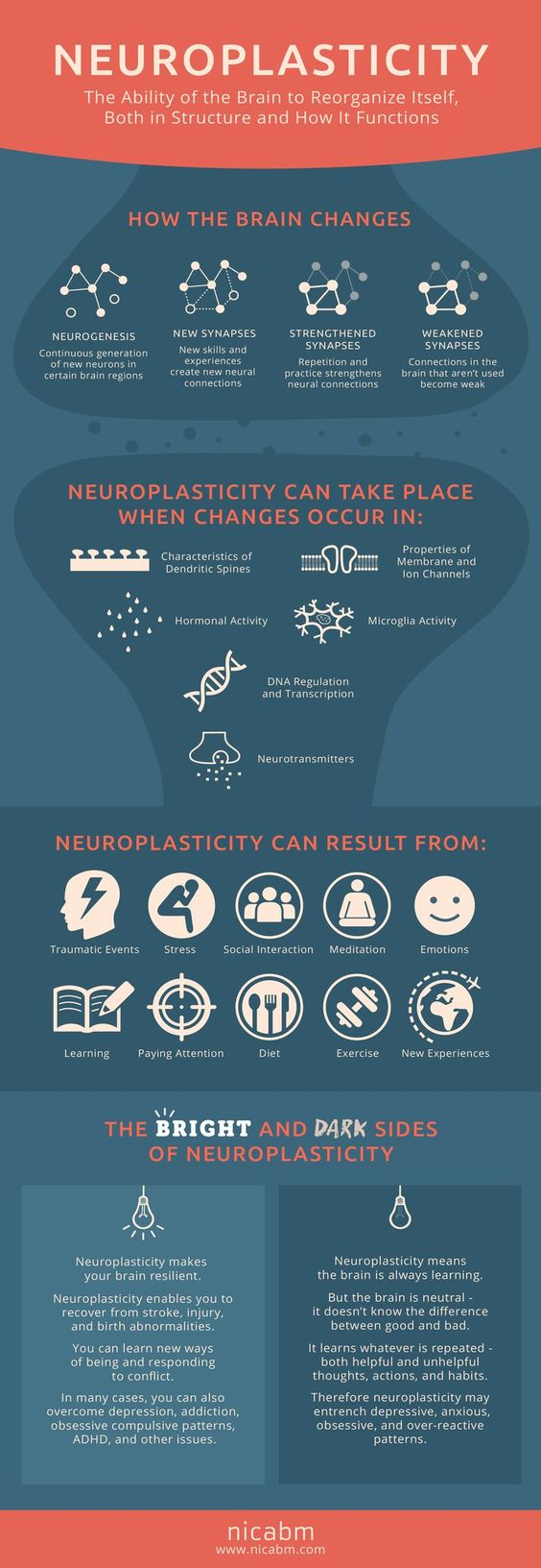
Source: NICABM
The same goes for complex, specialized concepts. It can often be difficult to break down the information in a way that non-specialists will understand. But an infographic that organizes the information, with visuals, can demystify concepts for novice readers.
2. Identify trends and outliers
If you were to sift through raw data manually, it could take ages to notice patterns, trends or outlying data. But by using data visualization tools like charts, you can sort through a lot of data quickly.
Even better, charts enable you to pick up on trends a lot quicker than you would sifting through numbers.
For example, here’s a simple chart generated by Google Search Console that shows the change in Google searches for “toilet paper”. As you can see, in March 2020 there was a huge increase in searches for toilet paper:
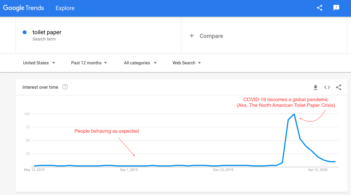
Source: How to Use SEO Data to Fuel Your Content Marketing Strategy in 2020
This chart shows an outlier in the general trend for toilet paper-related Google searches. The reason for the outlier? The outbreak of COVID-19 in North America. With a simple data visualization, we’ve been able to highlight an outlier and hint at a story behind the data.
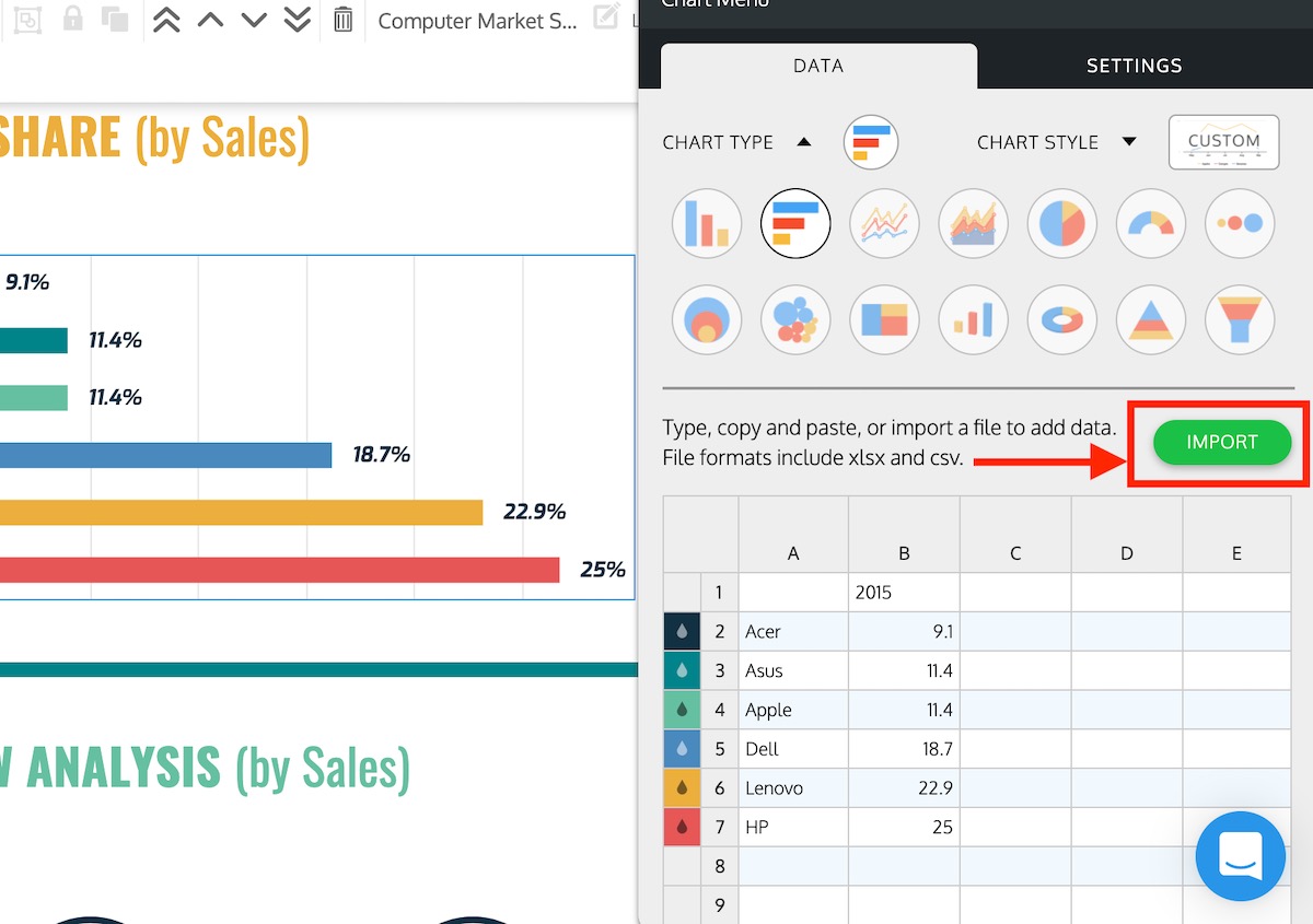
Uploading your data into charts, to create these kinds of visuals is easy. While working on your design in the editor, select a chart from the left panel. Open the chart and find the green IMPORT button under the DATA tab. Then upload the CSV file and your chart automatically visualizes the information.
3. Tell a story within the data
Numbers on their own don’t tend to evoke an emotional response. But data visualization can tell a story that gives significance to the data.
Designers use techniques like color theory, illustrations, design style and visual cues to appeal to the emotions of readers, put faces to numbers, and introduce a narrative to the data.
Related: How to Tell a Story With Data (A Guide for Beginners)
For example, here’s an infographic created by World Vision. In the infographics, numbers are visualized using illustrations of cups. While comparing numbers might impress readers, reinforcing those numbers with illustrations helps to make an even greater impact.
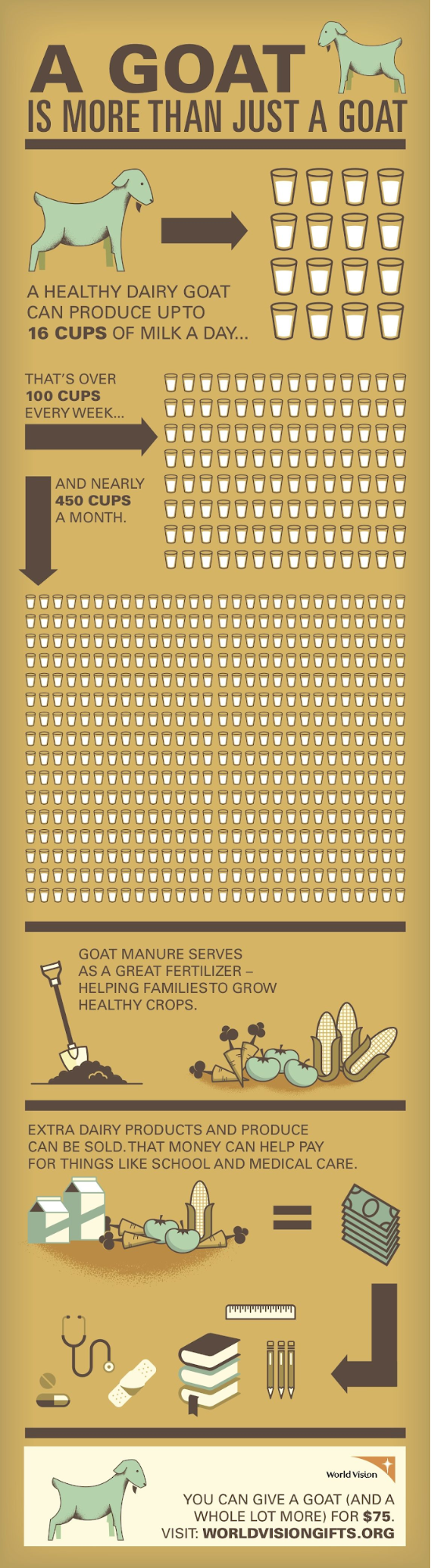
Source: World Vision
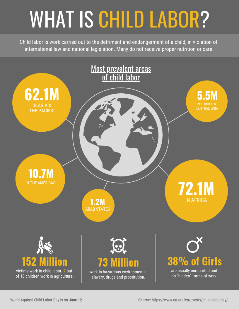
Meanwhile, this infographic uses data to draw attention to an often overlooked issue:
4. Reinforce an argument or opinion
When it comes to convincing people your opinion is right, they often have to see it to believe it. An effective infographic or chart can make your argument more robust and reinforce your creativity.
For example, you can use a comparison infographic to compare sides of an argument, different theories, product/service options, pros and cons, and more. Especially if you’re blending data types.
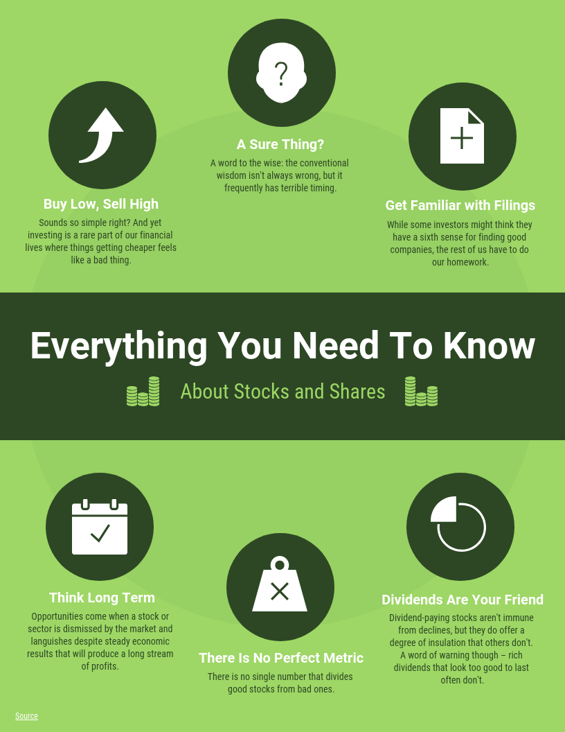
5. Highlight an important point in a set of data
Sometimes we use data visualizations to make it easier for readers to explore the data and come to their own conclusions. But often, we use data visualizations to tell a story, make a particular argument, or encourage readers to come to a specific conclusion.
Designers use visual cues to direct the eye to different places on a page. Visual cues are shapes, symbols, and colors that point to a specific part of the data visualization, or that make a specific part stand out.
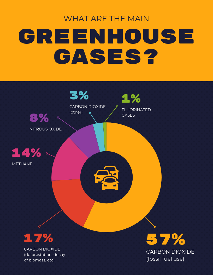
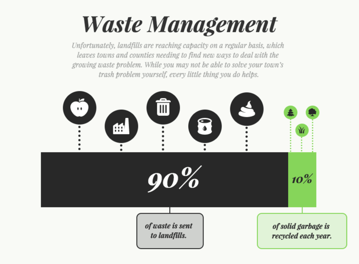
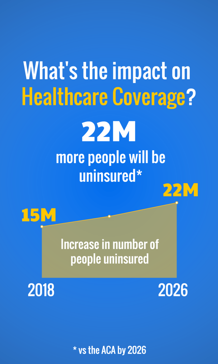
For example, in this data visualization, contrasting colors are used to emphasize the difference in the amount of waste sent to landfills versus recycled waste:
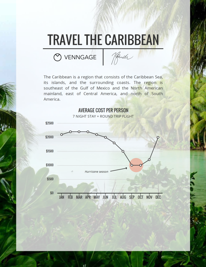
Here’s another example. This time, a red circle and an arrow are used to highlight points on the chart where the numbers show a drop:
Highlighting specific data points helps your data visualization tell a compelling story.
6. Make books, blog posts, reports and videos more engaging
At Venngage, we use data visualization to make our blog posts more engaging for readers. When we write a blog post or share a post on social media, we like to summarize key points from our content using infographics.
The added benefit of creating engaging visuals like infographics is that it has enabled our site to be featured in publications like The Wall Street Journal, Mashable, Business Insider, The Huffington Post and more.
That’s because data visualizations are different from a lot of other types of content people consume on a daily basis. They make your brain work. They combine concrete facts and numbers with impactful visual elements. They make complex concepts easier to grasp.
Here’s an example of an infographic we made that got a lot of media buzz:
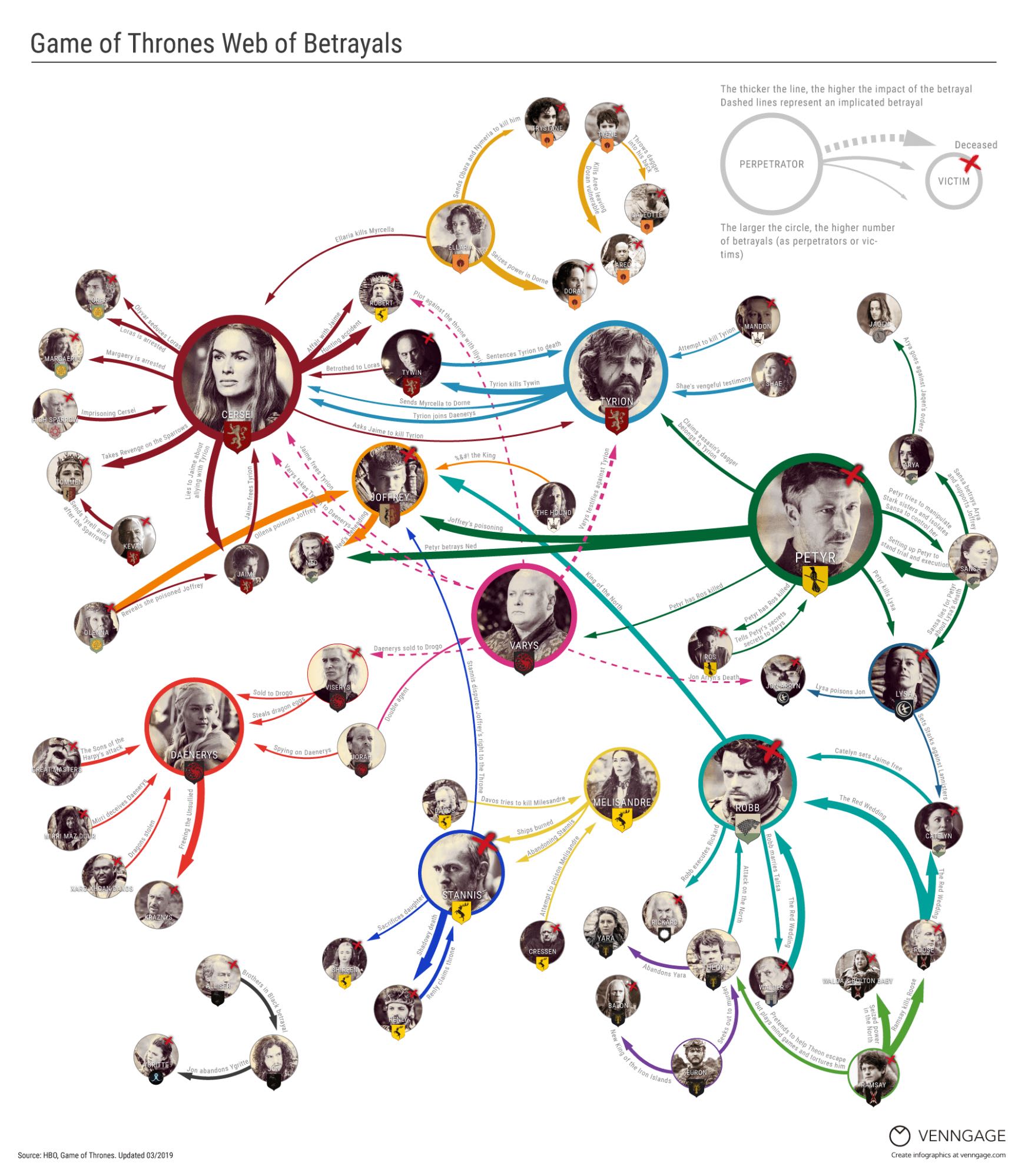
Read the Blog Post: Every Betrayal Ever in Game of Thrones
We created this infographic because a bunch of people on our team are big Game of Thrones fans and we wanted to create a visual that would help other fans follow the show. Because we approached a topic that a lot of people cared about in an original way, the infographic got picked up by a bunch of media sites.
Whether you’re a website looking to promote your content, a journalist looking for an original angle, or a creative building your portfolio, data visualizations can be an effective way to get people’s attention.
The data visualization process (How I approach it)
This is the process I use when working on reports, guides and trend studies, especially when the goal is to make data clear for non-technical audiences.
- Start with the question: I begin by defining the exact question the data needs to answer. This keeps the visual focused and prevents unnecessary charts.
- Clean and validate the data: Before designing anything, I check sources, remove inconsistencies and make sure the data is accurate and complete.
- Choose the right visual form: I select the chart type based on the insight I want to highlight, whether that is comparison, change over time or distribution.
- Design for humans: I design for readability first. Clear labels, simple layouts and minimal decoration help people understand the data quickly.
- Add context: I always include brief explanations or takeaways so readers know what they are looking at and why it matters.
Best data visualization practices I’ve learned from real-world use
While good data visualization will communicate data or information clearly and effectively, bad data visualization will do the opposite. Here are some practical tips for how businesses and organizations can use data visualization to communicate information more effectively.
1. Avoid distorting the data
This may be the most important point in this whole blog post. While data visualizations are an opportunity to show off your creative design chops, function should never be sacrificed for fashion.
The chart styles, colors, shapes, and sizing you use all play a role in how the data is interpreted. If you want to present your data accurately and ethically, then you need to take care to ensure that your data visualization does not present the data falsely.
There are a number of different ways data can be distorted in a chart. Some common ways data can be distorted are:
- Making the baselines something other than 0 to make numbers seem bigger or smaller than they are – this is called “truncating” a graph
- Compressing or expanding the scale of the Y-axis to make a line or bar seem bigger or smaller than it should be
- Cherry picking data so that only the data points you want to include are on a graph (i.e. only telling part of the story)
- Using the wrong type of chart, graph or diagram for your data
- Going against standard, expected data visualization conventions
Because people use data visualizations to reinforce their opinions, you should always read data visualizations with a critical eye. Often enough, writers may be using data visualization to skew the data in a way that supports their opinions, but that may not be entirely truthful.
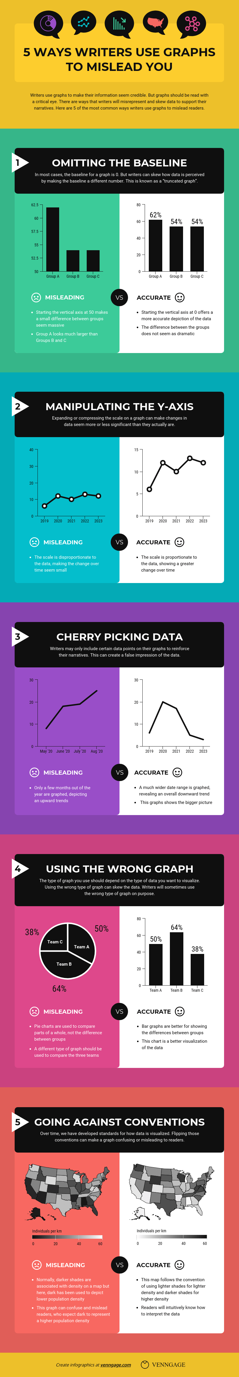
Read More: 5 Ways Writers Use Graphs To Mislead You
Want to create an engaging line graph? Use Venngage’s Line Graph Maker to create your own in minutes.
2. Avoid cluttering up your design with “chartjunk”
When it comes to best practices for data visualization, we should turn to one of the grandfather’s of data visualization: Edward Tufte. He coined the term “chartjunk”, which refers to the use of unnecessary or confusing design elements that skews or obscures the data in a chart.
Here’s an example of a data visualization that suffers from chartjunk:
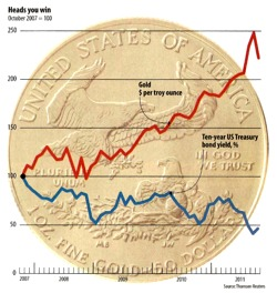
Source: ExcelUser
In this example, the image of the coin is distracting for readers trying to interpret the data. Note how the fonts are tiny – almost unreadable. Mistakes like this are common when a designers tries to put style before function.
3. Tell a story with your data
Data visualizations like infographics give you the space to combine data and narrative structure in one page. Visuals like icons and bold fonts let you highlight important statistics and facts.
For example, you could customize this data visualization infographic template to show the benefit of using your product or service (and post it on social media):
This data visualization relies heavily on text and icons to tell the story of its data:
This type of infographic is perfect for those who aren’t as comfortable with charts and graphs. It’s also a great way to showcase original research, get social shares and build brand awareness.
4. Combine different types of data visualizations
While you may choose to keep your data visualization simple, combining multiple types of charts and diagrams can help tell a more rounded story.
Don’t be afraid to combine charts, pictograms and diagrams into one infographic. The result will be a data visualization infographic that is engaging and rich in visual data.
Design Tip: This data visualization infographic would be perfect for nonprofits to customize and include in an email newsletter to increase awareness (and donations).
Or take this data visualization that also combines multiple types of charts, pictograms, and images to engage readers. It could work well in a presentation or report on customer research, customer service scores, quarterly performance and much more:
Design Tip: This infographic could work well in a presentation or report on customer research, customer service scores, quarterly performance and much more.
Make your own bar graph in minutes with our free Bar Graph Maker.
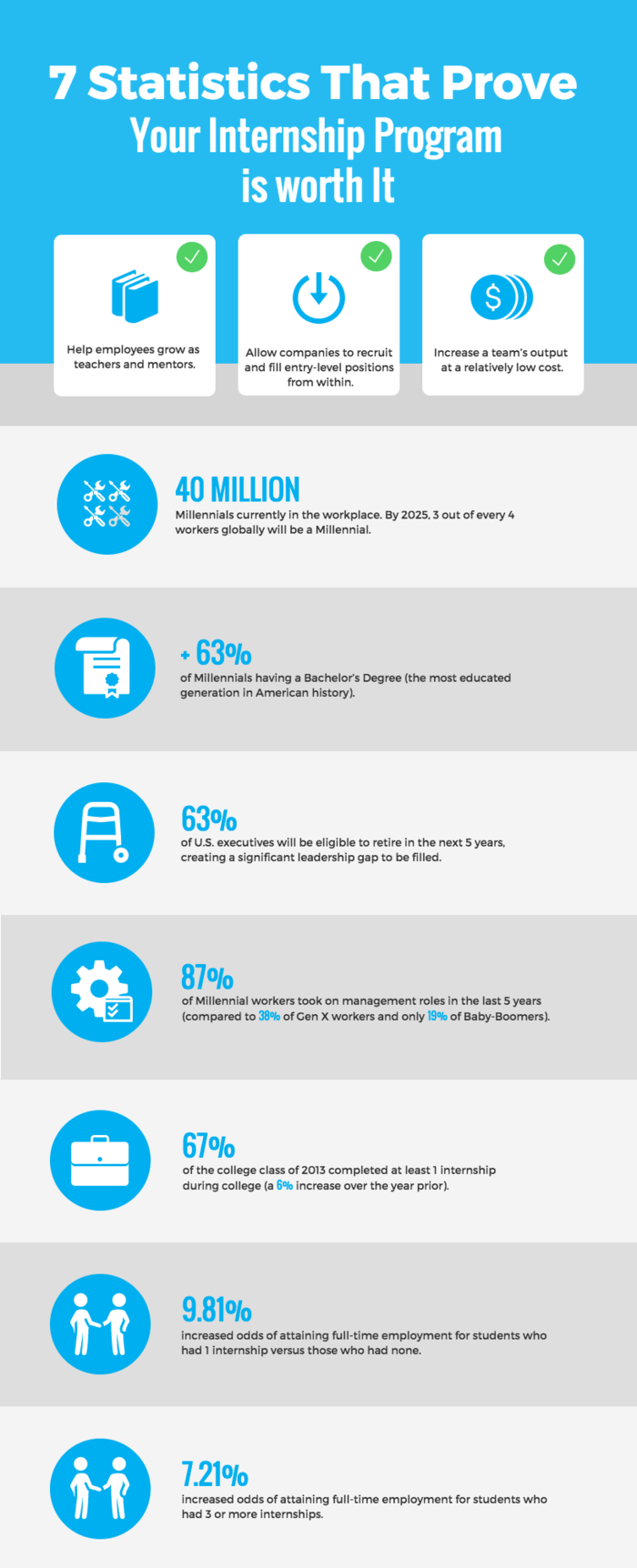
5. Use icons to emphasize important points
Icons are perfect for attracting the eye when scanning a page. (Remember: use visual cues!)
If there are specific data points that you want readers to pay attention to, placing an icon beside it will make it more noticeable:
Design Tip: This infographic template would work well on social media to encourage shares and brand awareness.
You can also pair icons with headers to indicate the beginning of a new section.
Meanwhile, this infographic uses icons like bullet points to emphasize and illustrate important points.
Design Tip: This infographic would make a great sales piece to promote your course or other service.
6. Use bold fonts to make text information engaging
A challenge people often face when setting out to visualize information is knowing how much text to include. After all, the point of data visualization is that it presents information visually, rather than a page of text.
Even if you have a lot of text information, you can still create present data visually. Use bold, interesting fonts to make your data exciting. Just make sure that, above all else, your text is still easy to read.
This data visualization uses different fonts for the headers and body text that are bold but clear. This helps integrate the text into the design and emphasizes particular points:
Design Tip: Nonprofits could use this data visualization infographic in a newsletter or on social media to build awareness, but any business could use it to explain the need for their product or service.
As a general rule of thumb, stick to no more than three different font types in one infographic.
This infographic uses one font for headers, another font for body text, and a third font for accent text.
Read More: How to Choose Fonts For Your Designs (With Examples)
Design Tip: Venngage has a library of fonts to choose from. If you can’t find the icon you’re looking for, you can always request they be added. Our online editor has a chat box with 24/7 customer support.
7. Use colors strategically in your design
In design, colors are as functional as they are fashionable. You can use colors to emphasize points, categorize information, show movement or progression, and more.
For example, this chart uses color to categorize data:
Design Tip: This pie chart can actually be customized in many ways. Human resources could provide a monthly update of people hired by department, nonprofits could show a breakdown of how they spent donations and real estate agents could show the average price of homes sold by neighbourhood.
You can also use light colored text and icons on dark backgrounds to make them stand out. Consider the mood that you want to convey with your infographic and pick colors that will reflect that mood. You can also use contrasting colors from your brand color palette.
This infographic template uses a bold combination of pinks and purples to give the data impact:
Read More: How to Pick Colors to Captivate Readers and Communicate Effectively
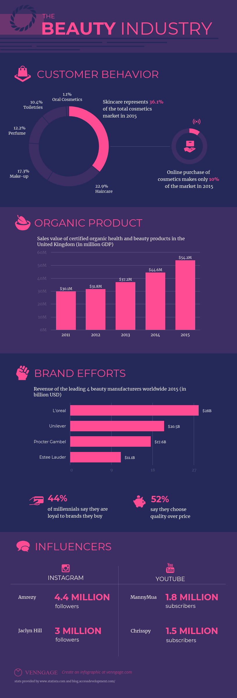
8. Show how parts make up a whole
It can be difficult to break a big topic down into smaller parts. Data visualization can make it a lot easier for people to conceptualize how parts make up a whole.
Using one focus visual, diagram or chart can convey parts of a whole more effectively than a text list can. Look at how this infographic neatly visualizes how marketers use blogging as part of their strategy:
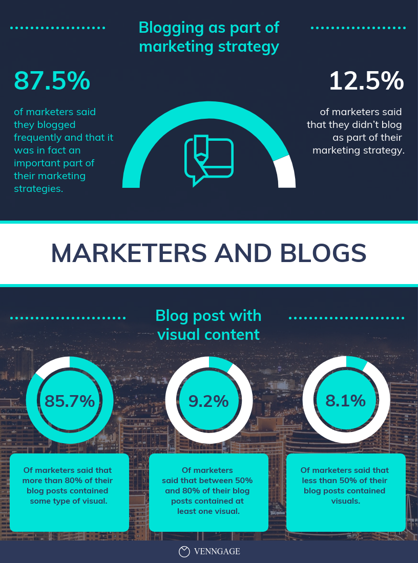
Design Tip: Human resources could use this graphic to show the results of a company survey. Or consultants could promote their services by showing their success rates.
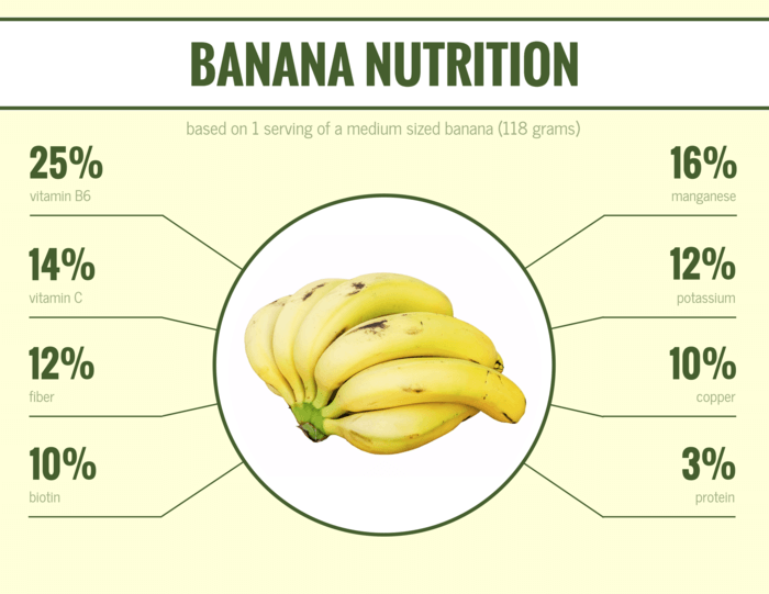
Or look at how this infographic template uses one focus visual to illustrate the nutritional makeup of a banana:
9. Focus on one amazing statistic
If you are preparing a presentation, it’s best not to try and cram too many visuals into one slide. Instead, focus on one awe-inspiring statistic and make that the focus of your slide.
Use one focus visual to give the statistic even more impact. Smaller visuals like this are ideal for sharing on social media, like in this example:
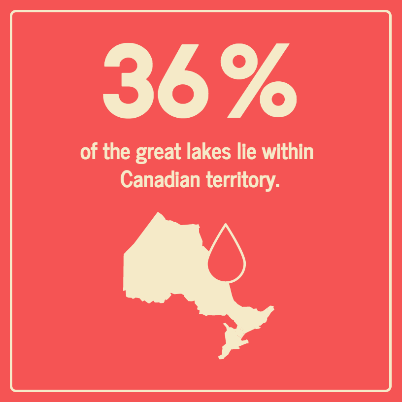
Design Tip: You can easily swap out the icon above (of Ontario, Canada) using Venngage’s drag-and-drop online editor and its in-editor library of icons. Click on the template above to get started.
This template also focuses on one key statistic and offers some supporting information in the bar on the side:
10. Optimize your data visualization for mobile
Complex, information-packed infographics are great for spicing up reports, blog posts, handouts, and more. But they’re not always the best for mobile viewing.
To optimize your data visualization for mobile viewing, use one focus chart or icon and big, legible font. You can create a series of mobile-optimized infographics to share multiple data points in a super original and attention-grabbing way.
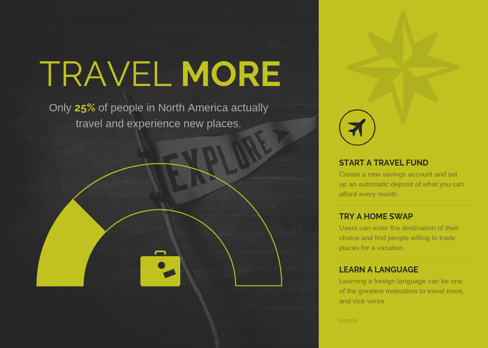
For example, this infographic uses concise text and one chart to cut to the core message behind the data:
FAQs on data visualization
1. Is data visualization only for analysts?
No. Data visualization is used by marketers, founders, educators and teams across industries to explain ideas clearly and make data easier to understand.
2. Can data visualization be misleading?
Yes. Poor chart choices, missing context or selective data can distort the message. Clear labels and honest scales help prevent confusion.
Want to look at more amazing data visualization? Read More: 50+ Infographic Ideas, Examples & Templates for 2020 (For Marketers, Nonprofits, Schools, Healthcare Workers, and more)


