


Fonts play a huge role in how infographics are perceived.
If you’re not a designer, you probably don’t notice font designs or choices unless they’re particularly ghastly:
You probably don’t care about them, either, and honestly, I don’t blame you. We all have that one designer friend who won’t shut up about Comic Sans (if you aren’t aware of the universal hatred for Comic Sans, you can get caught up here).
But hear me out—I’m not here to bash Comic Sans, or to tell you that Helvetica will solve all of your problems. I’m here to tell you why you should care about fonts, and to teach you how to use them like a designer.
You could argue that as long as text is readable, font choice doesn’t matter. While this may be true to a point, consider the following:
A 2008 study found that by simply using a font that was considered more “appropriate” for a resume, job candidates seemed more mature, more trustworthy, and more professional than candidates who used less appropriate fonts.
Despite having identical qualifications, these candidates were also more likely to secure interviews.
On board yet? Let’s talk about how to choose fonts for your infographics.
Why fonts matter
Before we dive into the nitty-gritty of font choice, I’d like to review the role that fonts play in visual communication.
Sure, we all want to use fonts that make our infographics “pretty”, but there are many other important things going on behind the scenes.
Don’t believe me? Check out these two versions of the same infographic—the same content, visuals, and color scheme, but different fonts:


Style aside, one of the infographics is much more effective because of the fonts that are used. It’s much easier to glean information from the first infographic than the second.
Why? Let’s look at the functions of fonts in infographic design.
1. Fonts impact readability and legibility
Legibility refers to how easy it is to make out any given letter on a page. Of the fonts below, one is clearly more legible.

Readability refers to how easy it is to read larger passages of text. As you can see in the example below, both fonts are fairly legible, but it takes much more concentration to read the sentence on the left. The font on the right makes for a more comfortable read.

Ideally, you don’t want to make your reader work too hard at reading your text.
Since there are clear winners and losers when it comes to font readability and legibility, choosing great fonts for infographics is often about striking a balance between style, readability, and legibility.
This infographic’s highly readable and legible text ensures that the message is forefront, while color adds interest and style:

2. Fonts can be used to create a sense of visual hierarchy on the page
What does this mean? Take a look at the article below. How long does it take to figure out what it’s about?

Now take a look at the same article, but with the fonts modified to create a sense of visual hierarchy. At a glance, it’s much easier to figure out what the article is about:

That’s because the fonts are used to make the headings and main points stand out.
Whenever you look at some text on a page, your eye has to start somewhere. On a page like the one above, your eye will subconsciously jump to the text that is bigger, bolder, and more unique. The visual hierarchy established by the font choices helps us quickly make sense of text.
For more examples, take a look at these 10 Attention-Grabbing Event Poster Templates. How many of them take advantage of a strong visual hierarchy to draw attention to their title? (Answer: all of them).
3. Fonts evoke emotion and have personality
Which of these fonts seems happier?
More confident?
More trustworthy?
Whether or not we intend it, our font choices evoke emotional responses from our readers (this is known as font psychology). To communicate effectively, we need to manage those responses by choosing fonts that match the nature of the subject matter.
We can see that the way text is displayed on the page (or the screen) impacts the way we interact with, read, and understand it. If we care about our readers’ perception of our text, we need to be conscious of our font choices.
How to choose fonts for your infographics in 5 steps
With the theoretical stuff out of the way, let’s get practical. Here are five steps you can use to make well-informed font choices for your infographics.
1. Think about your content
Your font choices should always be driven by the nature of your content, namely:
The purpose of the infographic:
- Fonts in infographics that are made to educate, inform, or simplify (like reports, statistical infographics, training posters) should be more minimal, with a focus on readability and legibility.

-
- Fonts in infographics that are made to entertain, engage, or inspire (like promotional flyers, social media marketing) can be more playful, with a focus on style and uniqueness.

The length and structure of the text:
- Fonts for long-form copy (like paragraphs or bullet points) should be highly readable
- Fonts for short copy that you want to stand out (like keywords, headers, subheaders) should be stylized and unique
- Fonts for text that must be read at a glance (like chart labels and captions) should be highly legible
The medium and setting in which it will be received:
- Fonts for print infographics should be easily readable at an arm’s length, at least 10 pt in size
- Fonts for infographics that will be read from greater distances (like posters and presentations) must be larger, highly readable, and highly legible
- Fonts for infographics that will be viewed on-screen should be at least 14 pt in size, ideally larger
This process of analyzing these characteristics of your content is about defining your focus for each piece of text–on style and engagement, or readability and legibility.
Let’s work through a few examples.
Scenario 1:
The executive of a small nonprofit organization is creating an event poster for an elegant fundraiser gala.
- Purpose: To foster awareness of the event and encourage people to attend.
- Text: Title, date and venue information in bullet points, a few sentences about the purpose of the event.
- Medium: Poster, to be displayed on walls in public spaces.
For an event poster with very little text, designed to catch the reader’s attention and provide some basic information about an event, the focus of the font choice can be on style, personality, and emotion.
The primary goal should be to find a heading font that evokes elegance, sophistication, and warmth. For the rest of the text, the focus should be readability; you don’t want to lose potential donors because they can’t figure out where or when to attend the event!

Scenario 2:
A financial analyst is creating a slide deck to present a quarterly account review
- Purpose: To communicate trends and highlight key statistics.
- Text: Chart titles and labels, brief point form summaries.
- Medium: Slide deck, to be used in a presentation.
The entire focus here is communication and education for a professional audience, so the fonts should be minimal, professional, and highly readable. The text should all but fade into the background, leaving space for the data to shine.
Key statistics can be highlighted in the text by increasing the size and weight (i.e. bolding) of the font.

To sum up—content is key!
Use the purpose, length, and medium of your content to determine whether your focus should be on readability or style. Use that focus to guide your font choices, ensuring that your text communicates effectively.
2. Choose a body font that is readable
Keeping your content in mind, pick a font to use for the majority of your body text (i.e. paragraphs, bullet points, summaries). This is what your readers will be getting most of their information from, so it should always take priority.
Body fonts should:
- Be highly readable and legible at small sizes
- Be less stylized than header fonts
- Have multiple weights (i.e. regular and bold)
- Never be all caps
To make things a little easier on you, I’ve compiled a list of the best professional, modern and more fonts that are great for body copy:
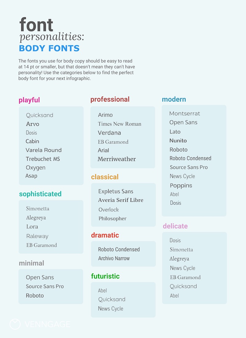
If you’ve put some thought into the content and purpose of your infographic, picking a font from this list should be easy! When in doubt, pick something simple and minimal–it’ll be easier to work with, and you can add more style in the next step.
3. Choose a few header font pairs that add some style
Once you’ve established a body font, it’s time to move on to headers. Eventually, you’ll have to consider how the header font pairs with the body font but for now, just focus on finding header fonts that fit your content.
Header fonts can generally have a little more character than body fonts, and can be used to catch a reader’s eye, drawing them into the graphic and encouraging them to read further.
Think of the header as a way to establish the style and feel of the piece. It should look great at large sizes and can be less legible than body text, if necessary.
Choose three or four fonts that you think might suit your content as headers. The idea here isn’t to find one perfect font, but pick a few that you want to try out. You can improve your chances of finding one that works by picking a variety of styles.
Use the graphic below for some inspiration, and don’t be afraid to use these body fonts as headers too. You can also check out our recommended best font pairs to get some ideas.

4. Find the header font that pairs best with your body font
By now you should have one perfect body font and three or four possible header fonts. It’s time to find the single header font that pairs best with your body font.
Font pairings should be high contrast or low contrast
It’s much easier to pair fonts that are either very different, or very similar in overall style.
You could pair a serif header font with a sans-serif body font:

Or a dramatic header font with a minimal body font:

Or even use a single font for a whole infographic. Create contrast with BOLD or italics versions of your font:


Try matching up your chosen body font with each one of your header options. Are any of them high contrast? Low contrast? If there’s a high or low contrast match that looks great to you, go with it. If not, and you want some inspiration, check out this collection of font pairings:


Don’t see anything you like? Check out some Google Font combinations, look for inspiration in books, or challenge yourself to use a single font for an entire infographic! I think you’ll find it easier than you’d expect.
5. Create visual hierarchy by varying size and weight
Once you have a pairing that works well with your content, it’s time to use your fonts to establish a clear visual structure. Play with size and weight to emphasize some text and de-emphasize other text.
Size
The easiest way to create visual hierarchy is to vary the size of your text. As always, it’s best to pick a size for your body font first.
Make sure it’s large enough to read easily at an arm’s length, but not too large—you don’t want it to overwhelm the page. A good rule of thumb or body font size is 10-14 pt for print, 14-18 pt for screen.
Don’t forget about your content; if you expect your infographic to be read from further away (a poster or presentation, for example), increase the font size.
With your body font size chosen, the rest is pretty easy!
Use a typographic scale tool to determine the rest of your font sizes. Choose a ratio (I like 2:3) and increment your font sizes by that ratio. Besides taking a lot of the decision-making out of the mix, this will give your type an important sense of rhythm and structure.

A typographic scale with a 2:3 ratio.

The 2:3 scale applied to create visual hierarchy.
Weight
While size alone can be enough to create a visual hierarchy within your text, weight and emphasis can be used to add some extra oomph.

As you can see, varying the font size and weight of a single font creates visual hierarchy. When combined with great font pairing, these tools will help you create the visual structure you need to make a clear, communicative infographic.
That’s it! You’ve learned that basics of choosing fonts.
Let’s review the key steps:

Want to learn more? Check out our analysis of America’s most popular font types, or test your skills by creating an infographic!


