


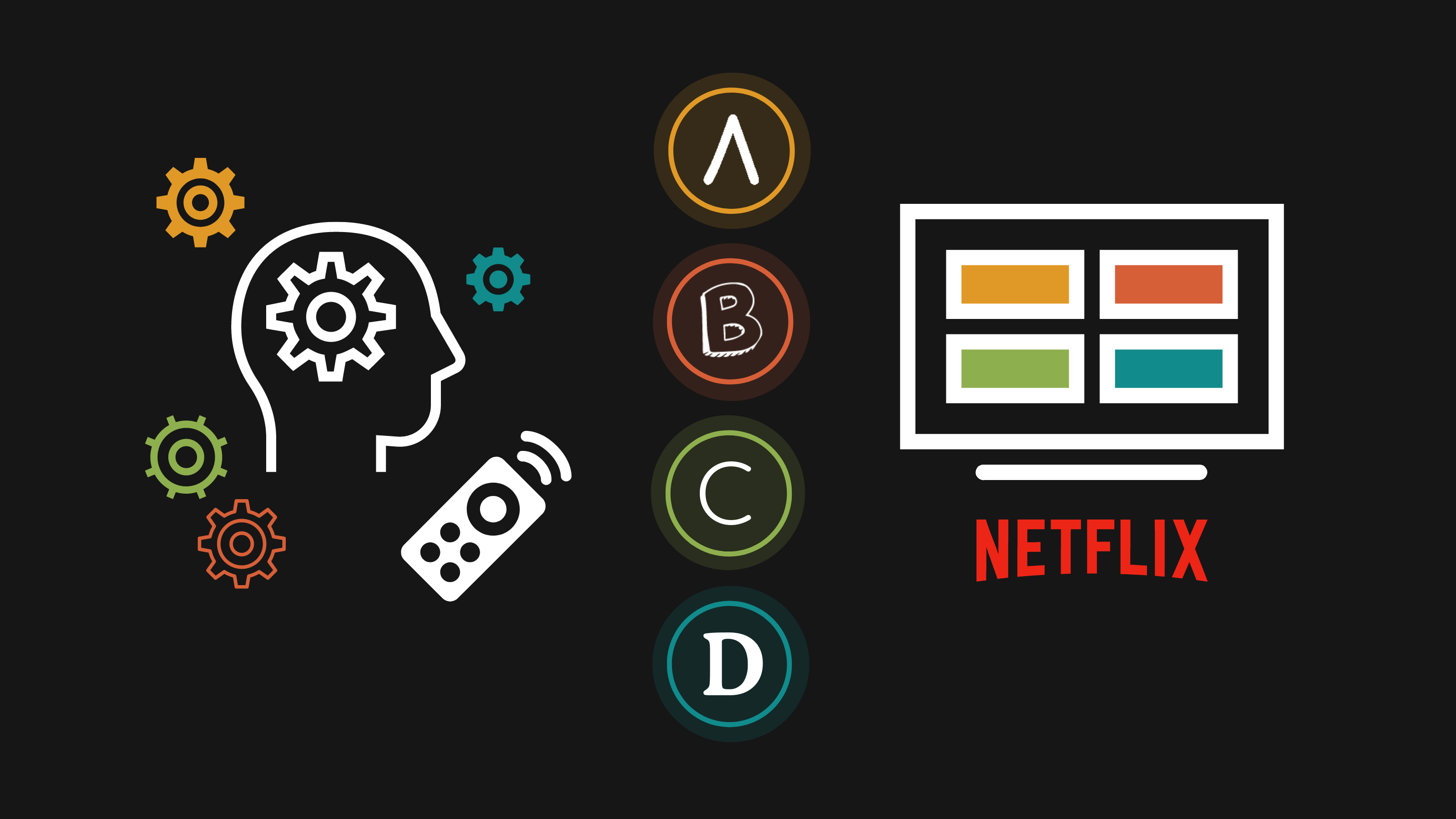
There is no shortage of options to choose from on Netflix. So how do we choose what show to watch?
Sure, many of us hop on the bandwagon for the latest binge-able show. But what makes a show seem appealing?
The promotional poster design might have more to do with it than you realize. Specifically…the font designs.

Whether or not we realize it, design plays a big role in how we perceive the value of a product. From books, to snacks, to beauty products, the power is often in the packaging.
So when it comes time to design an ad, or a product label, or a logo, put some thought into the font designs you use. There’s a good chance they can influence how people perceive your marketing content and your product.
How font psychology can influence how we perceive products
You may have heard about color psychology before. It’s the idea that certain colors elicit a certain emotional response from us (like yellow = happy and blue = sad).
But have you heard of font psychology?
In the intersecting worlds of marketing and design, quite a bit of thought has been put into how fonts affect our perception of products.
In fact, Netflix even announced that they now have their own custom website design font: Netflix Sans.

Similar to how colors have associations, fonts also have unique characteristics. As a bit of a crude example: you wouldn’t use Comic Sans on the poster for a hard-hitting drama, right?
When you’re creating your own promotional posters, flyers, packaging and site design, you should put some careful thought into picking the design fonts to use.
For example, simply changing the font choice on this movie poster we made for Titanic makes for an entirely different tone:

Different fonts have been designed for different purposes. For example, designers have worked hard to develop both Serif and Sans Serif fonts for maximum readability. But many designers have also created font designs that are meant to be weird and out there, for special uses only.
So when it comes to choosing the best design fonts, which should you spring for? Something more conventional, like Arial or Cambria? Or something more gaudy like Impact or Monotype Corsiva?
Different fonts have different characteristics
Your font choices may influence your audience’s imaginations, moods, and expectations when they view your content.
A study conducted back in 2006 by the Software Usability Research Laboratory (SURL) at Wichita State University looked at the personality traits that people associate with different fonts. They asked participants to rate the personality of 20 fonts using 15 adjective pairs.
What they found was that while more basic font designs like Arial or Courier New were considered “stable” and “mature”, they were also considered “unimaginative” and “conformist”. Meanwhile, more “youthful” and “casual” fonts like Kirsten and Comic Sans were also considered “happy” and “cuddly”.
Here are the top three fonts for each descriptive word:

(Keep in mind that this study was done over 10 years ago and Comic Sans has since gone out of style…or has it?)
Fonts can have an unexpectedly physical response on us as well, apparently. Designer Sarah Hyndman gave a TED talk on how different fonts can influence not just our moods, but also our perception of taste and smell.
For example, rounded fonts may call upon associations we have with plump, ripe fruits that are sweet to eat. Meanwhile, jagged, angular fonts can look angry or dangerous and may give us a sense of sourness and bitterness.
With that research in mind, we wanted to take a look at the fonts used in promotional posters for Netflix’s most popular TV shows. If we’ve mentioned any shows you don’t have access to, consider getting Netflix VPN.
Our method
We picked 50 of Netflix’s most popular TV shows and categorized the fonts based on their font types. Then, we look at the characteristics commonly associated with each font type to analyze how the font may affect our perception of the shows.
You can view our data sheet here.
That sheet also includes some similar fonts to the ones used in the posters, in case you want to use them to a similar effect.
How we categorized the fonts
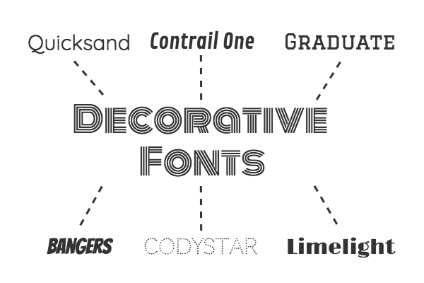
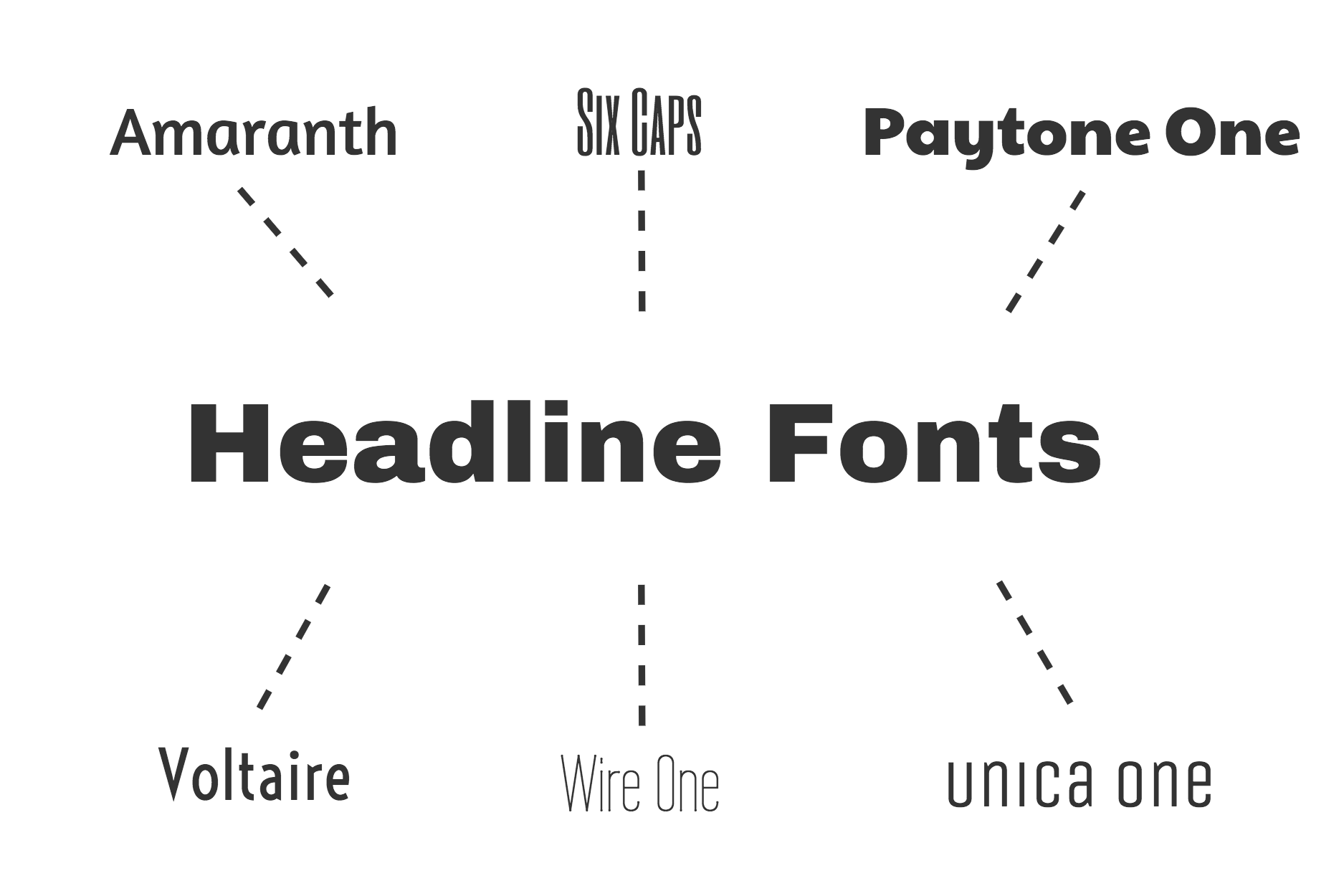
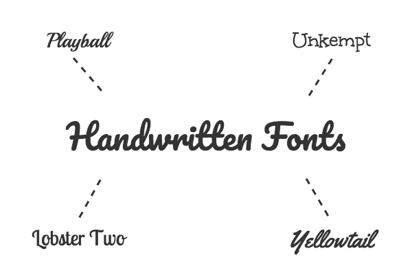
Apart from Serif and Sans Serif fonts, the categorization of fonts can vary from resource to resource. For our study, we decided to categorize fonts into six types:
- Serif
- Sans Serif
- Decorative
- Headline
- Handwritten
- Modern
Many of the TV show poster fonts fell into Serif or Sans Serif, as well as another category like Headline. But certain fonts were so original that they could only be classified as Decorative or Handwritten.
Here’s a quick summary of each font category:
First things first, Serif vs. Sans Serif fonts. Serifs are those little embellishments that make fonts feel a little more traditional and respectable.
Meanwhile, Sans Serif fonts are generally more minimalist and straightforward. They don’t have the embellishments, though that doesn’t mean they lack personality.

Decorative fonts are more quirky, creative and fun. You would use these to add some flare to your design.
Headline fonts are meant to grab your attention with their boldness and flare for the dramatic. They’re ideal for–you guessed it–headers.
Handwritten fonts are also pretty self-explanatory. They’re fonts that look like they were written by hand, giving them a personal and sometimes fancy touch.
On the other end of the spectrum are Modern fonts, with their efficient lines and the impression of being forward-thinking.

What Netflix can teach us about font selection
It was interesting to think about the intent behind font selection on certain TV show posters. In some cases, the fonts heavily reflected the themes of the shows–those fonts tended to be Decorative. In other cases, the fonts seemed to evoke a certain time period, like in the case of some of the Serif fonts.

Let’s take a look at how each font category were used.
Netflix posters with Serif fonts
Fewer TV show posters used Serif fonts than Sans Serif fonts. The ones that did use Serif fonts were generally shows that tapped into nostalgia.
For example, The Crown used a font that we categorized as both Serif and Headline. Their font choice is apt when you consider that the show is a period drama that will undoubtedly speak to the nostalgia of an older audience.
Serif fonts are often perceived as traditional and respectable, and that’s a prominent theme in The Crown.

The poster for The Keepers also uses a Serif font. Considering that the show is a documentary about the murder of a Catholic school nun, the traditional and respectable qualities of the Serif font takes on a sinister undertone.
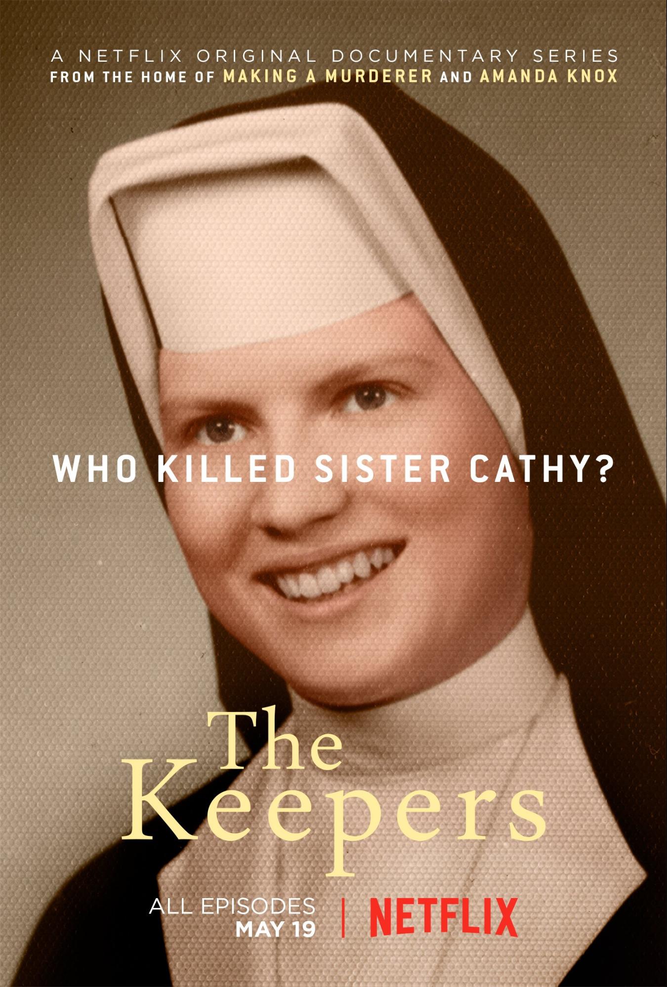
Serif fonts can be used to evoke a sense of nostalgia, authority, and stability. But they can also be used to challenge tradition by evoking the understood norm and then undercutting it with the content.
For example, the poster for Dear White People uses a Headline, Serif font. The font complements the boldness of the show and its themes of challenging and critiquing social norms.

Netflix posters with Sans Serif fonts
The majority of the fonts used in the sample of TV show posters were Sans Serif (52%). This makes sense, since Sans Serif fonts seem to appear more in web content these days.
While certain posters seemed to use Serif fonts deliberately to convey a sense of tradition or nostalgia, many of the Modern, Decorative and Headline fonts also happened to be Sans Serif. That’s because Sans Serif fonts can be subtle, or they can be bold and attention-grabbing.
For example, the Black Mirror poster uses a custom Sans Serif font that conveys the creepy feeling of the show. The modern-looking font is cracked down the middle, suggesting there’s something broken about technology.

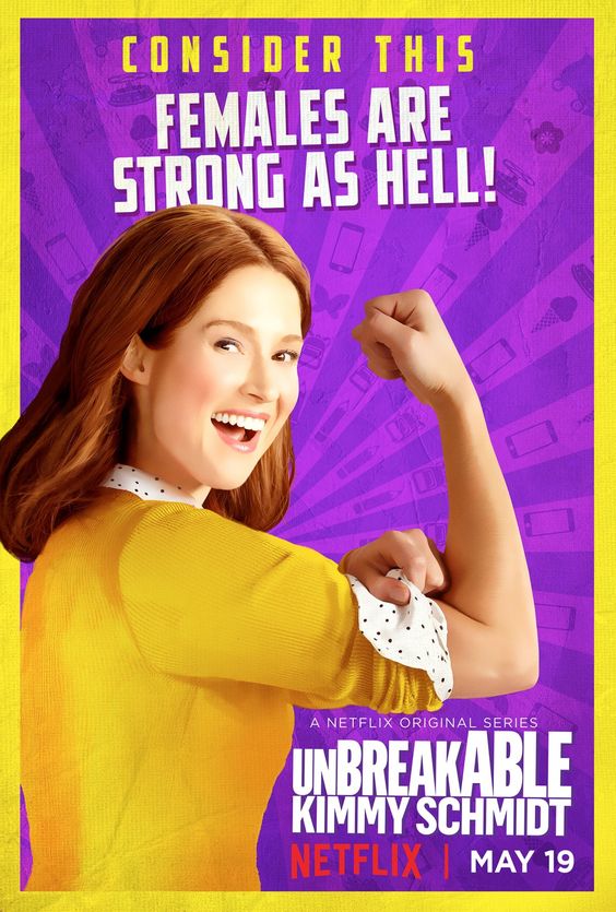
But Sans Serif fonts can also convey confidence. Take the poster for Unbreakable Kimmy Schmidt, with its bold, rounded lettering.
In general, the “personality” of a given font comes down to more than just the inclusion or exclusion of serifs. It also has to do with the shape of the letters, the font’s weight, and the spacing.
Netflix posters with Headline fonts
It’s unsurprising that many of the TV show posters (34%) used Headline fonts. After all, Headline fonts are designed to grab your attention.
The shows with Headline fonts in their posters tended to be dramas (or dramedies), with the exception of (weirdly) Fuller House and Arrested Development.

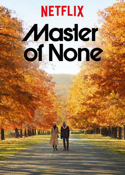
The font in the poster for Master of None makes a bold statement. In the case of this dramedy, the font choice has a tongue-in-cheek quality, since its grandiosity is undercut by the show’s common-place, relatable characters.
Some of the fonts in this category could also have perhaps been categorized as Decorative as well, since many Headline fonts have some sort of decorative element.
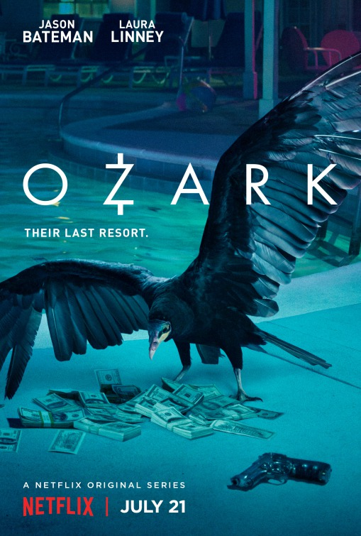
For example, the poster for Ozark features the trademark Z. Small custom embellishments like that can make your branding more recognizable.
Netflix posters with Decorative fonts
Unsurprisingly, the number of TV show posters with Decorative fonts came close to the number of posters with Headline fonts (32%). The Decorative fonts used tended to be custom fonts designed for the TV show.
A perfect example of this is the poster for GLOW. Lit up like neon lights, the GLOW font suggests that the show is going to be equally loud and in-your-face.

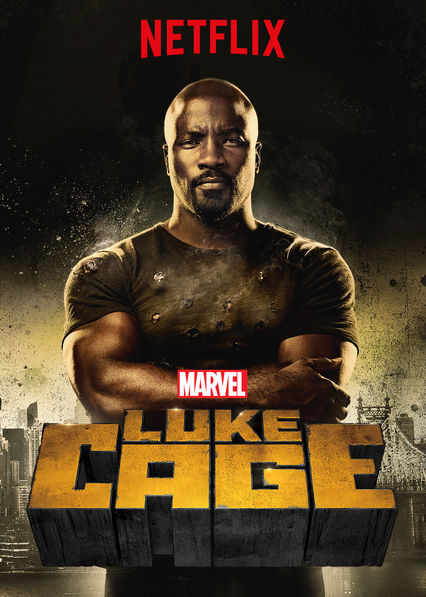
Meanwhile, the font for the Luke Cage poster incorporates the personality of the show’s protagonist. The solid, rock-like characters reflect Luke Cage’s bullet-proof superpowers.
But Decorative fonts don’t have to be as theatrical as that. They can be as simple as putting a creative twist on an otherwise more conventional font—like the A in the poster for Altered Carbon.

Creating your own Decorative fonts can be an investment but they will certainly give your content a unique look. More and more companies are opting to create their own custom fonts and illustrations for their websites and marketing collateral—in fact, custom illustrations are one of this year’s top graphic design trends.
Netflix posters with Modern fonts
The TV show posters with Modern fonts tended to be shows about modern life, innovation, or crime.
For example, Chef’s Table—a show about some of the world’s most innovative culinary masters—uses a sleek, Modern font to engage the foodie viewers of today.

Meanwhile, the poster for Friends From College uses a Modern font that helps paint the picture of a show that examines modern relationships.

While modern life and innovation make sense, the popularity among crime shows was unexpected.
It could be that the crime shows in question—Narcos, Mindhunter, Making a Murderer and American Vandal (spoof or not)—used Modern fonts to make the shows feel current.
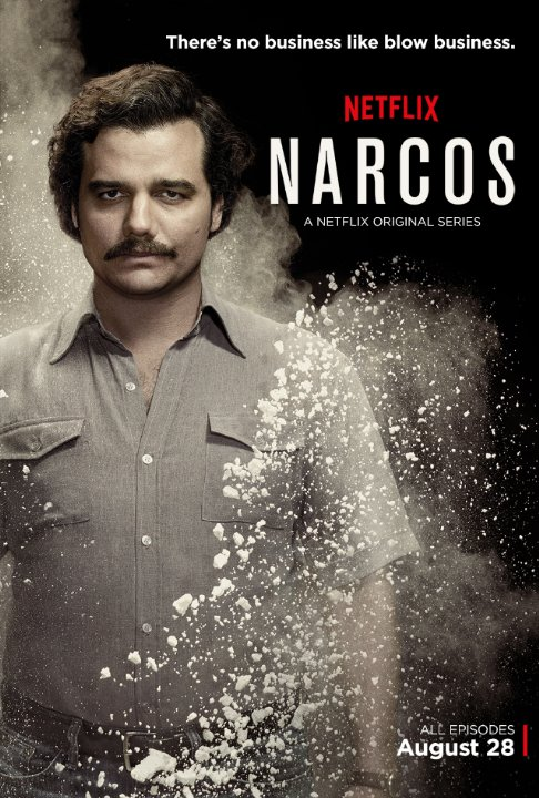
With the exception of American Vandal, the other shows are historical documentaries and dramas. But the Modern design of their posters makes the shows feel more immediate. It’s interesting when you consider how all of those shows make viewers reflect on problems that persist today.
While Serif fonts are often used to appeal to the nostalgia of the viewers, Modern fonts can be used to make viewers feel uncomfortable in a world with rapidly advancing technology.
Netflix posters with Handwritten fonts
The fewest Netflix posters used Handwritten fonts. The ones that did were for quirky, offbeat shows that aim at being relatable to the audience.
For example, Love has a custom Handwritten font in its poster. The poster gives the impression of a down-to-earth story with lovably imperfect characters.

The poster for Big Mouth also uses a child-like Handwritten font. This helps create the expectation that there will be a childish innocence to the show (or, as viewers will quickly find out, a comedic loss of innocence thanks to puberty).

You have probably seen Handwritten fonts used most often in ad content for children. But they can also be used to give your ad content a personal touch, regardless of the age of your target audience.
Formal Script fonts can give your designs a classy, romantic touch. For example, Script fonts are often used on perfume ads to give them a romantic feel.

They are also often featured in ads for non-profit organizations, to give the design a personal touch.

How to pick the best fonts for your marketing designs using font psychology
Now that we’ve analyzed why Netflix shows use the fonts they do for their posters, it’s time to apply that to your own designs.
There are a ton of fonts to choose from. It can be difficult to know where to start when picking fonts for your marketing posters, ads, brochures and infographics. You may be tempted to just settle on a font that you like the look of, but is that the smartest choice?
Here are some font selection best practices for you to keep in your back pocket.
(For a more in-depth guide, check out our post on choosing fonts for your designs.)
Think about your target audience
Whenever you create content for your brand, it’s important to consider who the content is for.
Think about the kinds of solutions your audience will be seeking. Also consider what their expectations will be for a product like yours.
For example, would it make sense for an insurance company to use a quirky decorative font? Probably not.
Instead, people will be expecting more standard, classic fonts that convey a sense of efficiency and trustworthiness. They’re probably not looking for a fun, outside-of-the-box insurance brand.

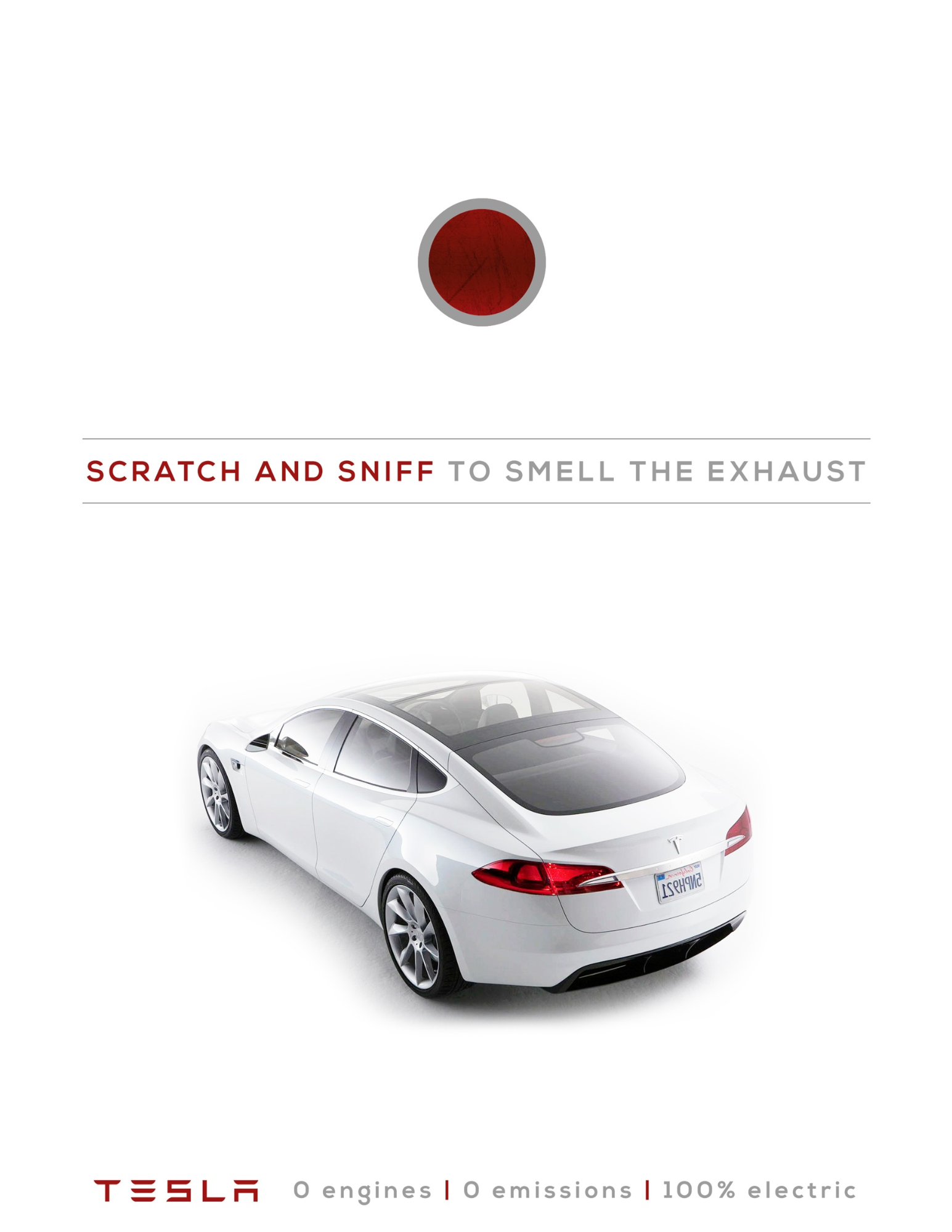
In the tech space, you can easily see font examples of companies taking two different approaches. Certain companies will use sleek, Modern fonts to show that they’re innovative and up-to-the-second with their tech.
Take a look at the clean, efficient font used in this Tesla ad:
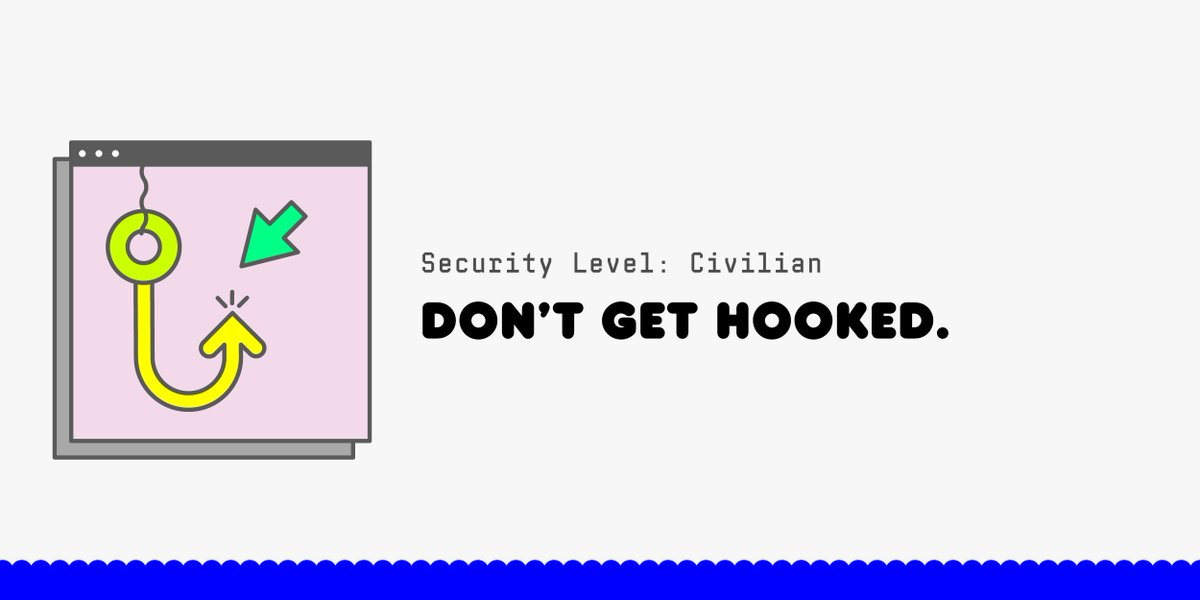
But other tech companies try to make their brand seem friendly and approachable by using quirkier fonts. For example, Wired uses a friendly bubble font for images promoting their security guide:
That leads me into the next best practice.
Look at typography trends in your industry
When choosing your font, a good place to start is to look at typography trends and how your competitors are designing their branded content. What kind of impression do they make in logos, ads, and social media content?
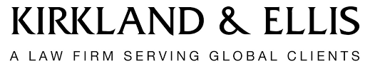
For example, law firms tend to go for more traditional Serif fonts to show stability and authority.
Once you have an idea of what other brands in your industry are doing, you can look for opportunities to stand out from them with your design.
For example, the discount Canadian mobile service provider Koodo uses a round, friendly font in their “Choose Happy” campaign. This sets them apart from the more serious, big name telecommunication companies:

Consider what emotion you want your design to evoke
As we’ve seen from many of the Netflix posters, fonts have a way of evoking an emotional response from readers. The emotion a font evokes often has to do with the shape of the letters and our associations with those shapes.
For example, which font seems happier to you?

Probably the round, bubbly second font, right?
Now which font seems more trustworthy?

Probably not the playful, juvenile first font, right?
Your font choice can have a surprisingly big impact on how your audience perceives your content.
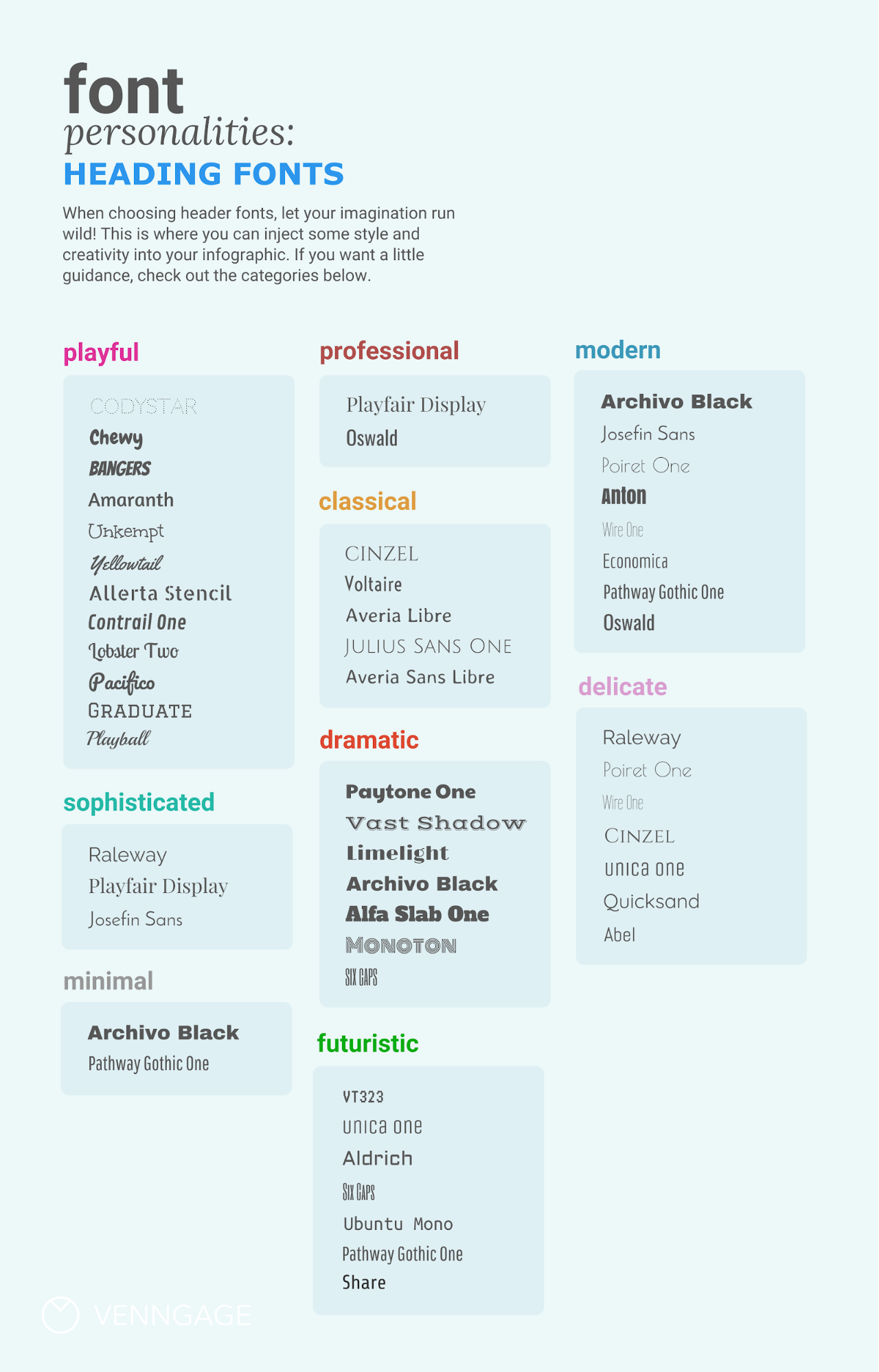
Pair a decorative header font with a readable body font
Your header font should grab your audience’s attention and reflect the theme or tone of what you’re promoting.
Meanwhile, the body text you choose should complement the header font but be easier to read. Generally, that means picking a more pared down font.
Here’s a cheat sheet for picking header fonts based on personality:
And here’s a cheat sheet for picking body fonts based on personality:

Conclusion
Font psychology isn’t an exact science. Fonts alone don’t make people see a poster and think, “I could spend the next 20 hours watching this show.”
One person’s reaction to a font may vary from another person’s reaction. Like with any marketing content, it’s important to test different designs and copy to see what resonates with your audience.
Put some careful thought into the fonts you choose for your designs. When you’re browsing social media or walking around your neighborhood, think about what the fonts you see in ads are saying to you. How can you apply what you see to your own designs?
That’s it for this lesson in the language of fonts.
Netflix Font Psychology infographic designed by Michelle Lee.
Check out our other pop culture design studies:
What Disney Villains Can Tell Us About Color Psychology [Infographic]
7 Essential Design Principles We Can Learn From Star Wars [Infographic]


