


Picking the right font when designing your resume sounds like a small decision… until you realize it quietly shapes someone’s first impression of your application. I’ve seen people stress over choosing the “perfect” font, but in reality, fonts usually aren’t what make or break a resume.
What causes more problems is formatting. Recruiters and ATS tools struggle with resumes that feel cluttered, inconsistent or hard to scan and that’s one of the biggest reasons resumes get rejected or misread, even when the experience is strong.
If you just want the safest, no-stress choice, go with Calibri or Arial (11 pt for body text and 14–16 pt for headings). They’re clean, professional and work reliably across most hiring systems to help you design a resume that will land you your dream job..
Where this guide is a little different is that it doesn’t just list “good resume fonts.” I’ll walk you through which fonts work best depending on whether you’re using Word, Google Docs or Canva, how to pair fonts without making your resume harder to read, and a simple “pick in 30 seconds” framework with resume templates and examples so you don’t get stuck second-guessing your choice.
Quick answer: the best resume fonts (safe, ATS-friendly picks)
| Font | Type | Best for | ATS risk | Notes |
|---|---|---|---|---|
| Calibri | Sans | Best overall default | Low | Microsoft Word default |
| Arial | Sans | Maximum compatibility | Low | Supported across most platforms |
| Cambria | Serif | Traditional or corporate roles | Low | Microsoft Word default |
| Georgia | Serif | Strong digital readability | Low | Common web-safe font |
| Verdana | Sans | High legibility | Low | Appears slightly larger than other fonts |
| Tahoma | Sans | Tighter spacing layouts | Low | Common system font |
21 best resume fonts (examples + pairings)
1. Archivo Narrow

Archivo Narrow is the slightly less bold version of the popular Archivo Black.
This sans serif font makes a great resume font because it is just bold enough to catch someone’s attention, but not so bold that it distracts from the information in your resume.
Because it’s narrower than many standard fonts, Archivo Narrow works well when you need to fit more content on one page without shrinking your font size too much.
I would recommend using this free font as either a header or body font like how it’s done in the resume example below:

As you can see, the designer used bold and italics to make Archivo Narrow look like a few different fonts on this resume.
If you’re not great at matching fonts, this is a great way to make it look like you know what you’re doing.
But if you want to use a different font, pair this resume font with Barlow or Roboto.
Use this font if you want:
A modern, space-saving font that still looks professional and readable.
Use this font if you prefer:
Business or tech-focused resumes with a structured, slightly contemporary feel.
Available On: Google Fonts, Google Docs (via More Fonts), Canva, Microsoft Word (after installing manually), Mac (after installation)
ATS Risk: Low (clean, readable font — just avoid very small sizes because it’s condensed)
Category: Sans Serif Fonts / Business Fonts
Archivo Narrow Font Pairs: Barlow, Roboto, Fira Sans
2. Arial

Arial is probably one of the fonts that you have seen the most without even realizing it. In 1982, it was created for IBM and then it has been used in most Windows computers since the early 1990s.
It has been available in basically every word processing app, spreadsheet or design tool ever since.
There’s a reason that Arial has been used for professional documents for that long—it just works.
So I would recommend using this as a great resume font, no matter what job you’re applying for.
As you can see in the resume template below, the designers used Arial as both a header and body font.

They also used Arvo for some of the section headers to really make those stand out from the sans serif font.
Now technically Arial isn’t a free resume font but you can use this font on Venngage for free! Simply start customizing any Venngage template and you’ll be able to choose Arial as your font:

All you need to do is sign up for Venngage and you can use it as much as you want.
Use this font if you want:
The safest, most universally accepted resume font.
Use this font if you prefer:
A familiar, traditional professional look that recruiters can scan quickly.
Available On: Microsoft Word (Windows and Mac), Google Docs (built-in), Venngage, Canva, most operating systems and document tools
ATS Risk: Very Low
Category: Sans Serif Fonts / Business Fonts
Arial Font Pairs: Times New Roman, Oswald, Verdana
3. Arimo

If you don’t want to buy Arial just for your resume, Arimo is a great substitute. It was created to be used in place of Arial when sharing documents across different platforms.
They share a lot of the same professional qualities that you need to have in a great resume font. It might be hard for a lot of people to even realize that they are two different fonts.
So if you want to share your resume with as many people as possible, maybe use Arimo instead of Arial.
I would recommend using Arimo as both a body or header font, and pairing it with another thinner sans serif font like Roboto.
Use this font if you want:
An Arial-style font that’s easy to use across Google Docs and design tools.
Use this font if you prefer:
A neutral, modern font that keeps your resume looking clean and straightforward.
Available On: Google Fonts, Google Docs (via More Fonts), Canva, Microsoft Word (after installing manually), Mac (after installation)
ATS Risk: Low
Category: Sans Serif Fonts / Business Fonts
Arimo Font Pairs: Roboto, Open Sans, Montserrat
4. Arvo

Arvo is the first serif resume font that we have on this list. If we want to be really technical, it’s actually a slab serif font. Unlike regular serif fonts which use flowy serifs, slab serif fonts use blocky or geometric serifs.
Slab serif fonts like Arvo are usually used as headers as you can see in the resume template below. The strong serifs make it hard for fonts like this to be used as a body font, so use a font like Roboto instead.
I would recommend using Arvo as only a header or display font as they did below:

This will help add some text hierarchy to your resume and make it easier to scan quickly.
Try pairing Arvo with a minimalist but modern resume font like Lato to maximize readability as well.
Use this font if you want:
Strong, confident section headers that help organize your resume visually.
Use this font if you prefer:
A more traditional or formal tone with a modern edge.
Available On: Google Fonts, Google Docs (via More Fonts), Canva, Microsoft Word (after installing manually), Mac (after installation)
ATS Risk: Low
Category: Slab Serif Fonts / Resume Fonts
Arvo Font Pairs: Lato, Roboto, Open Sans
5. Cabin

Unlike some of the past resume fonts on this list, you can use Cabin as both a header and body font. There are enough differences between the font weights to add some nice contrast to your resume.
I really like using Cabin because it has geometric influences at its core, but also there are rounded strokes that make it feel a little more casual.
So if you’re looking for a slightly less stuffy resume font, Cabin might be perfect for you actually.
Here’s an example of a resume that makes the most use of Cabin:

You can see that they use a bold Cabin for the header and a regular Cabin for the body.
You can try pairing with another sans serif resume font like Raleway or Open Sans as well.
Use this font if you want:
A modern resume font that feels clean but slightly less formal than traditional business fonts.
Use this font if you prefer:
Using one font family for both headings and body text without needing complex font pairings.
Available On: Google Fonts, Google Docs (via More Fonts), Canva, Microsoft Word (after installing manually), Mac (after installation)
ATS Risk: Low
Category: Sans Serif Fonts / Resume Fonts
Cabin Font Pairs: Source Sans Pro, Raleway, Roboto
6. EB Garamond

EB Garamond is another resume font that was basically created to make it easy for people to use Garamond on different platforms.
The original, Garamond, was created by Adobe and takes a ton of inspiration from classic typefaces and Roman letters.
The same influences can be seen in EB Garamond and make the free resume font look like it came from a different century.
That said, you can also use it as a header or title font on your resume to really make it stand out from the crowd.
I would recommend not using this serif font as a body font because it gets slightly hard to read at smaller sizes. Try using EB Garamond as a strong header font, and then Open Sans as the body font instead.
Use this font if you want:
A classic, elegant resume style that feels refined and distinctive.
Use this font if you prefer:
Traditional, academic, publishing, or research-focused resumes.
Available On: Google Fonts, Google Docs (via More Fonts), Canva, Microsoft Word (after installing manually), Mac (after installation)
ATS Risk: Medium-Low (generally safe, but thin strokes can reduce clarity at small sizes
Category: Sans Serif Fonts / Resume Fonts
EB Garamond Font Pairs: Source Sans Pro, Raleway, Roboto
7. Lato

When picking fonts for your resume, it’s important to select one that doesn’t distract from your accomplishments. Something that almost fades into the background and lets you shine.
Lato is one of those fonts, which is why I think it’s one of the better resume fonts you can use this year.
It’s a pretty simple sans serif font that can be used both as a header or body font in your resume. You can pair it with a minimalistic resume template to help you create a resume that stands out in a world full of information overload. Here are some simple resume examples to help you get started.
However, I would recommend using Lato as a body font and pair it with something a little bolder like Arvo or Oswald.
Fun fact, the creator of Lato actually made it for a big client, but they decided not to use it. So they released it to the public for free.
Use this font if you want:
A professional, modern resume font that’s easy to read and distraction-free.
Use this font if you prefer:
Minimalist resumes that feel clean and contemporary.
Available On: Google Fonts, Google Docs (via More Fonts), Canva, Microsoft Word (after installing manually), Mac (after installation)
ATS Risk: Low
Category: Sans Serif Fonts / Resume Fonts
Lato Font Pairs: Open Sans, Oswald, Raleway
8. Lora

Lora is a professional font serif font that was created a few years ago by the team at Cyreal.
In my opinion, most serif fonts feel like they are from hundreds of years ago. Lora is not like that at all, with it featuring serifs and strokes that feel more at home on a modern font.
It definitely takes some influences from the past with the variable strokes but does not feel old.
Additionally, Lora uses a diagonal stress for each of its letters. This means that each letter slightly tilts a little to the left, and the thinnest part of the stroke is actually off center.
This feature makes Lora feel even more informal, especially when compared to some other classic serif fonts.
I would recommend using Lora as a header font on your resume and pairing it with a simple sans serif font like Lato.
Use this font if you want:
A professional serif font that feels modern instead of old-fashioned.
Use this font if you prefer:
Creative, marketing, or editorial-style resumes that still feel polished.
Available On: Google Fonts, Google Docs (via More Fonts), Canva, Microsoft Word (after installing manually), Mac (after installation)
ATS Risk: Low
Category: Serif Fonts / Resume Fonts
Lora Font Pairs: Roboto, Lato, Poppins
9. Merriweather

Merriweather is another free resume font that features a diagonal stress. You can see it best on the lowercase “e” in the graphic above.
This is the second slab serif font on this list but it’s a lot less bold than Arvo. Because of this you can use Merriweather as either a header or a body font on your resume. Just don’t use this font as both on the same resume.
In the resume template below, the designer uses Merriweather as the title and header font:

They pair it with Arimo for the body font and this combo provides a nice amount of contrast between each section.
Use this font if you want:
A serif font that’s easy to read while still feeling professional and structured.
Use this font if you prefer:
Resumes that balance traditional credibility with modern readability.
Available On: Google Fonts, Google Docs (via More Fonts), Canva, Microsoft Word (after installing manually), Mac (after installation)
ATS Risk: Low
Category: Slab Serif Fonts / Modern Fonts
Merriweather Font Pairs: Merriweather Sans, Open Sans, Roboto
10. Montserrat

If you want to use a modern font on your resume, I would have to recommend Montserrat. The thin strokes and geometric influences make this resume font feel very modern from the instant you see it.
However, the influences for Montserrat actually come from the past!
Montserrat was actually created by a designer using a successful fundraiser on Kickstarter. They wanted to bring the typefaces that they saw in their historic Montserrat neighborhood to the world.
Early 20th century typography that they saw on signs, business, cafes, and more helped set the tone for Montserrat.
I would recommend using Montserrat as a body font on your resume and pair it with a bold header font like Roboto Slab.
Use this font if you want:
A modern, visually striking resume font with strong design presence.
Use this font if you prefer:
Creative, marketing, startup, or design-forward resumes.
Available On: Google Fonts, Google Docs (via More Fonts), Canva, Microsoft Word (after installing manually), Mac (after installation)
ATS Risk: Low
Category: Sans Serif Fonts / Resume Fonts
Montserrat Font Pairs: Roboto, Roboto Slab, Open Sans
11. Open Sans

Open Sans is a perfect resume font because it doesn’t try to do too much. A font like this will allow your accomplishments to be the focal point of your resume.
It was named one of the best fonts of all time, and I can see why. It scales down to smaller font sizes very well, can be used in print or on screens and looks very professional.
Open Sans also pairs with basically every other digital font that you could choose. I would recommend using it as a body font on your resume with a serif font like Merriweather or Lora.

As you can see in the resume template above, they use Open Sans as the body font and paired it with a slab serif font.
Use this font if you want:
A professional, distraction-free resume font that works almost anywhere.
Use this font if you prefer:
A modern sans serif that pairs easily with serif or slab serif header fonts.
Available On: Google Fonts, Google Docs (via More Fonts), Canva, Microsoft Word (after installing manually), Mac (after installation)
ATS Risk: Very Low
Category: Sans Serif Fonts / Resume Fonts
Open Sans Font Pairs: Roboto, Lato, Montserrat
12. Oswald

Oswald is one of the most unique san serif fonts on this list of best resume fonts. It’s pretty easy to create a different serif font, but it’s a little harder for sans serif fonts to stand out.
The combination of long vertical strokes and skinny letters make Oswald look completely different from something like Open Sans. Additionally, it feels like a bold header font without being too overwhelming for a resume.
I would recommend using Oswald as header font because it doesn’t scale down as well as some of the other sans serif fonts.
The designers of the resume below used Oswald as the header font and it really jumps off the page:

Even with the bold color palette, your eye is directed towards the headers and important information.
Try pairing Oswald with a very minimalistic or simple sans serif font like Open Sans or Lato for the perfect amount of contrast on your resume.
Use this font if you want:
A modern resume that feels polished but not overly corporate.
Use this font if you prefer:
A clean geometric look with a bit of personality.
Available On: Google Fonts, Google Docs (via More Fonts), Canva, Microsoft Word (after installing manually), Mac (after installation)
ATS Risk: Low
Category: Sans Serif Fonts / Resume Fonts
Oswald Font Pairs: Open Sans, Roboto, Lato
13. Poppins

At first glance you might think Poppins is a geometric font and each letter is perfectly crafted. But when you look a little closer, you can see that there are small imperfections and embellishments on each letter.
These additions make Poppins feel a lot more genuine than some of the other overly geometric resume fonts.
In the resume example below, the designer use Poppins as a header font:

I like that it is similar to the body font, Arimo, but different enough to be noticed.
Use this font if you want:
A modern resume that feels polished but not overly corporate.
Use this font if you prefer:
A clean geometric look with a bit of personality.
Available On: Google Fonts, Google Docs (via More Fonts), Canva, Microsoft Word (after installing manually), Mac (after installation)
ATS Risk: Low
Category: Sans Serif Fonts / Resume Fonts
Poppins Font Pairs: Fira Sans, Ubuntu, Roboto
14. Quicksand

Quicksand is a very interesting font and can be used on a ton of different graphics, including resumes.
The rounded corners and thicker strokes of each letter are immediately visible when looking at Quicksand. This makes it seem like the font could have been created by some just sitting down and writing with a maker.
Unlike some sans serif fonts with hard corners, Quicksand feels a lot less formal and even playful.
Because of this I would recommend only using Quicksand as a header font for your resume. Then pair it with a resume font like Roboto or Open Sans for the body content.
Use this font if you want:
A softer, friendlier resume design that still feels modern.
Use this font if you prefer:
Creative or design-forward roles where personality matters.
Available On: Google Fonts, Google Docs (via More Fonts), Canva, Microsoft Word (after installing manually), Mac (after installation)
ATS Risk: Medium-Low (safe structurally, but tone may not fit conservative industries)
Category: Sans Serif Fonts / Modern Fonts
Quicksand Font Pairs: Open Sans, Roboto, Raleway
15. Raleway

Raleway is the font that I probably use more than any other font in my graphics and designs. I mainly use it as a font for blog headers or social media posts.
The thin and tall strokes of each letter makes it take up a lot of space, without feeling overwhelming. It also uses enough white space between each letter to make it easy to read.
As you can see in the graphic above, each letter also has some interesting embellishments that help it stand out from other professional fonts.
It straddles that line of professional and modern, without going too far in either direction.
The designers created this font to be used as a header font, and I would recommend that as well. Pair it with another free sans serif font like Open Sans to help you create a great resume.
Use this font if you want:
Clean, modern headers that add style without clutter.
Use this font if you prefer:
A professional look that leans slightly modern rather than traditional.
Available On: Google Fonts, Google Docs (via More Fonts), Canva, Microsoft Word (after installing manually), Mac (after installation)
ATS Risk: Low (avoid very thin weights for body text)
Category: Sans Serif Fonts / Resume Fonts
Raleway Font Pairs: Open Sans, Roboto, Oswald
16. Roboto

If it feels like you have seen Roboto somewhere before, you would probably be right. It was designed by Google for Android in 2011 and has been in use on most of their products or software ever since.
There are a few reasons why Roboto has been used by one of the biggest companies in the world, and why you should use it on your resume.
First, there are a ton of different font weights that you can download for free. This is great if you still want some contrast in your resume but only want to use Roboto.
Also Roboto scales down very well, because it was designed for tiny screens, so you can use it as both a body and header font.
Use this font if you want:
A highly versatile, modern resume font that works for both headers and body text.
Use this font if you prefer:
A clean, tech-friendly or business-professional resume style that feels current and polished.
Available On: Google Fonts, Google Docs (via More Fonts), Canva, Microsoft Word (after installing manually), Mac (after installation), widely used across Android and Google products
ATS Risk: Very Low
Category: Sans Serif Fonts / Resume Fonts
Roboto Font Pairs: Open Sans, Noto Sans JP, Lato
17. Rubik

Rubik is another font that was created by our favorite search engine (which is not Ask Jeeves).
Google created Rubik for their Rubik’s Cube exhibition, and then gave it away to the masses for free.
Rubik was designed from the beginning to be an amusing font, and you can see that in the strokes and spacing. It has some slightly rounded corners which make it feel a lot more casual than other resume fonts on this list.
Because it is not a super professional font, I would recommend only using Rubik as a title or header font. If you use it as a body font in your resume it could send the wrong message.
Pair it with another classic Google font like Roboto for an eye catching resume!
Use this font if you want:
Eye-catching headers that feel modern and slightly playful.
Use this font if you prefer:
Creative, marketing, or startup resumes where personality matters.
Available On: Google Fonts, Google Docs (via More Fonts), Canva, Microsoft Word (after installing manually), Mac (after installation)
ATS Risk: Medium-Low (safe structurally but may feel too casual for conservative industries)
Category: Sans Serif Fonts / Resume Fonts
Rubik Font Pairs: Roboto, Roboto Slab, Montserrat
18. Source Sans Pro

Source Sans Pro was actually created by the design pros over at Adobe. It also was one of the first fonts that they released for free. Since then it has been used in their user interface across different platforms and apps.
It was designed to be easy to read on small screens or in small print, which makes it the perfect resume font.
Here’s an example of Source Sans Pro used as a body font for a resume:

In the resume template above, the designer paired it with Paytone One and it looks incredible!
If you want to use Source Sans Pro on your resume, I would recommend pairing it with a strong header font like Oswald if you want a sans serif font. Or Arvo if you like slab serif fonts better.
Use this font if you want:
A highly readable body font designed for clarity and screen readability.
Use this font if you prefer:
A professional, minimalist resume style that feels balanced and easy to scan.
Available On: Google Fonts, Google Docs (via More Fonts), Canva, Microsoft Word (after installing manually), Mac (after installation), Adobe products
ATS Risk: Very Low
Category: Sans Serif Fonts / Resume Fonts
Source Sans Pro Font Pairs: Arvo, Lato, Open Sans
19. Times New Roman

Everyone knows Times New Roman, it’s the one font that people who know nothing about fonts can name. Well, those people can also name Comic Sans but that’s for different reasons.
There’s a good reason why so many people know of Times New Roman, it just works. No matter what document you want to create, you can use this professional font.
Times New Roman is a pretty classic serif font, but the thin strokes and ample white space makes it perfect for a resume font. You can use it as both a header and body font on your resume.
Use this font if you want:
A safe, universally recognized resume font with strong professional credibility.
Use this font if you prefer:
Traditional, corporate, legal, or academic resume styles.
Available On: Microsoft Word (Windows and Mac), Google Docs (built-in), Canva, Venngage, most operating systems and document platforms
ATS Risk: Very Low
Category: Serif Fonts / Resume Fonts
Times New Roman Font Pairs: Roboto, Lato, Open Sans
20. Verdana

Technically, Verdana is not a free resume font that you can download but you can use it for free on Venngage just by signing up!

Verdana is a sans serif font that was created for Microsoft all the way back in 1996. Some of our readers might not have even been born when this resume font launched.
Like some of the other fonts on this list, Verdana was created to be easy to read on small screens.
This makes it an ideal body font for your resume, but if you want to it can also be used as a header font. There are enough interesting embellishments on each letter that will catch someone’s eye.
Use this font if you want:
Maximum readability and accessibility, especially for digital resumes.
Use this font if you prefer:
Simple, clean resume layouts that prioritize clarity over stylistic design.
Available On: Microsoft Word (Windows and Mac), Google Docs (built-in), Canva, Venngage, most operating systems
ATS Risk: Very Low
Category: Sans Serif Fonts / Resume Fonts
Verdana Font Pairs: Arial, Open Sans, Lucida Grande
21. Work Sans

Work Sans is a font that I really didn’t know about until I started collecting resume fonts for this project. I’m not really sure how it flew under my radar for so long, but I’m glad I found it!
When compared to something like Open Sans, this resume font feels very geometric and the letters look a lot more symmetrical.
In my opinion this is a great all around business font, which is probably why they named it Work Sans.
You can use Work Sans as both a header or body font on your resume, but I think it works best as a body font. Try pairing it with another sans serif font like Lato or Roboto.
Use this font if you want:
A modern business-friendly font that balances professionalism with contemporary design.
Use this font if you prefer:
Clean, startup-friendly or tech-focused resumes that still feel polished.
Available On: Google Fonts, Google Docs (via More Fonts), Canva, Microsoft Word (after installing manually), Mac (after installation)
ATS Risk: Low
Category: Sans Serif Fonts / Resume Fonts
Work Sans Font Pairs: Roboto, Open Sans, Lato
Calibri vs Arial (and Aptos in 2026)
If you’re stuck choosing between Calibri and Arial, you’re honestly choosing between two of the safest resume fonts available. Both are clean, professional and widely accepted across industries, but they do have subtle differences.
Calibri has been Microsoft Word’s default font for years. It feels slightly softer and more modern because of its rounded letter shapes and balanced spacing. Many recruiters and hiring managers are used to seeing Calibri, which makes it feel familiar and easy to scan.
Arial, on the other hand, is slightly more traditional and has been widely used in business documents for decades. It’s known for maximum compatibility across platforms, devices and ATS systems. If your priority is making sure your resume looks identical everywhere, Arial is usually the safest choice.
You might also notice Microsoft introduced Aptos (previously called Bierstadt) as the newer default Word font starting in 2023. Aptos feels a bit more contemporary than Calibri and is gradually becoming more common in professional documents. That said, not every recruiter or ATS platform has fully adapted to it yet.
Quick comparison:
- Calibri: Modern, slightly softer, widely accepted
- Arial: Maximum compatibility, highly traditional, safest cross-platform option
- Aptos: Newer, modern default, safe but slightly less universal (for now)
If you want the lowest-risk option today, Calibri or Arial are still the most reliable resume choices. Aptos is perfectly acceptable, especially for modern roles, but Calibri and Arial remain more universally recognized.
After choosing the right font, run your resume through an ATS-friendly resume checker tool to make sure your typography doesn’t trigger parsing issues with applicant tracking systems.
Serif vs sans serif for resumes (which is better?)
The serif vs sans serif debate comes up a lot when people choose resume fonts. The short answer? Both can work well and it mostly depends on the tone you want to set and the industry you’re applying to.
Sans serif fonts (like Calibri, Arial, Open Sans and Roboto) are usually considered the safest resume choice. They feel modern, clean and highly readable on digital screens. Because most resumes are now viewed online or through ATS software, sans serif fonts often perform better for readability and scanning.
Serif fonts (like Times New Roman, Georgia and Garamond) use small decorative strokes at the ends of letters. They tend to feel more traditional, formal and academic. Serif fonts still work well for resumes, especially in industries like law, academia, publishing or finance where a more classic tone is expected.
Here’s a simple way to decide:
- Use sans serif fonts if you want a modern, clean, easy-to-scan resume
- Use serif fonts if you want a traditional, formal or academic feel
- Avoid mixing too many font styles, one font or a simple pairing usually looks most professional
In most cases, recruiters care less about whether you chose serif or sans serif and more about whether your resume is readable, structured and easy to skim quickly.
Top 7 worst resume fonts you should avoid
1. Comic Sans

Comic Sans is infamous for its casual, playful appearance, making it a less suitable font choice for professional documents like resumes. Often used in educational materials and children’s books, its rounded letters and uneven spacing can sometimes give off a less-than-polished and not-so-serious vibe.
So, if you’re aiming for a professional look, you might want to steer clear of Comic Sans and go for a more polished and conventional font instead. After all, you want to make sure you’re taken seriously and seen as a pro!
2. Papyrus

Papyrus may have gained some popularity in the past, but thanks to its ancient and mysterious aesthetic, it has become an overused and clichéd font. Its exaggerated curves and uneven strokes make it challenging to read in small sizes and can impact the readability of your resume. Papyrus is better suited for novelty purposes rather than formal documents, making it a poor choice for a resume.
3. Curlz MT
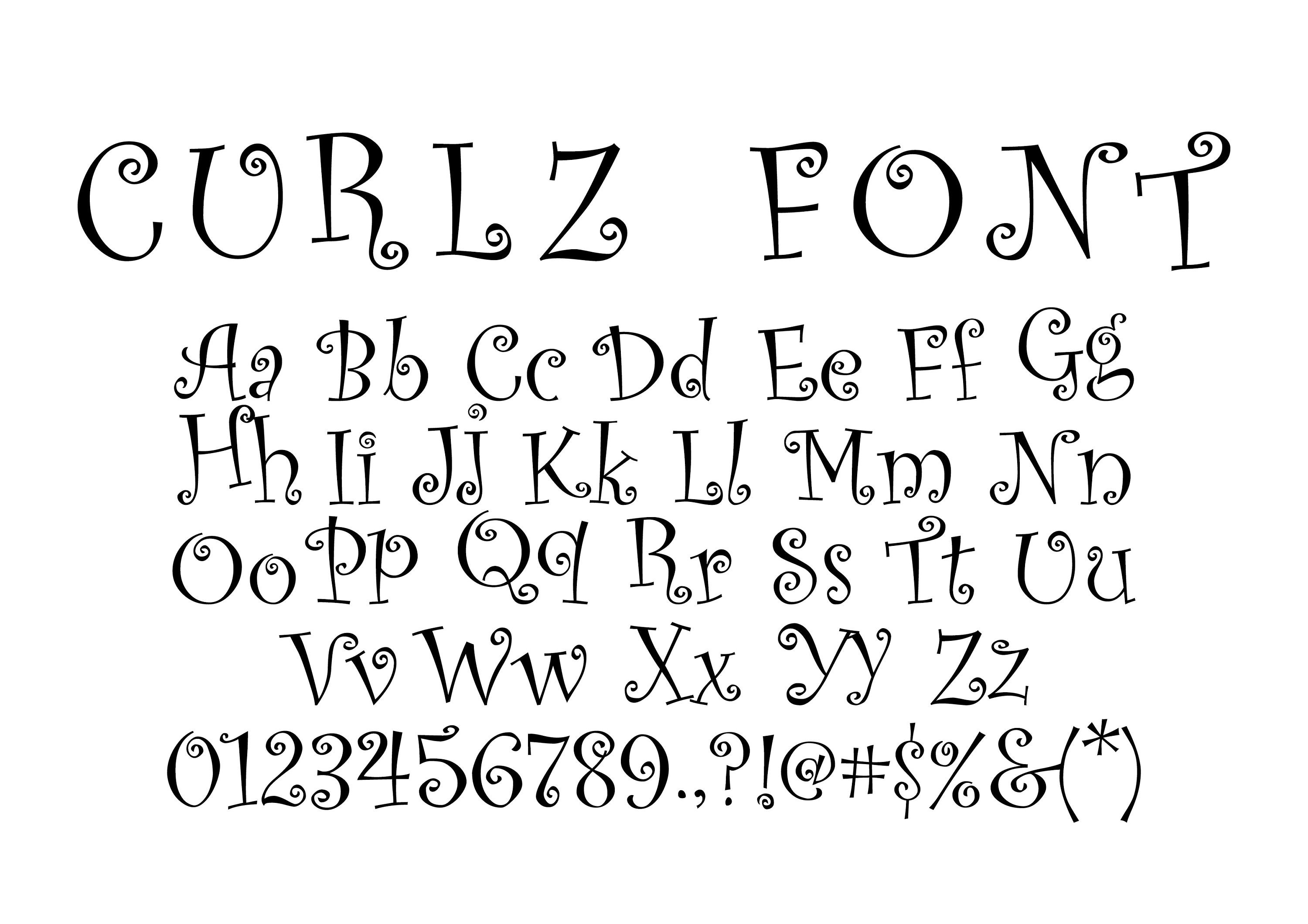
Curlz MT is a whimsical and excessively decorative font that is better suited for party invitations or children’s materials than a professional resume. Its excessive loops, curls, and uneven sizing make it difficult to read and can distract the reader from the content of your resume.
Using the Curlz MT font on your resume can potentially put a dent in your chances of snagging that important interview. Resumes are all about making a solid impression, so it might be best to steer clear of Curlz MT and opt for a font that screams “I mean business!” instead.
4. Impact
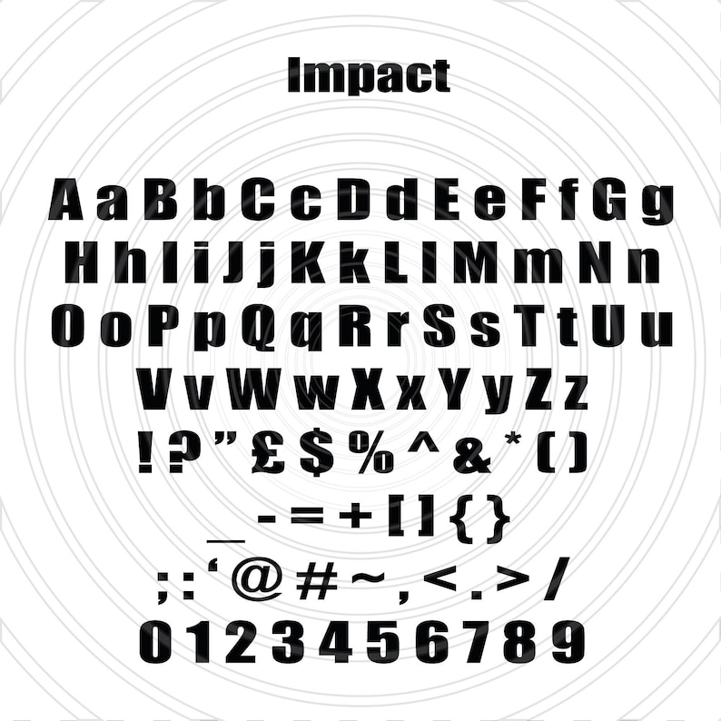
Impact may seem bold and attention-grabbing, but the font is best reserved for headlines or titles, rather than the body of a resume. The font’s heavy strokes and condensed letters can make it challenging to read in longer texts. Additionally, its boldness can create an overly aggressive and visually overwhelming impression, which may not be the best choice for a resume that should aim for a balanced and professional appearance.
5. Stencil
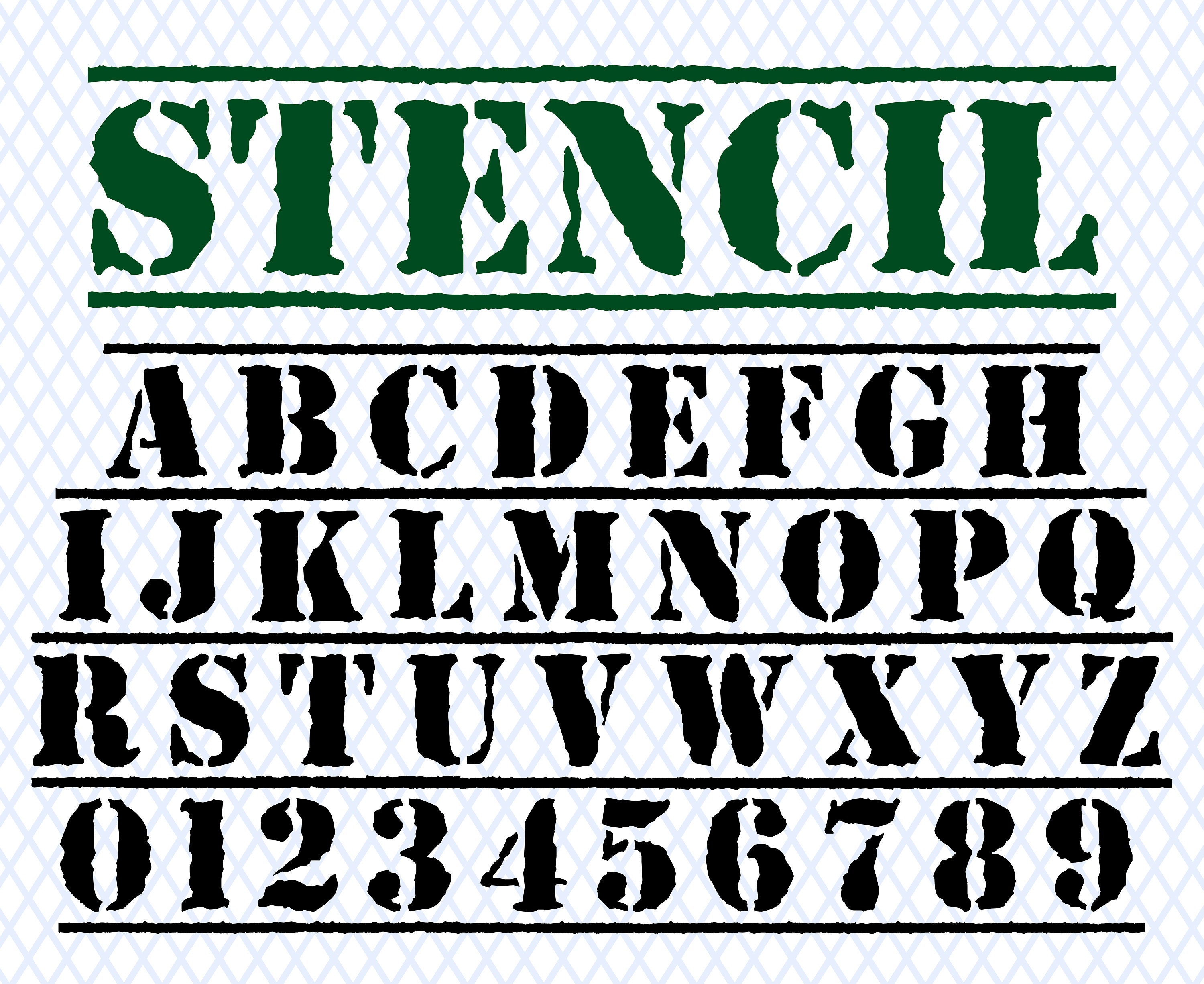
While Stencil font possesses a distinct and bold aesthetic, it is generally more suitable for specific design purposes rather than professional resumes. The rigid and condensed nature of this font can make it challenging to read and may give off an overly industrial or military impression.
Employers want to focus on your skills and experience, not get distracted by an overwhelming font choice. So, it’s probably best to keep Stencil reserved for other creative projects and opt for something more legible and professional for your resume.
6. Kunstler Script

Kunstler Script may exude a sense of old-world charm and elegance, but it is far from ideal for a modern resume. It can be challenging to decipher the font’s ornate and intricate lettering, reminiscent of handwritten calligraphy, especially for scanning software or when printed in smaller sizes. Using Kunstler Script on your resume can give the impression of being outdated and overly formal, potentially alienating prospective employers.
7. Kristen ITC
Kristen ITC — with its handwritten appearance and uneven letter shapes — may appear friendly and approachable, but it lacks the professionalism required for a resume. Its irregular strokes and informal structure can make it difficult to read, especially in digital or printed formats. Using Kristen ITC can convey a lack of seriousness and attention to detail, traits that are typically undesirable in a job application.
Best resume font size (body, headings and name)
The recommended font size for a resume generally falls between 10 and 12 points. This range ensures readability while allowing you to fit more information on a single page. Consistency is key throughout your resume, so maintaining the same font size and format creates a visually appealing and organized document. Avoid excessive variation in font sizes, as it can make your resume look disjointed and unprofessional.
Headings and subheadings should stand out to create a clear hierarchy and make your resume scannable. Consider using slightly larger font sizes for section headings, such as “Work Experience,” “Education” or “Skills.” Font sizes ranging from 14 to 16 points should do the trick for your headings as they draw attention and highlight important sections of your resume.
| Font | Recommended size range |
|---|---|
| Calibri | 10.5 – 12 pt |
| Arial | 10 – 11.5 pt |
| Helvetica | 10 – 11.5 pt |
| Garamond | 11 – 12 pt |
| Times New Roman | 11 – 12 pt |
| Georgia | 10.5 – 12 pt |
However, always remember that different fonts have varying legibility even at the same point size. Therefore, it’s wise to test the readability of your selected font by printing or viewing it on multiple devices. To create well-structured and visually appealing resumes with ease, check out these 12 resume builders that can help you save time and effort.
Now if you need some more font inspiration I would recommend checking out our collection of 40+ Best Free Fonts!

And if you need some amazing resume templates, check this out:


