Months before a movie is released, a studio will start trickling promotional materials out to the public…a movie poster here, a few teaser trailers there, then a full length trailer to really get people excited.
A movie poster is usually the first thing the public sees leading up to a movie release, making it an important piece of marketing collateral that helps studios build hype, drive curiosity, and provide information about their upcoming releases.
Marvel released the first teaser poster for their upcoming movie Black Panther way back in June, spurring some positive commentary on the parallels between it and a famous photo of the Huey Newton (Black Panther Party co-founder) back in the 60’s.

Source: Marvel Studios
Movie posters are powerful tools that shouldn’t be overlooked if you’re promoting your own short film or small theater production.
Let’s assume you’re not Marvel, and you don’t have a team of CG artists, A-list actors, and portrait photographers at your beck and call.
This doesn’t mean it’s impossible to create an eye-catching movie poster design. It just means you have to think a little differently about what it takes to make a great poster.
Luckily for you, I’ve done that thinking and I’m here to share the wisdom (with five examples of romantic movie posters redesigned for the web). You’ll be surprised how far you can get with the right poster template and a few handy design hacks. And if you start with Venngage’s beginner-friendly poster maker, you’ll be able to create poster in record time.
Use icons to represent major themes or to tell a story
Icons are simple vector graphics designed to represent more complex real-world objects or concepts. They’re an essential visual communication tool used in infographics to reinforce concepts seen in the text.
What makes icons so useful?
They’re infinitely scalable (meaning they can be made infinitely large without losing resolution), and you can change their color to fit a theme.

Most importantly, icon designers have already done the work to turn a complicated concept into an easily digestible visual. This makes icons the perfect visual element for non-designers to use in a movie poster design… all you have to do is pick the right icons for the job.
There are a few possible approaches to designing movie posters with icons:
Use icons literally, to depict important objects or moments in the movie
This could be as simple as pulling out an object that plays a significant role in the plot, choosing an image to represent a character, or spelling out the title of the movie with icons:
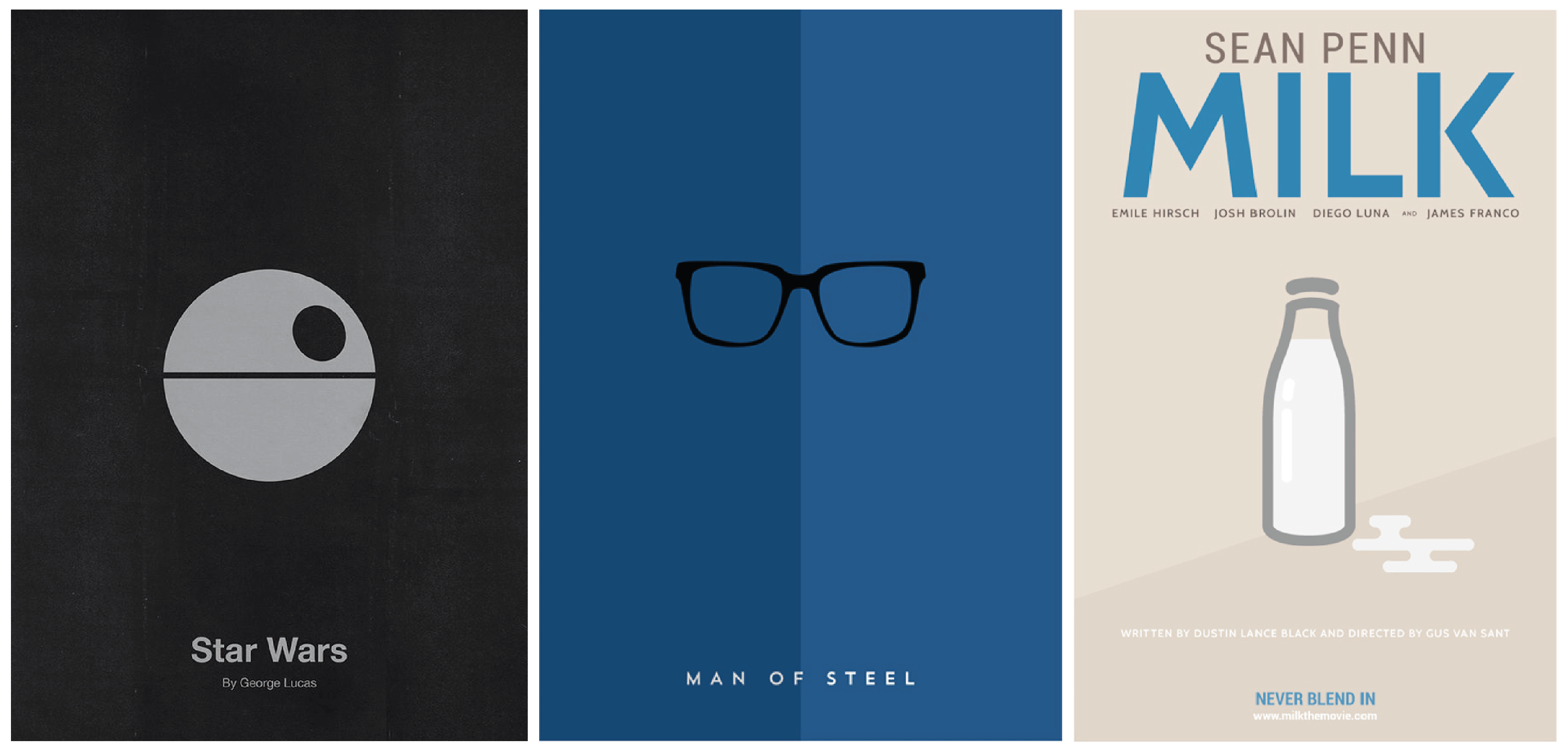
Source: Eder Rengifo, Kareem Magdi, Danish Ahmed
Sometimes it’s even possible to recreate an iconic scene, like we’ve done for Titanic:

Since the story is timeliness, I wanted to give the Titanic movie poster an updated look, so I redesigned it using icons and a simple composition.
Use icons symbolically, to represent major themes in the movie
A great way to get your viewers thinking is to find a symbol that represents an overarching theme in the movie.
Often, a movie poster is most impactful with when something is left to the imagination. If you force people to think about what they’re seeing, they may be more likely to remember (and appreciate) your graphic.
Let them fill in some of the dots.
Keep the style consistent
Sometimes it’s impossible to use just a single icon. If you’re going to combine icons, it’s important to match your icon styles. In Venngage, there are four main icon styles:
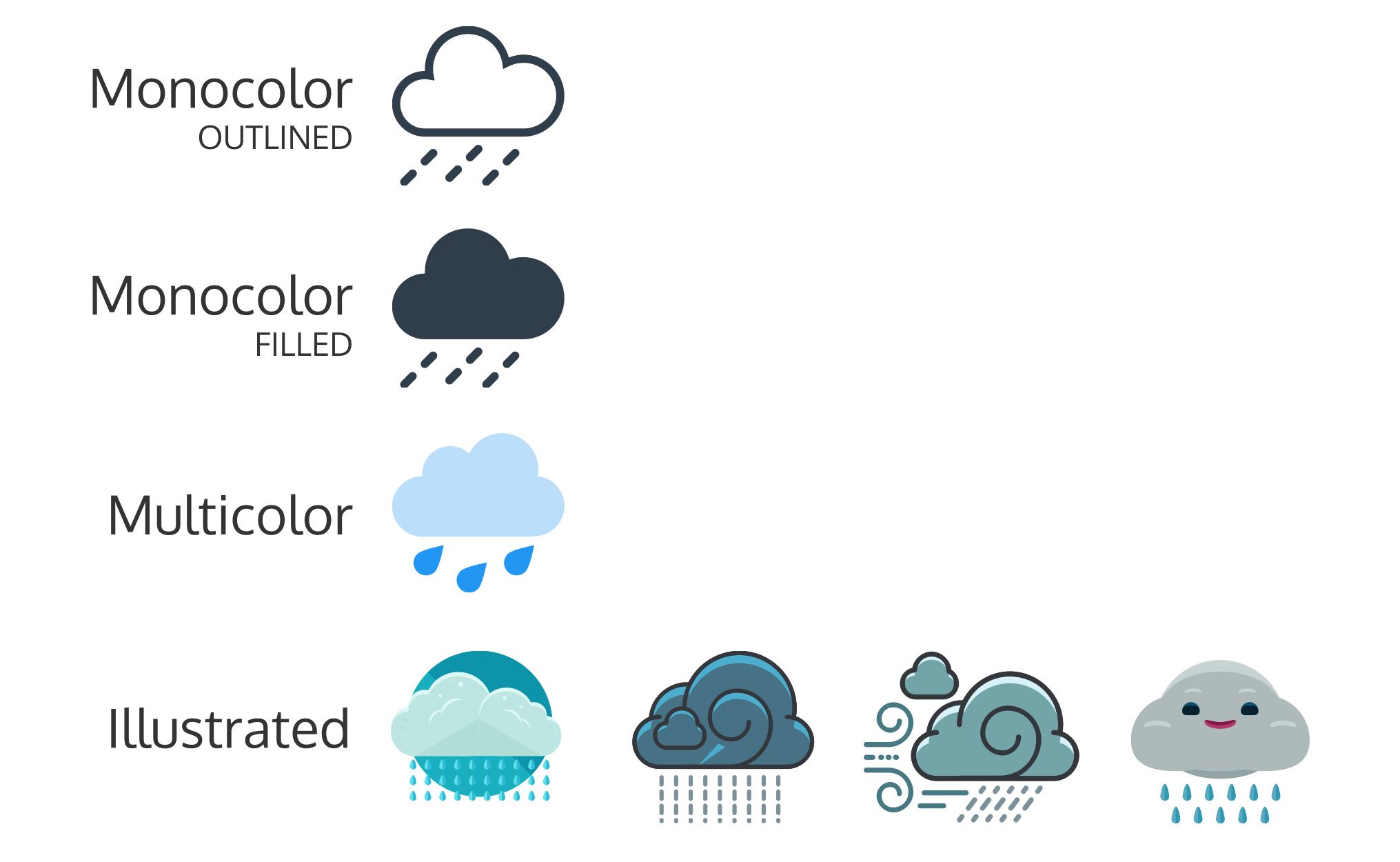
Used in a design, each style of icon provides a very different feeling. Once you choose one icon to use in your design, stick to that style for the rest of the piece.
Mixing different styles can get messy, while keeping style consistent can help tie everything together. Keep in mind that illustrated icons can have different styles, and those styles rarely mix well.
Here, we’ve chosen stylized illustrated icons to represent the star-crossed lovers in The Notebook.

I wanted to give The Notebook movie poster a storybook feel. To achieve that, I used icons as the primary visuals and tied the poster design together with a simple border.
Feature bold, saturated colors
A huge graphic design trend right now is bold, saturated, contrasting colors. An eye-catching movie poster is the perfect place to put those colors to work!
So go wild! Use solid fills.
Use bright backgrounds. Heck, use an all-black poster background if want.
Make color a focal point of your poster. Use color to make your poster impossible to miss:

I wanted the Love Actually movie poster to reflect the multiple intertwining stories in a fun and quirky way. That’s why I chose multiple color block backgrounds to give the poster design variety.
Keep the text short and sweet
Since we’re designing for the web, we can provide all of the event information in a link in the image description.
The focus of the poster should be building interest–making people curious enough to actually click on that link. If possible, limit your text to the essentials: the title, a tagline, and the release date (or lead actors).

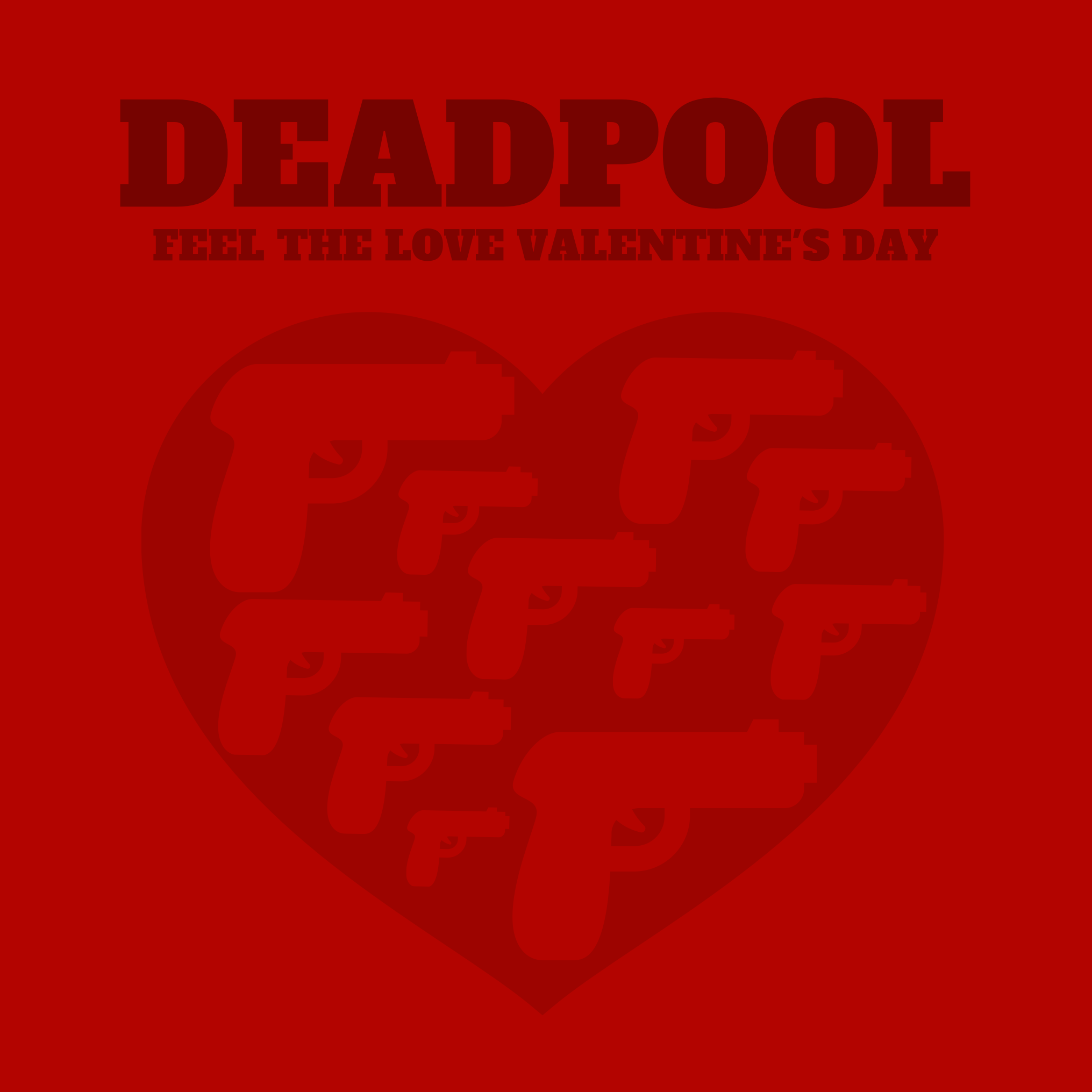
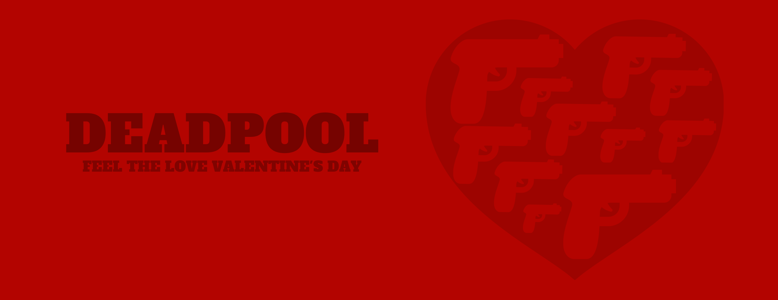
After all, Deadpool is, at its heart, a love story. To capture the feeling of this bloody Valentine’s Day flick, I gave the Deadpool movie poster a color scheme of several shades of red.
This tactic has the added bonus of making it super easy to optimize your design for multiple platforms, like an Instagram post:
Or a Facebook cover photo:
If you do decide you want to add all of your event information to the poster itself, it’s easier to add a distinct visual element (like a box or an overlay) than to integrate the text with the graphics. Check out more poster design tips and templates here.
Match the font style to the icon style
Since the focus of our poster isn’t on text, the text that is present really stands out, making your font choices critical.
If you’ve gone ultra modern and minimalist, stick to sans-serif fonts like:
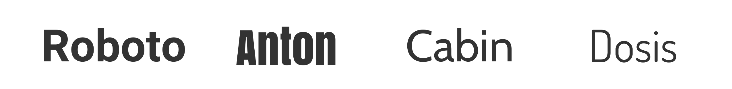
If you’re going for more of an classic feel, you can explore serif fonts:

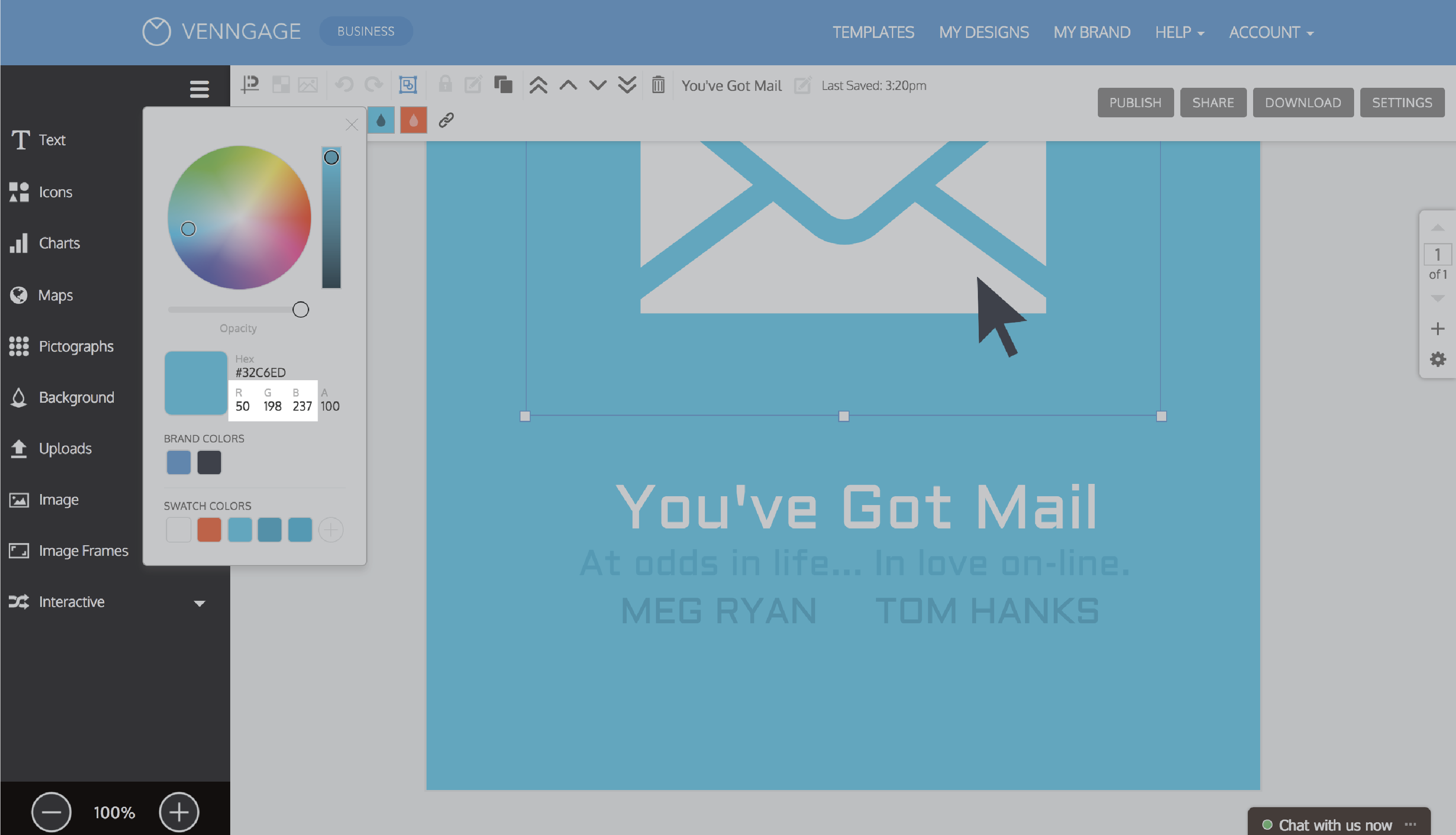
Sometimes the plot of the movie can directly inspire the font choice. Here, we’ve picked a font reminiscent of the earliest digital fonts to play on the theme of the movie You’ve Got Mail:

While the technology in You’ve Got Mail might be a bit outdated now, I wanted to give the You’ve Got Mail movie poster a modern upgrade. That’s why I used a simple color block background with one focus icon and brief, block text.
Optimize your poster for web or print
Once you’ve got your icons, colors, and fonts chosen, you should be ready to share your movie poster with the world. You’ll need to format your image based on how you intend to share it (i.e., on the web or in print).
Optimizing for web
If you intend to share your poster solely via the social media, downloading your poster as a PNG HD image is your best bet. Your text will look great at 100% scale, and you shouldn’t have any issues uploading to any of the major sites.

Just be sure to check your page size before you export–don’t export it any smaller than the size you’ll want to view it at. Letter and tabloid are both standard sizes for posters.

Embedding your poster in a blog post is even easier – just publish to get your embed code.

Optimizing for print
If you intend to print out physical copies of your movie poster there are a few things you’ll need to consider.
Color
Screens and printers use different colour spaces (RGB for screen and CMYK for print). While you don’t need to know all of the technical differences between the two, you should be aware that some brighter, more saturated colors will look duller in print than they do on screen.
To ensure your prints will look acceptable, take the RGB codes from your poster:
And run them through an RGB to CMYK converter to get a preview of what the color will look like in print. If you’re not happy with the preview, you may have to spend some time tweaking your color until you find one that reproduces well in print.
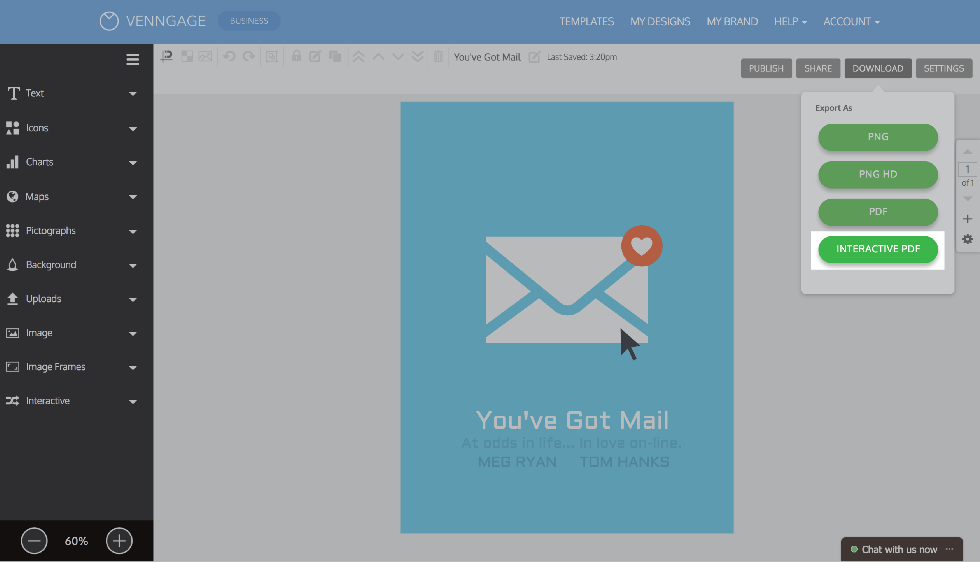
File format
To print your poster at home, first check that you’re using a standard page size (letter is your safest bet) then download your poster an as “Interactive PDF”. This is a vector file format, which means your text and icons will never look fuzzy or pixelated.
If you want to have your posters professionally printed, there are a few other things to consider. Read more about it in our help center.
Quick tips and takeaways
Creating a movie poster shouldn’t be a daunting task. It’s a simple as:
- Using icons to represent important objects or themes (and keeping the icon style consistent).
- Featuring bold, saturated colors.
- Keeping the text as brief as possible.
- Matching the font style to the icon style.
Don’t be afraid to have fun with it. Your goal should be to come up with something unique, be it funny, ironic, or a little quirky.
Most importantly–as tempting as it may be, don’t add any of the typical red velvet curtains, buckets of popcorn, or old-style film reels to your movie poster. Try to break the mold!

If you’re not sure where to start, get your feet wet with one of our new movie poster templates!
Want more Valentine’s Day designs? Check this out:
30 Valentine’s Day Charts to Say I Love You