


![5 Ways Writers Use Misleading Graphs To Manipulate You [INFOGRAPHIC] Blog Header](https://venngage-wordpress.s3.amazonaws.com/uploads/2020/04/5-Ways-Writers-Use-Misleading-Graphs-To-Manipulate-You-INFOGRAPHIC-Blog-Header.png)
In this post-truth era, graphs are being used to skew data and spin narratives like never before. Over 50% of social media users have encountered misleading graphs online. All it takes is a single graph from a less-than-reputable source, blasted out to a list of followers, to spread a false narrative around the world.
There are three kinds of lies: lies, damned lies and statistics.
Mark Twain, American writer
We have already seen this happen many times during the COVID-19 response, which is why we added a new section featuring a few of those misleading graphs!
Now the data doesn’t even have to be bad–it could just be presented in a misleading way. Well, I can’t make these data-skewing creators stop, but I can help you spot these misleading graphs when they crop up. I’ve included examples of how to graph the data properly, too.
Not a designer? No problem. Create better graphs in minutes for free with Venngage’s Graph Maker and chart templates.
In the meantime, following data visualization best practices ensures that your graphs are always clear and understandable, like in this infographic (the accurate part, at least!).
As Edward Tufte, American statistician and professor emeritus at Yale, famously said: “Avoid chartjunk—unnecessary and distracting embellishments that hinder the understanding of data.”
5 real misleading graph examples
During the peak of the COVID-19 pandemic, an overwhelming amount of data was shared, and not all of it was represented honestly. As researchers Amit Kumar Das and Klaus Mueller put it, misleading visualizations make it especially hard to interpret data accurately.
You probably remember seeing questionable graphs everywhere: on social media, in news articles, even on TV. Some were deliberately crafted to shift blame, while others came from creators who simply didn’t know how to visualize data correctly.
Let’s take a look at a few of those misleading graphs and see how we can improve them with Venngage.
Related: Bad Infographics: The Worst Infographics of 2020 (With Lessons for 2021)
1. Overloading readers with data
One of the most common mistakes I have seen people make when creating graphs and visualization is that they include way too much data. A survey by the Nielsen Norman Group revealed that users drop off by 50% when infographics exceed seven distinct visual components.
Trying to include all the data in one visual usually confuses more people than helps them.
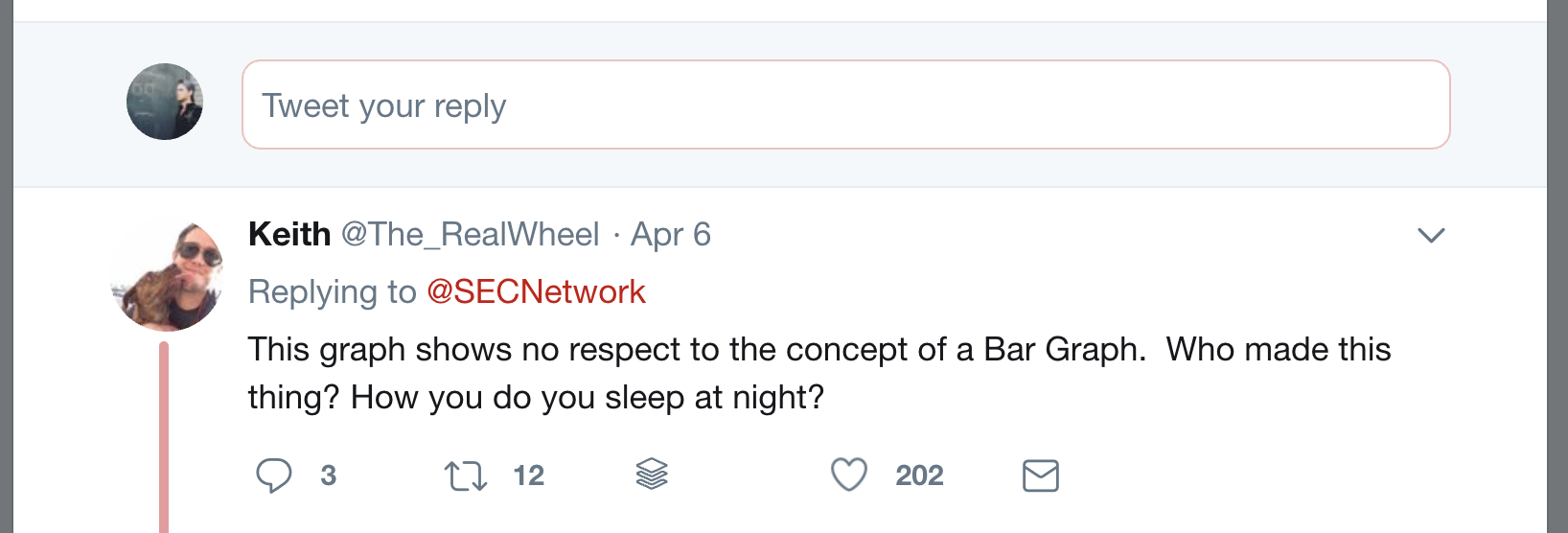
For example, this graph that was shared by a White House official tells us almost nothing about the rise in cases at that time.

After you look at the first two trend lines, the rest of the graph is basically worthless unless you have a magnifying glass handy.
Not only are there way too many trend lines on that graph, but the legend doesn’t help you decipher anything.
According to this graph, the state with the most cases could be either New York, Rhode Island, New Hampshire, Oregon, or Minnesota.
A better way to present this data might have been an interactive graph that you can isolate your state from the others, or just create single graphs for each state.
Honestly, I don’t think it was their intention to mislead people with this graph but it still could have hurt a lot of people who are looking for guidance in this troubling time.
2. Presenting the wrong data
Even when people don’t have too much data on your visualization, sometimes they just present the wrong data.
The main thing that sticks out to me in this map visualization is that they used absolute numbers as their data source.

Instead, they should have compared the number of cases to the population of the country, city or state. This would have made comparing the different locations a lot easier. It also would have made the chart actually useful.
For example, if Kansas City and Los Angeles had the exact same number of cases, Kansas City would be in much worse shape than Los Angeles.
But according to this map, someone could conclude that they both are in the same predicament.
Like the last example, this map tells us nothing useful, except where the biggest cities in the country are.
Additionally, stopping the range at 101+ is very misleading, there’s a massive difference between 101 cases and 500 or 1000.
Another example of using the wrong data can be seen in this pie chart from the Georgia Dept. of Health.
In this pie chart, they put every adult under 60 years old in one group, and then anyone 60 years or older in another:

If you were to take a quick look at this, you would probably say that COVID-19 really isn’t that dangerous to people over 60 since the other group makes up more than half of the pie chart.
But according to the experts, that’s the exact opposite of reality. Those over 60 were the most impacted by the pandemic.
3. Featuring the wrong graph
Now that we looked at a few pretty terrible data visualizations, let’s see if we can improve some that just used the wrong graphs.
Like I said earlier, using the wrong graph isn’t a great excuse but it’s better than being intentionally misleading or lazy with your data.
As you can see in this pie chart, the percentages from each section add up to more than 100%. This is a common problem when people try to visualize survey data that has multiple answers.

The creator of the original pie chart should have presented the data something like this:

Statista presented very similar data in an effective way in this simple bar chart:

4. Manipulating the Y & X-axis
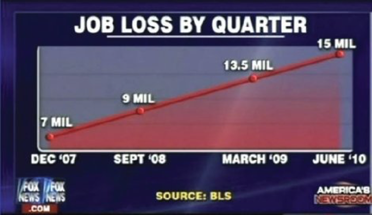
Let’s get back to some actually misleading graphs, starting with this example from Fox News:

As you can see, both the x-axis and y-axis have been manipulated, which is very common on graphs like this.
Instead of starting using a consistent scale on the y-axis of this graph, they jump from 0 to 5,000 and the to 20,000.
On the x-axis, the number of days between each important date are inconsistent as well.
I’m not sure if their goal was to minimize how fast it was spreading, but I think they made the opposite case. In only a handful of days, the number of cases basically tripled or more.
Here is a rough estimate of what that graph should have looked like:

By using accurate axes, this revised example showed truly how fast the virus was spreading in the later days of this chart.
It is a lot easier to see that the number of cases tripled in about 5 days between 3/15 and 3/20, and then tripled again in the next 4 days. The other graph is a lot less clearer, which could lead some viewers to believe that we had this thing under control.
5. Going against normal conventions
For our final example, I found another visualization that attempted to map the number of cases throughout the world.
This one goes against normal color conventions that you would see on a similar map:

First, they really should have used a ratio of cases to the population of each country instead of just a number. That would have painted a more accurate picture.
The scale that they used on this map is also pretty terrible, and like I said with the other map, there’s a big difference between 10,001 and 100,000 – especially in smaller countries across the world.
But the worst part of this graph is the colors used to show that scale–I really have no idea what they were thinking when they picked that palette.
The red that denotes 100k+ or more cases is the darkest, but it’s not the most eye catching of the colors. Your attention definitely isn’t drawn to that color when you first look at the visual.
Then it just goes downhill from there with the color selection once you take a hard look at each.
Why was a shade of purple included?
Why are half of the colors muted, except for one bright color?
Why does the scale go from a subdued color to a very vivid color and then back to a subdued color?
I really don’t have any answer to those questions at this moment. But if you have any ideas, please let me know in the comments!
What blows my mind is that they could have just picked lighter shades and tones of a single that dark red to build an effective scale of colors!
How writers use misleading graphs for manipulation
- Omitting the baseline
- Manipulating the Y-axis
- Cherry picking data
- Using the wrong graph
- Going against conventions
- Misleading Coronavirus graphs
1. Omitting the baseline
Omitting baselines, or the axis of a graph, is one of the most common ways data is manipulated in graphs. This misleading tactic is frequently used to make one group look better than another.
In the data visualization world, this is known as a truncated graph.
Truncating graphs can make something that is not very significant look like a massive difference.
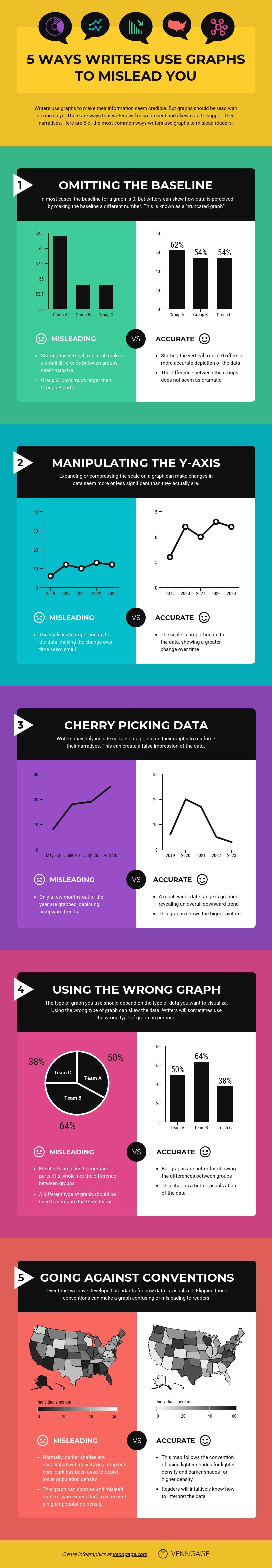
Just take a look at the first example below that compared how Democrats, Republicans, and Independents felt about a certain issue.
(I actually have used this graph before to show people also how they should have used color in their data visualizations!)

If you took a cursory glance at this graph you would probably think that Democrats agreed almost three times more than Republicans and Independents. But a closer look shows that difference was only about a 14% difference. This graph was obviously created to push an incorrect idea about a certain group.
If they wanted to properly show the differences, or just report the facts objectively, they could have included a more accurate graph like this:
Whoa, that is much better!
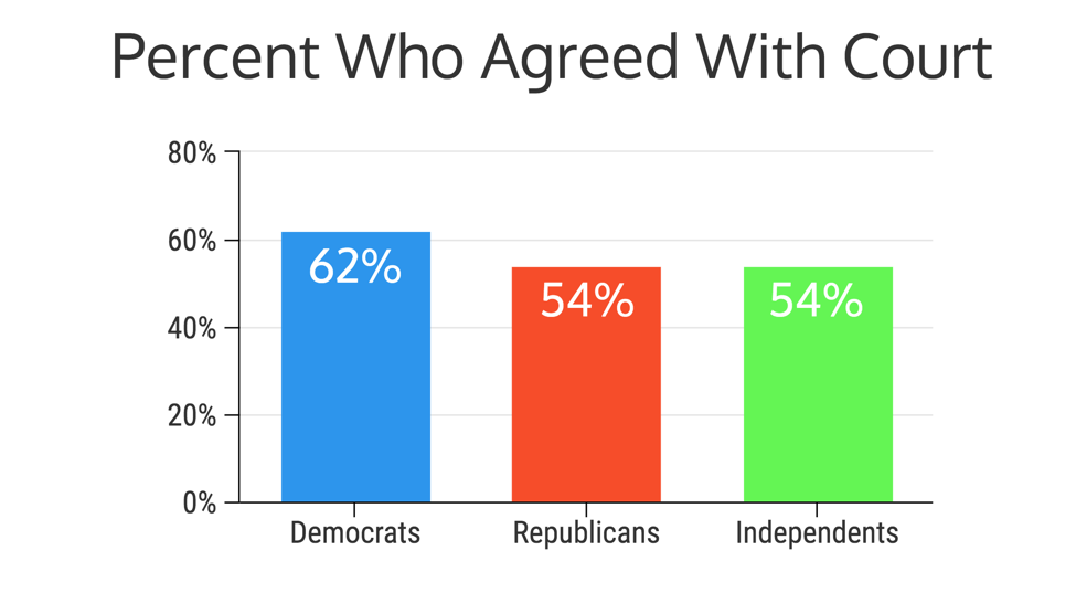
Another example of using good data in a misleading graph to fool readers comes from Fox News (which actually could win a medal for their many deceptive graphs and charts).

In this graph, they are trying to do the same thing as the previous example: deceive their audience. But the margin is a lot closer, with only an 11% increase.
That didn’t stop Fox from publishing a graph that makes one tax rate seem almost 4x larger than the other.
Oh, and the small numbers that they used not only on the axis but also as labels almost confirm they wanted to mislead their audience.
Here is how it should have looked (as you can see, the difference is not that impressive):
Writers also get themselves into trouble when they try too hard to be unique or creative with a graph.
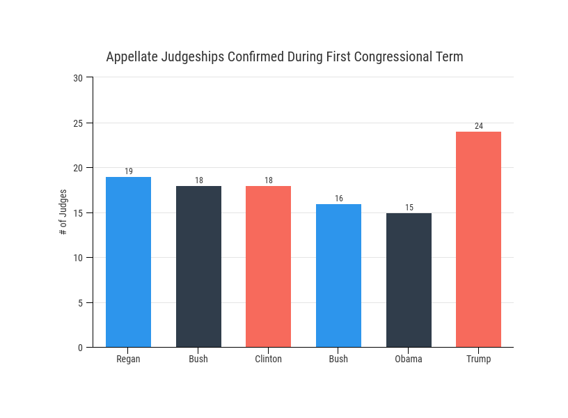
One of the first things they remove is the baselines or axis. I believe this is because the writers think it actually distracts from the data. But it only makes the data harder to read!
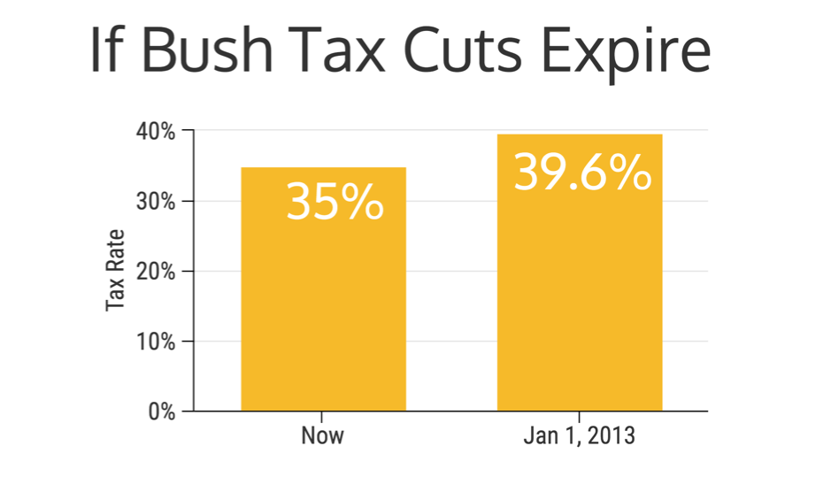
As you can see in this graph, there are no baselines at all! Now, this misleading graph makes it seem like our current president has nominated judges at double or triple the rate of his predecessors.
When the graph is adjusted and the axis are added you can see the real story. He definitely is nominating at a high rate, but it’s not as crazy as the original draft made it seem:
It is important to remember that axis manipulation like this is not limited to just politics or hot-button issues.
Even music journalists sometimes find themselves on the wrong side of a misleading or bad graph. Just check out this bad graph that I found from Genius:
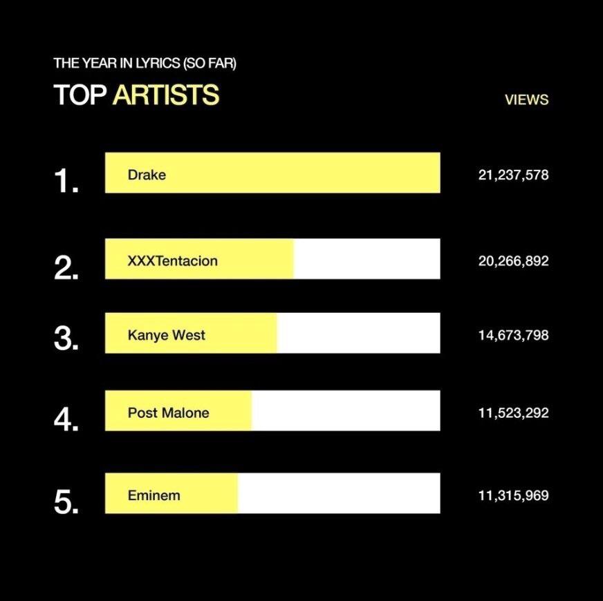
I’m guessing Drake was pretty happy to see this chart, but it really should have looked like this:

Sorry Drake.
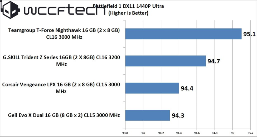
You can also see these kinds of misleading graphs it in tech:
In business meetings:

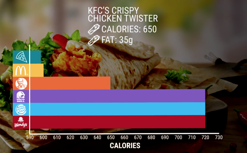
And even in nutrition information:
Honestly, wherever people are using data visualizations to backup their claims, you will probably find someone misleading graphs like the examples above.
Related: What Is Data Visualization? (Definition, Examples, Best Practices)
2. Manipulating the Y-Axis
A common trick of the graph manipulator is to blow out the scale of a graph to minimize or maximize a change. This is known simply as axis changing in the data visualization world.
Axis manipulation is almost the opposite of truncating data, because they include the axis and baselines but change them so much that they lose meaning.
This is a very powerful tool on social media and can be used to push a false narrative.
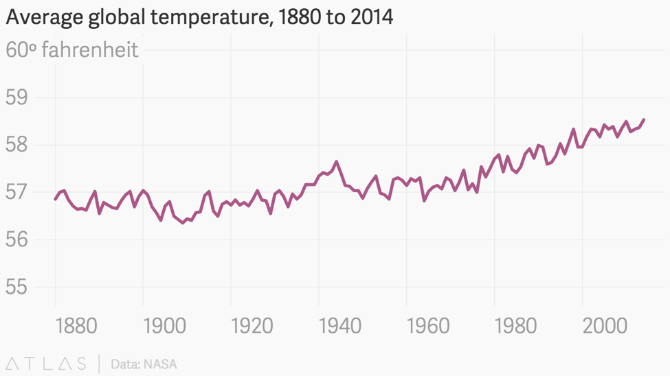
For example, take a look at this graph of global warming data from the National Review:

They are intentionally including temperatures from -10 degrees up to 110 degrees to make that line as flat as they can. All to push an idea that global warming is not real or something. Thankfully, those who are more respectable with data called them out on their misinformation immediately.
And the good people at Quartz decided to fix it for them, which you can see below:
The saddest thing is that these organizations know exactly what they are doing.
What should frustrate you, the reader, is that both of these organizations had access to the same data and tools. But only one decided to present it in a trustworthy manner.
I mean, I could do the exact same thing using data about my beloved Arkansas Razorbacks.
In this example, I looked at their win totals over the last 15 or so years and put them on a normal line graph. But I then took the same approach as the previous graph and manipulated the y-axis:
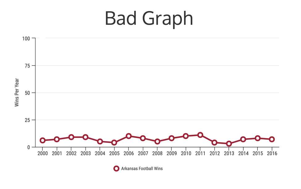
With those changes, I can make it looks like the Razorbacks have been winning fairly consistently over the past few years.
Awesome!
But if you follow college football you will know that we have not been winners most of the time, and the graph should look a little closer to this:

This one is not so inspiring…
Again, this is the exact same data, presented in the same type of data visualization, but each graph tells a completely different story.
It only took one tiny change to completely flip the story. That should make you uncomfortable.
Create your own line graph for free with Venngage’s Line Graph Maker.
Here’s another example. This graph makes it seem like you have a terrible credit rating, causing you to freak out:

When it really isn’t that bad of a rating, using 700 as the max:

Even when you use 850, the max credit score, the graph they used is still very misleading:

And even though this faux pas seems rather simple in the grand scheme of things, this approach can be used to mislead people about their situation. Or try to sell them something they don’t need.
I wanted to include this example to show that not all misleading graphs are line and bar charts. Some can be innocent pie charts that just got caught up with some shady people!
As you can see, this misleading tactic is being used in politics, on social media, and in businesses to push an agenda or idea.
3. Cherry Picking Data
Another way to skew data is by only including certain parts of the data in your misleading charts or graphs. Usually, it is only the data that puts your viewpoint in a positive light or your opponent’s in a negative light.
For example, only including a month where there was a sales spike and not the rest of the yearly data.
Or only sharing misleading poll results that make a certain person look favorable to everyone. But when you take a harder look at this graph, it only includes people from his own party:

And that party is shrinking by the day. This is definitely misleading, especially when the rest of the results looked like this:

If someone were to quickly look at the original bad graph, they would probably think everyone loves the president. When actually only about 35% of the country approves of his administration.
It is not technically wrong but it is definitely misleading. This is often called improper extraction when only a certain chunk of data is included.
This is more common in graphs that have time as one of their axes. I mean it is pretty easy to start with a year that confirms what you are trying to say.
You could also call this tactic omitting data. When–you guessed it–some of the key data is just left off the graph.
Both improper extraction and omitting data are things that you want to avoid!
Let’s start with an example of improper extraction because I don’t think I need to show you what omitting data looks like. In this case, I struggled to find some real-world examples, because who is really going to admit they left out data.
(Not many people!)
But I did find this great example from Tejvan Pettinger on how someone could cherry pick some data to make a compelling but misleading statement.
In the first graph below, a reader could obviously be mislead into thinking that the UK National debt has never been higher! This graph could be used to justify a politician voting on some piece of legislation that would lower the debt.

However, when you take a look at the full time series, you can see that national debt is actually pretty low in comparison.
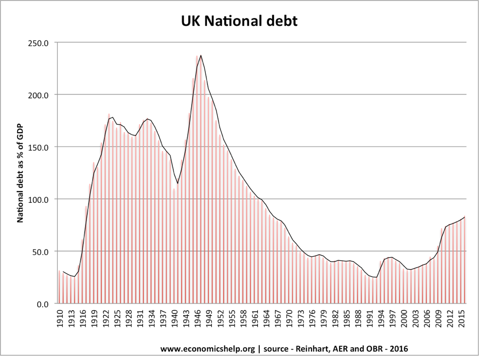
This fictitious creator decided to also start the graph right at a low point and falsely illustrate that it could have been rising from zero to these rates. They also stuffed the graph with a bunch of random points to make it seem like the data set was much larger, when it only covered 10 years!
If you want another example of improper extraction, look no further than the stock market.
There are thousands of data points that stock analysts look at before they make trades or recommend people buy something. So there are a lot of things that they can omit to make certain company stock look better or worse overall.
But I think something that is very easy to mislead readers with is stock price. For example, take a look at the graph below, which shows that Twitter has been on an large upward swing.

As an outsider looking in, with just this graph at my disposal, I would think that they have been doing something right lately!
But I would be mistaken…
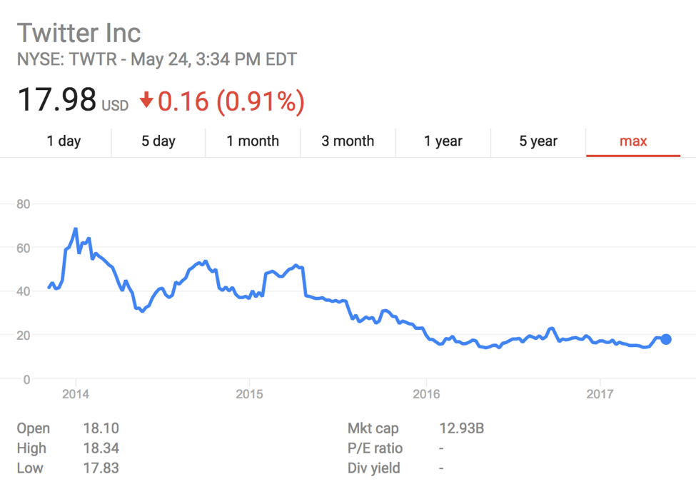
They have been on an unprecedented slide for the past year or so, and that increase is just a tiny blip on the long term graph.
Now, if I were a less than honest stock trader, I could try to unload a ton of Twitter stock just by using that graph.
And this type of misinformation could be used to manipulate about any piece of data you want to fit your goals.
Like this example, which tried to justify climate change not being real:

Mostly because people do not want to take a look at the raw data and they see graphs as a beacon of honesty.
I mean, why would someone lie on the internet, right?
4. Using The Wrong Graph
So far, I have talked about intentional misinformation tactics that writers use to push their agendas.
Now I think we should take a look at types of misinformation that can happen through sheer incompetence.
This usually involves picking a type of graph or chart that does not fit the data you are trying to present. And more often than not, the misunderstood pie chart is to blame for this.
It is not the pie chart’s fault that it can be so misleading–it’s the people who think it can be used for any and every type of data.
For example, take a look at this pie chart from the NFL Draft:

I am not sure what they were trying to do with this chart but as a multibillion-dollar company, they should have a competent graphics person.
First, in what world is 64 prospects half of 69 prospects? And second, why did they not use a bar graph for this data?
If you were scrolling through your Twitter feed and saw misleading graphs like this, it would make sense that you thought USC blew the others out of the water.
But if they wanted to share a more accurate graph, they should have created a column chart like this:

It may not be as flashy as the first one but at least it is accurate.
Here is another questionable graph from the world of college football. This time, they attempted to graph projected win totals:

They ranked each team correctly from highest to lowest, but the inclusion of the bar graph made no sense to most people.
If your school had a longer name it looked like they would win more in this graph. And if you were quickly scanning a social media feed, that would be a fair conclusion.

That’s much better, but it still hurts seeing my school, Arkansas, at the bottom of both graphs.
Another way brands can be unwittingly deceptive is by trying to be too “innovative” with their graphs or charts.
In the example below, they used a pizza pie chart and I really can’t understand why!
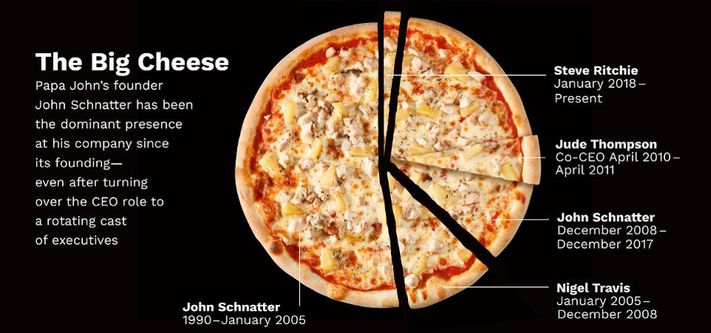
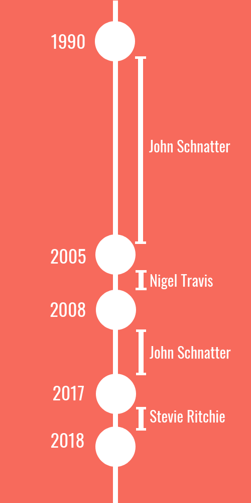
When it really should have been a timeline or even a simple table:
I mean, what are they even trying to show with that terrible graph? It’s not even labeled correctly to help the reader figure out what is going on!
It may look cool, but functionality should always come first!
In this example from Microsoft, by trying to be conceptual, they created a misleading data visualization:

Even if Microsoft Edge is faster than Chrome or Firefox, it is just by a slight margin. Not around 25% faster than Chrome or 50% faster than Firefox, as the visualization would lead you to believe.
They should have used a column chart if they wanted to be accurate with their data:

Or if they still wanted to use something a little less boring, they could have gone with a bubble chart like this:

Since I gave the pie chart a bit of grief above, I’m going to show a place that it definitely should have been used! You can also use Venngage’s free Pie Chart Maker to create pie charts that accurately depict your data.
In the example below, The Intercept was trying to show how the Russia issues have taken over the news lately:
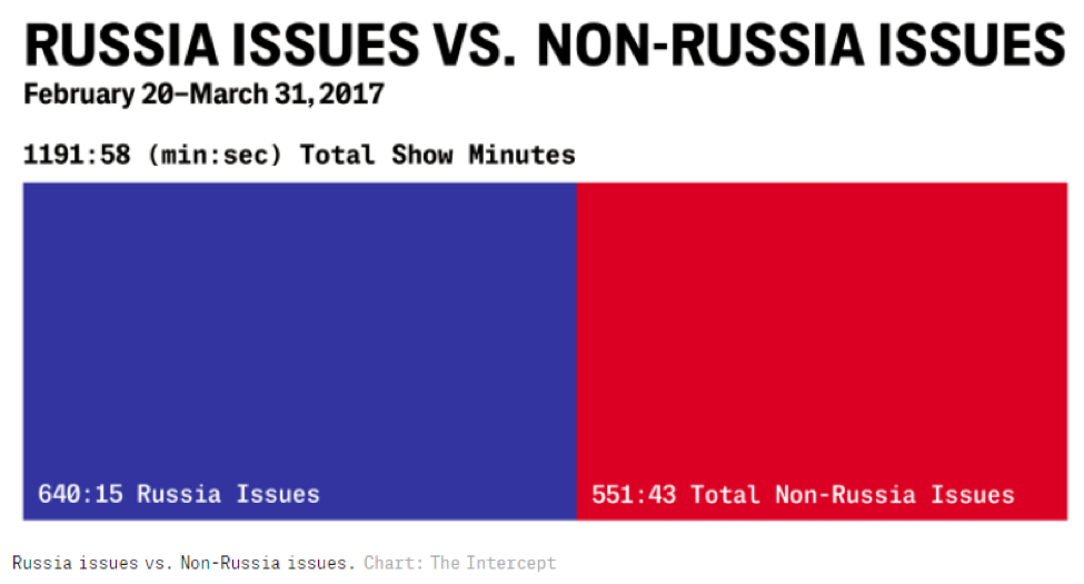
It fell just a little bit short, mainly because the labels they chose are not very descriptive.
And unless you calculated it yourself, you were left guessing what the actual split was between the two.
If I was creating this visualization, I would have gone straight to the pie chart:

Not only does it include the same information, it also makes it easy for someone to quickly spot the difference. Helping readers understand data quickly should always be the goal of any visualization.
As Ghulam Jilani Quadri and colleagues note in Do You See What I See? A Qualitative Study Eliciting High-Level Visualization Comprehension: “Designers often create visualizations to achieve specific high-level analytical or communication goals.”
Not a designer? Create better charts for free Venngage’s Chart Maker.
5. Going Against Conventions
To conclude our list of misleading data visualization tactics, I thought it would be a good idea to look at misleading graphs and charts that alter long-held conventions or associations.
If you are a little confused with what I am talking about, think about a graph where red represents Democrats and blue represents Republicans.
It would be pandemonium!
Or a simpler example is using green for losses, and red for profits.
That would make no sense to a competent graph maker but would be a great tool to manipulate an audience.
In this map about STI rates across the country, they choose to use a dark color to denote low levels and a light color for high levels:
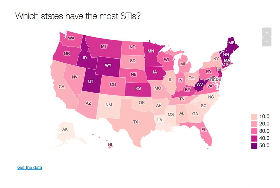
This use of color goes against almost every map data visualization I have even seen. So I do think it was created to intentionally mislead the reader.
And to make things even more mind-boggling, the higher the number is, the lower the rates are, supposedly. So the map is confusing all around, which could make someone rightly think that Idaho is a hotbed for STIs, when it is really the southern states.
Here is an example of how a map like that should have looked (we didn’t have access to the raw data to recreate the map, so we found something similar):
The dark colors are used to denote high values and the light ones are low ones.
Here is another example of a map using an insane color palette:

Could you even follow what they were trying to say? I couldn’t!
Just like I pointed out above, these map makers should have used a single color palette with shades and tints. Almost everyone knows how to decipher those types of maps.
Next, we have a graph where the writer wanted to outright push a false idea to its audience. Honestly, it is one of the most egregious graph manipulations I have ever seen because of how blatant their intent was.
They actually flipped a graph upside down. This made it look like gun deaths were going down when in reality, gun deaths were spiking after the Stand Your Ground law was enacted:

See what I mean? This was done to push an agenda.
A simple rotation and mirroring of the graph will show you what it should have looked like:

There! Good as new, well…kinda.
And for our final example, we have one from our favorite data manipulators, Fox News.
Why don’t you take a look at why this graph made this list?
Did you spot it? If not, I don’t blame you because I am guessing many of their viewers missed it too. And they are counting on that.
If you take a look at the x-axis, you will see that they choose to include a bunch of random time values for their graph. It’s not like they just left a few months or quarters out of the graph at random–they purposefully chose those quarters to fit their narrative. You could also consider this an example of omitting data.
And the worst part about this example is not that it is a bad chart, but that they thought they could dupe their loyal viewers.
If a brand thinks so little of your intelligence that they push bad graphs on you, I would recommend finding another source.
Deceptive charts are just one side of the story. To really understand their impact, it helps to look at the bigger picture of how data visuals have developed. Explore the evolution of infographics to see that journey.
Conclusion
Would you have guessed there were that many brands that play loose and fast with graphs?
Me neither!
As with any type of news story, I would recommend first checking where the graph is coming from and then taking a look at the data.
Like I said in the intro, most people sharing misleading graphs do not have your best interests in mind.
For example, if a graph that shows the benefits of coconut oil is being shared by a company that just happens to sell coconut oil, that graph may be skewed. Maybe look at some other sources before you order a case of it.
And if it is just one person or group sharing this particular graph, that is another red flag.
So be vigilant by always checking your sources, stay skeptical and if you feel like a writer is being misleading, call them out on it!
Do you want to learn more about picking the right charts for your data? Read this guide: How to Choose the Best Charts for Your Data


