


There’s a long history of people creating and using infographics, or visuals that communicate complex information. They are meant to make information more accessible. Yet we see examples of poorly designed infographics. It could be charts without proper context, designs that put style over substance, or visuals that simply don’t connect with their audience.
In this roundup, we’re taking a closer look at some of the worst infographics shared in recent years. More importantly, we’ll break down why they failed and what you can learn from them, so you can avoid the same mistakes and create visuals that actually engage and inform.
Lesson #1: Respect your audience
An X user posted a video comparing rent prices to household income from 1990-2023. The viral falsely claimed both were “inflation-adjusted” when in reality only the income data was adjusted for inflation while rent data was not. A lot of people called him out in the comments, claiming his post to be ‘untrustworthy.’
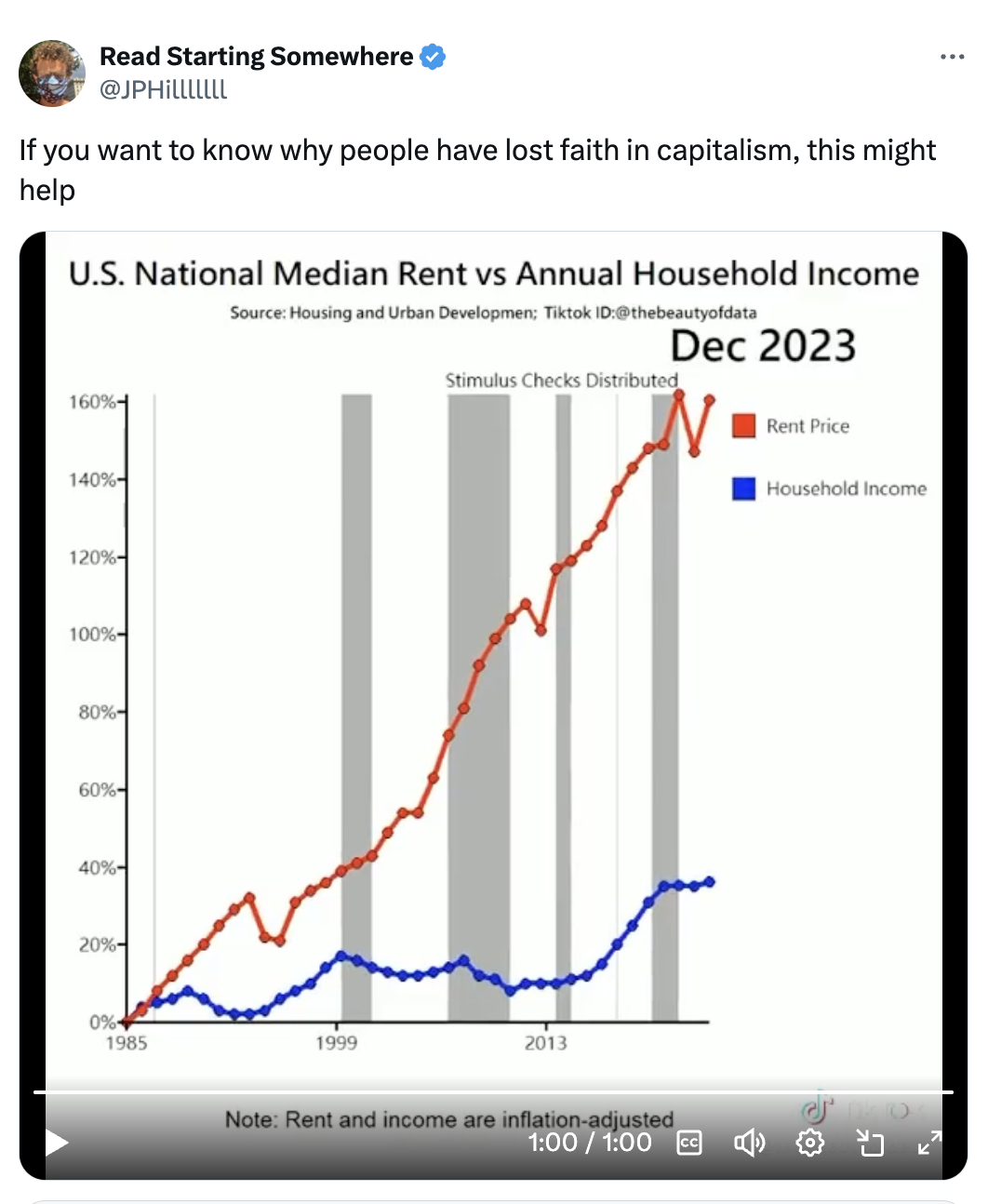
Source: X
Sometimes the people who are creating infographics, like statisticians or experts in government offices, make assumptions about the people who will ultimately consume those infographics, for example about their current level of knowledge.
Other times, people create infographics with little knowledge themselves of data or statistics, or of graphic or information design, in order to share engaging visuals on social media. Or they know how to create graphs, and they only use them to re-enforce the story they want to tell, regardless of their audience’s needs.
In every case, whether they realize it or not, they are using infographics to communicate with an audience. Keeping this audience in mind is key to communicating whatever information is at hand in a way that improves that audience’s complete understanding of the topic.
Lesson #2: This means don’t mislead them by making bad infographics
This really is the worst of the worst. These graphs are not merely filled with errors, they are grossly distorted, likely to serve specific agendas.


You can use data to tell a story, but you still need to represent that data in a way that is honest. That’s all there is to say about that.
Related: 5 Ways Writers Use Misleading Graphs to Manipulate You
Lesson #3: Quality data is a non-negotiable
There are many myths about infographics but perhaps the most harmful one is “numbers don’t lie.” The trouble is, numbers never stand alone.
First, they have to come from somewhere, and that means people are involved. Before it can ever be presented, data must be collected, organized and analyzed. Lots of things can happen across the board, whether they are intentional or not, so it’s important to make sure the data used in infographics meets certain standards.
Here’s a great example of a misleading infographic based on faulty data collection. Apple wanted to show how data about people’s use of their Maps app was changing during quarantine. The presentation of this data implies that people were walking less, but what was overlooked was the fact that people don’t need Maps to take walks around their neighborhood.

Quality data comes from not only a reputable source, but from the right source. This graphic shows federal data but the numbers chosen are not “accurate reflections of the problem of human trafficking or in many cases the identification of human trafficking,” Director of the School of Criminology and Criminal Justice at Northeastern University Amy Farrell told FactCheck.org.

It also should go without saying that if you are using a certain data set, you shouldn’t say you are using a different data set entirely. This map caused unnecessary panic because it was based on flight data not health data, according to the BBC.

Data should also be up to date, particularly if timely data is critical to the story being told. Both of the following infographics flagged by Reuters did not include current data and therefore misrepresented the impact of COVID-19.


The effort to keep data up to date caused alarm in the following case noted by PolitiFact. When counties in Wisconsin and Michigan released a batch of election results, it appeared as a sudden uptick in Democratic votes for Joe Biden which caused some to believe there was evidence of election fraud. (The lesson that follows this one describes what could’ve made the difference here.)

If you aren’t particularly data-savvy, that’s okay, just don’t pretend to be. The infographic below (also flagged by PolitiFact) was created based on calculations that were incorrect because the numbers were based on different benchmarks.

Regina L. Nuzzo, Ph.D. from the American Statistical Association told Reuters that these numbers attempt to over simplify a much more complicated reality.
Lesson #4: Provide plenty of context in your infographic
The reality is that numbers have to be explained, and this includes putting them in proper context. In some of the examples above, supporting text and/or visuals could have provided audiences with a better understanding of how to best interpret the data. Here are some more examples of missed opportunities to do so.
This graph makes the argument that masks help “flatten the curve” (or lower the rate of growth of COVID-19 cases) by pointing out that countries with mask usage had lower growth rates than countries without mask usage.

Whether we agree with the argument or not, this graphic conflates correlation with causation, which the following humorous reply points to.

It overlooks other potential factors to growth rates, like high-quality public infrastructure and practice preparing for a Coronavirus pandemic with the first one in the early 2000s.
Many COVID-19 charts like the one below show case counts, and the context that’s needed for these is that confirmed cases, as The Atlantic notes, provide a very limited way of knowing how much the virus is spreading if for no other reason than testing is not something every single person is doing. This chart of confirmed COVID-19 cases across US states gave the false impression that just a handful of states had the vast majority of cases.

Alternatively, a scatterplot using the same data (like this one created by Popular Science) but showing the relationship between confirmed cases and testing rates would clearly show that places with the highest infection rates also have the highest testing rates. If you don’t know, this is what a scatterplot looks like. Stay tuned for more about types of graphs.

Context really matters, especially when you are communicating about health. Arkansas’ Department of Health used these arc graphs to show the rate of preexisting health conditions in patients confirmed to have COVID-19. Because the percentages are low and the scale goes up to 100% (I will talk more about visuals in a bit), it gives the false impression that one shouldn’t be concerned — the reality is that even if the numbers are low these people have severe cases that can result in death.

Job growth is also more complicated than it may seem. The unemployment figures used in this video imply these numbers are static but they don’t show what really matters, according to Reuters, which is how rates changed over the course of both Obama’s and Trump’s presidencies.

Often, providing context simply means showing more data over a longer period of time so it can be put in a wider perspective. For example, the next infographic makes a case for economic recovery, but it only shows data from January to June of 2020.

Graphs that put recent changes in the economy into context, for example this one created by Minnesota Public Radio’s Marketplace with data from 2015 to 2020, tell a more complete story.
Lesson #5: Ask yourself if you’re using the best visual
When it comes to making infographics, there are so many options for showing data and information, from charts and graphs to maps and tables to icons and illustrations. Using the one that best fits the data and the topic is critical for making graphics that make the most sense.
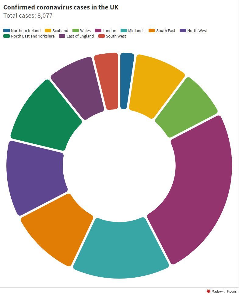
For example, pie charts are great if you have two or three categories which all add up to 100% but they are used in plenty of other situations where they are not particularly helpful. Among data visualization professionals, the pie chart is the ugly duckling. Taking a look at these major mishaps explains why.

Because people have a hard time using the size of a colored area to distinguish differences in numbers, there are other types of visuals to be cautious with. This bubble chart was published by The European Commission, who was subsequently accused of overstating the UK’s reliance on trade with Europe, thereby disrupting trade talks, according to inews.co.uk.

Be deliberate if you are using maps to explain, because countries or states with more geographic area will naturally be emphasized, as demonstrated by the example below.


Alternatives include cartograms and point-based maps (as demonstrated here by Popular Science), or equal-area choropleth maps like this:
I know people like to get creative, but don’t go too far outside conventions (more on this next).
Related: Common Symbols and Meanings: How to Use Them in Design
This next infographic replaces bars with icons, which not only makes it harder to read but also might marginalize some women (no woman wants to feel dwarfed by others) — always remember your audiences.

As mentioned previously, certain graph types are better for certain types of data. Remember the example where a scatterplot would’ve offered more context than the horizontal bar chart?
Related: How to Choose the Best Charts for Your Data
Here’s another example from The Conversation of a bar chart that should have been a line graph, which is great to use when you are showing change over time. As mentioned before, it provides more context, as opposed to having to process the time lapses on the horizontal axes here (more on that in a bit).

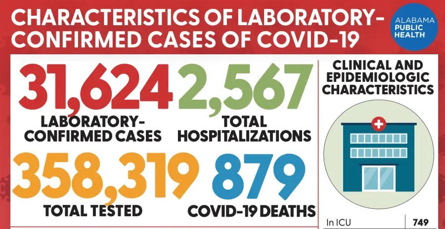
Don’t be afraid to use data visualizations, just make sure they are meaningful. If you are tempted to simply put big numbers in big bold text, please consider something more helpful, for example a visual that shows trends over time. Here is another example of a missed opportunity from Alabama’s Department of Health.
Lastly, it should go without saying, but having the right logo should be a no-brainer. The creator of this graphic was so audacious they included the Texas Department of State Health Services’ logo without their permission according to their local CBS station, and on a table that includes misleading data no less.

Lesson #6: Always pay attention to the axes
Some of the previous lessons here have been based on general guidelines, but there are also some basic rules that must be followed without question.
Firstly, a horizontal or X axis will always be read left to right, so numbers or years must be sequential and ordered from low to high. In this bad infographic, age increases vertically but decreases horizontally, which makes it harder to read. The horizontal axis is also not labeled which adds to the confusion (more on that later).

Axes should generally start at zero too, and without question the spacing between numbers should be based on the size of those numbers. The vertical axis in the infographic below is incredibly misleading – it looks like the curve is flattening when that is not at all the case.

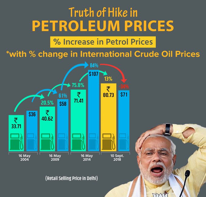
Here is another example of distorted axes, and in this case the error is tripled. The horizontal axis is not labeled at all, and by having two vertical axes, one on the left and one on the right, this infographic is attempting to force a narrative rather than allowing the reader to see the data clearly.

And to top it all off, the lines are hard to read because they are 3D and have shadows, which brings us to the next lesson.
Lesson #7: Please minimize clutter in your infographic
Infographics are great for communicating about complex information, but that doesn’t mean they should be overly complex themselves. When the material is complex, it is wise to not oversimplify it, but it is critical to at least clarify it.
That is where good infographic design comes in. It’s totally normal for it to take some practice to get good at creating visuals that are both complex and clear. If you haven’t gotten there yet, please don’t publish ridiculously confusing graphics like these.


Looking at designs like these not only makes your eyes and brain hurt it can also lead you, like these authors from Wall Street on Parade, to believe that the infographic creator could be intentionally confusing or concealing. Respect your audience and they are more likely to respect you back.
Related:
- 7 Tips on How to Make a Good Infographic
- Infographic Elements: How to Piece Together the Perfect Infographic
Lesson #8: Use titles and labels to clarify
Even though this is lesson number eight, this lesson is critical. Here’s more good rules of thumb.
Keep titles succinct and try to use words that are easy for your audience to understand. If you can announce the takeaway from the graph in the title, that really helps the audience. Here’s one of countless examples of missed opportunities to do so.

It’s also wonderful to include exact numbers alongside the points or bars within the graph. If you do, make sure people know what you are counting. Otherwise it could end up as confusing as the example below.

I’ll say it again: Please label all axes. Not doing so can’t even make up for a title as exemplarily clear as in the next infographic.

The infographic above is also hard to read because of the dark blue-green colored background and the light green colored line. Let’s talk more about color.
Lesson #9: Use color intentionally
There are several troubling things about the infographic below, and now that we’ve learned so many lessons I hope you can find them. Color is an additional problem because it doesn’t add any obvious meaning, but the reader might expect or want it to. It’s a good idea to color the largest bar differently, but in this case, that difference in color (as well as the color differences between the top set of bars and the lower set of bars) is too slight so at first glance it looks like a color scale.

Sometimes poor use of color adds unnecessary clutter, which we saw in some of the examples of clutter mentioned previously.
Related: How to Pick Colors to Communicate Effectively
For this reason, color gradients in particular should be used with great care. In the next example, the gradient colored bars could distract the reader from what they might learn if they focused on the data instead, which is not clearly labeled either.
I know many people think that color is what makes infographics fun, and that’s true, but it shouldn’t be used lightly. In this example from the Arizona Department of Health Services, the color gradient makes it look like COVID-19 cases in Navajo County (second graph) are comparable to the rest of the state (first graph). And, again, the lack of a vertical axis is just inexcusable.


The reality is that nearly half the population of Navajo County is Native American and the Navajo Nation has had some of the highest infection rates in the entire U.S., so using quality data and providing adequate context play a role here too. Are you starting to see how all these pieces fit together?
Lesson #10: Own and correct your mistakes if you create a bad infographic
We know it can take time to improve at these lessons and that mistakes will happen. When they do, it’s best to take responsibility, like in the very first example mentioned in this article. It’s also important to make the changes that are needed to aid in clarity and comprehension. This is what will help restore your audience’s trust.
This is why of all the bad infographics of 2020, the next one is the absolute worst. It not only exemplifies so many of the errors already discussed, but it also was supposed to be an infographic that was “fixed” after several complaints about previous misleading graphs, according to India’s Business Today.
Now, how do you know if you’ve made a mistake, whether it’s like the ones we’ve listed here or another? The good news is you don’t have to wait until the press or Twitter hears about it. You can ask for feedback from colleagues, associates, even friends, anyone who can help you get a different perspective before you release it more broadly or publicly.
These examples from 2020 demonstrate that bad infographics can be created by anyone – professional designers, journalists, marketers, politicians, public health experts, economists, people young and old.
It doesn’t matter if you are savvy with expensive software or using pen and paper. Here at Venngage, we want anyone to be able to easily create smart designs. That’s why we have easy-to-customize infographic templates like this:

In summary, it doesn’t matter if you are a professional designer, but what does matter is that you don’t mislead your audiences, and that you pay attention throughout the process, from selecting the data to picking the visual to adding color and labels.
With all the communication disasters that happened last year, we all now know how important it is to be able to say “lessons learned”!


