






Are you looking to design an infographic that grabs attention and gets shared? You’re in the right place.
Whether you need to simplify data, tell a story, or boost engagement, great infographic design makes all the difference. Below, we’ll cover 13 essential tips to help you create appealing infographic visuals. Want to put these tips into action? Start with a professionally designed infographic template and customize it using our easy-to-use Infographic Maker or AI Infographic Generator.
13 infographic design best practices
Knowing how to create an infographic is easier when you have the right foundation. Here are 13 best practices for infographic design to make your visuals clear, engaging, and impactful.
1. Plan your infographic design and give it a clear flow
Before you start designing an infographic, you need to have some context. Here's how you can plan it:
- Define what your infographic will communicate: Start with one clear message or takeaway. This prevents you from trying to cover too many ideas and ending up with a vague or generic infographic.
- Know who it's for and where you'll publish it: Identify your target audience, such as business professionals, marketers, students or another group. Then consider where the infographic will appear: on your blog, social media, in an email or somewhere else.
- Gather your information: Collect the statistics, quotes, numbers, steps, examples or other details you want to include before you start designing. Save the original sources too so you can cite them in your infographic.
- Pick the right infographic type: Choose a format that matches the information you're presenting. For example, use a process infographic to explain steps, a comparison infographic to show differences or a statistical infographic to highlight data.
- Pick a design reference: Find an infographic template or example that's close to what you want to create. You can also sketch a rough layout by hand. The goal is to have a visual reference before you start designing.
- Outline the infographic structure: Create an infographic outline before you dive into actually designing it. Include headers, data and any design details you want to add. This makes the infographic design process much easier.
You should also think about how you want the readers to move through the design. Strong infographics guide the eye from one point to the next, with visual hierarchy.
Here are three examples of infographics with clear flow that you can easily try:
Timeline structure
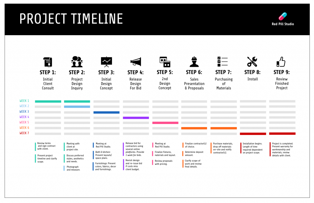
Use a timeline or sequence structure when your content has a natural chronological order, such as project stages, onboarding steps or a customer journey.
This template walks the reader through a full project timeline. The top-to-bottom sequence mirrors how the work actually happens, so readers don't have to figure out where to look next.
Numbered boxes with directional cues
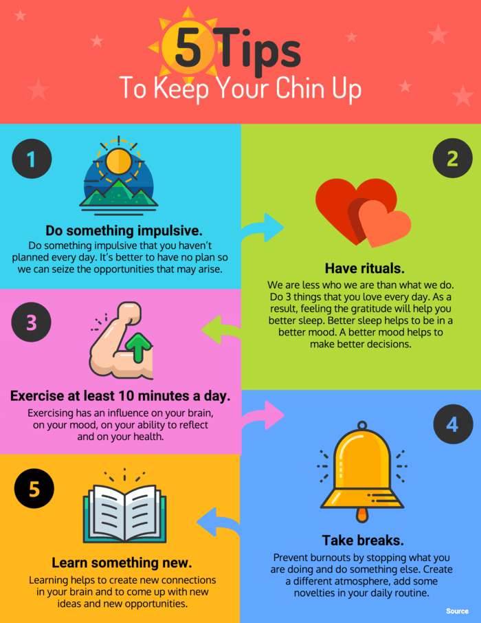
Numbered boxes and arrows do the navigation for the reader. Even if they skim, the numbers tell them the order and the arrows show which direction to move. This layout works well when your steps aren't visually obvious on their own, like a decision-making framework or a workflow with branching points.
This infographic template uses numbered boxes and arrows to keep the reader's eye moving in the right direction.
Step-by-step process layout
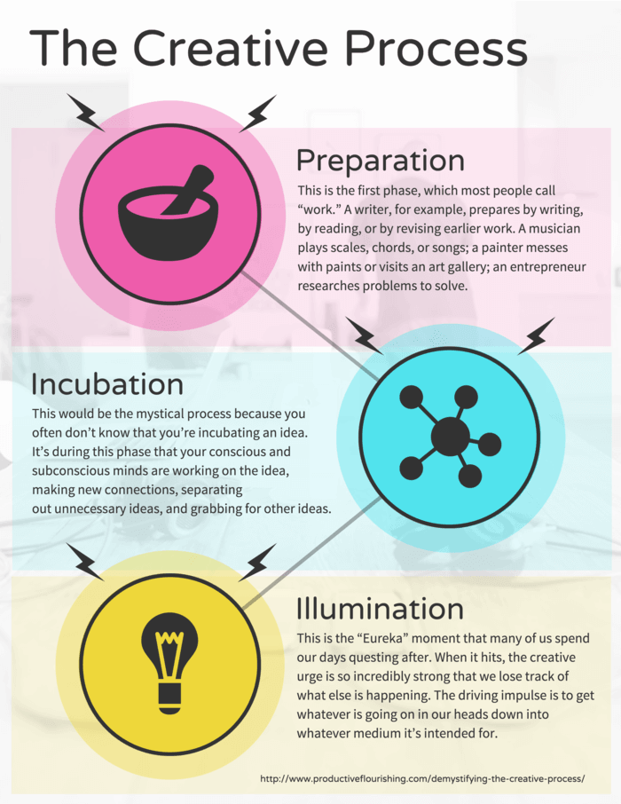
Process infographic, like this one break a single task into visible stages, one per section. Each block gets equal weight, which easily guides the reader through a process or workflow.
P. S. — Watch this video to learn how to design the perfect infographic:
2. Select the right infographic layout
Picking the right layout for an infographic is one of the most crucial decisions. You can swap the colors and fonts, rewrite copy and even tweak the visual elements later, but if you pick the wrong layout, you need to start all over again.
Let's understand how to pick the most appropriate infographic layout.
List layout
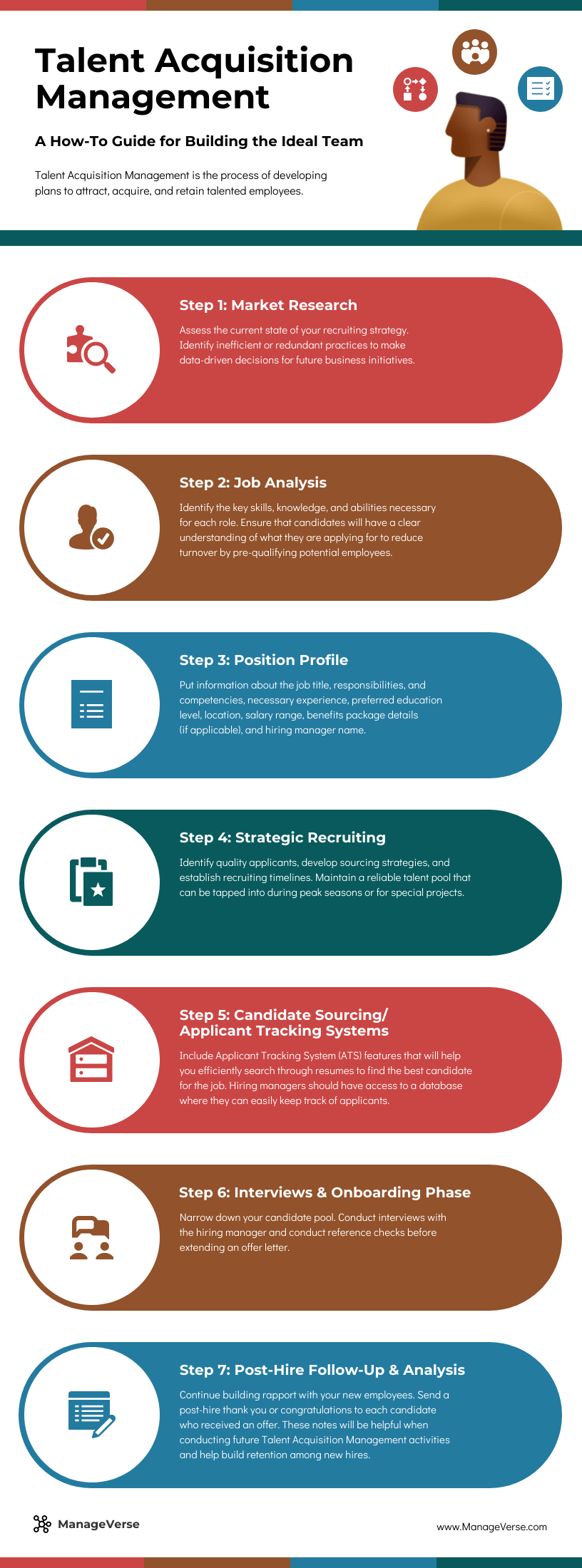
Use a one-column list layout for a clean, minimal design, like the one in this infographic template. The clear sections and vertical flow make it a good fit for step-by-step processes, workflows, checklists and how-to guides where readers need to move from one point to the next.
Comparison layout
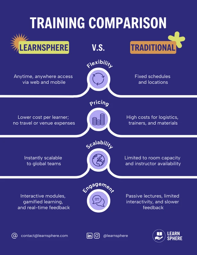
If you want to compare two things, go with a comparison infographic template. The template below, for example, compares e-learning vs traditional learning.
The side-by-side text placement along with relevant icons the make the infographic easy to scan and understand. You can use the same format to show a before-and-after, highlight pros and cons or do’s and don’ts, or compare data side by side.
Statistical layout
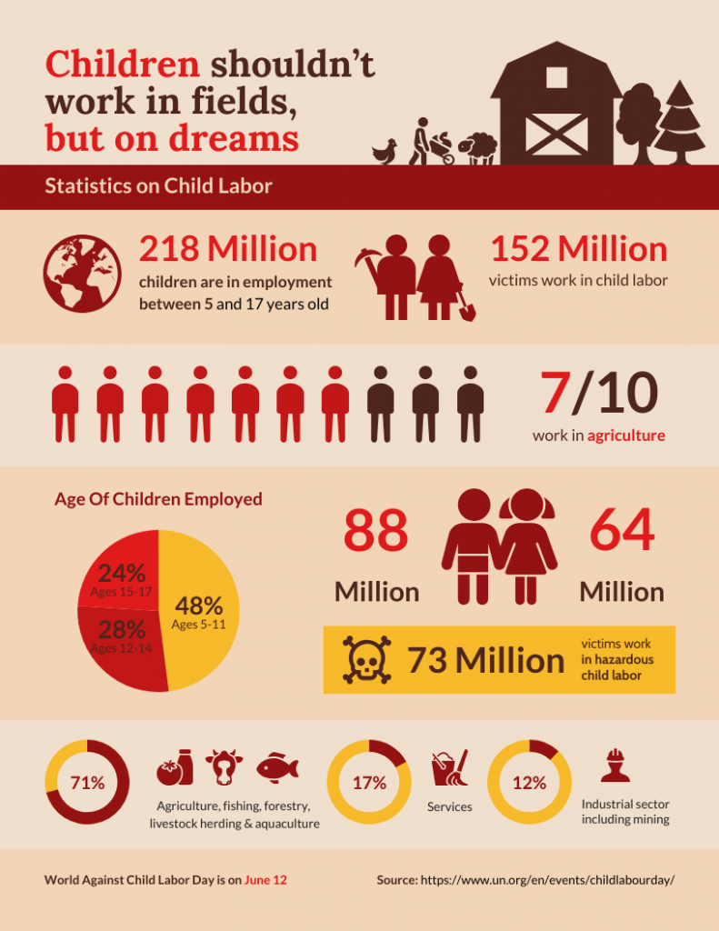
.Go for a statistical infographic if you present a survey data, research findings or standalone stats.
This template, uses a staggered two-column infographic design to present the stats. There's no set reading order, which lets readers scan and stop wherever a stat catches their attention. You can use this layout when your content is a collection of related facts that don't need to be read in sequence
This quick video will help you pick the best infographic layout for your data:
3. Use an AI infographic generator
You no longer need to spend hours designing an infographic manually. An AI infographic design tool can help you create a professional design in minutes, all with a simple text prompt. Describe the type of infographic you want, generate different layouts and easily customize the AI-generated infographic.
However, the overall quality of your design depends on your text prompt and how you edit the result. So, be clear about what you want to communicate, who it is for and how much information you need to include. The key is to give AI enough information about what you want to create, including the topic, key points, infographic type and visual style.
Venngage AI Infographic Generator is one of the best options you can use to create infographics with less manual design work, even if you're not a designer.
Add a description of the infographic you want and let Venngage AI create the first design.
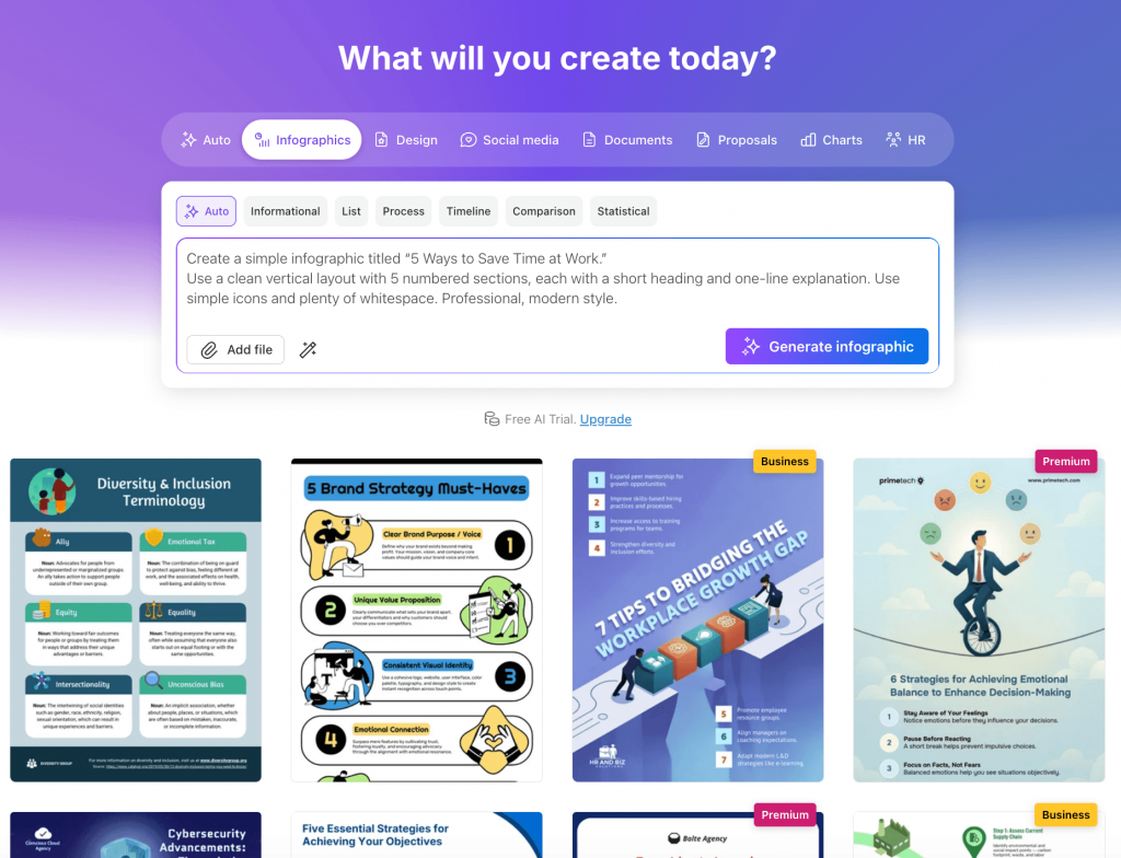
I tried to create an infographic on '5 Ways to Save Time at Work,' and here's what Venngage AI generated. You can generate statistical, process, list, comparison and other types of infographics easily with Venngage.
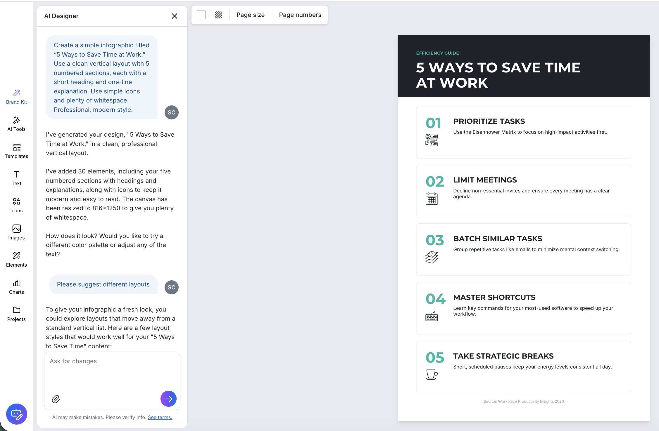
If you want to try a different layout, ask the AI designer in the chat to suggest different templates. You can keep experimenting until you find a structure that presents your content clearly. Venngage AI will automatically apply your content to new template.
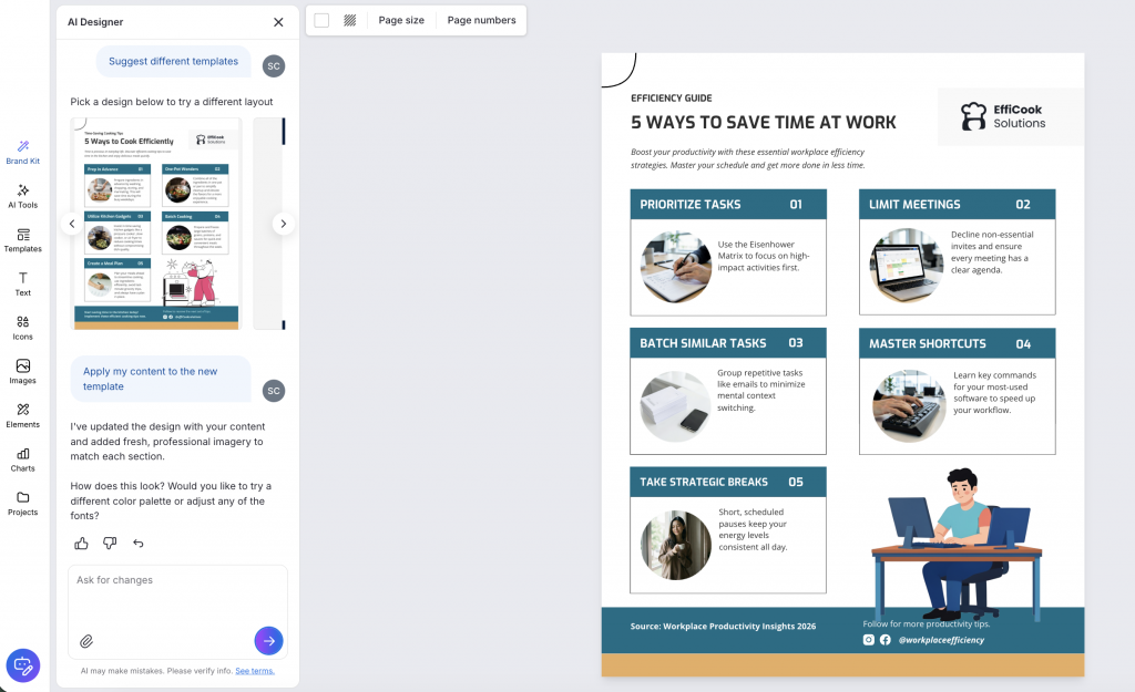
Once you have the layout you want, refine the design by testing different color palettes and fonts, generating custom icons and more. Here’s what you can do with Venngage AI:
- Create visuals that fit your topic: Generate custom icons and images with AI instead of spending time searching for visuals that match your design.
- Make your copy easier to read: Use Venngage’s AI Writing Assistant to shorten, rewrite or refine text so your infographic is easier to scan.
- Get feedback on your design: Ask the AI Designer to review your infographic and suggest improvements to the layout, content or overall design.
- Keep your infographic on-brand: Use My Brand Kit to apply your brand colors, fonts and logo without having to format each element manually.
4. Visualize your data correctly
A study shows that using graphs, charts or tables along with the text helps process the information better and promotes deeper learning.
However, adding charts is usually the hardest part of designing an infographic. The wrong chart type buries your finding, while a chart with no context leaves readers guessing. Here's how to ensure proper data visualization in an infographic.
Choose the best chart types for your data
The best chart for an infographic depends on what you want the reader to understand from your data.
Are you highlighting a single important number? Is the infographic a comparison between multiple data points? Or, are you showing some trend over time?
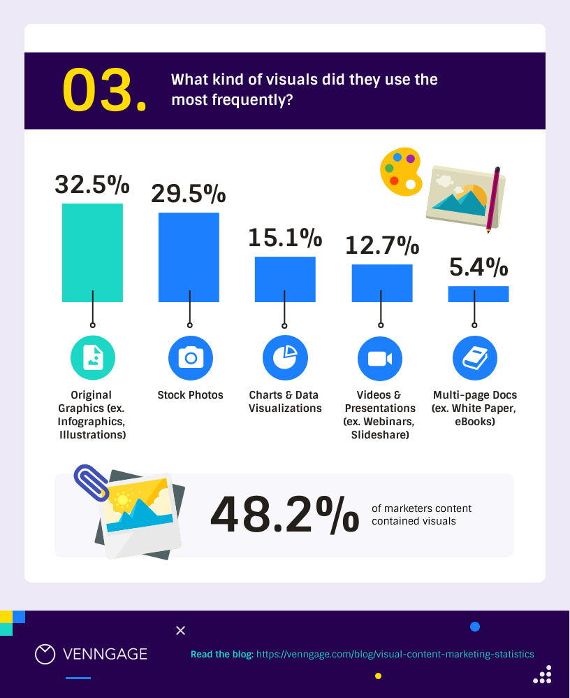
The most common chart types used in infographics are pie charts, bar charts, column charts and line charts. For example, bar or column charts work well when you want to compare different categories.
This template uses a bar chart to show the most common type of visual content format marketers use frequently. It also highlights a hero statistic, making it easier to interpret the data.
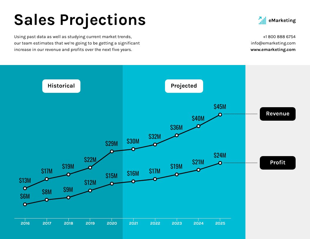
A line chart is the go-to choice for showing trends over time. This template works best to show past performance and project growth for a given period.
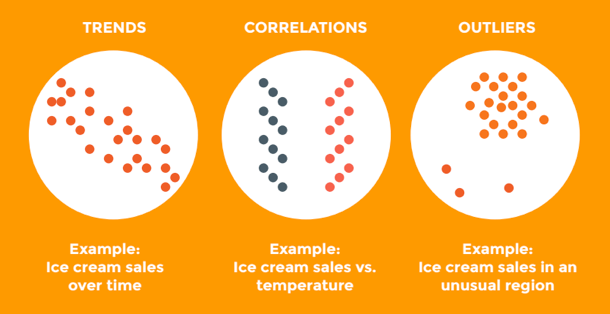
If you think of a more unconventional chart that would convey your data effectively, don't be afraid to get creative.
For example, you could show trends (like sales over time), correlations (like sales compared to temperature) or outliers (like sales in an unusual area) using scatter plots:
Add the right context to support your charts
Charts show the data, but they don't always explain what it means. Add a short finding alongside each chart to highlight the key takeaway.
Don't just label the chart with a topic like “Email performance by industry.” You need to tell the reader what the data shows, such as “Healthcare emails outperform retail by 2x.”
Design the chart based on the use case and platform
The chart you create for a blog post might not look good in a presentation or social post. Choose the chart size and level of detail based on where people will see it.
- Blog posts: You have more room to explain the data, so detailed bar charts, line charts and annotated charts can work well. Use a short takeaway above or beside the chart to help readers understand what to look for.
- Presentations: Keep charts focused on one takeaway. Remove unnecessary labels and data points, enlarge the key number or trend and make sure the chart can be understood from a distance.
- Social media and carousels: Simplify even further. Use fewer data points, larger labels and strong visual hierarchy so the chart makes sense at a glance on a phone.
- Long-form or vertical infographics: You have more space to build a story, so you can combine charts with explanations, supporting statistics and annotations. Use the available space to guide readers from one finding to the next.
Want to visualize your data effectively? Try Venngage AI Chart Generator. All you need to do is simply add a text prompt or upload a CSV or XLSX file.
Venngage AI will analyze your data and create a custom chart infographic with a professional layout and relevant text and icons. It even recommends other suitable chart types based on your data format.
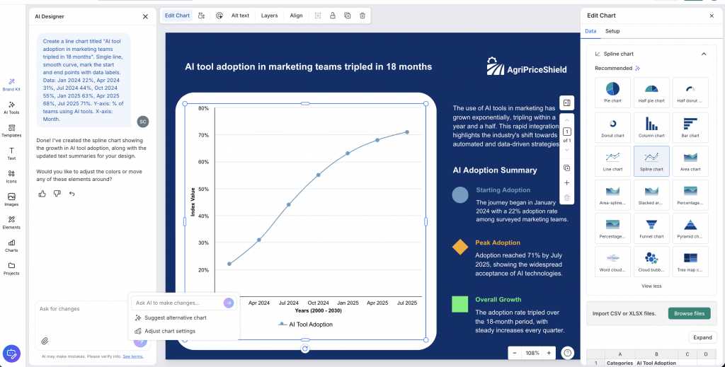
You can try different chart types with one click, without having to rebuild the chart each time. This makes it easier to compare different ways of presenting the same data and choose the one that works best for your message.
5. Leverage contrasts
Contrast creates visual impact by placing two strikingly different elements next to each other. If an infographic has a light background with bold-colored shapes, the bold colors immediately attract our eyes. This allows you to organize information by making certain elements more prominent than others.
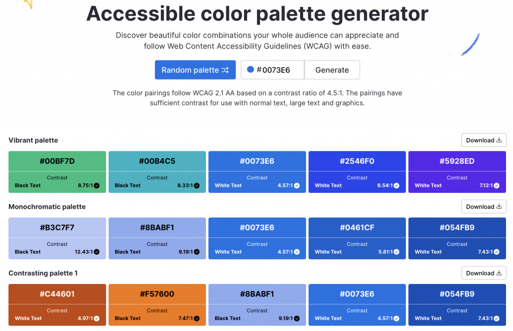
Use contrasting colors
Color selection can have a big impact on your infographic design.
Try pairing complementary colors to make your headline pop. One of my favorite combinations is a darker blue with a brighter color like orange. Here's an example:
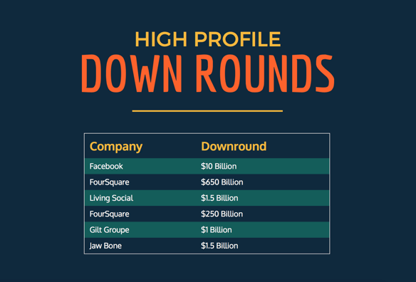
Pro Tip: Try Venngage's Color Palette Generator to ensure your infographic has sufficient color contrast.
Add contrast with visuals
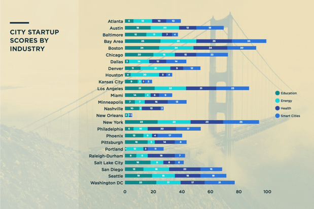
Use a tinted image or background and contrast it with a chart overlay to add context to your infographic. In this example, an image of the Golden Gate Bridge immediately implies the topic of the infographic: cities.
Contrast using typography sizes
The header is usually the largest text on an infographic, followed by the subheader and then the body copy. The header should always be in the largest point size so viewers understand the subject of your infographic right off the bat.
6. Write a compelling title
Come up with a title that's catchy and descriptive. I know, easier said than done.
Make sure the title communicates the most important information right off the gates. Otherwise, the readers not be invested enough to keep reading. Remember the three Cs: be clear, crisp and concise.
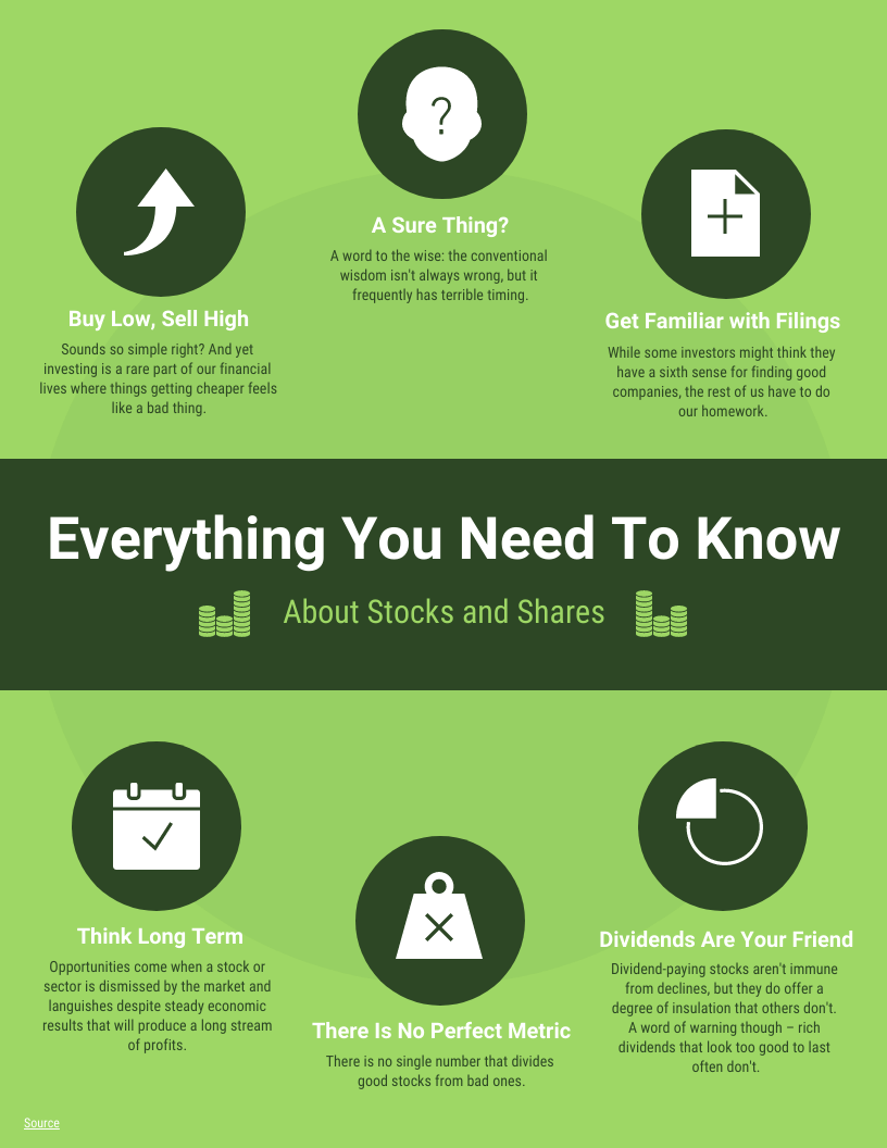
The title of this infographic has two numbers — a technique that copywriting gurus would approve. That's because headlines with numbers grab more attention and shares on social media.

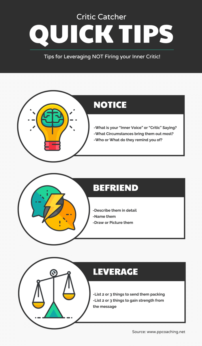
Typography can also help emphasize your title. For example, this infographic design makes use of a big, bold headline and a specific subheader. Readers know exactly what information they're going to get:
7. Use a grid design
Grids and wireframes provide a structural basis for any design, including infographics. Designing on grids allows you to easily organize elements and information. Grids also help you to keep design elements aligned.
For example, when aligning items in a tall infographic, you can reference the same vertical grid lines and space each list item accordingly.
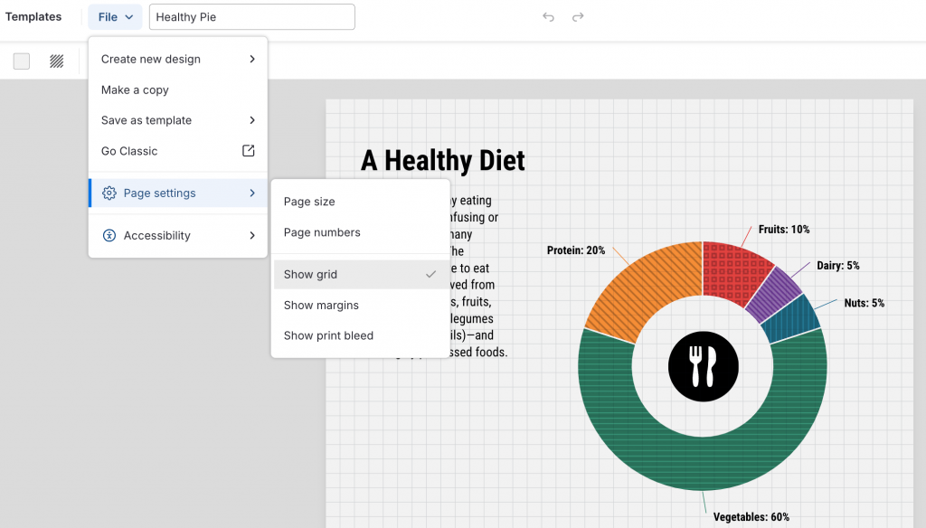
The image below shows how color palettes are aligned on a graphic design grid. Venngage gives you the option to add grids to your design. Just click on the File option at the top navigation menu, select Page settings from the options, and click on Show grids:
For your infographic design, you can use grids to create margins. Make sure you keep enough space between your elements and the edge of your canvas to avoid visual tension.
Your margins can be any size you want, but it's important to keep them consistent across the design. A good rule of thumb is to keep all objects and elements at least 20px (one square on the grid) away from the edge of the canvas.
8. Incorporate different design elements
Spice up your infographic designs by mixing and matching different infographic elements. Besides images, charts and icons, you can also choose different fonts to make your infographic stand out.
Font psychology can help you choose fonts that match the tone of your infographic. If you are creating a business infographic, use professional infographic fonts, such as Helvetica, Times New Roman or Arial. For more modern, casual infographics, such as social media or trend-focused infographics, try fonts like Montserrat or DM Sans.
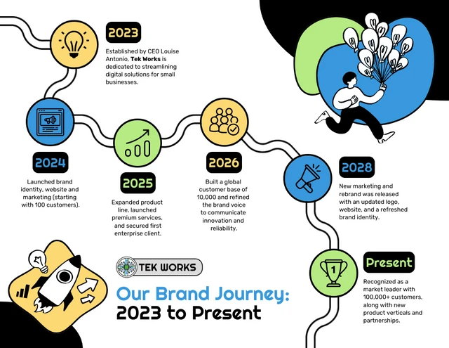
Look at this infographic. It uses the playful Righteous font for headings and Rubik for supporting text. The combination gives the infographic a fun, approachable feel without making the smaller text difficult to read. You can use a similar approach by choosing a more expressive font for headings and pairing it with a simpler, readable font for body text.
Also, try to limit the amount of text you use in your infographic. The best infographic designs focus on visual content, with text playing a supporting role.
Make sure your text is legible. In most cases, avoid decorative or script-style typefaces since they are hard to read.
To keep your infographic designs cohesive, limit your use of fonts to a maximum of three types. But don’t stick with just one. A tasteful use of two brand fonts can create a nice dynamic and hierarchy of information.
You can take a simpler approach like this infographic design, which uses one font for headers and another for body copy:
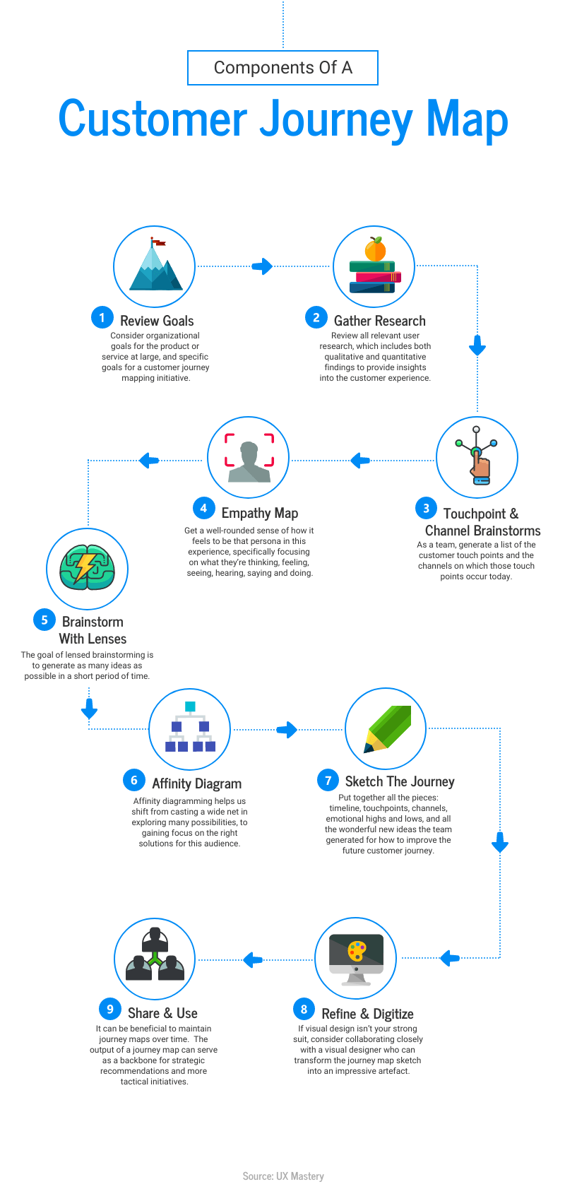
Similarly, you can use one font type for communicating numbers and statistics and another font for texts to create a hierarchy of information:

9. Add custom images
One of the best ways to make your infographic more engaging is to use images that relate directly to your topic or help explain the information.
This New York infographic uses a large illustration of the Statue of Liberty as the main visual. It immediately tells you what the infographic is about and makes the design more eye-catching. Other illustrations, such as the Empire State Building and airplane, support the topic without taking attention away from the main image.
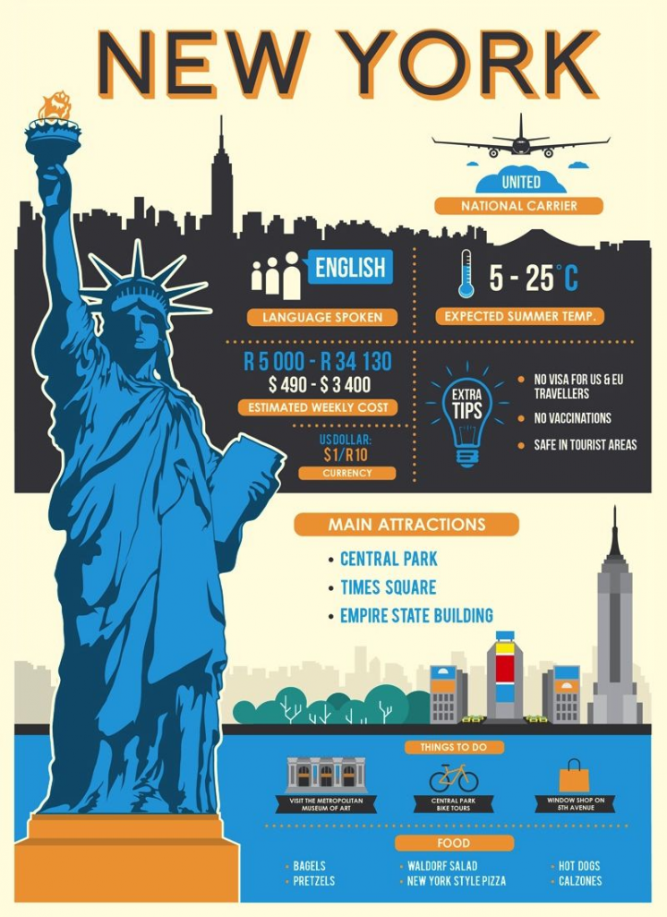
Source: Getaway Magazine
Picking the right images for an infographic can be tricky. You can use stock photos that are royalty-free from places like Pixabay, Unsplash or Pikwizard. But they can make your infographic look generic.
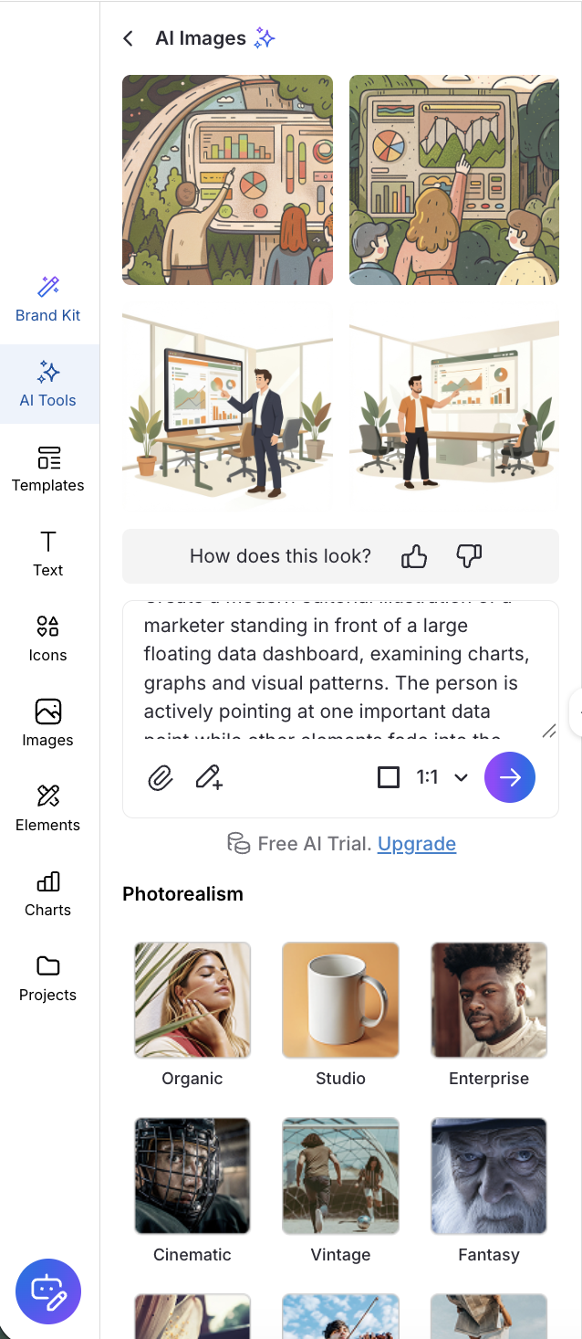
For something more unique, try creating custom images that fit your topic and design. Venngage’s AI Image Generator lets you create custom images and illustrations in different styles, including vintage, cinematic and fantasy.
Whatever images you choose, make sure they feel like they belong together. Stick to a consistent visual style, with similar lighting, backgrounds and composition. Mixing completely different styles can make the infographic feel disconnected and distract readers from the information.
10. Create balance
An infographic with a visual balance is pleasing to the eye. A balanced design keeps the entire composition cohesive — especially in a long-form infographic.
For example, if there are heavy visuals at the top of an infographic, keep the flow going right to the bottom of the piece with heavier visuals throughout.
Remember that there are two types of balance: symmetrical and asymmetrical. Symmetrical balance is when each side of the composition has equal weight. This layout is effective in a comparison infographic, like this one:
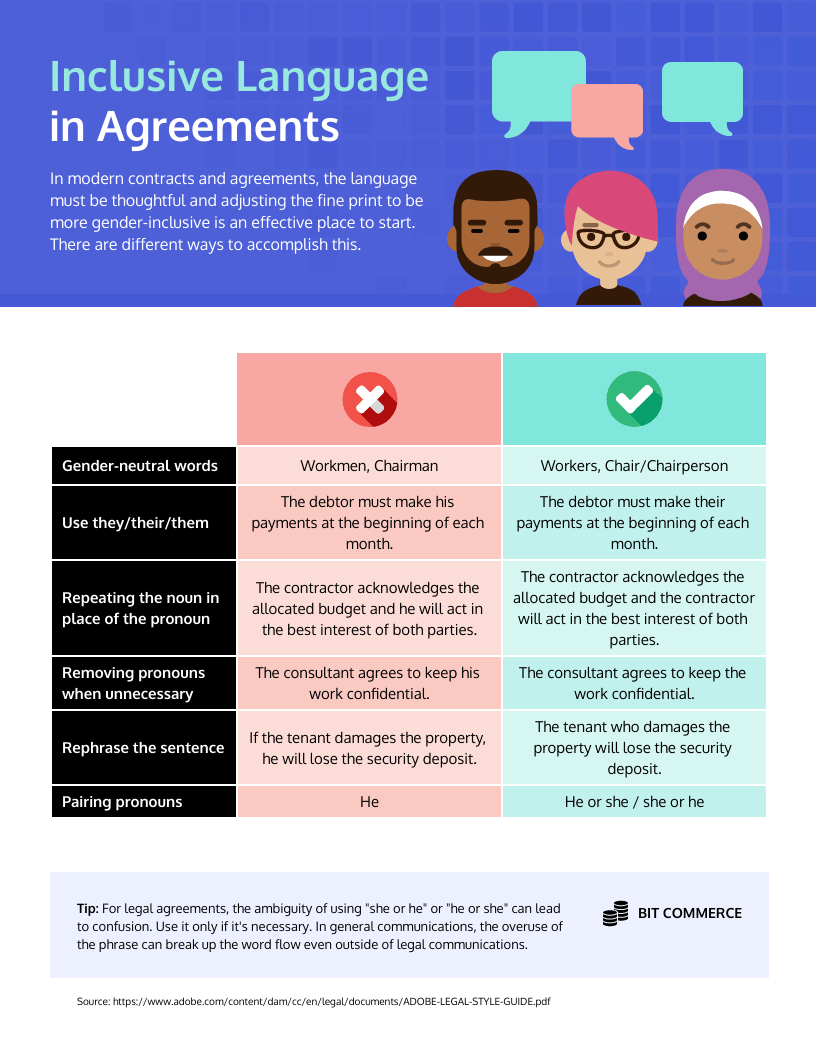
Asymmetrical balance is more natural and less uniform than a symmetrical composition. It creates a more complex relationship between objects and can make an infographic more dynamic.
For example, if you're making a timeline infographics, alternate the text boxes between both sides of the timeline for an asymmetric composition:
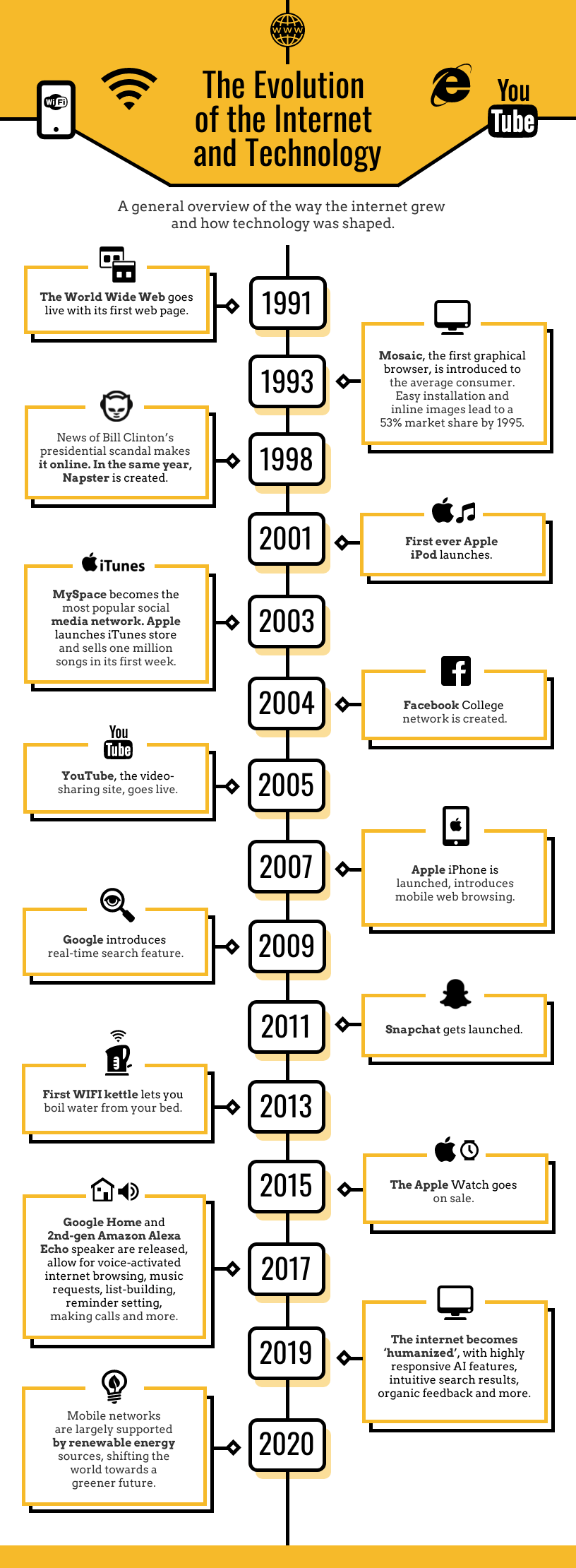
Want to create a timeline infographic like this? Check out these creative timeline templates.
11. Use color effectively
Decide on a color scheme before making your infographic. A good rule of thumb is to design your infographic with two or three main colors and use additional colors for minor accents.
Did you know that most buyers make 62-90% of snap judgments about products are based on color alone?
When choosing your color scheme, decide on the tone of your infographic. Is it a business infographic? If so, try using neutral colors like blue or green. Or perhaps you would want to use your brand colors, especially if you're using your logo in the design.
Use brighter hues for fun, eye-catching infographics. Just be careful not to use large amounts of dark or neon colors since they can strain the readers' eyes.
You can also use color to divide up your infographic designs. Add blocks of color to create sections within your infographic. This helps guide the eye as viewers scroll down:

Source: Anegis
Here is a free Color Palette Generator tool to help you choose the right color for your designs.
For more tips, check out our blogs on the best color palette generators and the best color palette tools for businesses. Or check out this series to explore some popular color palette options:
12. Maintain consistency
Keep design elements consistent for a smooth infographic flow. For example, if you're using filled-in icons, rather than line art icons, keep it the same throughout your entire infographic:
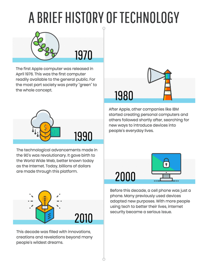
The same concept applies to the style of images you use, your font style and your color palette. Keeping all these elements consistent will prevent your infographic from looking cluttered, and will actually make it easier to read.
If you plan to share your infographics widely in the public domain, you'll also need to maintain brand consistency across your designs for easy recall and recognition.
Not sure how to use infographic icons properly in your designs? Tune into this short 3-minute video:
13. Leverage negative space
Negative space is the blank space surrounding objects in a design. Negative space has a big impact on design. Design experts claim that increasing space between paragraphs and margins can improve comprehension by up to 20%.
If your infographic is cluttered with too many elements, it can overwhelm viewers and make it difficult to read the information.
Creating space around the elements in your design gives readers breathing room to process the information.
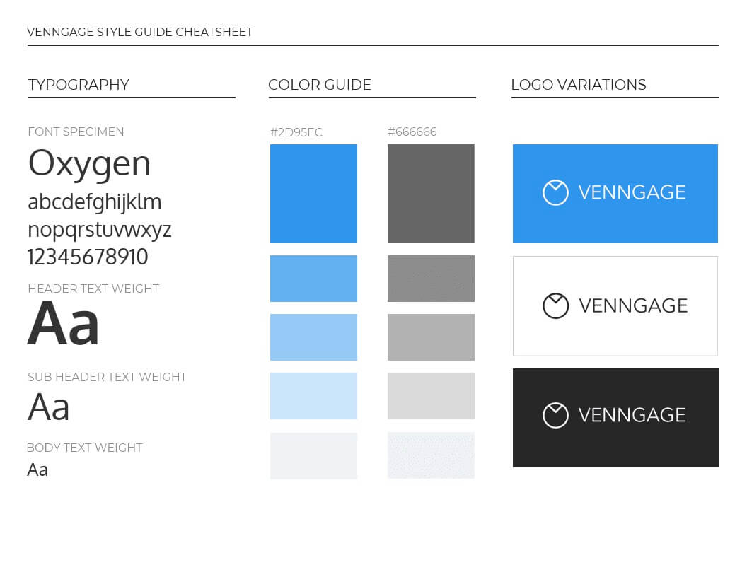
Leaving negative space can be as simple as making sure there's enough space between lines of text. Just look at the difference a little space makes in the example below:
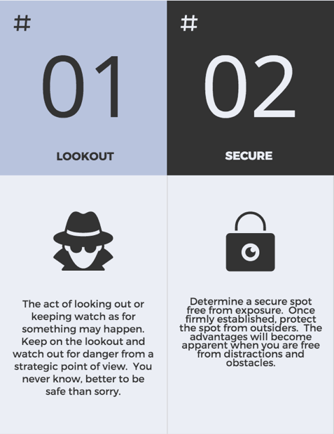
Pro tip: If you're using a font with 16pt size, your line height should be no less than 1.2.
What are some common mistakes to avoid when creating infographics?
Creating effective infographics requires attention to detail and strategic design choices. Here are some common mistakes to avoid:
- Information overload: Too much data can overwhelm readers. Focus on key points and simplify complex information.
- Poor color contrast: Low contrast reduces readability. Use contrasting colors for text and background.
- Inconsistent design elements: Mixing different fonts and styles looks unprofessional. Keep a consistent style throughout.
- Lack of visual hierarchy: Organize information so readers know where to look first. Use size and positioning to guide attention.
The difference between good and not-so-good infographic design
It's no accident that infographics have emerged as a sought-after visual content medium across all niches. Done well, infographics can help you communicate complex information visually and in an engaging way.
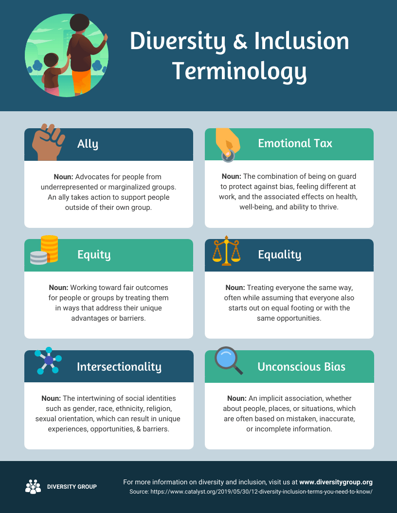
Here's an example of a good infographic:
But for every well-made infographic, there are a handful of bad infographic designs circling the web.
Poorly designed infographics can skew and obscure information, rather than make it easier to understand.
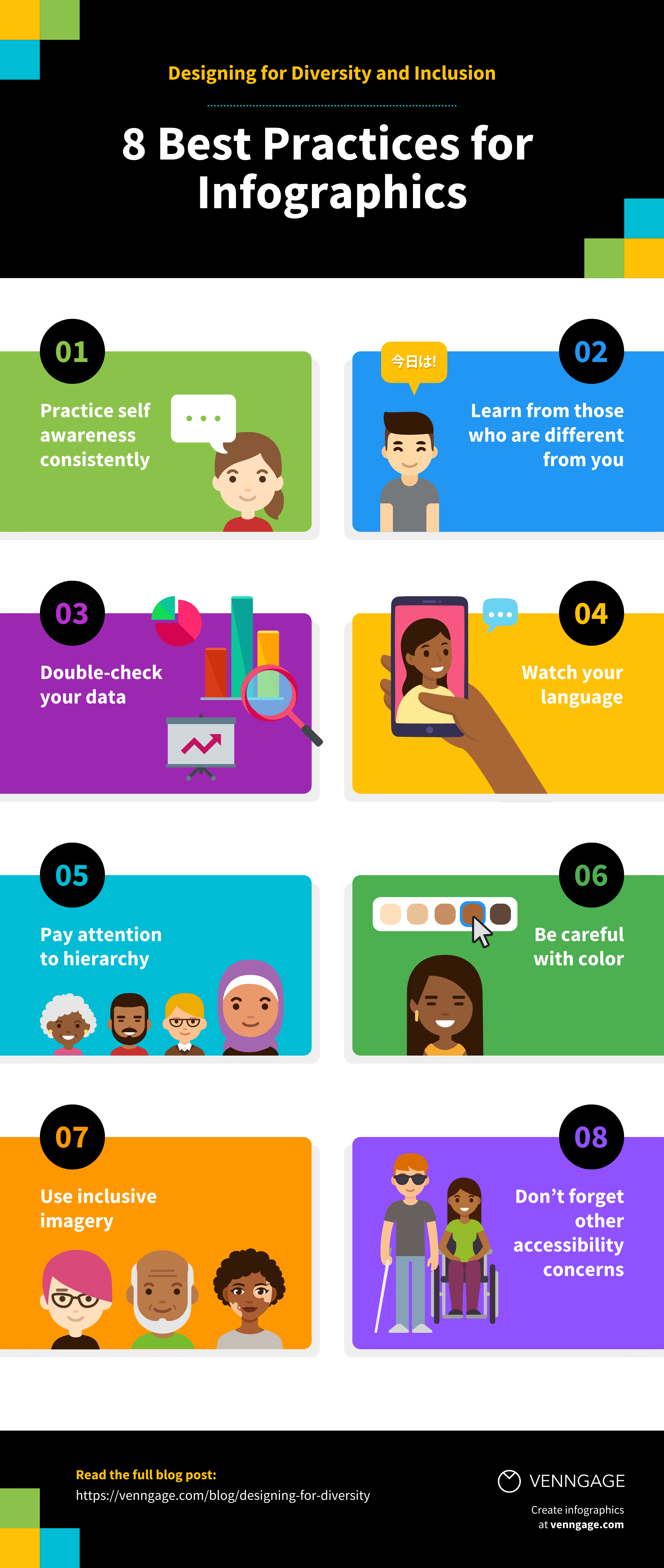
So it's worth taking the time to form a basic understanding of infographic design best practices. If you want to avoid the mistakes of designing a bad infographic, just choose a pre-made infographic template like this one.
Ready to start making infographics?
Creating the perfect infographic often takes a few rounds of revisions to get right. You'll need to play around with what works and what doesn't. If you're like us, you'll design a few duds before you make a masterpiece.
Luckily, you can shorten the learning curve by using a ready-to-use infographic template. You can also refer to infographic examples for you to draw inspiration from.
One last tip: When in doubt, ask someone else to look over your design before you publish it. Sometimes, you need a fresh set of eyes to tell you what works and what doesn’t.