


Infographic outlines are essentially the recipes for creating high-quality infographics.
When crafting an infographic outline, the written content serves as the list of ingredients, while the notes you include act as the step-by-step instructions, guiding the design process. To make the process even easier, you can use free infographic templates or an infographic maker to streamline your workflow and ensure a professional look.
In this step-by-step guide, I cover:
- How to create an infographic outline from scratch
- How to create an infographic outline from existing content
Let’s get cooking.
How to create an infographic outline from scratch

Create an infographic outline from scratch by following these 6 steps:
- Decide on a topic for your infographic
- Decide on the question(s) you want to answer
- Choose a tool for collecting data
- Collect and organize your data
- Add headers, subheaders and general findings to provide context/relevance to your data
- Include design notes
Pro Tip: To create a process infographic like this one, use our process infographic maker.
1. Pick a topic for your infographic
When deciding on a topic, you should think of something that’s insightful, solves a problem or answers a question. For a more in-depth guide on picking a topic for your infographic, check out this post.
As an example, I collected data on something that is hugely important to any workplace setting:
The Netflix habits of my coworkers.
I sent out a survey to the hardworking and tireless team at Venngage and asked about their Netflix habits. It was part of my plan to make us seem cool and relatable, so that you couldn’t help but like us and think we’re awesome.
2. Decide what question(s) you want to answer in your infographic
Once you’ve got a topic in mind, you’ll need to formulate your questions and determine a way of getting getting your answers.
I decided I want answers to these burning questions that keep me up at night:
- How many hours in a week do my coworkers spend watching Netflix?
- What are my coworkers’ top 3 shows/movies?
- How true is the statement, “Hours of excessive Netflix viewing has resulted in feelings of guilt right afterwards”
- If Netflix didn’t exist, how do my coworkers think their time would be spent?
Once you have your questions, you can also get your answers in a number of ways. A few ways to collect data are:
- Conducting your own research
- Accessing academic sources
- Using Google search hacks
- Using existing data repositories
For a more detailed guide on conducting research, check out this blog post.
3. Choose a tool for collecting data
If you’re conducting your own research, you’ll need a tool to collect your answers somehow. One way to do that is to send out a survey or poll. I decided to create a survey.
If you’re thinking of something similar, you can use one of these popular choices:
I sent out my survey, refreshed my inbox, stared at the clock for a few minutes and started pestering my coworkers to check their emails. The responses started coming in over the next few days.
4. Collect and organize your data
Sweet Christmas! All my survey results came in and now I get to organize my data. I exported my data into a spreadsheet which looked like this:

I wanted to see the survey responses so I ignored other things that got measured (respondent IDs, survey completion dates, survey completion times, etc.).
Basically, I listed each question down on a separate document, followed by the volume of each response. For some of the qualitative questions I asked, I determined what the most common answers were by just tallying them up.
So as I gathered my data on a new document, it ended up looking like this:

I repeated this process for all my questions. Once the data from my Netflix survey got organized and laid out, I had the body to my outline.
But on its own, it was just raw data and meant nothing.
5. Add headers, subheaders and general findings to provide context/relevance to your data
The infographic can’t just be information listed out, it needs to explain what has been shared.
That means I need to:
- Add a title
- Provide a brief introduction of the data I’ve collected
- Group my various data sets under their respective headers
- List key takeaways (my unique findings).
Here’s what that looks like:

I summarized my findings in words to reinforce the story that the data told. There was more to the data than what I pointed out alone, but what I brought up were the most important facts relevant to the survey.
Once your data and your points are clearly laid out, you’re at the last step.
6. Include design notes in your infographic outline
If someone handed off a bunch of ingredients to you and said, “Make lemon-herb grilled salmon”, you might not know where to start or it would take you a long time.
It’s sort of the same thing if someone handed you a sheet of point-form notes, and said, “Can you turn this into an infographic? That’d be great,” and walked off.
If you’re the designer, the notes are reminders for yourself. If you’re handing off the design to someone else, the notes will serve as instructions.
To avoid any confusion between the notes and the actual content itself, I leave notes in the headers and footers of a document.
Your design notes might look something like this:
- For design: refer to [example infographic]
- Include company logo: [link to logo]
- For page format: landscape orientation, multi-pager
- Page dimensions: letter-size (8.5×11)
- Color scheme: use company color scheme, refer to link: [example link]
For my Netflix survey infographic outline, I made very specific notes.
If you take a look below, you can see in the header that I included a link to an infographic I liked. I also indicated the type of page layout I want and the fact that a logo needs to be included.
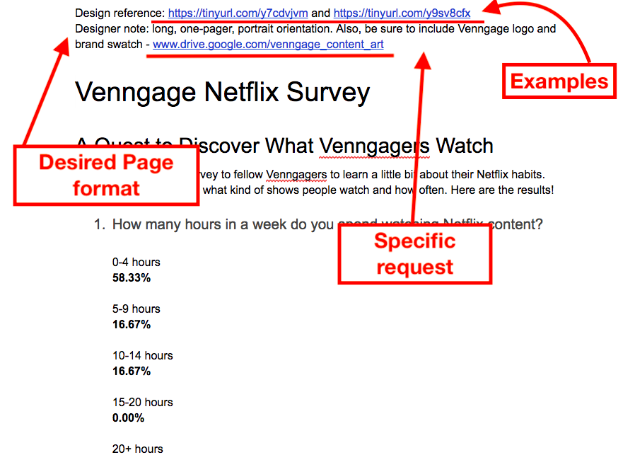
We all know the day brings many distractions (cats) so I need to stay organized.
With clear notes in place, I can always come back to this outline and remember that there were three very specific things to keep in mind while working on this particular infographic.
But what’s this? You say you’ve already got content, do you?
Well, in that case, you’ll be following a slightly different process.
How to create an infographic outline from existing content
Let’s say you want to repurpose some existing content into a visually engaging infographic. It could be a presentation, a post for another publication or part of a newsletter, etc.
Or maybe you haven’t published it yet, but seeing your lengthy, dry content has made you realize it’s missing something.
So, like all smart content creators, you decide you’ll turn your content into an attractive and engaging infographic.

Create an infographic outline from existing content in 4 steps:
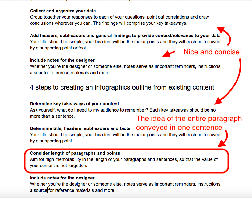
- Determine key takeaways of your content
- Determine title, headers, subheaders and facts
- Consider length of paragraphs and points
- Include notes for the designer
1. Determine the key takeaways for your infographic
Alright, first we strip. Our content, that is.
We strip our content to its key takeaways. Ask yourself, what do I need my audience to remember? If they’re going to forget how awesome my writing style is, my wonderful jokes and extensive vocabulary, then what should they leave with?
I transformed this particular post itself into an outline for you, to show you what you should end up with. Below is a snapshot of this article:

As it is, there’s way too much written content in this post to cram into an infographic.
What I did was identify the essential need-to-know facts that are of value to my readers, that can be grasped within seconds of viewing my infographic.
So once I started reducing the existing content to the most important bits of information, my content became a series of headers and points.
That brings us to the next step.
2. Determine title, headers, subheaders and facts
Above, in the outline version of this post, you can see what stayed the same and what drastically changed. Your title and subtitle can stay the same.
But each header in my article became one of the major points for my infographic outline. Then, after each header or subheader, I summarized a key takeaway in one or two sentences.
Here’s another possible way to organize content for an infographic:

It’s similar to the first example, but there are just less headers and list-type sections summarizing the content.
3. Organize your information using descriptive section headers
When crafting your outline, you want to balance how informative the content is with how it’ll appear in an infographic.
For example, if all this stuff you’re reading now was slapped into an infographic, it would look crowded. The pile of words would look as if it was forcefully crammed in with everything else.
Instead, if I just sum up the essence of these points into one sentence, then I know my reader will remember the content.
In the example below, you can compare the length of this subsection to how it appears in the outline. I circled it:
Our last step, whether the infographic outline is for fresh content or old, stays the same.
4. Include design reference notes
As I mentioned before, whether you’re creating an outline for brand new content or existing content, the role of notes in your outline doesn’t change.
If you’re the designer, then the notes are reminders that keep you on track, while for another designer, the notes are instructions. Here’s the snapshot again for your reference:
Conclusion
So that’s all there is to creating easy-to-understand infographic outlines. If you’ve got any thoughts or questions, just comment below. Also, feel free to explore our design blog further for more guides, how-to posts, and ebooks on content creation, design and other topics.
More infographic design guides:
- How to Make an Infographic in 5 Steps
- How to Pick Colors For Your Infographic
- How to Pick Fonts For Your Infographic
- How to Use Icons in Your Infographics


