Whether it’s the serenity of a clear blue sky or the dazzling brilliance of a sparkling blue ocean, humans have for centuries been drawn to a variety of blue shades. Today, blue remains the world’s favorite color, so let’s explore these best blue color palettes you can try in your next design.
What aspects about your brand can you express by using a blue color palette, which popular brands today use blue and how can you create your own cohesive blue color palette? Explore all things blue before you get started on your next Venngage design project.
Blue Color Palettes with Hex Codes
Explore 21 blue color palettes for design inspiration.
| Palette Name | Color Swatches | Hex Codes |
|---|---|---|
| Burnt Sienna Orange + Bedazzled Blue | #3d5a80, #98c1d9, #e0fbfc, #ee6c4d, #293241 | |
| Imperial Red + Space Cadet Blue | #2b2d42, #8d99ae, #edf2f4, #ef233c, #d90429 | |
| Orange + Honey Yellow + Prussian Blue | #8ecae6, #219ebc, #023047, #ffb703, #fb8500 | |
| Candy Pink + Rose Desert + Y in Mn Blue | #355070, #6d597a, #b56576, #e56b6f, #eaac8b | |
| Paradise Pink + Caribbean Green + NCS Blue | #ef476f, #ffd166, #06d6a0, #118ab2, #073b4c | |
| Lemon Meringue + Prussian Blue | #003049, #d62828, #f77f00, #fcbf49, #eae2b7 | |
| Orange Web + Oxford Blue | #000000, #14213d, #fca311, #e5e5e5, #ffffff | |
| Carolina Blue + CG Blue | #ffffff, #00171f, #003459, #007ea7, #00a8e8 | |
| Cyber Yellow + Royal Dark Blue | #00296b, #003f88, #00509d, #fdc500, #ffd500 | |
| Shades of Blue | #03045e, #0077b6, #00b4d8, #90e0ef, #caf0f8 | |
| Midnight Eagle Green + Metallic Seaweed | #177e89, #084c61, #db3a34, #ffc857, #323031 | |
| Sage + Ming + Indigo Dye | #033f63, #28666e, #7c9885, #b5b682, #fedc97 | |
| Almond + Purple Navy + Oxford Blue | #f1dac4, #a69cac, #474973, #161b33, #0d0c1d | |
| Ruby + Bright Yellow Crayola + Sky Blue Crayola | #d81159, #8f2d56, #218380, #fbb13c, #73d2de | |
| Atomic Tangerine + Pacific Blue + Yale Blue | #f79256, #fbd1a2, #7dcfb6, #00b2ca, #1d4e89 | |
| Burnt Sienna + Cadet Blue + Columbia Blue | #dd6e42, #e8dab2, #4f6d7a, #c0d6df, #eaeaea | |
| Jet + Ming + Indigo Dye | #353535, #3c6e71, #ffffff, #d9d9d9, #284b63 | |
| Sunglow + Sizzling Red + Crayola Blue | #ff595e, #ffca3a, #8ac926, #1982c4, #6a4c93 | |
| Light Salmon + French Pink + Baby Blue | #70d6ff, #ff70a6, #ff9770, #ffd670, #e9ff70 | |
| Black Coffee + Duke Blue + True Blue | #3c3744, #090c9b, #3066be, #b4c5e4, #fbfff1 | |
| Cerise + Blue Crayola + Royal Dark Blue | #0a2463, #3e92cc, #fffaff, #d8315b, #1e1b18 |
Blue color meaning
The color blue has a range of physical and emotional effects on humans, including making us feel at ease while paradoxically being linked to feelings of sadness. Research has shown blue enhances productivity and lowers blood pressure.
In a business or corporate context, the color psychology of blue is connected to feelings of calm, confidence, security and trust. That’s one reason why so many businesses, from PayPal to GE, use blue as their primary brand color (more on that later).

Aside from the scientific links between blue and its effects on people, the fact is that blue is the most popular color in the world, according to a YouGov survey. In all 10 of the countries surveyed, blue was cited as the favored color by the biggest percentage of people. Keep in mind that when adding blue to your web projects, you should always use color calibration software to convey the colors as clearly as possible. Also, when discussing the popularity of blue, it’s worth noting that certain shades of blue, such as shades of teal, have gained increasing popularity in recent years.
Top blue color palettes for 2026
Looking for a blue color palette to reflect your organization’s personality? Check out the top blue color palettes for 2026 and why we think they might work for you.
1. Burnt Sienna Orange + Bedazzled Blue Color Palette

Hex Codes: #3d5a80 // #98c1d9 // #e0fbfc // #ee6c4d //#293241
Anchored by four shades of blue that range from light to dark with a burst of orange, this palette is ideal for designs that require high contrast as well as complementary shades. Pair the lightest and darkest blues for a visual pop.
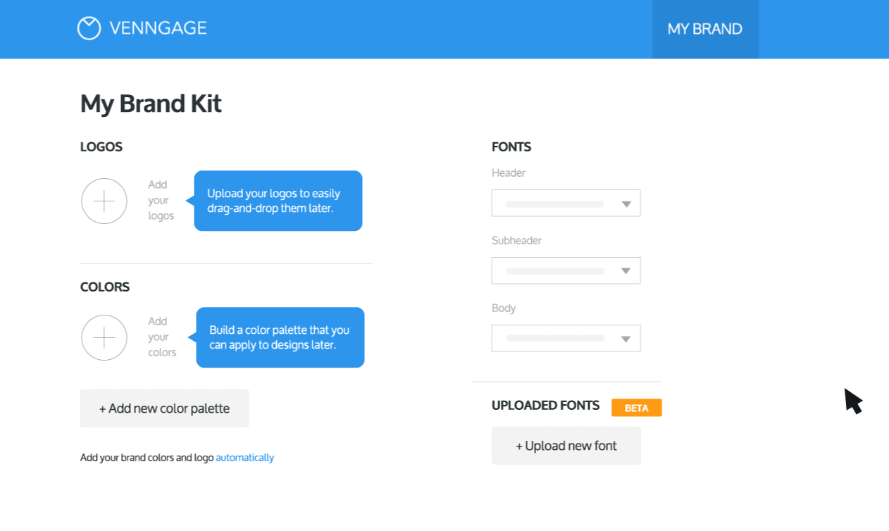
If you choose this color palette as your brand colors and want to apply it to your design, you can start by adding the Hex Codes to My Brand Kit in order to load the colors to your account:

Once that’s done, simply apply your brand colors to your design in one click (which can be done with a Business account):
2. Imperial Red + Space Cadet Blue Color Palette

Hex Codes: #2b2d42 // #8d99ae // #edf2f4 // #ef233c // #d90429
Inject energy and excitement into your designs with this palette that pairs a stately slate blue with bright-as-it-gets red. Use either of the reds as an accent color in your logo or other visual content to bring balance to your designs.
3. Orange + Honey Yellow + Prussian Blue Color Palette

Hex Codes: #8ecae6 // #219ebc // #023047 // #ffb703 // #fb8500
Explore the tropical side of blue with this palette that pairs a range of blue hues with two warm yellow/orange tones. A color scheme like this is ideal for brands that have a youthful vibe.
4. Candy Pink + Rose Desert + Y in Mn Blue Color Palette

Hex Codes: #355070 // #6d597a // #b56576 // #e56b6f // #eaac8b
Blue isn’t the star of the show in this color palette, but it serves an important purpose in creating calm. The dusky plum, rose and sand tones are an ideal complement for a sturdy, dependable blue shade.
5. Paradise Pink + Caribbean Green + NCS Blue Color Palette

Hex Codes: #ef476f // #ffd166 // #06d6a0 // #118ab2 // #073b4c
Show you’re unafraid of bright colors by using this energetic palette that covers almost the entire color spectrum. Every individual pairing creates visual contrast, making this color scheme ideal for inspiring accent or emphasis colors.
6. Lemon Meringue + Prussian Blue Color Palette

Hex Codes: #003049 // #d62828 // #f77f00 // #fcbf49 // #eae2b7
This color scheme calls to mind the dry, warm tones of the American Southwest while adding a splash of blue to cool things down. For buttoned-down corporate uses, pair the blue and lemon or bring a primary color vibe by matching blue with red.
7. Orange Web + Oxford Blue Color Palette

Hex Codes: #000000 // #14213d // #fca311 // #e5e5e5 // #ffffff
Oxford Blue is the single blue shade included in this palette, pairing it with neutrals like black, gray and white, and a bright pop in the form of orange. The blue-orange color combination is backed by color science, and because both shades are warm, they’ll contrast without clashing.
8. Carolina Blue + CG Blue Color Palette

Hex Codes: #ffffff // #00171f // #003459 // #007ea7 // #00a8e8
A mostly blue color palette doesn’t have to be boring, as this color scheme illustrates. With four blue tones that range from light and airy to nearly black, this combination is ideal for organizations in finance, tech and other serious fields.
9. Cyber Yellow + Royal Dark Blue Color Palette

Hex Codes: #00296b // #003f88 // #00509d // #fdc500 // #ffd500
Bring vibrance to your next design with this palette anchored by a nearly purple dark blue and energetic shades of yellow. If versatility is important for you, this palette offers monochromatic pairings and ones that are high-contrast.
10. Shades of Blue Color Palette

Hex Codes: #03045e // #0077b6 // #00b4d8 // #90e0ef // #caf0f8
Stay entirely in the blue family with this monochromatic color palette. Explore the diversity within the color by pairing an ultra-light blue with a nearly purple dark blue or ratchet the contrast down by using the middle-range colors side-by-side.
11. Midnight Eagle Green + Metallic Seaweed Blue Color Palette

Hex Codes: #177e89 // #084c61 // #db3a34 // #ffc857 // #323031
This earthy color palette offers green-leaning blues and two high-contrast red and orange shades that inject energy into the proceedings. Brands with an organic-but-serious personality would be ideal candidates for this blue color palette.
12. Sage + Ming + Indigo Dye Blue Color Palette

Hex Codes: #033f63 // #28666e // #7c9885 // #b5b682 // #fedc97
Speaking of organic, in this palette, blue is the big surprise, as it joins shades in the green-yellow range. Pair the creamy yellow shade with indigo and a dash of sage for balance.

Hex Codes: #f1dac4 // #a69cac // #474973 // #161b33 // #0d0c1d
Amp up the serenity in your brand’s identity by using this blue color scheme that leans heavily purple. Just looking at this palette is enough to make you sleepy, which means it’s ideal for organizations that need to project a sense of calm.
14. Ruby + Bright Yellow Crayola + Sky Blue Crayola Color Palette

Hex Codes: #d81159 // #8f2d56 // #218380 // #fbb13c // #73d2de
This blue color palette should never be mistaken for calm. That said, while it offers high-contrast combinations because they’re all in the jewel tone end of the spectrum, they all work together in harmony.
15. Atomic Tangerine + Pacific Blue + Yale Blue Color Palette

Hex Codes: #f79256 // #fbd1a2 // #7dcfb6 // #00b2ca // #1d4e89
Don’t allow the inclusion of the word “atomic” in this blue color palette to lead you to think it’s toxic for your brand. Though there are some bright shades, they are toned down, and by combining them with cool blues, the overall effect is cohesive and satisfying.
16. Burnt Sienna + Cadet Blue + Columbia Blue Color Palette

Hex Codes: #dd6e42 // #e8dab2 // #4f6d7a // #c0d6df // #eaeaea
This color scheme that offers one dark and one light shade of blue is highlighted by a rusty orange color that pops against all other tones in the palette. That makes it ideal for companies in the tech, finance or cybersecurity fields.
17. Jet + Ming + Indigo Dye Blue Color Palette
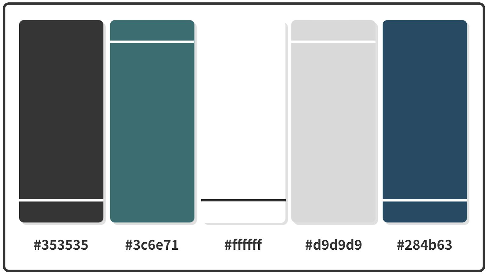
Hex Codes: #353535 // #3c6e71 // #ffffff // #d9d9d9 // #284b63
Indigo is the only true blue in this color palette that includes an almost-black dark gray along with Ming, a dark teal green-blue. The rich tones are ideal for creating a logo or icon set for a nonprofit, financial services firm or energy company.
18. Sunglow + Sizzling Red + Crayola Blue Color Palette

Hex Codes: #ff595e // #ffca3a // #8ac926 // #1982c4 // #6a4c93
Explore your bright side with this palette that includes Crayola Blue. While it’s not exactly a rainbow color palette, this scheme covers most of the colors in the ROYGBIV acronym, so we think it’s close enough.
19. Light Salmon + French Pink + Baby Blue Color Palette

Hex Codes: #70d6ff // #ff70a6 // #ff9770 // #ffd670 // #e9ff70
Some blue tones convey a sense of authority, but baby blue lends your designs an air of gentility that goes perfectly with a bright pastel color palette like this one.
20. Black Coffee + Duke Blue + True Blue Color Palette

Hex Codes: #3c3744 // #090c9b // #3066be // #b4c5e4 // #fbfff1
Highlighted by Duke Blue, this blue color palette gives you a true sense of duality thanks to the near-black and near-white. The resulting high contrasts are ideal for just about any corporate color scheme.
21. Cerise + Blue Crayola + Royal Dark Blue Color Palette

Hex Codes: #0a2463 // #3e92cc // #fffaff // #d8315b // #1e1b18
This rich color palette is highlighted by royal dark blue and cerise, while Crayola Blue, pink and black ensure there’s plenty of contrast. Use cerise as your logo’s accent color for a burst of energy or opt for pink accents to bring a lighter touch.
Best blue color combinations
It’s safe to say color selection is more art than science, but there’s definitely science involved. You’ve probably been familiar with primary colors since, well, primary school. But exploring a concept called the color wheel can open up a world of science-backed color combinations.
If you’re putting an outfit together, it’s long been conventional wisdom that blue jeans are considered neutral, meaning they’ll go with anything. While it’s not true in design that every color goes with blue, there are dozens of possible blue color combinations.
A few technical terms can be helpful with picking colors to go with blue. Let’s see what each term has to say about blue color combinations:
- Monochromatic: All blue, whether similar shades or not
- Complementary: These are colors directly across from each other on the color wheel, which for blue shades would be yellow and orange, depending on the blue
- Triadic: Three shades that are equidistant on the color wheel. For blue shades, that could be green and red, green and orange or yellow and red, depending on the blue
Tired of reading? Here are two quick videos for your crash course on colors, starting with one answering your all-too-often question: What is color?
If you’re interested in learning more, here’s another under-3-minute video on color relationships:
Which brands use a blue palette?
Some of the world’s most recognizable brands, including Facebook, Twitter and LinkedIn, use blue as their primary colors. Let’s look at some prominent global brands and how they use blue to establish their identities.

With one of the most-visited websites on the planet, Facebook has grown far beyond a social media network. While the company has gone through immense change, its brand identity has stayed relatively consistent, including blue letters or white letters on a blue background.
Like many tech companies, Facebook’s brand identity has been grounded in blue since its early days, attempting to call to mind trust and security. It’s arguable if Facebook has achieved real trust, but it has become utterly ubiquitous. So, perhaps actual trustworthiness is irrelevant.

With a more expansive color palette that includes shades of gray, Twitter is another of the major social media platforms with blue as its central color.
While Facebook’s primary blue until 2019 was much darker and desaturated, Twitter blue has long been bright and cheerful. The simplicity of Twitter’s color scheme allows its pleasant blue to stand out, which reflects the site’s mission to help people amplify their voices.

Of the three big social media platforms that use blue as its primary color, LinkedIn is the most obviously corporate.
In addition to blue—its primary color, LinkedIn also uses a lot of secondary colors, making the color palette “warmer” and “more approachable”. This is reflected in a lot of the illustrators used on LinkedIn and their social media assets.

According to LinkedIn, this new color palette is built with accessibility in mind. If you want to learn more on how to make your designs accessible, read our blog on color-blind-friendly palettes.
Lowe’s

If you’re ever in doubt about which big-box hardware store you’re standing in, if you see blue anywhere, it’s definitely Lowe’s (and not Home Depot). Lowe’s has just two shades of blue approved as part of the chain’s primary color palette.
The dark blue shade conveys the trust Lowe’s is hoping to instill in customers who want to be sure that the tools and materials they use are reliable.
Major League Baseball

Like other brands that also use a red-white-blue color palette (Pepsi, Bank of America), there’s one big reason Major League Baseball’s color scheme consists of three colors: America. Since it’s America’s national pastime, it should be no wonder that the league’s official colors are the same as those appearing on U.S. flags.
Best color palette generators
Want to create your own blue color palette? Check out our favorite color palette generators.
Venngage’s Accessible Color Palette Generator

In a typical design process, you’d choose a color palette, put together a visual and then manually check it for accessibility using a contrast checker or color blindness simulator.
This means you have to mix, match, test and retest, until you’ve found something that works.
Translation: there’s a ton of trial, error and time involved… so save yourself extra time and effort by flipping this process around!
With Venngage’s 100% free Accessible Color Palette Generator, you can generate a range of beautiful, WCAG-compliant color palettes in one of two ways — no design experience or accessibility knowledge required.
How does it work? In two ways:
- Randomize. Don’t think twice — roll the dice and generate palettes based on a random color.
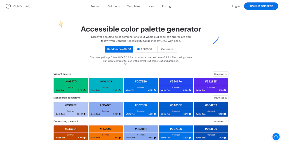
- Generate from HEX. Input a HEX code to discover accessible palettes based on your color of choice.

No matter which route you choose, you’ll see the contrast ratio of each color against black or white text. And every palette generated adheres to a contrast ratio of 4.5:1 as per the latest Web Content Accessibility Guidelines (WCAG) 2.1 AA.
In other words, the designs you create with these color combos will be compliant and inclusive — you can pass those accessibility tests with flying colors.
Once you find a palette you love, simply click Download. You’ll get a text file with the HEX codes for that palette and for the text color that goes with it (#ffffff for white text and #000000 for black text).
Ready to give it a try?
Coolors

Coolors is easy to use, letting you scroll through the options or enter a keyword and see what palettes fit that search term. That means you can type in “blue” or get more specific and search for something like “blue technology” to see schemes that fit the bill.
Learn more about how to use Coolors.
Color Hunt

Color Hunt’s artist-generated palettes consist of four colors each, but you can search in a specific color family or explore collections to find shades that work for you.
Learn more about how to use Color Hunt.
Paletton

While it appears more technical than other color generators, Paletton is one of the best tools for using color science to find combinations that will work. Explore monochromatic, triadic, tetradic and complementary palettes based on the color wheel.
Learn more about how to use Paletton.
Colormind

Colormind is an excellent tool for test-driving a color palette so you can see what it would look like applied to a website. Input your colors, or lock in a couple of selections and have the system generate accent colors, then scroll down and see what they might look like in the real world.
Learn more about how to use Colormind.
Hubspot
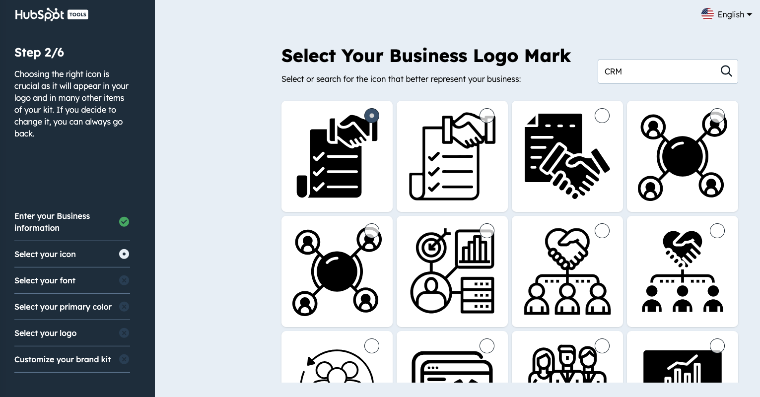
Hubspot’s Color Palette Generator HubSpot’s Color Palette Generator elevates the process of selecting brand colors by focusing on user-friendly functionality and specificity. With the capability to input keywords such as “blue” or even more descriptive terms like “oceanic blue” or “midnight blue,” users can easily discover a range of blue shades that precisely match their brand’s theme or mood. This tool not only suggests complementary colors to create a harmonious palette but also enables brands to tap into the diverse connotations of blue – from trust and calmness to innovation and professionalism. It simplifies the creation of visually cohesive and emotionally resonant brand identities.
Color palette FAQ
Do you have questions about picking the best colors for your designs? We’ve got answers.
What is a color palette?
Just as a painter uses a color palette to create their artwork, business, organizations and brands use color palettes to establish the personality they want their company to have. Most brand color palettes consist of one or two main colors, along with accent colors.
How do you pick a color palette?
To pick a color palette for your business, you must first identify what personality you want your brand to have. Organizations that need to appear trustworthy, stable and serious tend to choose colors like blue. You can stick with just one color or add a few others to complement or contrast that.
If you find it challenging to pick a color palette for your business, check out our list of the best 15+ color palette tools to help make that job easier.
How many colors should a color palette have?
Your brand color palette should be grounded by one or two (at most) main colors and between two and four colors that contrast or complement the main shade. So most brands’ color palettes should have between two and six colors.
What color goes best with blue?
White is a classic match for blue, offering a clean and balanced contrast. Neutrals like gray and beige also pair well, while orange adds a bold, complementary pop.
What are the complementary colors to blue?
Blue’s complementary color is orange, sitting opposite on the color wheel. Warm tones like coral, rust, and copper also complement blue beautifully.
What are 3-color combinations that go well with blue?
- Blue, white, and gray – sleek and modern
- Blue, yellow, and green – fresh and energetic
- Blue, pink, and beige – soft and contemporary
- Dark blue/navy blue: Pairs well with white, gold, blush pink, or camel
- Sky blue: Matches nicely with white, soft gray, peach, or lemon yellow
In summary: Appeal to the masses by creating a brand identity using their favorite color, blue
Use your blue color palette to express your brand’s trustworthiness and stability, and add accenting colors to bring out different facets like friendliness or earthiness.
Once you’ve decided on a color palette you want to use for your brand, simply add the Hex codes to My Brand Kit or add it to your website and have the colors and logos automatically extracted in just one click: