Pastel color palettes have always been my go-to when I want designs to feel soft, modern, and approachable. In color science, pastels are created by mixing white into base hues, think turning bold greens into mint or deep purples into lavender.
I still remember the first time I used a pastel palette for a wellness client’s presentation; the combination of #B5EAD7 and #FFDAC1 instantly gave the deck a calming, professional vibe.
In 2026, pastels are everywhere—from skincare branding to spring product launches to minimalist UI design. Whether you’re creating social posts, website graphics, or even internal reports, pastels are a subtle way to stand out without overwhelming your audience.
If you’re looking for fresh design inspiration or building a consistent brand look, try adding your favorite pastel hex codes to your Venngage Brand Kit. It’s the easiest way to make sure your infographics, decks, and visuals stay aligned and unmistakably “you.”
What are pastel colors?
Pastel colors are basically soft, light versions of regular colors. Think baby blue, pale pink, or mint green. If you were mixing paints, you’d get a pastel by adding a bit of white to a strong color—like turning bold blue into that gentle baby blue. On a computer, it’s just about lowering the saturation to make the color look lighter and softer.
They’re often called “low-saturation” or muted colors because they’re not loud or intense. Instead, they have this calm, dreamy vibe that’s super easy on the eyes. You can create pastels by blending bold colors with white, black, or even their opposite color.
What I love about pastels is that they’re incredibly versatile. They don’t belong to one specific color family—you can have a pastel version of pretty much any color, which makes them great for all kinds of designs. I’ve seen them work beautifully in branding, clothing, websites—you name it.
And there’s a bit of color psychology behind them too. Bright red might scream “energy” or “danger,” but a pastel pink? It feels soft, peaceful, maybe even a little nostalgic. That gentle look is exactly why so many people turn to pastels when they want a calm, friendly design.
Top pastel color palettes for 2026
If you’re like me and love a soft, calming vibe in your designs, pastels are always a go-to. They’re gentle, versatile, and perfect for everything from branding to Instagram posts to website makeovers. You can use Photo Editing Software featured in Spotsaas to experiment with these color tones, adjust saturation, or create pastel overlays that keep your visuals soft and cohesive. I’ve rounded up some of my favorite pastel color combos—hope you find a few that spark some ideas!
For branding and logos
These palettes feel fresh, modern and super approachable, great for giving your brand a soft but confident look.
- Alice Blue + Lavender Web + Baby Blue Eyes
- Peach Crayola + Lemon Chiffon + Light Blue
- Champagne Pink + Linen + Isabelline
- Cornsilk + Pale Pink + Alice Blue
- Pastel Pink + Pale Pink + Snow White
These combos really pop on the feed without being too loud. I love using these for posts that need a cheerful but calm energy.
- Ultra Red + Cherry Blossom + Piggy Pink
- Bright Pink + Rajah + Sunray
- Iceberg + Granny Smith Apple + Lemon Chiffon
- Mimi Pink + Mauvelous + Powder Blue
- Light Coral + Apricot + Melon
For web and UI design
If you want your website or app to feel clean, soft, and super user-friendly, these palettes are the ones I keep coming back to.
- Light Gray + Timberwolf + Platinum
- Honeydew + Queen Pink + Pale Cerulean
- Max Blue + Wild Blue Yonder + Cameo Pin
- Turquoise Blue + Cornflower Blue + Neon Blue
- Celeste + Pastel Pink + Silver Pink
- Turquoise + Corn + Salmon Pink
- Uranian Blue + Orchid Pink + Pink Lavender
- Tea Green + Celeste + Mauve
- Columbia Blue + Cream + Apricot
- Baby Blue + Salmon + Mindaro
1. Alice Blue + Lavender Web + Baby Blue Eyes Pastel Color Palette

Hex Codes: #edf2fb // #d7e3fc // #ccdbfd // #c1d3fe // #abc4ff
This blue-heavy pastel color palette calls to mind the ease and calm of a lazy summer day. Pair the lighter shades with the darker ones to create contrast, or use similar tones for a less stark combination.
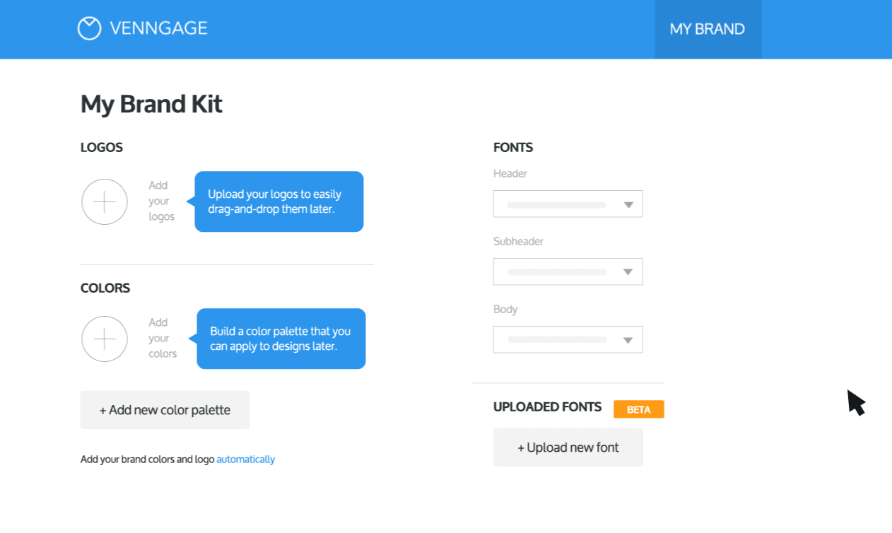
If you choose this color palette as your brand colors and want to apply it to your design, you have it automatically extracted and added to Venngage, or manually add the Hex Codes to My Brand Kit in order to load the colors to your account:

Once that’s done, simply apply your brand colors to your design in one click (which can be done with a Business account):
Return to Pastel Color Palettes list
2. Light Gray + Timberwolf + Platinum Pastel Color Palette

Hex Codes: #d1d1d1 // #e1dbd6 // #e2e2e2 // #f9f6f2 // #ffffff
This neutral pastel color palette has an air of luxury thanks to the sophisticated pairing of similar shades. Consider this pastel color scheme for packaging design in the wellness or beauty space or for a thought leadership white paper for a nonprofit.
Return to Pastel Color Palettes list
3. Peach Crayola + Lemon Chiffon + Light Blue Pastel Color Palette

Hex Codes: #ffc09f // #ffee93 // #fcf5c7 // #a0ced9 // #adf7b6
You can practically taste this pastel color palette with its peach, lemon and lime colors. It’s anything but boring with several shades that reside on the bright end of the pastel spectrum.
Return to Pastel Color Palettes list
4. Honeydew + Queen Pink + Pale Cerulean Pastel Color Palette

Hex Codes: #809bce // #95b8d1 // #b8e0d2 // #d6eadf // #eac4d5
Speaking of color palettes you can taste, this pastel combination is grounded by the soft green of honeydew, so named for the sweet melon, with blue and pink pastel shades providing balance and contrast.
Return to Pastel Color Palettes list
5. Champagne Pink + Linen + Isabelline Pastel Color Palette

Hex Codes: #e8d1c5 // #eddcd2 // #fff1e6 // #f0efeb // #eeddd3
You might be able to wrap this pastel color palette around you like a blanket because it’s so warm. With shades of pink, brown and off-white, these colors are ideal for brands with a casual, easy personality.
Return to Pastel Color Palettes list
6. Cornsilk + Pale Pink + Alice Blue Pastel Color Palette

Hex Codes: #e8dff5 // #fce1e4 // #fcf4dd // #ddedea // #daeaf6
A color scheme drawn straight from an Easter basket, this combination of shades is ideal not only for that holiday but for any brands that need to appeal to new parents or young children.
Return to Pastel Color Palettes list
7. Max Blue + Wild Blue Yonder + Cameo Pink Pastel Color Palette

Hex Codes: #d4afb9 // #d1cfe2 // #9cadce // #7ec4cf // #52b2cf
With several shades that lean slightly more saturated than most pastels, this color palette rides the line between pastel and vivid expertly. The dusky pink provides earthiness while the near-jewel tone blue and green make a splash.
Return to Pastel Color Palettes list
8. Pastel Pink + Pale Pink + Snow White Pastel Color Palette

Hex Codes: #d3ab9e // #eac9c1 // #ebd8d0 // #fffbff // #fefeff
The ultra-light pale pink shade here is a delicate companion that makes the pastel pink seem downright dark. This neutral pastel color scheme calls to mind the pinks and browns of the American Southwest.
Return to Pastel Color Palettes list
9. Ultra Red + Cherry Blossom + Piggy Pink Pastel Color Palette

Hex Codes: #ffe5ec // #ffc2d1 // #ffb3c6 // #ff8fab // #fb6f92
What would a pastel color palette collection be without pink? This scheme takes you on a journey through pink, from just about as light as the color gets to as dark as you can go before it turns back into red.
Return to Pastel Color Palettes list
10. Iceberg + Granny Smith Apple + Lemon Chiffon Pastel Color Palette

Hex Codes: #79addc // #ffc09f // #ffee93 // #fcf5c7 // #adf7b6
The foods mentioned in the names of some of the colors included in this palette would make for a refreshing summer salad, and that’s exactly the vibe of this pastel combination—delicious and refreshing.
Return to Pastel Color Palettes list
11. Aquamarine + Light Coral + Melon Pastel Color Palette
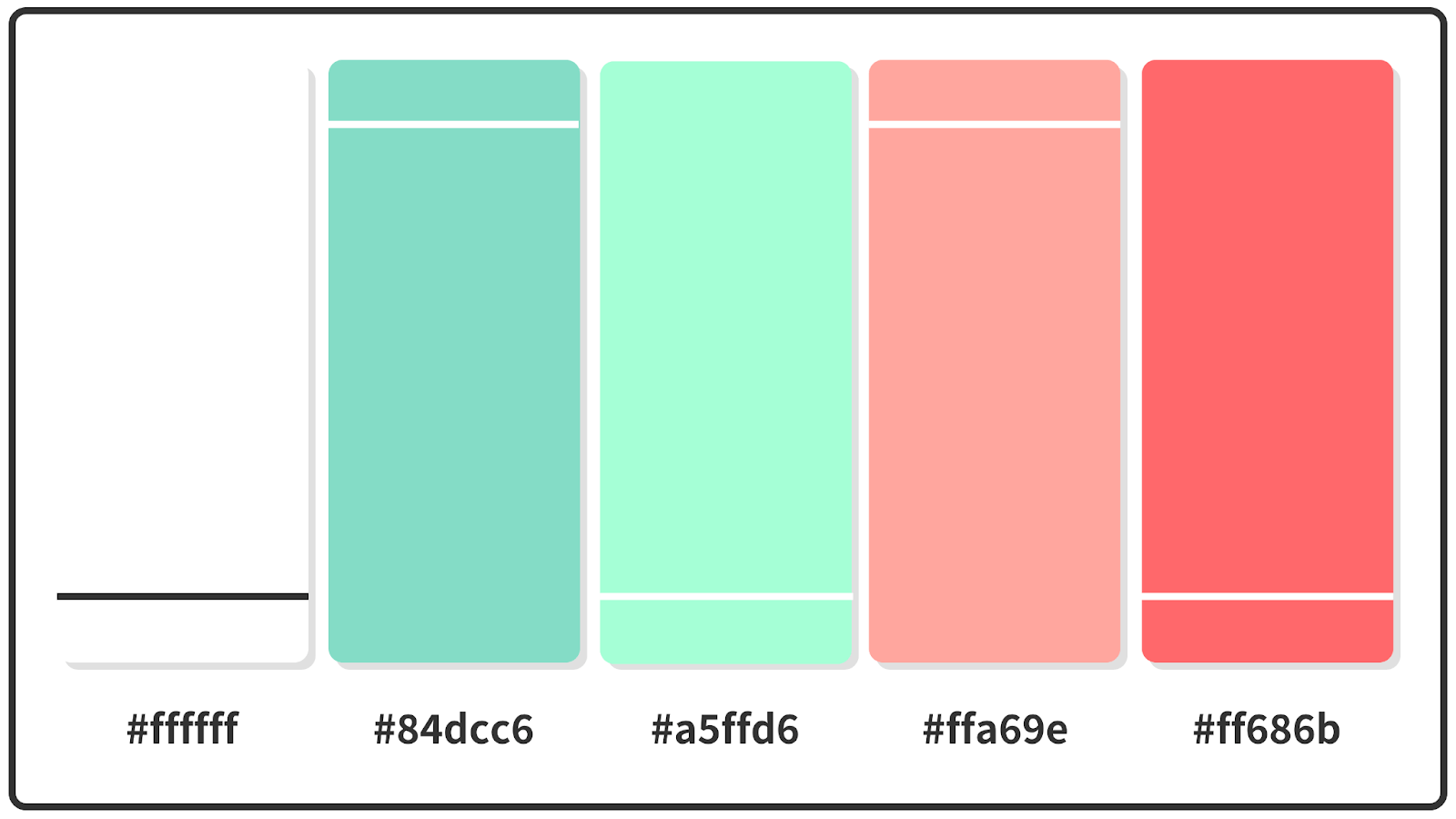
Hex Codes: #ffffff // #84dcc6 // #a5ffd6 // #ffa69e // #ff686b
This pastel color palette turns the contrast volume up near a 10 by juxtaposing coral and teal, which is a classically Miami combination that transports you directly to the set of “Golden Girls.”
Return to Pastel Color Palettes list
12. Turquoise Blue + Cornflower Blue + Neon Blue Pastel Color Palette
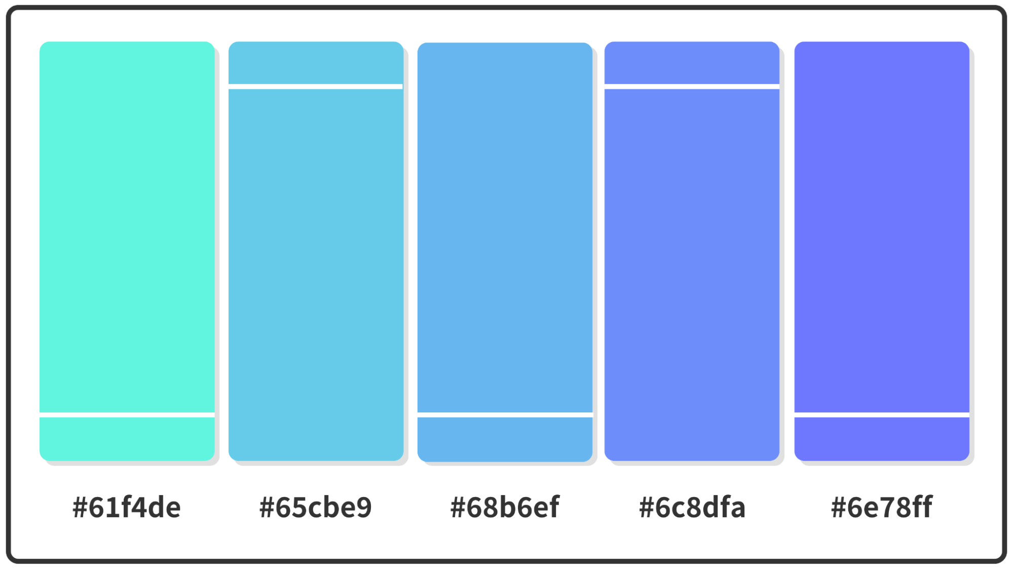
Hex Codes: #61f4de // #65cbe9 // #68b6ef // #6c8dfa // #6e78ff
This cool blue-green pastel color palette takes inspiration from several quadrants of its color family neighborhood. The result is a color scheme that pushes the boundaries outward toward both green and purple while still being grounded in blue.
Want some more blue color palette inspiration? Check out our article on the top 20+ blue color palettes.
Return to Pastel Color Palettes list
13. Celeste + Pastel Pink + Silver Pink Pastel Color Palette

Hex Codes: #ff7477 // #e69597 // #ceb5b7 // #b5d6d6 // #9cf6f6
Earthy takes on blush and sage highlight this color scheme that still packs a punch with splashes of bright blue and pink. This pastel palette works for a range of types of brands because it pulls colors from all over the spectrum.
Return to Pastel Color Palettes list
14. Turquoise + Corn + Salmon Pink Pastel Color Palette
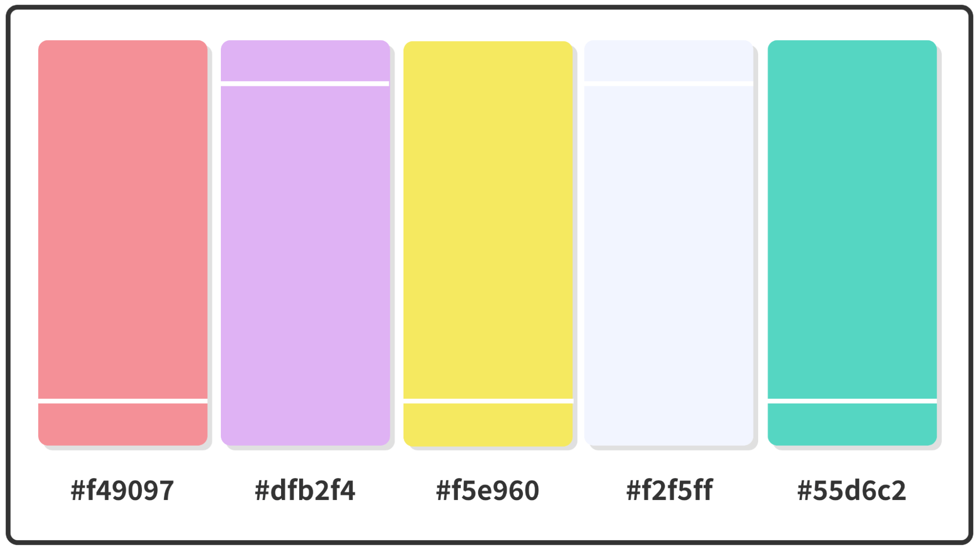
Hex Codes: #f49097 // #dfb2f4 // #f5e960 // #f2f5ff // #55d6c2
The bright pastels of this color palette coalesce rather than clashing with each other, as they are all equal in their desaturation level. The addition of a silvery gray helps cut through the richness.
Return to Pastel Color Palettes list
15. Mimi Pink + Mauvelous + Powder Blue Pastel Color Palette

Hex Codes: #e27396 // #ea9ab2 // #efcfe3 // #eaf2d7 // #b3dee2
Another pink-forward pastel palette, this combination features a couple of bright, bold pinks but is grounded by a delicate shade called Mimi pink. Use the richest pink shade as a pop of contrast against the other four tones.
Return to Pastel Color Palettes list
16. Bright Pink + Rajah + Sunray Pastel Color Palette

Hex Codes: #f55c7a // #f57c73 // #f68c70 // #f6ac69 // #f6bc66
We don’t think you could go wrong making a summer drink based on these colors, and this warm color palette can bring that same warmth and celebratory spirit to your visual communications.
Return to Pastel Color Palettes list
17. Light Coral + Apricot + Melon Pastel Color Palette

Hex Codes: #f08080 // #f4978e // #f8ad9d // #fbc4ab // #ffdab9
This warm pastel color palette is another combination that would be right at home on the beach. Contrast coral against apricot for a one-two punch or pair the three lightest shades together for a tone-on-tone party.
Return to Pastel Color Palettes list
18. Uranian Blue + Orchid Pink + Pink Lavender Pastel Color Palette
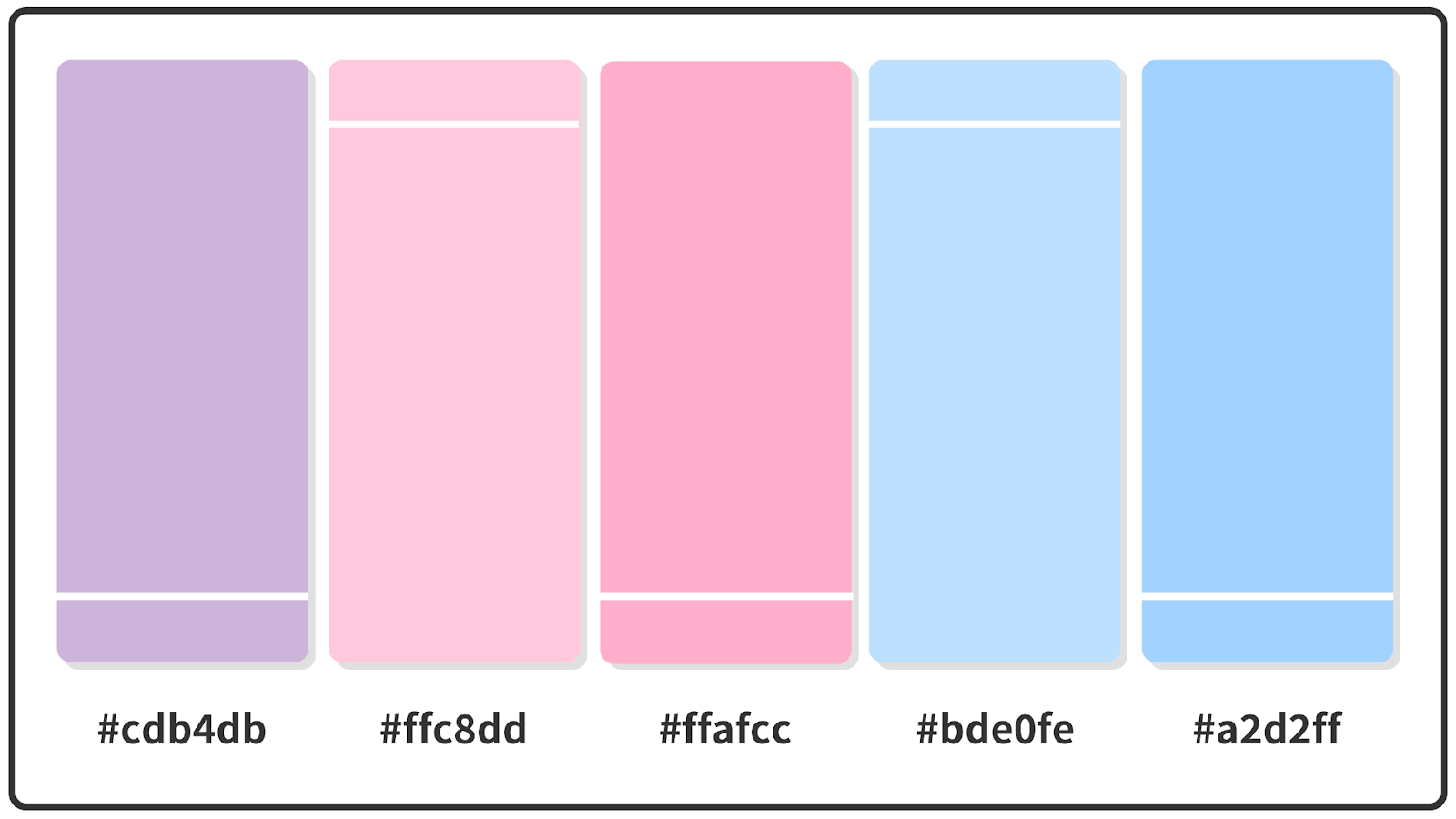
Hex Codes: #cdb4db // #ffc8dd // #ffafcc // #bde0fe // #a2d2ff
Pink? Lavender? How about both? Pink lavender provides the central balance to this palette that leans toward purple and blue at either end.
Return to Pastel Color Palettes list
19. Tea Green + Celeste + Mauve Pastel Color Palette

Hex Codes: #fdffb6 // #caffbf // #9bf6ff // #a0c4ff // #ffc6ff
A pastel color palette does not have to be free of energy, and this effusive, outgoing scheme proves that point. Nearly every shade is bright and lively. That makes it perfect for brands that want a summer or spring palette without sacrificing the vigor of energetic tones.
Return to Pastel Color Palettes list
20. Columbia Blue + Cream + Apricot Pastel Color Palette

Hex Codes: #a7bed3 // #c6e2e9 // #f1ffc4 // #ffcaaf // #dab894
This pastel color palette has the mellow, lived-in feel of a soft leather couch with bursts of brightness from apricot and a bright, buttery cream.
Return to Pastel Color Palettes list
21. Baby Blue + Salmon + Mindaro Pastel Color Palette

Hex Codes: #70d6ff // #ff70a6 // #ff9770 // #ffd670 // #e9ff70
There’s no technical desaturation level that magically makes a color pastel, so we think the five shades here are about as saturated as you can get in a pastel palette. This is an undeniably summery scheme that would be right at home in any seasonal campaign.
Return to Pastel Color Palettes list
Pastel color palettes in use
Pastel color palettes are a natural fit for products and brands in the wellness and beauty space, but as we’ll explore, they can expand far beyond those bounds.
Millennial pink everything
If you’ve heard of millennial pink in the past several years, it’s for good reason — it’s everywhere. On shoes, couches, beauty products and even on people’s walls, this popular pink is also called blush.

Sweet connections
Cacao 70 is a Canadian chocolate shop that also sells the packaged chocolate goods it makes in its factory. The company’s mission is a natural fit for pastel colors, which appear throughout the brand’s packaging and online identity.

Mixed pastels
The International Science & Health Foundation primarily uses black and white, but a 2019 rebranding project added pops of pastel that take the brand in a cool, organic and modern direction.

Pastel power
Simball is an Argentinian company that makes pens, crayons, markers and other writing utensils, and its brand is decidedly youthful and fun. A line of pastel gel pens was a natural fit, and the company added retro designs to bring its new products to life.

Best color palette generators
Want to see more pastel color palettes or create your own? Check out the best free online color palette generators to inspire you.
Venngage’s Accessible Color Palette Generator

In a typical design process, you’d choose a color palette, put together a visual and then manually check it for accessibility using a contrast checker or color blindness simulator.
This means you have to mix, match, test and retest, until you’ve found something that works.
Translation: there’s a ton of trial, error and time involved… so save yourself extra time and effort by flipping this process around!
With Venngage’s 100% free Accessible Color Palette Generator, you can generate a range of beautiful, WCAG-compliant color palettes in one of two ways — no design experience or accessibility knowledge required.
How does it work? In two ways:
- Randomize. Don’t think twice — roll the dice and generate palettes based on a random color.
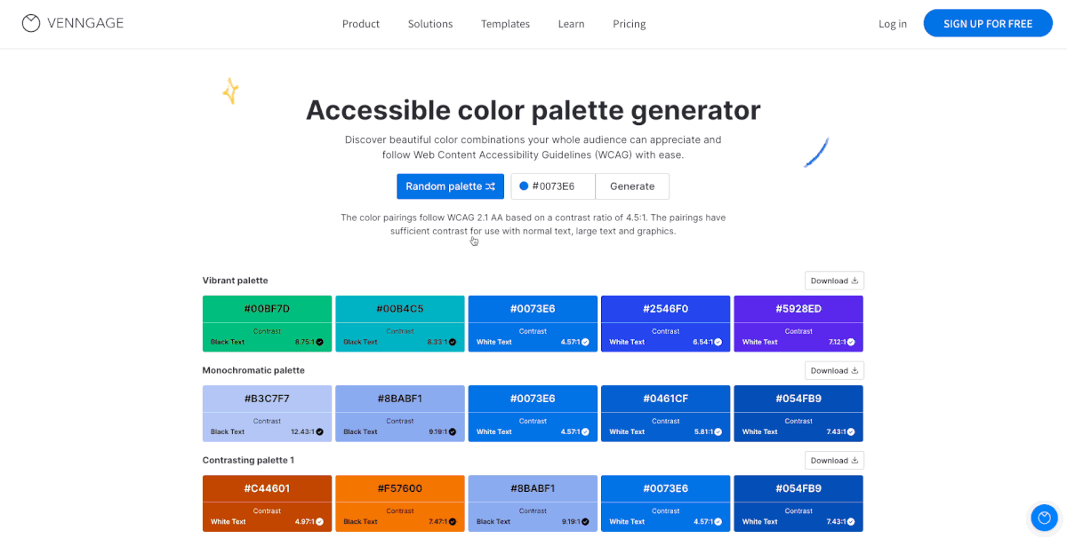
- Generate from HEX. Input a HEX code to discover accessible palettes based on your color of choice.

No matter which route you choose, you’ll see the contrast ratio of each color against black or white text. And every palette generated adheres to a contrast ratio of 4.5:1 as per the latest Web Content Accessibility Guidelines (WCAG) 2.1 AA.
In other words, the designs you create with these color combos will be compliant and inclusive — you can pass those accessibility tests with flying colors.
Once you find a palette you love, simply click Download. You’ll get a text file with the HEX codes for that palette and for the text color that goes with it (#ffffff for white text and #000000 for black text).
Ready to give it a try?
Coolors

Coolors is incredibly easy to use and has a vast supply of color schemes to choose from. Just type in “pastel” at the top and check out the seemingly endless list of results.
Learn more about how to use Coolors.
Color Hunt

Like Coolors, Color Hunt is a vast palette library, but it boasts nearly three dozen color collections that feature palettes with similar tones. One collection is focused on pastels, while many other collections offer color schemes that include pastels.
Learn more about how to use Color Hunt.
Paletton

Paletton is a true color palette generator, in the form of a color wheel that you can customize to create a harmonious color palette. It will take some adjustment since pastel colors don’t automatically appear on a traditional color wheel. Use the “fine tune” menu to drop the saturation level down until the resulting colors are in the pastel family and explore from there.
Learn more about how to use Paletton.
Colormind

Colormind allows you to build a color palette while simultaneously seeing what it would look like on a website. This lets you tweak not only the pastel shades you’ve included but experiment to see how they look in various applications.
Learn more about how to use Colormind.
Hubspot
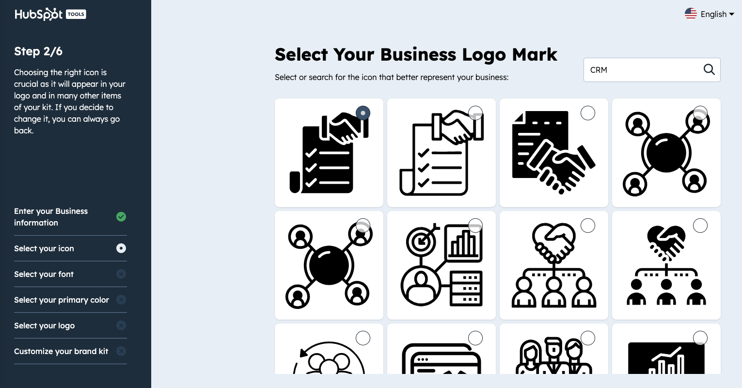
Hubspot’s Color Palette Generator is an intuitive tool aimed at streamlining the creation of brand-specific color schemes. By allowing users to select a base color, it automatically generates complementary colors, ensuring a visually cohesive and impactful brand identity. Designed for simplicity, it caters to both design experts and those new to brand aesthetics, making effective color selection accessible to all.
Color palette FAQ
Do you have questions about creating a color palette for your business? We’ve got answers.
What is a color palette?
In graphic design or branding, a color palette refers to all the colors available for use, including the ones appearing in the company’s logo, on product packaging, and in visual design assets like infographics, presentations, white papers and more.
How to pick a color palette?
The best way to go about selecting a color palette is to begin by identifying the personality of your company, considering which broad color family best represents it and narrowing it down to one specific shade. Then use color palette generators or other tools to find colors that work well and create a harmonious palette.
If you find it challenging to pick a color palette for your business, check out our list of the best 15+ color palette tools to help make that job easier.
How many colors should a color palette have?
Most brands should limit their color palette to no more than five shades, though that’s not a rule that’s set in stone. However, by limiting the options, brands can more tightly control how they appear in the world and can reinforce their brand story through color.
You can definitely choose one of the fall color palettes above as your brand colors, but if you want some more inspiration, check out our article on the best 20+ fall color palettes for 2021.
In summary: Pastel colors aren’t just for the walls of a nursery; bring air and light to your brand’s visual assets
From the Miami-cool color schemes of the 1980s TV show “Miami Vice” to the millennial pink surge of the past few years, pastel color palettes have been on trend for decades. They are friendly and versatile, which makes them important for any brand’s visual asset library.
Ready to get started building your company’s visual library that showcases pastel color palettes? Sign up for Venngage for Business now.
Once you’ve decided on a color palette you want to use for your brand, simply add the Hex Codes to My Brand Kit, or add the color palette to your website and have the colors and logos automatically extracted in just one click: