


If you’ve set out to rebrand your business, or if you’re launching a new business, you’re probably wondering how in the world you’re supposed to pick the colors that will represent your brand identity.
Luckily, it’s a task that’s been done many times by many successful companies, and we can learn from what they’ve done and apply it to our own businesses.
What is branding?
Branding is the process of creating a unique identity for a product, service, company, or individual that differentiates it from others in the marketplace. The main goal here is to leave a lasting impression and build a loyal following. For more insights on what is branding, watch:
With successful branding, you’ll be able to grow your brand recognition by applying your new brand colors across all of your collateral, from infographics and presentations to business cards, brochures and social media images.
What are brand color palettes?
Brand color palettes are carefully selected sets of colors used consistently across all brand materials to create a consistent look and feel. These colors reflect the brand’s personality and values, helping to evoke the right emotions and associations with the audience.
Here’s what typically makes up a brand color palette:
- Primary Colors: The main colors that represent the brand and are used the most.
- Secondary Colors: Additional colors that complement the primary ones, adding variety and flexibility.
- Accent Colors: Colors used sparingly to highlight specific elements and create emphasis.
- Neutral Colors: Usually for backgrounds or text, these colors balance and support the primary and secondary colors.
Having a well-chosen color palette helps build a strong visual identity, making the brand easy to recognize and remember. Next, let’s dive in-depth into how to pick and use brand colors.
How to pick the perfect brand colors
You can pick successful brand colors in a few simple steps (click to jump ahead to each section):
- Identify your brand personality
- Pick a core brand color based on your brand personality traits
- Use a proven formula to build a color scheme from your core brand color
1. Identify your brand personality
Before you even think about picking your brand colors, you’ll need to lay some groundwork. You need to have a clear understanding of your brand’s personality so you can try to communicate that personality through color.
Otherwise, you’ll end up overwhelmed, trying to wade through countless color palette options without a clear purpose.
Start by identifying a few adjectives that describe your business. Focus on the things that set you apart from your competitors–your key differentiators.
If you’ve already got your company up and running, the best way to get an accurate read of your business is to talk to a few of your most enthusiastic customers.
Get those top customers to tell you what they love about your business. Have them take a look at a list of brand personality traits, like the one below, and pick out the ones that best describe your business to them.

If you’re not at the stage where you have customers yet, you can get your colleagues to do the same exercise, and supplement it with a bit of background research.
- Research competitor brands within your niche
- Identify the key qualities that set your brand apart from your competitors
- Use the key qualities to figure out the brand vision that’s going to speak to your brand’s target audience
If you’re struggling, a good first step is to place your brand along the brand personality spectrum below.
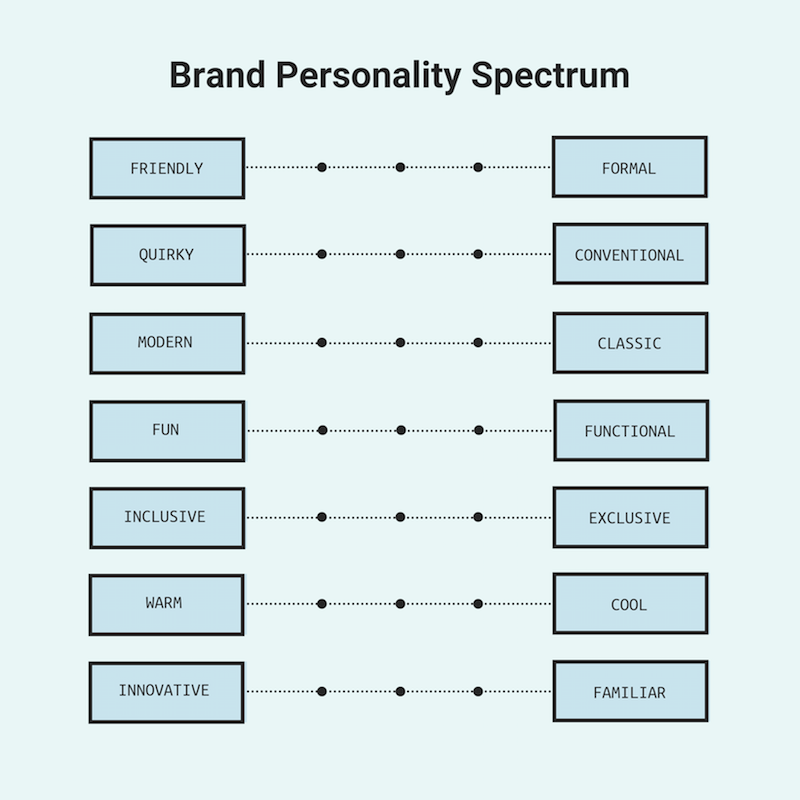
At the end of this process, you should have a list of at least 3-5 adjectives that describe your brand to a tee.
2. Pick a core brand color based on your brand personality traits
Once you’ve identified your key brand personality traits, it’s time to find the one color that best embodies those traits.
This is where color psychology comes into play. Color psychology can help us understand the personality traits that people generally associate with common colors.
Ever wondered, for example, why financial and tech companies tend to have blue brand colors?

According to color psychology, cool colors tend to evoke feelings of trust, loyalty, and stability, while warm colors are more evocative of energy, excitement, and positivity. Obviously, trust and stability are critical for large financial institutions that need to convince consumers that they can be trusted with their life savings.
The results of our recent study on logo styles back up this idea, suggesting that consumers have strong opinions about how well different color schemes work for various industries.
But color psychology goes even deeper than just warm and cool tones. We can go so far as to associate some specific personality traits with specific hues.
Here’s a brief overview of common color meanings:

It’s important to note that these color meanings are highly dependant on context, personal experience, and culture, among many other things. But they’re a great jumping-off point for picking your core brand color.
Use the list above to pick the one color that best embodies your brand personality (or the feeling, mood, or experience you want to create around your brand).
3. Use a formula to build the perfect brand color scheme
Now that you have your core brand color picked out, you can start building a color scheme that’s unique to your brand.
To help you out, I’ve put together a few brand color scheme formulas that have been proven to work by some of the world’s top brands.

Use 1 core brand color (plus a few neutral shades)
If you look at many of the top tech companies dominating their industry, you’ll see that one unique brand color can be enough to communicate a complete brand identity.
Netflix, Spotify, and Lyft, for example, each have a single bright, dominant brand color that they’ve supplemented with a few grounding neutrals. The effect is striking, effective, and memorable.

In fact, according to a study of the world’s top 100 brands, a vast majority of the top brands have only one or two brand colors! So don’t be afraid to keep it simple and stick with that core brand color. It works pretty well in infographics, too.

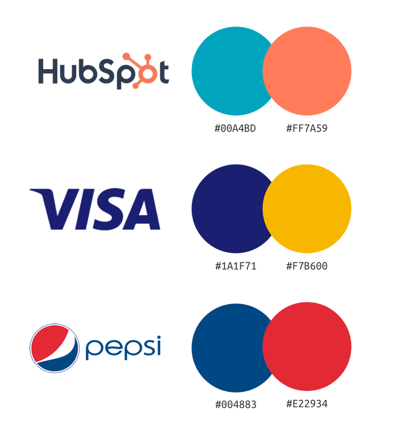
Use 2-3 variations on your core brand color
Research suggests that consumers tend to prefer color schemes with very similar (or analogous) colors. So another way to go is to riff on your core brand color by adding a few related colors.
As seen with PayPal, Mastercard, and BP, analogous color schemes are quite pleasing to the eye.

These analogous color schemes also happen to be a breeze for designers to work with. It couldn’t be easier to make a nice-looking infographic or presentation with this type of color palette:
Add a contrasting accent color
If you’re looking for a little more oomph, add a contrasting accent color that’s complementary to your core brand color.
The contrasting accent color will help make your brand pop, and it’s great for making things like CTAs and stats stand out on websites and in infographics.

If the idea of contrasting or complementary colors is new to you, you can brush up on your color theory with our guide on how to pick colors for infographics.
Balance out your core color with 3-4 equally vibrant hues
For a bright, modern look, consider following the lead of top brands like Google and Slack. These brands have gone with nearly full-spectrum color schemes that feature 4 or 5 equally vibrant hues.

This type of color scheme can make your brand feel fun and approachable, which lends itself particularly well to infographics and other visuals.

To sum up, here’s everything you need to know to pick the perfect brand colors:
- Identify your brand personality
- Pick a core brand color based on your brand personality traits
- Use a formula: 1 core brand color plus a few neutral shades
- Use a formula: 1 core brand color plus 1-2 analogous colors
- Use a formula: 1 core brand color plus a contrasting accent color
- Use a formula: 1 core brand color plus 3-5 equally bright colors
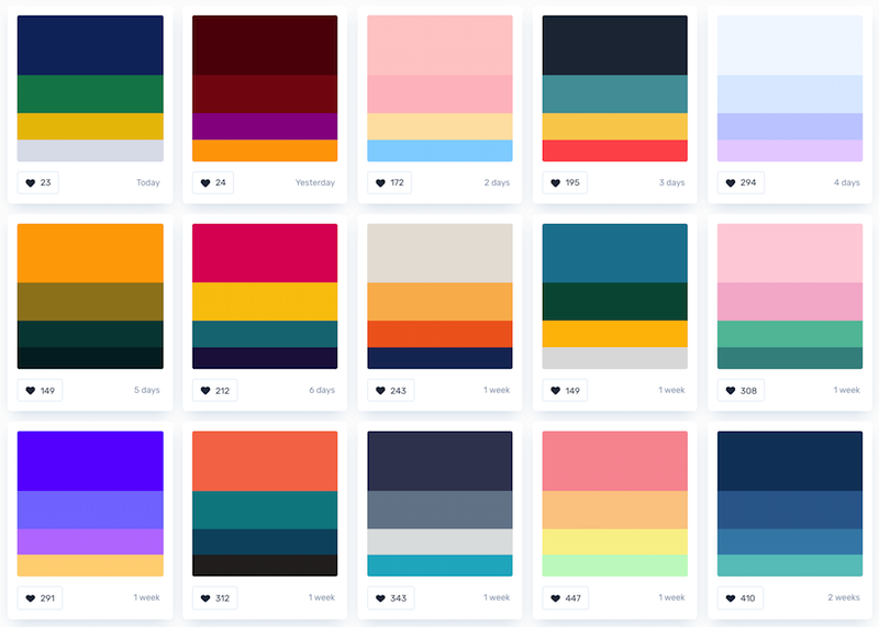
To get you started, here are some color schemes based on these formulas above. Feel free to use them for your own brand!

How to use brand colors
Apply your brand colors frequently and consistently
It’s well established that consumers prefer to buy from brands that they recognize. The easiest way to build brand recognition is to apply your brand consistently across all of your marketing collateral.
Be sure to use your brand colors (along with your logo and brand fonts) in any infographics, reports, presentations, or social media graphics that your business publicly shares.

A brand style guide can make this much easier, ensuring that everyone across your organization has quick access to the right color codes, fonts, and logos. You can even include guidelines about when and where to use particular brand colors to keep your brand identity consistent.

Speaking of which, there are two easy ways to add your brand colors to infographics, reports, presentations, and social media posts.
Use your core brand color as a design accent
In the design world, there’s a 60-30-10 rule which suggests that only 10% of any design should be a bright, dominant accent color.
This happens to be a pretty good rule for applying your brand colors to marketing collateral. Here’s how it would work:
- 10% of the design should be your core brand color
- 30% of the design should be your secondary brand color
- 60% of your design should be a neutral color
This will make your documents feel branded, but the brand won’t overwhelm the design.

As shown above, this means keeping backgrounds and large sections pretty neutral and using your core brand color to add pops of color and visual interest with icons, headers, or footers.
Build your design around your core brand color
Alternatively, you can flip the script and make your branding a focal point of your design. Build the design around your core brand color and use a secondary brand color for that visual interest.

Add your brand with Venngage’s My Brand Kit
If you don’t have time to experiment with the way your brand colors are applied to each design you make, you might want to check out Venngage’s Brand Kit.

Brand Kit allows you to save your brand’s color palettes, logos, and fonts so you can have quick access to them while you’re designing.

Once you save your brand elements in your Brand Kit, you can apply them to a design with a single click.
Don’t like the way your design turned out? Keep on shuffling until you get a design you like!

Conclusion
Having a distinct brand identity is crucial for the success of your business.
So spend a little time, get to know your brand personality, and pick the brand colors that reflect your brand’s unique identity.


