


Choosing the right fonts for your brand is more than just a design choice—it’s a powerful tool in shaping your brand’s identity. Fonts play a psychological role in how your audience perceives your brand. When customers encounter your marketing or business materials, the font you choose influences their opinions, emotions, and overall judgment. Whether your brand exudes luxury, feels approachable, or remains neutral, the fonts you use set the tone. By selecting the right fonts, you can communicate your brand’s personality—whether it’s bold and modern, classic and elegant, or playful and casual—and make a lasting impression on your audience.
In this article, we’ll guide you through everything you need to know about choosing the perfect brand fonts. From understanding font styles and combinations to ensuring readability across various platforms, we’ll cover all the key factors to help you make informed decisions and enhance your brand’s visual impact.
How to pick the perfect brand fonts
- Get to know your brand personality
- Understand the personality traits and meaning of different font category
- Pick a pair of brand fonts that matches with your brand personality
- Make sure your brand fonts meet 3 basic requirements
- Know your budget and licensing requirements
Building a brand identity is not an easy task.
Your logo design, business card design, brand messaging, brand colors, and brand fonts all have to come together to tell the story of your brand.
And that story has to resonate with your audience.
No pressure.

So let’s see if we can demystify just one part of that process: picking the perfect fonts for your brand.
The perfect brand fonts should:
- Unique & memorable
- Legible
- Work on every platform
- Communicate your brand personality
Keep reading to learn everything you need to know about picking brand fonts.
New to branding? Learn everything you need to know about branding in 3 minutes:
1. Get to know your brand personality
Every brand identity needs a well-defined brand personality. A clear brand personality will be what your customers relate with, connect to and remember you for. This can play a role in increasing your brand awareness.
All of the components of your brand–your brand voice, brand color scheme, logo design, and brand fonts–should align with and communicate your brand personality.
If your brand personality isn’t already well-defined, spend some time thinking about how you’d like your brand to be perceived before you try to find your brand fonts.
Not sure where to start? Work with your stakeholders to pick 3-4 adjectives from the list below:

With your brand personality in mind, you’ll be ready to enter the wild world of fonts and typography.
2. Understand the personality traits and meaning of different font category
If you’re not a typography nerd, you might not be familiar with the idea of font categories. But they can be a good place to start your search for the perfect brand fonts.
Font categories are classifications that help designers choose, pair, and identify fonts.
Each category has its own unique traits (this is sometimes referred to as font psychology), so understanding these categories is critical for finding the right fonts for your brand personality. They’ll help you narrow down your search and hone in on the right feel for your brand.
Here are six of the basic font classifications:
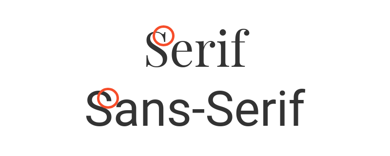
- Serif
- Sans-serif
- Slab serif
- Script
- Handwritten
- Decorative

Serif fonts are classic, traditional, and trustworthy
Serif fonts are the oldest font style, originating way back in the 15th century. They’re named for the feet (called serifs) seen at the top and bottom of each letter.
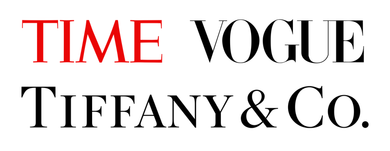
Because serif fonts are the original font style, we generally perceive them as classic, traditional, and trustworthy (as seen in the logo design below):
They’re favored by brands that want to convey a feeling of respectability and tradition, like Tiffany & Co, Vogue, and Time Magazine.
A few popular serif fonts include:
- Times New Roman
- EB Garamond
- Playfair Display
- Baskerville
- Lora
- Merriweather
Sans-serif fonts are modern, clean, and help create a minimal design
Sans-serif fonts didn’t emerge until the 19th century, much more recently than the traditional serif fonts, so we tend to perceive them as more modern.
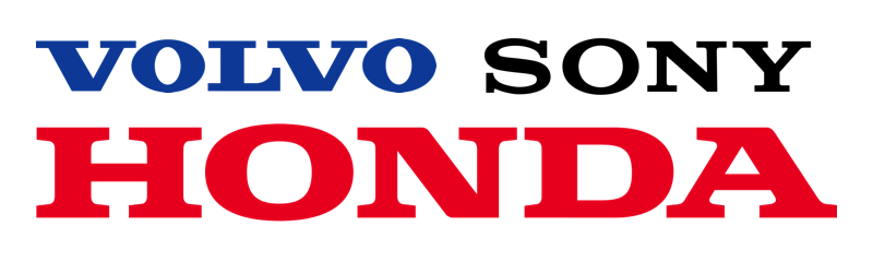
Sans-serif fonts are also much simpler in form than serif fonts, so they tend to evoke a sense of cleanliness and aid in giving you a minimal design, as seen in the logo design below.
Sans-serif fonts have taken over the web in recent years, with many of the top tech companies choosing bold sans-serif brand fonts:

The most common sans-serif fonts include:
- Helvetica
- Arial
- Open Sans
- Roboto
- Source Sans Pro
Slab serif fonts are bold, quirky, and confident
Slab serifs, a special breed of serif fonts, feature larger, blockier serifs. As a result, they look a bit more rugged, bold, and quirky than traditional serif fonts.
This type of font works well for companies with a long and proven history of producing quality products who still want to appear current:
Some popular slab serif fonts include:
- Rockwell
- Roboto Slab
- Courier New
- Arvo
Script fonts are elegant and unique
Script fonts, elegant fonts designed to imitate cursive handwriting, have character strokes that connect one letter to the next.
Just as everyone’s handwriting looks very unique, each script font feels very distinctive. They tend to follow the design trends of the day, making script fonts a risky choice for a brand font, as they might fall out of fashion too quickly.
Still, the script fonts used by brands like Ford, Johnson & Johnson, Cadillac, and Instagram have stood the test of time (so far).

Here are a few trendy script fonts that are popular today:
- Lucida Script
- Pacifico
- Allura
- Dancing Script
- Satisfy
Handwritten fonts are informal and artistic
Handwritten fonts are pretty self-explanatory…they’re fonts that look like they’ve been written out by hand.
They sometimes incorporate weird letterforms, and they’re about as different from traditional serif fonts as you can get.
They’re a fun choice if you want to present yourself as a playful, informal, approachable, or artistic brand, as seen in this coffee shop logo below:
Some examples of handwritten fonts currently available on Google Fonts are:
- Knewave
- Permanent Marker
- Patrick Hand
- Amatic SC
- Just Another Hand
Decorative fonts are stylized, distinctive, and dramatic
Decorative fonts are the most diverse. They include any font that uses unique shapes, forms, or proportions for a highly stylized look, such as graffiti fonts.
The logos of Lego, Disney, and IBM feature distinctive decorative fonts that make their brands especially memorable:

These powerful fonts are best used in small doses, so use them at your own risk. They tend to be a bit more trendy, which you might want to avoid if you’d like your brand to endure for years to come.
Some fun decorative fonts include:
- Fredericka
- Fredoka One
- Lobster Two
- Bangers
To sum up, here are the personality traits of the 6 top font categories:
- Serif fonts are classic, traditional, and trustworthy
- Sans-serif fonts are modern, clean, and help create minimal designs
- Slab serif fonts are bold, quirky, and confident
- Script fonts are elegant and unique
- Handwritten fonts are informal and artistic
- Decorative fonts are stylized, distinctive, and dramatic

Learn more about font personalities in our guide: How to pick fonts that make (not break) your infographic.
3. Pick a pair of brand fonts that match with your brand personality
Once you’re familiar with your brand personality and you’ve got a handle on the different font categories, you should be ready to try out some fonts for your brand (with your business plan and marketing plan in mind).
But the font categories we reviewed above don’t really tell the whole story when it comes to font personalities.
There’s a ton of style variation within each category that impacts the vibe of each font, and how you pair the fonts plays a huge role, too.
So let’s look at some font pairing schemes that work for different brand personalities.
Pair a bold serif header with a nondescript sans-serif subheader for an approachable yet trustworthy feel
The contrast between serif and sans-serif styles makes them a natural pairing, allowing you to balance the modern traits of the sans-serif font with the trustworthy vibe of the serif font.
Some balanced serif/sans-serif pairings include:
- Abril Fatface (header), Montserrat (subheader)
- Rozha One (header), Raleway (subheader)
- Abril Fatface (header), Quicksand (subheader)
Use a single, minimal sans-serif font for a modern, professional, corporate look
You can try pairing a bold version of a modern sans-serif font with a regular version of the same font for a look that’s sleek and professional.
You can’t really go wrong when you’re pairing a font with itself, so it’s a safe approach if you’re not confident in your typography skills.
Some minimal design sans-serif font pairing options include:
- Economica Bold (header), Economica Regular (subheader)
- Montserrat Regular (header), Montserrat Bold (subheader)
- Source Sans Pro Bold (header), Source Sans Pro Regular (subheader)
Use thin, stylized, sans-serif fonts for a high-end, elegant feel
According to font psychology researcher Sarah Hyndman, thinner, lighter weight fonts are consistently rated as looking more expensive than heavier, more rounded fonts.
As in the example below, you can create a delicate, high-end look by mixing a thin sans-serif header with a light serif subheader:
So if you’re looking for elegant fonts, stick light, thin fonts, like:
- Julius Sans One
- Playfair Display
- Poiret One
- Verdana
Use thick, rounded sans-serif fonts for a youthful, friendly feel
Thick, rounded sans-serifs have the opposite effect to thin, lightweight fonts–they appear playful, affordable, and youthful.
As seen in the logo design below, they match well with kid-focused, inclusive businesses like daycares or restaurants:
For this friendly, low-cost feel, use thicker, rounded font pairings like:
- Quicksand Bold (header), Open Sans (subheader)
- Fredoka One (header), Montserrat (subheader)
- Quicksand Bold (header), Quicksand Regular (subheader)
Use a single traditional serif font for a conservative, trustworthy feel
Similar to the way we paired a bold version with a regular version of the same sans-serif font, another foolproof method for pairing fonts is to vary the capitalization of the font.
We can pair an all-caps version of a serif font with itself for a look that’s neutral, conventional, and reliable (like the non-profit logo below).
Serif fonts that work well for traditional businesses include:
- EB Garamond
- Playfair Display
- Baskerville
- Wire One
To review, here are some brand font pairing options for different brand personalities:
- Pair a bold serif header with a nondescript sans-serif subheader for an approachable yet trustworthy feel
- Use a single, minimal sans-serif font for a modern, professional, corporate look
- Use thin, stylized, sans-serif fonts for a high-end, elegant feel
- Use thick, rounded sans-serif fonts for a youthful, friendly feel
- Use a single traditional serif font for a conservative, trustworthy feel
4. Make sure your brand fonts meet 3 basic requirements
After you’ve chosen one or two brand fonts that align with your brand personality, there are a few final checks you should do before pitching them to your client or manager.
Brand fonts must be flexible
Considering you’re probably going to be stuck with these fonts for years to come, you’ll need to make sure your brand fonts work well for every medium (including print, web, and mobile).
Make sure you have the proper licenses for each application, and if you plan to use your brand fonts on your product packaging design, your blog, in external presentations and in static social media images, make sure you mock up designs for each.

Brand fonts should have multiple font weights
Multiple font weights (i.e. light, regular, semibold, and bold) are critical for building a clear text hierarchy, which should be specified in your brand style guide, like the one below.
You’ll need to use the different font weights to differentiate between headers, subheaders, body text, callouts, and quotes in both print and online media.

Brand fonts must be legible
Finally, brand fonts must be legible. It should be easy to read and understand any text styled in your brand fonts…uppercase or lowercase, large or small, numbers or letters.
The brand font that you use for headers doesn’t have to be quite as legible as the font you use for body copy, but nonetheless, it should be easy to read at a glance.
5. Know your budget and licensing requirements
Before you get serious about picking your brand fonts, you should think about how you’re going to source your fonts.
Some font libraries offer free, open-source fonts, including:
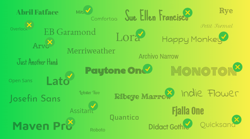
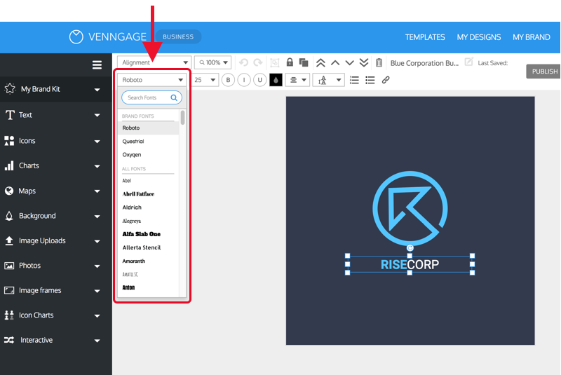
You can find a curated list of free fonts in Venngage’s editor, making it the perfect playground for testing out brand fonts:
While convenient, free font libraries tend to offer a limited selection of fonts, and these fonts might only come in a few different styles (like bold or italic). It might be hard to find font families with a range of different font weights and styles (like light, regular, semibold, bold, and more).
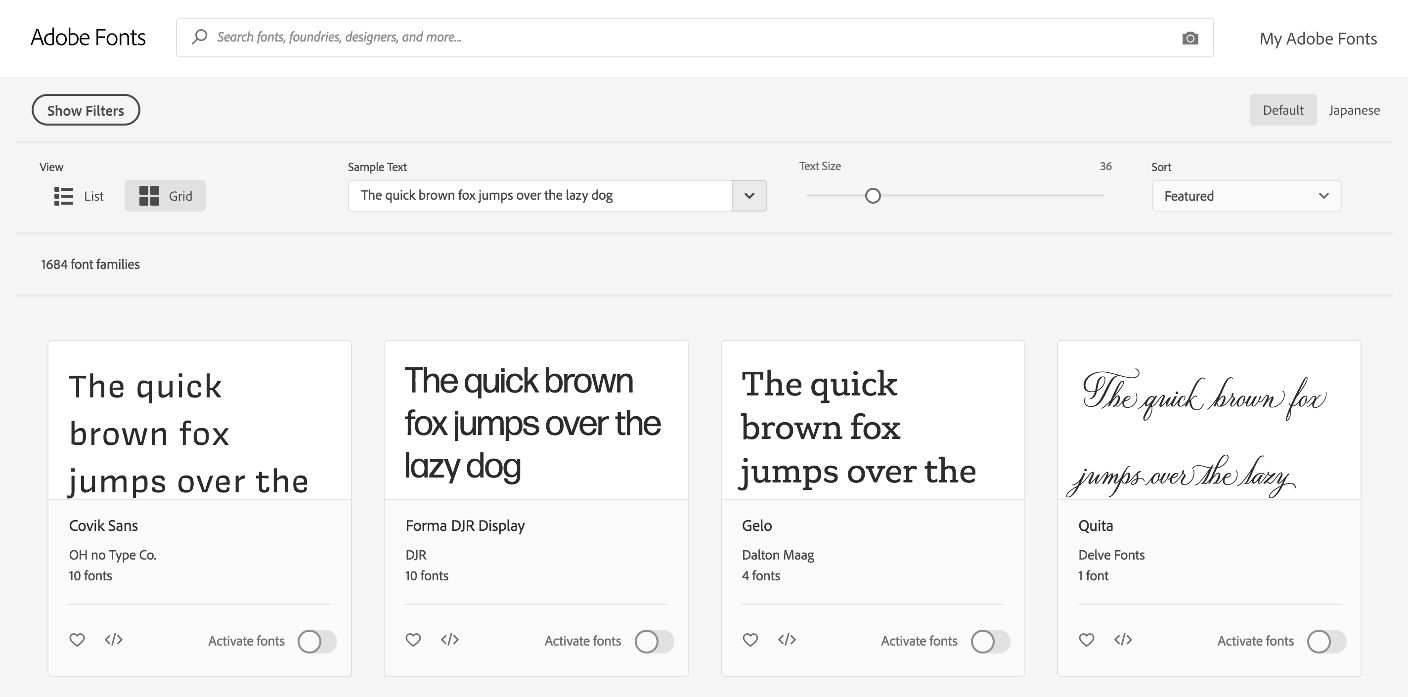
Other font libraries offer paid font licenses, including:
- Adobe Fonts (previously Typekit)
- Linotype
- Fonts.com
These libraries can give you access to many more options, but they can get expensive. Most paid font libraries will charge individual fees for each type of font license. So if you want to use your new font on the web, in a mobile app, and for print materials, you’ll probably have to pay for three separate font licenses.
Whether you go for free or paid fonts is up to you, but when making your decision, consider where your brand fonts are going to be used.
Conclusion
Much like any other brand design challenge, picking brand colors is all about finding fonts that match your brand personality (and making sure they’ll work for anything you throw at them).


