

If you need a brand guidelines template you can customize quickly, you’re in the right place. Creating brand guidelines from scratch takes time and it’s even harder when you’re trying to build something your team will actually use. Starting with a ready-made template lets you focus on your brand instead of worrying about the structure.
This collection gives you ready-to-customize brand guidelines templates for different business sizes, industries, and use cases. Whether you need a simple one-page guide for a small team or a detailed brand book for a growing company, you’ll find examples that are easy to adapt to your own brand.
You’ll also learn:
- How to choose the right brand guidelines template for your team
- What sections every brand guide should include, from logos and colors to voice and imagery
- How to customize a template quickly without starting from a blank page
Browse the template categories below, find the format that fits your workflow, and start building a brand guide your team can use with confidence.
What is a brand guideline template?
A brand guidelines template is a pre-built framework that helps businesses document and organize their brand standards in one place. Instead of creating guidelines from scratch, teams can customize the template with their logo usage rules, brand colors, typography, imagery and brand voice to keep every piece of content consistent.
A one-page brand guide covers the essential visual elements for quick reference, a full brand book provides comprehensive standards for every brand touchpoint and a brand kit is a collection of ready-to-use brand assets like logos, fonts and color codes.
Why brand guidelines matter?
Brand guidelines help every employee, designer, marketer and external partner represent your brand consistently. Instead of relying on personal interpretation, everyone works from the same set of standards for logos, colors, typography, imagery and messaging.
Consistent branding makes your business look more professional and recognizable across every touchpoint, from your website and social media to presentations, packaging and customer communications. It also saves time by reducing revisions, speeding up content creation and giving teams a clear reference for design and copy decisions.
As your business grows, brand guidelines become even more valuable. They make it easier to onboard new employees, collaborate with agencies and freelancers, launch campaigns across multiple channels, and keep your visual identity consistent as your brand evolves.
What brand guidelines template should include
A good brand guidelines template gives every team a clear reference for using your brand consistently. These sections make it easier to create marketing materials, presentations, websites and social content without second-guessing design decisions.
Brand overview and core use cases
Start with a short introduction to your brand, including its mission, values, audience and personality. Explain where the guidelines apply, such as marketing campaigns, sales materials, social media, packaging or internal communications.
Why it matters: It gives everyone context before they begin creating assets.
Good example: A one-paragraph brand summary followed by a list of approved use cases.
Logo usage
Define approved logo versions, minimum sizing, clear space requirements, background rules and when each variation should be used.
Why it matters: Consistent logo usage strengthens brand recognition and prevents distorted or hard-to-read logos.
Good example: Show the full-color logo on light backgrounds and the white version on dark backgrounds with minimum clear space.
Color palette
List your primary and secondary brand colors, including HEX, RGB, CMYK or Pantone values depending on where they’ll be used.
Why it matters: Consistent colors help customers instantly recognize your brand across print and digital materials.
Good example: Include color swatches with exact codes and recommended usage for each color.
Accessibility and contrast guidance
Include recommended color combinations that meet accessibility standards and identify combinations that reduce readability.
Why it matters: Accessible color choices improve readability for all users and create more inclusive designs.
Good example: Pair dark text with light backgrounds and provide approved high-contrast color combinations.
Typography
Specify your brand fonts, font hierarchy, sizes, weights and acceptable alternatives if licensed fonts aren’t available.
Why it matters: Consistent typography creates a cohesive visual identity across every channel.
Good example: Use one font for headings, another for body text and define standard font sizes.
Imagery, icons and graphic elements
Document your photography style, illustration approach, icon style, patterns and other supporting graphics.
Why it matters: Visual elements work together to create a recognizable brand beyond the logo.
Good example: Use bright lifestyle photography with simple line icons that match your brand’s visual style.
Voice and tone
Describe how your brand communicates, including preferred language, writing style and tone for different audiences or channels.
Why it matters: A consistent voice makes your messaging feel familiar regardless of who’s writing it.
Good example: Friendly, conversational language with clear, jargon-free copy.
Layout and brand applications
Show how brand elements come together in real designs, including presentations, social media graphics, websites, emails, packaging or business documents.
Why it matters: Real examples help teams apply the guidelines correctly instead of interpreting them differently.
Good example: Display approved layouts for social posts, presentation slides and marketing flyers.
Correct and incorrect usage examples
Include side-by-side examples showing approved and prohibited applications of your brand assets.
Why it matters: Visual comparisons reduce mistakes and answer common design questions quickly.
Good example: Show the correct logo spacing next to examples of stretched logos, incorrect colors or poor placement.
File handoff essentials
Provide links or locations for downloadable brand assets, including logo files, font licenses, templates and shared asset libraries.
Why it matters: Teams can quickly find the files they need instead of recreating or requesting them.
Good example: Link to a shared folder containing SVG, PNG, and PDF logo files, font download links and editable templates.
How to customize a brand guidelines template
Customizing a brand guidelines template is easier when you treat it like a step-by-step workflow. Start with the essentials, then add more detail as your brand assets and use cases grow.
1. Choose your template type
Pick a format that matches how much guidance your team needs. A one-page brand guide works well for quick visual rules, while a full brand book gives more room for detailed logo, color, typography, imagery and messaging standards.
2. Add logo rules
Upload your logo files and include approved variations, such as full-color, black, white, horizontal, stacked or icon-only versions. Add clear space rules, minimum sizes and examples of how not to use your logo, like stretching, recoloring or placing it on busy backgrounds.
3. Add color specs
Break down your brand colors by HEX, RGB and CMYK codes so they work across digital and print designs. Include primary, secondary and neutral colors, plus approved tints, shades and hues for charts, backgrounds, buttons or accent areas.
4. Set typography
Add your brand fonts, font hierarchy and fallback fonts for situations where your main font is unavailable. Show which fonts to use for headings, subheadings, body copy, captions and calls to action.
5. Add voice and tone rules
Define your brand overview and positioning so writers understand what your brand stands for before they start creating copy. Then add voice and tone rules with examples of approved phrases, words to avoid and sample messaging for different channels.
6. Add imagery and applications
Include imagery examples, icon styles, graphic elements and sample applications to show how your brand looks in real-world materials. This could include social media posts, presentations, reports, ads, emails or website sections.
Save one editable master version for brand owners and one shareable version for the wider team. Include links to logo files, font links, templates and asset folders so everyone can access the latest approved materials.
If you want to learn more about creating brand guides from scratch read our guide to creating a brand style guide from scratch.
How to choose the right brand guidelines template
The best brand guidelines template depends on the size of your team, the complexity of your brand and where your brand appears. Some businesses only need a one-page reference, while others benefit from a detailed brand book that covers every touchpoint.
Use the guide below to choose the template that best fits your needs:
If you’re creating your first brand guide, start with a simple or one-page template. As your business grows, you can expand it into a more detailed brand book that includes brand applications, accessibility guidance, downloadable assets and platform-specific standards.
Common brand guidelines template formats
Brand guidelines templates come in several formats, depending on how your team plans to create, share, and update them. The best option is one that’s easy to maintain and accessible to everyone who uses your brand assets.
Many businesses maintain both an editable master version and a shareable PDF. This approach lets your brand team update guidelines as your business evolves while giving employees, contractors and partners access to a consistent, read-only version.
One-page brand guidelines templates
Sometimes you don’t need a multipage brand guide to talk about your company colors, fonts or other design elements. A lot of the time, you can distill this information down to one page, like in the brand guidelines examples below.
I like these simple one page guidelines because they are very actionable and easy to share with your team to ensure consistent branding. You can also keep a guide like this on your desktop or save it to your Google Drive for easy access.
Plus, anyone can create a quick but comprehensive brand guide using our templates and online editor even if you’re not a designer.
White one page brand guidelines template
Best for: Startups, freelancers and small teams
Highlights: Covers the essential brand elements in a single-page reference.
Choose this template if: You need a quick, easy-to-share guide for everyday brand consistency.
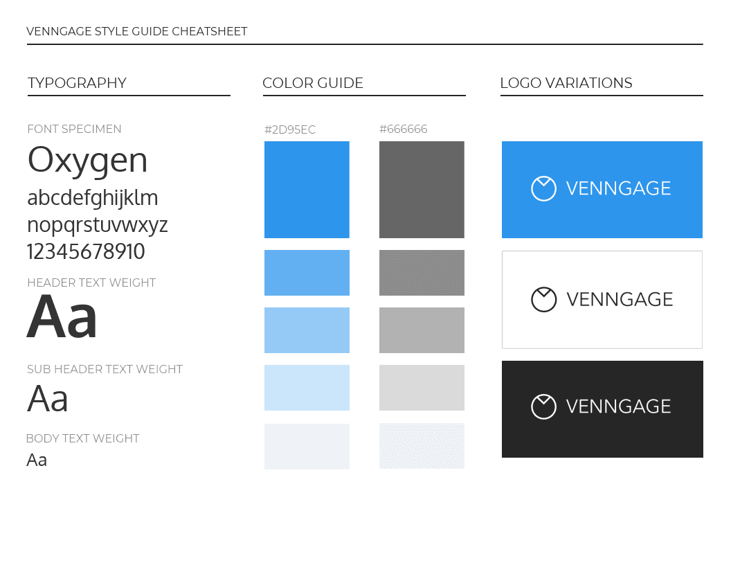
While you should have a more comprehensive branding manual, it’s a lot for people to sift through every time they have a question.

That’s where a simple cheat sheet will do the trick. The above brand guidelines template outlines some of the most important facets of your visual brand. This condensed version of the brand style guide is easy to pin up in your workspace.
Black one page brand guidelines poster
Best for: Modern, premium and bold brands
Highlights: Uses a dark background to make brand colors and typography stand out.
Choose this template if: You want a visually striking guide that reinforces your brand aesthetic.

I may be a little biased here because black is my favorite color, but I think it makes a great background for many brand guidelines templates. That’s because the colors and text can really pop on a dark background.
For example, look at how striking the colors and text are in the above example from Egotype.
Core color palette brand guide template
Best for: Marketing and design teams
Highlights: Documents brand colors with HEX, RGB, CMYK and Pantone values.
Choose this template if: Multiple people create branded assets across print and digital channels.

Not every designer uses the exact same programs or ideas when creating something. There are also hundreds of apps that can be used to design, like Venngage for Business. And even more ways of creating the same type of design work.
Some brands may use an internal team, or outsource it to another company.

You should keep all that in mind while building a one page brand guide. Especially when laying out your color palettes. It’s a good idea to include the Hex, RGB, CYMK and PMS color codes of all your colors, like in the brand guidelines template above.
Modern color palette brand guidelines template
Best for: Brands building a strong visual identity
Highlights: Explains the inspiration behind the color palette alongside the color specifications.
Choose this template if: You want your visual identity to feel intentional and memorable.

Every brand is going to include their company colors in their brand guidelines. That’s almost a given, but what they don’t show is how they selected those particular colors.
In this simple brand guide example from Fight To Breathe they go the extra mile and show the origin of their colors. In this case, it was an image that must have spoken to them, and in turn, influenced their whole brand.
You can use the same approach to outline how your brand colors, fonts, or other elements fit into your brand mission, voice and tone.
Modern tech brand guideline template
Best for: SaaS companies, startups and technology brands
Highlights: Documents digital-first assets such as gradients, UI colors and modern design elements.
Choose this template if: Most of your branding lives on websites, apps or digital marketing.

As you can see in this brand guideline example for Crypho, a fake crypto company, they included a branded gradient that people can use. This can be extremely useful, especially if it’s part of your company’s design language.
One page font brand guidelines template
Best for: Teams creating presentations, websites and marketing materials
Highlights: Defines font hierarchy, weights and typography usage.
Choose this template if: You want consistent typography across every customer touchpoint.

Be sure to label where each of your branded fonts should be used, like in this one-page brand guide. No one should have to guess which is a header or a body font when it comes time to use them.

If your company has a ton of different fonts make sure to specify when or where they should be used. Even if you only have two fonts, it doesn’t hurt to include specific instructions for using them.
Creative one page brand guidelines example
Best for: Creative brands and agencies
Highlights: Shows correct logo usage across different backgrounds and layouts.
Choose this template if: Your logo appears in a variety of digital and print formats.

In this brand guidelines example for Maison Iggy, they show exactly how to use their logo on different backgrounds.
As you can see, the main font color changes with each background to help ensure the logo can be seen.
Modern one page brand guidelines example
Best for: Growing businesses expanding their brand assets
Highlights: Includes primary, secondary and supporting brand colors.
Choose this template if: You need a more flexible color system for multiple marketing channels.

You may have a simple color palette with two or three branded colors already selected but it can always be added to! Try to select at least five colors that represent your brand voice for a more robust color palette.
Especially if your content is going to be seen on a bunch of different platforms, channels or social media networks.
Just like in this brand guideline example created by a designer for the brand Skyscanner. The five colors are different but they all complement each other. If you can’t come up with five, at least pick three and fill the other two spots out with some neutral colors.
Creative one page brand guideline template
Best for: Design-led brands and creative teams
Highlights: Documents font weights, styles and visual hierarchy in one place.
Choose this template if: Several people create branded content and need clear typography rules.

Make sure your employees know what weight each of your fonts should have. Some places may need a bold font, a medium or a minimal font but they will not know that unless you tell them.

In this template above, they show you exactly what weight should be used with all fonts.
One page brand positioning guide template
Best for: Growing businesses and larger teams
Highlights: Aligns brand positioning, messaging, audience and competitive differentiation.
Choose this template if: You want everyone communicating your brand with a consistent voice and message.

It’s very important these days to have a unified brand message or voice coming from all of your employees. Having a bunch of random messages, ideas, or visuals coming from people working at the same company is never good for consistency.
Especially when consistent branding leads to a revenue increase of 23%!
To make sure that everyone is on the same page from day one, I would recommend creating a brand positioning document before working on your full brand guidelines.
Obviously, this shouldn’t replace your brand guidelines but instead be supplementary to it.
As you can see in the style guide template above, they outline their slogans, competitors, market and more. A guide like this is probably not needed for small teams, but larger companies should already have something like this drawn up.
Simple brand guidelines templates
If you need more room than a one-page guide provides, a simple brand guidelines template gives you space to document your visual identity without becoming overly detailed. These templates work well for businesses with straightforward branding that still want clear standards for logos, colors, typography and messaging.
With a few extra pages, you can explain not only what your brand standards are, but also why they exist. This additional context helps employees, contractors and partners apply your brand consistently across marketing materials, presentations, websites and internal communications.
Now that you have a lot more space to work with, you can explain why certain colors or fonts were selected. This approach can help you tell your brand story to new employees as part of their onboarding or people outside of the company. You can include it as part of your employee handbook.
Simple business brand guidelines template
Best for: Small businesses, startups and growing teams
Includes: Brand overview, logo guidelines, color palette, typography and voice guidelines
Why choose this template: This fully editable template provides a structured framework that you can customize with your own brand assets and standards, making it easy to onboard new team members and maintain consistency.

Instead of only documenting visual assets, this template includes a dedicated brand overview section that explains your brand’s personality and positioning. Giving teams this context helps them make better design and messaging decisions without constantly referring back to stakeholders.

An easy way to illustrate that to readers is by including a signature section, like in the brand guidelines template above. From the beginning, this company outlines how to achieve that feeling in all design work.
Minimalist coffee shop brand guidelines example
Best for: Coffee shops, cafés, restaurants and hospitality brands
Includes: Primary and secondary color palettes, approved tints and shades and color usage guidance
Why choose this template: This example demonstrates how to expand a simple color palette into a flexible brand system that stays consistent across menus, packaging, signage and digital marketing.

One of the easiest ways to expand your official brand colors is to also include branded tints and shades. This is a great way to make a few simple colors go a long way.
But with so many options out there you probably should make a list of approved colors. Otherwise, you are going to have too many “official” colors to keep track of.
In this brand guidelines example for Stories, they include five official variations of their official colors. This should take the guesswork out of using tints and shades in the future as well.
Creative brand style guide example
Best for: Coffee shops, cafés, restaurants and hospitality brands
Includes: Primary and secondary color palettes, approved tints and shades and color usage guidance
Why choose this template: This example demonstrates how to expand a simple color palette into a flexible brand system that stays consistent across menus, packaging, signage and digital marketing.

Creative brands often rely on more than logos and colors to stand out. This template documents how visual elements, photography, illustrations and layouts work together to create a recognizable brand identity.
Including real-world examples of branded materials helps designers and marketers to make communication easier and apply the guidelines consistently across websites, social media, presentations, packaging and other customer touchpoints.
Simple white brand guidelines poster
Best for: Small businesses, creative teams and internal brand communications
Includes: Brand values, logo usage, typography, color palette, icons and visual identity guidelines
Why choose this template: This editable template presents your core brand standards in a clean, poster-style format that’s easy to customize, share digitally or use as a quick reference for employees and collaborators.

In this example from Little Free Radical, the custom icons, typography and paper-inspired textures reinforce the brand’s handcrafted personality. Every visual element supports the same message, demonstrating how consistent design choices strengthen brand recognition.
Small business brand guidelines templates
Small businesses often need a practical brand guidelines template rather than a lengthy enterprise brand book. A well-designed template helps keep branding consistent across websites, social media, marketing materials and customer communications without requiring a large design team.
If you’re a solo founder or have a small team working across just a few channels, a one-page brand guide is often enough to document your logo, colors, fonts and voice.
As your business grows, your team expands or you begin managing multiple channels and campaigns, a multi-page brand guide gives you more space to document detailed logo rules, imagery, layouts, messaging and brand applications.
Bold blue restaurant brand guidelines template
Best for: Restaurants, hospitality businesses and customer-facing brands
Includes: Brand values, messaging, typography, color palette and logo guidelines
Why choose this template: This editable template combines visual standards with brand messaging, making it easier for employees and partners to communicate your brand consistently.

Your brand guidelines should outline exactly what your brand stands for. Not just list visuals, logos, and colors that your brand uses.
Strong brand guidelines document more than logos and colors, they explain what your brand stands for. This template highlights key values and messaging throughout the guide so readers quickly understand your brand personality alongside its visual identity.

One of the easiest ways to bring attention to these values or keywords is to highlight them, like in the brand guideline template above. The designers used a white font to make a few key phrases jump off the page.
This was strategically included so that a reader will associate this brand with “an escape”, “a community” and “a haven.”
One page photography brand guidelines example
Best for: Photography studios, creative professionals and visual brands
Includes: Primary and simplified logo variations, photography style and visual identity guidelines
Why choose this example: It demonstrates how simplified logo variations improve flexibility across digital, print and social media applications.

If your primary logo doesn’t work well at smaller sizes or in narrow layouts, include an approved secondary version. This example shows how a simplified logo gives designers, partners and the media more flexibility while maintaining a recognizable brand identity.
You can create a simplified version of your logo using our logo maker.
Colorful small business brand guidelines template
Best for: Small businesses and growing teams
Includes: Table of contents, brand overview, visual standards and supporting assets
Why choose this template: This editable template organizes your brand guidelines into clearly labeled sections, making them easier to navigate and update over time.

As your brand guidelines become more detailed, a table of contents helps employees, agencies, and contractors quickly find the information they need from presentations to annual reports,. It also provides a helpful overview of your complete brand system, and even, as you can see above, brand guidelines.

Not only will this help the reader navigate through your content. It also gives them a preview of what they are going to find in your brand guidelines!
Small business infographic brand style guide
Best for: Small businesses, nonprofits and mission-driven brands
Includes: Brand story, imagery, visual identity and core values
Why choose this example: It shows how imagery can communicate your brand personality before readers dive into the detailed guidelines.

A strong introduction doesn’t always require lengthy text. This example uses photography to establish the brand’s mood, values, and personality, helping readers understand the visual direction from the very beginning.
Muted photography brand style guide example
Best for: Photography, lifestyle, travel and fashion brands
Includes: Photography direction, editing style, camera settings and visual examples
Why choose this example: It demonstrates how documenting photography standards helps create a recognizable visual identity across all marketing channels.

Consistent photography is just as important as consistent colors or typography. Including guidance on composition, editing, lighting or camera settings helps ensure every image reflects the same brand style.
Check out our post on how to incorporate stock photos in your designs for more tips.
Simple restaurant brand style guide template
Best for: Restaurants, cafés, hospitality businesses and local brands
Includes: Team introduction, brand story, visual identity and messaging guidelines
Why choose this template: This editable template combines brand standards with storytelling to create a more personal and memorable brand guide.

At the core of every small business is the founders and employees, no matter what industry you work in.
Take some time to introduce yourself or your employees in your branding guidelines. In this brand guidelines template, they use an entire page just for that!
Not only will this make your brand feel a lot more genuine, these people are an important part of your brand story.
Minimalist interior design brand guide template
Best for: Interior designers, architects and creative studios
Includes: Typography, logo usage, color palette and visual identity guidelines
Why choose this example: It highlights how typography can become a defining part of a brand’s visual identity.

The font used in this brand guide example from Anna Vanderiet is simply incredible. It jumps off the page and grabs your attention in an instant. And when it is paired with a minimalist guide, the font looks even better.
Creating a font guide like this also shows that certain fonts are important in maintaining consistent visual branding.
White boutique brand style guide template
Best for: Retail, fashion and boutique brands
Includes: Color palette, graphic elements, typography and brand applications
Why choose this example: It presents brand colors in a way that clearly demonstrates how they work together across different applications.

Rather than listing individual colors, this guide illustrates the relationships between them. Showing approved combinations makes it easier for designers to apply your palette consistently across digital and print assets.
Modern fitness brand guidelines example
Best for: Personal brands, fitness businesses and coaches
Includes: Brand statement, messaging, visual identity and positioning
Why choose this example: It shows how a founder’s story or mission statement can strengthen a brand guide beyond visual standards.

A personal statement can go a long way in helping your audience understand your brand. This statement is especially useful for entrepreneurs or founders, but smaller brands can also utilize it.
For example, in this brand guidelines example from Lauren Sambataro a large section of the guide is used for that statement. I also like how prevalent it is in the graphic, which also shows that they take this statement very seriously.
Creative small business brand style guide template
Best for: Food brands, artisan businesses and creative companies
Includes: Color palette, textures, typography and supporting graphic elements
Why choose this template: This editable template shows how custom textures and graphic elements can become recognizable parts of your visual identity.

Your brand identity isn’t limited to logos and colors. This template demonstrates how textures, patterns, and other graphic elements can create a more distinctive and memorable brand across packaging, websites, and marketing materials.
Creative brand guidelines templates
If you work for an extremely creative brand, like Venngage, your branding guidelines should reflect that.
It would be a little confusing if a creative brand like Adobe or Nike had very bland and boring brand guidelines.
Explain why a font was selected, where the inspiration for that brand color was found and more.
If your designers took any inspiration from other creators or artists, you can add those to your branding manuals or guides as well!
These pieces of information can really help tell your brand story to both people inside and outside the company.
Muted business brand guidelines template
Best for: Creative agencies, startups and modern brands
Includes: Custom typography, color palette, logo guidelines and brand overview
Why choose this template: This editable template uses branded typography throughout the guide, reinforcing your visual identity while documenting your brand standards.

If your brand uses a custom typeface, don’t just list its name, use it throughout the guide. This template demonstrates how consistent typography can reinforce your brand personality while showing readers exactly how the font should appear across different applications like social media and annual reports.

In the brand guide template above, a branded font is used in each page header. This ensures that the font is the first thing a reader or the press will see on each page of the creative brand guide. And whether it be serious, or playful, they can set that tone from the beginning.
Bold fashion brand style guidelines template
Best for: Fashion, retail and lifestyle brands
Includes: Logo applications, typography, color palette and visual identity guidelines
Why choose this template: This editable template demonstrates how to reinforce brand recognition by showing your logo consistently across multiple layouts.

Your logo is one of the first things people will associate with your brand. When people see that graphic out in the world they should immediately think about your company.
Now, most companies only have a small section for their logo in their brand guides. Sometimes they even dedicate a page to showing how you shouldn’t use their logo.

But as you can see in this fashion brand guidelines template above, they plaster their logo all over each page.
Creative minimalist brand guide template
Best for: Creative studios, design agencies and minimalist brands
Includes: Brand patterns, graphic elements, typography and visual identity standards
Why choose this example: It shows how documenting patterns and supporting graphics creates a more complete design system.

Supporting elements like patterns, textures and graphic motifs deserve the same attention as logos and colors. Including them in your guidelines ensures they are used consistently across presentations, websites, packaging and marketing materials.
Bold collage brand style guidelines template
Best for: Creative brands, agencies and lifestyle companies
Includes: Mood board, visual inspiration, photography direction and brand personality
Why choose this example: It demonstrates how mood boards help communicate the look and feel of your brand beyond individual design assets.

Mood boards help define the overall creative direction of your brand. Including one in your guidelines gives designers, marketers and external partners a visual reference for the style, mood and tone they should aim to achieve.
Extra colorful brand guidelines example
Best for: Brands with extensive design systems and multiple content types
Includes: Section organization, color coding, typography and brand hierarchy
Why choose this example: It shows how color can improve navigation while organizing longer brand guidelines.
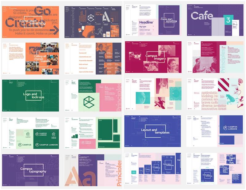
Using color to help readers move from section to section is a classic design hack. It shows them that they are reading a new piece of information, without spelling it out for them.
The designers for Campus used this design hack to help organize their brand guide effectively. With the 5 primary colors breaking down the somewhat long guide into manageable chunks of information.
Fun illustrated branding guidelines example
Best for: Consumer brands, startups and illustration-led businesses
Includes: Custom illustrations, icons, graphic elements and visual identity guidelines
Why choose this example: It demonstrates how illustrations can become official brand assets alongside logos, typography and colors.

Over the past few years, there has been a huge increase in brands using hand-drawn illustrations. They have already taken over Silicon Valley and social media.
And now brands are starting to add them to their official brand, like Fabled did above.
Not only are illustrated icons and symbols all over their brand guidelines, they officially sanctioned a handful of branded illustrations as well. These official illustrations are a fantastic way to set your company apart from the competition.
Simple one page color palette guidelines
Best for: Brands with extensive color systems and design teams
Includes: Primary, secondary, and supporting color palettes with usage guidance
Why choose this example: It demonstrates how to organize a large color system into a clear, easy-to-reference guide.

As your brand grows, your color system may expand beyond a handful of primary colors. This example shows how to organize a large palette into structured groups, making it easier for designers to choose the right colors for different applications while maintaining consistency.
Corporate brand guidelines templates
When your company is spread across the globe, with thousands of different employees in hundreds of offices, your brand guidelines need to be very clear and easy to understand.
Otherwise, the strong visual brand that you have built up could fall apart because of inconsistent branding.
Below there’s a great cross section of different corporate brand guidelines examples. We think that they have outlined basically everything that you need to include in your brand guidelines.
Spotify logo brand guidelines example
Best for: Corporate brands, professional services and B2B companies
Includes: Brand overview, imagery guidelines, typography, color palette and messaging
Why choose this template: This editable template combines visual standards with photography guidance, making it easier for teams to create consistent branded content.

A strong cover page introduces your brand personality, while curated photography examples establish the visual direction for future marketing materials. Including approved imagery helps designers and content creators select visuals that align with your brand.
Bold brand style guide template
Best for: Corporate brands, professional services and B2B companies
Includes: Brand overview, imagery guidelines, typography, color palette and messaging
Why choose this template: This editable template combines visual standards with photography guidance, making it easier for teams to create consistent branded content.

A strong cover page introduces your brand personality, while curated photography examples establish the visual direction for future marketing materials. Including approved imagery helps designers and content creators select visuals that align with your brand.

Additionally, throughout this brand guideline template, they include examples of images that fit their mission. This can help give designers and writers a clear idea of what to strive for.
Green bold brand guidelines example
Best for: Brands with strong visual identities
Includes: Typography, brand messaging, color palette and layout examples
Why choose this example: It shows how consistent typography and messaging reinforce your brand throughout the guide.

A solid example of bold brand guidelines comes from Homestar. As you can see above, each page uses a font that readers can’t miss to give them some important information. From their brand colors to the motto and even the headers of each page.
All of this info probably could be placed on a single page, but that approach doesn’t fit their brand. For them, bigger is better.
Healthcare brand style guide ebook template
Best for: Healthcare organizations, nonprofits and professional services
Includes: Typography, color palette, imagery guidelines and communication standards
Why choose this template: This editable template creates a polished, trustworthy reference that teams can customize with their own brand assets.

Typography shapes how people perceive your brand. This template demonstrates how a consistent font system can communicate professionalism and credibility while providing clear guidance for digital and print materials.
Ideame branding guide example
Best for: Companies with multiple marketing teams or external partners
Includes: Logo spacing rules, clear space requirements and logo usage examples
Why choose this example: It demonstrates how documenting clear space protects logo visibility across different applications.

Adding minimum clear space requirements prevents logos from competing with nearby graphics or text. Including visual examples removes ambiguity and helps ensure consistent implementation.
Logo development brand style guide
Best for: Brands documenting their visual identity process
Includes: Logo evolution, design rationale and visual identity development
Why choose this example: It provides useful context for why the final logo was selected, helping internal teams better understand the brand system.

Standing out in the market is one of the main reasons that you are creating a visual brand in the first place. But if the branding you choose is too close to your competitors, all this work will be a waste.
Before you decide on any fonts, colors or graphics, take a look at what your competitors are doing first. As you can see, Mobingi took this advice pretty seriously when developing their logo.
You can include this section in your brand guide if you want, especially because it explains how you picked a certain logo.
Airbnb brand assets guide example
Best for: Companies with extensive media libraries and marketing assets
Includes: Organized brand assets, photography, illustrations and downloadable resources
Why choose this example: It demonstrates how organizing assets by category makes them easier for employees and media partners to locate.

Your brand guidelines should obviously include a nice collection of authorized company visuals or images.
But if you dump all of those visuals into a single folder, regardless of content, it may be difficult for your team or then press to find the images they’re looking for.
Instead, try organizing the official images by topics or use like Airbnb does.
Lonely planet icon usage brand style guide
Best for: Content publishers, travel companies and product-focused brands
Includes: Icon library, icon usage rules and graphic elements
Why choose this example: It demonstrates how documenting custom icons creates a more consistent visual language.

Icons often become an extension of your visual identity. Including approved icon styles, sizing, spacing, and usage examples helps maintain consistency across websites, apps, and printed materials.
Orange STIHL business brand guidelines example
Best for: Large organizations with multiple contributors
Includes: Brand applications, real-world examples, logo usage and visual standards
Why choose this example: It reinforces every guideline with practical examples that teams can replicate.

Created by Steven Arnold, the directions in this unique brand book example are so simple and straightforward that anyone could follow them.
Each page is perfectly crafted to help almost anyone use the STIHL branding correctly.
They make sure to include examples of it being used in the real world, and fun visuals to drive home the point. Even though this is a fake brand book example for the company STIHL, I’m guessing it’s better than the real one.
Classic professional law brand guidelines template
Best for: Law firms, financial services and corporate organizations
Includes: Typography, layout standards, brand colors and document design guidelines
Why choose this template: This editable template uses a clean layout that prioritizes readability while documenting essential brand standards.

Clear spacing and consistent layouts improve readability, especially in longer brand guides. This template uses generous white space to organize information, making it easier for readers to locate and apply brand standards.
Tech brand guidelines templates
Tech brands are in a unique situation when it comes to creating brand guidelines. Not only do they have to make sure the branding works on a ton of digital platforms, but also in the real world.
A logo that was optimized for social media might look terrible on a poster hanging on the wall.
Or a hex code for one of your brand colors doesn’t render correctly in a video editing tool unless you create a business video using a tool that integrates your brand colors.
Now this means that your style guide might be a little more in depth than some of the other companies that we have looked at.
But it’s worth it in the long run, because inconsistent branding will cost your company revenue and trust.
Modern colorful brand guidelines template
Best for: SaaS companies, startups and digital-first brands
Includes: Color system, typography, logo guidelines and visual identity standards
Why choose this template: This editable template showcases a comprehensive color system that teams can customize for websites, products and marketing materials.

A well-organized color system goes beyond listing brand colors. This template dedicates space to primary, secondary and supporting colors, making it easier for designers to apply the correct palette across digital and print assets.

First, they dedicate an entire page to their brand color schemes, which shows how much those colors actually matter to them. Overall, it’s one of my favorite examples of a truly ingenious branding manual!
Mailchimp logo brand guidelines example
Best for: Brands with mascots, illustrations or signature brand characters
Includes: Logo rules, mascot usage, approved variations and visual examples
Why choose this example: It demonstrates how to document the correct use of branded characters alongside traditional logo guidelines.

If your brand includes a mascot, illustration or signature graphic (like Mailchimp), treat it as an official brand asset. Providing clear usage examples helps maintain consistency across campaigns, merchandise and digital experiences.
Mailchimp name usage brand guidelines example
Best for: Brands with unique or unconventional names
Includes: Brand name formatting, capitalization, spelling and usage guidelines
Why choose this example: It removes ambiguity by documenting exactly how your brand name should appear across every channel.

These days, many brand names are made up, missing letters or are a mashup of multiple words.
If your company has an obscure or made up name, like Mailchimp, be sure to show the public how it should actually be used. This includes showing what letters should be capitalized and if the name includes any spaces.
Netflix brand guidelines site
Best for: Enterprise brands and companies with extensive brand resources
Includes: Online brand portal, downloadable assets, logo files and usage guidelines
Why choose this example: It demonstrates how a centralized online brand hub makes assets and documentation easier to access and maintain.

As you can see in this example, Netflix has organized all of its brand guides onto a landing page. In my search for great examples for this article, I found that a handful of larger brands used this idea as well.

Also, by giving your brand guide its own site, you show to the public that you really care about what it says.
Yelp extended color brand guidelines example
Best for: Digital products, apps and web platforms
Includes: Device-specific color guidance, accessibility considerations and color usage examples
Why choose this example: It shows how color systems can be optimized for different screen sizes and digital environments.

Colors are going to interact in different ways if they are used on a mobile device. Something could look amazing on your massive monitor, but when seen on a small phone screen it’s much less impressive.

So to make sure this doesn’t happen to your brand, try copying what Yelp did. Each color in their palette has been approved for use on a device, or not, with a smart icon.
Web summit conference brand guidelines example
Best for: Large marketing teams and event brands
Includes: Typography, color combinations and layout rules
Why choose this example: It demonstrates how detailed specifications reduce inconsistencies across large teams and multiple design applications.

Get extra specific with your guidelines as a consistent brand is worth its weight in gold these days. Especially when your company has spent so much time building a strong visual brand.
In this example from WebSummit they show which colors should be used with each font. This may seem like a bit much, but I think it helps show exactly how your branding should be used.
Don’t leave any extra room for interpretation if you can, because then mistakes will be made. Especially if you’re working with a large or distributed team.
Mozilla large color palette brand guidelines example
Best for: Brands with extensive design systems
Includes: Primary, secondary and supporting color palettes with visual hierarchy
Why choose this example: It organizes a large color system into clearly defined groups that are easy for designers to reference.

If you took a quick look at the official brand colors from Mozilla you would probably be able to figure out which were the main and secondary colors instantly.
This is because they’ve created a visual hierarchy using different sized circles. Visitors can quickly learn about their primary and secondary colors thanks to this simple trick.
As your design system grows, grouping colors by purpose makes them easier to understand and apply consistently across products and marketing materials.
Dropbox brand guidelines example
Best for: Companies evolving or expanding their visual identity
Includes: Extended color palette, brand evolution and visual identity guidance
Why choose this example: It demonstrates how an expanded color system can support a broader range of marketing and product experiences.

A flexible color palette gives designers more creative options while maintaining a cohesive brand identity. Documenting when and where each color should be used keeps the system organized.
As you can see above, instead of using their old trademark blue, they expanded their brand color palette significantly to include some muted colors.

These rather massive changes were undertaken to position the company as something that connects the creatives of the world. I think they did a great job with the rebrand.
Dribbble color palette brand style guide example
Best for: Companies managing multiple products, departments or sub-brands
Includes: Product color systems, brand hierarchy and organizational guidelines
Why choose this example: It shows how color coding helps distinguish different teams or product lines while maintaining an overall brand identity.

To keep all your projects, departments and sub-brands straight, try color coding them.
Dribbble uses this tactic in their brand guide, with Hiring, Teams and other teams in their company getting their own official color.
This can come in handy when creating internal documents such as marketing plans or reports, blog posts, presentations and more.
Disqus creative brand style guide example
Best for: Brands with distinctive names or pronunciations
Includes: Brand name guidance, pronunciation resources and communication standards
Why choose this example: It demonstrates how documenting pronunciation and naming conventions strengthens brand consistency beyond visual identity.
There are words out there that no matter how many times you read it, you still will never know how to pronounce it correctly.
But for some words, like Disqus, you aren’t going to have a friend to tell you how to pronounce it. So the people over at Disqus decided to create a short video that shows the perfect way to pronounce their name.
Envato brand tone guide example
Best for: Content teams, SaaS companies and global organizations
Includes: Voice and tone guidelines, messaging principles and terminology standards
Why choose this example: It establishes a consistent writing style that teams can apply across websites, product interfaces, marketing and customer support.

Creating a brand voice or tone guide like this example from Envato will help your employees or designers avoid calling the same thing a handful of random other names.
Not having a consistent brand voice will just leave the reader confused and could even lead to the loss of a customer. This is extremely useful for a large and rather diversified company like Envato.
Frontify interactive brand guidelines example
Best for: Large organizations with evolving design systems
Includes: Interactive brand portal, typography previews, color systems and downloadable assets
Why choose this example: It demonstrates how interactive guidelines improve accessibility and make brand documentation easier to explore.

Why not show exactly how a font would look in all your brand colors with a single click? That’s exactly what the team at Frontify did to help people visualize the different facets of its branding.
This was one of the only interactive brand guidelines examples that I saw, but I think it’s extremely helpful. I hope more companies will follow their lead and make the guides more interactive for everyone.
Social media brand guidelines templates
This section is a little different than the others, but it still has a lot of great brand guidelines examples.
Below you will find some examples from the biggest social media brands and networks.
I wanted to highlight them because they have done a great job of creating and maintaining a visual identity. These examples can help you keep a very consistent brand identity on social media as well.
Like I mentioned with the corporate brand guidelines, there is a lot of risk for inconsistent branding when your company expands.
But these social networks have been able to keep very consistent branding throughout the entire growth process.
Instagram app brand style guide example
Best for: Apps, SaaS companies and mobile-first brands
Includes: Product screenshots, logo usage, app visuals and media assets
Why choose this example: It demonstrates how approved screenshots help ensure consistent product representation across marketing materials and press coverage.

If you really want to show off your product or app in the best light, include some high-quality product screenshots.
For example, if the Instagram brand guidelines didn’t include these screenshots, journalists would have to make their own. Then they could create a screenshot of really anything, instead of using the perfect one your brand should have already made.
Obviously for internal brand guidelines you should include more than just a few screenshots as well.
LinkedIn brand guidelines example
Best for: Enterprise companies and multi-product brands
Includes: Extended color palette, logo guidelines, typography and supporting brand assets
Why choose this example: It demonstrates how an expanded color system supports multiple products and campaigns while maintaining a unified visual identity.

When you are working for a company as large as LinkedIn, you are probably going to have a handful of brand colors to choose from.
With thousands of projects and smaller companies under their control, it makes a lot of sense to have an extended colors palette to choose from. You may not need a ton of separate colors but having a few extra sanctioned ones can’t hurt.
Facebook brand guidelines example
Best for: Companies managing multiple brands or products
Includes: Parent brand architecture, sub-brand guidelines and visual identity standards
Why choose this example: It demonstrates how documenting relationships between brands creates consistency across an entire product portfolio.

This tip may not apply to every company, but many bands may have a few sub-brands under their umbrella. Even at Venngage we have Beam and a few other projects that have their own branding.
If your company manages multiple products or sub-brands, include guidance showing how each brand relates to the parent brand while maintaining its own identity.
Facebook media usage brand guideline example
Best for: Brands working with media, partners and affiliates
Includes: Logo usage rules, prohibited examples and media guidelines
Why choose this example: It reinforces brand standards by clearly showing both correct and incorrect asset usage.

Visual “do’s and don’ts” reduce mistakes more effectively than written instructions alone. Side-by-side examples help external partners quickly understand how to use your brand assets correctly.
Pinterest brand guidelines example
Best for: Consumer brands and marketing teams
Includes: Brand overview, core principles, logo guidelines and messaging
Why choose this example: It demonstrates how a short introduction helps readers understand the purpose of the brand before reviewing detailed standards.

Like with any piece of content, you don’t just want to jump right into the middle of your brand guidelines. Summarize some of your brand values and ideals in a useful introduction instead.

Pinterest‘s brand guidelines not only used a brief intro in their brand guidelines but also a “Basics” section. The intro section outlines all the simple rules and guidelines for using their brand.
Reddit 101 brand guidelines example
Best for: Technology platforms, online communities and digital products
Includes: Brand terminology, product overview, messaging and communication guidelines
Why choose this example: It explains platform-specific terminology alongside brand standards, making the guide more useful for new users and media partners.

If your business uses unique terminology, product names or community features, documenting them alongside your visual identity helps readers understand your brand more quickly.

Take Reddit as an example. Within a minute or so you can understand how the entire platform works! It also effectively outlines terms like “subreddits” and “AMA” that are unique to Reddit but might be new to a user.
Twitter culture brand guidelines example
Best for: Employer brands, technology companies and growing organizations
Includes: Company culture, brand values, mission and communication principles
Why choose this example: It demonstrates how documenting company culture complements visual branding and creates a more complete brand guide.

Brand guidelines don’t have to focus exclusively on design. Including your mission, values and culture helps employees understand how your brand should be represented in both visuals and communications.
YouTube brand guidelines example
Best for: Media companies, content creators and digital platforms
Includes: Brand terminology, naming conventions, logo usage and communication standards
Why choose this example: It shows how documenting official terminology creates consistency across content, marketing and media coverage.

If your brand has coined any words or phrases, include a dictionary in your brand guidelines.
For example, the word “YouTuber” wasn’t intentionally created by YouTube but it became synonymous with their brand.
So they take the time to explain how that word should be used in the official YouTube brand guidelines.
Instagram: Instagram’s brand resources provide clear instructions on logo usage, color palettes and other brand assets to maintain consistency across platforms.
Nonprofit brand guidelines templates
For the last section of this long article, let’s take a look at some nonprofit brand guidelines examples.
Depending on the size of your nonprofit, you could probably just create simple brand guidelines. But if you work for a multinational nonprofit organization, the guidelines need to be a little bit more in depth.
Especially because a consistent brand is very important if you are hoping to raise money or gain the trust of new volunteers. In this space, brand consistency can make or break your organization.
Also, be sure to read our complete guide to nonprofit marketing for more tips and templates.
Modern nonprofit brand style guide template
Best for: Nonprofits, charities and community organizations
Includes: Brand overview, mission, logo guidelines, color palette, typography and imagery
Why choose this template: This editable template combines storytelling with visual standards, making it easy to customize for fundraising, marketing and outreach materials.

A nonprofit brand guide should communicate both your visual identity and your mission. This template uses imagery and messaging together to explain your organization’s purpose while documenting the standards needed to create consistent branded materials.
Bold black & white nonprofit brand guidelines examples
Best for: Established nonprofits and larger organizations
Includes: Brand history, values, visual identity and communication standards
Why choose this example: It demonstrates how a comprehensive brand guide can introduce new employees and volunteers to both your organization and your brand.

Instead of showing employees where they can find your brand guidelines online, you could give them this book on their first day. Not only will it outline exactly how visual branding should be used, it can provide some insight to the history or culture of the company.
Set a book like this one from the Museum of Humanity on every desk, or in every meeting room so anyone can take a look if needed as well.
Colorful brand guidelines examples
Best for: International nonprofits and organizations with regional chapters
Includes: Multiple logos, regional branding, color systems and visual identity guidelines
Why choose this example: It demonstrates how to maintain a unified brand while supporting regional variations.

When you are a multinational organization like ILGA+, it makes sense to use multiple logos and colors.
Different countries may have different design trends and preferences. While their logo designs are varied, they’re still similar enough that they build a singular brand.
Don’t have a logo yet? Our logo maker can help! But first, check out our post on what logo styles consumers trust the most.
Girl scouts brand guidelines examples
Best for: Youth organizations, nonprofits and educational institutions
Includes: Infographic-style guidelines, visual identity, messaging and brand assets
Why choose this example: It presents brand standards in a highly visual format that’s easy for staff, volunteers and partners to understand.

Complex brand guidelines don’t always need lengthy explanations. An infographic-style layout makes important information easier to scan while maintaining a visually engaging presentation.
Also, read our blog types of nonprofit infographics.
Data Viz brand guidelines examples
Best for: Research organizations, advocacy groups and nonprofits that publish reports
Includes: Data visualization standards, charts, color usage, typography and reporting guidelines
Why choose this example: It demonstrates how documenting data visualization standards creates consistent reports, presentations and campaign materials.

Presenting data in an effective, consistent and beautiful way is a bit tricky sometimes. That’s why it’s important to outline how your company visualizes data in your brand guidelines.
In this incredible brand guidelines from Truth, they spend two full pages telling their employees how they should visualize data.
New to visualizing data? Our data visualization best practices guide is a great place to start.
Essential sections in a brand guidelines template
To create an effective brand style guide, here are some essential elements you shouldn’t miss:
Brand overview
The brand overview provides a brief but comprehensive understanding of the brand’s mission, values, and target audience. It helps establish the context for the brand’s identity and ensures that everyone working with the brand understands its fundamental purpose and messaging.
Logo usage
Include detailed guidelines for your logo usage including information on size specifications, clear space requirements and proper color variations. This section also outlines the proper and improper uses of the logo, ensuring that it remains consistent and recognizable across all mediums.
Color palette
This section presents the primary and secondary colors that define the brand, along with their specific color codes (e.g., RGB, CMYK, and HEX) for both print and digital use. Guidelines on how to use these colors in various contexts are also included.
Typography
Specify the typefaces and fonts that represent the brand, including guidelines for headings, subheadings and body text. You can also include instructions for font sizes, weights and styles for different types of content.
Imagery
Guidelines for imagery ensure that all visual content, including photography and graphics, aligns with the brand’s aesthetic. This section might include information on image style, composition, tone and any specific filters or effects to use or avoid to maintain consistency in visual communication.
Iconography
If the brand uses specific icons, this section outlines guidelines for their use, such as preferred styles, sizes and recommended contexts for implementation.
Voice & tone
This part of the style guide defines the brand’s preferred tone of voice, including examples of language that reflects the brand’s personality and values. It provides guidance on how to communicate effectively with the target audience while maintaining a consistent brand voice.
Layout & design
Guidelines for layout and design ensure that all branded materials, whether in print or digital form, adhere to specific formatting standards. To maintain a cohesive visual identity, include instructions for margins, spacing and the overall structure of branded materials.
Examples & best practices
Include visual and written examples to demonstrate how to apply the brand guidelines effectively in various contexts. These examples showcase the correct application of the brand elements and provide a clear understanding of the brand’s visual and written identity.
Use cases & applications
This section provides specific instructions on how to apply the brand guidelines to various materials and platforms, such as business cards, letterheads, websites, advertisements, social media posts and other marketing collateral. It ensures that the brand’s identity is consistent across all touchpoints.
Legal considerations
This part of the style guide includes information on the legal use of the brand assets. It covers topics such as copyright information, trademark usage and any necessary disclaimers to protect the brand’s intellectual property and prevent unauthorized usage of its assets.
FAQs about brand guidelines templates
What’s the difference between a brand guide and a brand kit?
A brand guide explains how to use your brand, including rules for logos, colors, typography, imagery, layouts and voice. A brand kit is a collection of ready-to-use assets, such as logo files, color codes, fonts and templates. Many businesses use both: the brand guide documents the standards, while the brand kit provides the files needed to follow them.
Can a one-page brand guidelines template be enough?
Yes. A one-page brand guidelines template works well for startups, freelancers and small businesses that only need to document the essentials, such as logo usage, colors, typography and brand voice. As your team, marketing channels or product offerings grow, you can expand it into a more detailed multi-page brand book.
Are brand guidelines only for large companies?
No. Businesses of any size benefit from having documented brand standards. Even a simple guide helps employees, freelancers, agencies and partners create consistent marketing materials, social media posts, presentations and customer communications while saving time on revisions and approvals.
Conclusion
If you’ve made it this far, you probably don’t need another reminder that keeping a brand consistent can get messy. When different people create presentations, social posts, reports or marketing materials, it’s easy for logos, colors, and messaging to drift.
The good news is you don’t have to start from scratch. Pick the template that fits the way your team works:
- Go with a one-page template if you want a simple, quick-reference guide for a startup, freelance business or small team.
- Choose a multi-page brand book if you need more detailed guidance for multiple teams, channels or external partners.
- Use an editable template so you can update your brand guidelines as your business grows instead of rebuilding them every time something changes.
At the end of the day, the goal isn’t to create a document that sits in a folder. It’s to make everyday brand decisions easier so everyone can create on-brand content with more confidence and fewer revisions.
Pick a template, customize it with your logo, colors, typography, imagery, and voice, then share it with your team. Your future self (and everyone creating content for your brand) will thank you.