


What’s worse than sitting through a boring presentation? Being the one to deliver a boring presentation. Presentation templates to the rescue!
Say goodbye to typical, boring PowerPoint slides, too. Instead, create a presentation that will make a lasting impression with presentation templates like this one to engage your audience. You can also use them for inspiration for PowerPoint layout ideas:
In this post, I’ll show you how to create a presentation that will not only grab the attention of your audience but hold onto it as well,
This post will offer tips for creating different types of presentations, including:
- Pitch decks
- E-learning slides
- Class presentations
- Webinar presentations
- Marketing presentations
I’ll also give you design tips to customize our presentation templates and share ppt design ideas.
Click to jump ahead:
- Start with presentation templates
- Pick a visual motif to use consistently
- Highlight important information using text
- Dedicate each slide to only one topic
- Don’t overburden your slides with text
- Establish a visual hierarchy on your slides
- Visualize data using charts and infographics
- Create custom illustrations using icons
- Change slide layouts to keep your audience engaged
- Add a progress tracker to your presentation slides
- Download your presentation as a PDF
Design a presentation that engages your audience
Think about the last boring presentation you sat through:
- What did the slides look like?
- Did they have a bland color scheme?
- Were there too many points (or worse, paragraphs) crammed onto one slide?
- Were the charts and diagrams clunky and hard to understand?
When people see the same old boring PowerPoint layouts and themes, there’s a good chance they’re going to lose focus.
Rich media, like video, matters more than ever and there’s no better way to stand out than by creating creative and engaging visual content. If you want to really capture your audience’s attention, you need to design creative presentations, like this one:
That means incorporating eye-catching images, effective data visualizations, and bold typography into your slide decks.
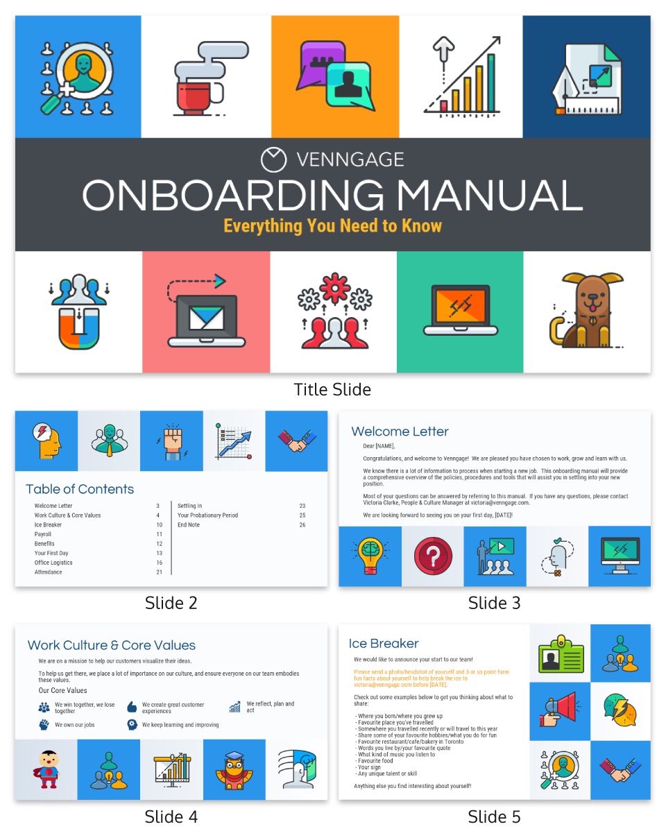
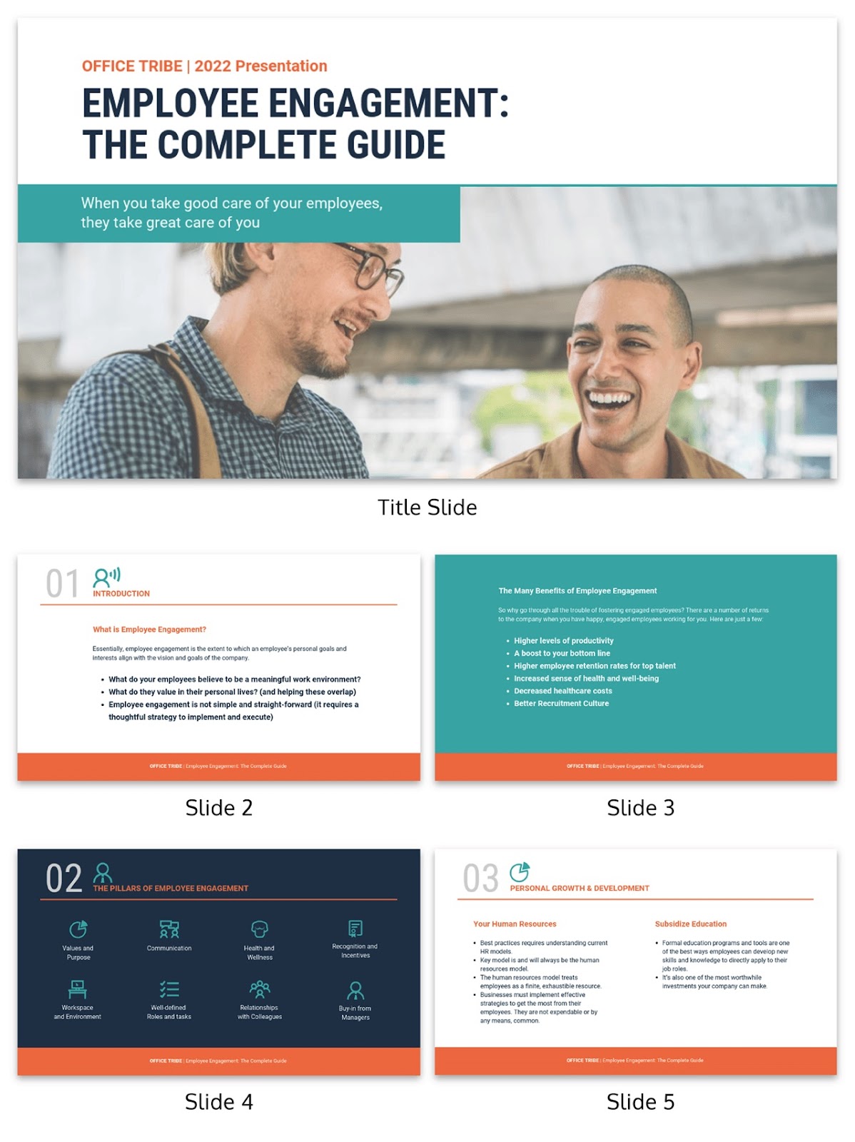
This onboarding presentation, for example, strategically uses bright icons and illustrations to make the material more engaging. This is especially important when presenting to new hires, who are likely dealing with information overload on their first day.
In this particular case, a more visual approach is not necessarily a matter of aesthetic preference, but a decision that can make your presentations more likely to stick.
Pro Tip: Venngage has over 40,000 icons and illustrations you can use to spice up your presentations!
Need something more geared towards speaking? Our keynote presentation templates are all the rage.
Tips to hold your audience’s attention
Many Venngage users have mentioned that they’re always looking for ways to make presentations more engaging. But most of them don’t have any formal design experience.
If you’re in the same boat, don’t worry–this guide is for you. You can also check out this video for all the highlights:
Here are my top tips for designing a presentation with impact:
1. Start with presentation templates
Before jumping into the other tips, let’s set the foundation.
You’ve decided to create something a little more interesting than a standard PowerPoint theme–good on you! But that doesn’t mean you have to start completely from scratch.
Instead, you can give yourself a head start by using creative presentation templates, like this one:
Or this one:
While most PowerPoint themes are fairly limited in how much you can customize them, freeform presentation templates will give you the freedom to alter the design as much as you want.
For example, let’s take this template:
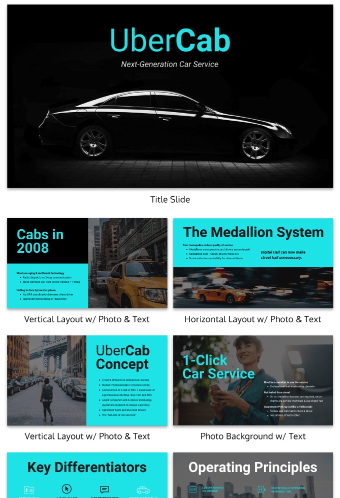
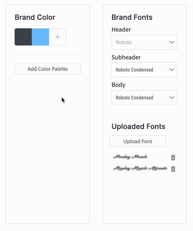
I used Venngage’s My Brand Kit tool to efficiently apply our brand color palette to the Uber template in one click:
There are a ton of creative presentation templates. You can take a look at them in our presentations templates library.
Cool? Now let’s talk presentation design.
2. Pick a visual motif to use consistently in your presentation
You can use visuals to pull your presentation design together and make it cohesive. Picking a visual motif will allow you to use consistent visuals throughout your presentation.
A visual motif is a repeated pattern, design, or image. In your presentation design, a motif can take many forms.
When it comes to infographic color selection, one of the simplest approaches is to use a consistent color motif (or color scheme). That could mean using one or two colors for all of your headers, background and borders.
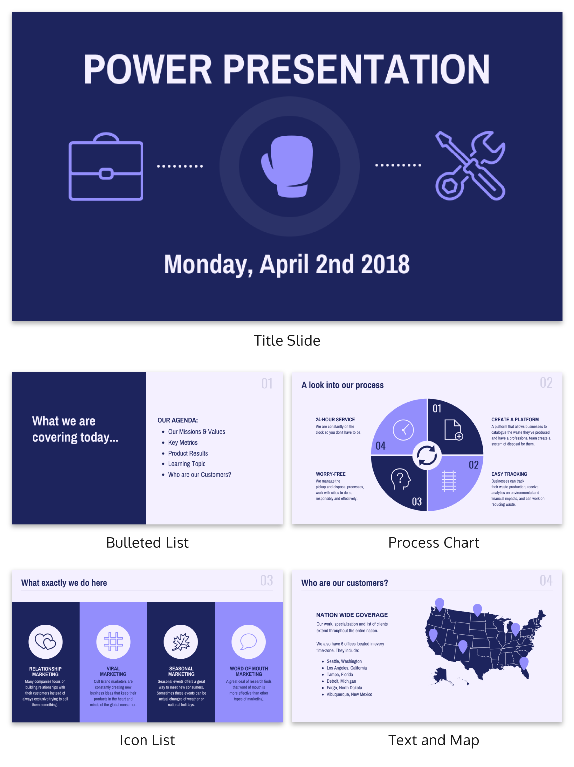
For example, this presentation template uses two shades of purple for a modern design:
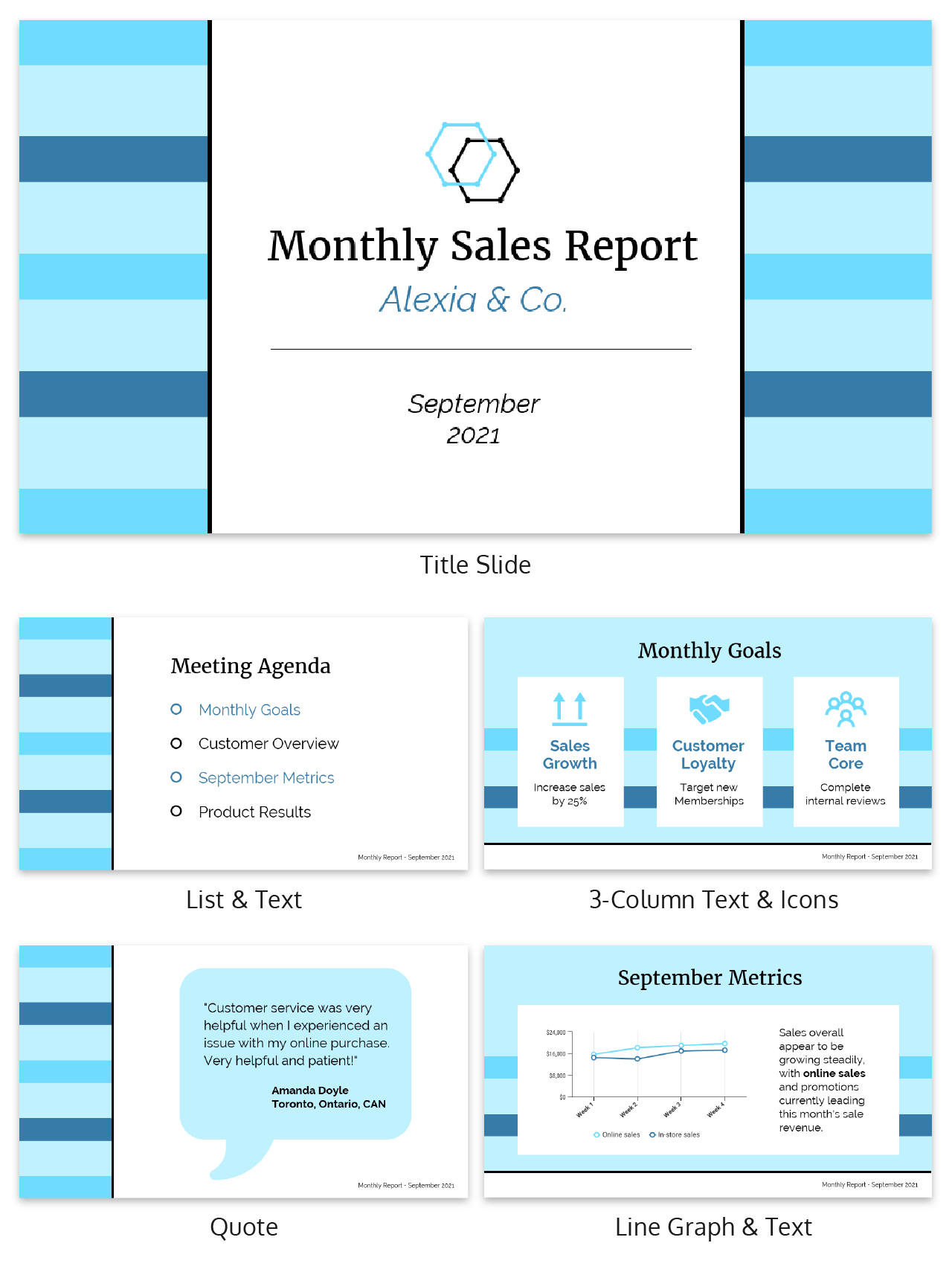
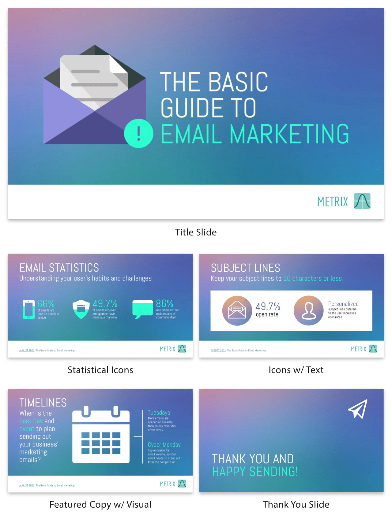
But combining different colors and patterns can also make for a more interesting design. For example, this presentation template uses a blue stripe motif to link the slides together visually:
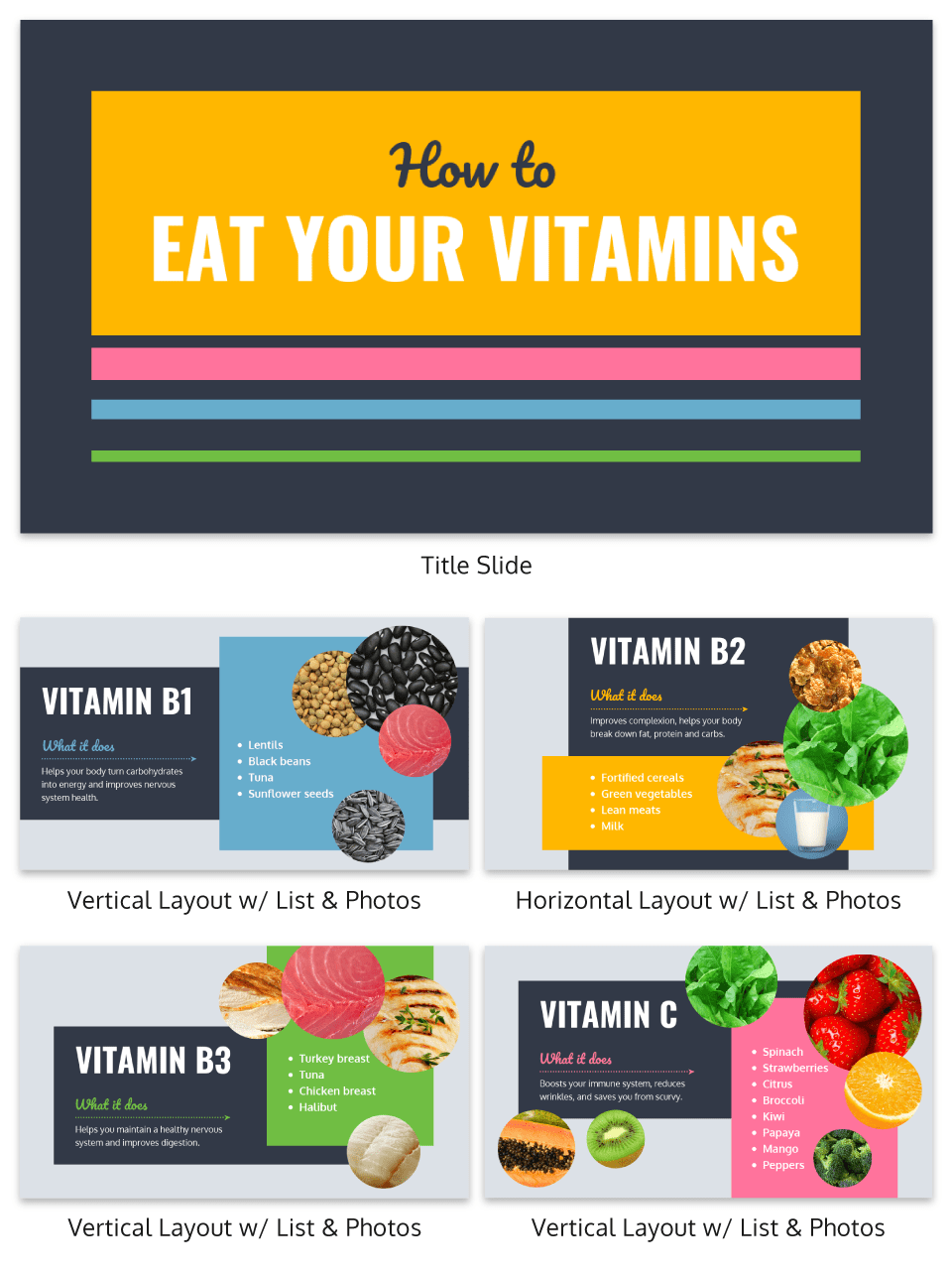
You could also use a recurring shape or image, like the circle image frames in this presentation template:
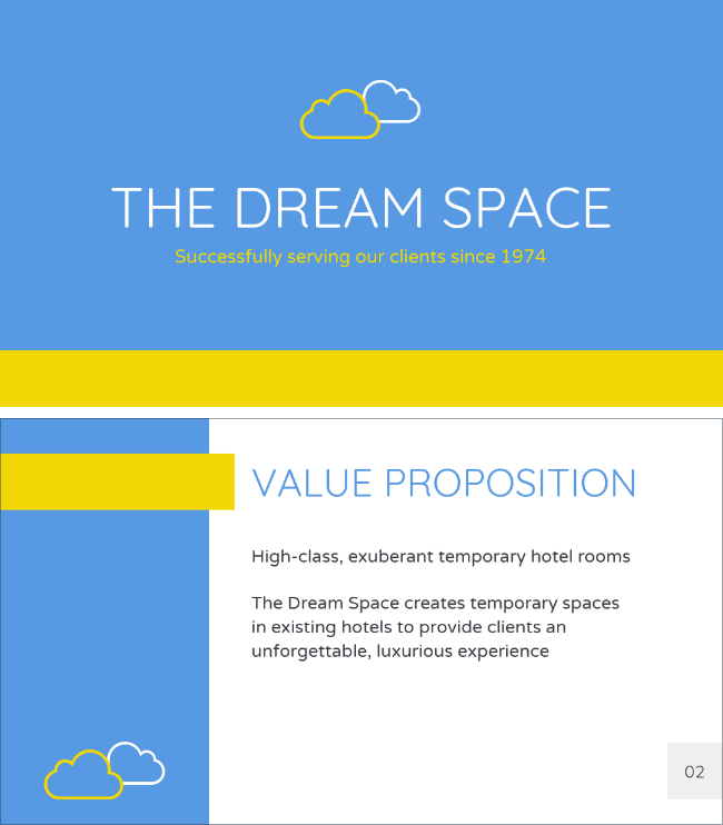
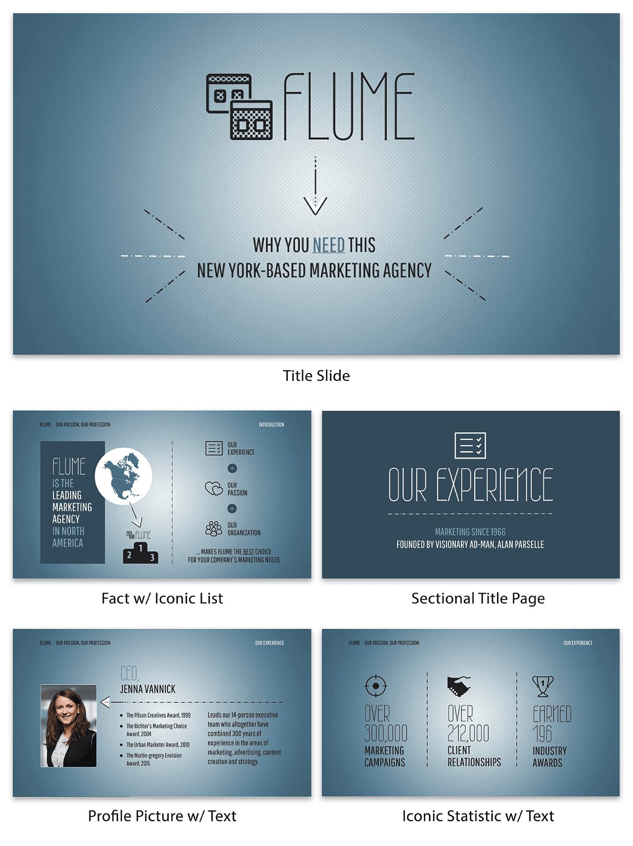
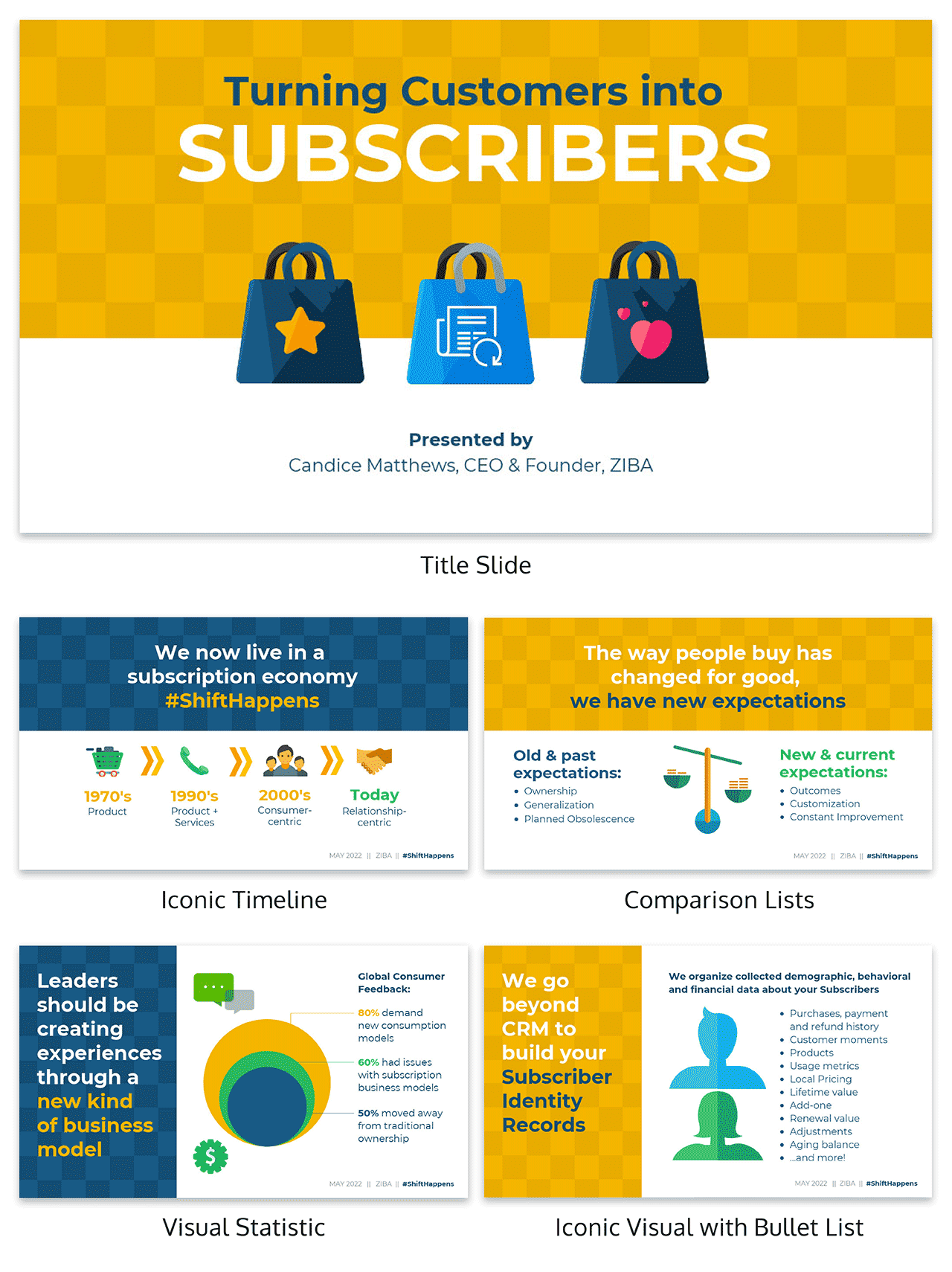
Or you could use a motif that reflects the theme of your presentation. For this presentation, the template uses a recurring cloud motif throughout the presentation to reflect the “dream” theme of the brand. This presentation example demonstrates the power of maintaining a consistent theme to reinforce brand image.
This is a case where starting with a presentation template can really come in handy, because the template will already have a motif. Look for presentation templates with a motif that fits your topic and brand.
3. Highlight important information using text
Returning to the idea or focal points on your slide: emphasize a key number or phrase when creating a persuasive presentation using big, bold text in a contrasting color.
This will communicate to your audience that if they take away one thing from your slide, it should be that piece of information.
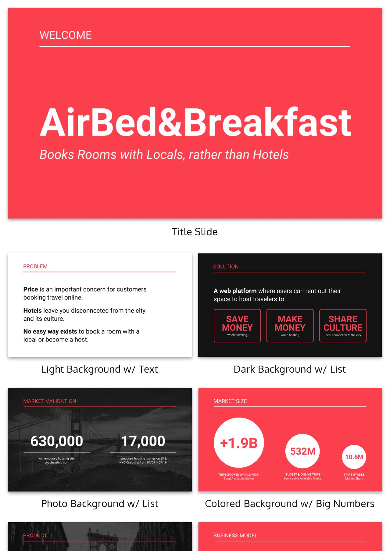
For example, this presentation template uses bright colored font in several sizes larger than the rest of the text to emphasize important numbers on each slide:
But you could also pick one color to emphasize key information with. That way, your audience will catch on to the pattern and look for that color in upcoming slides.
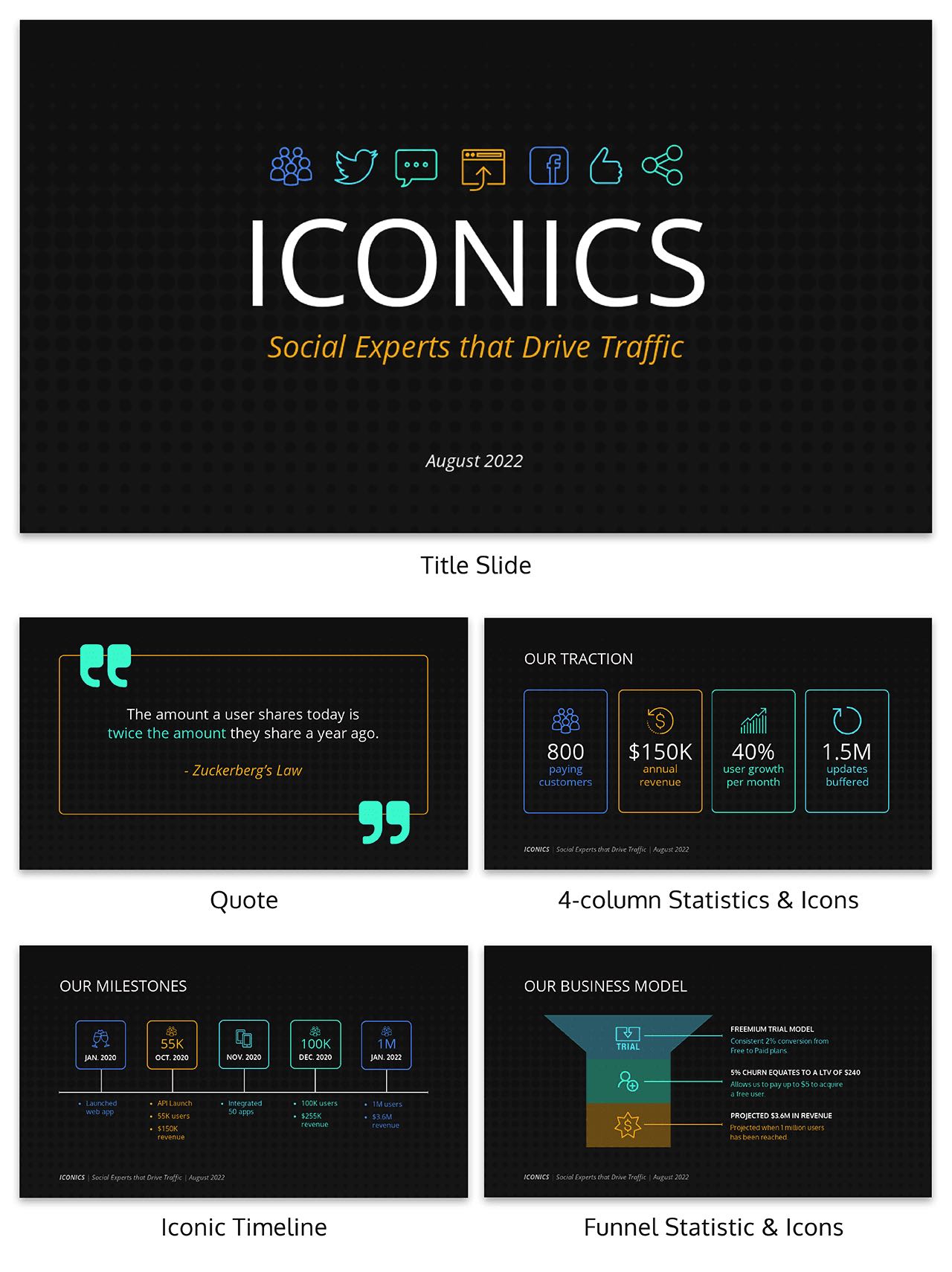
Take a look at how this presentation uses teal to contrast with the other text and emphasize information:
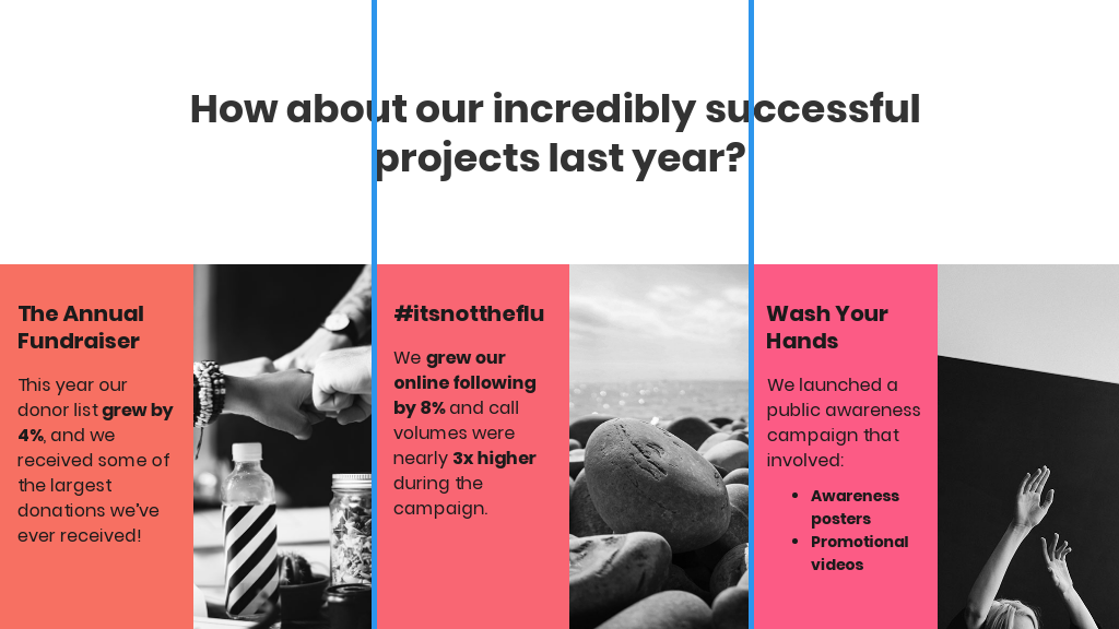
4. Dedicate each slide to only one topic
Just as it’s important for your slides to not be cluttered, it’s also important for your slides to be cohesive.
Keep each slide focused on just one topic. The topic of each slide should be clearly stated in the slide title.
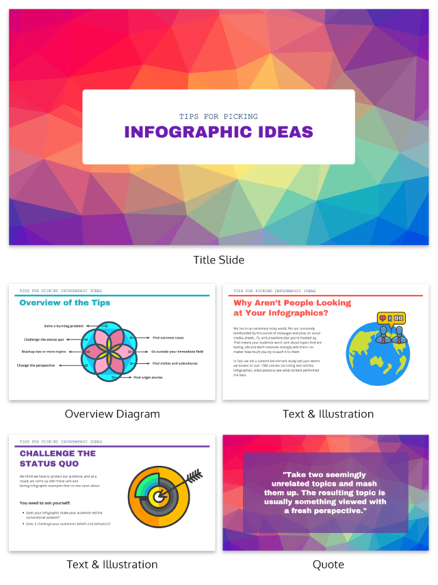
For example, this presentation example, shows a template which covers different ways to be creative. Each individual slide covers one approach:
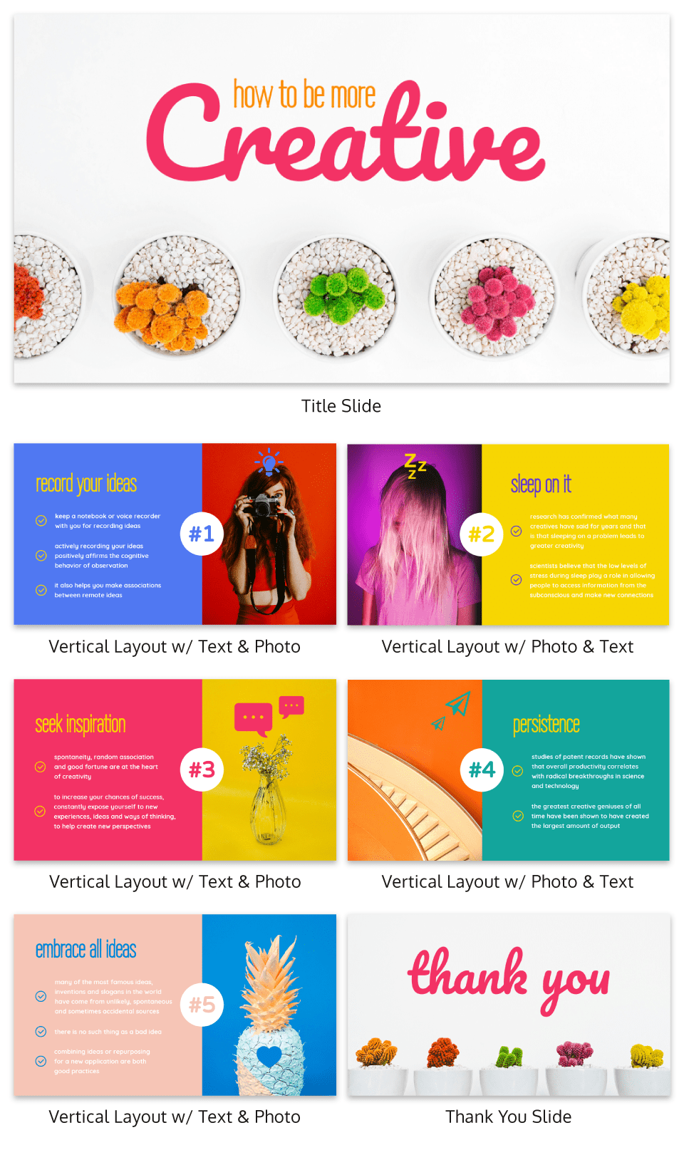
This simple, straightforward slide pattern will help the audience follow along without any confusion.
Or take this presentation template that introduces some of this year’s biggest business trends. Rather than listing multiple trends on one slide, each trend is fleshed out in its own slide:
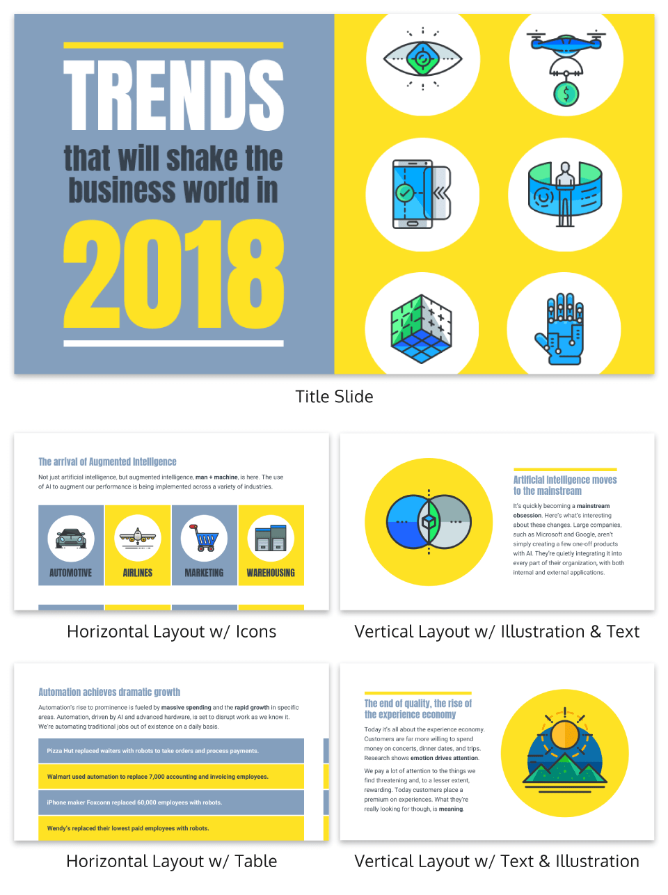
As a presenter, keeping your slide topics organized will help you organize your thoughts as well. Each new slide will signal a new topic.
5. Don’t overburden your slides with text
Even if you decide to ignore most of the other tips in this guide, don’t skip over this one. This is presentation design 101.
When you flip to a slide covered wall-to-wall with text, there’s a good chance your audience is going to think:
- I don’t want to read all of that.
- This presenter isn’t well-prepared.
In fact, a study published in Business and Professional Communication Quarterly found that anxious presenters tended to use more text on their slides, usually because they used their slides as speaking notes.
Instead of using a bunch of text, look for ways to present information visually charts and infographics.
For example, this slide template uses brief text and some simple icons to summarize the presentation:
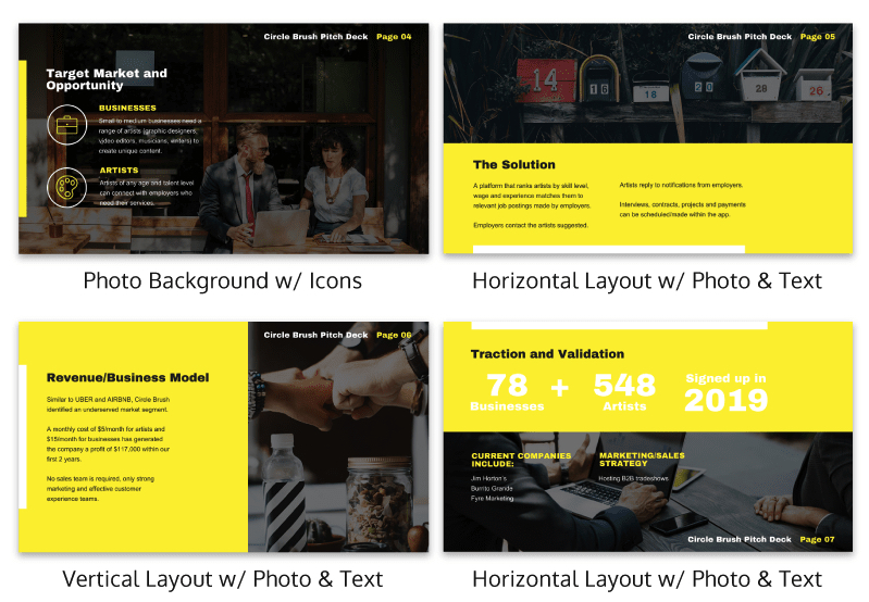
This startup pitch deck makes use of evocative images, icons and big text to help present its ideas:
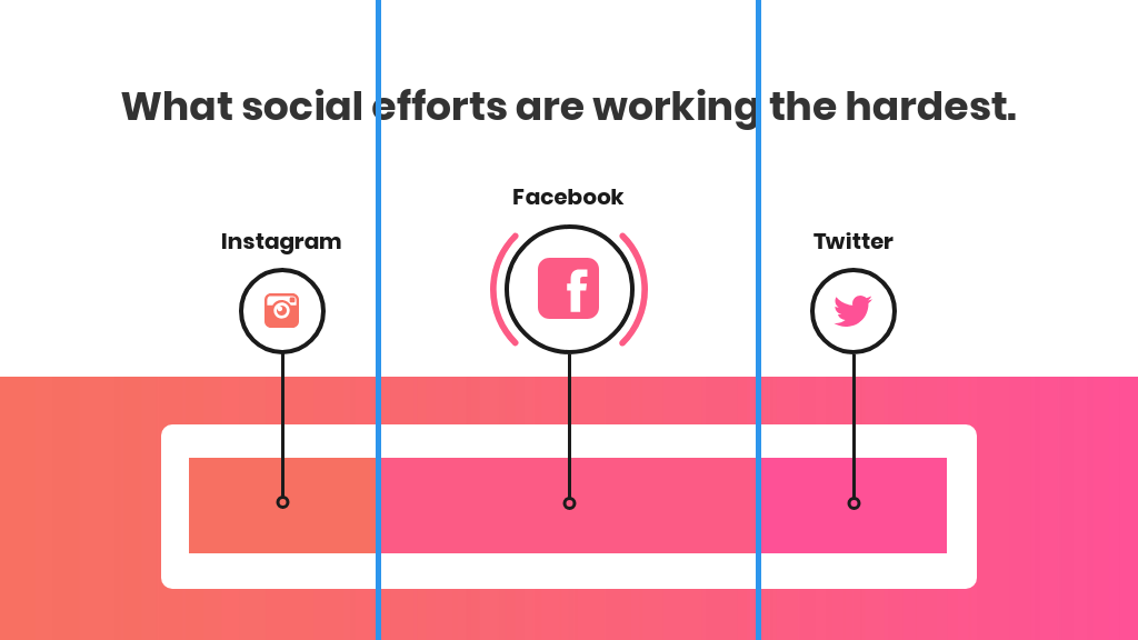
6. Establish a visual hierarchy on your slides
When you flip to a new slide, your audience will be seeing it for the first time. Their eyes are going to naturally be drawn whatever the focal point on the page is.
The focal point is the most dominant area on your slide–the point that draws the most attention.
You can create a hierarchy of information on your slide by making the most important information the focal point of your slide. In most cases, the focal point will be the slide title, or a particular visual, or an important phrase or number.
There are a few ways you can create a visual hierarchy on your slides.
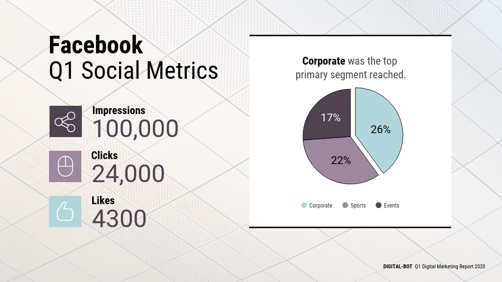
You can bold important phrases, like the word “Facebook” in this slide:
Icons also help to establish a reading order. They draw your eye from point to point. Placing icons beside headers and important points will make them stand out from the other information on the slide.
Icons can also be used to indicate where a new point begins:
Color selection can also be used to establish a visual hierarchy. Take a look at how the colorful blocks in this slide help to make the slide titles pop:
Your eyes are drawn first to the title text, then to the supporting information beside it.
7. Visualize data using charts and infographics
Replacing text with visuals is one of the best ways to prevent your slide design from becoming cluttered. Charts and infographics present information in an engaging, digestible way.
I won’t go into too much detail here about what types of charts you should use for what data. We’ve got an in-depth guide to picking charts for that.
But I’ll give you a few ideas for some types of charts and infographics that work well in presentations.
Related: How to Make Better Infographics for PowerPoint
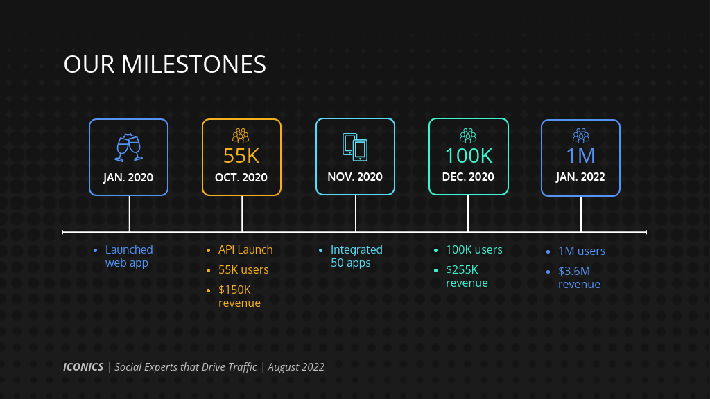
If you want to visualize steps in a process, the history of something, or a roadmap, use a timeline.
This slide template uses a simple timeline with complementary icons to emphasize each date:
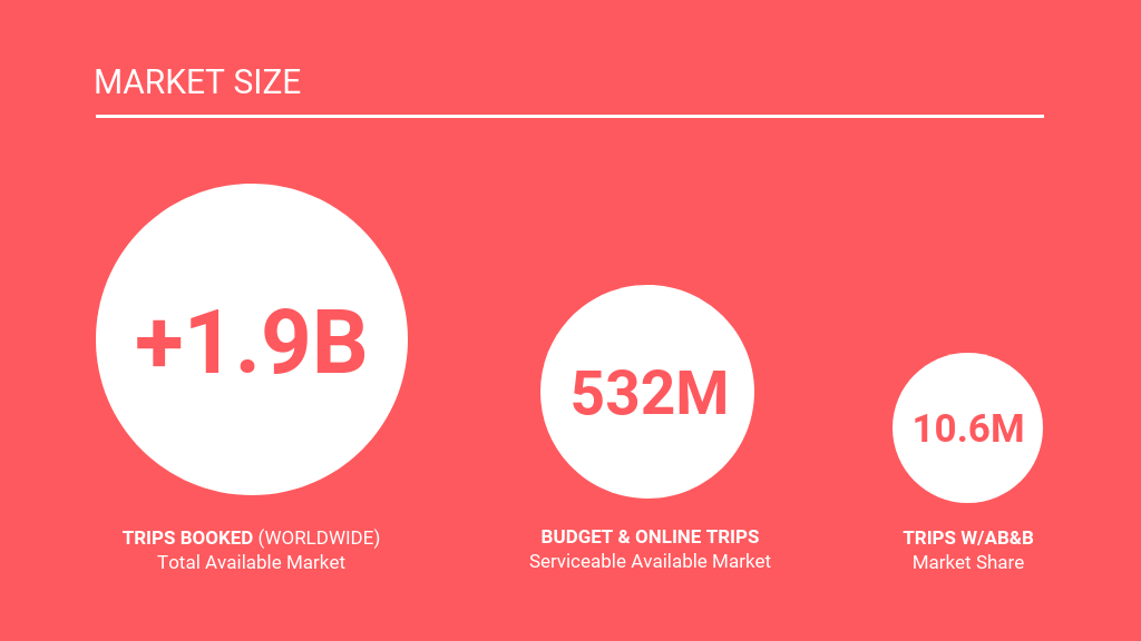
To compare amounts or sizes, a bubble chart can help drive the point home:
Learn how to customize this template:
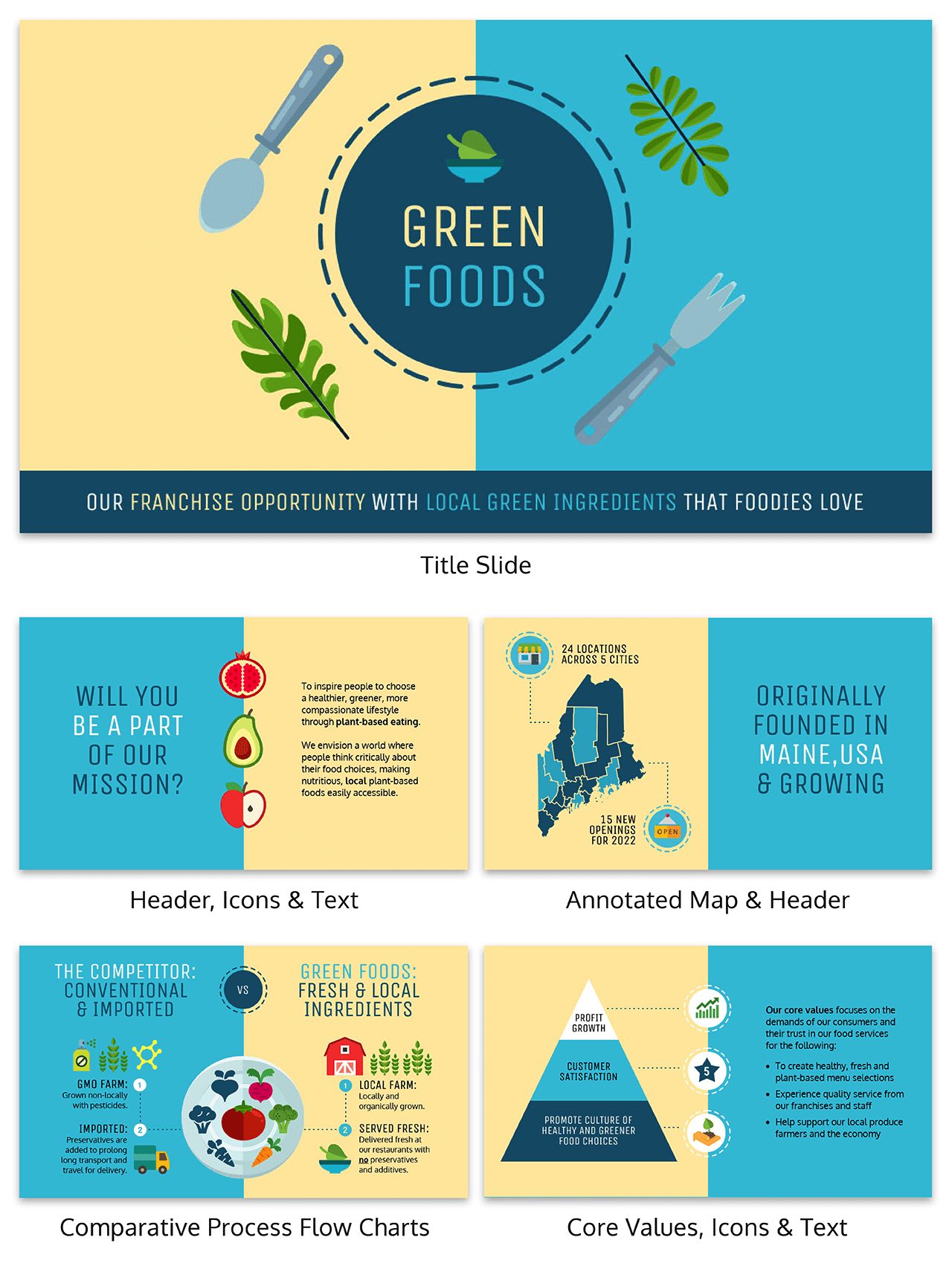
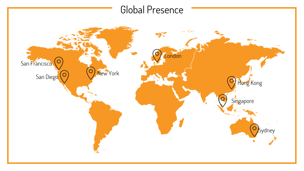
To create an infographic for geographic and demographic information, a map can make a big impact on your audience:
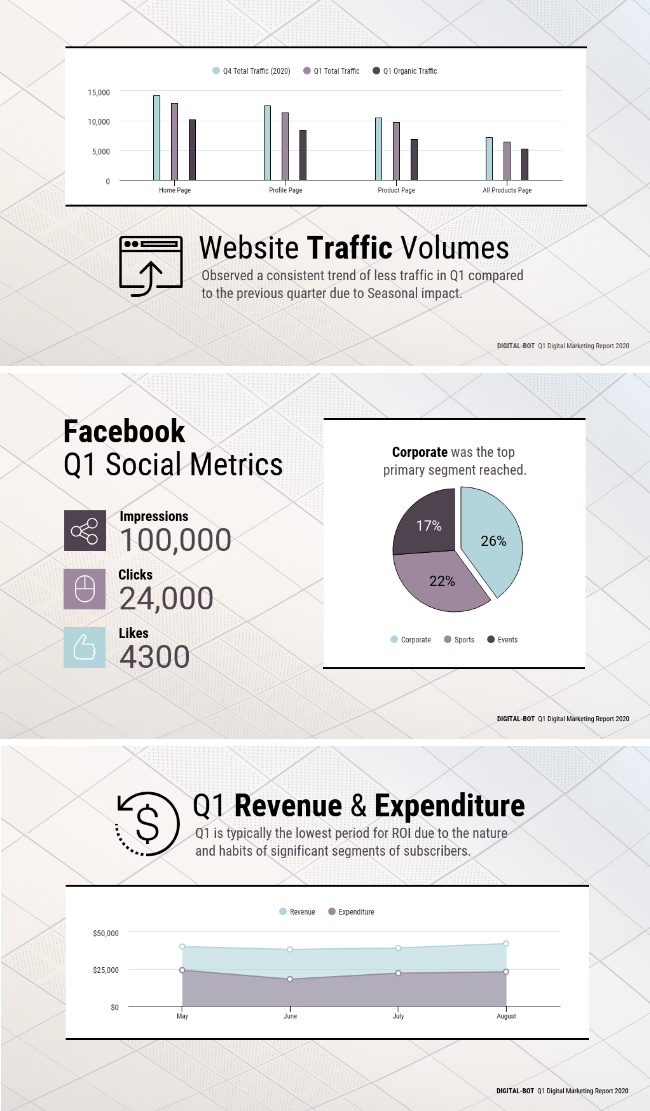
A classic pie chart or bar graph should be easily understood by your audience, provided you’re following chart best practices.
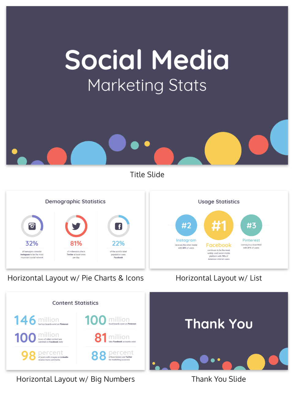
This presentation template uses a bar graph, a pie chart and a line graph to show different metrics:
If you can, mix up the types of data visualizations you use. This will help prevent your audience from getting bored.
Those are just a few different ways you can use charts to visualize. For more ideas, check out our guide to picking the best charts for your data.
8. Create custom illustrations using icons
Custom illustrations are one of this year’s biggest graphic design trends. They’re fun, quirky, and more exciting than a boring old stock photo.
Creating your own illustrations for social media graphics might seem like a costly and time-consuming undertaking. And it can be. But I’m going to offer you a hack:
Use icons to create illustrations.
You can arrange icons together to create a scene–like the pieces of a puzzle. (Venngage offers over 40,000 icons, so finding an image shouldn’t be too hard!)
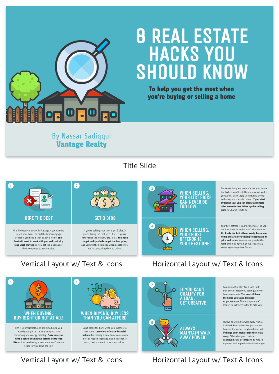
For example, this real estate presentation template uses icons to illustrate each real estate hack:
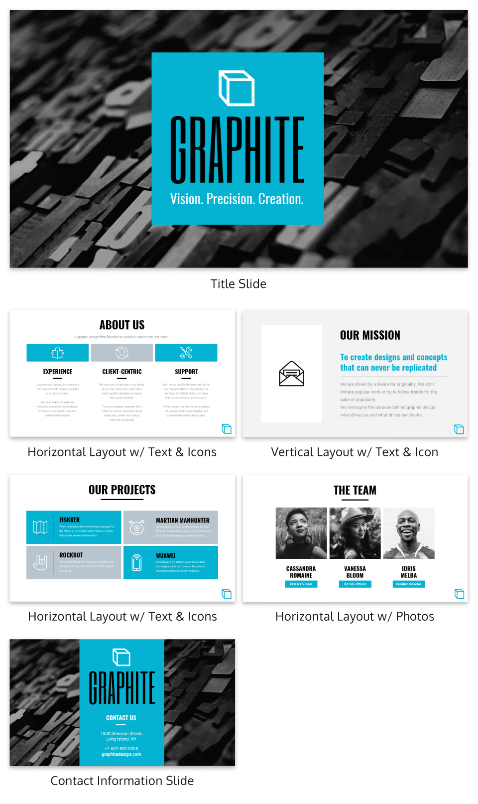
When picking icons or symbols for your illustrations, make sure that the icon style you use is consistent. For example, this presentation template uses line art icons for a scribbly youthful look:

For more ideas, read our guide to creating icon illustrations.
9. Change slide layouts to keep your audience engaged
You may be tempted to use the same slide layout throughout your entire presentation–either for consistency or because you’re not sure how else to design your slide.
The problem is, using the same slide layout over and over again won’t do much to excite your audience.
There are other ways you can create consistency throughout your presentation, while also using different slide layouts–like through a visual motif.
For example, this presentation template uses five different slide layouts. The consistent color scheme, image style and font style pull the presentation together.
To come up with different slide layouts, try dividing your slide into columns. This can make it easier to arrange the elements in your slide.
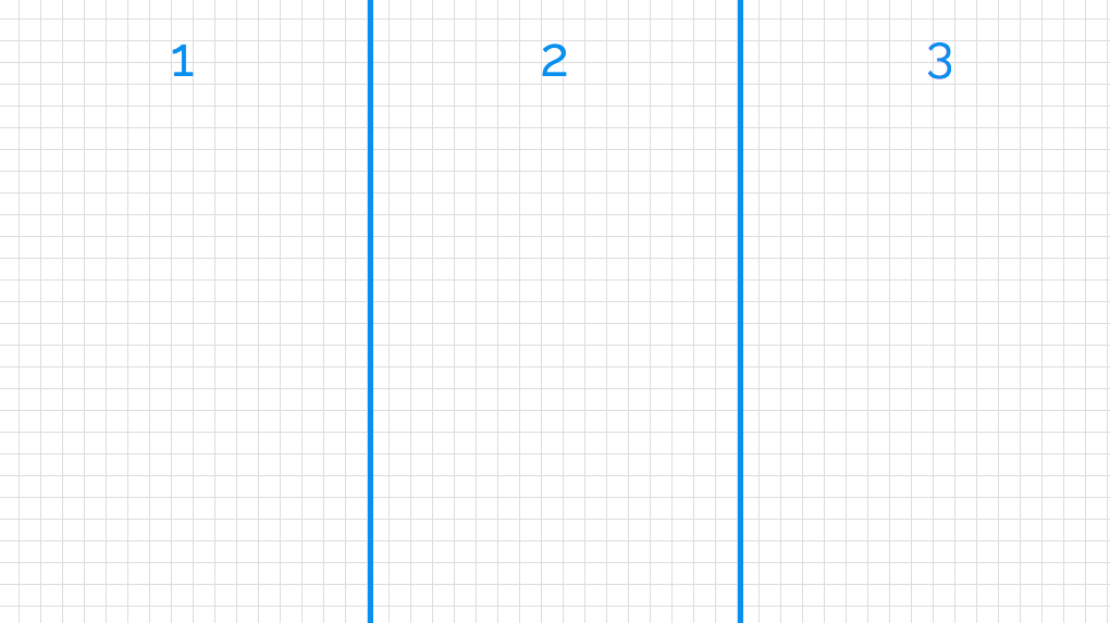
This can make it easier to arrange the elements in your slide.
10. Add a progress tracker to your presentation slides
Creating a sense of forward movement will help keep your audience engaged.
Similar to how you would put the chapter title at the top of the pages in a book, you can track the progress of your presentations in your slides. This will let your audience know what stage you’re at in your presentation. Your audience will also be able to refer to the sections in your presentation more easily afterward.
That said, pacing your presentation thoughtfully with well-designed presentation slides also adds brownie points to your presentation. Check out the top qualities of awesome presentations and learn all about how to make a good presentation to help you nail that captivating delivery.
A simple progress bar at the bottom of your slide shouldn’t distract too much from the rest of your information.
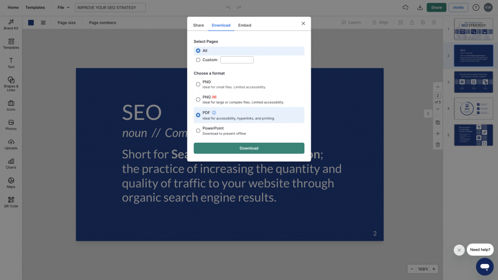
11. Download your presentation as a PDF
It’s common for audience members to request a copy of your presentation for their reference. Make sharing your presentation easy by exporting it as a PDF or zipped file.
Now that you’re equipped with some fundamentals of presentation design, the best way to learn is by doing. It’s also the perfect time to upgrade your presentation skills while you’re thinking about it too!
If you have any questions, please don’t hesitate to leave a comment below.
More presentation templates and design guides:
- 120+ Best Presentation Ideas, Design Tips & Examples (+ Presentation Templates!)
- 12 Business Pitch Deck Templates and Design Best Practices to Impress Investors
- 5 Foolproof Presentation Layout Ideas (+ Presentation Templates!)


