


Startups grow fast and growth needs funding. That’s where a pitch deck comes in.
In this post, I’ll walk you through top pitch deck templates from brands like Airbnb and Uber, plus show you how you can create one that secures investors, clients or partners.
Want to get started right away? Try Venngage’s pitch deck templates or the easy-to-use Presentation Maker — no technical expertise required.
Table of contents:
- What is a pitch deck?
- Best pitch deck examples for startups investment
- What makes a good pitch deck?
- How to create a pitch deck with Venngage
- Pitch deck FAQ
What is a pitch deck?
A pitch deck is a presentation created to raise venture capital for your business. In order to gain buy-in and drum up financial support from potential investors, these presentations outline everything from why your business exists, to your business model, progress or milestones , your team and a call-to-action.
While the deck captures the imagination, investors often require a detailed written document to complete their due diligence. Venngage AI provides a proposal content generation engine to instantly expand a startup pitch deck into a detailed investor brief. Much like Beautiful.ai, this ai in sales proposals tool ensures you can generate a high-quality written document that matches the energy and professionalism of your visual slides.
Best pitch deck examples for startups investment
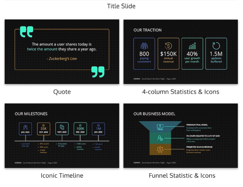
Buffer | Airbnb | Uber | Facebook | Front | Crema | WeWork | Crew (now Dribble) | Aspire Food Group | Mattermark | Dwolla | Kickfolio (App.io) | Yalochat | Brex | Purple Go | Mint | Park Evergreen (Plot) | Hampton Creek (Eat Just) | Sickweather | Dutchie | Studysmarter | Clearbanc (Clearco) | Foursquare | TalentBase | Peloton | Guy Kawasaki | Sequoia capital | TikTok | Y Combinator | Ledgy1. Buffer
Buffer is a social media management platform that helps users schedule posts, analyze results and engage with their customers. It can be used on the web or mobile and is designed for small businesses.
Year: 2013
Funding round: Series A
Total funding raised: $4.07 million (in 3 rounds)
Investors: Union Square Ventures, Collaborative Fund, Red Swan Ventures, Collab Fund, Angel List, and AngelPad
Industry: Social Media Management
Business model: Subscription-based SaaS (Software as a Service)
Headquarters: 2443 Fillmore St #380-7163, San Francisco, CA 94115
Website: Buffer.com
Key takeaway: The traction slide was key for Buffer: it showed they had a great product/market fit and a clear TAM, which made funding easier. The challenge came with competition since investors were often confused by the crowded social media landscape.
Eventually, they created this slide to clear the air:

To be frank, I’m still confused by this addition to the Buffer pitch deck, but perhaps their presentation would have cleared things up.
In any case, we’ve recreated Buffer’s pitch deck with its own traction, timeline and competitor slides, plus a clean new layout and some easy-to-customize icons:


Sometimes, you’ll be pitching to a small room of VCs. Other times, it will be to an auditorium full of random people in your industry. And I can guarantee that not everyone is going to know your brand off the top of their head.
Make it extremely easy for people to find out more info or contact your team with any questions after the meeting. I would recommend adding this to the last slide, as shown below.

Alternatively, you could add it to the slide that will be seen the longest in your pitch deck, like the title slide. This will help anyone interested write down your information as event organizers get things ready.
Related: Creating a Pitch Deck? 5 Ways to Design a Winner
2. Airbnb
Airbnb is an online marketplace that connects people looking to rent out their homes with those seeking accommodations, offering unique lodging experiences worldwide.
Year: 2017
Stage: Series F
Amount raised: $1 billion
Investors: Sequoia Capital, Andreessen Horowitz, TPG Capital
Industry: Hospitality, Travel and Technology
Business model: Online marketplace (peer-to-peer) for lodging and travel experiences
Headquarters: San Francisco, California, USA
Website: airbnb.com
Key takeaway: Airbnb stood out with a large marketplace, strong traction and a market ready for disruption — all showcased in a clear, story-driven pitch deck. Keep your deck simple and focused, just like Airbnb did.
We’ve re-designed Airbnb’s famous deck as two light and airy sample pitch deck templates. The focus here is on engaging visuals, with minimal text used.

Airbnb fundraising slide deck
This type of deck is also called a demo day presentation. Since its going to be viewed from a distance by investors while you present, you don’t need lots of text to get your message across. The point is to complement your speech, not distract from it.
Another great thing about Airbnb’s fundraising slide deck format is that every slide has a maximum of three sections of information.
As one of the most popular presentation layouts, the rule of three design principle has been drilled into my head. And for good reason!
Here’s one of the slides that demonstrates why this pitch deck design tip works:

Minimalist Airbnb pitch deck template
This simple sample pitch deck template is clean and incredibly easy to customize, which is why it’s perfect for presentation newbies.
Don’t forget to insert your own tagline instead of the famous “Book rooms with locals, rather than hotels” slogan.
Hint: your tagline should similarly convey what your business offers. Airbnb’s pitch deck offers up tantalizing benefits: cost savings, an insider’s perspective on a location and new possibilities.

Related: How to Create an Effective Pitch Deck Design [+Examples]
3. Uber
Uber is a ride-hailing service that connects passengers with drivers through a mobile app, offering transportation and delivery services in numerous cities worldwide.
Year: 2018
Stage: Series G
Amount raised: $1.5 billion
Investors: SoftBank Vision Fund, Benchmark Capital
Industry: Transportation, Technology
Business model: Commission-based platform
Headquarters: San Francisco, California, USA
Website: Uber
Key takeaway: In 2008, Uber co-founder Garrett Camp shared the company’s first pitch deck through a Medium post, showcased the pain of inefficient cabs and their solution — one-click ordering. Despite being text-heavy, the deck nailed the essentials — differentiators, use cases, financials and scenarios — clearly and succinctly.
Want something similar? We’ve updated the classic Uber pitch deck template with a sharp layout:

Many of the best pitch deck presentations out there are rather brief, only covering a few main points across a handful of slides. But sometimes your deck needs to provide more information.
There’s nothing wrong with having a longer investor pitch deck, as long as you switch up the slide layouts throughout. No one wants to see the same slide (just with different metrics or points) 25 times over.
This sample pitch deck template we created based on Uber’s pitch deck has 20 or more slides and a wide range of layout options:

Blue Uber slide deck
In this navy version of the Uber pitch deck template, we’ve added bright colors and creative layouts.
Again, it’s easy to swap out the icons in our online editor. Choose from thousands of free icons in our in-editor library to make it your own.

4. Facebook
Facebook is a social networking platform that allows users to connect, share content and communicate with friends and family online.
Year: 2005
Stage: Series A
Amount raised: $12.7 million
Investors: Accel Partners
Industry: Social Media
Business model: Advertising-based
Headquarters: Menlo Park, California, USA
Website: Facebook
Key takeaway: If you lack revenue traction, focus on metrics like user growth and engagement and use a timeline presentation template to share your story. A great pitch deck sells your product and the hard work behind building it.
In their first-ever investor slide deck, Facebook founders talked about all the reputed schools (slide #10) that’ve already signed on and describe when future launches will happen.
The sample pitch deck template featured below shows another example of a company or product timeline. This is a great fit for startups that want investors to know about their humble beginnings.

Plus you can summarize a ton of information about your brand on a single slide. Check out how well the timeline fits into this pitch deck template below:
If the designer wouldn’t have used a timeline, the same information could have been spread over five or six extra slides! Luckily, Venngage’s timeline maker can help you visualize progress across a period of time without any design experience required.
5. Front
Front is a customer communication platform that combines emails, apps and teammates into a single view, enhancing team collaboration and response efficiency.
Year: 2018
Stage: Series B
Amount raised: $66 million
Investors: Sequoia Capital, Initialized Capital
Industry: Software, Communication
Business model: Subscription-based SaaS
Headquarters: San Francisco, California, USA
Website: Front.com
Key takeaway: Use a flowchart to clearly visualize the problem your product solves—sometimes a unique approach makes all the difference. Front did this brilliantly — opting for a flow chart over text to communicate the problem visually.
Did I mention you can make your own flowcharts with Venngage?
Also, I really like how they distilled each down to a single phrase. That approach, combined with the visuals, will help it stick in investors’ minds as one of the best pitch decks.
Here’s another example pitch deck that uses a chart to convey their problem/solution:

It splits the competition slide right down the middle to illustrate the differences. It also shows exactly how the processes differ between the two entities using mini flowcharts.
Helping the audience make the right conclusions about your company should be an important part of your pitch deck strategy. Without saying a word, the visual choices you make can greatly impact your message.

6. Crema
Crema is a digital product agency that partners with enterprises and startups to design and build custom software solutions, enhancing business processes and user experiences.
Year: N/A
Stage: N/A
Amount raised: N/A
Investors: N/A
Industry: Software Development, Consulting
Business model: Service-based
Headquarters: Kansas City, Missouri, USA
Website: https://www.crema.us
Key takeaway: Choose presentation background images that share a similar color palette to keep your deck consistent. This helps create a cohesive feel, especially when using different photos for backgrounds. A mismatched background image can throw off the entire presentation, so sticking to a unified theme is key.
Check out the images Crema used in their startup pitch deck below:
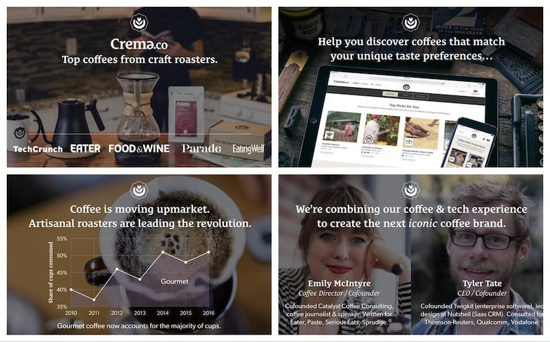
If you’re struggling to find exactly the same colored photos, you can use a color filter to make things more uniform.
7. WeWork
WeWork provides flexible shared workspaces and services for entrepreneurs, freelancers, startups and small businesses, fostering collaborative work environments.
Year: 2019
Stage: Series H
Amount raised: $1 billion
Investors: SoftBank Group
Industry: Real Estate, Coworking
Business model: Membership-based
Headquarters: New York City, New York, USA
Website: https://www.wework.com
Key takeaway: WeWork’s pitch deck, despite the company’s recent troubles, still stands out as one of the best. My favorite thing from this is how their key metrics are on the second slide. They waste no time getting down to business! This approach grabs the audience’s attention early, putting them in a positive, receptive mindset.
8. Crew (now Dribble)
Crew was a freelance marketplace connecting designers and developers with clients for high-quality creative projects. Dribbble acquired the company in 2017.
Year: 2015
Stage: Seed
Amount raised: $2.1 million
Investors: Real Ventures, BDC Venture Capital
Industry: Freelance Marketplace
Business model: Commission-based
Headquarters: Montreal, Quebec, Canada
Website: Dribbble
Key takeaway: Start your presentation on a strong note. For instance, you can add a powerful quote or an intriguing statement to set the mood for your audience before jumping into your slide deck.
This may sound cliche, but the creatives over at Crew (now Dribbble) used this approach well in their pitch presentation.

By claiming that every business is an online business, they instantly change the way that people think about the business sector.
Additionally, the designers used this straightforward statement to set up the rest of the presentation. In the next few slides, they explain the potential of their market. Without the statement, I don’t think these numbers would be as impactful.
Let’s take a look at the graphs and charts the Dribble team used in their slide deck. In the pitch deck example below, you can see that the line charts use the same color palette, size and typography.
One of my favorite tips from my presentation ideas roundup article states you should never make the audience do the math.
You can also use this mantra when you’re adding data visualizations to your slides. Make each slide extra easy to consume and compare to other visualizations.
Below, the pie charts use the exact same color palette, size and typography as well:
Consistent design across multiple slides ensure your audience can make comparisons that lead to the right conclusions.
Pro Tip: You can also use a comparison infographic to distinguish key points you’re comparing.
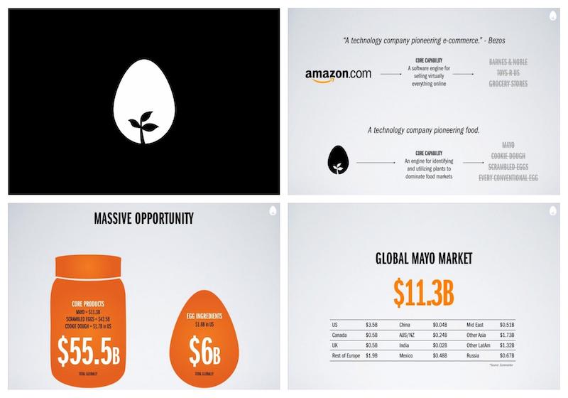
9. Aspire Food Group
Aspire Food Group is an innovative company specializing in sustainable insect farming, producing edible insects as a protein source to address global food security challenges.
Year: 2016
Stage: Series A
Amount raised: $1 million
Investors: Kosla Ventures, Social Capital
Industry: AgriTech, Food Production
Business model: B2B and B2C product sales
Headquarters: Austin, Texas, USA
Website: https://www.aspirefg.com
Key takeaway: Use simple graphics to communicate the problems, market size and the solution. By making an emotional connection with a real customer story, Aspire’s pitch deck instantly makes their idea relatable and impactful.
Another simple design hack is to choose a unique background for your nonprofit or social enterprise pick deck. Take this sample pitch deck template:

There are millions of stock photos out there for you to pick from, so finding one that will work shouldn’t be too hard. However, when you’re picking your presentation background images, it’s important to make sure it matches your message or brand.

In the example above, the pitch deck’s slightly crumpled paper background fits an eco-friendly startup well. Especially because eco-friendly living and minimalism share similar tenets.

Another great example is this sponsorship pitch deck above. It elevates the message by opting for a simplistic background choice.
With a beautiful yet minimalistic slide deck like this, who wouldn’t want to donate?

Most of the time your pitch deck background images are supposed to be used in a supporting role. However, you can also design your presentation around the background images to create some of the best pitch decks out there.
As you can see in this pitch deck template, we added text to the white space in each of the stock photos:

This lets you highlight specific copy or create a pleasing contrast in your slide decks.

Just be sure to pick photos that share the same color palette and theme to keep your design cohesive and visually appealing.
10. Mattermark
Mattermark was a data platform for venture capital companies to quantify signals of growing and potentially lucrative startups. It ceased operations in 2017. How much did they raise while they were still around? A total of $17.2M so far, according to Crunchbase.
Key takeaway: Screenshots are a great way to show the problem you’re solving. Mattermark used screenshots to highlight how unorganized SAAS reporting was — and to make their product’s potential clear. This approach helped investors easily grasp the problem and see the value of the solution.
In terms of design, the Mattermark term stuck to the rule of three (see slide below). This rule will help you keep your team from overwhelming the audience with a flood of stats or figures.

They also decided to make these figures easier to consume by highlighting them in different colors
Compared to a boring list of figures, it’s a lot easier to remember three distinct colored numbers. Plus because the background colors darken as they go, it naturally guides the reader’s eyes down the slide.
11. Dwolla
Dwolla is a payment platform that simplifies ACH payments for businesses by offering APIs for seamless money transfers.
Year: 2014
Stage: Series C
Amount raised: $16.5 million
Investors: Union Square Ventures, Andreessen Horowitz
Industry: Fintech, Payments
Business model: SaaS-based API platform
Headquarters: Des Moines, Iowa, USA
Website: dwolla.com
Key takeaway: Share your company’s origin story in one quick sentence to help your audience connect with your brand. People love these stories, since they showcase your growth journey and the effort behind your success.
Take a look at the pitch deck slide from Dwolla. They succinctly talk about their rationale for starting the company and what they hope to solve, in a single slide.

On a side note, I see a lot of brands talk ingabout their potential users in vague terms. I recommend creating visual user personas instead. Our persona guides can help you with this!

As you can see above, Dwolla visualized their user personas for each use case.
These visual user personas allow audiences to put a “real” face to your user base. And if you have many ideal users (like Dwolla), it helps keep each group organized.
12. Kickfolio (App.io)
App.io (formerly Kickfolio) was a platform for running iOS apps in the browser, enabling interactive app demos for marketing and testing.
Year: 2012
Stage: Seed
Amount raised: $1.1 million
Investors: Y Combinator, Quest Venture Partners
Industry: App Development, SaaS
Business model: Subscription-based platform
Headquarters: San Francisco, California, USA
Website: Defunct
Key takeaway: Go for huge graphs — the bigger, the better. You worked hard to grow a company from scratch. Why make it hard for your audience to see that growth?

Our suggestion…get bigger with your graphs! And I mean huge, like the ones App.io deployed in the pitch deck above. Their graphs are large and imposing so that everyone in their audience can see them clearly.
Venngage’s graph maker can help you do this for your own pitch decks too.
13. Yalochat
Yalochat is an AI-powered conversational platform that helps businesses connect with customers on WhatsApp and other messaging apps.
Year: 2021
Stage: Series C
Amount raised: $50 million
Investors: B Capital Group, Sierra Ventures
Industry: AI, Messaging, Customer Support
Business model: SaaS
Headquarters: Mexico City, Mexico
Website: yalo.com
Key takeaway: Icons are making a big comeback in design and they are handy for adding instant context to your slides. Recent graphic design trends show they’ll continue to be popular for a while.

This presentation from Yalochat is one of the best examples of how to use illustrated icons correctly.
Each icon perfectly illustrates the point being made on each slide, giving instant context. They will definitely catch the eyes of any audience member.
Just remember to follow their lead and use consistently designed icons!
14. Brex
Brex is a financial technology company offering corporate credit cards and expense management solutions tailored for startups and growing businesses.
Year: 2021
Stage: Series D
Amount raised: $425 million
Investors: Tiger Global, Greenoaks, DST Global
Industry: Fintech
Business model: Transaction-based and SaaS
Headquarters: San Francisco, California, USA
Website: brex.com
Key takeaway: Include a slide showcasing your team and what makes them exceptional — they’re key to your brand’s success. Brex’s slides does this well by featuring team photos, titles and affiliations to build credibility.
Let’s tale a look at a sample pitch deck that employs a similar philosophy.

I’m guessing you already planned on adding something similar to your pitch deck. Again, I would recommend using only a single team slide (like Brex).
You can use a team photo if you want to talk about the whole team or add an organizational chart instead. Alternatively, like Brex, you can highlight the most important individuals, like this business pitch example:

Whatever you choose to do, don’t forget to talk about your team on a team slide and highlight the people who make your company truly great.
Read More: 12+ Organizational Chart Examples and Templates
15. Purple Go
Purple Go is a mobile app that enables small businesses to manage operations, accept payments and grow their business efficiently.
Year: 2020
Stage: Seed
Amount raised: Undisclosed
Investors: Purple Innovation Inc.
Industry: Fintech, Business Management
Business model: SaaS
Headquarters: Provo, Utah, USA
Key takeaway: Use contrasting hues to highlight key information and grab your audience’s attention. Color isn’t just for style. It often helps you highlight what matters most.

This simple pitch deck from Purple Go contrasts deep purple with white to help certain sentences pop. It’s a great way to make your slides have a lot of impact. Just be sure to pick colors that contrast boldly with each other.
16. Mint
Mint is a personal finance platform that helps users track spending, create budgets and manage finances in one place.
Year: 2009 (acquired by Intuit)
Stage: Acquisition
Amount raised: $31 million (prior to acquisition)
Investors: Shasta Ventures, Benchmark Capital
Industry: Fintech, Personal Finance
Business model: Freemium
Headquarters: Mountain View, California, USA
Website: mint.com
Key takeaway: Use visuals like illustrations and icons to help explain what sets your brand apart. Listing differences alone isn’t enough — visual cues can make your pitch clearer and more impactful.
We redesigned Mint’s original deck for a contemporary take on this.

In this minimalist pitch deck template, our designers used visuals to make the main company stand out even more. This simple addition to your slides will help your information jump off the page, providing a rewarding visual break from related companies.
17. Plot (formerly Park Evergreen)
Plot (formerly Park Evergreen) offers parking management software that streamlines operations and improves user experiences.
Stage: Seed
Amount raised: Undisclosed
Investors: Independent investors
Industry: SaaS, Parking Management
Business model: Subscription-based platform
Headquarters: Denver, Colorado, USA
Key takeaway: Slide decks are often packed with important metrics — but not all are easy to notice or remember. Give each metric its own slide to keep things clear and focused. Your audience will thank you for it.

I’m a fan of how Park Evergreen (now called Plot) included important numbers in this slide deck. As you can see below, each metric is given its own slide:
With this approach, the audience members place their full attention on that number. And they’ll be able to recall the information a lot quicker. It may look overly simple to some, but the best pitch decks use this tactic a lot.
18. Eat Just (formerly Hampton Creek)
Eat Just is a food technology company known for plant-based and cultivated meat products like JUST Egg and GOOD Meat.
Year: 2021
Stage: Series D
Amount raised: $267 million
Investors: Qatar Investment Authority, Vulcan Capital
Industry: Food Technology
Business model: Direct-to-consumer and retail distribution
Headquarters: Alameda, California, USA
Website: ju.st
Key takeaway: A lot of times, members in the audience end up spending more time looking at title slides than the actual content. Create your title slides to build anticipation and keep your audience engaged. Insufe minimalist design elements to build suspense and pique your audience’s interest.
The team at Eat Just did just that.
The strategic lack of information makes people want to learn more about your brand, keeping them intrigued.
19. Sickweather
Sickweather is a health forecasting platform that uses social media and public health data to predict illness outbreaks.
Year: 2015
Stage: Seed
Amount raised: $2 million
Investors: Techstars, Social Starts
Industry: Health Technology
Business model: Subscription and data licensing
Headquarters: Baltimore, Maryland, USA
Website: sickweather.com
Key takeaway: Make your graphs and charts easy to understand by highlighting the main metrics. Never make investors do the math — especially with complex numbers — because skipping this step can ruin your pitch.
That’s why I recommend you to “do the math” on every slide where you include a graph or chart — like how Sickweather did above. By pulling out the main growth metrics from the graph, they made this slide a lot more consumable and showed the audience exactly what they should pay attention to.
20. Dutchie
Dutchie is an all-in-one cannabis technology platform offering e-commerce, POS and payments solutions to dispensaries.
Year: 2021
Stage: Series D
Amount raised: $350 million
Investors: Tiger Global, Casa Verde, Dragoneer Investment Group
Industry: Cannabis Technology
Business model: SaaS and transaction-based platform
Headquarters: Bend, Oregon, USA
Website: dutchie.com
Key takeaway: Set the tone by leading with your most impressive stat, like Dutchie did with “10% of all legal cannabis in the world” purchased through their product. It’s a powerful way to grab people’s attention right from the start.
It makes sense for Dutchie to highlight market share figures in the introduction to show investors their success and market presence.
21. Studysmarter
Studysmarter is a digital learning platform providing tools to create, share and explore personalized learning content for students and professionals.
Year: 2022
Stage: Series B
Amount raised: $15 million
Investors: Owl Ventures, Left Lane Capital
Industry: EdTech
Business model: Freemium and subscription
Headquarters: Munich, Germany
Website: studysmarter.de
Key takeaway: Studysmarter illustrates their vision across several slides to highlight their goal of becoming the “world’s central hub” for lifelong learning. They consistently use visuals to reinforce this message and show their unlimited target market and use cases.
These graphics build off the sleek, modern interface Studysmarter’s brand image invokes. It also illustrates what they want investors to envision for the future of the brand.
22. Clearbanc (Clearco)
Clearco provides revenue-based financing and growth solutions for startups, enabling founders to scale without equity dilution.
Year: 2021
Stage: Series C
Amount raised: $215 million
Investors: SoftBank Vision Fund, Inovia Capital
Industry: Fintech
Business model: Revenue-based financing
Headquarters: Toronto, Canada
Website: clear.co
Key takeaway: Clearco uses a flowchart template to explain their complex revenue-sharing business model quickly and clearly. Instead of text-heavy slides, the flowchart saves space while keeping the audience engaged. This approach helps investors get up to speed fast and allows you to focus on other important details.
23. Foursquare
Foursquare is a location-technology platform that provides geolocation data and insights for businesses and consumers.
Year: 2019
Stage: Series F
Amount raised: $150 million
Investors: Andreessen Horowitz, Union Square Ventures
Industry: Location Technology
Business model: SaaS and API solutions
Headquarters: New York City, New York, USA
Website: foursquare.com
Key takeaway: Foursquare’s 2009 pitch deck may feel outdated, but it clearly showed how their app’s points and badges looked to users. By using an iPhone graphic (slide #3 onwards), they took the guesswork out of their pitch, demonstrating how consumers would interact with the product. This visual approach was key to winning over investors.
24. TalentBase
TalentBase is an HR and payroll software solution designed for SMEs in Africa, offering tools for employee management and payroll automation.
Year: 2017
Stage: Seed
Amount raised: $250,000
Investors: 500 Startups
Industry: HR Technology
Business model: SaaS
Headquarters: Lagos, Nigeria
Key takeaway: Keep you pitch deck simple and let the numbers do the talking. TalentBase’s slides skip the fluff, use data to tell a compelling story and show investors exactly how they’re capturing the market.
25. Peloton
Peloton is a fitness platform offering connected exercise equipment, live and on-demand classes and fitness tracking features.
Year: 2018
Stage: Series F
Amount raised: $550 million
Investors: TCV, Kleiner Perkins, Fidelity
Industry: Fitness Technology
Business model: Hardware sales with subscription-based content
Headquarters: New York City, New York, USA
Website: onepeloton.com
Key takeaway: Peloton focuses on both the tangible and emotional benefits their product offers — and shows how it improves customers’ lives meaningfully. This approach helped the company raise $550M in funding.
Looking to try something similar? Check out the below Peloton sample pitch deck template, reimagined by our Venngage design team.

26. Guy Kawasaki
Guy Kawasaki is a venture capitalist, author and public speaker best known for popularizing the 10/20/30 rule for presentations.
Year: N/A
Stage: Marketing thought leader
Amount raised: N/A
Investors: N/A
Industry: Venture Capital, Marketing
Business model: Consulting and public speaking
Headquarters: California, USA
Website: guykawasaki.com
Key takeaway: Avoid deep technical details in your pitch deck and focus on the key elements of your business plan: the problem, your solution, how you’ll make money and reach customers.
Kawasaki’s famous 10/20/30 rule helps you keep things focused, with just 10 slides, 20 minutes and no small fonts. His outline highlights what VCs care about: problem/solution, competition, team and financials.

Remember: opt for a 30-point font or larger. This will force you to stick to your key points and explain them clearly. Anything smaller and you’ll risk losing your audience — especially if they’re busy reading while tuning out what you’re actually saying.
The more conservative pitch deck template design keeps all the focus on the core information. Read our blog post on persuasive presentations for more design and speaking tips.

27. Sequoia capital
Sequoia Capital is a venture capital firm investing in startups across various sectors, including technology, healthcare and consumer services.
Year: Ongoing investments
Stage: All stages (Seed to Growth)
Amount raised: N/A (firm-level data unavailable)
Investors: N/A
Industry: Venture Capital
Business model: Equity investment
Headquarters: Menlo Park, California, USA
Website: sequoiacap.com
Key takeaway: Sequoia Capital’s 10-slide pitch deck highlights innovative ideas and focuses on your mission, not just features. It’s clear, curated and easy to adapt, as shown in the example below.
If you can’t tell the story of the company in five minutes, then you’re either overthinking it or you haven’t simplified it down enough.
Mike Vernal, Sequoia Capital

Related: How to Make Successful Financial Pitch Decks For Startups
Blue and pink iconic pitch deck
Ready to try it for yourself? Add a pop of color to your version of the Sequoia pitch deck template with this pink and blue slide deck. The contrasting colors will make your information stand out.

Related: Creating a Pitch Deck? 5 Ways to Design a Winner
28. TikTok
TikTok is a social media platform for creating and sharing short-form videos with features like filters, music and editing tools.

Year: 2018 (ByteDance raised funding for TikTok)
Stage: Growth
Amount raised: $3 billion
Investors: SoftBank, Sequoia Capital China
Industry: Social Media
Business model: Ad revenue, in-app purchases
Headquarters: Beijing, China
Website: tiktok.com
Key takeaway: TikTok’s pitch deck uses icons as visual anchors to highlight key stats, making the information easier to digest. This deck was created for potential advertisers, not investors, and provides a great example of effective icon usage. Icons can really upgrade your slides and there’s plenty of ways to use them effectively.
If you’re not sure what I’m talking about, just look at the slide deck template below.


Each of the main points has an icon that gives instant visual context about what the stat is about to the audience. These icons draw the eye immediately to these important facts and figures as well.
29. Y Combinator
Y Combinator is a startup accelerator providing funding, mentorship and resources to early-stage companies in exchange for equity.
Year: Founded in 2005
Stage: Accelerator
Amount raised: N/A (provides funding instead)
Investors: Self-funded
Industry: Startup Incubator
Business model: Equity-based funding
Headquarters: Mountain View, California, USA
Website: ycombinator.com
Key takeaway: Y Combinator’s pitch deck is simple because seed-stage companies need to tell a clear, concise story investors can understand at a glance. Note that one of Y Combinator’s key components is the problem (above) and solution (below) slides.

Explaining how your startup is going to solve a pain point is a vital part of any slide deck. According to Y Combinator, startups should use the problem slide to show the problem your business solves and how this problem currently affects businesses and/or people.
Without that information, investors are going to be left with more questions than answers.

The solution slide should show the real-world benefits of your product/service. I recommend using data visualizations to show traction, like the chart above, with a couple of notes for better context.
To ensure your problem and solutions slides are easily understood, use a similar layout for both, as shown below.

This will help the audience quickly recall the main problem you want to solve and connect it to your solution (even if the slides are separated by a few other points or ideas).
30. Ledgy
Ledgy is an equity management platform that helps companies track, manage and automate employee stock options and cap tables.

Year: 2022
Stage: Series B
Amount raised: $22 million
Investors: Sequoia Capital, Speedinvest
Industry: Fintech, HR Technology
Business model: SaaS
Headquarters: Zurich, Switzerland
Website: ledgy.com
Key takeaway: Ledgy’s seven-slide pitch deck uses minimal text and engaging visuals to tell a clear, logical story. By starting with their mission, they create a compelling narrative that investors can easily follow.
Yoko Spirig, CEO and co-founder of Ledgy, echoed this sentiment in an interview: “Starting with the ‘why’ lets you build the business case for the product and create a logical narrative that investors can follow.”
Design-wise, this is one of the cleanest pitch deck examples in the bunch. It’s one of the shortest too.
I also appreciate how their brand colors are used in conjunction with white to keep everything consistent (something that Venngage’s automated branding feature My Brand Kit can help you out with).
What makes a good pitch deck?
To summarize, some of my favorite pitch deck design tips include:
- Adding icon headers to your most important insights
- Use similar charts and graphs for easy comparisons across slides
- For longer pitch decks, switch up the slide layouts
- Pick a consistent theme for your presentation background images
- Don’t just list your ideal users, create visual personas
- Use a timeline to show how your company has grown
- Always do the math for your audience
How to create a pitch deck with Venngage
Not a graphic designer? No sweat — creating your own pitch deck is a breeze using Venngage’s Presentation Maker. We’ll go over the basics here. For a more in-depth look, check out this article.
If you’re a visual learner, you can also watch the short video below to learn how to customize a pitch deck template (we’ll choose Airbnb’s slides).
Step 1: Sign up on Venngage for free with your email, Gmail or Facebook. You can also log in if you already have an account.

Step 2: Choose one of the professionally designed pitch deck templates that suits your needs from Venngage’s library.

Step 3: Customize the template design with using our drag-and-drop editor. Modify colors, fonts and images. Add your company details, product info, market analysis and financial projections.

Note: Venngage has hundreds of templates that you can design and share for free. If you want create personalized designs in just a few clicks, use our My Brand Kit feature.
Step 4: Download your pitch deck in formats like PDF or PNG or share it via link or Venngage’s platform presentation tools.

These steps will help you create a compelling pitch deck, whether for an investor meeting, a demo day or even a competitive hackathon presentation where standing out is essential for capturing interest.
To leave a lasting impression on your audience, consider transforming your slides into an interactive presentation. Here are 15 interactive presentation ideas to enhance interactivity and engagement.
Now that you know how to create the best pitch decks to communicate your ideas, present your startup or raise venture capital, take action and start designing your own pitch deck today!
Pitch deck FAQ
What should a pitch deck contain?
A well-crafted pitch deck should contain key information that effectively communicates your business concept, value proposition and growth potential. While the specific content may vary depending on your industry and target audience, here are the essential elements that a pitch deck should typically include:
- Problem statement
- Solution
- Market opportunity
- Business model
- Competitive analysis
- Marketing and sales strategy
- Team members
- Financial projections
- Milestones and timeline
- Investment opportunity
What is a pitch deck presentation?
A pitch deck presentation is a slideshow that introduces a business idea, product or service to investors. Typically consisting of 10–20 slides, a pitch deck is used to persuade potential investors to provide funding for a business. It serves as a comprehensive overview of your company, outlining your business model, the problem you solve, the market opportunity you address, your key team members and your financial projections.
And if you want to learn more, there are a ton of other presentation design resources you can take a look at next:


