

TL;DR
To make a timeline infographic:
- Outline your timeline: List the dates, milestones and short descriptions you want to include.
- Choose the right layout: Use a horizontal layout for fewer events, a vertical layout when you need more room for text or a snake layout for longer timelines.
- Decide how to create it: Generate the timeline with AI, customize a template or build the structure from scratch.
- Add your content and visuals: Place the dates, headings and descriptions in chronological order, then add icons or images where they help explain the information.
- Refine the design: Use consistent colors, fonts, spacing and visual hierarchy so each milestone is easy to scan.
- Export and share: Download the finished timeline in the format that works best for where you plan to use it.
Timelines look simple until you actually have to make one. You start with a list of dates and events, but then you have to decide what to include, how much context to add and how to arrange everything without making the timeline feel crowded.
A timeline infographic solves that by turning dates, milestones and supporting information into a visual sequence that’s easier to follow.
In this guide, I’ll show you how to make a timeline infographic step by step, from choosing the right events and layout to refining the final design. To make the process easier, I’ll also cover how to create one using timeline templates or Venngage’s AI Timeline Generator.
What is a timeline infographic?
A timeline is a visual representation of events arranged in chronological order. It shows when events happened or are expected to happen and the sequence in which they occur.
A timeline infographic presents that sequence as a visual story. It combines dates and events with short text, icons, illustrations, charts or other design elements to show how a story, process or set of milestones develops over time.
You can use timeline infographics to show:
- Project timelines for mapping out milestones, deadlines and major stages
- Historical timelines for tracing important events across a specific period
- Process timelines for explaining how something happens from one stage to the next
- Event timelines for laying out schedules, activities and key dates
- Onboarding timelines for walking employees, customers or users through each stage of the journey
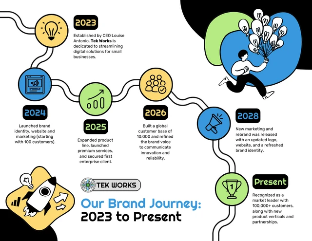
Here’s an example of a timeline infographic that maps a brand’s journey from its launch in 2023 to the present. Each milestone marks a key stage in its growth, from launching its first products to expanding its team, rebranding and reaching new customers.
“We think in pictures. For instance, when someone tells us a story, the words instantly conjure images in our minds.”
Dr. Lynell Burmark, Visual Literacy Expert
How to make a timeline infographic (step-by-step guide)
- Step 1: Create an outline for your timeline
- Step 2: Pick a layout for your timeline infographic
- Step 3: Decide how to create the timeline infographice
- Step 4: Add dates, text, and images to your timeline infographic
- Step 5: Embellish your timeline with colors, fonts, and decorative shapes
- Step 6: Download and share your timeline
At the bottom of the post, you’ll find our FAQs about how to create a timeline. You can also learn what is an infographic in our beginner-friendly guide.
Prefer watching a video? Check out this simple tutorial on how to make a timeline:
Let’s dive right in, shall we?
Step 1: Create an outline for your timeline
Before designing any new timeline, I like to start with a simple outline which includes the events or milestones I want to add to the infographic. This gives a clear idea of how much information needs to be covered and helps decide the best infographic layout.
A timeline should clearly explain the sequence and timing of tasks and events without needing an explanation. Here is what a well-built timeline should have:
- Clear title: So anyone looking at it immediately knows what the timeline is about.
- Dates or time scale: The time scale needs to be consistent and visible, either in days, months or years.
- Events or tasks in order: This should be arranged chronologically from left to right or top to bottom.
- Milestones: Key moments or deadlines that mark progress or significant points in the sequence.
- Short labels: Each event or task should have a brief label.
- Visual hierarchy: Use size, color or placement to signal what is most important and explain the sequence correctly.
- Owners or dependencies: Optional but useful for project timelines where accountability matters
At this stage, focus on the events or milestones that are necessary to understand the timeline. Leave out dates or details that don’t add useful context.
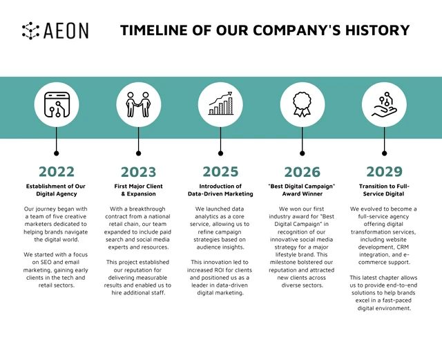
For example, if you were creating a timeline of a company’s growth, your outline might look like this:
- 2022: Company launched as a digital agency
- 2023: Won its first major client and expanded the team
- 2025: Introduced data-driven marketing services
- 2026: Won a “Best Digital Campaign” award
- 2029: Expanded into a full-service digital agency
Keep descriptions brief
Since a timeline should be a visual summary of a series of events, try to keep the descriptions pretty brief. I usually like to aim for less than 30 words per description, then try to spice it up by using icons or illustrations to make it visually exciting.
Try to keep the amount of text fairly consistent across entries too. In the example below, each social media milestone follows the same pattern: a date, a short label and a brief description. That makes the timeline easier to read from left to right.

Not sure what type of timeline to create? Check out these timeline examples for inspiration, from project planning to company history designs.
Step 2: Pick a layout for your timeline infographic
With an outline prepared, it is now time to select a timeline layout! This is where you can start to make critical design choices based on your outline.
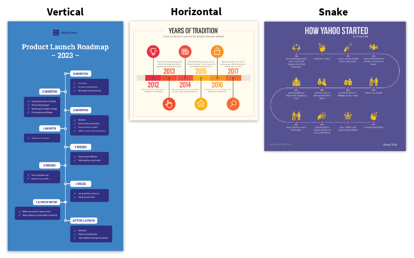
There are three common timeline layouts:
- Horizontal timeline: Events run from left to right along a straight line. This works best when you have a smaller number of milestones and short descriptions.
- Vertical timeline: Events are stacked from top to bottom. It gives you more room for text, so it works well for longer timelines or milestones that need more explanation.
- Snake or S-shaped timeline: The timeline bends back and forth across the page instead of running in one straight line. It helps fit more events into a compact space without making the infographic extremely long.
To choose the best layout for your infographic, you’ll want to consider two factors:
- The number of points in your outline
- The amount of text associated with each point (i.e. the length of your descriptions)
Some layout designs are better for lengthy text, while others are suited to many points in time with less text. Let’s review the strengths and weaknesses of each type of timeline layout.
Related: How To Create a Project Timeline (Free Templates + Tools)
Vertical timeline infographic layout
The vertical timeline layout is by far the most popular layout for timeline infographics. It comes in two alignments: centered and left-aligned.
Centered vertical timelines
The centered vertical timeline is my personal favorite. In this layout, the timeline runs right down the center of the page, with branches coming off of alternate sides of the timeline:

Its symmetry and simplicity make it pleasing to look at and extremely easy to follow. Most people will automatically recognize it as a timeline without studying it for more than a second.
It’s also quite flexible; there’s plenty of room for long descriptions, and to add more points, you can simply extend the length of the page. Plus, it’s easy to add visuals to this type of layout.
Use a centered vertical layout when you have many points with a mixture of text and images.
For example, this product roadmap timeline is a great example of a layout with all the key stages mapped out vertically, from concept to completion. Perfect for keeping your team organized and on track by visualizing a product roadmap:

Left-aligned vertical timelines
Next, we have the other most popular timeline infographic layout: the left-aligned timeline. Instead of having branches come off of either side of the timeline, the line itself is aligned to the left of the page, and all of the content is placed to the right of the line.
They’re ideal for those looking to present complex information hierarchically or as a series of steps. For example, if you’re a consultant outlining a product release timeline for your clients, this timeline infographic would be the perfect way to do so:
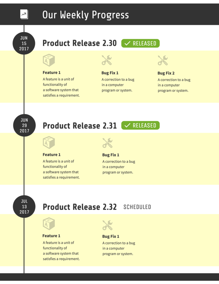
The left-aligned vertical layout is great for a text-heavy timeline, with few visuals and lots of sections. You can learn how to make a timeline like the above example by following the steps in this guide.
I recommend the vertical layout, either centered or left-aligned, for most timeline infographics because it’s so flexible. It’s the easiest to create, edit, and adjust to all sorts of content.

Horizontal timeline infographic layout
You’ve learned how to make a timeline with a vertical format. You might also recognize the horizontal timeline layout from every presentation you’ve seen in the last decade. They seem to be a staple of presentation slide decks everywhere (like the one below):

While they do work nicely on presentation slides, they’re not ideal for most infographics. They can only handle up to 6 or 7 points in time (on a letter-size page) before they get too cramped to read. If you’ve got less than 7 points and your descriptions are very brief, you can use a horizontal layout.
For example, if you’re looking to raise funds for your new business idea, the slide deck timeline above is the perfect add-on to your pitch deck showcasing your company milestones and wow potential investors.
Otherwise, stick with a vertical or snake layout.
Snake timeline infographic layout
S-shaped timelines curve back and forth across the page, creating a clear visual path for the reader to follow. They work well when you have several events or milestones to include because the layout lets you use more of the page while keeping each point connected to the same chronological sequence.
Look at the timeline template below. Each decade sits along the curved path, with the supporting text alternating from side to side. That gives every milestone enough space while still making the order easy to follow from the 1970s through the 2020s.
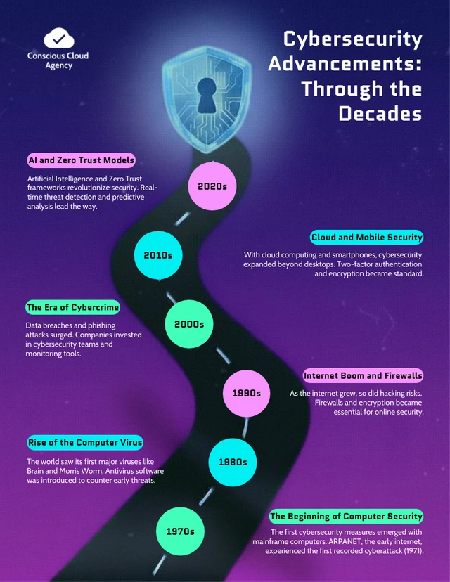
Snake timelines don’t always have to look like a winding road. Here’s another version that uses the same back-and-forth flow with a different visual treatment.

To sum up, here’s everything you need to know to choose the best layout for your timeline:
- Centered vertical layouts are best for timelines that mix text and visuals
- Left-aligned vertical layouts are best for timelines with lengthy text
- Horizontal layouts are appropriate for timelines with less than 7 points and very brief descriptions
- Snake layouts are best for timelines with more than 10 points, lots of images, and very little text
Here’s a quick overview of the different types of timelines and when to use them.
Our post on how to turn content into an infographic will also help you decide on the best layout.
Step 3: Decide how to create the timeline infographic
Now that you know the format and details you want to include, it’s time to create your timeline.
There are three ways to do it: generate one with AI using a timeline software, customize a timeline template or build the layout yourself.
You could design a timeline in PowerPoint manually using lines, arrows and text boxes, but that usually takes more time than necessary. A faster option is to start with an AI timeline generator or a ready-made timeline template.
Method 1: Use an AI timeline generator
If you already have your dates and milestones, an AI timeline design software can turn them into a finished visual much faster than building the layout yourself.
A dedicated tool like Venngage’s AI Timeline Generator can generate a complete timeline layout from a simple text prompt. It arranges your dates and milestones in the right order while also handling the visual hierarchy, spacing and supporting elements, so the result looks like a finished timeline infographic.
Add a prompt explaining what the timeline is about, the dates or milestones you want to include and any preferences you have for the layout.
For example:
Create a vertical timeline infographic showing the history of remote work from 2000 to 2026. Include six major milestones with a date, short heading and one-sentence description for each.
Here’s what Venngage generated from that prompt:
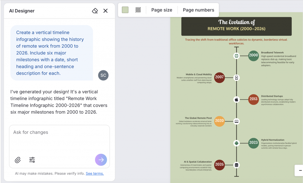
The dates, milestones and descriptions are already arranged into a complete vertical timeline, which you can then edit or customize.
If your information is already in a document, you can also upload the file and Venngage AI Timeline Generator will pull out the relevant dates and details for the timeline.
Method 2: Customize a timeline template
Another easy way to generate a timeline is to edit a timeline template. You can find a variety of timeline infographic templates in Venngage. Choose a layout that fits the amount of content you have, then replace the sample dates, milestones and descriptions with your own.
You can edit the template manually or use AI to update the content for you.
For example, I took the Cybersecurity Milestones Timeline Infographic template shown above and used it to create a new timeline on “The evolution of artificial intelligence from 1950 to 2026.”
Venngage AI replaced the original content with the new dates and milestones while keeping the overall layout and visual structure intact. You can then edit the text, icons, colors or other elements as needed.
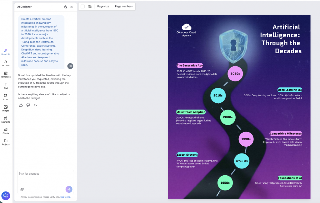
You can then customize the design further or use AI editing tools to refine it.
Method 3: Build your timeline from scratch
If you want full control over the layout, you can build the timeline manually in a design or presentation tool. I’m using Google Slides here, but the same basic process works in PowerPoint and similar tools.
Start by adding a line or path to form the backbone of the timeline. Go to Insert > Shapes > Line and add a horizontal or vertical timeline depending on the timeline layout you want.
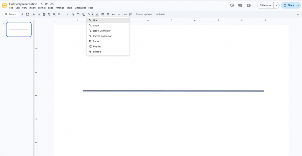
Then place a marker for each event or milestone. Go to Shapes > Circles and add one circle for each point on the timeline. Use short connector lines to link each circle to the main timeline, leaving enough space around it for the date, heading and description.
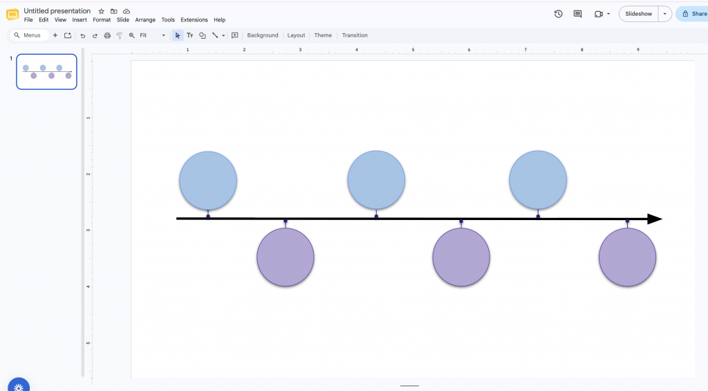
Once the basic structure is in place, you can add your text, icons and other visual elements.
Step 4: Add dates, descriptions and visuals to the timeline
Once the structure is ready, add the content from your outline to each milestone. Start with the dates and headings, then add a short description explaining each milestone.
You can also use icons or images for each event to break up the text and make important milestones easier to spot.
If you’re creating your timeline in Venngage
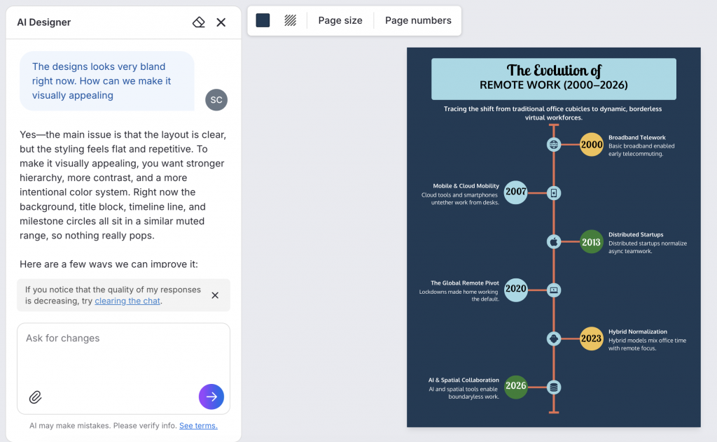
You can customize your timeline design easily in Venngage using AI. Go the AI Designer chat at the bottom left corner of the page and type the changes you want.
For example, you can ask the AI Designer to try a different timeline layout, add more milestones or events, rewrite a description, suggest a more relevant visual, improve the background and more.
I asked the AI Designer to make my initial timeline infographic design more engaging and it suggested different color palettes and ideas to improve the design.
It’s also easy to add custom visuals in Venngage. Try the AI Icon Generator Type a simple text prompt and Venngage AI generates four options to choose from.
If you’re designing the timeline manually
Add your dates, headings and descriptions first, then look for visuals that support the information. Most design tools have built-in icon and image libraries, but you can also find icons on sites such as The Noun Project, Icons8 or Flaticon.
Here’s the final timeline I generated in Google Slides.
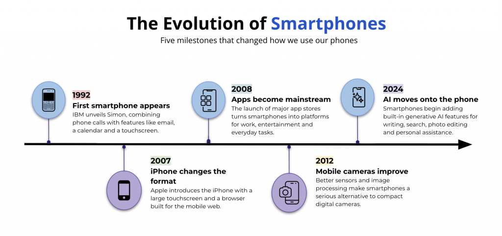
Try to keep the visual style consistent. Mixing detailed illustrations, flat icons and photos across the same timeline can make the design feel disjointed.
Keep the placement of dates, headings and descriptions consistent from one milestone to the next so readers can quickly understand how to follow the timeline.
Step 5: Embellish your timeline infographic with colors, fonts, and decorative shapes
All of the essentials are now in place, so you can focus on making the timeline design more visually interesting.
Start by picking a color scheme to spice things up a bit. Use the background color picker in the left toolbar to swap the background color, and the color picker in the top toolbar to change to colors of other elements.
Notice how we’ve used the same colors for the same elements across the entire timeline? By sticking with a simple three-color scheme for this timeline we can create a clean, cohesive look. We use a bright eye-catching red to draw attention to the dates and kept the background pretty neutral in a dark blue.
Next, let’s jazz up the style of our graphic by picking a font pairing with some character. Scroll through the font family options in the top toolbar to find 2-3 fonts that you like. Feel free to use bold, stylized fonts for your headers and dates, but stick with basic, easy-to-read fonts for your descriptions.
Finally, add some basic shapes like circles and boxes around important elements (like icons and titles) to give the timeline more structure.
By repeating the exact same rounded box throughout the design, we create a satisfying sense of rhythm that makes our design easier to understand. This technique is key for elevating particularly simple designs like this one:
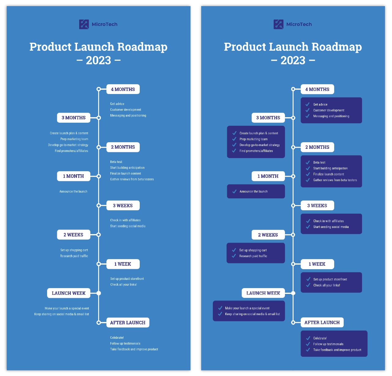
Pro Tip: If you’re someone who doesn’t have time to mess around with expensive design software or you just want to make sure all your designs strictly follow your branding, utilizing Brand Kit will make that part a breeze.
When you’ve finished customizing your timeline infographic template with fun fonts, colors, and shapes, you’ll want to share it with the world.
With Venngage, you have the option to download every infographic in PNG or PDF format. If you want to embed links into your timeline, be sure to choose the interactive PDF option. Otherwise, high-quality PNG is likely your best bet.
You’ve also got the option to embed your infographic directly on a webpage. Simply hit “Publish” to get your embed code.
Learn more about our infographic features.
Common timeline infographic design mistakes to avoid
Here are a few common mistakes to avoid while creating an timeline:
- Too much text: A timeline is a visual tool. It should have only necessary text including date, task/event and owner name. Cramming too much text makes it difficult to read.
- Inconsistent spacing or scale: Compressing three months into the same space as three days makes the timeline misleading
- Using a timeline when another format fits better: If you need to track task dependencies, use a Gantt chart. If you are organizing by date and time, use a calendar
What are the benefits of using timelines in projects?
The benefits of using timelines in projects include:
- Enhanced Organization: Timelines provide you with a clear visual representation of project tasks and deadlines, helping teams stay organized.
- Improved Time Management: Timelines help you prioritize tasks and manage deadlines, ensuring your project stays on track.
- Better Communication: Visual timelines facilitate easier communication among with your team members, stakeholders, and clients by clearly outlining your project stages and milestones.
- Increased Accountability: Assigning tasks and deadlines on a timeline helps hold your team members accountable for their responsibilities.
- Simplified Planning: Timelines allow for straightforward planning and adjustments, making it easier for you to identify potential bottlenecks and allocate resources efficiently.
- Progress Tracking: Timelines enable your teams to monitor their progress and make necessary adjustments in real-time, ensuring timely project completion.
- Enhanced Collaboration: By providing a shared visual reference, timelines foster better collaboration and coordination among your team members.
FAQs about how to create a timeline infographic
1. What should a timeline infographic include?
A timeline infographic should include a clear title, dates or time periods, key events or milestones and short descriptions. You can also add icons, illustrations, photos or charts where they help explain the information. The main goal is to make the sequence easy to follow at a glance.
2. How many events should you include in a timeline?
There’s no fixed number, but five to eight milestones is usually a good range for most timeline infographics. If you have more information, group related events into phases or choose a layout that gives each point more space.
3. Should a timeline be horizontal or vertical?
It depends on how much information you need to show. A horizontal timeline works well for fewer milestones with short descriptions. A vertical timeline gives you more room for text and is usually a better fit for longer timelines.
4. What is the difference between a timeline and a timeline infographic?
A timeline shows events in chronological order so you can see when they happened and in what sequence. A timeline infographic uses that same structure but adds visual elements such as icons, illustrations, charts, color and hierarchy to make the information easier to understand.
5. Can I create a timeline infographic with AI?
Yes. You can use Venngage’s AI Timeline Generator to create a complete timeline infographic from a simple text prompt. Describe the topic, dates or milestones you want to include and Venngage will generate the timeline layout for you. The simple Venngage drag-and-drop editor makes adding, removing, and swapping elements easy.
Venngage offers thousands of free templates, as well as photos, 40,000+ icons, and numerous text options, so your designs can convey your message to any audience.
6. How do you draw a timeline in Word or PowerPoint?
6. You can draw a timeline in Word or make a PowerPoint timeline using Venngage. Both Word and PowerPoint can be cumbersome to design on. The results aren’t always satisfactory or attractive.
But with Venngage, you can design beautiful timeline infographics and add them to your Word document or export the design from Venngage for your PowerPoint presentation.
Make timelines effortlessly
Timeline infographics are the perfect visuals for telling stories that your readers will enjoy and want to share with their friends. They’re perfect for visualizing steps in a project, as well as including them in your pitch decks to woo potential investors.
Perhaps you have an important project coming up or you’re a marketing manager who just needs a quick alternative to Photoshop? With Venngage’s AI Timeline Generator, you can create timelines n minutes. Now that you know how to create a timeline infographic, what are you waiting for?
More infographic design guides: