


Let’s be honest with ourselves: we are not all designers.
We are writers, marketers, and business owners, which means our design skills are nowhere near an expert level.
But that doesn’t mean we can’t fake it ‘til we make it.
I’ll let you in on a secret–that is exactly what I have been doing for the past three years of my career. I have had no formal design training but after consistent back and forth with the design team at Venngage, I now know what good and bad design looks like.
And one of the easiest ways to make or break your fake design cred is with a color scheme!
Here I will show you how to do that…in less than 10 minutes. Plus, as a bonus, I will include all the tools I use to create a killer visualization.
Let’s get into it!
And as a special gift to everyone, I have compiled a list of 30 free color schemes that you can use. No need to enter your e-mail to download. Add these schemes directly to your Brand Kit with the Venngage Business plan right now!
Do Make A Plan
You’re excited to start a new visualization and finish your task quickly. But starting without a plan will end up costing you more time than it saves you.
This is where many people, including myself, first run into a problem and end up having to redo many visualizations. So save yourself the trouble and create a simple plan, or list, of charts or visualizations you want to use while you are writing.
Here is what I do:
- Read through your content and find places that would be better explained in a visualization. For example, in this chart, I was comparing millions of dollars spent in college football in many charts.
- Next, decide what types of charts or graphs would get your point across the best. In this case, I used a bubble chart to help explain the magnitude between the groups.

- Then, determine how many pieces of data each chart needs to be illustrated in each of the visualizations. There are four different groups we illustrated throughout the article. So we knew that there would only be a maximum of four different colors used.
- Knowing that you need a certain number of colors, pick a color scheme! This can be done with any of the tips we explain in this article.
- Now visualize it!

Those steps will give you a great place to start when picking colors schemes, instead of making it up while you go. Which, again, I am guilty of doing in the past!
There is a big difference in approach between needing seven distinct colors for a pie chart or only one for a line graph.
Like so:

I have often wasted a ton of time reworking a color scheme because it doesn’t fit with the article. By creating a simple plan beforehand, like the one above, there will be less confusion about the number of colors you will need.
Want to take your infographic design to the next level? Download our interactive guide on The Dos and Don’ts of Infographic design!
Do Not Use Bland Colors
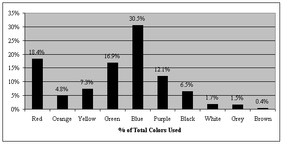
Let’s start by taking a look at the graph below. Aside from it being completely misleading, it is lacking the color needed to help readers understand it.
The graph below involves political parties, which should have made color selection almost a no brainer. Republicans are red and Democrats are blue. Yet, the choice above highlights the most boring color in the entire color wheel, gray.

Here is another example of a chart that is LITERALLY about colors. But the designers, like real designers, decided that black would be a better way to convey their data.
Color me unimpressed.
Do not be like these designers. There are literally millions of colors that can be used.
Actually, there are 16,777,216 colors that could have been used, all of which are available in Venngage’s color too.
I mean, gray and black are technically not even colors. They are shades, making them the worst choice to portray differentiation in your data visualizations.
Visualizations are used to help people understand complex data.
And these have both failed that simple test. But with a little splash of color they could be much more usable.
Do Use Brand Colors
This is one of the easiest but often most overlooked ideas, especially for beginners.
You already have a battle-tested brand color scheme. Why not use it?
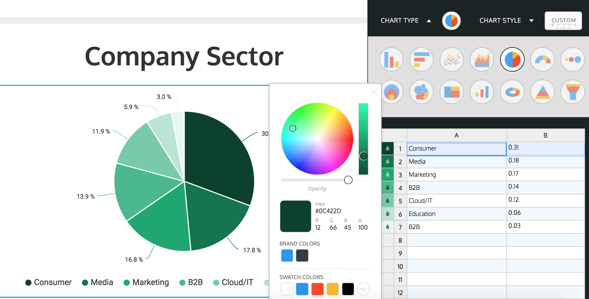
Venngage’s main brand color is a bright blue, which you can see in the pie chart below. And we used some of the tools I mention at the end of this article to find two other colors that matched it perfectly.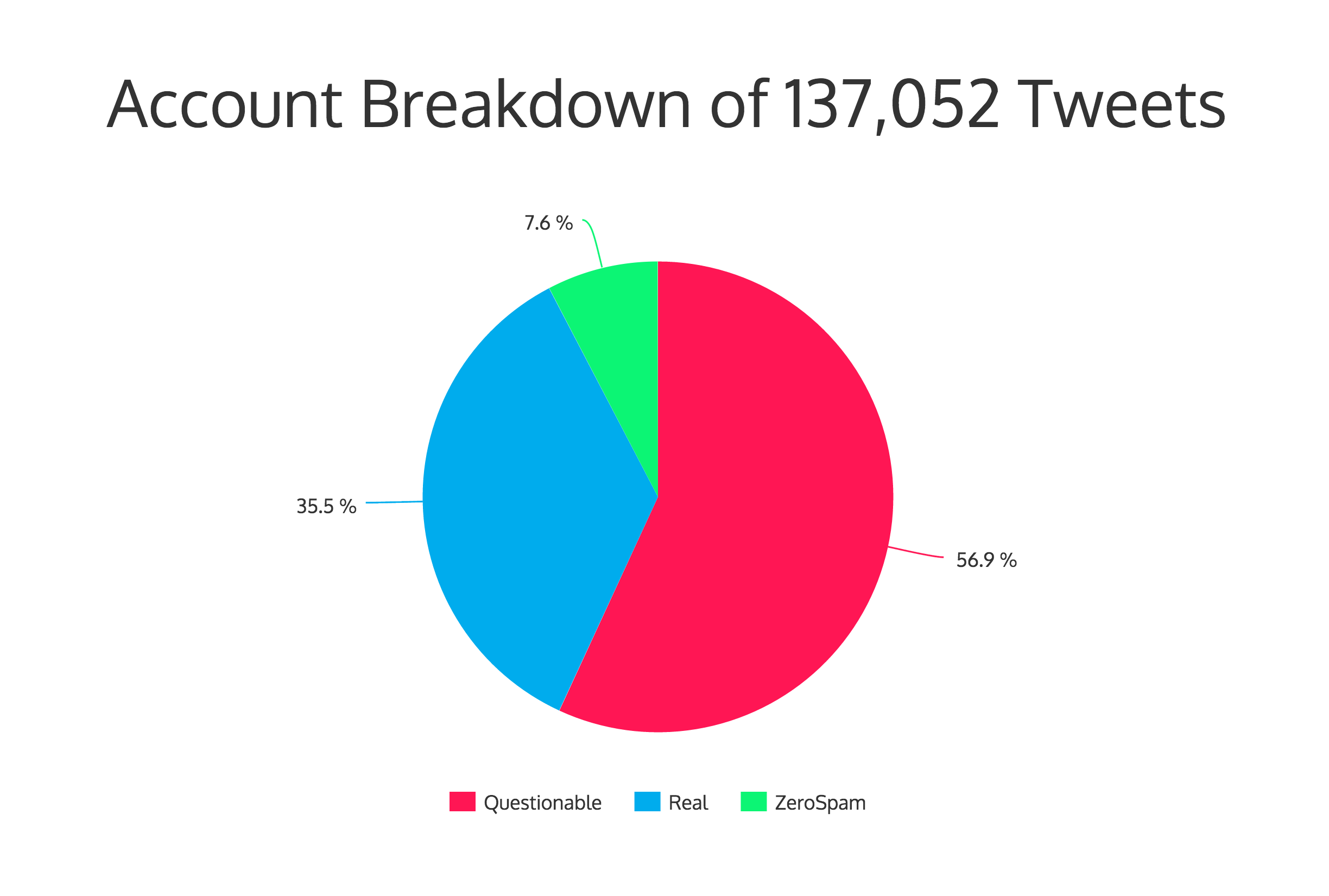
Here is another example from L2Inc in a graphic about Snapchat, using their signature yellow:

And here is one more using my alma mater’s shade of red in an article about college football:

Even if you are not using your brand’s colors in a visualization, it is a great place to start when choosing a color scheme.
With Venngage’s My Brand Kit you only have to enter your brand colors ONCE.

They are then saved in the tool and then you can use them for every chart, visualization or infographic you make.
So no more searching for or bothering the designers for the hex code of the colors your brand uses!
Do Not Let Colors Distract From The Data
To repeat myself: the ultimate goal of a visualization is to make complex data easier to comprehend.
Readers should be able to glance at a data visualization and understand it in a few seconds. If your design or color choice inhibits this, you need to change it.
Here is an example in which I used too many colors, thus distracting from the point I wanted to make.

Instead of using seven very distinct colors, I could have easily taken a different approach entirely. Even using a bland color like gray would look better than what I did above. Because it would put the focus on the blue section of the graph, which as you can see from the title was the main focal point.
This is not the place to show off the newest and greatest trends in design. It is the place to help your readers understand your data or story better.
In the next section, I will show you exactly what I should have done.
WATCH: Everything you need to know about COLORS… in under 3 minutes!
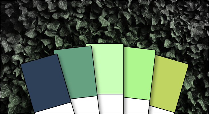
Do Use Tints, Tones, and Shades
This is one of my favorite color hacks, and I only started using recently. It’s very simple to use across different types of visualizations.
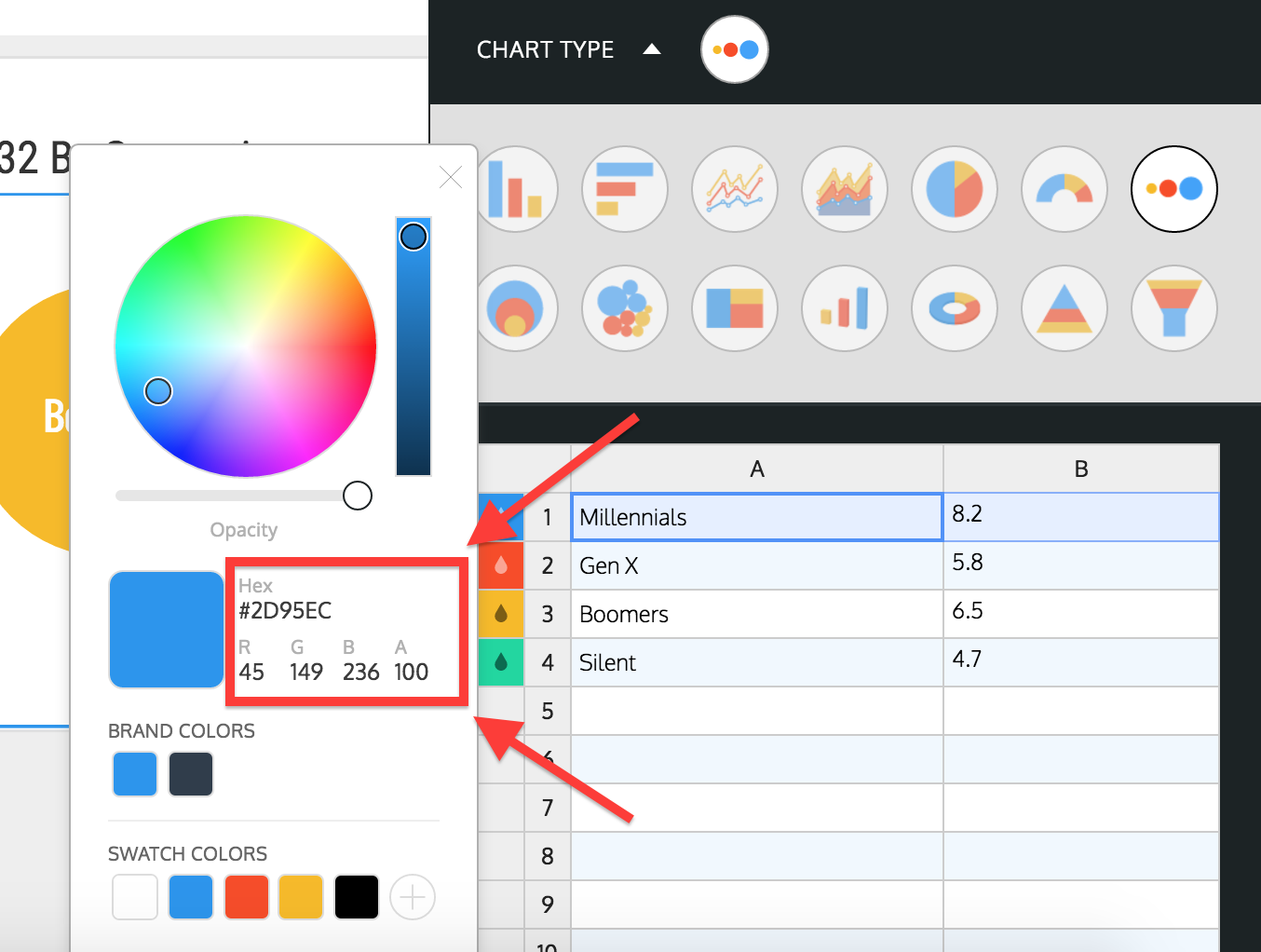
First you need a color to start with: in this case, I selected a light blue with the hex code of #93BEDF.
Then all you have to do is plug that hex code into one of the thousands of color tools and it will give you a great spectrum.
Let me show you…
Notice how this tool provides you with 20 unique colors you can use:

Seriously it is that simple! And because of that simplicity, it has become my favorite color hack and I will continue to use it in many projects to come.
Here is an example of it used in a bubble chart:

A pie chart:

And even a bar chart:

If you have not noticed yet, blue is my favorite color to work with. Mainly because it looks clean and professional on a white background. And it is used by many businesses to evoke a feeling of trust and stability.
If you can find some colors that you love working with and memorize what they look great with, you will save yourself a few headaches. And more importantly, you will save time.
Do Keep It Consistent
This is another concept I struggled with in the beginning of my pseudo-design career. I really believed that each chart or visualization needed to be unique and in turn put that before usefulness.
But consistency over uniqueness in design is the best plan of action when making a visualization.
Here are all the visualizations I used in one of my article.

By my count, there are all of three colors used throughout the entire article.
And only three were used in this graphic, keeping the labels consistent throughout as well:

When you are keeping it consistent you can also keep it simple. Which as a non-designer, you should want at all costs!
Figuring out how I can keep it dead simple is how I approach every visualization now. And it has helped me become a better creator in no time.
But if you don’t want to worry about picking a perfect scheme, BEAM is here to help.

There are four preset color schemes to be used across different charts. It is literally dead simple to use.
Do Not Avoid The Color Wheel
The color wheel is your friend when it comes making a compelling scheme. It may be a low-tech way to match colors but it also has been used by creatives for hundreds of years.
If you remember elementary school art class, then you know that there are three ways to find color harmony.
This can be done if you already have a color to start with or if you need a dash of inspiration to get started!
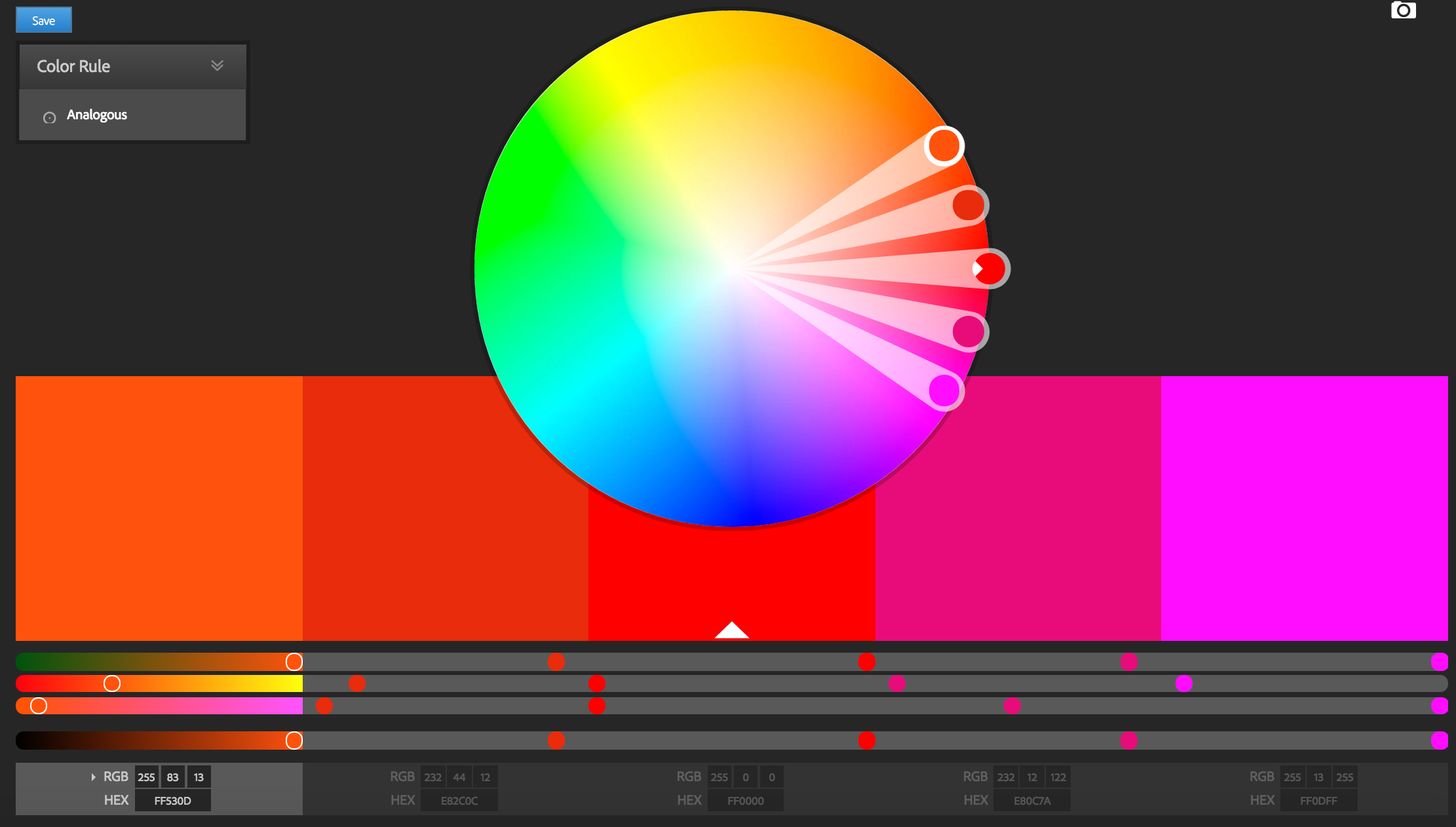
First, we have analogous matching, which means choosing colors that are next to each other on the wheel.
This is what it looks like in the Adobe Colors tool:
Next, there is monochromatic matching, which uses the different tints, tones, and shades of a single color.

This type of color scheme we talked about above as well! And can be used in pretty much any type of visualization.
And finally, there is complementary matching, which involves using colors that have the highest contrast.

Now, there are a few other ways to match colors using the color wheel, but those three are the most effective.
After you get the hex codes, you can enter them directly into Venngage’s color picker.
It is that easy!
Do Fit Your Purpose/Theme
I touched briefly on using colors to evoke certain emotions, ideas or stances above. In this section, I want to dive a bit deeper into using different color meanings in your infographics.
I am trusting that most people have seen something like the graphic below. Right?
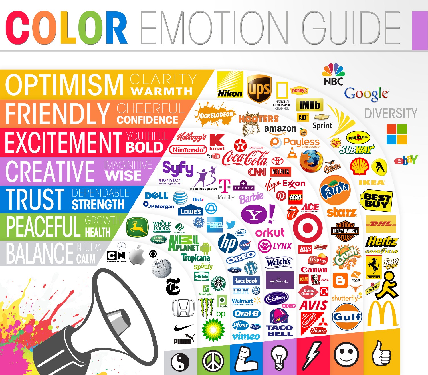
Using color to bring emotion into a visualization can help really drive home the point. You also can establish a stance on a problem without saying it outright.
For example, look at the chart below depicting real Twitter accounts versus accounts that are probably fake. I used blue, which signifies trust, to represent the real accounts and and red, which is usually a negative color, to represent the questionable accounts.

If I had picked a different color scheme, I don’t believe the point would have been so easy for readers to understand.
And what are visualizations all about? Making data easier to understand!
Another way to subtly use color is to signify different groups is based on their branding colors. For example, this award-winning infographic splits the political parties based on their colors.
The designer made it very easy to quickly compare and get the point.

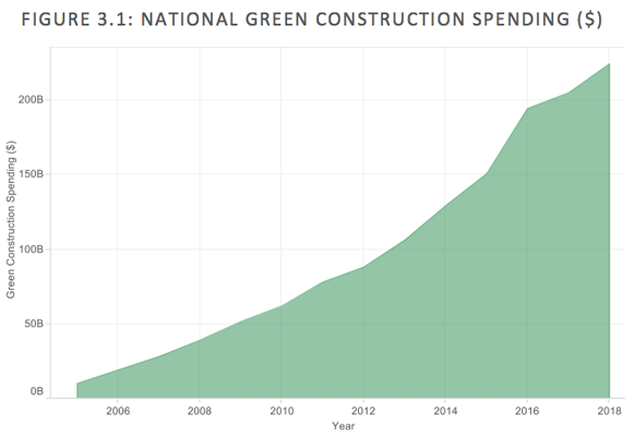
And let’s not forget about the importance of color fitting the content. If you are talking about an environmental issue, a green color would be best.
Source
But if you are writing about Twitter compared to Snapchat, blue and yellow would be best. Looks like this graph maker did not get the memo:

Visualizations should be all about making the data easier to understand, and you can easily use color to do that.
BONUS: Use These Tools
1. Coolors

2. Color Code Hex

3. Adobe Color

4. Material UI Colors

5. BrandColors

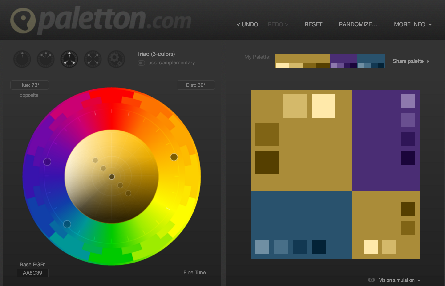
6. Paletton


