


The ability to give a captivating presentation is something that seventy percent of American employees believe is a crucial skill required to finding success at work.

Whether you’re standing in front of 5 people, or 5000 people, it goes without saying that there is a lot of pressure that comes with delivering a talk and putting together a slide deck that effectively gets your thoughts across to an audience, and engages that audience.
I’ve attended many different conferences and panels, and spoken at many events in the past few years. It’s always a little bit daunting to get in front of a room full of strangers who, without a doubt, have high expectations of the content I’m about to share…as well as the delivery of my presentation.

Nearly every conference organizer I speak with tells me the same thing: that their audience typically responds best to actionable content. Plus, I should share something that is not only memorable, but that can be applied immediately by those in attendance.
Oh, but those aren’t the only requirements, of course…
I’ve got to present this information without access to any notes, I have a limited amount of time, I need to avoid incorporating too much text in my slides, and we can’t forget that every single person in the room, despite having the job title of “marketer”, comes from vastly different backgrounds and organizations.
So what’s the takeaway here? Well it’s clearly a lot harder than it seems to deliver a captivating and valuable presentation than may have previously been assumed.
Now I’ll be honest with you–I’m not the strongest public speaker, so it’s difficult for me to just “wing-it” when I get up on stage. I need a lot of cues and structure in my slide decks to help me stay on track, and keep a good pace in order to consistently grab the attention of my audience.
What I’ve learned from giving dozens of presentations in the past year is that every audience seems to respond very well and very strongly to the visual nature of my slide decks. I have almost no text, and in some cases, I have close to 150 slides in a 20 minute presentation.

Despite how many slides I use, I’ve been told specifically from a number of attendees that they are able to clearly remember almost everything I cover in that time. In fact, many have come up to me after a session to recap all of the things they learned and how they plan on applying those tactics to their own jobs.
Am I telling you this simply to brag about how great of a presenter I am? Maybe a little bit. But the main point I want to make is that I’m actually not the only speaker who places such a strong focus on creating visually appealing presentations.

I decided to reach out to speakers from all of the conferences I’ll be attending this year to find out what their processes are for compiling their slide decks in order to make them as engaging and actionable as possible.
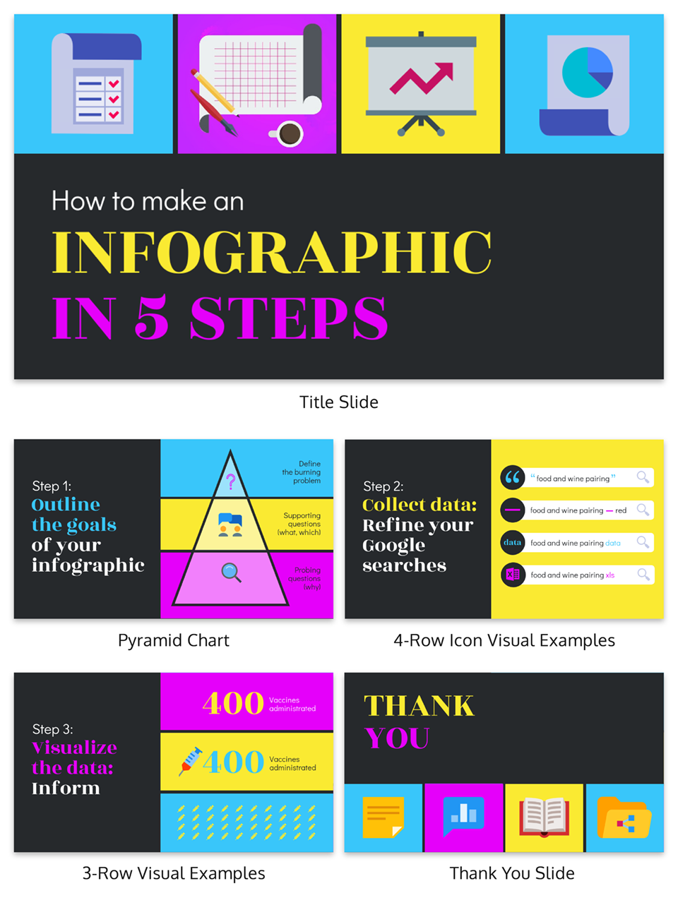
They answered 15 different questions, and using those responses our design team actually created customized presentation templates that are available for you to use. Click on the link to check out these presentation templates.
The results from the survey are below.
Presentation Design Statistics to Know for 2019:
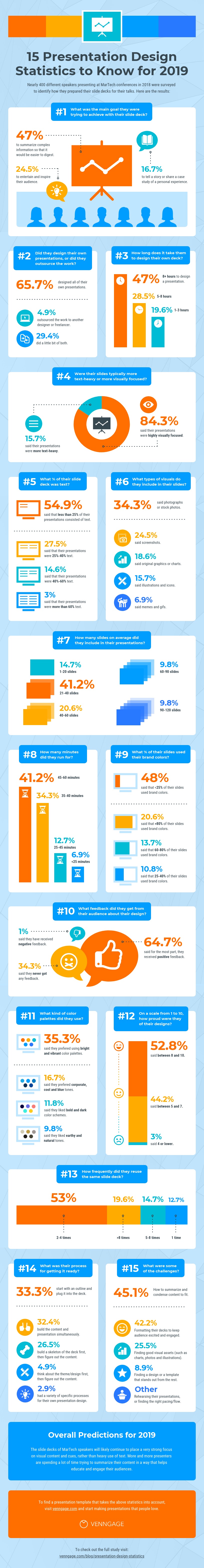
1. What was the main goal that presenters were trying to achieve with their slide decks?
When asked, 47% of speakers surveyed stated that their main objective when designing their presentations was to summarize complex information so that it would be easier for their audience to digest the content.
Other goals that presenters had were to create slide decks that entertained and inspired their audiences (24.5%) and to tell a story or to share a case study of personal experiences with their audiences (16.7%).
Some speakers were also more focused on sharing specific statistics and facts with their audiences (2%) or breaking down specific topics or strategies into smaller inputs and tactics that their audience could take away (9.8%).

2. Did they typically design their own presentations and slides, or did they outsource the work to another designer?
The same speakers were also asked about the design process of their presentations, and if they had a tendency to design their decks on their own, or out-sourced their work to a freelancer, agency or an in-house designer.
What was surprising was that the majority, that being 65.7% of presenters, actually designed all of their presentations on their own, and only 4.9% would hire someone to do it for them. But 29.4% of speakers stated that they did some of the design work themselves, and also got some assistance from a designer.
3. How long did it take speakers to design their own slide decks and presentations?

Of those who designed a presentation on their own,47% said that it took them more than 8 hours to simply design the deck, 28.5% said it took them between 5 and 8 hours to design their presentations and 19.6% said it took them between 1 and 3 hours.
After speaking to our support team to identify how long users on Venngage were spending on their presentation designs, on average those who used an existing presentation template spent between 45 minutes to 2 hours to complete a slide deck. However the users who started from scratch and chose to begin with a blank canvas took between 8 and 12 hours to complete a design.
Browse our library of professionally designed engaging presentation templates to save time creating engaging slide decks.
4. Were their slides typically more text-heavy or more visually focused?
Next we asked presenters whether their decks consisted primarily of visual content or were more text-heavy in nature, and a shocking 84.3% said that their presentations were highly visually focused.
When we surveyed marketers last year to identify how they were using visual content in their marketing efforts, on average the use of visual content in articles increased by 130% from 2015 to 2016 due to the higher engagement levels with visually-focused blog content.
5. What percentage of their slide decks consisted of text?
Only 15.7% of speakers surveyed said that their presentation decks were more text-heavy, and the majority (54.9%) stated that less than 25% of their presentations consisted of text.

6. Which types of visuals were most frequently included in presentations?
When asked what types of visuals were used in their presentations, 34.3% of speakers and presenters reported that they predominantly used photographs and stock photos in their presentations, but as we learned from our survey on visual content, only 7.6% of marketers claimed that photography and stock photos resulted in high-engagement.

The majority (41.5%) had stated they had seen higher engagement rates from visuals such as infographics and original graphics.
But only 18.6% of presenters admitted to using original graphics, or charts in their presentations, and 15.7% said they primarily used illustrations and icons. One individual surveyed even went a step further and said:
“Charts and support elements are my biggest stumbling block. I am a practitioner and usually have a really good idea about the story I would like to tell but when it comes down to finding the right graph or free template to help me, I stumble. It’s really, really hard to find good support elements!”

A lot of emphasis is placed on incorporating good storytelling in a presentation, which admittedly is crucial to an engaging presentation, but unfortunately not enough focus is placed on data visualization and using graphs and charts as a supporting element in that story. You can read more about chart design best practices here.
In addition to this, 24.5% of speakers said they used a lot of screenshots and only 6.9% said they used mostly memes and gifs.
7. How many slides on average were included in their presentations?
As I mentioned above, I have a tendency to use a lot of slides in my presentations because it helps me stay on track, but it also keeps the pace of the presentation up, so I was surprised to see that only 3.9% of presenters surveyed used more than 120 slides in their talks, followed by 9.8% who used between 90 and 120 slides.
The majority, being 41.2% said that they only included between 21 and 40 slides in their presentations.

Now if you’ve ever heard of the 10/20/30 rule by Guy Kawasaki, you know that he claims presentations should only have 10 slides and last 20 minutes, but this is a bit of an outdated belief system if you ask me.
The reason being that the modern audience has vastly shorter attention spans than they did even a decade ago.
In fact, apparently the average attention span has dropped from 12 seconds in the year 2000, down to 8 seconds in 2018.

8. How many minutes did their presentations run for?
Keeping this in mind, you need to keep your audience constantly stimulated and offer continuous visual cues to accompany each new thought. We see this a lot today in YouTube videos where frame changes and energy changes occur every 10 seconds, and a new point is made every 30 to 60 seconds.
And considering that 41.2% of speakers surveyed said they now have to give presentations that last anywhere between 45 and 60 minutes, and only 6.9% said their presentations last less than 25 minutes, you need to do everything in your power to avoid losing their interest.
9. What percentage of their presentations consisted of their brand colors?
We also asked how much of their presentations included their own brand colors, and 48% said that less than 25% of their presentations consisted of branded color schemes. That being said, 20.6% said that more than 80% of their presentations consisted of brand colors and only 6.9% said they used their branding between 40% to 60% of the time.
For the most part, slide decks were either incredibly brand focused, or not at all.

You can upload your own brand colors and fonts when you use Venngage’s Brand Kit. Click here to see.
10. Had they ever gotten feedback from their audience specifically for their presentation design?
If you’ve ever given a talk at a conference, you understand that audience feedback goes a long way. So we asked these speakers if they had ever received any feedback specifically about their presentation design itself.
For the most part, 64.7% of speakers said they had received positive feedback on their presentation designs and only 1% said they had received negative feedback on their design (if you’re the 1%, please let us help you).
But 34.3% said they actually never received any feedback on their designs at all.
Now I’d like to take this opportunity to brag again, if that’s okay, and it’s to say that 90% of the time the feedback I receive is on the engaging and memorable nature of my slides’ design and style.

What I’m getting at, is in many cases if the design of your presentation is truly outstanding, people will comment on it. If they say nothing, there is a strong chance that the design didn’t stand out in their minds.
Delivering a memorable presentation is something all speakers strive to achieve, and you need to keep in mind that your audience is spending anywhere between 25 and 60 minutes staring at your slides, not at you.
And if you’re slides contain valuable information and look good, the chances of your audience taking pictures and sharing those pictures online is much higher (and as marketers we all love shareable content, don’t we?).
11. How proud were they of the overall design of their slide decks, on a scale of 1 to 10?
We also asked these speakers how proud they were of their slide design on a scale of 1 to 10, and 52.8% said their pride fell somewhere between an 8 and a 10.
Only 3% rated themselves a 4 or lower, and 44.2% fell somewhere in between a 5 and a 7.

Explore a range of creative presentation templates so that you can create a slide deck you are truly proud of.
Unfortunately, design comes as an afterthought to many presenters, and that makes sense since conference attendees typically decided whether or not to sit in on a talk based on the content, not the look of the presentation.
But the use of visuals is an enhancement to that content that will in turn have an impact on information recall.
12. What kinds of color palettes did they prefer using in their presentation design?
Since we already addressed that most speakers shied away from using their brand colors in their presentations, we wanted to learn a bit more about what types of color schemes and palettes they were drawn to.
Bright and vibrant color palettes ranked the highest, with 35.3% of speakers leaning towards this option, followed by 16.7% who stated they prefered corporate, cool and blue tones in their presentations.

In addition to that, 11.8% said they liked bolder and darker color schemes, and 9.8% said they prefered more earthy and natural tones. Only 7.8% of people stated that they prefered fiery and red tones, and 3.9% said they liked color schemes that were more subtle and consisted of pastel tones.
The remaining 14.7% selected the “Other” option, and shared a much wider range of specific color schemes, most of which consisted of their specific brand colors, or variations of the above palettes (such as “Neon” or “Brown tones”).
13. How frequently did they reuse the same slide deck, or give the same presentation?
As mentioned above, many speakers spent over 8 hours when it came to designing a presentation, so it only makes sense that they would repurpose or reuse that presentation a few times.
In fact, 53% said they reused the same slide deck between 2 and 4 times, and 19.6% said that gave the same presentation more than 8 times. On top of that, 14.7% said they gave the same talk between 5 and 8 times, and 12.7% said they gave the talk only 1 time.

It’s also worth noting that some people commented that even if they didn’t use the exact same presentation multiple times, they would repurpose certain parts or ideas multiple times in different talks.
14. What was their process for getting a presentation ready?
I was interested in learning what the process was for preparing a presentation or slide deck, and 33.3% of those surveyed said they typically started with the content or an outline, and then broke down their script or notes to plug into a deck. For these individuals, design came as a last thought.
Similarly, 26.5% said they started with a skeleton of the entire presentation and then added the design elements to that.

Only 4.9% of people said they would think about the overall theme or design of the presentation, and figure out the exact content later on, whereas 32.4% actually built the content and the presentation simultaneously.
The remaining 2.9% had a variety of more specific processes for their own presentation design, such as determining the audience level first, or starting by talking out loud and letting their natural expertise guide the flow of the overall presentation.
15. What were the most difficult parts of putting together a slide deck?
Finally we asked speakers to tell us everything they found most difficult about putting together their slide decks and 45.1% said they struggled primarily with figuring out how to summarize and condense their content so it would fit in a good presentation.
Ironically, this was also one of the most common goals many of the speakers had. Then 42.2% said they struggled with formatting their presentations in a way that would keep their audience excited and engaged.
As I recommended of course, a possible solution to this struggle is to keep the pace up by changing the slide with every new thought.

And next 25.5% said they struggled with finding good visual assets to include in their presentation, such as charts, photographs and illustrations. Finally, 8.9% said they had a hard time finding a design or a template that stood out from all the noise and clutter.
There were some other results as well that ranged quite a bit where people stated that they struggled with the actual rehearsal of their presentations, or finding the right pacing and flow to accompany the format of their decks. Again I think a solution here is to structure the slide deck in a way so that with each new thought or phrase, the slide changes.
Venngage offers a range of customizable charts, an image library and unique illustrations that you can drag right into your presentation template. Sign up for free.
Conclusion
Based on the findings from this survey, it appears that overall the slide decks of MarTech speakers will continue to place a very strong focus on visual content and cues, rather than heavy use of text.
More and more presenters are spending a lot of time trying to summarize their content in a way that helps educate and engage their audiences, and a clear struggle that many presenters face is figuring out how to format and design their presentations in a way that can accomplish this.
How to make presentations that engage your audience: 5 proven presentation templates that will help
As promised, below you will find five custom templates that the Venngage Design Team put together based on the results of this survey. Our goal is to provide you with templates that not only save you time, but are fully equipped with all the components of an engaging presentation.
1. Use bright and vibrant color schemes to make your information pop
Based on the survey results, we learned that a lot of speakers and presenters are drawn towards brighter and more vibrant color schemes. So we took that into consideration in designing each of these custom engaging templates.
2. Avoid including too much text on your slides
As you can imagine, your audience doesn’t want to be bombarded with text when they are experiencing your presentation, so try not to include too much text in your slides. Get straight to the point or use photographs, screenshots and illustrations to help get your point across visually.

3. Include graphs and charts to help summarize complex data
If you have survey results, or a lot of data to share with your audience, rather than simply listing out the raw data in your presentation, try to use charts and graphs to help simplify and condense that complex information. It will make it a lot easier for your audience to interpret your findings, and keep them more engaged overall.
Take a look at this article on chart design for more information on how to transform data into charts and data visualizations.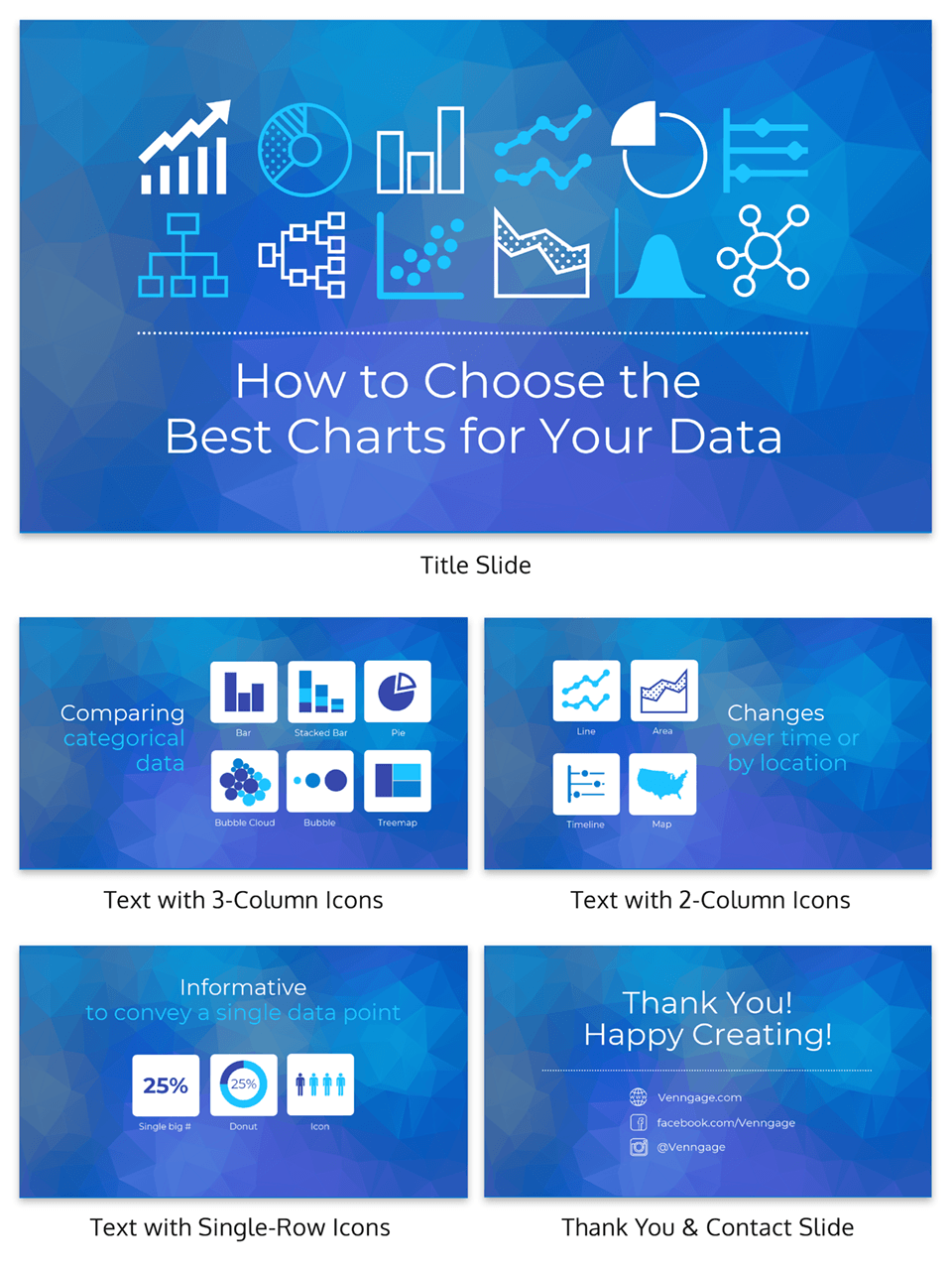
4. Use icons to provide visual cues and draw connections
If you’re struggling to figure out how to make your presentations more visual, you can use icons to create visual cues, or draw connections from the text-heavy content in your slides. Icons will help your audience better recall the information you cover during your talk.

5. Focus on summarizing the key points of your content
And if you’re still struggling to figure out how to summarize your key points in an effective and engaging way, try focusing on the “main headers” that structure your content. These are usually your key points and is ultimately the information your audience will want to walk away with at the end of your presentation.

You can explore a wide range of engaging presentation templates and designs here and ensure that the next time you deliver your own presentation, your audience leaves motivated and educated.
More presentation guides:


