


If you’ve struggled to turn raw data into compelling visuals, you're not alone. Survey data often ends up buried in boring charts and tables that fail to engage your audience.
A good survey design helps businesses present clear, actionable insights that build trust with stakeholders. It ensures the results are easy to understand, accurately reflect customer opinions and guide decision-making. Well-organized survey data also increases credibility and can lead to meaningful changes.
In this blog post, we will talk about how to present survey results in a way that makes a lasting impression. We will show you how to make a survey results infographic, how to choose the right survey results templates and creating visually-stunning survey results infographics for your use cases.
How to present survey results?
Use different charts for different survey results. Match charts to binary, rating scale, multiple-choice, single-choice or demographic data.
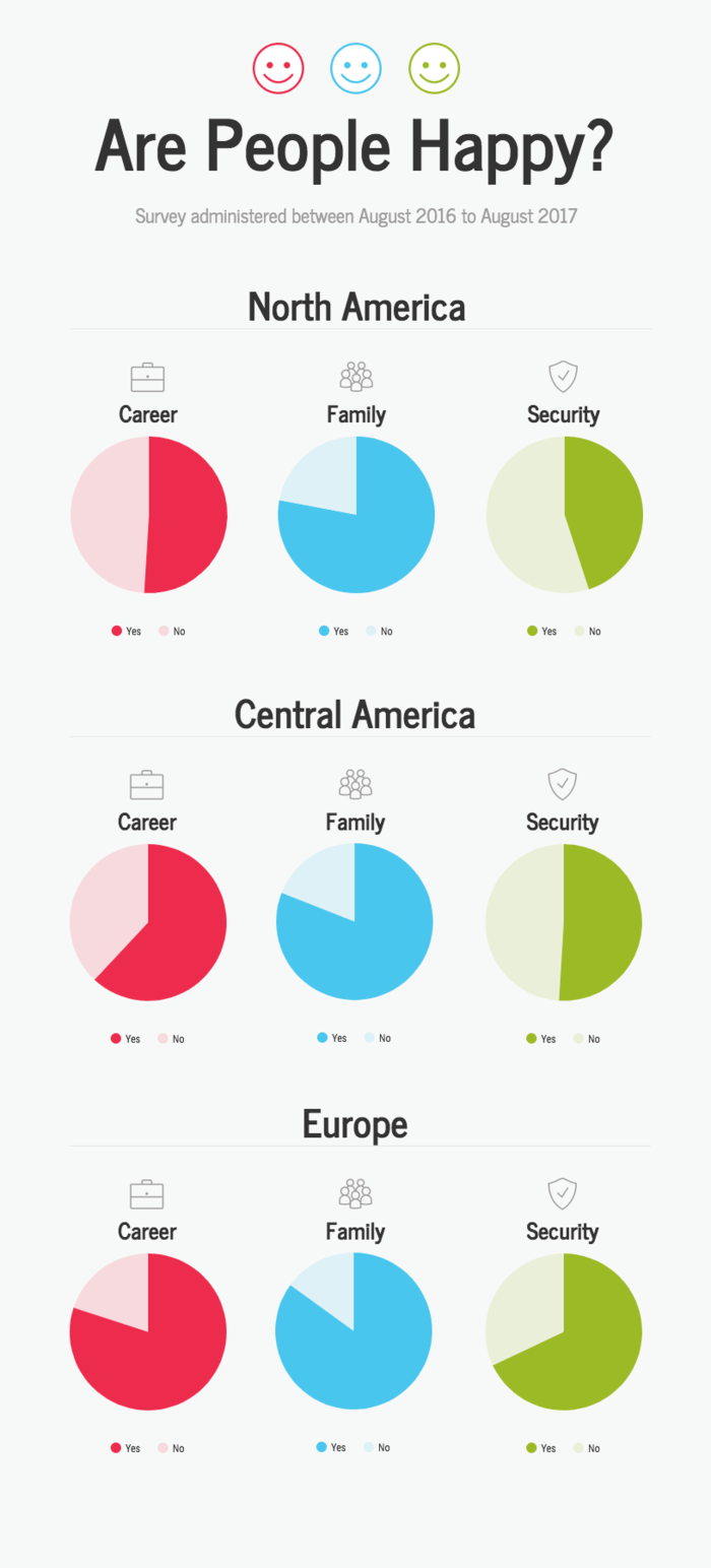
1. Binary results
If your survey has two choices, like "yes" and "no," use a pie chart. It's the simplest option.
Using pies for binary results is pretty self-explanatory. Use one pie slice to show the percentage of “Yes” responses. Compare it to the “No” responses.
For the “Yes” responses, use a brighter, more saturated color and start the segment at 12 o’clock on the pie chart:
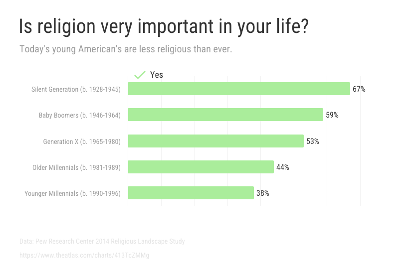
If you want to compare the response rates of many groups, skip the pies and go for a single bar chart. A bunch of aligned bars are much easier to compare than many pie charts. Don’t forget to label each bar with its percentage for clarity:
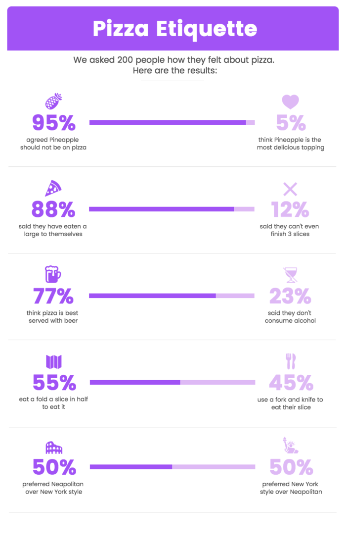
For a simpler, fun option, split the bars. This creates a modified stacked bar chart. This frees up some space to add better labels for both the “Yes” responses and the “No” responses.
If your findings are complex, you can use data visualization to present them clearly. For example, you can have visual data to show how many people prefer different pizza types, with 40% liking pepperoni, 35% opting for cheese, and 25% going for veggies. This makes it easy to compare data at a glance.
Or, use a stacked bar chart with contrasting colors to let data speak for itself.
Related: How to Choose the Best Charts For Comparison and Other Data
2. Rating scale results
A rating scale question gives a range of answers. Respondents just need to pick one from the scale.
This type of question is common in customer satisfaction surveys. It helps you understand how customers feel about your products or services. It's also popular for post event surveys, for instance, to gauge how much people enjoyed the event.
Additionally, incorporating such questions into a multi-step lead form can help qualify leads more effectively by capturing insights about user preferences and expectations early in the funnel.
There are 2 types of rating scale survey:
- Likert scale with options ranging on a scale from “Strongly Disagree” to “Strongly Agree.”
- Net Promoter Score (NPS) that offers respondents to score a question from 0 to 10.
Businesses use NPS to evaluate the willingness of customers to recommend a product or service to others.
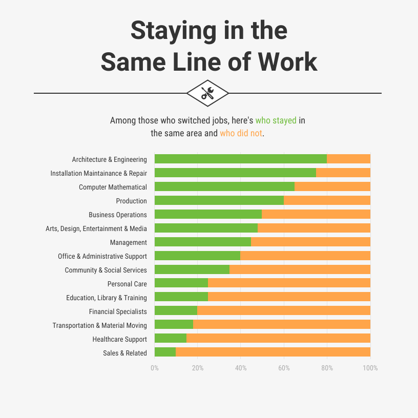
A stacked bar chart is the easiest way to show rating scale survey data. It’s easy to make and present the responses in each category clearly.
You just need to make sure to group the results into simpler categories. If it's a Likert scale, for instance, use 3 points: "disagree," "neutral," and "agree" or "positive," "neutral," and "negative."
Grouping survey results into distinct categories makes the data easier to read.
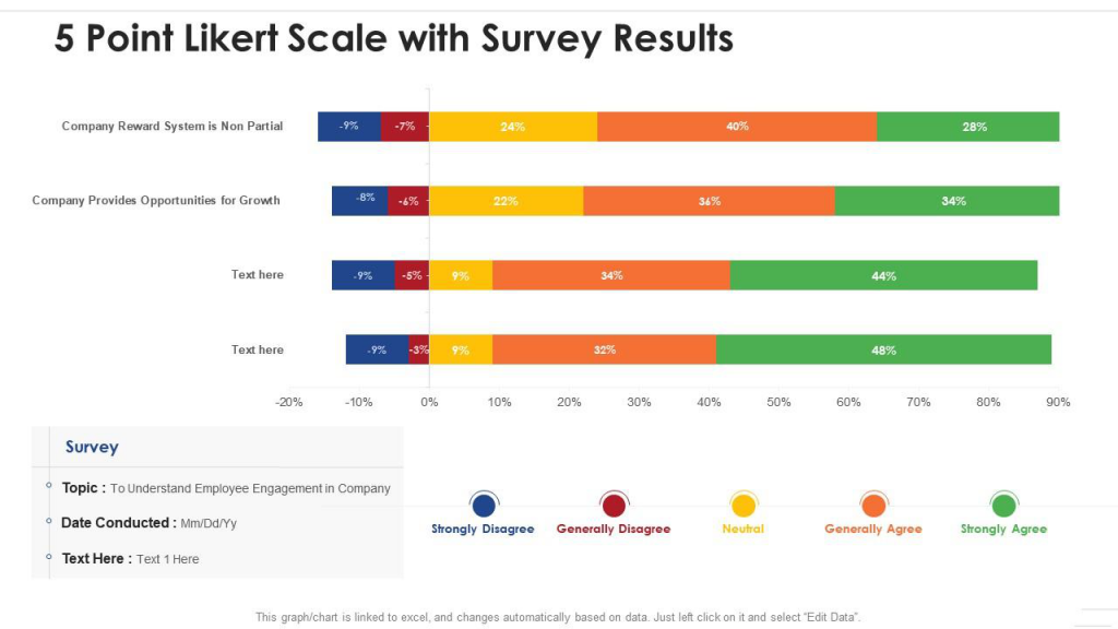
Source: Slide Team
3. Demographic results
If your survey includes demographic data, use it in your analysis. Factors like age, gender, income and location can add depth to your infographic.
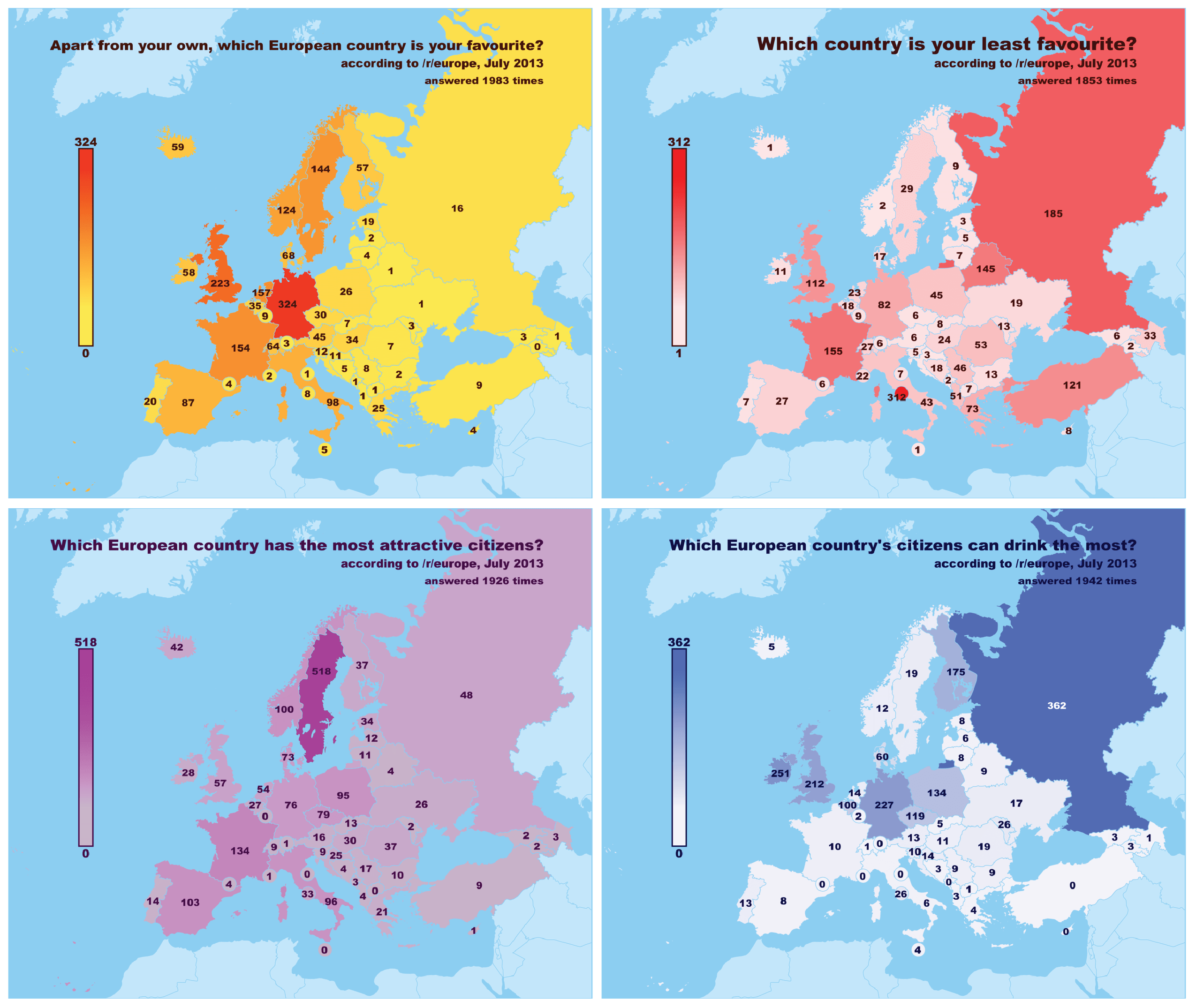
Visualizing survey data on a map is a fun way to include a demographic component in your infographic. A choropleth map shows data distribution by geographic location. Different colors represent different values. This makes it easy to understand without reading.
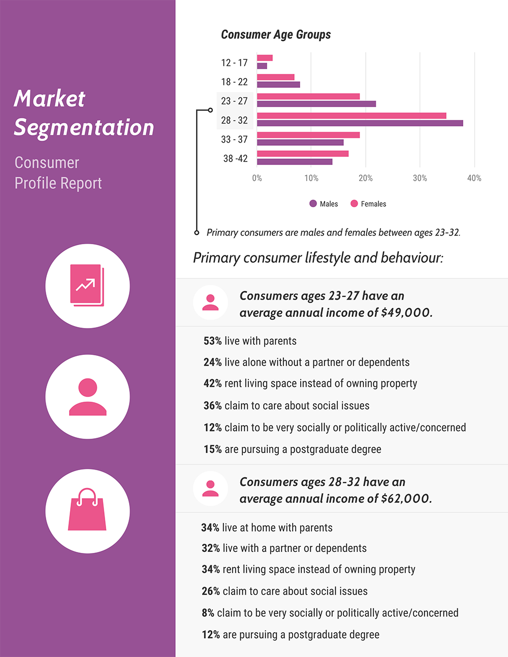
You can also use histograms to show the age distribution or gender data of a particular population:
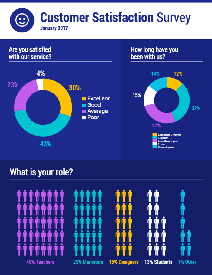
Specialized survey charts are great for complex data, but you don't have to rely on them all the time. Use an icon chart or pictogram for simpler demographic data, like job or role. They’re a fun way to add more impact to simple results:
If your survey has overlapping survey data, like how many people enjoy specific physical activities, use can use a Venn diagram to share your findings. For example, you could use a Venn diagram to illustrate how 30% like hiking, 25% enjoy biking, and 15% love both.
Related: How to Make an Infographic From Your Poll And Survey Data In 4 Steps
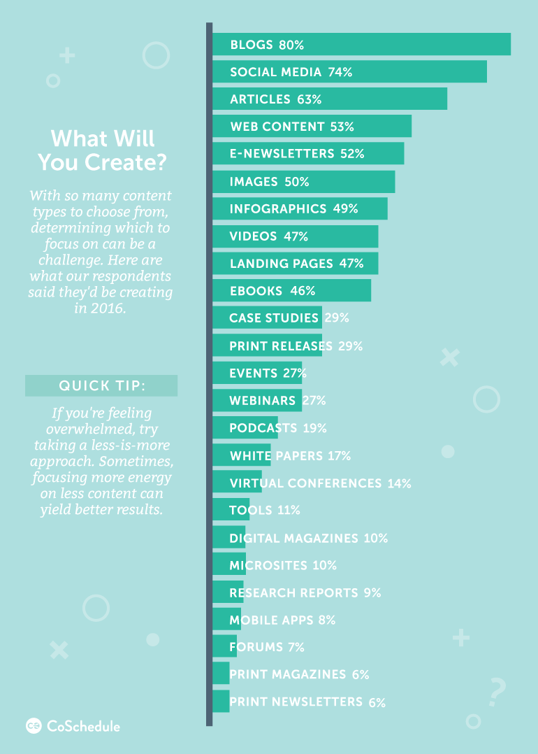
4. Open-ended questions
Open-ended questions can be tricky to visualize. But you can group the answers by common keywords, sentiments or other factors.
This is why word clouds are the best fit to showcase qualitative data. While some experts don't prefer them, they're great for audiences without a data background and easy to create. Just pick the most frequent keywords and use a word cloud generator.

The other option is to do a more intensive manual qualitative analysis. Go through the open-ended responses and create categories.
After quantifying the answers, present the results in the bar chart format. This chart shows the percentage of content type based on popularity of survey respondents:
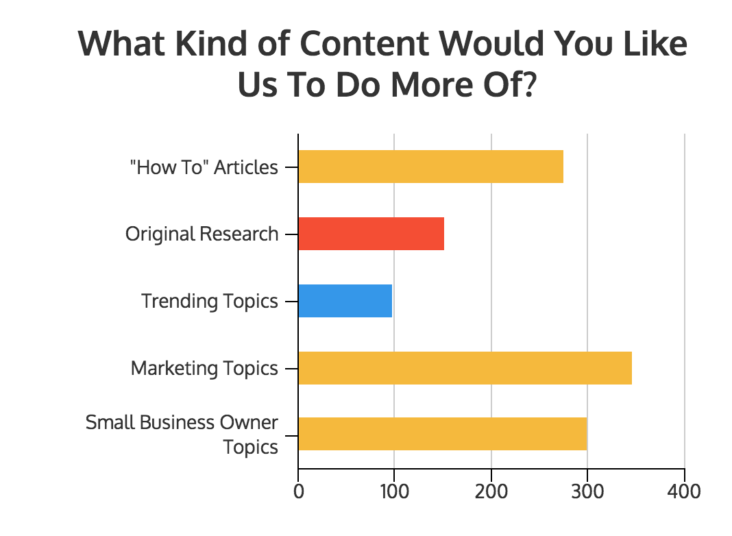
5. Multiple-choice results
Multiple-choice questions let respondents choose one or more answers. The answers come from a list of options.
But the best visual for this kind of survey is a simple bar chart. For questions with multiple selections, calculate the percentage for each answer. Here's an example of how CoSchedule does it:
Source: CoSchedule
As a rule of thumb, bars should be sorted from greatest to least — or the other way around.
Pie charts are a decent option for times when respondents can only select a single answer from multiple choices. Keep in mind, though, that they’re not ideal if you’ve got a lot of data. If you have more than a few different responses to show, try giving each one its own chart:

Other chart types for specific scenarios
Some scenarios need more specialized visualizations to highlight trends, comparisons, and changes more clearly. Here are some other charts you can use to visualize survey results.
Line graphs for time-based trends
If your survey tracks responses over weeks, months, or quarters, use a line graph to show how answers shift over time. Line graphs make patterns and inflection points easy to spot, especially for time series data like satisfaction scores, adoption rates, or sentiment changes.
Column charts for category comparisons
When you want to compare multiple categories or groups side by side, column charts are the most intuitive choice. They help you show which option ranks highest, where gaps exist, or how different segments responded.
Change charts for before-and-after results
If you’re showing survey results from two periods (like pre-launch vs. post-launch, or last quarter vs. this quarter), a change chart visualizes improvement or decline clearly. These charts emphasize the delta, making the impact of changes easy to interpret.
What’s the best way to present survey results to executives?
When you present survey results to executives, focus on clarity, relevance, and decision-making. Leaders don’t have time to sift through every data point. You need to offer a crisp narrative that tells them what’s happening, why it matters, and what they should do next.
Instead of showcasing the entire survey results, translate the data into insights that are relevant for the business. Here's how you can present survey results to executives.
1. Lead with a clear, outcome-focused summary
Start with the headline insights and the business implications. In a few sentences, tell executives what the survey revealed and what it signals for strategy, customers or operations. This will help them understand the key points even if they don't go through the entire survey report.
2. Connect each insight to a business priority
Executives process information through the lens of goals: revenue, retention, product adoption, employee engagement, operational efficiency. Tie your findings directly to these priorities. This helps them see why the data matters and where decisions need to shift.
3. Share only the insights that influence decisions
Don’t walk through every question. Select the 5–7 findings that truly move the needle, such as the patterns that reveal opportunities, risks, or unexpected gaps.
4. Provide just enough context to build credibility
Add a quick note on sample size, audience, and timing. Flag any limitations. This helps executives trust the data and interpret results without overextending a small or skewed sample.
5. Turn data into a narrative
Guide them through the story behind the numbers: what stood out, what changed from expectations, what patterns matter, and what the business should take away. Executives engage more deeply when findings are framed as a narrative rather than disconnected stats.
6. Close with recommendation-ready next steps
Make the decision path obvious. End with a short set of actions or options based directly on the findings. You can validate a hypothesis, adjust a strategy, prioritize a roadmap item, or launch follow-up research.
What are the 3 types of survey results infographics?
We’ve covered the best chart types for different types of survey results. Now, let’s look at how to combine them into an infographic. A survey results infographic should combine charts, graphic elements and annotations to tell a story.
Single-column summary infographics
The most popular type of survey results infographic is the single-column summary infographic. It sums up all of the major takeaways of a survey and highlights the most important insights upfront.
You can also show the results of each survey question with a large number or a simple chart for clarity:
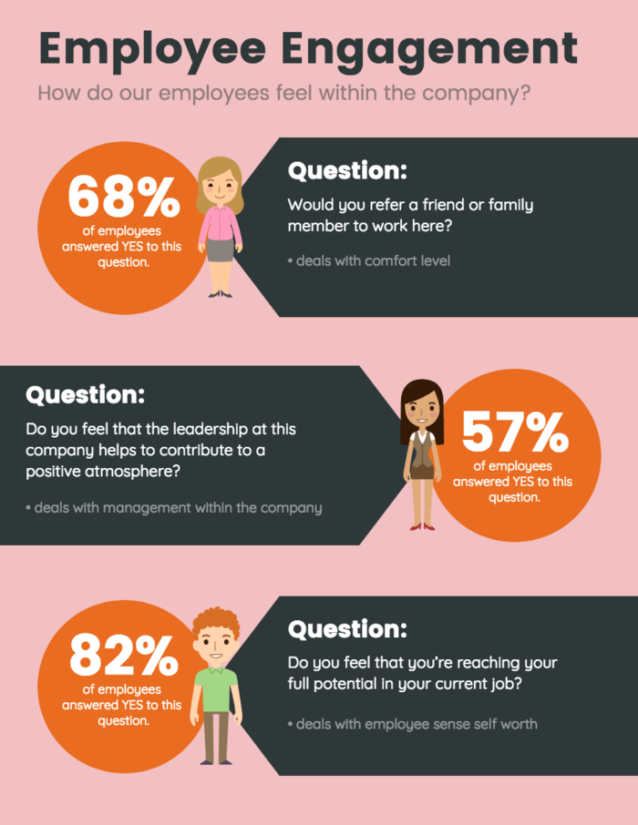
Or, you can use it to share an overview of the data, with detailed, annotated charts for each question.
You can also some your commentary to each survey data to help your audience interpret what the data means.
In either case, present the questions in order, in a single column. This lets viewers scroll through and read the results like a story.
To create a single-column summary infographic, start with the first question. Work down the list to cover each major survey insight. State each question, add the results in the form of a chart and add notes about any interesting learnings.
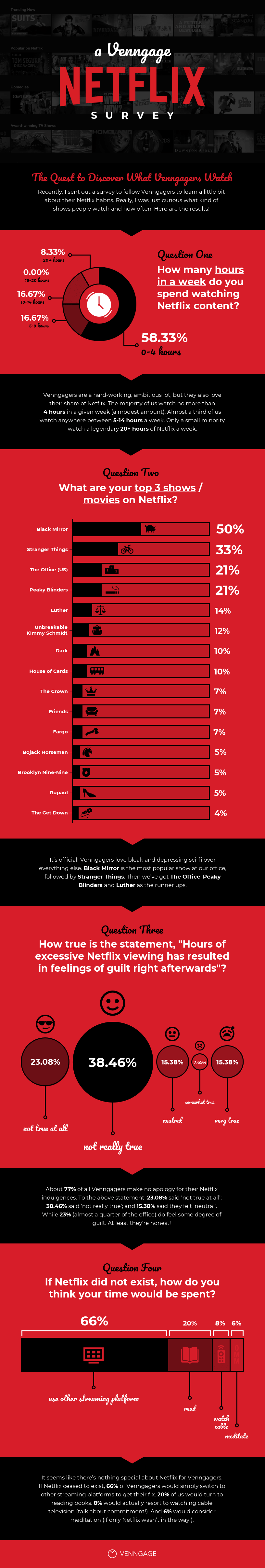
Use different background colors to separate sections in a single-column infographic. This adds visual organization. Add colored blocks behind each question to divide up the content.
In the Netflix example above, the alternating red and black backgrounds create rhythm. It also makes the infographic easier to scan.
Related: How to Tell a Story With Data: A Guide for Beginners
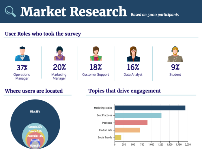
Letter-sized summary infographics
If your survey is only a few questions long, a big single-column infographic is probably overkill. It might be better to stick with a basic 8.5”x11” page and make it all about the numbers.
Don't overcomplicate the data by adding a lot of notes, comments and annotations. State each question simply, like "Where users are located." Use basic survey charts to summarize the results.
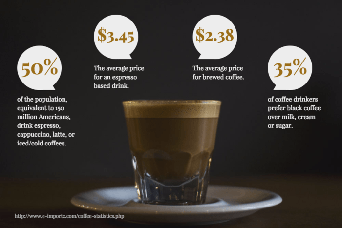
Instead of using a chart design, you can also present your findings through a simple infographic. Just use big, bold numbers to make sure the data sticks out in the design:
Letter-sized feature infographics
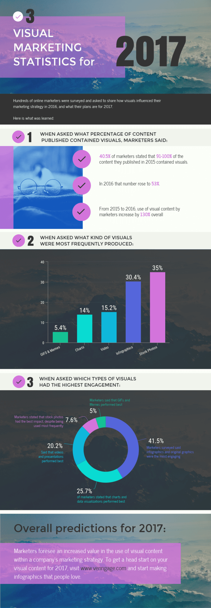
The last go-to option for presenting survey results is the one-page feature infographic. It's a simple infographic design that breaks down the results of a survey question in a single chart and on a single page.
Here's an example of a power stat infographic. It combines a chart design with big, bold text for commanding attention:
What are the best practices for presenting survey results in infographics?
A bad design won't catch anyone's attention even if you are presenting the most interesting data. Keep these best practices in mind when you make your next survey results infographic.
Label charts clearly
Labels are the most important chart elements (after the data itself, of course). Your readers should be able to understand your survey charts in a few seconds — and without any confusion.
Use descriptive labels to add context to the data. The labels in the examples below explain the conclusions and prevent misinterpretation:
Simplify data for clarity
It's tempting to turn every single data point into a visual, but that doesn't always do you any good.
Be selective with your data. Having a lot of data doesn't mean your audience wants to scroll through a long infographic.
Focus on the most important results. Save the rest for white papers or reports — if your survey data is accompanied by one. Include supporting data if necessary, but always cut through the clutter to keep things simple.
Pro-tip: Don't have double-barrelled questions in your surveys. A double-barrelled question asks about two different topics (e.g. "Do you like the product's design and functionality?") but only allows one answer. This can confuse respondents because it mixes multiple issues in a single question.
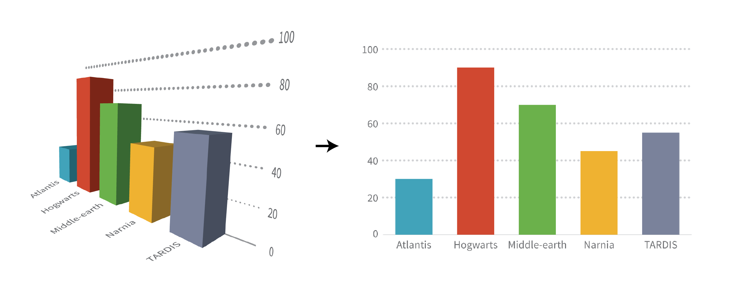
Avoid unnecessary decorations
Avoid fancy icons, hard-to-read fonts, bright colors and 3D effects. Basically, avoid all sorts of "chartjunk" — unnecessary or excessive decorative elements that don't add value to the data.
Adding extra elements might seem appealing, but they often clutter the visual and distract people from the main message.
To maintain the aesthetic balance of your survey design, focus on using:
- Notes, labels or annotations to provide context
- Consistent color scheme for clarity and visual appeal
- Clean formatting with readable fonts and sizes
- White space to avoid clutter
Use consistent style choices
Be consistent with colors, fonts, images and icons throughout the graphic. Notice how color was used consistently to represent the same response in the pie chart example we discussed earlier? It makes comparing responses across audience cohorts painless.
Related: How to Maintain Brand Consistency Without a Design Team
Cite data source links in the footer
Cite your data sources in the footer of your infographic. Make it easy for people to find and explore the original data. If you can link to the data sources, even better.
Referencing to original sources of your research improves credibility and lets readers make their own decisions. Who knows? They might discover something interesting that you missed.
What are the alternative methods to display survey results?
There are many ways to present your survey data beyond just infographics. What methods you use depends on what your business prefers, what your audience might prefer or what might have worked for you in the past.
For example, charts and graphs are great at presenting insights, comparing data or highlight trends. They use visuals to help audiences see patterns, relationships and key insights at a glance.
Videos and animations can engage your audience and help explain complex results in a fun and interactive way. Or you can use spreadsheets to communicate detailed internal reports, especially when working with large datasets.
What are the common pitfalls in presenting survey results?
Presenting survey results poorly can make all your hard work meaningless. Avoiding these common mistakes is key to ensuring your audience actually understands and values your data.
- Data overload: Too much information overwhelms your audience and distracts them from the main message.
- Lack of context: Presenting data without context can confuse or mislead the audience.
- Poor visualization choices: Using the wrong chart or graph can make data harder to interpret.
- Ignoring your audience: Not tailoring the presentation to meet your audience's expectations reduces engagement and clarity.
- Complicating data: Not simplifying complex data makes it difficult for the audience to understand the insights.
Why choosing the right survey tool matters?
Presenting results in a clear and easy-to-understand way starts with how you collect and analyze them. The right survey tool helps you organize responses, uncover insights, and prepare your data for visuals.
You can use a tool like the Opinion Stage survey maker to create an interactive survey and collect results. By going to your analytics dashboard, you can see how many people viewed, started, and completed your survey. When you're ready to design your infographic, you can export the data in CSV or Excel format, then import it into Venngage's infographic tool, copy it into chart widgets, or use it to build your own custom visuals.
Final thoughts on presenting survey results
Sometimes tables and graphs alone just don’t cut it.
Tailoring your survey design for clarity helps your message land with impact. The good news is that it's pretty straightforward to make your survey stand out. Combine charts with storytelling to ensure engagement, make your data easy to understand and use colors or icons to make your findings memorable.
Now that you know how to present survey results with the right charts, designing the infographic should be easy. If you get stuck, check out this roundup of our most popular survey results templates.