


Discover over 40 unique examples created with precision and creativity—each one showing how numbers can be transformed into stories.
From the clean simplicity of a bar chart to the intricate detail of multi-line graphs, these visuals demonstrate what’s possible when you use the right chart maker and graph maker.
As American mathematician John Tukey once said, “The greatest value of a picture is when it forces us to notice what we never expected to see.” These charts do exactly that, turning raw data into moments of insight.
Click to jump ahead:
- Understanding graphs and charts
- Different types of graphs & charts with examples
- How do I create effective data visualizations using charts and graphs?
- What software tools can I use to create charts and graphs?
- How do I make interactive charts and graphs for websites or presentations?
- Best practices for interpreting charts and graphs
- How do I decide which type of chart or graph is best for my specific data set?
- What are some common mistakes to avoid when creating charts and graphs?
- Chart examples FAQs
Understanding Graphs and Charts
At their core, graphs and charts transform numerical data into visual representations. This not only makes the data more accessible but also facilitates quicker analysis and comparison. Research shows the human brain processes visuals up to 60,000 times faster than text.
Hence, the choice of a graph or chart typically depends on the nature of the data and the story one wishes to tell.
Data visualization is the language of decision making. Good charts effectively convey information. Great charts enable, inform, and improve decision making.
David McCandless, Data Journalist
Graphs serve as a foundation in data visualization. They primarily emphasize the raw data’s transformation, providing a visual cue to its trends, behaviors and potential anomalies. Most commonly, graphs capture time series data, detailing how particular variables evolve over periods.
Charts excel in representing large datasets, breaking down the complexity into comprehensible visuals. They offer a snapshot of vast amounts of information, simplifying it and presenting it in a manner that’s immediately understandable.
Their design can be as simple or as intricate as needed, making them suitable for both high-level overviews and in-depth data explorations.
Different types of graphs & charts with examples
1. Bar chart
Bar charts stand as one of the pillars in data visualization, offering clarity and simplicity. They are designed to represent discrete categories or groups. Their primary function is to allow for easy comparison across these categories, letting viewers instantly gauge differences and similarities.

In a bar chart, each rectangular bar signifies a specific category or group. The size of these bars, whether measured in height (for vertical bars) or length (for horizontal bars), relates directly to the value or quantity they represent.
This design ensures that even a quick glance can provide a wealth of information. It’s not uncommon to find variants with stacked bars or grouped bars to compare sub-categories within a larger category.

Bar charts find utility in a myriad of scenarios, from business presentations showcasing quarterly sales to medical research outlining experiment results. Approximately 18.6% of presenters admitted to using original graphics or charts in their presentations.

2. Pie chart
Pie charts are circular visuals that dissect data into ‘slices’ or segments, each representing a part of a whole. Their very design, with each slice being a portion of the circle, underscores the relationship between individual data points and the total dataset. The larger the slice, the larger its share in the overall dataset.

Each segment in a pie chart denotes a particular category or group. The angle or size of each slice corresponds to its proportion or percentage in the total sum. This offers viewers an intuitive understanding of proportions at a mere glance.
Color-coded sections, sometimes complemented by labels or legends, further aid in differentiation and interpretation.

From marketing stats to yearly expensed visualization, pie charts simplify and visually represent proportional data elegantly. Pie charts are commonly used in business and marketing to visualize market share distributions, budget allocations, survey results, sales analysis and demographic compositions.

3. Map chart
Map charts, also known as cartograms or thematic maps, are a unique blend of cartography and data visualization. They utilize geographical maps as their base, overlaying them with colors, symbols or sizes to represent specific data values. Rather than just indicating locations, they emphasize the spatial patterns or variations across regions, countries or any geographical unit.

In map charts, each geographical unit (like a country, state or city) is encoded with visual cues, whether they be color gradients, proportional symbols or specific patterns. For instance, a map chart illustrating layoff events might use different colors for different frequency of layoff events. Legends accompany these visuals, offering clarity on the data’s range and what each visual cue signifies.

Map charts are invaluable—from tracking disease outbreaks in healthcare to analyzing gas payments across countries or visualizing sales distributions in business. They provide a geographically contextualized view of data, and the use of geospatial charting tools has grown by 33% over the past two years.

4. Line chart
Line charts, one of the most frequently employed tools in data visualization, excel in representing quantitative data over a continuous interval or time span. By connecting individual data points with lines, they illustrate the trajectory of data, helping viewers discern patterns, trends or fluctuations over time.

Within a line chart, the x-axis typically signifies time or another continuous variable, while the y-axis captures the metric or value being observed. Each point on the line corresponds to a specific value at a particular time or interval. The continuous nature of the line allows for a seamless understanding of data progression, whether it’s witnessing a stock market’s ebb and flow or monitoring a patient’s vital signs.

Many use them to show economic cycles, track supply and demand, or help marketers demonstrate a product’s popularity over time. In fact, line charts appear in nearly every other data visualization published by The Economist.

Related: 15+ Line Chart Examples for Visualizing Complex Data
5. Histogram
A histogram looks similar to a bar chart at first glance, but it serves a distinct purpose. Instead of comparing discrete categories, histograms showcase the distribution of continuous data by segmenting it into intervals or “bins”. Each bin’s height reflects the frequency or number of data points that fall within its range. The broader the bar, the wider the interval; the taller the bar, the higher the frequency.

On the histogram, the x-axis represents the data range segmented into bins, while the y-axis displays the frequency of observations. It provides a snapshot of where the data concentrations lie, whether it’s clustered around certain values or spread out.

Marketers might use them to understand the social media engagement rate, economists to study income distributions in populations and managers to produce employee performance ratings. By offering a visual representation of frequency distributions, histograms become a crucial tool for both data analysis and storytelling.

Related: Bar Charts Vs Histograms: A Complete Guide
6. Scatter plot
A scatter plot or scattergram, stands out in the realm of data visualization by using dots or points to represent two numerical variables – one plotted along the x-axis and the other along the y-axis. Each dot’s position on the horizontal and vertical axis indicates values for an individual data point. By placing these dots in a two-dimensional space, scatter plots reveal relationships, trends or clusters within the data set.

The primary strength of a scatter plot lies in its ability to visually depict relationships between two variables. Whether the dots cluster in a certain direction, form a clear line or appear randomly dispersed can indicate positive or negative correlations or no correlation at all.
For instance, a rising diagonal pattern might suggest that as one variable increases, the other does too, indicating a positive correlation.

Scatter plots are a favorite in fields that require the exploration of relationships between variables. For example, in the scientific world, they might be used to analyze sea levels, in healthcare, to analyze the relationship between patient age and recovery time.

By visualizing the interplay between two quantitative variables, scatter plots provide valuable insights that might be less evident in tabular data alone.
7. Bubble chart
While scatter plots use dots to represent two numerical variables, bubble charts add a third dimension through the size of the dots or “bubbles”. This third dimension can represent an additional quantitative variable, allowing for a richer data exploration.

The size of each bubble, however, reflects a third variable. In some instances, bubbles can even be color-coded to represent a fourth categorical variable, enhancing data interpretation. The challenge and art lie in discerning patterns and relationships not just horizontally and vertically, but also through the comparative sizes of the bubbles.
Given their ability to represent multiple variables simultaneously, bubble charts find use in scenarios demanding multi-dimensional analysis. For instance, in the business world, a company might use a bubble chart to compare products based on sales figures, profit margins and total revenue (bubble size).

Similarly, in public health, one might compare countries based on average life expectancy, GDP per capita and population size. By capturing the interplay between multiple data points, bubble charts enable comprehensive insights in a singular visual frame.

8. Funnel chart
Funnel charts aptly derive their name from their characteristic funnel shape, which is wide at the top and narrows down at the bottom. This design inherently reflects a process that starts with a large number of potential items and filters down through several stages or criteria, resulting in a fewer number by the end. It’s particularly useful for showcasing the progressive reduction of data as it moves through stages.

Each segment or layer of the funnel chart corresponds to a phase or step in a process. The width of these segments represents the quantity or value at each stage. By comparing segment widths, viewers can easily gauge drop-offs or advancements at every step.
For example, in a sales funnel chart, the top might represent all potential leads, while the bottom shows the few that were converted to actual sales.

Funnel charts are widely utilized in sectors where understanding conversion or attrition is pivotal. In marketing, they help in analyzing the efficacy of sales processes, tracking potential customers from awareness to purchase.
Similarly, in HR, they can depict the candidate filtering process, from initial applicants to those finally hired. By providing a visual representation of progression or regression through stages, funnel charts offer clear insights into bottlenecks, efficiencies and the overall flow of a process.

9.Gantt chart
The Gantt chart is a time-tested tool for project management, serving as a visual representation of a project’s timeline. Named after its inventor, Henry L. Gantt, this chart type uses horizontal bars to depict the start and end dates of individual tasks within a larger project.
It provides a clear snapshot of the project’s schedule, task durations and overlaps, ensuring everyone involved understands the sequence and dependencies.

On a Gantt chart, the x-axis represents time, often broken down into days, weeks or months, while the y-axis lists the various tasks or stages of a project. Each horizontal bar’s length indicates the duration of a task, with its placement on the timeline showing when the task is scheduled to start and finish.
Dependencies or relationships between tasks can also be depicted, highlighting if one task can’t commence until another is completed.

In the realm of project management, Gantt charts are invaluable. Whether orchestrating a construction project, mapping out a marketing campaign or coordinating a product launch, these charts provide clarity on task scheduling and resource allocation.
By giving a holistic view of the project’s timeline and potential bottlenecks, Gantt charts enable managers to make informed decisions, reallocate resources when needed and ensure the project stays on track.

Related: 8 Best Gantt Chart Software for Efficient Project Management
10. Venn chart
The Venn chart, often referred to as a Venn diagram, is a method for representing sets and their interactions. Consisting of circles (or occasionally other shapes), each circle represents a distinct set. The places where these circles overlap showcase commonalities or intersections between sets, making it an intuitive tool for visualizing both differences and similarities.

In a Venn chart, each distinct area (whether it’s inside a circle or an overlapping region) signifies a specific set or an intersection of multiple sets.
A simple two-circle Venn might show the shared characteristics between two items, while a three-circle Venn delves deeper, illustrating commonalities between three sets and their various intersections. The number of circles can increase, though it’s worth noting that clarity can diminish with too many overlaps.

Venn charts find use in numerous scenarios that demand comparison. In education, they’re often harnessed to teach logical reasoning, helping students discern relationships between different groups. In business, they might compare product features across competitors or analyze market overlaps.
Meanwhile, in science, Venn charts can depict shared traits between species or shared genes in genetic studies. By visually demarcating intersections, Venn charts provide a clear and concise method to understand complex relationships and overlaps.

11. Area chart
An area chart, in essence, is a line chart with the space beneath the line filled with color or shading. This visualization not only showcases the trend over time, much like a line chart, but also emphasizes the magnitude of quantities through its filled areas. By doing so, it provides a stronger visual impact of the total value across a sequence or a period.

In an area chart, the x-axis typically represents a chronological order or a continuous variable, while the y-axis showcases the metric or value in question. As the line traces the data’s trajectory over time, the filled area beneath it reinforces the cumulative magnitude at each interval.
When multiple data sets are portrayed, their areas might be stacked or overlapped, allowing for comparison or to exhibit the part-to-whole relationships.

Area charts are versatile and find application in diverse fields. Nutritionists can employ area charts to track nutrition program expenses. By merging the clarity of line charts with the emphasis on volume, area charts offer a deeper understanding of data dynamics over intervals.

12. Pictographs
Pictographs, also known as pictograms or icon charts, use icons or images to represent data values, making the data more relatable and engaging. Each icon usually stands for a specific quantity of a dataset.
For instance, if an apple icon represents 10 units sold, three such icons would signify 30 units. Through the use of universally recognizable symbols or context-relevant imagery, pictographs make data interpretation more intuitive and less abstract.

In a pictograph, data is not just a matter of numbers—it’s translated into visual symbols, ensuring a more immediate understanding. The scale is vital; every image or icon should represent a consistent number of units to maintain clarity and avoid misinterpretation.
The key advantage of a pictograph is its ability to humanize data, making it particularly effective for audiences that might be less familiar with traditional data representations.

Educators might use them to introduce younger students to basic data concepts, given their appealing and easily digestible nature. Businesses can harness pictographs in presentations or marketing materials to offer a quick snapshot of product performance, customer feedback or market reach.
Non-profits or social campaigns might employ them to depict impactful statistics in a more emotive manner. While they may not be suitable for detailed or complex datasets, pictographs excel in scenarios where the goal is to communicate essential data points in a memorable and engaging manner.

13. Organizational chart
Organizational charts, often referred to as org charts, are visual diagrams that outline the structure of an organization. They depict the roles, responsibilities and relationships between individual members or departments.
By providing a clear snapshot of the organization’s hierarchy, these charts can clarify lines of authority, reporting structures and chains of command, ensuring that every member knows their role and their position within the broader framework.

At its most basic, an organizational chart starts with the highest level of leadership at the top, often the CEO or president and branches downward to various levels of management and operational roles.
Lines connecting the different boxes or circles indicate reporting relationships, offering clarity on whom each individual or department reports to. The design, be it horizontal, vertical or matrixed, typically mirrors the nature of the organization’s hierarchy.
In healthcare, organizational charts are pivotal. They detail the structure of large hospitals or healthcare systems, clarifying roles from administrative leadership down to individual clinicians or support staff.

Turning to the world of entertainment, Netflix’s unique organizational culture also translates into its org chart. Instead of a traditional top-down hierarchy, Netflix emphasizes agility, cross-functional collaboration and empowered decision-making.
Whether in healthcare or entertainment, organizational charts serve as invaluable tools for understanding, navigating and optimizing structural dynamics.

14. Flowchart
Flowcharts are diagrammatic representations that depict processes, systems or workflows. These charts use standardized symbols connected by lines or arrows to showcase the sequence of steps, making complex procedures or decision-making pathways easier to understand and follow.
By visually breaking down processes into distinct steps or stages, flowcharts offer a roadmap for problem-solving, planning or training.
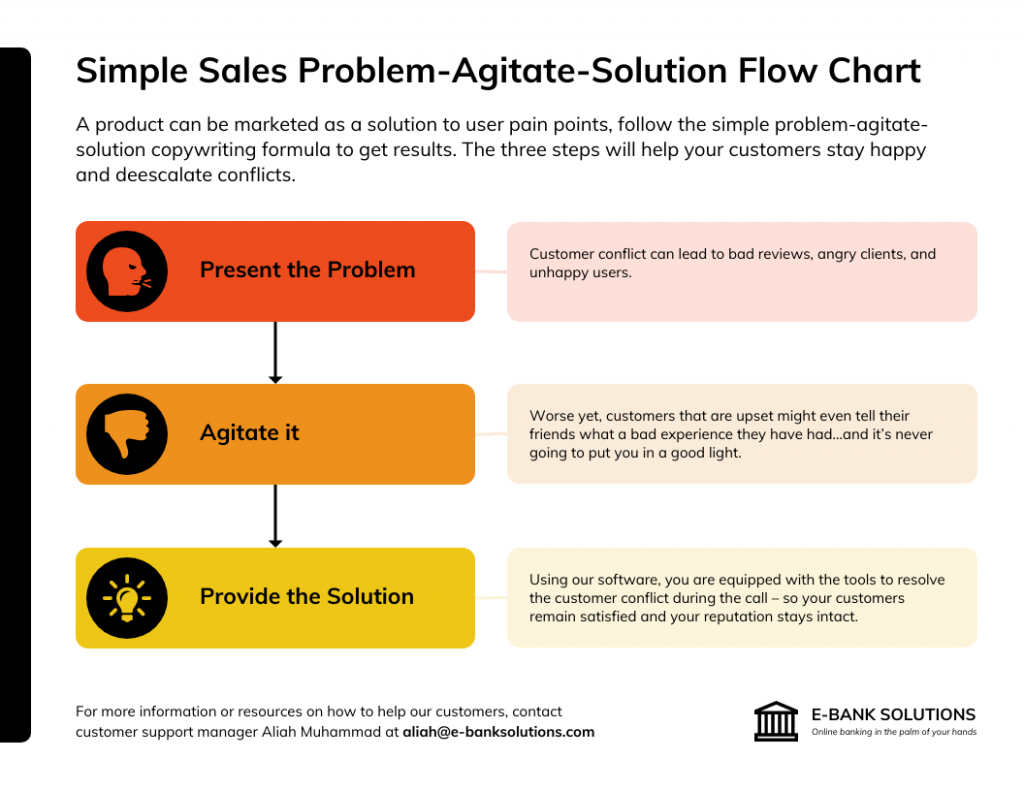
At the heart of a flowchart are its symbols, each representing a specific type of action or step. Common symbols include ovals for start or end points, rectangles for processes or actions, diamonds for decision points, and arrows to indicate flow direction.
The beauty of a flowchart is in its simplicity—by following the arrows and understanding the symbols, one can navigate any process from beginning to end, making decisions or taking actions as outlined.

Businesses might use flowcharts for quality assurance, mapping out product manufacturing steps or customer service protocols. In educational settings, flowcharts can elucidate scientific processes or historical timelines.
Regardless of the domain, flowcharts stand as invaluable tools for clarifying, simplifying and streamlining complex processes or decision paths.

Related: How to Use Cross-Functional Flowcharts in Business Planning
15. Stacked Charts
Stacked charts are a variation of traditional bar or column charts where segments are placed atop one another, forming a single bar or column that represents the sum of their individual values.
By stacking data in this manner, these charts provide both a collective overview of the total and a breakdown of its component parts. This makes them incredibly effective for displaying part-to-whole relationships and understanding the composition of a dataset at a glance.

In a stacked chart, each segment’s size is proportional to its value. The total height (or length) of the stacked bar or column indicates the cumulative value of the segments it contains.
Stacked charts can be either “absolute,” where each segment’s absolute value contributes to the total or “percentage-based,” where each segment represents a portion of 100%, allowing for a comparative analysis of proportions rather than raw values.

In marketing studies, they might showcase how difficult it is to produce visual content consistently for a brand.

By presenting both the total and its subdivisions in one view, stacked charts reveal patterns that lead to deeper insights and better decisions. As Chip and Dan Heath, authors of Made to Stick, put it: “Data are just summaries of thousands of stories – tell a few of those stories to help make the data meaningful.”
How do I create effective data visualizations using charts and graphs?
Understanding the nuances that transform a simple chart or graph into a compelling narrative is key. This is where design meets data and numbers come alive. As former Hewlett-Packard CEO Carly Fiorina said, “The goal is to turn data into information, and information into insight.”
Choosing the right type of chart or graph
To ensure your data speaks clearly, selecting the right visualization is paramount. For instance, if you’re illustrating a trend over time, line charts or area charts might be apt. For showing percentages of a whole, pie charts work best.
When you want to compare discrete categories, bar charts come in handy. It’s essential to understand the nature of your data and the story you wish to convey. Assessing samples of various charts can further guide your decision-making.
Using color and typography effectively
Color isn’t just for aesthetics; it can accentuate, differentiate or even categorize data. Utilize contrasting colors for clarity and ensure a coherent color scheme for related data. Typography, on the other hand, aids in legibility and emphasis.
Choose simple fonts and maintain consistency throughout. Use size variations for highlighting titles or key data points. Both color and typography should align with the overall design ethos of your visualization.
Incorporating interactive elements
In today’s digital age, interactivity can elevate your data visualization, making it more engaging and informative. Elements like hover tooltips, zoom features or clickable segments can offer deeper insights without overwhelming the viewer.
For instance, a map chart with interactive pins might display detailed information upon clicking or a scatter plot may allow zooming to closely inspect clustered data points.
Ensuring accessibility in data visualizations
Accessibility ensures that everyone, including those with disabilities, can comprehend your visualization. Use contrasting colors for those with visual impairments and ensure alt text descriptions for every element.
Moreover, consider providing explanations or legends for unique symbols or colors. An accessible design isn’t just inclusive but also amplifies the reach of your data visualization.
Related: How to Use Color Blind Friendly Palettes to Make Your Charts Accessible
Leveraging tools and software for visualization
With numerous tools available, from Excel to specialized data visualization software, creating charts and graphs has never been simpler. These tools offer templates, allow customization and facilitate the import of numerical data directly.
Whether you’re a student presenting a project or a professional showcasing performance metrics, choose software that aligns with your needs and expertise level.
Testing and gathering feedback
Once your visualization is crafted, it’s essential to test its effectiveness. Gather feedback from peers or target audience members. They might offer insights into clarity, design or even potential errors. Testing ensures your data visualization isn’t just beautiful but also serves its primary purpose of communicating data seamlessly.
Telling a story with your data
Beyond mere numbers, a good data visualization tells a story. The title, design, choice of chart, and accompanying text should collectively convey a message or answer a question. Whether showcasing sales growth through a stacked line chart or depicting workflow using a flowchart, ensure your visualization resonates with the audience and drives the central narrative home.
Related: How to Use Data Visualization in Your Infographics
Use Venngage Accessible Design Tool: Your Key to Effective Data Visualizations
Data visualization serves as a bridge between intricate information and clear visual representation. With Venngage’s Accessible Design Tool, this process is made both seamless and inclusive.
The tool offers an array of chart and graph templates, each tailored to diverse visualization needs, be it pie charts, line charts, or bar graphs.
Customization is at the heart of Venngage, ensuring that every dataset finds its unique visual voice. Beyond aesthetics, Venngage places a significant emphasis on accessibility.
Built-in color contrast checkers, a rich library of ADA and WCAG-compliant templates, and features like alt text descriptions ensure that visualizations aren’t just visually pleasing but are also universally comprehensible.
In essence, Venngage’s tool empowers creators to craft visual narratives that resonate with and are accessible to all, making data visualization truly inclusive.
What software tools can I use to create charts and graphs
The surge in the need for effective data visualization has spurred the development of myriad software tools, each designed to cater to specific needs and preferences. Let’s explore few examples of software that you can use to create charts and graphs.
Microsoft Excel
Microsoft Excel boasts a diverse suite of charting tools. From simple bar graphs to more intricate scatter plots, Excel provides a familiar interface for crafting visualizations.
One of Excel’s significant advantages is its familiarity. Millions around the globe use Excel for various tasks, from basic data entry to advanced financial modeling.
This widespread usage ensures a shorter learning curve for most users. Moreover, Excel’s integration with other Microsoft Office products, like PowerPoint and Word, facilitates easy data transfer and presentation.
Furthermore, Excel’s flexibility extends beyond its native capabilities. With the ability to integrate various add-ins and third-party tools, users can expand Excel’s functionality, tapping into advanced analytics, data processing, and enhanced visualization options.
Venngage
For those looking to elevate their design, Venngage emerges as a compelling choice.
Venngage is committed to making design accessible. Its suite of professionally crafted templates ensures that even those without any design experience can create aesthetically pleasing and impactful charts. From bar and line graphs to detailed pie charts, inputting your data is the only task you need to worry about.
Venngage allows users to effortlessly integrate data from various sources, be it a CSV file or a Google spreadsheet. Once imported, the editor takes over, ensuring your chart is an accurate representation of your data.
A chart is more than just numbers and lines; it’s a reflection of your brand. With Venngage, you can easily integrate brand colors, ensuring consistency across all visuals. Plus, the platform fosters collaboration, allowing team members to work on projects collectively.
Venngage doesn’t stop at providing tools. They ensure users have a smooth experience, offering priority support for any challenges that might arise.
Plotly
On the other hand, for interactive charting, Plotly offers a fresh approach. Compatible with several programming languages, including Python and JavaScript, Plotly is especially favored by developers aiming to integrate dynamic charts into web applications.
Exploring Further Options
Beyond these, the world of data visualization software is vast and varied. Tools like Tableau, Google Charts, and D3.js each offer unique features, spanning from drag-and-drop interfaces to intricate programming libraries for web-based visualizations. The key is to identify the specific needs of a project, gauge the desired level of interactivity, and factor in the target audience.
How do I make interactive charts and graphs for websites or presentations?
When you needed to present data or statistics, interactive charts and graphs enhanced the user experience and made your information more engaging. Instead of static images, interactive graphs allowed viewers to explore the data in depth. Here was a guide on how to achieve this.
Selecting the right visualization tool or library
The foundation of any interactive graph was choosing the right tool or library. You considered your data type, whether it was quantitative or continuous and the kind of graph you needed – be it a bar chart, line chart, scatter plot or even a map for geographic data.
For presentations, simple tools like Excel were used for data visualization. But for websites, libraries like D3.js or Chart.js provided more dynamic options. Always ensuring the tool fit the data and design needs was essential.
Incorporating hover effects and tooltips
Hover effects and tooltips enhanced user understanding. When a user placed the cursor over a specific bar in a bar chart or point on a line chart, tooltips provided a detailed explanation, including the exact number or percentage. This feature helped in giving context without cluttering the design with excessive text.
Adding zoom and pan features
Especially for dense data or diagrams with multiple lines, the zoom and pan features were invaluable. They allowed users to focus on a particular area of a graph, especially if looking at data over an extended time like years.
For geographic data displayed on maps or for scatter plots showing many data points, these features improved clarity and user engagement.
Leveraging animation and transitions
Animations made data come alive. A simple bar plot became more engaging when bars grew in size, or a line chart showed the progression of data over time through an animated line. Transitions helped when data changed, making it easier for viewers to follow and understand any shifts or trends.
Gathering user feedback for improved interactivity
You always considered the end user. Gathering feedback was essential to refine your interactive charts. Sometimes what seemed clear to a designer might have been confusing to a student or a viewer unfamiliar with the data.
Incorporating feedback loops, you asked users if the color choices worked for them, if the scale made sense or if the title and description provided enough context. This feedback ensured your charts were not only creative and unique but also functional and intuitive.
Best practices for interpreting charts and graphs
Effective interpretation of charts and graphs is crucial in making informed decisions based on the presented data. Whether for academic, business or personal purposes, understanding these visual tools enables clearer comprehension of complex datasets. Here are some best practices to guide you.
Recognizing different types of charts and their uses
Different charts serve distinct purposes. For example, bar charts typically represent categorical data, while line charts show trends over time. Being familiar with the purpose and structure of pie charts, histograms, scatter plots and others helps in accurate interpretation.
Reading and understanding axes and scales
Axes and scales form the foundation of most charts. Misreading them can lead to incorrect data interpretation. Always take time to understand the unit of measurement, the range of values, and the intervals used, especially in area charts or column graphs.
Deciphering color codes and legend keys
Colors play a significant role in distinguishing data sets or categories. A legend key explains what each color represents. Ensure you correlate the color in the chart with its explanation in the legend accurately, especially when dealing with multiple line or area charts.
Questioning outliers and anomalies
An outlier or anomaly can either be a mistake or an essential data point. Instead of overlooking them, question their origin and relevance. Outliers can sometimes reveal significant insights or areas that require further investigation.
Considering context and external factors
Data doesn’t exist in a vacuum. External factors such as economic conditions, geographic location, or seasonal variations can influence the data in charts and graphs. Ensure you’re aware of these factors when interpreting data visualizations.
Evaluating the consistency of time series data
For charts that display data over time, consistency is key. Look for any gaps in the data or unusual spikes or drops. Inconsistent time intervals or missing data points can skew your understanding.
Using annotations and highlights effectively
Annotations provide additional context or highlight essential points in a chart. They offer explanations or emphasize specific data points, aiding in clearer understanding and interpretation.
Balancing intuition with data insights
While data provides valuable insights, it’s also essential to balance it with intuition. Sometimes, real-world experience or knowledge of a particular domain can guide you in interpreting a graph more effectively than relying solely on the presented data.
How do I decide which type of chart or graph is best for my specific data set?
Choosing the best type of charts and graphs for your data is pivotal in ensuring that your data conveys the intended message and resonates with your audience. The design should enhance comprehension rather than complicate it. Here are several key considerations to guide your choice:
- Nature of your data: Categorical data is often represented by bar charts or pie charts, continuous data by line charts or histograms and geographic data by maps or geospatial visualizations.
- Purpose of the visualization: Scatter plots may be ideal for relationships, histograms for displaying distribution, and tree diagrams for hierarchical structures.
- Number of variables/data sets: Single variables fit well with pie charts or single bar charts, while multiple variables might need stacked bars, multiple line charts or multi-set scatter plots.
- Data complexity: Simple data is often visualized with basic charts like pies or bars, while complex datasets can be better suited to heat maps or parallel coordinate plots.
- Intended audience: Straightforward, easily digestible charts are better for general audiences, while more complex visualizations can be reserved for a technical audience.
- Visual clarity and aesthetics: The chosen chart should be clear and free from unnecessary clutter, with a focus on readability and visual appeal in terms of colors, design elements and scale.
What are some common mistakes to avoid when creating charts and graphs?
Crafting an effective chart or graph is as much an art as it is a science. Ensuring clarity and precision is pivotal, as these visual aids are meant to simplify complex data for better understanding. However, there are pitfalls creators often stumble upon. Here are some common mistakes to steer clear of:
- Using the wrong type of chart for the data: Different data types require appropriate chart forms for accurate representation, so it’s crucial to match the data with the right visualization.
- Not labeling axes or providing a clear legend: A chart without clear labels can be confusing; always ensure that every axis is labeled and a comprehensive legend is provided.
- Using too many colors or overly complex designs: While aesthetics are important, using excessive colors or intricate designs can distract from the data’s main message.
- Distorting data through misleading scales or axis breaks: It’s vital to ensure that the scale and axis breaks don’t give a misleading view of the data, as this can lead to incorrect interpretations.
- Overloading charts with too much information: While it’s tempting to include all data points, overloading a chart can make it cluttered and challenging to decipher. It’s essential to strike a balance for clarity.
Related: 5 Ways Writers Use Misleading Graphs To Manipulate You [INFOGRAPHIC]
Chart examples FAQs
Can you provide examples of business applications for charts and graphs?
Absolutely. In business, charts and graphs play a pivotal role in visualizing and interpreting a wide array of data. For instance, line charts might be employed to track monthly sales, helping businesses spot trends or anomalies.
Pie charts, on the other hand, can showcase how a company’s budget is divided among various departments or projects. Bar graphs offer a visual representation of employee performance comparisons while column charts can vividly illustrate a company’s market share against its competitors over successive quarters or years
Related: 11 Types of Charts and How Businesses Use Them
How can I make my charts and graphs more visually appealing?
Enhancing the visual appeal of your charts not only captures attention but also boosts data comprehension. A harmonious color palette can be instrumental—colors should contrast well, especially when representing different datasets.
Embracing simplicity is equally essential; it’s always better to focus on key data and keep your chart free from extraneous information. For those venturing into digital charting, interactivity, such as hover effects or zoom capabilities, can amplify user engagement. Incorporating relevant icons or shapes can add context and depth to data points.
What are some advanced types of charts and graphs for data analysis?
When delving into intricate data sets or seeking profound insights, some advanced chart types come to the fore. Heat maps, for example, use color gradients to depict data density, making it easier to spot patterns or concentrations in vast datasets. Sankey diagrams visually represent flow—be it of resources, information or other metrics, through a system.
For data distribution analysis, box plots are quite handy as they show data spread through quartiles and pinpoint outliers. Parallel coordinates offer a unique way to visualize multidimensional data by plotting data points across several parallel lines.
What are some best practices for labeling and annotating charts and graphs?
Labeling and annotating are the linchpins of chart clarity. It’s imperative that every chart carries a clear and concise title, summarizing its primary focus. Axes should be descriptively labeled, ensuring units of measurement or time intervals are unmistakably clear.
Legibility is paramount and the text should be easy to read, regardless of whether the chart is displayed on a screen or printed. In scenarios where charts juggle multiple datasets, legends become invaluable, helping users differentiate and decode each set.
Final thoughts
In our article, I have showcased an array of chart and graph examples that can revolutionize the way one views and analyzes data.
From simple bar charts to complex area charts, this compilation illuminates how each chart type can be employed to bring out specific insights, aiding both beginners and seasoned analysts in making informed decisions.
These visual tools are not only pivotal for data interpretation but also for effectively communicating findings to varied audiences.
If you’re inspired to create your own charts and graphs after reading, the Venngage Graph Maker & Chart Maker offers a user-friendly platform to bring your data to life. With its intuitive design interface and a plethora of templates, you can transform raw data into visually compelling narratives.


