Whether you’re doing market research, writing a blog post, drafting a report, or gauging your customers’ satisfaction, a survey can provide you with valuable data.
But once you’ve collected your data, how can you present it in an engaging way?
Survey infographics are a great way to summarize and visualize data. They can help you back up an argument you want to make by using charts and illustrations.
Need help visualizing your survey data? Get started with our free Infographic Maker or browse our collection of infographic templates or get started.
12 Survey infographic examples with data visualization tips
- Highlight key statistics that you want readers to know
- Guide the order of how your data is read using directional cues
- Use color coded charts to compare similar data points
- Show the proportion of different responses using a stacked bar chart
- Visualize demographic data using pictograms
- Illustrate different personas or groups of people using icons
- Provide context for your data by including brief descriptions
- Incorporate visuals that help tell the story behind your data
- Vary your data visualizations to keep your survey infographic engaging
- Ask a question in your infographic header that your data answers
- Visualize location-based data with a map chart
- Group your data into sections to make it easier to scan
1. Highlight key statistics that you want readers to know
If you’ve collected a lot of data, it’s a good idea to prioritize and emphasize particularly important numbers that you want your audience to know.
Asking the right questions in your survey is thus critical. Avoid asking loaded or double-barrel questions since they contribute to logical fallacies and cannot be adequately captured in an infographic. Also, choose the right sample size for your survey and avoid ambiguity. Dichotomous and Likert scale-based survey questions can be efficiently consolidated into reports and are ideal for infographics.
You might also want to focus on specific statistics if you’re creating a survey infographic to make a compelling argument.
There are a handful of different ways you can highlight key statistics, including:
- Using bold font in a bigger size than your other text
- Using one bright, contrasting color to help your statistic stand out
- Placing an icon beside your statistic to illustrate it and help attract the eye
- Using directional cues like arrows, lines, and borders to direct readers’ eyes to a certain spot
For example, this employee engagement survey infographic uses a few of those methods to emphasize three key statistics.
First, the statistics are written in big, bold font. Then, a bright orange background helps them contrast with the pink background. Each statistic is also grouped with an icon, to illustrate each group of employees.
Finally, each question that the statistics answer are placed on an arrow-shaped background that points to the statistic. The arrows also help points the eyes in the direction the infographic is supposed to be read.
2. Guide the order of how your data is read using directional cues
Directional cues are visual indicators that guide readers’ eyes towards specific parts of your infographic. For example, an arrow pointing to a statistic, or a photo where someone’s eyes are looking towards a specific point.
The sizes of different visuals in your infographic can also direct how the data is read by creating a hierarchy of information.
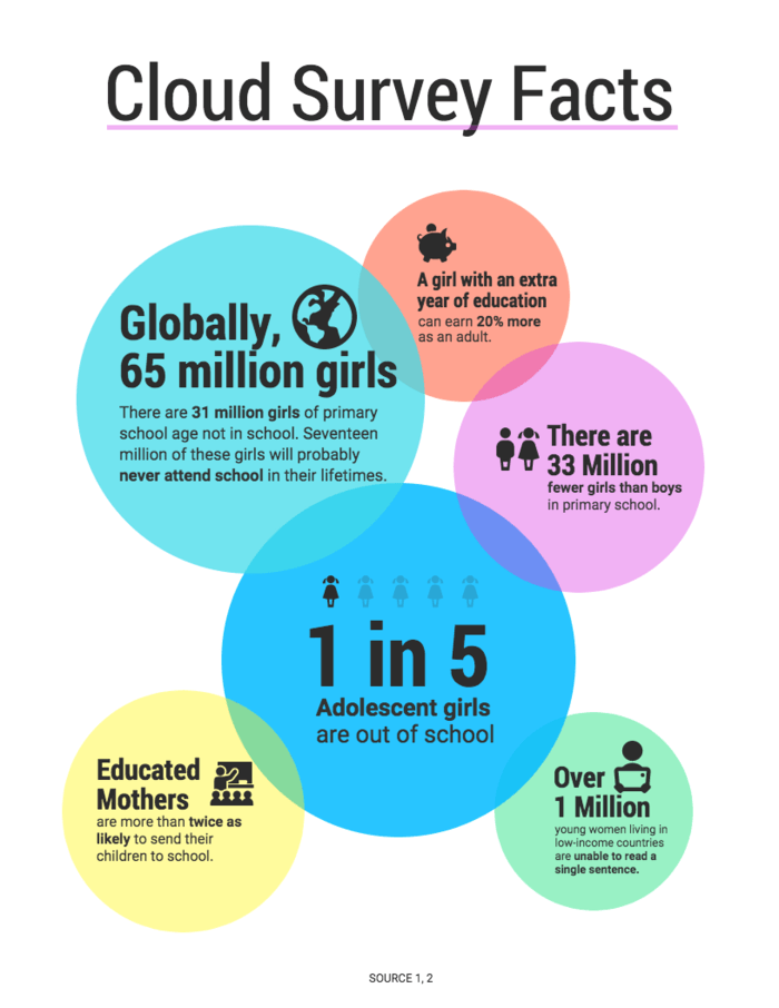
For example, take a look at how the sizes of the bubbles in this survey infographic indicate which information should be read first:
The biggest circle in the middle offers a shocking statistic (1 in 5 adolescent girls are out of school), then presents supporting statistics in descending order using smaller and smaller circles.
You could take the same approach using other shapes, icons, pictograms, or different sized charts.
3. Use color coded charts to compare similar data points
An infographic is a great way to compare data points side by side.
Using the same type of chart can help readers make easier comparisons between data points. But looking at a page of bar graphs or pie charts can be boring.
You can categorize your data and engage your audience at the same time by color coding your information. For example, take a look at how this survey infographic uses three colors to categorize the data by three topics: career, family and security.
4. Show the proportion of different responses using a stacked bar chart
If you want to show how parts make a whole, or if you want to show the proportion between different responses, a stacked bar chart works well.
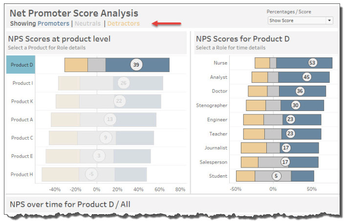
Stacked bar charts are often used to visualize Net Promoter Scores. Each bar in the graph represents the NPS for a different product or demographic. Meanwhile, each bar is divided into three sections that are proportionate to the number of people who qualify as “Promoters”, “Neutrals”, or “Detractors”.
Basically, you can visualize what the total number is, and how the parts of that total are proportioned:
You can also use a stacked bar graph to show proportions between two opposing responses or viewpoints.
For example, this survey infographic about pizza preferences uses a stacked bar graph to visualize how many people, say, like pineapple on their pizza (wrong) vs. those who think pineapple doesn’t belong anywhere near a pizza (correct):
Clearly, pizza is a polarizing topic.
5. Visualize demographic data using pictograms
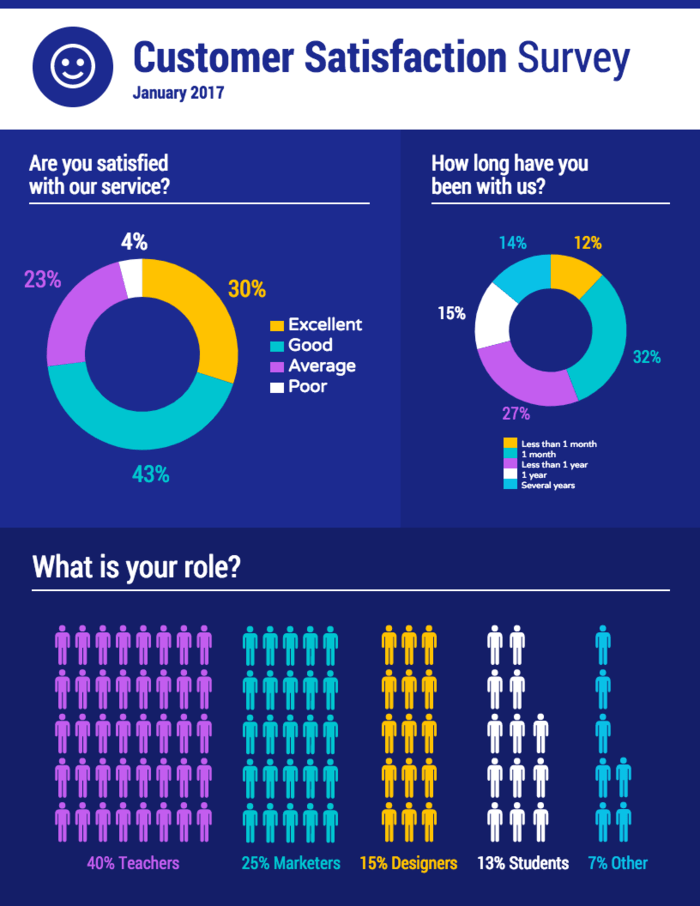
Pictograms are data visualizations where icons represent the units of measurement. Rather than using a typical chart, you can use a pictogram to illustrate your data.
For example, this customer satisfaction survey infographic uses a pictogram to show a breakdown of a company’s customers by occupation:
While this information could have been visualized using a bar graph or a pie chart, a pictogram lets you show the “people” aspect of the data.
Visuals like pictograms and icons help you tell the story behind your data. That’s why it’s a good idea to look for ways to mix up your data visualizations, to help keep readers engaged.
6. Illustrate different personas or groups of people using icons
If you’re visualizing data from a market research survey, a customer satisfaction survey, or a demographic survey, your data will probably be categorized into different personas or groups of people.
Icons are a great way to both illustrate and differentiate between the different groups of people. Simply pick a different icon to represent each group.
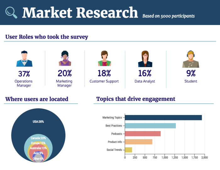
For example, this market research survey infographic uses a different person icon to represent each user persona for a company:
When you’re picking icons for an infographic, make sure that you pick icons of the same style. For example, if you decide to use a flat icon, use a flat icon for all of your personas.
Consistency is key when it comes to design.
7. Provide context for your data by including brief descriptions
The goal of your charts should be to make data more engaging and easier to understand. Often, some additional context is needed to clarify and contextualize your charts.
Simply adding a brief description under your chart( or a descriptive header) can make your chart much easier to understand. Describe what the chart depicts and what the main takeaway for the reader is.
For example, this chart provides some context in the side column. Then, it identifies the main takeaway in the caption under the chart:
8. Incorporate visuals that help tell the story behind your data
Do you want your survey infographic to have an emotional impact on your audience? If so, then you can incorporate images into your design that help tell the story behind your data.
Studies have shown that images of real people in your content can increase your conversions rates, as opposed to stock photos. So if you want people to feel connected to your infographic, consider using photos of real people involved in your business, organization or community. You could even drop an infographic like this in your annual report, ebook or magazine layout.
For example, this music survey infographic uses a picture of David Bowie to put a face to the song in question:
Image frames can help you incorporate photos seamlessly into your design. This infographic uses a circle image frame, but Venngage offers a variety of other shapes in our infographic editor.
9. Vary your data visualizations to keep your survey infographic engaging
Part of what makes infographics so useful is that they’re flexible. You don’t have to stick with boring old charts and tables.
To help keep your audience engaged with your design, vary the types of data visualizations you use. If you’ve used a bar graph in one chart, what other type of chart could you use instead in the next section?
For example, this survey infographic uses a pictogram in one section and a bubble chart in another section. This helps make each section interesting in its own way:
But remember that clarity comes first. Whatever type of chart you choose should be the best option for the data you’re visualizing. If that means you have to repeat the same type of chart, then prioritize clarity over variation.
10. Ask a question in your infographic header that your data answers
When you’re looking over your data for points to use in your infographic, think about the central questions that your data answers.
A central question will help keep your infographic focused. This will also help you tell a more compelling story with your infographic.
Once you’ve identified the central question, make that question the title of your infographic.
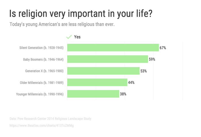
For example, this infographic asks the question: “Is religion very important in your life?” A brief description under the title summarizes the answer presented in the data:
You can use infographics like this to back up an argument you’re making in a presentation or in a report.
11. Visualize location-based data with a map chart
If you have demographic or location-based data, a map chart can help your audience visualize the data.
For example, this family census infographic uses a map in the last section to show how the number of households is distributed across the country. This helps put into perspective just how many people live in only four states:
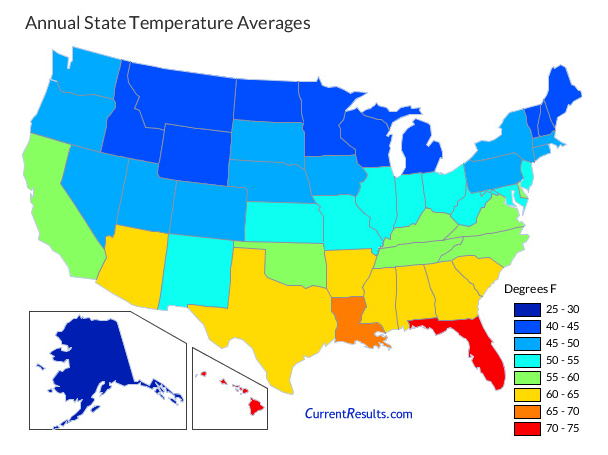
If you want to show more complex data, you could also use a choropleth map. A choropleth map chart allows you to shade areas according to statistical variables. Choropleth maps are often used to show data like population density.
For example, this choropleth map chart shows the average annual temperature across America:
12. Group your data into sections to make it easier to scan
Similar to how you would organize a data report, organize your infographic into sections. Use descriptive headers to make it easy for people scanning your infographic to find the information they’re looking for.
You can organize your data by a wide variety of topics or qualities, including:
- Age
- Year
- Occupation
- Location
- Product
- and a whole lot more…
Under each header, you may want to provide a brief description of the section to contextualize the data. For example, this consumer profile report infographic is organized into sections for each market segment:
Each section has a descriptive header, making it easy for readers to scan for a particular market segment that interests them.
Plan your survey infographic before you begin your design
Visualizing data can be a bit tricky. While you want your survey to be creative and engaging, the clarity of your information should come first.
That’s why it’s good practice to create an outline for your infographic and to draw a mockup of what your infographic will look like. Starting with an infographic template can help you plot out your information.
Follow these steps to turn your survey data into an infographic:
- Identify the data points you want to include in your infographic (long surveys may require you to break up your data into several infographics)
- Find the story behind your data (this will help engage your audience)
- Choose the best types of charts, graphs and other visualizations for your data
- Pick a survey infographic template that will help tell the story behind your data
For more details about each step, read our guide to visualizing survey data.
This pocket guide will help you pick the right survey infographic templates for your data. We’ve also provided some essential data visualization tips to help you make smart design choices. If you’re looking for helpful survey tools to collect insights, you can get started with Survey Anyplace, SurveySparrow, or Jotform’s survey templates.
More infographic design guides:


