


It’s a typical work day. Julie is working on an infographic for an internal training program. She goes to Venngage’s library, picks a template and starts editing away.
Half an hour later, she looks at her design. It looks nice, but feels just a bit off. For some reason, it doesn’t seem as good as the original template. It can pass as a good design, but Julie wants to make it great. The problem is, she’s not sure how.
Does this story seem familiar? Have you ever been in Julie’s shoes?
Enter: Principles of design.
If your designs are lacking that “je ne sais quois”, these principles can be a big help. So in this article, I’ll break down the basic principles of design, including how you can use them to create engaging, visual business communications.
Don’t worry, you don’t need a graphic design degree to follow along! In fact, this guide is best for beginners. So let’s begin…
13 principles of design you need to know (click to jump ahead):
- Unity
- Emphasis
- Rhythm
- Contrast
- Proximity
- Repetition
- Variety
- Alignment
- Proportion
- White space
- Hierarchy
- Movement
- Balance
Looking for a shortcut? Watch this quick 12-minute video for an overview of each design principle:
Unity
Unity is more of a goal than a design principle. But technically speaking, it does belong on this list.
Here’s the thing: if your design follows the other rules on this list, you’ll achieve unity. In other words, you don’t need to overthink it.

Many people refer to unity in design as harmony and the comparison with music is appropriate! If you’ve been unlucky enough to hear music that makes you question your sanity… you already understand how a lack of unity can ruin a design.
It’s important to note unity or harmony doesn’t mean sameness. Rather, it’s about ensuring the various elements of a design work well together, and you can do this in lots of ways. Let’s look at a few examples of unity across an entire design.

Just so you know, some of our templates are free to use and some require a small monthly fee. Sign up is always free, as is access to Venngage’s online drag-and-drop editor.
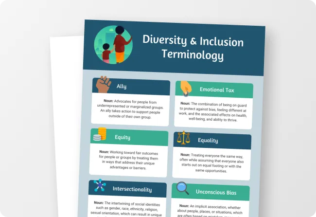
This infographic is a good example of unity for a few reasons. For starters, it repeats a visual metaphor or theme throughout the page.
All the icons and illustrations represent the topic (“tests”, “experiments”, “diabetes”). Because the content is scientific, these elements are a perfect match.
Other design principles in play include contrast (reds vs. blues), rhythm and movement (dotted lines direct the eye) and, of course, repetition — in addition to the theme, the science-related visual elements like bubbles and test tubes repeat.
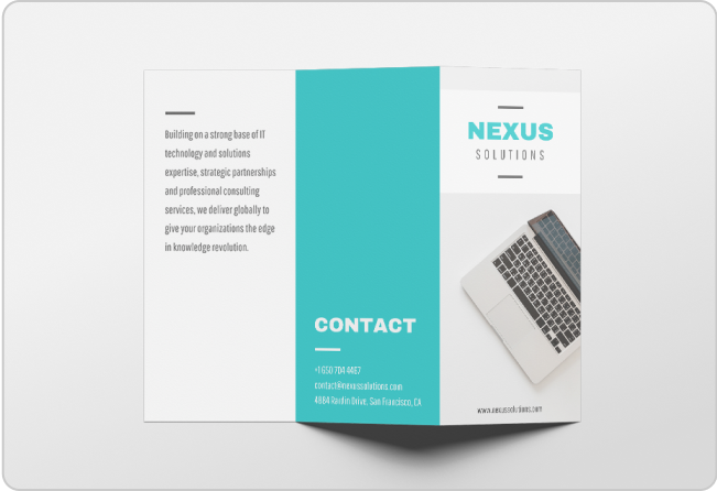
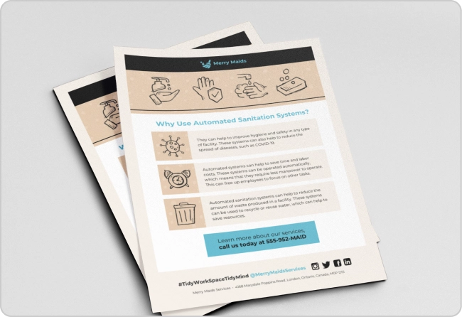
Of course, ensuring unity on a single page is much easier than across several pages. That’s why it’s even more important to use the principles of design to create unity in printed materials with multiple pages, like this brochure:

Notice how this brochure features one consistent color palette. This makes the brand pop and ensures the design is harmonious.
Also note the use of different types of media. Actual photos (cars getting serviced) and flat icons (cars and engines) each serve a purpose. What’s more, they’re cleverly placed to enhance unity. They also add variety to the brochure (another important design principle I’ll cover later on!).
Read more about this principle here: A Brief Guide to Unity — A Design Principle
Return to Principles of Design
Emphasis
Emphasis helps guide the reader’s eye. It tells them where they should look first.

Sometimes referred to as dominance, emphasis helps draw the eye to key elements in a design. That could be imagery, charts and graphs, headings or other important bits.
Creating emphasis in a small design like the following one-stat infographic might seem simple. (The yellow is the dominant element, right?) But this example goes beyond color:

In this case, the designer made a break in the pear illustration and put the most important word there. This moves the emphasis from the pear to the fact that so much food goes uneaten. Clever right?
Read more about this principle here: A Brief Guide to Emphasis — A Principle of Design
Rhythm
Rhythm in design refers to consistent application of elements in a way that can suggest movement, patterns or action.
Rhythm goes well with repetition and movement, two design principles I’ll touch on in a moment. Similar to repetition, rhythm provides visual energy. And along with movement, rhythm suggests vitality in a design.
Remember how we talked about unity/harmony and its relevance to music? It’s the same thing with rhythm.
Just like rhythm in music can seem repetitive or random, the same is true in design. There’s no one way to find a rhythm in design. What do I mean by that? Let’s look at some examples.
You can create an alternating rhythm by repeating more than one element in a design, like in this example where the designer alternates between two main colors:

Or you can create a random rhythm by repeating elements in no particular pattern, like in this infographic:

Note how there’s a rhythmic feel to this design even though there’s no specific pattern. The designer does alternate between four main colors (blue, dark blue, yellow and off white), but there’s no rule that dictates the order of the colors. The infographic doesn’t use one particular layout either: the columns vary in length from section to section.
You can add rhythm to a multi-page design too:

The contrasting color scheme of this corporate annual report creates rhythm. Notice how the color scheme flip-flops depending on the page. Odd-numbered pages feature one color scheme, while even-numbered pages feature another.
All the pages work well together rhythmically because there’s a pattern. But you can only see that pattern when you look at the whole, multi-page document.
Return to Principles of Design
Contrast
Contrast doesn’t just refer to color choice. Contrasting elements in a design could refer to font choice, shapes, patterns, textures, graphic size and more.

Contrast can help designers achieve many of the other principles on this list, including rhythm, variety, proximity, hierarchy and balance. Let’s look at an example:

This infographic comparing COVID-19 and common condition symptoms shows contrast in a few different ways.
The most obvious way is the use of red for the column on COVID symptoms. But the text also shows contrast: the bold headers stand out against the lighter text. There’s also contrast between the white and shaded boxes, which makes the table easier to read.
Another cool example? Star Wars! Our team looked into how Star Wars uses different design principles, including contrast. Take a look here: 7 Essential Design Principles We Can Learn From Star Wars [Infographic]
Read more about this principle here: A Brief Guide to Contrast — A Design Principle
Return to Principles of Design
Proximity
Proximity refers to grouping elements together to emphasize their relationship. A clever use of the distance between design elements can add meaning to your design.
The eye tends to naturally read elements near each other as being related, even if they lack other unifying characteristics.
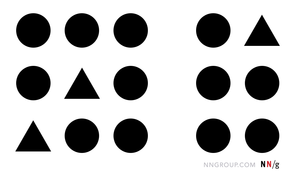
As the image above illustrates, even though both sets of shapes aren’t all the same, moving them closer together (or further apart) tells the reader they’re related.
Let’s look at how proximity can be applied to an actual design:

In this statistical annual report, you can see the proximity principle in play.
In all four quadrants of the design, there are graphs with descriptive headers. But the dominant elements are the shapes of the graphs. If those elements were further from each other than they are, the report would be harder to read.
Read more about this principle here: A Brief Guide to Proximity — A Design Principle
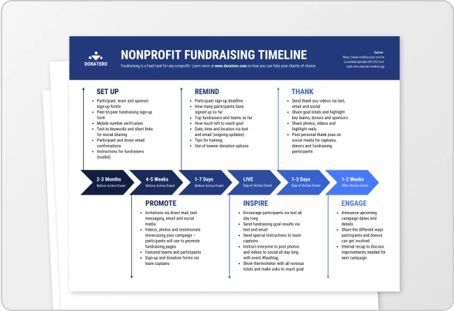
Repetition
Repetition refers to using identical or similar elements in various points throughout your design. It’s one of the best ways to achieve hierarchy, rhythm, movement and — ultimately — unity. This principle is often used for headings, patterns, lines and shapes.
Repetition is one of the easiest design principles to use in your designs. But that also means it can easily be abused. So it’s wise to have a soft touch when repeating visual elements.
This quarterly report template, for example, uses subtle colors and patterns to create repetition without beating the reader over the head with it.

Read more about this principle here: A Brief Guide to Repetition — A Design Principle
Variety
They say variety is the spice of life — and it can also spice up a design! But as with spices, a little variety can go a long way.
When used properly, variety in colors, shapes, typography and more can keep the reader from visually tuning out your content.

Remember, not every design principle needs to hit you over the head. In this example, the same basic graphic illustrates each type of beer, but a subtle color change provides visual variety while perfectly illustrating the information contained.
Read more about this principle here: A Brief Guide to Variety — A Design Principle
Alignment
Alignment is all about how elements on a page relate to each other. Keeping tabs on how all elements align can help you ensure good proximity of related items, hierarchy of items, repetition, white space and more.
This infographic shows how alignment can help the reader understand information.

In the chart at the top, aligning the bars in the graph to the left makes it easy to digest the data. And the bottom section shows how aligning the icons with the text below them makes each one its own contained piece of information. For visual consistency, the two section headings align with each other too.
Read more about this principle here: A Brief Guide to Alignment — A Design Principle
Proportion
Sometimes called scale, proportion refers to the relative size of all the elements on the page, including imagery, graphics, patterns, text and more.

Changing the proportion of one item relative to another can make it appear more or less important. It can also affect the dominance of that element in the design overall.
This business card template is an excellent example of how you can use proportion to shift the focus from an element that could be more dominant.

In this case, the striking photography in the background of the card should steal the show. But it actually carries the same weight as the name of the photographer — which stands out as the only large text on the front of the card.
White space
White space, sometimes called negative space, isn’t necessarily white. Rather, white space refers to the distance between items. Minimalist designs use a lot of white space, while maximalist designs may not use any.

This cleverly designed business card takes advantage of negative space on the front and keeps the minimalism going on the back with simple lines and shapes. The overall effect is undeniably cool and confident.
Read more about this principle here: Using White Space in Design: A Complete Guide
Ensuring your design has enough white space is one of the essential graphic design tips for beginners. But how much is enough? Learn more in our blog: 11 Actionable Graphic Design Tips for Beginners, According to Design Experts
Hierarchy
Hierarchy refers to the relationship between elements. As such, it’s related to proportion, emphasis and alignment. But the key here is that visual hierarchy helps establish the order of importance in a design. Most often, size indicates hierarchy.

Simply put, the most important elements in your design should take up the most space — though there are a few other, more subtle ways to establish hierarchy.

Hierarchy is well-established in this infographic. The cascading size of the text throughout and the varying colors and shapes help the reader process what they’re seeing.
Read more about this principle here: What is Visual Hierarchy & Why It’s Important in Business Communication
Movement
Movement helps the eye shift naturally from one element to the next, down the page (or across it, depending on the dimensions). Often, principles like hierarchy, repetition and rhythm create movement. If you apply these principles to a design, the eye will flow through a composition.
Here’s an example of movement applied in a design:

As you read this infographic, your eyes naturally move from one element to the next in a Z pattern.
Let’s look at another example:

This infographic uses a motif-appropriate set of pet footprints to create obvious movement down the page, taking the reader from one pet Halloween costume to another. The series of numbers in circles also creates natural but less obvious movement, as the reader knows intuitively another number will follow.
Balance
Balance in design doesn’t mean giving elements equal weight — it’s not about balancing the scales! Rather, this principle refers to a unified or harmonious distribution of elements in a design.

Practically speaking, that means making sure that, say, the sections in your infographic take up space that’s appropriate to their importance.

This infographic illustrates how it’s possible to use varying types of content to create balance. Another way to organize this information would have been to align the tips from left to right. But by placing them all on the right and adding colorful illustrations on the other side, the designer struck the perfect balance.
Learn more about this principle here: A Brief Guide to Balance — A Design Principle
Design principles FAQs
Still have questions about the principles of design? Here are some quick answers:
What are the 7 principles of design?
In reality, there are more than seven principles of design. But seven of the most crucial ones are unity (harmony), hierarchy, repetition, emphasis, alignment, contrast and balance. There are also the Gestalt principles, including the law of Pragnanz or “good Gestalt” that states the human brain will naturally try to simplify complexity.
What are the 5 design principles?
The five most basic principles of design are unity, hierarchy, repetition, alignment and contrast, but there are many more design principles that you can put into practice.
The principles of design don’t need to be mystifying — in most cases, they’re about helping the reader
Whether you’re creating a report, brochure, infographic, presentation, or even product packaging for your brand, designing the information in an easy to understand way is key for engaging your audience. In other words, your design can help (or hinder) the reader!
So go ahead, follow these design principles in your next Venngage project, and make things as easy (and visually pleasing) for your readers as possible.