If you were walking down the street and saw two people near each other ahead of you, what would you assume about them? Your first thought would probably be since they’re physically near each other, they must be walking together.
But why would you assume that, not knowing anything else about them? Because your brain constantly searches for patterns and comes to conclusions based on pattern recognition. One of the most basic patterns it recognizes is proximity — when things are near each other, they’re usually related.
Just as the people down the street are likely connected if they’re walking together, elements in visual communication are likely related if they’re in close proximity to each other. It follows that you can use the proximity design principle to send subtle messages in your business communications.
Let’s learn more about the principle of proximity and how you can master it, no design experience required.
Click to jump ahead:
- What is the proximity principle in visual design?
- Why is proximity in design important?
- How do you use proximity in a design?
- What is an example of the proximity principle?
- Tips for using the proximity principle in design
- FAQ about the proximity design principle
What is the proximity principle in visual design?
In visual design, the principle of proximity establishes intuitive connections between text, graphics and other elements in a composition. Because the brain is more likely to perceive nearby elements as related, designers can use the proximity principle to convey information, establish connections (or create contrast) and craft a visually pleasing composition.
When it comes to visual design, proximity applies to all elements in a composition. That includes headings, body text, graphics, images, illustrations, icons, shapes and so on — the placement of all items in the frame relies on proximity (as well as alignment) to help the reader grasp information.
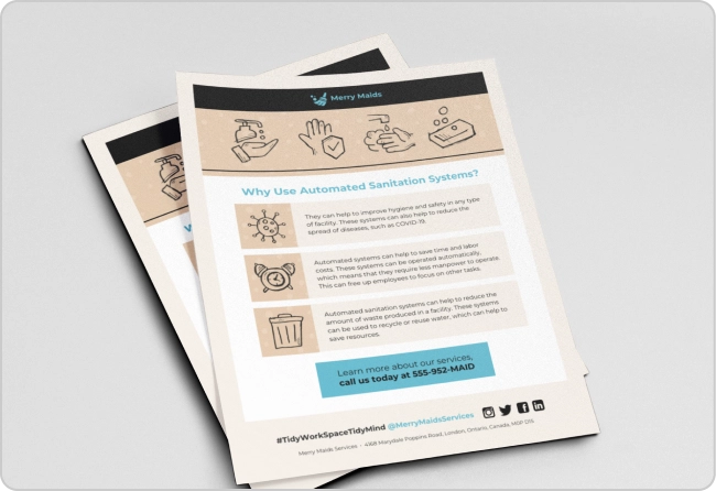
In the flyer design above, for example, we see proximity at play in several ways. First, the headings over the bits of copy establishes a connection between those elements, and their proximity to the icons to their left adds another proximity-driven relationship.
Of course, the white boxes make the text readable. But it’s proximity that makes the information understandable at a glance — the placement of both the headings and the icons creates a pattern the brain can instantly recognize.
Just so you know, some of our templates are free to use and some require a small monthly fee. Sign up is always free, as is access to Venngage’s online drag-and-drop editor.
Why is proximity in design important?
Your brain makes thousands of decisions every day and many of them aren’t obvious to you. Proximity is one of the most important design principles because it relies on the brain’s capacity for this type of quick decision-making. In fact, proximity can often override other design principles or aspects of visual processing.
Take this graphic, for example. The principles of unity, repetition and rhythm might suggest a reader would assume all the triangles are related to the other triangles and the circles are related to the circles, since they have the same shape and color.
But the proximity principle is so strong that I can pretty much guarantee your brain assumes the items in the two groups are more closely related than the triangles or the circles.
Proximity is also an important bridge to other design principles, including hierarchy and balance. Without understanding why proximity matters and how powerful a tool it is, it would be just about impossible to create a design that would make sense to a reader.
Here’s what I mean:
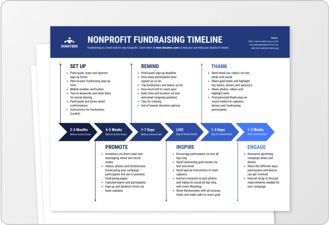
Without understanding that proximity makes readers know at a glance the all-caps headings go with the information closest to them, there’d be no hierarchy in this design. This would make the infographic overwhelming and difficult to read.
Without proximity, the text and icons in the first part of this infographic could be completely imbalanced. The result? Readers might think the text goes with the wrong icon or that two icons are related, while the third is unrelated. By pushing them apart — which is also part of proximity as it’s the absence of closeness — the designer achieves balance.
How do you use proximity in a design?
Many design principles are tough to master. This isn’t one of them. Are elements in your design related? Then place them close to each other. Now, of course, I wouldn’t be doing my job if I didn’t go deeper than that, so I’ll cop to the truth, which is that proximity can be a bit more complicated than that.
In the previous section, I talked about how elements being far apart is actually an example of proximity. How can that be?
Proximity isn’t a state; it’s a range. It’s not that things are close to each other that matters; it’s how close they are. Close enough to create a connection or far enough away to break a connection — both of those are examples of proximity in design.
Let’s put these ideas into context with some examples…
What is an example of the proximity principle in use?
In any example of visual communication you’ve ever seen, the proximity principle is probably in use; that’s how fundamental it is to the practice of graphic design. But let’s take a close look at a few examples, so you can better understand how to use this principle in your work.
There are several proximity examples here, but the one I want to call your attention to is the bar graph at the top of the page. The designer added labels to the bars to help the reader do the math and see at a glance what the graph is saying.
But because they’ve placed the numbers immediately to the right of the bars, rather than, say, all the way at the right of the graph, it’s immediately clear what those numbers mean. It keeps the reader from having to look at the graph, then all the way to the right, then back to the graph.
Here’s another example of proximity:
Take a look at the white/blue icons and text in the first section of this flyer. Because the designer placed the text in close proximity to the icons that describe them, the connection is unmistakable. Given the amount of information there, even bumping that text a few pixels to the right would have made the composition confusing.
The designer also makes good use of both repetition and variety — repetition in the text treatments and just a smidge of variety in the colors to spice things up.
But back to proximity… let’s go over some practical tips next.
Tips for using the proximity principle in design
Using proximity in your designs is absolutely critical, but (thankfully) it’s one of the easier design principles to master. Still, here are some tips to help you apply it to best effect:
Know what you want to say. If you’re not sure what elements in your design need to be related, you won’t be able to apply proximity to help the reader grasp the information. So, it’s important to have a good handle on what you’re trying to convey before getting started.
Think like a reader. If you’re creating good, people-first designs, you’re already doing this. But it’s worth reiterating: make sure every decision you make when placing elements is thoughtful, considering the entirety of your design. Few things are more annoying than completing an infographic or brochure and realizing the placement you’ve chosen makes your work confusing!
Make friends with white space. White space, or negative space, is an area of a design without any content. Use white space to establish (or not) connections between elements in your design.
Keep it simple. The more elements you have (and the more types of elements you have), the more likely you’ll lose track of the proximity principle in your work. Especially in a business context, clear communication is always more important than flashiness or creativity.
FAQ about the proximity design principle
What is the principle of proximity in document design?
The proximity principle in document design means that items placed nearby each other are related, while those that are far from each other are unrelated. Simply put, the proximity principle is the same, whether you’re a graphic designer or a business professional creating documents for work.
Is proximity a principle or element of design?
Both. While proximity is one of the most important and fundamental design principles, the term proximity can technically refer to things that are nearby or things that aren’t — it’s all a matter of degrees.
Why is proximity a valuable design principle?
Proximity is a valuable design principle because it allows you to organize information and visuals in the most effective way to convey information to the reader. It’s one of the easiest principles to master because it’s a basic pattern the human brain understands, which makes it especially useful for designing business communications.
You probably understood proximity before you read this because it’s a basic pattern the human mind recognizes…
…but I hope you learned a bit more about why proximity is so important and so useful as a tool in your design arsenal.
If you can master proximity, along with a few other basic design principles, your work will not only be beautiful, but informative for your audience.
And if you’re ever not sure exactly how close or how far you should place elements in your designs, I’ll leave you with one last graphic design tip: use a template. Venngage has thousands!


