


With so many businesses and organizations now operating online, visual communication is more important than ever.
Whether you’re an executive looking to align your team on new organizational processes, or a marketer looking for ways to differentiate on social media, you may wonder how best to use visuals to really connect with your audience.
In this guide, I’ll give you some effective tips from my experience as an information designer. I’ll show you how to leverage design and visual communications best practices to engage your audience while avoiding information overload.
Table of contents:
- What is visual communication
- Examples of visual communication
- What are the types of visual communications
- Why does visual communication matter
- How to use visual communication in the workplace
- How to make your visual communications look professional
What is visual communication?
Visual communication is the practice of using visual elements to convey a message, inspire change, or evoke emotion.
It’s one part communication design—crafting a message that educates, motivates, and engages, and one part graphic design—using design principles to communicate that message so that it’s clear and eye-catching.
Effective visual communication should be equally appealing and informative.

Visual communication is really about picking the right elements (usually text, icons, shapes, imagery and data visualizations) to create meaning for your audience. You can also communicate visually with video. For example, you can use a free screen recorder to show a colleague how to complete a task rather than sharing a document.
Some common visual communication strategies include:
- Using data visualization to show the impact of your work
- Using shapes and lines to outline relationships, processes, and flows
- Using symbols and icons to make information more memorable
- Using visuals and data to tell stories
- Using color to indicate importance and draw attention
Examples of visual communication
Visual communication is a powerful tool that uses images, symbols and graphics to convey information and ideas. It’s like showing someone a picture instead of just telling them a story.
Here are some examples of smart visual communication strategies:
Infographics: These combine visuals and text to present complex data in a clear and concise way. For example, an infographic could show the population growth of different countries over time using a combination of charts and illustrations.
Videos: Videos can be used to demonstrate processes, explain concepts, or tell stories in a visually engaging manner. For instance, a video tutorial could demonstrate how to change a flat tire, while a promotional video could tell the story of a brand’s mission and values. An AI video creator can streamline the production of such content, enabling users to generate professional-looking videos quickly and efficiently.
GIFs: Animated GIFs can add movement, humor, or emotion to your content. For example, a GIF of a dancing cat could be used to add a playful element to a social media post.
Emojis: Emojis can be used to express emotions or ideas in a concise and visually appealing way. For example, a thumbs-up emoji could indicate approval or agreement.
Photographs: Photographs can capture real-world scenes and tell stories or convey emotions. For instance, a photo of a child playing in a field could evoke feelings of joy and innocence.
Illustrations: Illustrations can be used to represent ideas, concepts, or emotions in a creative and visually appealing way. For example, an illustration of a dragon could be used to represent power and mythical creatures.
Diagrams: Diagrams can be used to visualize relationships between different elements or concepts. For example, a flowchart could show the steps involved in a process, while a Venn diagram could illustrate the similarities and differences between two groups.
Charts: Charts can be used to represent data in a visual format, such as bar charts, pie charts, or line charts. For example, a bar chart could show the sales figures for different products, while a line chart could illustrate the trend of stock prices over time.
What are the types of visual communications?
When you think about visual communication, your mind might first jump to design-heavy content like social media graphics or infographics.
And while visual communication certainly plays a role in those cases, there are a ton of other types of content that fall under the visual communication umbrella.
8 types of visual communications in the workplace include:
- Infographics
- Process Diagrams
- Flow Charts
- Roadmaps
- Charts and Graphs
- Visual Reports
- Presentations
- Mind Maps

These can look very different when used in different industries, but they all use the same visual communication strategies and design principles to accurately present information and create meaning for audiences.
Let’s take a look at some visual communication strategies used across different types of organizations.
Different types of visual communication strategies across industries
Nonprofit organizations
Nonprofit organizations often combine data visualization and visual storytelling to gain the trust of their audiences, improve interaction and establish the credibility of their organization.
This might take the form of a statistical infographic or an impact report that they share with their donors and supporters:

They may also create public-facing informational posters or brochures to build awareness around their organization and foster support for their cause through visual perception.

Another place where visual communication is key for larger nonprofits is to update stakeholders on campaign or research results. These reports often combine storytelling with data visualization to inform and convince.

Healthcare organizations
A visual communication strategy often applied in healthcare is the use of plain language and simple iconography to communicate with audiences with lower health literacy.
For example, a public health unit might create an infographic factsheet to ensure that recommended protocols are followed, like these recent COVID-19 guidelines from Public Health Ontario:

In fact, the CDC recommends the use of visuals to boost understanding of health information for external communications in healthcare.
These types of visual guides aren’t just helpful for external communication. Similar tactics can be used to remind staff of workplace best practices, like patient safety and infection prevention practices.

Business consulting organizations
Business development organizations may use diagrams like process maps to communicate high-level strategy to clients, which can help make their value more tangible.
A simple roadmap or summary of strategy recommendations can go a long way towards advertizing their services and communicating and aligning with clients.

Why does visual communication matter?
Visuals can help create understanding where words alone cannot.
They can help bridge the gap between concepts and words, especially when appealing to an audience with diverse needs and backgrounds.
It’s clear that visual communication is top-of-mind for many. When we surveyed marketers about their use of visual content, 74% of the marketers we surveyed stated that more than 70% of their content contained some form of visual.

Plus, it’s been demonstrated time and time again that in addition to making information more engaging, visualization can actually help with the comprehension of information.
But when should you consider making your content more visual?
You can use visual communication to:
- Engage your audience
- Communicate complex information
- Tell a story and convey emotion
- Simplify information
- Communicate the impact of your data
Let’s take a look at how this can apply in the workplace.
How to use visual communication in the workplace
You might think that visual communication isn’t really necessary in your day-to-day work.
But visuals, in the right hands, can be used as a tool to influence what your audience pays attention to, thinks about, and understands.
1. How to make boring topics engaging
Creating engaging content that shows the value of your business can be a challenge when you work in a “boring” or technical industry like finance, business development, engineering or healthcare.
But it’s this kind of challenge where visual communication shines. Creating unique visuals can help you position yourself as the innovative solution in the market.
Here are some simple strategies to consider:
Use stylized icons to make technical information feel concrete and approachable
This infographic about credit card merchant processing, for example, takes advantage of a playful icon style and a modern design treatment to capture your attention and keep you reading.

This might be the perfect way to signal to young business owners that you’re different from the traditional big banks, and that you’re right for them. It feels so much more approachable than a wall of text on a web page.
Just applying some basic visual communication strategies can make this “boring” technical information a bit more accessible and relatable to your target audience—ready to boost engagement on social media, your blog, or your newsletter.
Use visual metaphors to get your audience thinking
Visual metaphors are another way to make old ideas feel fresh and exciting, and can even help foster deeper understanding of your subject matter.
The use of women running in the infographic below, for example, helps me think about NPS scores in a new way:

By allowing the visual presentation to drive how you position the value of your product or service, you can find new ways to reach your customers.
Read more: Common symbols and meanings and how to use them in design
To sum up, here are some visual communication tips for how to make boring topics engaging:
- Use visuals and icons to make technical information feel approachable
- Choose a graphic design style that will resonate with your target audience
- Think outside of the box: use a unique visual presentation to get your audience thinking
If your visual presentation is unique, your information doesn’t have to be revolutionary to give you an edge over your competitors.
Read more: Infographic ideas to make your information engaging.
2. How to communicate process changes and improvements
Being able to quickly re-align your team on process changes has never been more important.
Visuals can make processes easier to understand and more memorable. They can also help boost employee alignment and engagement.
Here’s how you can use process documentation to help align your team.
Show both high-level and low-level changes with hierarchical process diagrams
Breaking down processes into discrete visual steps can make new processes much easier to grasp.
And breaking down steps into even smaller sections can help you communicate both high-level concepts and specific details in the same place, like in this process diagram below.

Providing these process documents to employees can help quickly align teams on new strategies, like an action plan to address a crisis or a shift into a new market, while also acting as a reference point in the future.

Provide presentation slides as a post-meeting reference guide
With remote work becoming the norm, you likely spend many of your days in back-to-back Zoom calls.
If you’re holding a meeting to discuss major process changes or company updates, it may be worth your while to whip up some quick meeting slides to help clarify changes and ensure your team is aligned.
Including a slide deck can help reinforce the importance of what’s discussed, and act as a reference when your team digs into their work. An AI meeting note taker can add to that post-meeting record by automatically transcribing the conversation, summarizing key decisions, and turning action items into follow-up points your team can revisit alongside the slide deck.

Provide checklists to help your team keep track of complex processes
Providing a checklist of steps for your team to follow can help you delegate work with confidence, while giving your team the confidence to know that they’re doing things right.
Checklists are particularly helpful for communicating complex or proprietary internal processes, as they can help remove any anxiety from the process.

Build out a library of internal training documents that you can update periodically
Building out a library of training documents, while it might take a bit of time up front, can really save time and money in the long run, because a team that’s aligned is a team that’s productive.
Onboarding guides, FAQs for new employees (like the fun onboarding FAQs below), and other process documentation can all help make remote onboarding easier, and help new employees feel comfortable and in control.

HR onboarding checklists can help avoid the headache of overlooked paperwork and unclear expectations. Having one checklist for the employee and one for your HR department will help keep everyone aligned and on top of their tasks.

If you’re ramping up to hire a mass of new employees, it may even be worth rethinking the design of your offer letter. After your new employee signs, you can send on their package of matching onboarding documents.

And once you create those documents, they should be easy to update and disseminate to new and existing team members, making your job even easier.
To summarize, here are your tips for communicating process changes on the fly:
- Show high- and low-level changes with hierarchical process diagrams
- Provide presentation slides as a post-meeting reference guide
- Help your team keep track of changes with checklists
- Build a library of internal training documents that you can update periodically
3. How to simplify complex information with visuals
Perhaps the most powerful use of visual communication is to simplify complex information.
Just take this image that HubSpot posted on Twitter recently, for example. With one simple visual, they manage to position their product as the perfect solution to three problems experienced across three different teams:

This doesn’t just work for external communications on social media.
It can be the perfect approach for consultants looking to effectively communicate their ideas and strategies to clients, in a quick and digestible way.
Or B2B organizations in technical fields looking to demystify the products and services they offer to differentiate from their competitors, without using a ton of technical language:

Or healthcare organizations looking to make recommendations clear to patients:

The four key steps for simplifying complex information with visuals are:
- Remove as much text as possible
- Use shapes like circles and rectangles to indicate groupings
- Use lines and borders to indicate flows and relationships
- Use color and size to draw attention to key information
Read More: How to Summarize Information Visually
4. How to visualize data and insights
Effective data visualization does more than just display some data from a spreadsheet.
It should communicate insights and capture ideas. It should communicate the why behind the trends.
It should help you answer the question often asked by busy people with competing demands: why should I care?
Use the right chart for your data and your goal
The first thing to consider when visualizing data is what visual form will best communicate your insight.
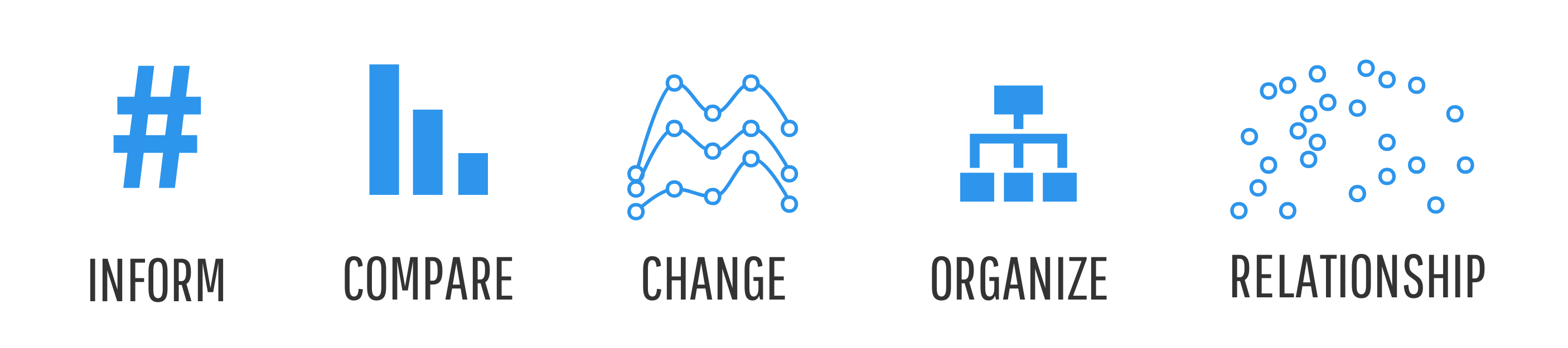
At Venngage, we’ve developed the ICCOR method to help you choose the best charts for your infographic. The ICCOR method is a framework aimed to help you use a visualization type that aligns with your communication goal.
Your communication goal might be to:
- Inform: convey a single important message or data point that doesn’t require much context to understand
- Compare: show similarities or differences among values or parts of a whole
- Show Change: visualize trends over time or space
- Organize: show groups, patterns, rank or order
- Reveal Relationships: show correlations among variables or values
Each of these different goals will be best communicated with a different type of chart.
For example, icons arrays (also called ‘pictograms’) have been shown to be more effective than bar or pie charts for communicating risk, which is particularly important for healthcare providers and public health workers who want to support good decision making in their patients.
Bar charts, on the other hand, are perfect for handling larger amounts of data and highlighting comparisons between sets of data, which might be more important for those working in finance:

For the full ICCOR framework, check out: How to choose the best types of charts for your data
Choosing a chart is just one part of the process. How do you actually make an impact with your data?
Tell a story with your data to inspire your audience
A plain old bar graph won’t do much to inspire your audience. But a creative combination of charts, visuals, text, and statistics that tells a story can.
By highlighting the right numbers and pulling in text and other visuals, you can show the impact of your organization in a more holistic way, and tell the story behind the data.

Storytelling with data is as much about crafting a narrative as it is about understanding and communicating the insights in your data.
The first step to crafting your narrative is understanding your audience. Think about:
- What’s going on in their lives?
- What knowledge do they have on the subject?
- What context do they need from you?
Once you understand your audience, it should be easy to pull out the insights that will make an impact, and present them in an impactful way. That’s the difference between an engaging design and your standard Excel chart.
Another common practice in data storytelling is the use of icon stories to draw viewers in and make abstract ideas more concrete.
Take this report from UNICEF, for example. The simple, universal icons are combined in different ways to create and reinforce key ideas, creating an impactful report that will be memorable for readers.

Call out key insights and action items in the data
The impact of your hard work can easily get lost in a monthly or quarterly report.
But you can apply the design techniques typically used in infographics to make sure your efforts stand out of more traditional summative reports.
The trick is to do more with less. Get rid of data that doesn’t say anything, and emphasize the data that’s meaningful. Remove the noise to pull focus towards what’s useful.
Highlight key data points and add annotations to provide context to the most important data:

Here’s what to consider when visualizing your data and insights:
- Use the right chart for your data and your goal and select an appropriate layout
- Tell a story with your data to inspire your audience
- Understand your audience and design with their knowledge in mind
- Call out key insights and action items in the data
Read more: Data visualization examples and best practices
How to make your visual communications look professional
If you’re not a full-time designer, one of your main concerns might be making sure your visual communications look professional.
You want to make sure you’re producing content that elevates your brand, and inspires your colleagues, donors, and stakeholders. Focus on visual expression, consistency, and how every element contributes to conveying your message effectively.
Here’s what you should think about:
Establish a cohesive visual brand for any external communications
It’s critical for any growing business to establish cohesive visual branding.
Especially for consumer-facing communications, like for your blog or social media, the quality of your visual brand signals to your customers about the quality of your organization.
Luckily, it’s pretty easy to ensure your branding feels consistent. Here’s how:
- Include the same header and footer with your logo across infographics, one-pagers, reports, and flyers
- Apply your brand style guide‘s fonts and colors consistently across all of your collateral and ensure your typography choices reflect the tone and style of your brand
- Use the same style of symbols and icons across every document

As a shortcut, you can use Venngage’s Brand Kit to add your brand logos, fonts and colors to your designs with just a few clicks, using a simple interface.
Read more: Don’t have your brand guidelines built out yet? Learn how to choose fonts and how to pick colors for designs, first.
Repurpose and reuse designs to keep your communications consistent
Reusing and repurposing existing designs can truly be a game changer.
For one, it’ll speed up your workflow. But more importantly, it’ll ensure that you’re producing communications that are consistent and cohesive.
Did I mention yet that your communications need to be cohesive and match your brand aesthetics?
You can repurpose the documents you’ve created for one client or project, add different content and tweak it a bit for a new client or a different target audience, to get a ton of mileage out of a small amount of design work.
Even if you’re just creating documents to share internally, like project summaries or company newsletters, you can set yourself and your team apart by producing documents that have a consistent visual style.
Conclusion
The recent rapid transition to remote work has propelled visual communication from a “nice-to-have” into an integral part of communication at work.
I hope you’ve already started thinking about how you can use visuals to amplify your communications.
Just remember to keep these design and visual communication principles in mind:
- Use modern design and visuals to make boring information engaging and differentiate yourself from your competitors
- Simplify your information with multimedia to make an impact
- Use data visualization techniques to show the value of your work
- Create designs with a cohesive visual brand and reuse them to keep your communications consistent
For help getting started with visual communication and infographics, check out this guide: How to make an infographic in 5 steps.


