I am a huge fan of social media, even in its current–somewhat chaotic–form.
It has allowed people like myself to build a career and a community around their writing. Honestly, many writers I know would not be where they are without social media.
But what I’m not a fan of is seeing the same terrible stock photos that people slap on their social posts.
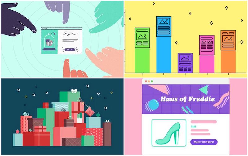
I’m not going to lie, I used to take the easy way out and pick boring stock photos to “spice up” my social media posts.
But that was almost 4 years ago, when a great stock photo could still stand out on social media.
Now that everyone is using stock photos, they just add to the noise, instead of helping you stand out from it.
Stock photos are boring, overused and don’t really add anything to your content. After all, that’s the point: for the photos to be vague enough that a ton of different people could use them!
I could be writing about a tech article, and use literally any of the stock photos below:

But now if you want to stand out, you need to create unique and interesting graphics.
Something that rises above all that noise, draws the reader’s eye and shows the world that this is a great share or piece of content.
With well-designed, high-quality visuals and content automation, you’ll smash the competition—especially when paired with scalable social media marketing workflows.
Lucky for you, I’ve put together 8 reliable social media graphic design tips to set you on the right path. With well-designed, high-quality visuals and content automation, you’ll smash the competition.
1. Use bold and bright color schemes
A trend that I have seen taking over social media graphics, and graphic design in general, are bold and bright color palettes.
As brands and designers move further away from minimalism that dominated the last decade, color will explode across their graphics.
However, we are just seeing the first movers use this color explosion in their social media shares right now. Tech companies and startups are usually the first to take on a trend, and this one is no different.
Over the past year or so, eBay has fully embraced bold and bright colors across all of their branding:

These product shots with non-traditional color schemes pop on their site and on social media.
Many will follow this trend eventually, but I think when they finally do try to use these color schemes, it will be too late. But that means that your brand can use these bold colors in your designs this year and be ahead of the curve.
Another great example of bright color usage comes from the data company, FiveThirtyEight:

Many of their competitors in the news industry are still using stock photos and bland images for their social media posts.
But each of these graphics from FiveThirtyEight features a unique illustration and graphic layout.
They use bold, bright and interesting colors to differentiate themselves from the old school brands that have been around for decades.
And you can be just like them with just an addition of a few great color to your social media graphics.
Now you may be asking, if I am not a first-mover or tech company, can I still use crazy colors?
I say…why not? Just take a look at what the Harvard Biz Review has been sharing lately:

They were founded in 1922 and if they are taking risks with color, so can your company!
2. Use icons to illustrate concepts
I know that not every single company has the resources, or even a designer, to produce design their own social media marketing images from scratch.
That’s why I wanted to share this simple social media graphic creation tip that I’ve used many times throughout the years.
All you need is an icon that reflects the theme of the content you’re sharing (check out our icon library for over 40,000 different icons) and a bold background color.
Here are some examples from our own social media pages:
All of these social media graphic designs are simple enough for you to create in a few minutes and share quickly and they won’t require any intensive graphic design resources.
Plus, the icon creates a clear and focal point that draws the eye. Now compare those examples to this image:

This one is much more generic, isn’t it? Something like this would fade into the noise that is the modern social network.
But if you’re strapped for graphic design resources and still think using stock photos is your best bet, you can add some originality by using icons to augment photos.
For example, take a look at these social media graphics from Axios:

They blend photos with icons to create whimsical, original designs. Kind of like a collage!
So take some advice from me and all these companies; invest in icons this year.
3. Create unique illustrations
One of my favorite trends that I have seen take over social media lately is illustrated social media graphics.
They actually are one of the biggest design trends this year.
That’s probably because not only are they fun to look at, they also can’t be replicated by your competition the way a graphic using a stock photo can.
I mean, can you imagine scrolling past these examples from Backchannel?

Me neither–they made me stop in my tracks. I am confident that even the most interesting stock photo you can find will not cause that kind of reaction.
That feeling is what all of your social media graphic designs should do as well, no matter the platform.
But having someone to pay attention to your post is only half the battle, you also want them to click or share.
And in my opinion, illustrated social media graphics rise above the rest here too. Not only do they look great, they show the reader that you really care about the content that you are sharing.
Seriously, which shares would not only catch your eye but make you want to learn more? These vague stock photos:

Or these illustrations from Mailchimp:

Technically, they both get the job done, but the illustrations have more going on and will definitely stand out in a social media feed.
Slapping a stock image on a social media post literally the bare minimum you can do.
So stop doing that. Your readers will thank you with their clicks.
And to close this tip, I would like to show off this really interesting use of illustrations from Wired. They use a handful of images to help people learn more about digital security:

Each of these images are obviously illustrated, but they also are presented in a single Twitter thread. They could have just as easily used a bad stock photo…or no photo at all.
But solely through Wired’s great use of illustrations, they grabbed my attention, made the content simple to quickly consume and left me wanting to learn more.
Strive to cause that kind of action with your shares and you will succeed on social media. You need graphic design resources for this, but I’d probably say it’s well worth the investment.
4. Visualize data with charts and infographics
One of the most unique and versatile types of social media graphics you can create is a classic graph or chart to go along with your content.
If you are writing interesting data-driven content, you have probably already created a graph in the article or blog post. Why not use that on social media too?
It seems like a no-brainer but so many people forget the power of a well made graph or chart.
With graphs, charts and infographics, you can quickly disseminate key information to your audience about the content they are about to read. And if it’s interesting enough, they will want to click and learn more.
Like in these examples from SEMrush:

The graphs tell a key part of the story story, quickly and effectively. In a matter of seconds, you can see that content marketing is important and desktop is more popular than mobile. But to find out WHY, readers will have to click for more.
Plus, they’re eye-catching, since not many people know to use graphs or charts in their social media graphic plans.
If you want to go a less traditional route, you could create simple data visualizations by combining text, icons and images.
Online payment processing tool PayPal uses these types of infographics all over their social media feeds as well:

They are easy to follow or consume in a matter of seconds. Not one of these social media graphics are trying to do too much, and each only have a single number or value to focus on.
5. Make text the focus of your social media graphic design
Back in the day, when I first started creating content, adding the title of the article I was sharing to the social media graphic was my favorite thing to do. I also added text-heavy graphics to most of my other posts too.
Kinda like these:

It honestly was the best thing I thought that a person with little design experience could do to differentiate myself from the others online.
Plus it was a lot more informative to potential readers than a simple stock photo.
I have stopped creating these lately but I think they still can be used effectively, with a few caveats.
Obviously, it should be well designed and easy to read from every device. You don’t want people squinting to try to see what is on your image. But also don’t make it so large that the text is cut off in the feed.
If you can find a happy middle ground, like Mention did, you should be set:

Even in that example in the bottom left, you can easily read even the smallest text. And it helps tell the reader or follower know what they are about to click on almost instantly.
Another thing that Mention does well is add the company or person to an image, like they did with Soylent and Neil Patel. This is a easy way to add an image to an otherwise boring share and easily hack the influence of the subject.
Using text and titles to grab the attention of your readers is pretty common in the marketing world too. With both Ahrefs:

And the Content Marketing Institute using this tactic on a majority of their social media graphic designs:

In my opinion, the ones from CMI are the best examples in this section by far. They are able to mix the important text with some related icons to create an interesting social media graphic.
Each part of the graphic can be used to grab the attention of someone scrolling through a feed, or add some additional context to the share.
That said, each graphic doesn’t feel overdone or too busy, which is a hard thing to achieve with this much visual content.
These are leaps and bounds above what I was able to produce back in the day but with Venngage you can easily create something like this in a few minutes.
6. Use pre-made social media templates to get you started
One way to upgrade your social media graphics is to start creating pre-made templates in bulk that you can use later on.
This tactic is great for someone who isn’t a trained designer or doesn’t have the time to create something new for each post.
Pre-made templates may seem like they are all “paint-by-numbers” graphics, but if you personalize them and incorporate your branding, they can still be quite unique.
Take a look at the examples from Moz below, in which they do exactly that:

Each of these social media graphics share the same general layout, which may seem boring, but they use it to their advantage. Because they don’t really use any other graphics, this has become the “Moz template.”
People know a post came from them almost instantly because of the template. You could take off all of the branding and I would still know it came from Moz.
This tactic is great for places, like Moz, that produce a ton of content and shares throughout the day. Now instead of needing a designer to create each of their featured images they can quickly swap the elements and build a unique graphic in seconds.
Kissmetrics takes the template graphics a little more literally, with only the text and images changing:

Again, this can be used to increase your brand reach and power. Once someone knows that good content is tied to an image like this, they will want to click every time.
And finally, I would like to show that not every template has to be so rigid. Each of these social media graphics from Social Media Examiner uses a flexible template:

They may not be as similar as the other social media examples in this section but they also follow a template.
As you can see each has an icon on the left, with the text on the right and the website in the bottom center. Despite having differences, they still look like cohesive designs.
7. Create custom GIFS and cinemagraphs
Everyone knows, and probably loves, GIFs. They are the little helpers we use to communicate visually with the world and create shared experiences.
Most of these GIFs are from a TV show or movie that everyone has seen, so they carry some significance.
However, those types of GIFs are not going to cut it now that everyone is using them. You need to take it to the next level and maybe create some of your own custom GIFs or Cinemagraphs.
The one negative of using custom GIFs is that you are going to most likely need a designer’s help. They are definitely above my skill level.
But that doesn’t mean that they have to be overly complicated to succeed on social media.
This GIF from IBM is very simple, with a few moving parts, and visually appealing at the same time.

Each of their GIFs follows this same formula, which mixes simplicity with beauty to create something very relevant to the share. That isn’t an easy feat to accomplish but it seems that IBM has almost mastered it.

They also seem to tie in some of the tactics that we have discussed already! Like bright colors, icons and illustrated images:

The same can be said about Strange Work:

And even GitHub:

If you want to keep your GIFs super simple, I would recommend checking out cinemagraphs too. They are like the more sophisticated brother of a GIF and share elements with a static image.
But instead of a fully animated image, only one point of the image moves. Like so:

These definitely take a little design knowledge to pull off but they can be extremely beautiful. And with only a single point of movement, I think that they are much more eye-catching than a video or a GIF on social media.
It’s almost like your brain doesn’t expect anything to move, and then that unexpected movement jumps out at you.

Plus, not many people are using them yet so you get the first-mover advantage!
8. Incorporate your branding into your design
I saved the simplest social media graphic design tip in this whole article for last: brand your graphics.
Even if you know nothing about design, you can incorporate your logo or brand colors into a social media graphic pretty effortlessly.
It will take you all of two seconds to do that, depending on how fast your internet is. And, of course, how much effort you want to put into it.
You could keep your designs minimalist, like these graphics from Think Growth:

All they added to each social media graphic was their logo and a few dots, but that consistency creates strong branding across their social pages. Plus, almost any one of their writers or creators can use that template to create their own graphic.
Another way to add your branding to an image or graphic comes from The Next Web:

They create a sense of consistency between every one of their shares with that gradient bar on the bottom.
This way, they can build a sense of continuity throughout each graphic, even though every single one is a wholly different image.
And like we saw with some of the social media template examples from above, you know it came from a good source almost instantly by staying consistent.
It’s definitely a great way for a team that is short on designers to build their visual brand from the ground up.
To help you save time, explore this guide on the best free AI social media post generators in 2025 to compare features, usability and creative strengths in one place.
Conclusion
There are hundreds of other people out there using the same stock photos. When you use one, that boost that everyone says you get by including images in your posts disappears.
Eventually, you have seen the same stock photo so many times that it just fades into the background.
But if you follow these tips I’ve provided, you can create stand-out social media graphics that will grab your audience’s attention.
Goodbye, bad stock photos!
Read More: 10 Simple Ways to Incorporate Stock Photos Into Your Designs


