


Do you have to create reports or charts frequently and want a better way to engage your readers? One of the most common charts you’ll see in a presentation is the “Sales Chart”–a column chart with the products on one axis and total sales on the other. Something like this:

Or a more complicated stacked version that includes another dimension, such region or months.
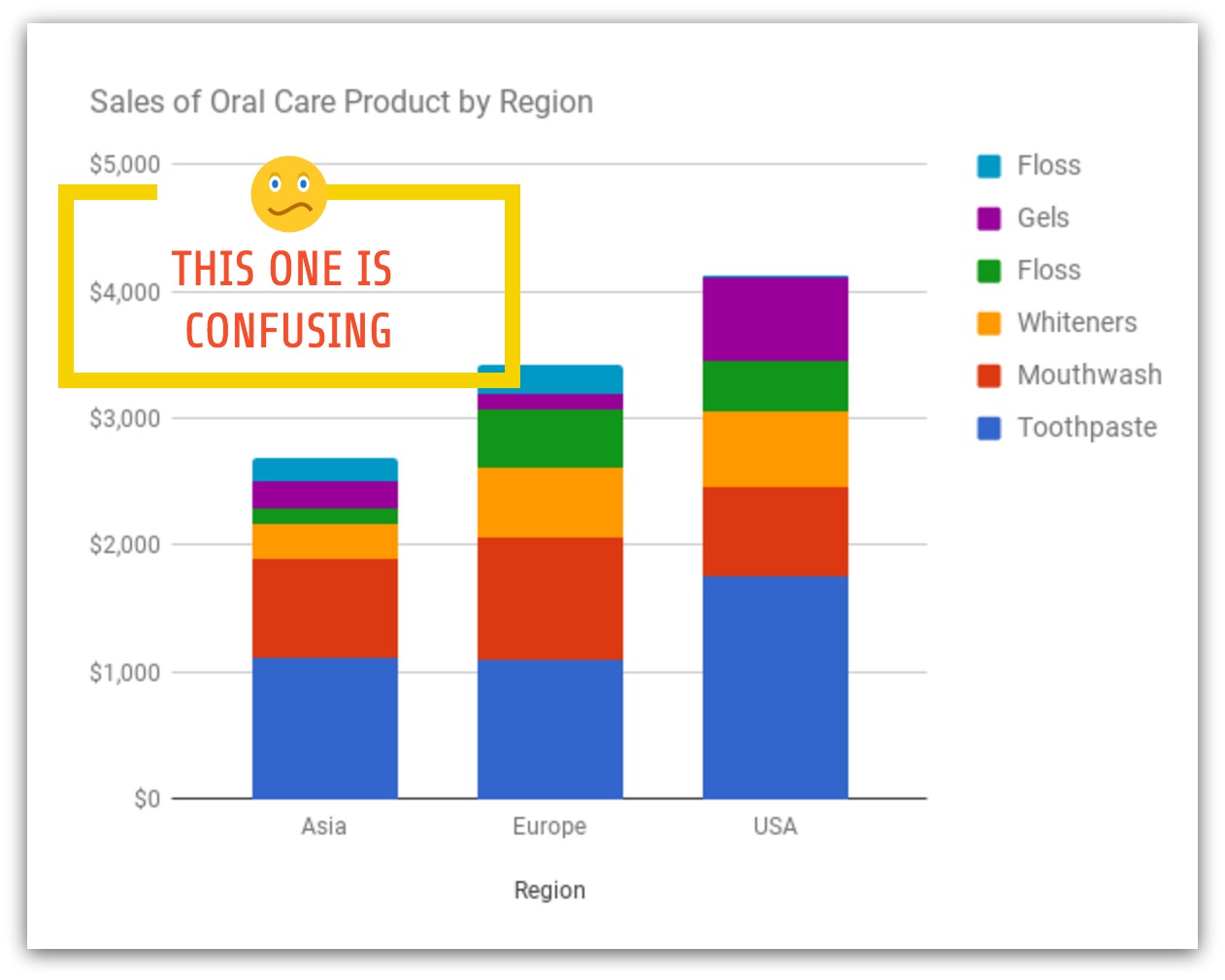
Did your heart skip a beat when you saw these charts?
They’re charts about toothpaste sales, perhaps one of the most mundane things in the world. For most people, their reaction is either apathy or confusion. There is so much going on here. What do all these numbers mean? What should I be looking at?
As part of the Make Data Fun series, we seek to make boring charts more engaging and fun for everyone—whether you’re seeking to analyze the performance of your reps, visually evaluate the performance of sales emails across your organization or otherwise.
How can you transform this common Sales Chart into something eye-catching, engaging and impactful to your stakeholders or team members?
The most common mistake people make when creating charts or reports is to show everything–essentially, doing what we call a “data dump”. While that is useful for a data analyst or a highly technical audience, for most people, it’s overwhelming.
The first step we recommend is to simplify the information we have. We use the 3S framework based on the method used by Tim Ferris for accelerated learning.

- Split up the information into its main parts.
- Select the most important parts using the 80/20 rule. What are the important parts for your story?
- Sequence the parts into a story.
The 3S Framework helps you simplify your data and sequence it into a story. There are stories everywhere, even in data about toothpaste sales.
Here’s an example of a potential story you could do if you were a marketer talking about international growth opportunities.
“We’re going to focus on whiteners (these are the strips that whiten your teeth). In the US, it’s the third biggest product and accounts for 16% of total sales. But in the other regions, it’s relatively small. That’s because teeth whitening is getting more common in the US, which is a leading market. This product can have huge growth opportunities if marketed properly in Asia and Europe.”
Now that we have the parts of a good story, we need to visualize it. Here are a few guidelines on how to making your charts pop out and grab the attention of your audience.
1. Use contrasting colors to focus on key points

In this example, we have used a contrasting color for the product we want to highlight. We’ve changed the data from absolute values to percentages to be able to compare between regions. We didn’t even label the other data points because we want to only focus on one product for the story.
You can create your own chart with this template by clicking on the image above.
2. Group by clusters

Group products into different categories to highlight them. In the example above we used a bubble cloud chart. It’s not common in sales charts, and therefore quite effective in grabbing attention.
Click on the image above to customize your own chart.
3. Use bubble chart designs

Bubble charts are eye-catching because we are drawn to circles (they look like faces). They are also useful for high level comparisons. Obviously, it’s not easy to do exact comparisons with area charts but if you only need to convey relative sizes, bubble charts do the job well and are more engaging then the typical bar chart.
4. Strip down to two colors

Simplify, simplify, simplify. This chart only focuses on the share of whiteners in the three regions. Nothing else. It uses two different colors – one dark and the other bright to draw your attention. Simple two tone charts are easier to read and delivers your story point quickly.
Click on the image above to customize this chart.
5. Use combination of icons + pie charts

This is an experimental chart that uses iconography and donut pie charts together. This chart combines both imagery and data visualization with a bit of novelty.
6. Visualize tables with icons
An alternative to ranking tables is to use icons instead of text. Using icons can make the table more visually appealing and engaging. You can also use arrow to show potential movements or changes in positions.
Click on the image above to customize this design. Want to make sure your sales charts inform rather than mislead? Check out our article on misleading graphs for examples and tips.
Hopefully these examples will inspire you to try eye-catching chart types and innovative designs for your presentations or your sales meetings. If you would like to follow the Make Data Fun series or customize some of these charts yourself, please sign up for Venngage for free.


