


From presenting data and explaining processes to comparing ideas or telling a story, choosing the right type of infographic can make your message clearer and more impactful. Whether you’re creating an infographic for marketing, training or internal communication, understanding the different types of infographics helps you pick the right format for your goal.
This guide breaks down the most common types of infographics and when to use each one.
Or, you could always jump right into designing the perfect infographic with Venngage’s range of professionally designed infographic templates.
9 of the most popular types of infographics are:
- Process infographics
- Statistical infographics
- Informational infographics
- Timeline infographics
- Geographic infographics
- Comparison infographics
- Hierarchical infographics
- List infographics
- Resume infographics
| Infographic Type | Best For |
|---|---|
| Process infographics | Explaining step-by-step workflows, tutorials, or how-to guides. |
| Statistical infographics | Presenting survey data, research findings, reports, or performance metrics. |
| Informational infographics | Breaking down complex topics, frameworks, or concepts into digestible sections. |
| Timeline infographics | Showing project roadmaps, company history, or sequences of events over time. |
| Geographic infographics | Visualizing location-based data such as regional trends, demographics, or markets. |
| Comparison infographics | Comparing options, plans, features, pros and cons, or before-and-after scenarios. |
| Hierarchical infographics | Showing organizational structures, ranking systems, or levels of importance. |
| List infographics | Highlighting tips, checklists, key takeaways, or best practices in a visual format. |
| Resume infographics | Showcasing skills, experience, and achievements in a visual, scannable resume layout. |
Confused about what an infographic is and why you’d want to use one? Our guide to What is an Infographic? is the best place to start.
Now, let’s dive into each type of infographic in more detail.
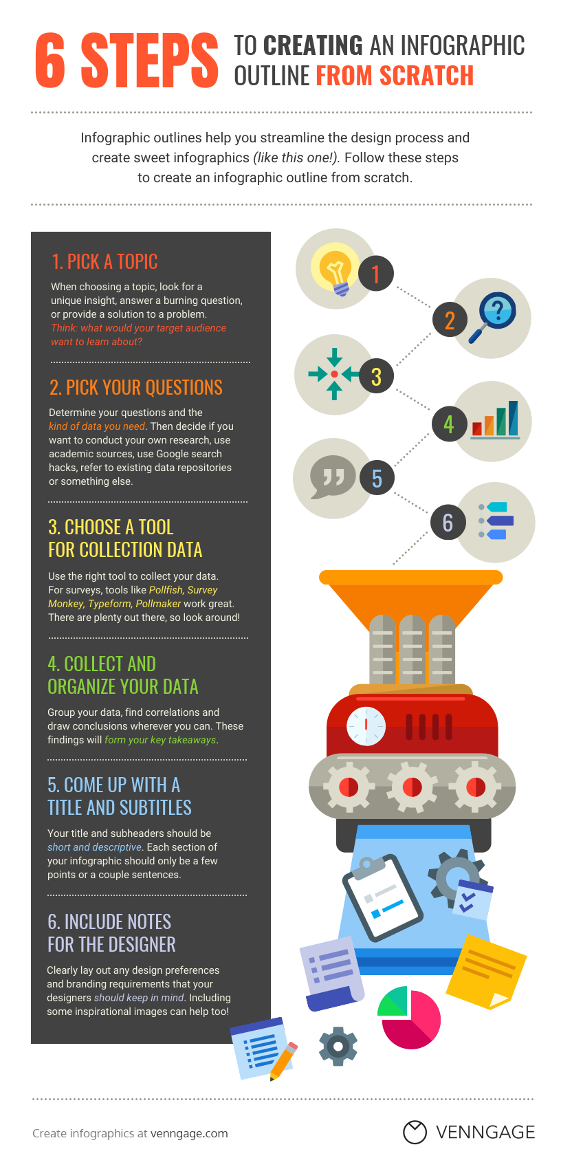
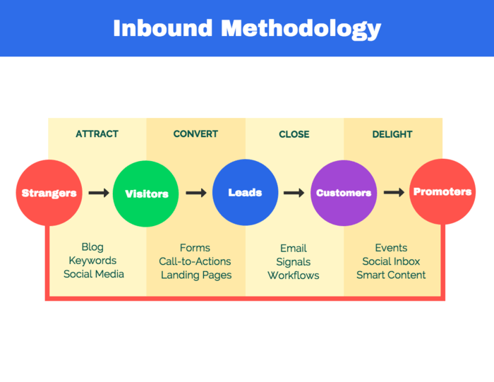
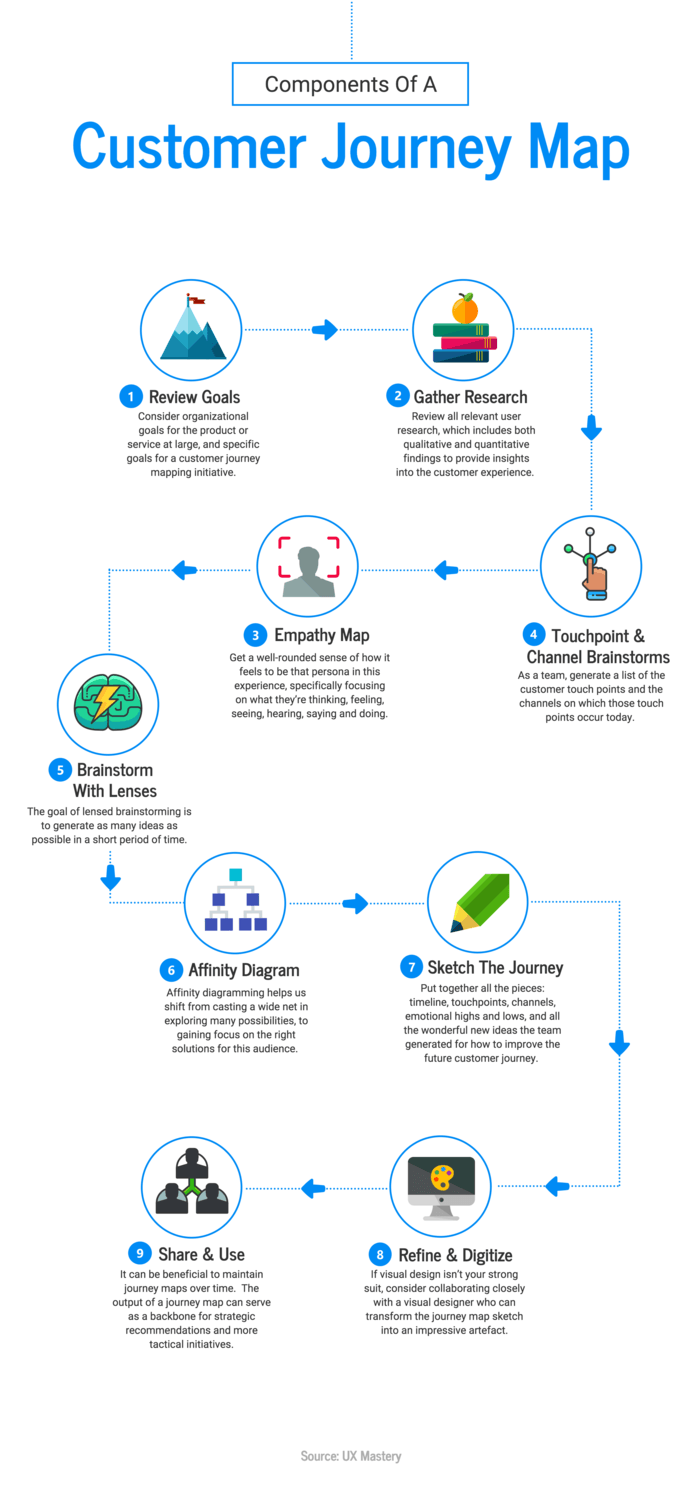
1. Process infographics
A process infographic is the best infographic for providing a summary or overview of the steps in a process.
Process infographics will allow you to simplify and clarify each step. Most process infographics follow a straightforward top-to-bottom or left-to-right flow. Numbering the steps will make your process easy to follow.
For example, this process infographic template uses a different color for the headers of each step. Notice how the colors of numbered icons on the right side of the infographic correspond with the headers.
To help your information flow, use directional cues like arrows, lines and other shapes that point the eyes in a certain direction. An AI infographic maker can assist in automatically generating these elements to ensure a smooth and visually appealing process infographic.”
For example, this process infographic template uses arrows to visualize the order of each step. This simple process summary is perfect for including in a presentation or video:
If you have many steps to fit into one process infographic, try using a “snake” layout. Basically, your steps will wind back and forth across the page in an S-shape. This will help you save space:
Best practices for creating a process infographic:
Follow the below setups to create a process infographic:
- Number each step in your process to make it easy to follow.
- Use an S-shape layout to fit many steps into one page.
- Use visual cues like arrows to indicate where the eye should look next.
- Write your headers in a different font or colors from the other text to help them stand out.
Want more process infographic templates and process visualization tips? Check out this guide on creating process infographics and our recommended step infographics, circle infographics and roadmap infographics you can customize immediately.
2. Statistical infographics
A statistical infographic puts the focus on your data. The layout and visuals will help you tell the story behind your data.
If you want to visualize survey results, present data from multiple sources, or backup an argument with relevant data, then a statistical infographic is the best infographic to do that.
Your storytelling devices can include charts, icons, images and eye-catching fonts.
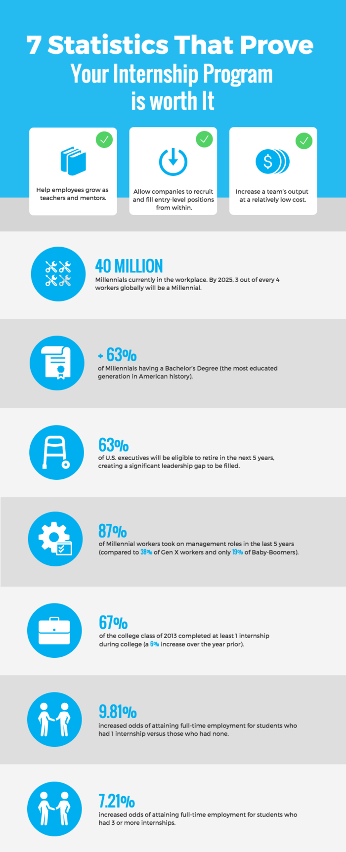
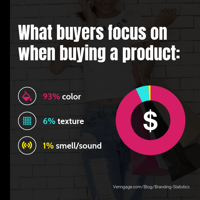
For example, this infographic uses an icon to illustrate each statistic:
And this statistical infographic template uses a combination of bold fonts and colorful icons to draw attention to each statistic:
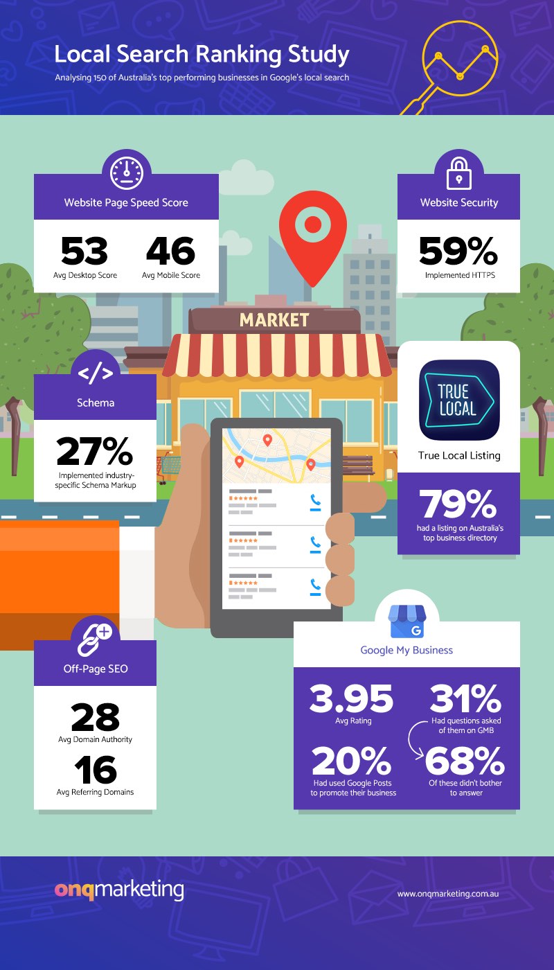
Another example of a statistical infographic that visualizes data is from this local SEO study report:
Meanwhile, this statistical infographic template takes a more varied approach. The design combines pie charts, icons, and a timeline:
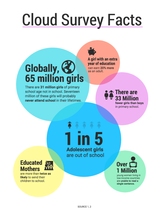
If you have a few key statistics that you want to emphasize, you can also opt for a more unconventional design.
A bubble or cloud layout will can help each statistic stand out while also creating a hierarchy of information. Simply put your most important statistic in the largest bubble, then decrease the bubbles in size:
Learn more about some other types of statistical infographics:
- 17 Number Infographics for Your Business Data
- 12 Survey Infographic Templates and Essential Data Visualization Tips
- By the Numbers Infographic: Perfect for Getting to the Point
Best practices for creating a statistical infographic:
- Look for the story behind your data and reflect that in your design.
- Vary the types of data visualizations you use—like charts, icons, and text.
- Write a descriptive infographic title that contextualizes the data.
- Emphasize key data by using a contrasting color or pairing the number with an icon.
Want more statistical infographic templates and design tips? Read this guide on creating statistical infographics.
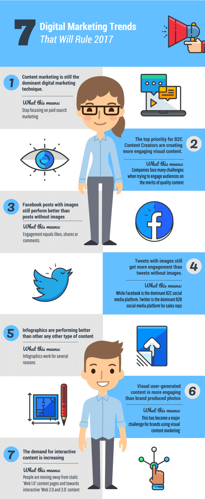
3. Informational infographics
An informational infographic is the best infographic for clearly communicating a new or specialized concept, or to give an overview of a topic.
Typically, an informational infographic is divided into sections with descriptive headers. Numbering each section will help your infographic design flow. Plus, I’ve found that people tend to like infographics with numbers in the title.
This informational infographic template is one of the most popular by far. It keeps the information brief with five points. Descriptive headers and illustrative icons help communicate each point clearly:

But you don’t have to follow a chronological order. If you have a collection of tips or facts that have no order, then you could opt for a circular layout:
Use design tricks like switching up color and direction to keep people engaged with your infographic. For example, this informational infographic template alternates between three different background colors for each section:
Adding decorative borders around each section can also add a bit of flair to an otherwise simple design. For example, this infographic template strikes a balance between decorative and functional:
Best practices for designing informational infographics:
- Give each section a descriptive header so the information is clear.
- Number your sections to help the information flow.
- Alternate between different colors, types of visuals and directions to keep readers engaged.
- Illustrate concepts using icons and images.
Learn more about how to summarize content, such as a blog post or report, and present it visually as an infographic.
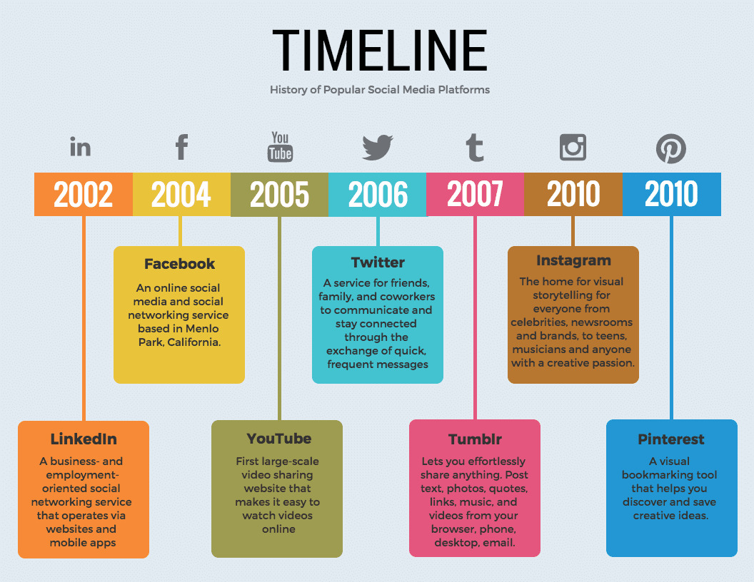
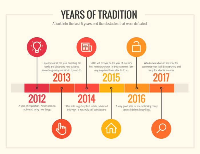
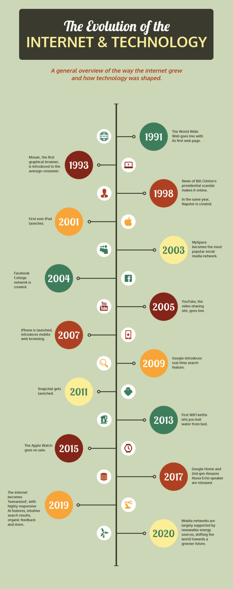
4. Timeline infographics
Timeline infographics are the best type of infographic for visualizing the history of something, highlighting important dates, or giving an overview of events (for example, a project timeline).
Because humans tend to make sense of time spatially, a visual like a timeline infographic can help create a clearer picture of a timeframe. Visuals aids like lines, icons, photos, and labels all help to highlight and explain points in time.
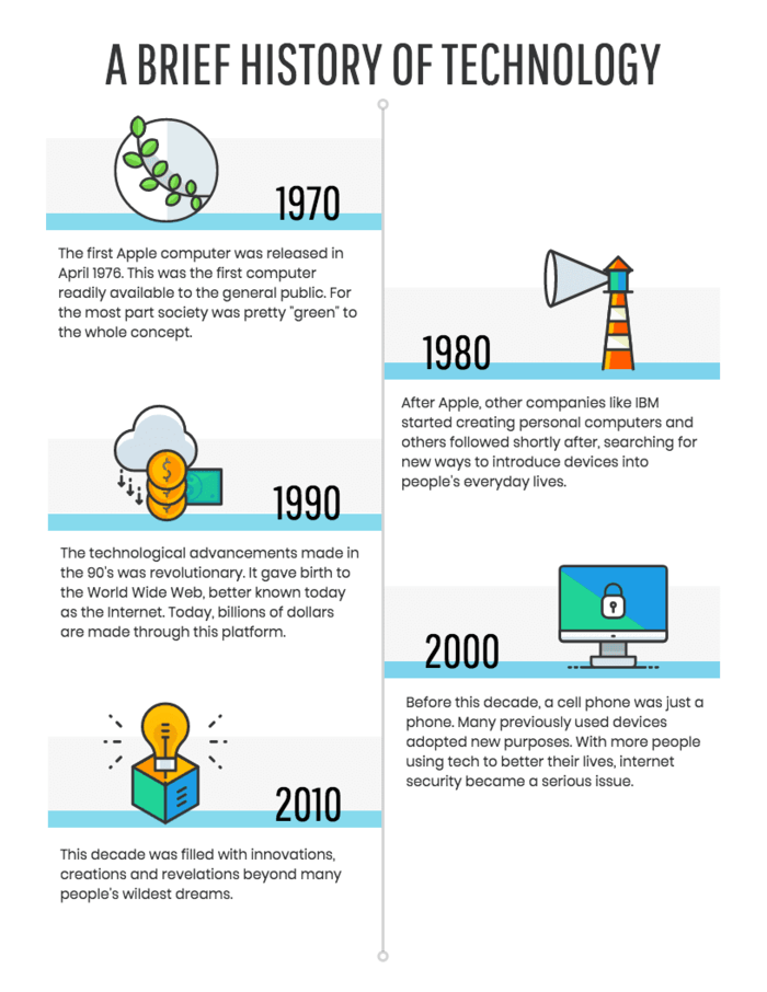
For example, this simple timeline template emphasizes each year using a larger font. Each point in time is illustrated using a colorful icon:
While icons of the same style represent different events in this timeline infographic:
A visual trick to show time progression is to use a color gradient.
Take a look at how the progression of color in this timeline template helps create the impression of movement from past to present. The darker color on the left draws the eye to the beginning of the timeline:
Alternating between different colors for each point in time can also help draw the reader’s eyes down along the timeline:
Timeline infographic design best practices:
- Use a central line to connect the different points in time.
- Use a bold, contrasting font to highlight the year or name of each event.
- Illustrate each point in time with a simple icon.
- When necessary, provide a brief description for each point in time.
Looking for more timeline templates, examples and design tips? Read this guide on creating timeline infographics and our post with 20 timeline template examples.
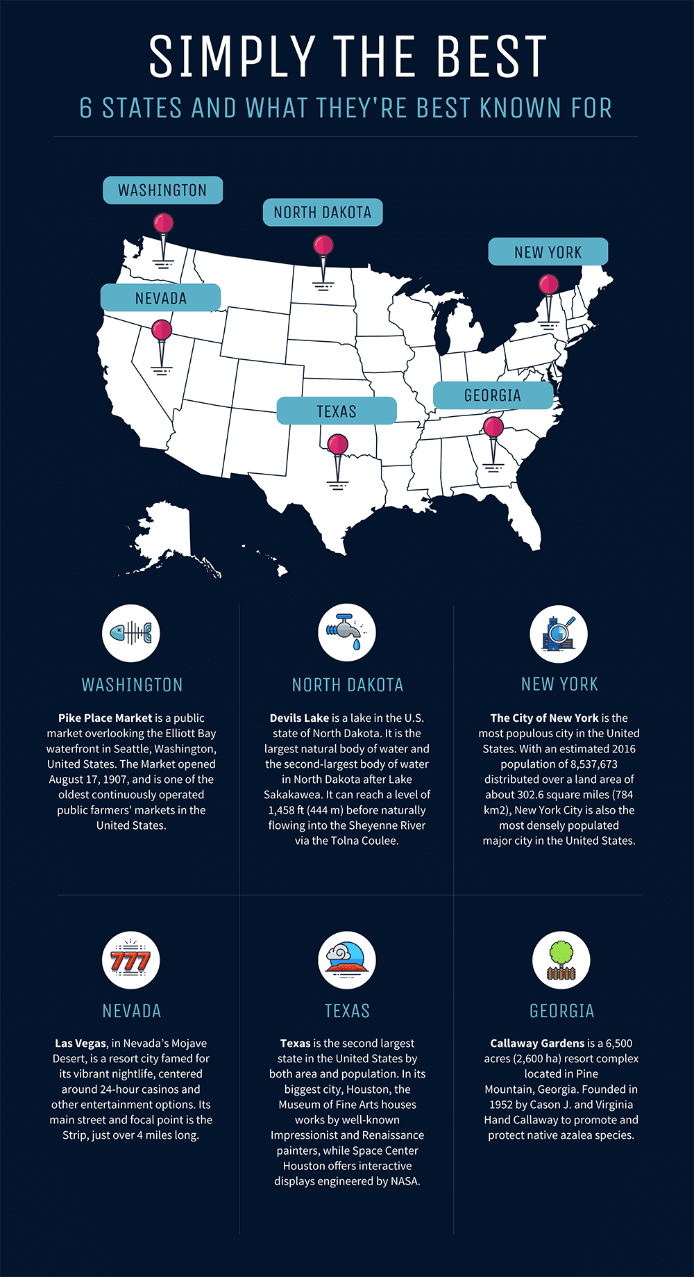
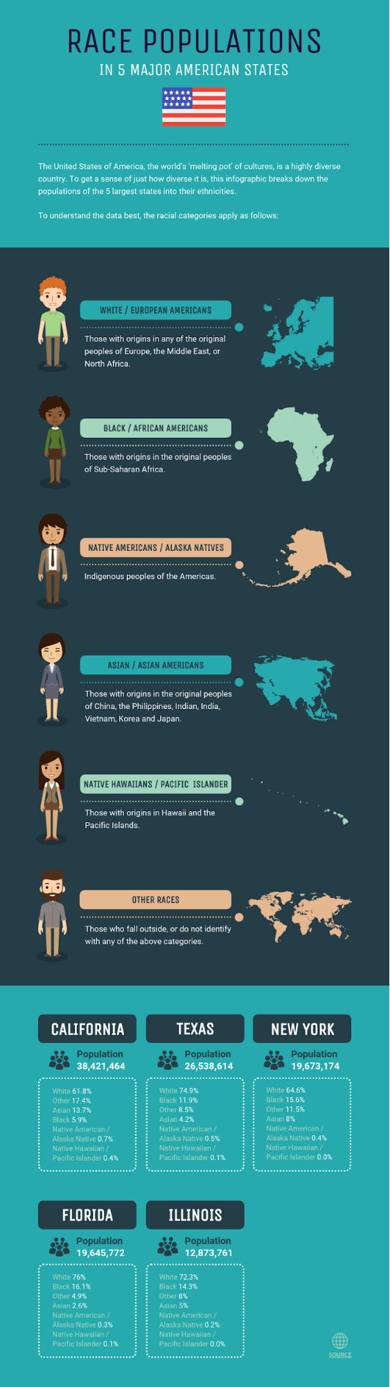
5. Geographic infographics
A geographic infographic is your best bet when it comes to visualizing location-based data, demographic data or large quantities of data.
Geographic infographics use map charts as the focus visual. Different types of map charts work better for different types of data.
For example, this geographic infographic template uses a heat map to show regions hierarchically:
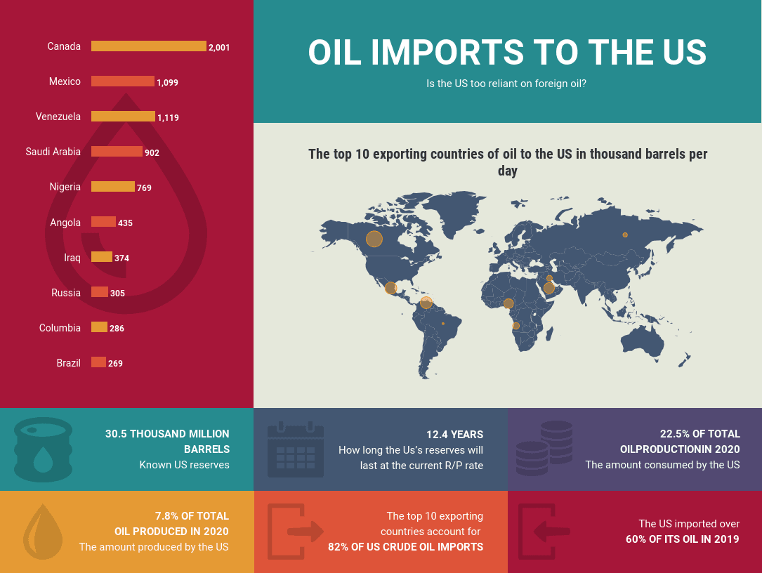
But if you want to simply point out locations on a map, use icons and brief labels:
Geographic infographic templates can also be used to compare data by region or demographic. You can do this by placing several maps side by side.
For example, this geographic infographic template uses maps of different countries to help compare a breakdown of the population of America by race:
Geographic infographic design best practices:
- Use a heat map to visualize density by area, and to create a hierarchy of data.
- Use a map series to compare location-based information or to shows changes over time.
- Clearly label points on a map to make your data easier to understand at a glance.
Want more geographic infographic templates, examples and design tips? Here’s a map infographic design guide that might come in handy.
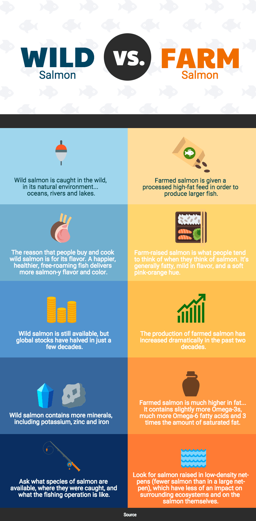
6. Comparison infographics
Comparison infographics are the best infographic to compare options in an unbiased way.

Typically, comparison infographics are split down the middle vertically or horizontally, with one option on each side.
For example, this comparison infographic template offers an unbiased comparison of two phones. The phone specs are listed down the middle of the infographic, making it easy to compare both options:
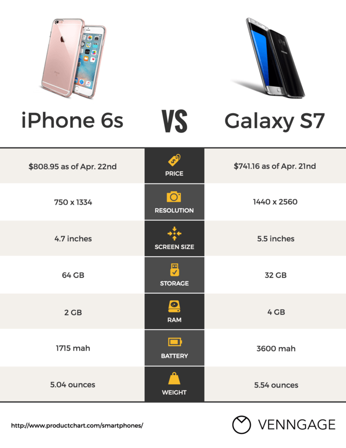
Use contrasting colors to set two options apart. You can also use a brighter, more eye-catching color to emphasize the option you want readers to pick.
This comparison infographic template uses contrasting colors to emphasize the difference between both options:
If you want to compare more than two things, then simply dividing your infographic in half won’t work. Instead, you can divide your infographic into multiple columns.
Best practices for creating a comparison infographic template:
- Divide your infographic in half to show two options.
- Divide your infographic into columns to show more than two options.
- Set two options apart by using contrasting background colors.
- Use a brighter color to highlight the option you want readers to pick.
For over 20 comparison infographic templates and design tips, read this comparison infographic design guide.
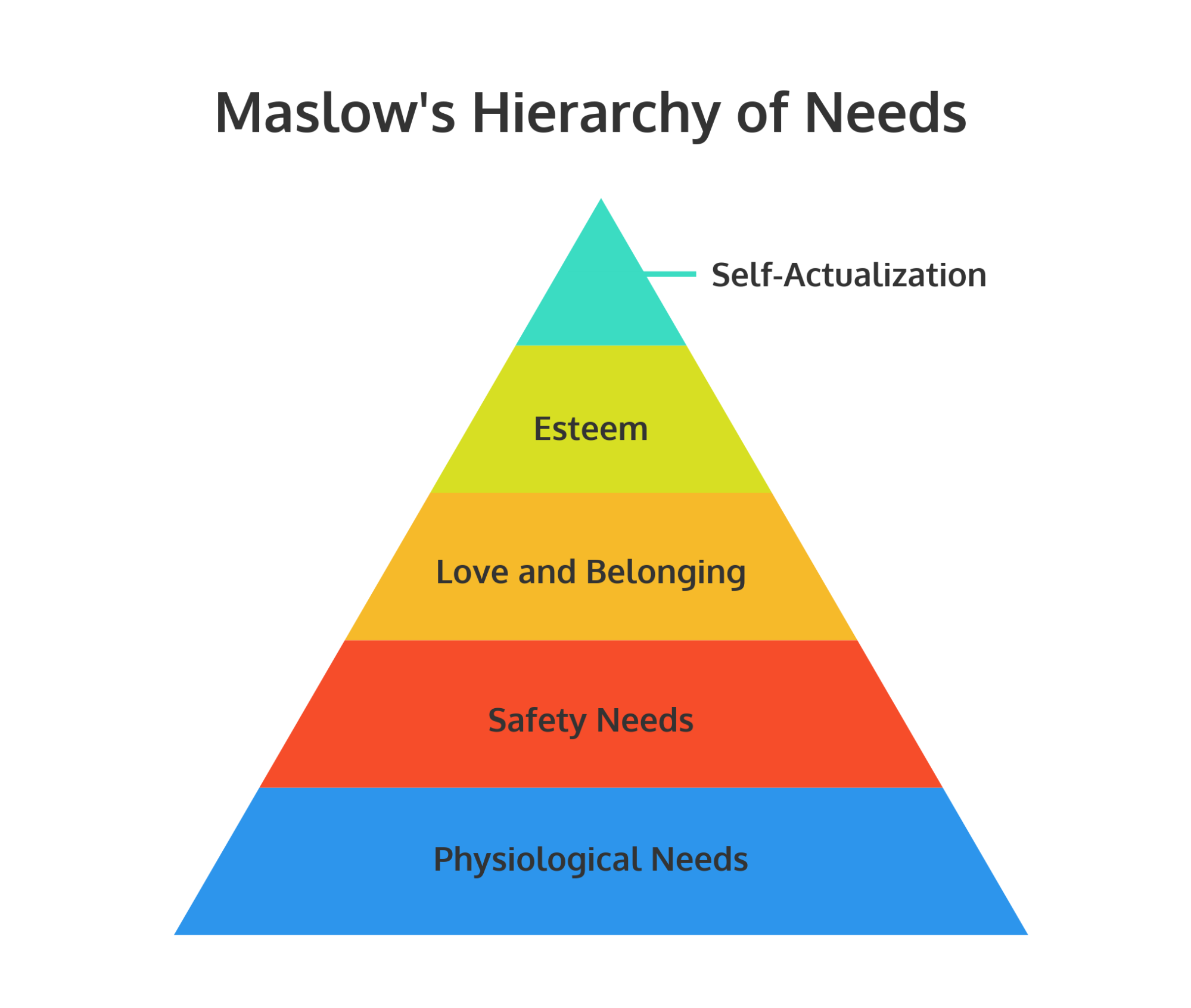
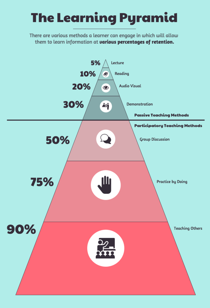
7. Hierarchical infographics
A hierarchical infographic can organize information from greatest to least.
One famous example of this is the pyramid visualizing Maslow’s Hierarchy of Needs. Humanity’s most important needs are at the base of the pyramid, ascending to humanity’s least important needs in the smallest segment at the top.
You can use a similar pyramid chart for a wide variety of hierarchical information. For example, this hierarchical infographic template depicts the most effective learning methods, with the highest retention method at the base:
To visualize a chain of command, or to show how something is broken down into parts, use an organization flow chart. For example, this hierarchical infographic template uses two organizational flow charts to show the chain of command at a company:
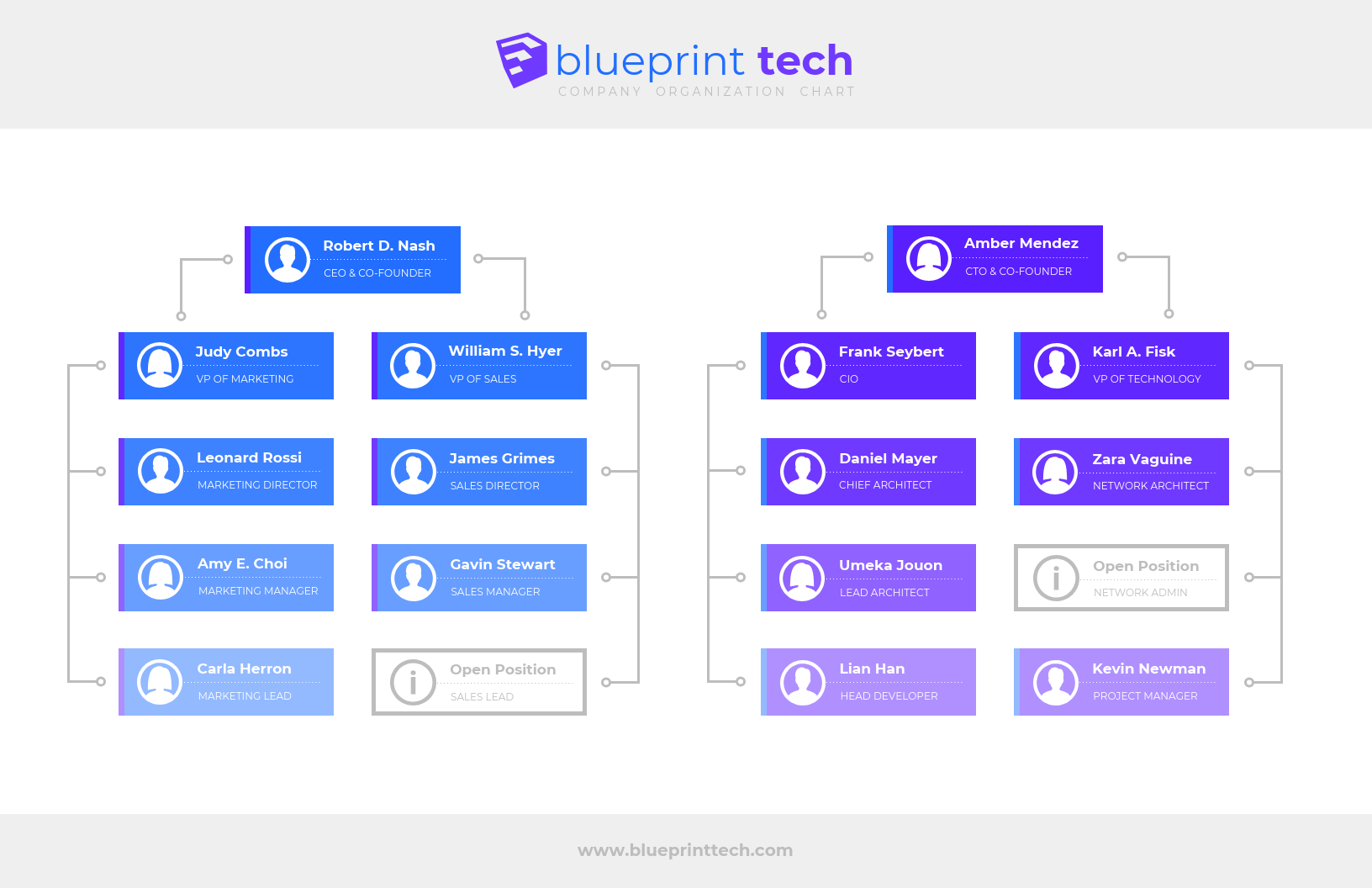
Click the template above to enter Venngage’s online organizational chart maker tool. Edit the template to your liking—no design experience needed.
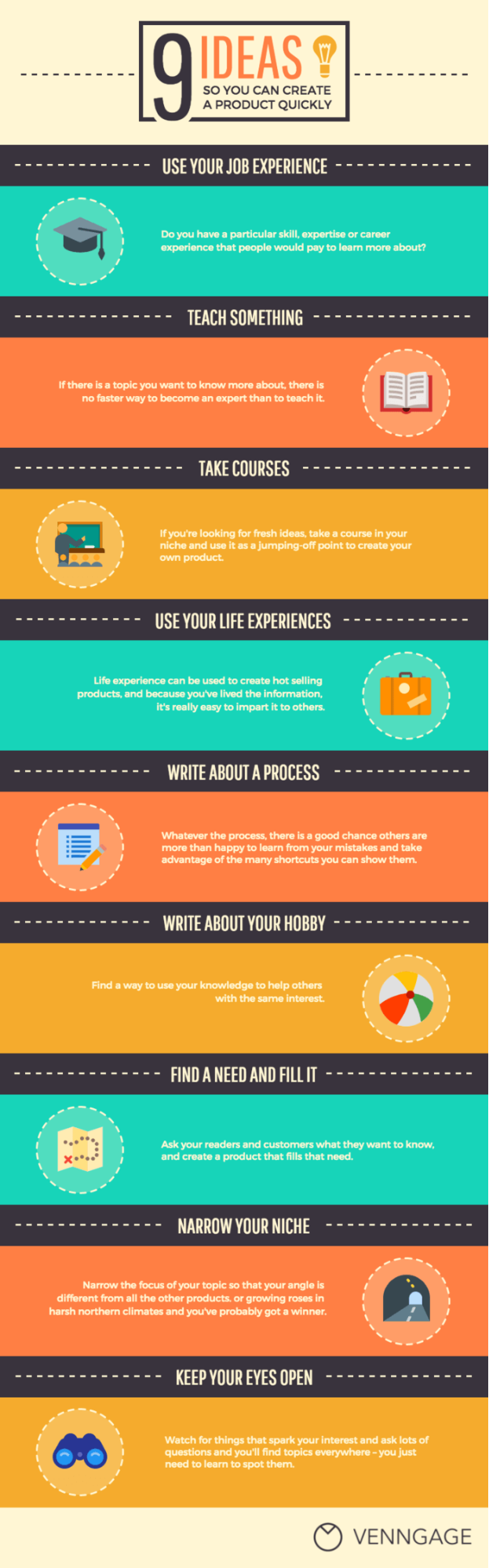
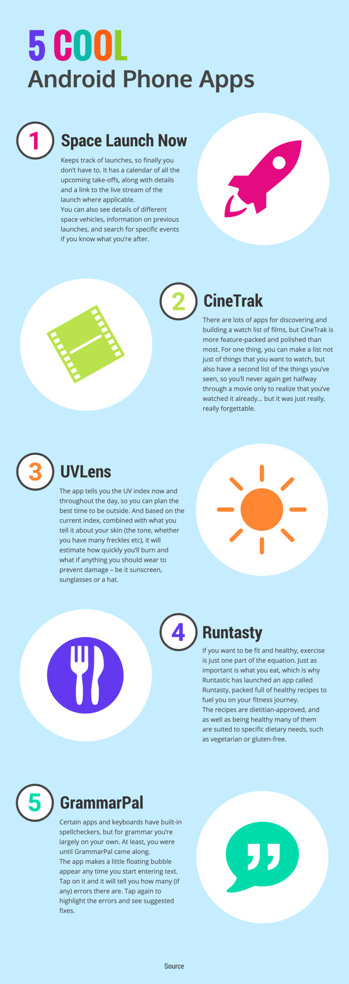
8. List infographic templates
List infographics can be super useful when you want to share a bunch of tips, a lineup of resources, or a series of examples.
List infographic templates are generally straightforward—the goal is to make them more eye-catching than a basic list. Visuals like icons can replace bullet points, and creative fonts and colors can make each item stand out.
Numbering the points in your list will help your information flow. This list infographic template uses different colored circle icons to help each number pop from the page:
Just because your content is a list, doesn’t mean you have to follow the basic top-to-bottom layout.
For example, this list infographic follows no particular order. Instead, the points circle around the main topic, with different background colors to make each point stand out:
Look for creative ways to lay out the points in your list. Play with your audience’s expectations and include eye-catching design elements to give their eyes a break.
For example, this list infographic template uses an S-shape layout to keep your eyes moving back and forth across the page. The brightly colored icons contrast with the blue background, making the design exciting:
Best practices for creating a list infographic:
- Number the points in your list to help the information flow.
- Replace bullet points with icons to illustrate your points.
- Vary the color of the fonts, backgrounds, or icons of each point to keep your design engaging.
- Try unconventional layouts like S-shaped layouts or circular layouts.
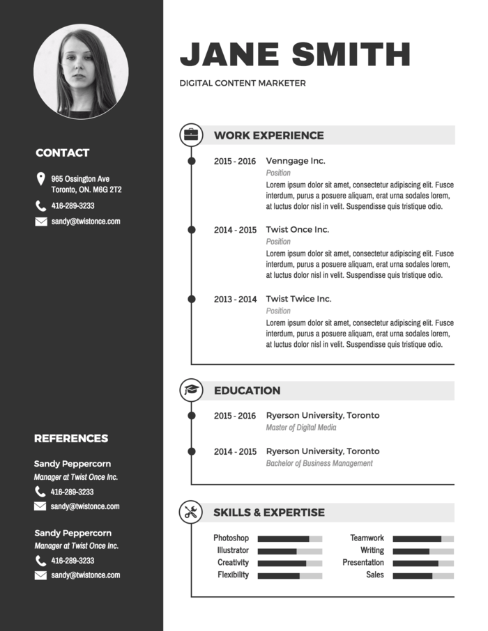
9. Infographic resumes
Infographic resumes have become all the rage lately because, let’s face it, with the job market so packed, job seekers need to be creative to stand out.”
Infographic resumes won’t be able to entirely replace a traditional resume in most cases. But they’re a great visual document to bring to an interview, to publish on your portfolio site, or to include in an email application.
For example, this infographic resume template has a muted, minimal color scheme. Simple icons and a sidebar add some subtle embellishments to the design:
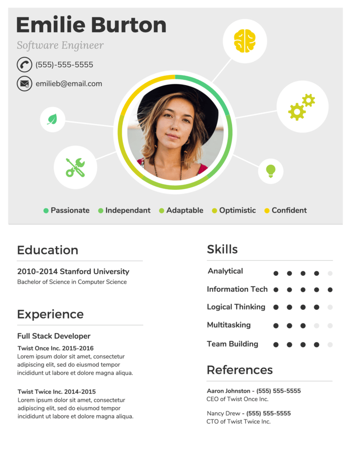
Design a resume header that reflects your skills and experience. For example, this infographic resume template uses a simple mind map with illustrative icons to visualize the job candidate’s experience:
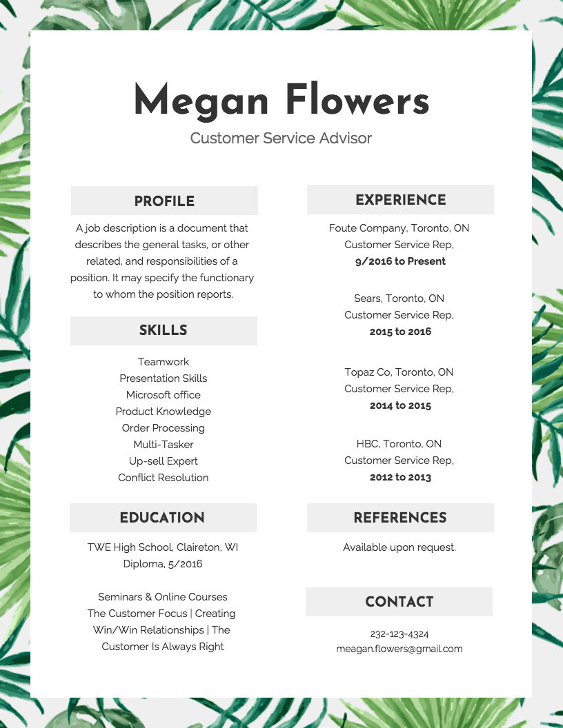
Give your infographic resume a decorative border that reflects your personality or personal brand. For example, the leafy border gives this infographic resume template a calming, friendly feel. Perfect for a customer service advisor:
Infographic resume design best practices:
- Design a header for your resume that reflects your personality or personal brand.
- Embellish your infographic resume by adding company logos, icons, and data visualizations.
- Use bar or line graphs to show profits or growth.
- Use word clouds to visualize relevant keywords like skills or values.
Or check out our roundup of 20+ infographic resume templates.
BONUS: Infographic charts
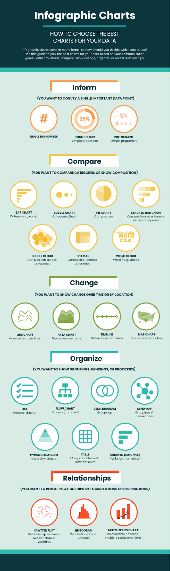
Once you’ve picked a layout for your infographic, the next step will be to figure out how to visualize your data using charts. Depending on your data and the goal of your infographic, you may want to change a pre-existing chart in a template to something better fitting.
At Venngage, we use the ICCOR method to pick the best charts. The types of charts you choose should depend on the goal of your chart.
ICCOR stands for:
- Inform: convey a single important message or data point that doesn’t require much context to understand
- Compare: show similarities or differences among values or parts of a whole
- Show Change: visualize trends over time or space
- Organize: show groups, patterns, rank or order
- Reveal Relationships: show correlations among variables or values
This infographic summarizes how to pick the right chart depending on your goals:
What are infographic types?
Infographic types are basically different ways to visually share information depending on what you’re trying to say. For example, if you’re showing data, a statistical infographic works best. Want to explain steps in a process? A process infographic does the trick. There are also timeline infographics for showing events over time and comparison ones for weighing options side by side.
Picking the right type helps make your message clearer and way more engaging—especially when you’re working with complex info.
This guide will explain what are the types of infographics, and what the best infographic to use is depending on your information.
What type of information is best suited for infographics?
Infographics are a great way to take complex information and make it easier to swallow. Here’s the kind of information infographics are particularly good at explaining:
- Quantitative data: Numbers, percentages and statistics come alive in infographics through charts, graphs and icons. Infographics can easily represent trends, comparisons and relationships between numbers.
- Geographical data: Maps are a natural fit for infographics. They can show things like population distribution, resource allocation or migration patterns.
- Processes: Infographics can break down complex processes into clear steps using visuals and concise text. This can be helpful for instructions, tutorials or workflows.
- Comparisons: Infographics can effectively showcase differences and similarities between things. This can be done through side-by-side comparisons, timelines or contrasting visuals.
- Lists: Simple lists can be enhanced with icons and illustrations in an infographic, making them more engaging and memorable.
But how do you pick the right infographic for your information? Long story short: it depends on the goal of your infographic and the type of information you’re visualizing.
What are the best infographics for marketers?
Marketers use infographics to repurpose their text content into engaging visuals.
For example, marketers can use information infographics to summarize key points from a blog post:
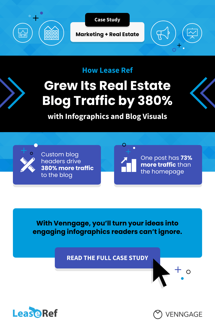
In fact, that’s exactly how Lease Ref used Venngage to increase their blog traffic and online visibility. They used infographics to improve audience engagement, and creative blog headers to drive clicks to their posts—without design experience!
Want to learn how they did it? Check out the Lease Ref Case Study.
Content can also be repurposed into social media infographics, like instagraphics:
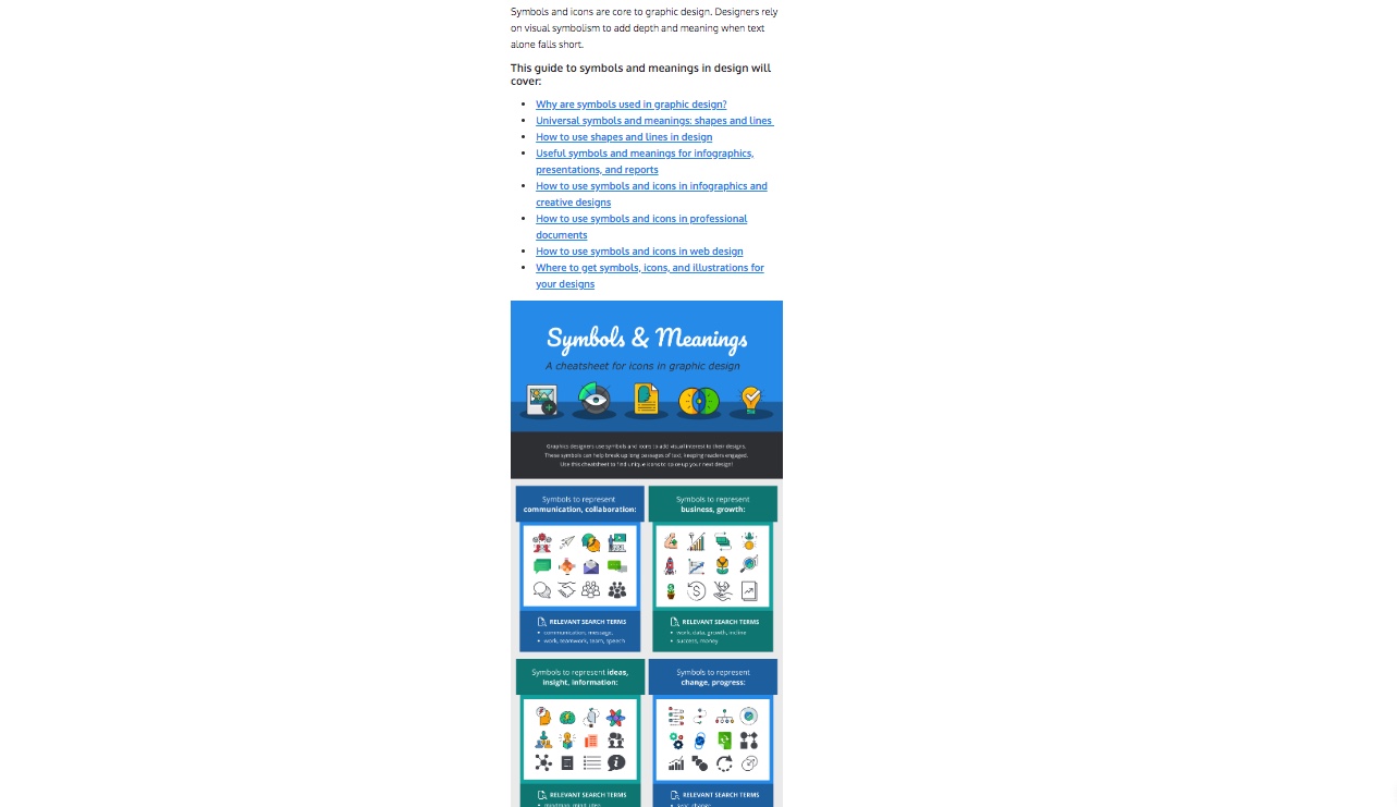
(By the way, you can read this blog post about common symbols and meaning here.)
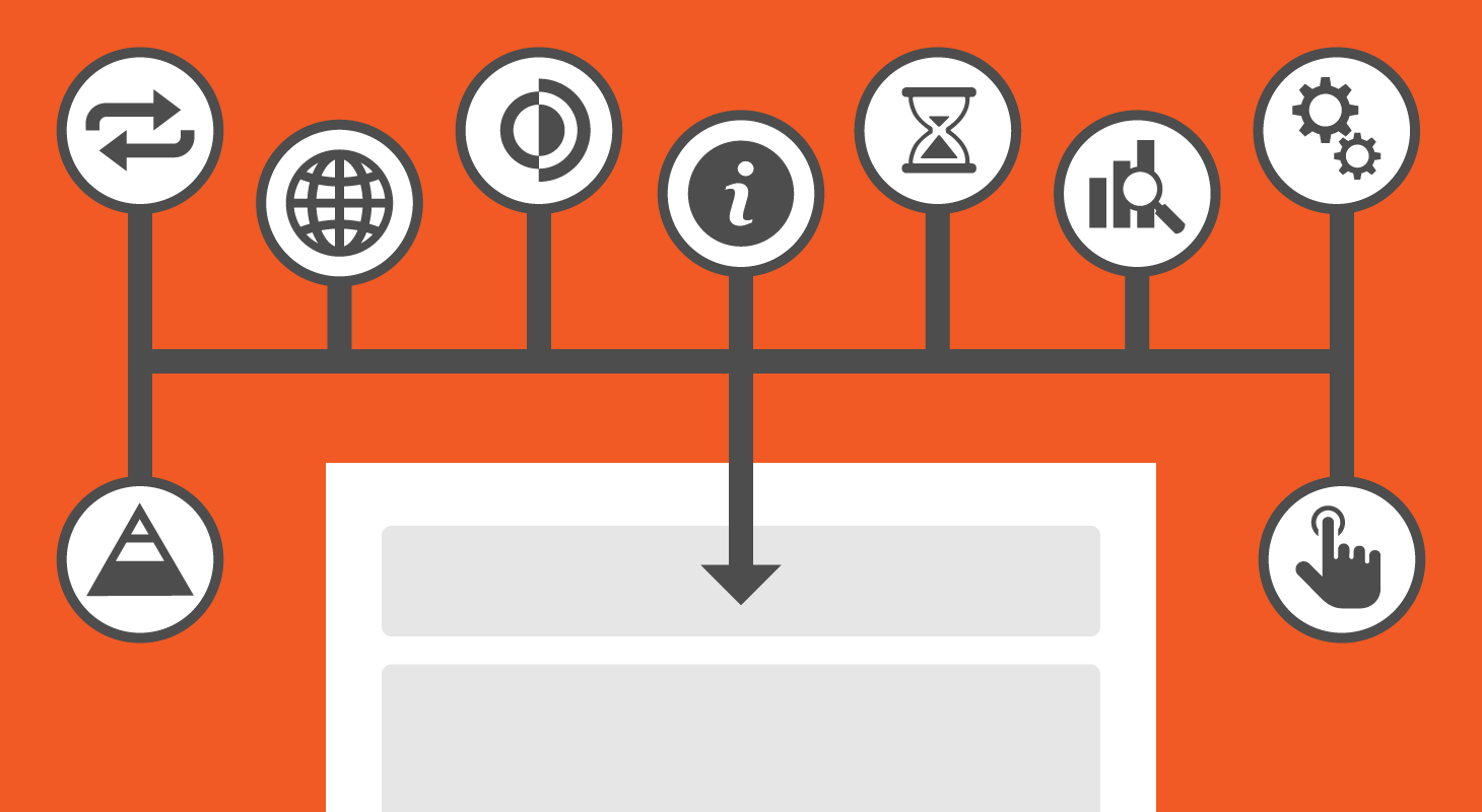
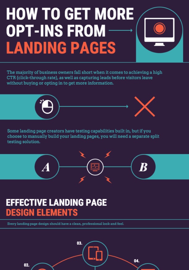
Marketing consultants can also use infographics to explain processes to their clients. For example, this marketing infographic walks readers through how to increase landing page conversions:
What are the best infographics for teachers?
Infographics are the perfect tool for visualizing information in the classroom. They can make boring and technical information fun!
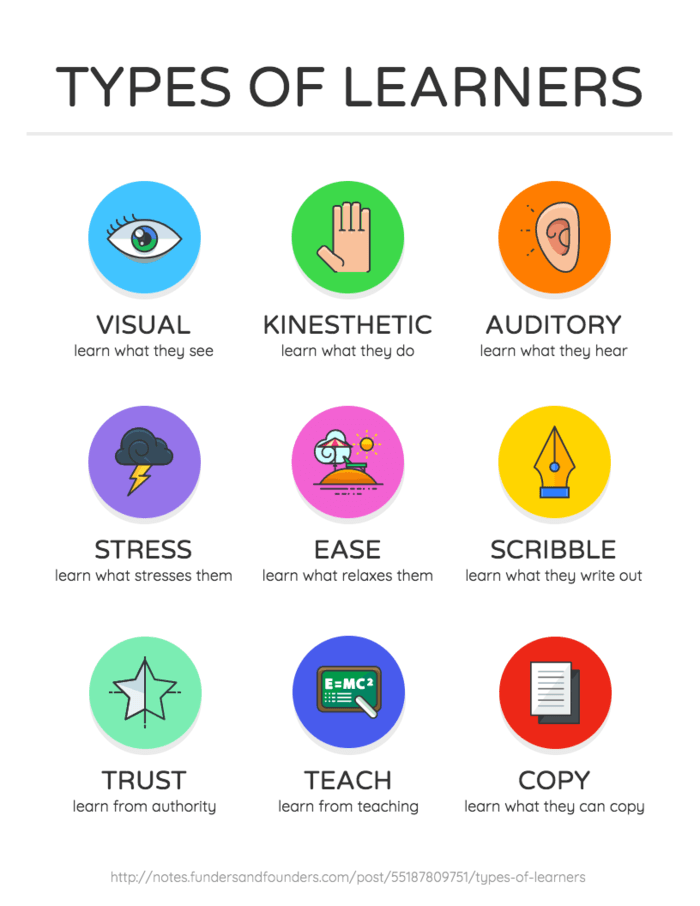
Teachers can create informational infographic posters to hang up around their classrooms:
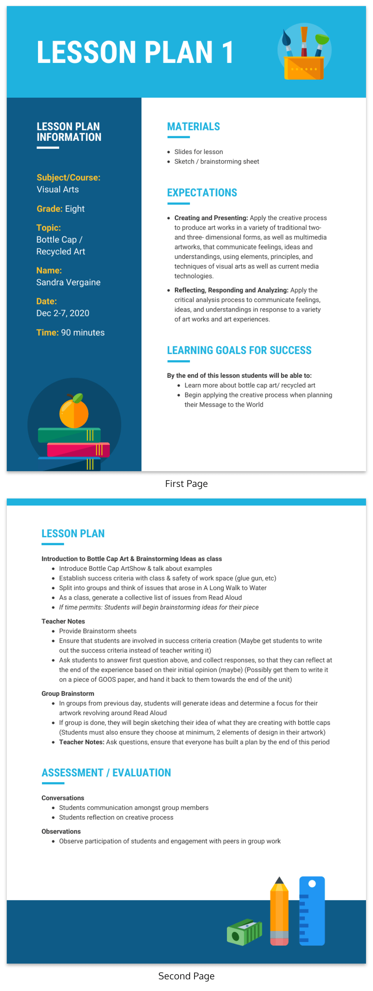
Teachers can also create infographic lesson plans to share with their teachers, or post online:
Many teachers also have their students create infographics. Data visualization is a useful skill that can be applied to many types of careers.
Learn more about how to use infographics in the classroom.
What are the best infographics for human resources?
Human resources specialists need to communicate a lot of dry information to teams…and have them pay attention. HR infographics can make information more digestible and attention-grabbing.
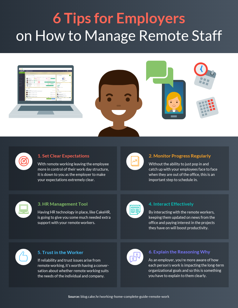
For example, HR teams can use infographics to communicate processes to management:
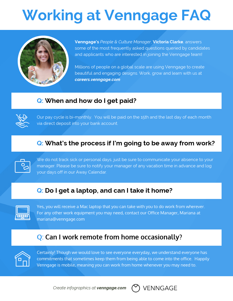
HR team members can also create an infographic company FAQ sheet to share on their site & company social media profiles:
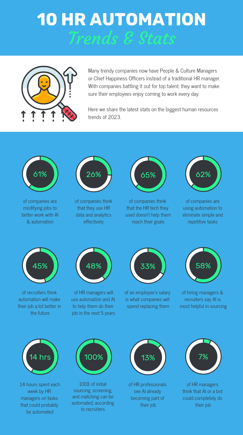
HR specialists looking to grow their thought leadership can also share statistical infographics and list infographics sharing HR trends:
What are the best infographics for real estate agents?
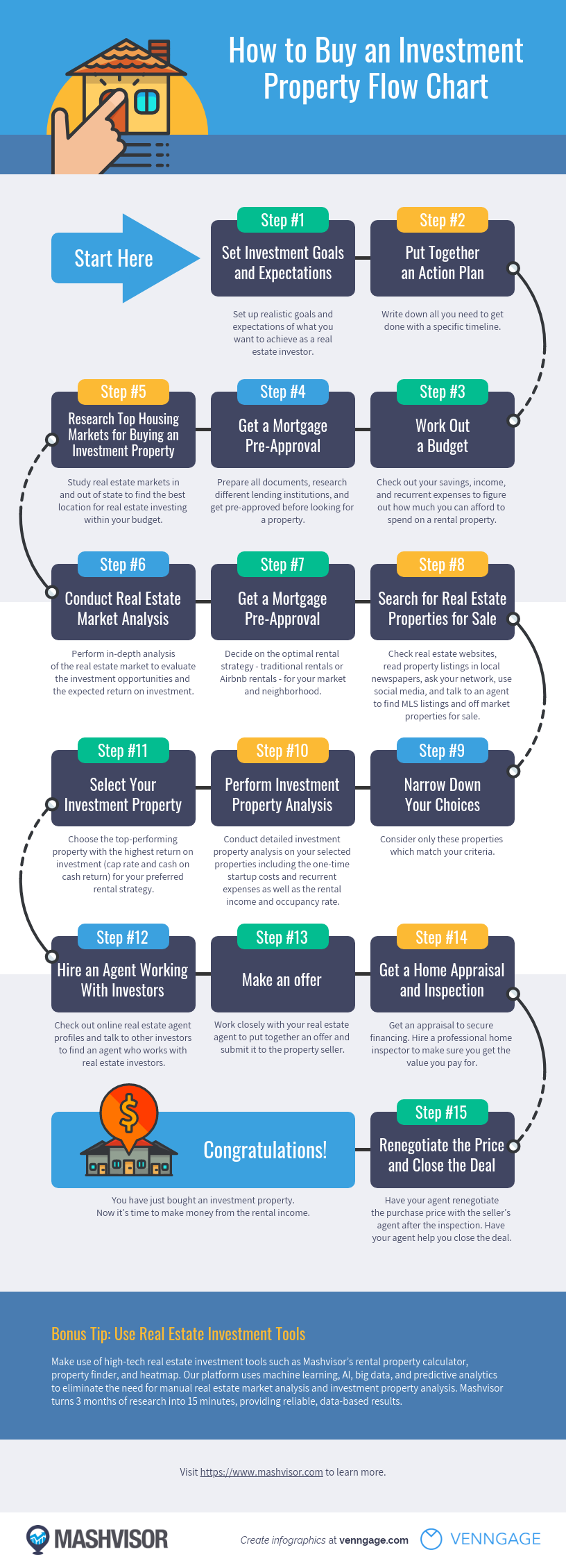
Real estate agents know that a big part of their job is communicating processes to clients. A process infographic can help alleviate some of the stress and mystery around the property-buying process.
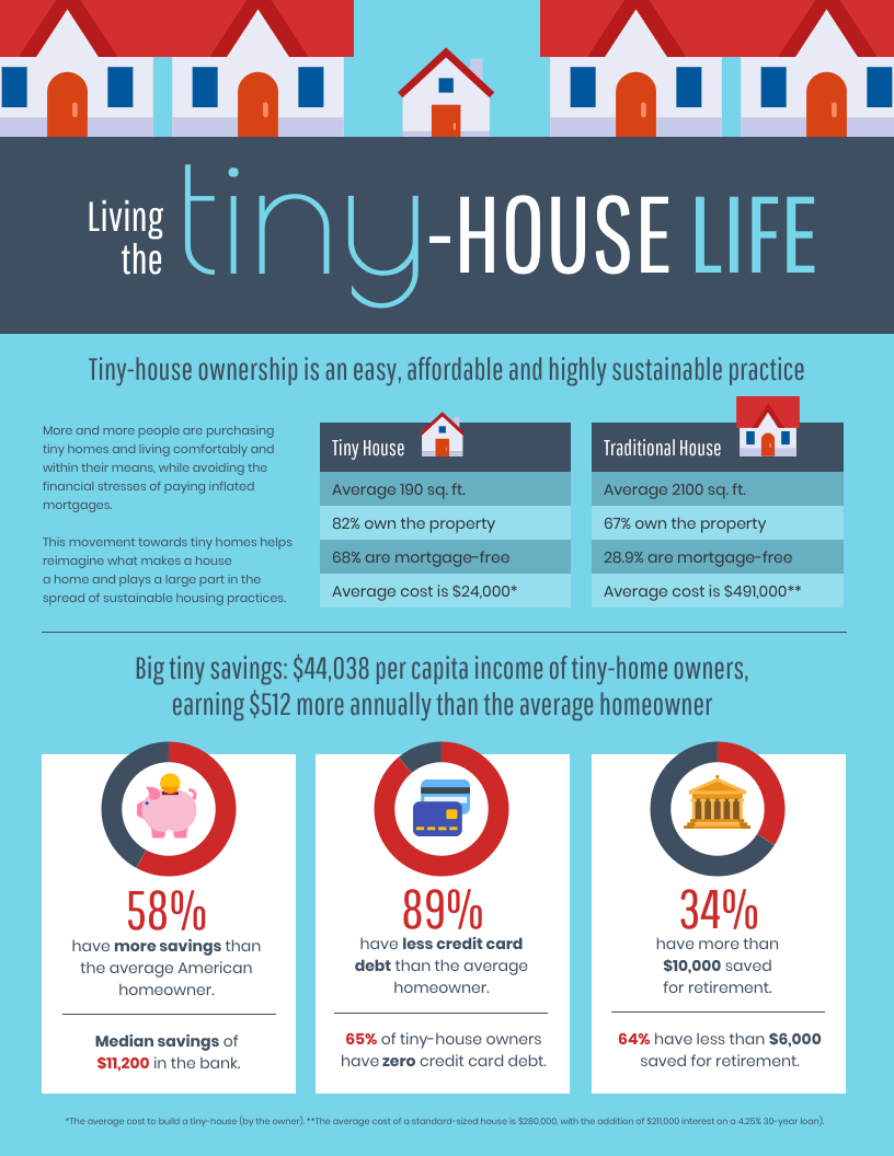
Statistical infographics are also perfect for sharing real estate trends on your social media channels, to grow thought leadership:
For more real estate infographic examples, read the guide here.
What are the best infographics for nonprofits?
Nonprofit infographic templates can be a powerful storytelling tool. A statistics infographic can make numbers more concrete.
An infographic can also make complex problems seem more approachable and solvable. Organizations can share their campaigns in a visual, easy-to-understand format. Marketing collateral like infographics can be instrumental increasing exposure and attracting donors. They also make compelling visuals for your nonprofit website.
With these nine essential types of infographics, you will be equipped to visualize most types of information. In fact, 53% of interactive infographic users saw strong engagement.
Ready to start designing an infographic? This short video will show you how to make an infographic in five steps, or just start now with Venngage’s infographic maker:


