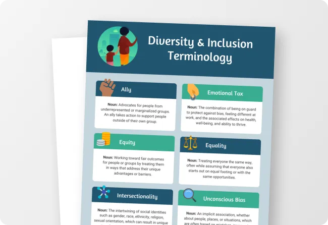
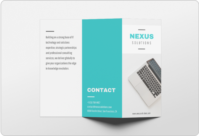
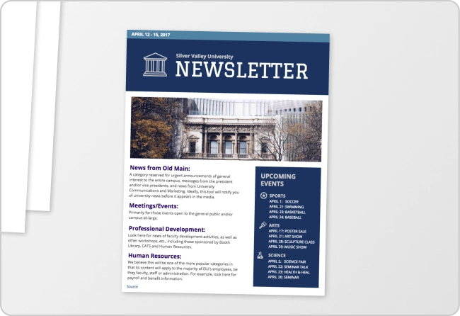
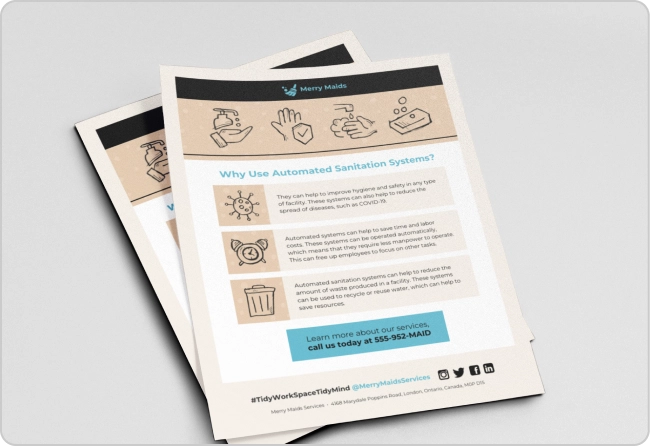
Light and dark. Big and small. Warm and cool.
As a design principle, contrast is all about using opposites to capture your audience’s attention and draw the eye to key parts of your message.
When creating business communications, these benefits are especially handy. After all, getting your audience’s attention is half the battle. The other half? Keeping their attention and conveying your message.
A basic understanding of contrast can help you accomplish both. And I mean basic… you don’t need a degree in graphic design to apply contrast to your communications. In fact, this brief guide is all you need to start captivating your audience with this principle. So let’s get started!
Click to jump ahead:
- What is the design principle contrast?
- Why is contrast effective in graphic design?
- How is contrast applied in graphic design?
- 5 tips to create contrast in your designs
- FAQ on creating contrast in design
What is the design principle contrast?
The design principle contrast refers to the use of visually different elements. In addition to capturing attention, contrast can guide the viewer’s eye to a focal point, highlight important information and add variety, or even drama, to a design. Paired with other principles like proximity, it can really drive a design’s message home.
In theory, applying contrast is simple. All you need to do is use opposite or different elements: color, size, shape, texture, value… you can play with any of these visual elements to achieve contrast.
But in practice, it’s a little trickier. Knowing when to use contrast and which elements to oppose isn’t always obvious. That’s where this guide comes in. I’ll cover the different ways to use contrast in your designs a little later on, so stay tuned.
For now, let’s wet our feet with a few quick examples…
Notice how the following infographic template uses contrasting colors to highlight the comparison between management and leadership skills. This is a simple example of using contrast to make a message clear:
Paired with a wealth of white space (the breathing room around visual elements — also called negative space) and proper alignment, the bold colors in this design contrast and draw the eye right to the heart of the content. At the same time, repetition of the text treatments and shapes ensure the design still feels cohesive.
There are several other instances of contrast in this example, too. Can you spot them? The black text contrasts with the white background, and the bolded headings contrast with the lighter descriptions. Most of us use these types of contrast every day without even thinking about it.
All this to say, you can use contrast in more than one way in a design. Just remember, there’s such a thing as overdoing it with contrast. Like with anything in life (and design!), finding a balance is key. Otherwise, you might overwhelm your readers or dilute your message. Remember, your goal should always be to create a unified design design that gets your message across.
A quick rule of thumb is to use contrast to highlight key takeaways. Here’s a fun example from our viral Game of Thrones article — this template uses bold contrasting colors for the bar graphs, but sticks to a simple design otherwise. This ensures the data stands out:
But don’t be deceived by all these colorful examples. You can create contrast just as effectively with other elements, like size, shape, texture and more.
Take a look at the contrasting shapes in the following template. With a little help from arrows in contrasting colors, the triangles and circles draw the eye throughout the design:
Just so you know, some of our templates are free to use and some require a small monthly fee. Sign up is always free, as is access to Venngage’s online drag-and-drop editor.
Why is contrast effective in graphic design?
Simply put, contrast helps you get the message of your design across. It draws the eye to the most important visual element in a design — making it clear what readers should pay attention to first and foremost.
What’s more, contrast makes for a visually appealing design. After all, if everything was matchy matchy, a design would be monotonous and boring. But sprinkle in some contrast, and you’re much more likely to engage and delight your audience.
Here’s an example of a template that uses contrast in several different ways. For starters, the red icons stand out against the white backgrounds. The size contrast of the circles draws the eye to the big ones first. And the dates alternate between a blue and white background creating a sense of movement:
How is contrast applied in graphic design?
In many ways! As we’ve seen, you can add contrast with color, shapes and size. But there are even more techniques to be aware of…
Let’s take a look at all five ways to apply contrast to your designs:
Contrasting colors
When you think of contrast, you probably think of color. So it should come as no surprise that color is one of the most common ways to use contrast in design. An easy trick is to use two colors that are opposites on the color wheel.
Or, you can choose colors that aren’t necessarily opposites — like blue and purple — but that are bold enough to stand out against each other:
To make your design accessible, there’s a contrast ratio between text and background color you should aim for. Check out blog to learn more: 11 Actionable Graphic Design Tips for Beginners, According to Design Experts
Contrasting shapes
Squares, triangles, circles, diamonds. There are many shapes you can mix and match to create some contrast. You can also consider contrasting geometric shapes with organic shapes that draw inspiration from nature. Organic shapes are irregular and unpredictable, while geometric shapes have precise edges and consistent curves.
Here’s an example of a template that uses contrasting geometric shapes to direct the reader’s eye through the design:
Contrasting sizes
Size is another classic way to create some contrast. By opposing large and small shapes, illustrations, text and more, you can add real drama to your designs. Size also ties in closely with visual hierarchy — generally, the size or scale of elements in a composition demonstrates their relative importance.
Fun fact: the creators of the original Star Wars trilogy were masters at creating drama with contrast:
Contrasting textures
Designs may not have physical texture, but they do have visual texture. That is, texture in design refers to the way a surface is perceived to feel. (And visual senses can be just as acute as physical ones!) There are many different ways to evoke texture in design, like using natural photography, geometric patterns or even simple backgrounds.
To create contrast with texture, simply pair it with a non-textured element, like a smooth surface. Or, combine different textures, like pairing a pattern with photography:
Contrasting values
In design, elements can also have different values (sometimes called tones). Simply put, value refers to how light or dark an element appears. The higher the value, the lighter the design — and vice versa. It follows that you can add contrast by using high and low values within one design.
Here’s an example of a design that uses a progression of values, from low to high:
5 tips to create contrast in your designs
Now that you’re familiar with the different ways to apply contrast, let’s talk tips.
Here are some quick ways to get a handle on contrast (and improve all your visual communications!):
1. Familiarize yourself with the color wheel
Since color is the easiest way to create contrast, it pays to have a peek at the color wheel. After all, unless you’re a designer, you probably haven’t thought about the relationship between primary, secondary and tertiary colors since grade school.
But with a color wheel to reference, these relationships are easy to understand. And you can literally pick colors on opposite sides of the wheel to add contrast. Or, choose adjacent complementary colors.
In this neat example, the designer used a literal color wheel to present data:
2. Pair hard and soft shapes
A quick way to add contrast to your designs is to pair a hard shape, like a square or rectangle, with a soft shape, like a circle or an organic figure. Hard shapes are sharp and crisp while soft shapes are more casual and laid-back, so this combo creates natural contrast.
You can even apply this concept when choosing fonts. Try pairing a hard-edged typeface with a rounded script, like in this example:
3. Keep scale in mind
When it comes to creating contrast with size, you’ll want to keep scale in mind — the relative size of one design element compared to another. As I touched on earlier, the scale of different elements creates a visual hierarchy, which is key for conveying your information in order of its importance.
For example, if you’re making an infographic, it can be helpful to assign a level of importance to the different pieces of information you’re going to be visualizing. Then, you can make sure to scale these elements accordingly.
You can see this concept in action in the template below. The biggest circle highlights the main topic, the second largest circles highlight key data points and the smallest circles provide more context:
4. Combine clean and gritty textures
Just like soft and hard shapes, combining clean and gritty textures creates an interesting contrast. A clean texture may simply be a flat, colored background, while a gritty texture may be a distressed or raised pattern.
Either way, combining these types of textures can add visual interest to an otherwise flat design. Distressed textures can also add rustic or retro charm to a design. If your creation is looking a little too classic or plain, adding a gritty texture is a good way to give it more character.
Here’s an example of a business card that contrasts a gritty cardboard background with clean-textured icons and text. (If the background was just a matte color, this card would be a lot less interesting visually!)
5. Play with value progressions
You might think contrast is, by nature, extreme. But it’s possible to be subtle when wielding contrast, too. Playing with value progressions is a great way to add contrast without making things look too stark.
By value progressions, I simply mean adjusting the hue of different colors from light to dark. For instance, the following infographic uses a gradient from a darker pink-red color to a lighter yellow color to reinforce its message:
FAQ on creating contrast in design
What are examples of contrast in design?
Contrast in graphic design can take many forms. It can be as simple as using light and dark colors and big and small sizes. Or, it can be more complex and involve using different shapes, textures and values. Contrast is often used to create visual interest, highlight important information and catch the reader’s attention.
What is the difference between contrast and juxtaposition?
The contrast design principle refers to the use of opposites or different elements to create an arresting effect, while juxtaposition is more specific and refers to placing contrasting elements side by side.
When is contrast most effective in design?
Of the design principles, contrast is one of the most effective techniques for drawing attention to important elements or a key message. Of course, it also makes designs more visually appealing.
What does too much contrast look like?
An excess of contrast creates tension and confusion in a composition. The design may come across as messy or too busy. To avoid this type of design, stick to applying contrast to place emphasis on the core message you’re trying to convey.
Create visual interest and captivate your audience with contrast
Would a vacation be as sweet if you didn’t work the rest of the time?
Perhaps, but my guess is the contrast makes it sweeter.
Just like life, contrast enriches designs. It adds beauty, interest, and most of all, meaning. So if you’re in the business of creating visual communications, contrast deserves a prominent place in your toolbox.
I’d be remiss if I didn’t mention Venngage deserves a spot in it too. Between our collection of stunning templates and user-friendly visual editor, you can get a head start on any design — and wield contrast with confidence.


