


In any type of visual communication, making sure your audience understands the information at hand is the single most important task. Of course, it doesn’t hurt for your design to be really nice-looking as well.
Visual hierarchy helps on both these fronts.
This design principle helps readers understand what’s important at a glance, which is why it’s key for anyone creating business communications like infographics, reports, presentations and more.
So without further ado, let’s explore the principles behind visual hierarchy and how you can apply them in your next project. (No design degree necessary!)
Click to jump ahead:
- What is visual hierarchy?
- What is an example of visual hierarchy?
- What is good visual hierarchy?
- What four things affect visual hierarchy?
- What are six principles of visual hierarchy?
- How can you apply visual hierarchy principles to business communication?
- How can you create a visual hierarchy?
What is visual hierarchy?
Visual hierarchy is a broad principle designers use to organize elements in their work and show order of importance or create visual flow.
Examples of visual hierarchy are all around us. Movie posters, newspapers, websites, even your phone’s lock screen — all of these use visual hierarchy to communicate the relative importance of information.

As a reader, your eye is naturally drawn to the element that stands out most in any given visual. That’s often the largest thing, but not always.
Designers use visual hierarchy (often paired with emphasis) to provide subtle guidance to the reader about the order in which information should be consumed. They also use this principle to show how different pieces of information relate to one another.
Visual hierarchy as a concept has its roots in the Gestalt philosophy that emerged in Germany during the early part of the 20th century. The primary premise of this school of thought is humans perceive patterns or entire compositions, rather than just their individual components.
What is an example of visual hierarchy?
There is no single way to apply visual hierarchy — it very much depends on the piece of visual content you’re working on. Earlier, I mentioned movie posters, and they’re an excellent way to understand how visual hierarchy can work on multiple levels, like in this classic example:
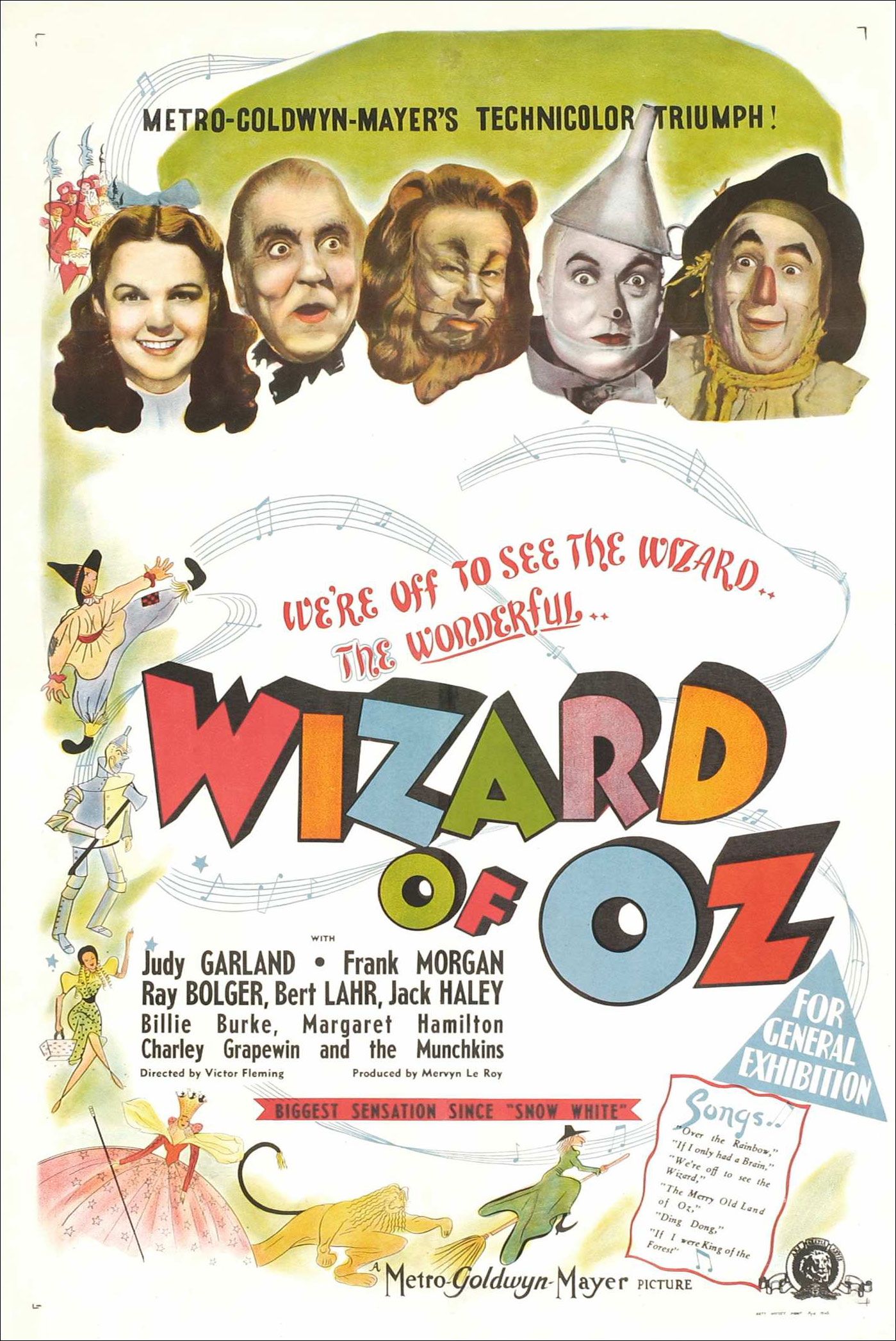
While some people might begin to read this poster at the very top, most people won’t. That’s because the largest element on the page is the title of the film. In addition to size, use of color and movement help draw the eye down the page.
But that’s not the only example of how the designer took visual hierarchy into account when creating this poster. They also used typographic hierarchy to layer information based on how important it is. And there are even sub-layers within that.
Take a look at the block of text listing the names of people in the film. The main stars — portraying, of course, Dorothy, the Wizard, the Scarecrow, the Cowardly Lion and the Tin Man — are listed with the biggest text, while other performers’ names are smaller.
In the entertainment industry, this is known as having top billing, but in design, it’s simply smart visual hierarchy. Speaking of which…
What is good visual hierarchy?
Visual hierarchy is so fundamental to design that it can be easier to understand the reverse: bad visual hierarchy. In other words, good visual hierarchy, like many other design principles, only stands out when applied incorrectly.
If you’ve ever attempted to park your car in a downtown area, you’ve probably encountered examples of bad visual hierarchy in the form of parking signs.

The signs themselves are, of course, meant to be functional. That means design isn’t a big consideration. But because these signs are often installed one on top of the other on poles, it can be quite difficult to decipher them.
And while they all use some of the basic principles of visual hierarchy, because they’re placed in such close proximity to each other, they compete for attention. Worse, they seem to contradict each other. The result? I truly have no idea when it’s okay to park my car.
What four things affect visual hierarchy?
I’ll address basic visual hierarchy principles in a sec. But first, it’s important to understand how the human brain processes information.
When all your designs flow from a deeper understanding of human visual processing, it’ll be easier to know when and how to apply hierarchy principles. This is key because every design is different, and not every principle of visual hierarchy applies in every case.

The basic point of visual hierarchy is to use the mind’s natural processes to make information easy to understand. Our brains, though quite advanced, use the same techniques to understand daily visual inputs, and these techniques are pretty basic.
Specifically, our brains use four properties — size, color, alignment and character — to process, distinguish and understand information. So when creating a design, you can control how the eye moves across your work by manipulating these elements.
Make sense? Now for some principles!
What are the six principles of visual hierarchy?
Here are the six major principles of visual hierarchy you can apply to your work (whether you’re a design savvy or can’t draw to save your life!):
Size
While bigger might not be better, the human mind does process bigger elements as more important. We’ll read bigger text first and look at bigger images or illustrations before smaller ones.
Remember: everything in your design is competing with everything else for attention. That means it’s your job to guide the reader by making sure the way elements are sized and scaled relative to each other reflects their importance.
Color
Bright colors tend to stand out, particularly if the colors around them are subdued. That means the eye will naturally be drawn to a color that looks different from the others, even if the difference isn’t extreme.
Reading patterns
In the West, we read from top to bottom and left to right. While there are examples of good visual hierarchy that diverge from this pattern, there’s usually no reason to fight human nature. Conversely, if your culture reads from right to left, make sure the visual hierarchy of your design reflects that.
Alignment
Elements aligned vertically or horizontally read as related (unless they differ in things like size, color or style). Elements placed in close proximity will also appear related.
Spacing
Adding space around elements, referred to as negative space or white space, can further emphasize them or strengthen their visual connection.
Patterns and shape
Complex patterns will generally attract more attention than simple ones, and the same goes for shapes. A square, for example, is likely to draw less visual attention than a more freeform shape or even a square with rounded corners.
How can you apply visual hierarchy principles to business communication?
Effective visual hierarchy doesn’t have to be complex. In fact, there are many simple ways you can apply the principles of visual hierarchy to your business communications to ensure your audience has a good experience. Even a seemingly boring report is a perfect candidate for great visual hierarchy.
Take this one, for example:

This consulting analysis report has a lot of great things going for it in terms of visual hierarchy.
Starting with the cover page, we see a striking image that runs the height of the page juxtaposed with a large heading that’s placed in a dark-colored box. The designers uses color to create contrast, and typographic hierarchy to convey the relative importance of information. And these principles carry throughout the other pages as well.
Of course, not every piece you create for your business will be a traditional report-type asset.
Infographics are increasingly popular for brands, both internally and externally. Fortunately, infographics offer a few visual hierarchy benefits. The biggest benefit? The eye naturally flows down the page, which reflects the typical presentation of an infographic, like this one:

But that also means it’s even more important to use balance, color, repetition (paired with a little variety), contrast, size, spacing and alignment, as this example does, to ensure the reader understands the relative importance of the information — not to mention achieve unity in your designs!
For an infographic, try using just three to four type sizes ranging from the biggest (for the title or main heading) to the smallest (for notes or captions).
If you need to further emphasize text, use bolding, italics and underlining or vary colors. This will help you establish another layer of typographic hierarchy, like in this white paper:

I said it once, but I’ll say it again: visual hierarchy doesn’t need to be complex. You don’t have to go overboard with making text or images huge in order to establish hierarchy. Take the white paper template above, for example. It uses contrasting colors and loads of whitespace to create a striking, stylish cover.
Other visual hierarchy techniques used in this example include alignment, spacing and typographic hierarchy.
Now, presentations do pose a bit of a hierarchy challenge because they’re consumed slide by slide. That means the visual hierarchy you create needs to work for each individual slide, while maintaining a cohesive look throughout.

That’s not to say the text on every slide has to be the same size. In fact, it’s best to consider the takeaways you want your audience to have as you create your visual hierarchy. Just because an element is the most important thing on one slide doesn’t mean it captures the point of the presentation.
For more specific graphic design tips on applying visual hierarchy with text or visual content, check out our blog: 11 Actionable Graphic Design Tips for Beginners, According to Design Experts
How can you create a visual hierarchy?
As you’ve seen, there are dozens of ways to go about helping your readers understand how information is related and what’s most important.
But here are a few quick tips and tricks to help you create strong, clear visual hierarchy in your business communications:
1. Get your arms around the information
Before you start a design, make sure you have a strong handle on the text and visuals that will populate it. Late additions can create chaos in your design and obscure hierarchy, as you shift everything around to accommodate new text or visuals.
2. Make an outline
Put yourself in the mind of a school student. Think of your work as a lecture or class lesson and jot down a quick outline, including numbered sections and subsections. Not only will this help you get a grasp on the content, but you’ll understand how certain elements may be related (or not). You can make a note of this to apply to your design.
3. Work backward
Once your content is locked down and you’re ready to start designing, it can be helpful to work backward. That is, start with the smallest piece of content you have until you reach the largest one. Don’t do this with every word on the page, but take a few elements — main title, section header, subheading and body text, for example — and play around with size, scale, color and more to find the best way to make your information clear.
4. Use the squint test
When looking at your composition, squint or un-focus your eyes so that it looks blurry. In this blurred state, note which areas or individual elements of the design stand out the most. Adjust scale, color or alignment if certain areas are jumping out more than they should.
Creating a strong, clear visual hierarchy can bring order and simplicity to your business communications
To apply visual hierarchy to your designs, you first need to understand why people process information in the way they do.
Once you have a firm grasp on these concepts, you’ll be able to create content with a strong visual hierarchy — and your audience will be able to get the most out of it.
What’s more, adding visual hierarchy to your business communications shows your audience you’re on their side in a subtle way. By making an effort to create clear communications, you’ll engage, delight, and most importantly, inform.
But you don’t have to do it all from scratch. With Venngage’s vast library of professionally-designed templates, you can get a head start on your designs and create clear communications with ease.


