Though the principles of Gestalt have guided modern design for decades, there’s one Gestalt principle that’s notoriously difficult to pin down: the law of Pragnanz.
Yet understanding how Pragnanz applies to design is essential for creating clear, engaging visuals, including business communications. As you’ll see in a moment, this principle is truly foundational to good design. But rest assured, you don’t need to be a designer to understand it.
Let’s explore the law of Pragnanz, where it originated and how you can apply it when creating business communications to enhance information retention and audience engagement.
Click to jump ahead:
- What is the law of Pragnanz?
- What is Gestalt design?
- Is Pragnanz a Gestalt principle?
- How do you apply the law of Pragnanz to business communications?
- Law of Pragnanz FAQ
What is the law of Pragnanz?
German psychologist, Max Wertheimer, introduced the concept of Pragnanz in a 1923 paper discussing Gestalt theory. Along with Kurt Koffka and Wolfgang Kohler, Wertheimer was one of the three founders of this school of psychology dealing with human perception.
Gestalt theory underlies many modern design principles because of its ability to explain why human beings perceive and process visual information in the way they do. Over the past nearly 100 years, many people have attempted to describe the law of Pragnanz, but specific definitions remain elusive.
Over time, Pragnanz has generally been understood as the law of simplicity, reflecting the fact that the human mind prefers order to chaos. While this isn’t wrong, more recent scholarship on Wertheimer’s work suggests that rather than being a specific technique, Wertheimer was using the term to describe humans’ ability to recognize good Gestalt at all.
With that in mind, it makes sense that Pragnanz would literally translate to “short description” or “pithiness,” as it may more accurately describe the way humans process information — which tends to be quickly and succinctly. That’s why many designers use Gestalt theory to guide their work.
What is Gestalt design?
Gestalt principles emerged in Europe in the early 20th century as psychologists in Austria and Germany wanted a better way to understand human perception and behavior.
Gestalt emerged as a result of the understanding that humans process information as one whole rather than each individual element. The phrase “the whole is greater than the sum of its parts” was derived from Gestalt study.
Given that the movement sought to understand the human mind and how it processes information, it’s no wonder those principles quickly shifted to design, including graphic design. No literal translation exists from German, but the word Gestalt is most closely related to words like “form,” “pattern” and “shape.”
Gestalt design derives from the theory that humans will naturally seek to simplify and organize what they see. So designers who use Gestalt practices strive to ensure their work helps the viewer understand and retain the information contained.
Is Pragnanz a Gestalt principle?
Pragnanz is typically listed as one of the main principles of Gestalt despite its unique characteristics (which we’ve explored already). It’s often called the law of good Gestalt. Here’s a look at the 10 Gestalt principles in visual design:
- Reification: how the mind perceives more visual information than what it literally sees.
- Multistability: how the mind tends to shift between perceptual experiences given ambiguous inputs.
- Invariance: how the mind recognizes certain objects independent of other factors, like rotation, scale or distortion.
- Pragnanz: how the human mind prefers experiences that are simple and orderly and will simplify complexity.
- Proximity: how the mind perceives objects near each other as a related group rather than independent individuals.
- Closure: how the mind perceives an incomplete object as a complete one.
- Similarity: how the mind perceives objects as related if they share characteristics, like shape, color or pattern.
- Continuity: how the mind will follow a path that’s literal or implied by the objects it sees.
- Symmetry: how the mind perceives symmetrical elements as connected, even if they aren’t.
- Past experience: how the mind will make assumptions based on past experiences.
The law of Pragnanz says humans prefer experience and stimuli that are simple and orderly. What’s more, when we’re faced with complexity, our brains will naturally simplify what we perceive. This means that to bring order to chaos, we’ll do things like look for shapes in passing clouds.
But it also means that we’ll infer meaning and create connections in the objects we see. The image of the famous Olympic rings is a good example of this. Taken literally, they are simply a jumble of semi-circles and incomplete shapes, but our brains naturally perceive them as interlocking rings, representing the spirit of friendly competition.
How do you apply the law of Pragnanz to business communications?
When it comes to applying the law of Pragnanz to business communications, the easiest (though not necessarily correct) way would be to oversimplify everything you do.
But, of course, that would create too many limitations on the amount and types of information you could include in your reports, infographics, presentations and more.
So instead, here are some actionable tips for applying the law of Pragnanz to your business communications:
Create a clear visual hierarchy
Using variations of size, color, alignment, shape, patterns and spacing, make sure that the eye is naturally drawn to the most important element on every page or frame of your work. You’ll also want to ensure you’ve arranged elements in a way that makes the order in which information should be consumed clear.
Take this infographic, for example. With almost 50 individual pieces of information and a vibrant color palette, it’s easy to imagine this infographic could be unfriendly to the reader. But by making sure the title is the biggest element on the page and working out from there, the designer creates a clear visual hierarchy and achieves balance and simplicity, per the law of Pragnanz.
Choose colors carefully
In the world of visual business communication, your color choices may be made for you, as you’ll likely be limited to using approved brand colors. But when you’re able to select your own colors, consider the following to ensure you’re applying good Gestalt:
- Contrasting colors tend to draw attention
- Analogous colors tend to create groups
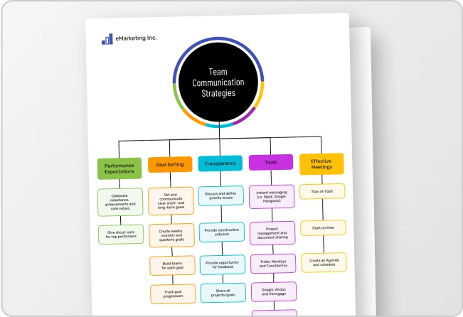
Here’s an example of an infographic design that uses contrasting colors to illustrate and emphasize each tip, while subtle analogous colors create sections throughout the composition:
Don’t fight human nature
In the West, we read from left to right and top to bottom. While there may be situations in which you can break that format (the color wheel infographic we looked at earlier did this well!), it’s typically best to put the most important information at the top of the page, slide or frame.
EConsider this monthly expense report. From the title to the flow of information, the most important elements feature large type and contrasting colors to make sure they stand out.
This is especially important when using the law of Pragnanz to create business communications that rely on data. Too many numbers can easily overwhelm your audience, so making things simple is crucial.
Bring balance
Symmetry is one of the 10 main Gestalt principles, but that doesn’t mean everything has to be the same size or in perfect counterbalance. The law of Pragnanz holds that people prefer simplicity and order — not that they want to be bored! So, applying subtle changes to imply movement can also satisfy the need for good Gestalt.
This simple infographic, for example, achieves balance not by making everything look identical, but by using an alternating technique in which the eye moves from side to side. The result is a composition that’s naturally pleasing and visually engaging.
Law of Pragnanz FAQ
Who made the law of Pragnanz?
German psychologist Max Wertheimer was the first to introduce the concept of Pragnanz in a landmark 1923 paper discussing Gestalt theory. Pragnanz most closely translates to “short description” or “pithiness.” It’s best understood as a characteristic of the way human brains perceive information, preferring order to chaos.
In modern Gestalt theory, Pragnanz is also called the law of good Gestalt. And in Wertheimer’s writing, he intended Pragnanz to be a term describing the human brain’s ability to recognize good Gestalt.
If your business communications are simple and clear, chances are they’re following the law of Pragnanz
Whether you’re creating infographics for internal or external audiences, building presentations and slide decks for a sales team or assembling an annual report, Gestalt theories — like the law of Pragnanz — are right at home in any type of business communication.
As their sole focus is understanding and catering to human perceptions, Pragnanz and other Gestalt principles will help you make the most of your business communications, and ensure your audience understands and appreciates what you have to say.
Venngage’s professionally-designed templates can you help you there, too. (And as an information design expert, I can confirm: they’re Gestalt approved!)


