


Ever designed a document that didn’t look quite as polished as you hoped?
I’ve been there. But the more tweaks I made, the more “off” my design looked.
So I asked the pros for some easy graphic design tips to solve my woes. By “pros”, I’m referring to the designers here at Venngage!
Read on for their top tips to make any design professional and thoughtful — whether you’re a beginner like me or have some design savvy.
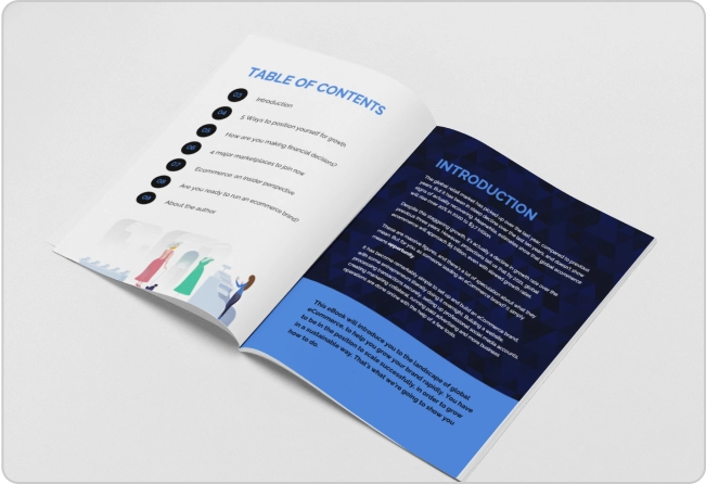
Click to jump ahead:
- 11 graphic design tips for beginners [infographic]
- Typography
- Color
- Imagery and icons
- Alignment and white space
- Graphic design checklist for beginners
11 graphic design tips for beginners [infographic]
So, how can you take a template from underwhelming to over-the-top impressive? Here’s an infographic featuring 11 actionable graphic design tips…

Typography
Back when I first learned how to make an infographic, whenever I summarized a document like this…
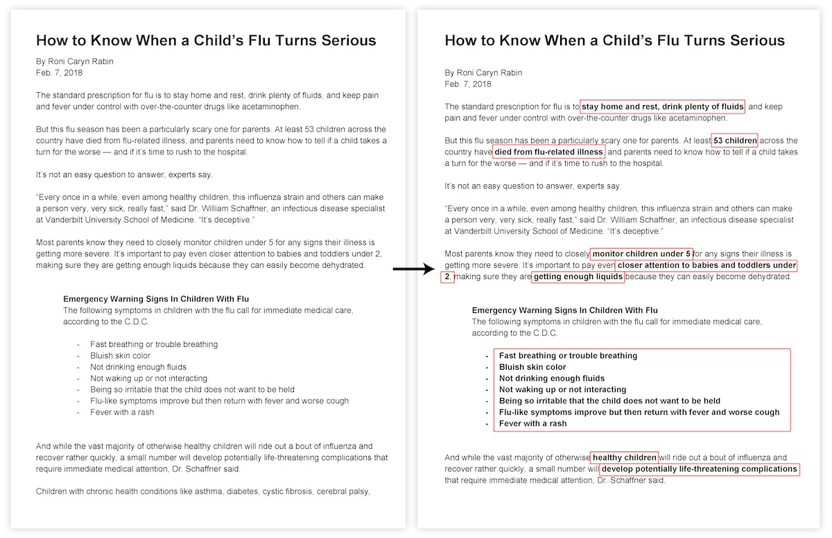
…I always ended up keeping too much text on my infographic. The end result? Well, there wasn’t much difference between my infographic and the original text.
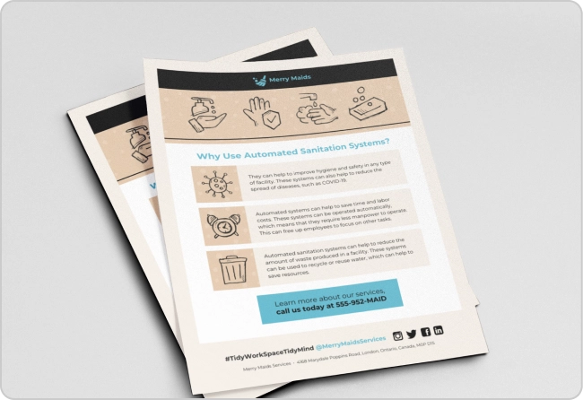
I wanted to know how to make my infographic look like this one:

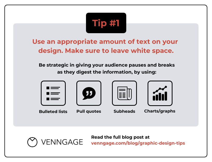
So, I came to our trusted designers for advice. One of their tips was to provide the audience with pauses and breaks as they digest the information. How? By using:
- Bulleted lists
- Pull quotes
- Subheads
- Charts/graphs
Another piece of advice was to add white space to a design. But how much white space should you add? This depends on the format of your project, how you’re presenting it and how long your audience should interact with it.

For example, a report or white paper is informative in nature, so you can include more copy to give your audience the right amount of context.
Of course, you should still break up the text using the technique above. Which brings us to our first tip of the day…
Graphic design tip #1: Use an appropriate amount of text on your design. Make sure to leave white space.
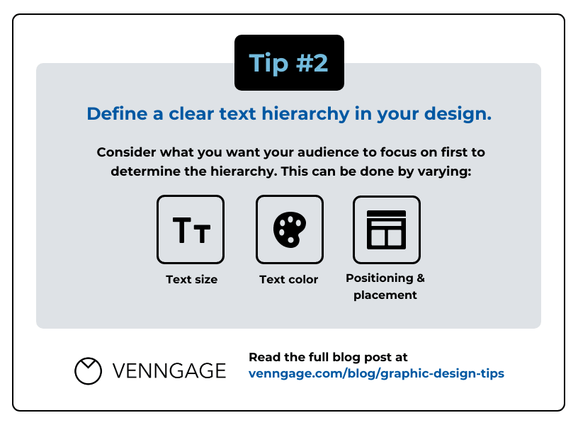
Besides having too much text in a design, another design mistake is not using text hierarchy — or using it incorrectly.
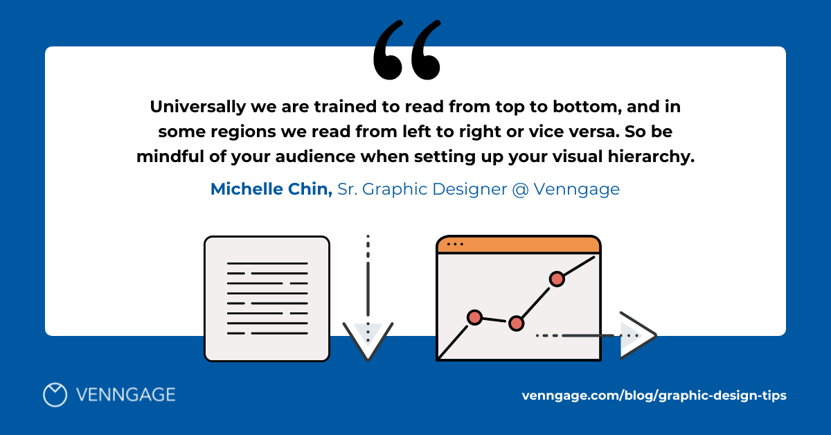
So what is text hierarchy? Simply put, it shows the reader which information to focus on. You can do this by varying your font faces, font sizes, font colors etc. You should also position your text strategically:
Most often, you can see a clear hierarchy in title vs. body text. Title/heading text is often large, bolded and may be a different typeface from body text. Here’s an example of clear text hierarchy:
In sum, our second tip is…
Graphic design tip #2: Define a clear text hierarchy in your design.
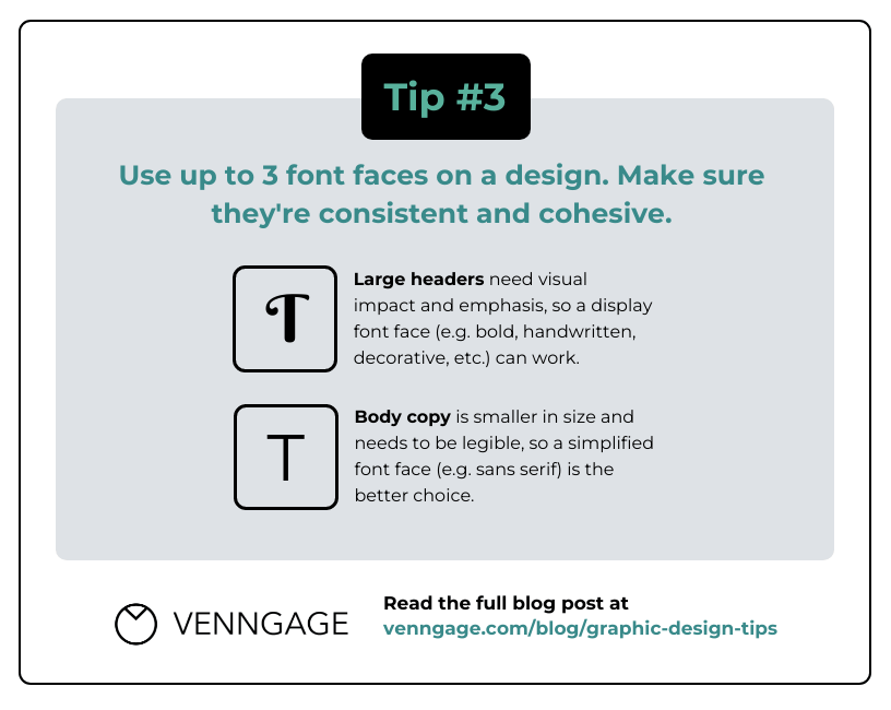
The number of fonts you use can also affect text hierarchy. Remember, less is more. Graphic designers suggest using two to three fonts max in a design:
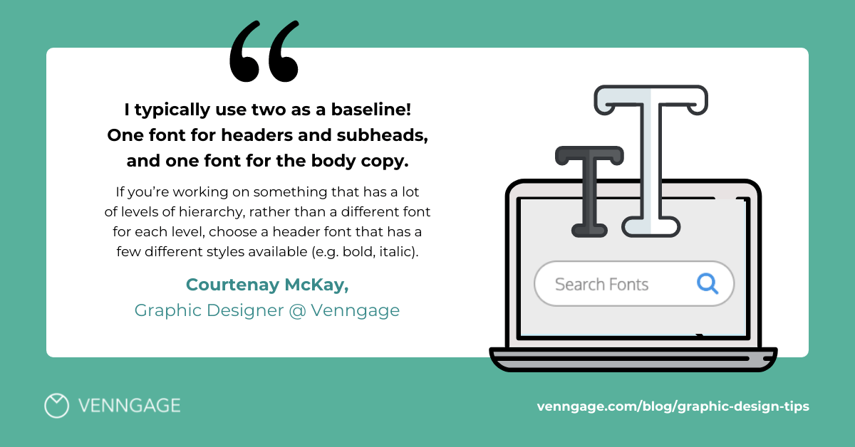
Plus, you should make sure to apply fonts in a consistent and cohesive way.
For example, you can use a “display type” font face (i.e. bold, handwritten, decorative, etc.) to emphasize your large headers. For body text, the aim is legibility. Since there’s more body text and it’s often smaller in size, you should use a simple typeface (i.e. sans serif) instead.
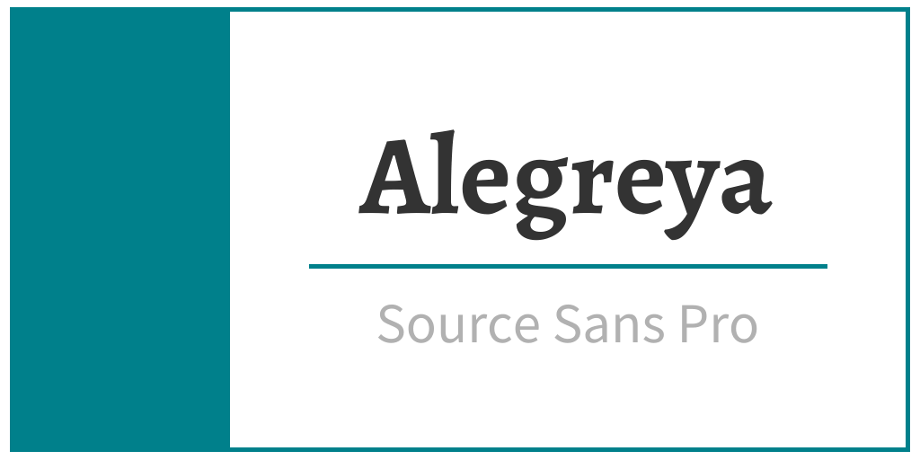
Here’s an example that pairs two different typefaces to serve distinct purposes — the heading is decorative while the body text is simple and easy to read.
Overall, too many typefaces can get messy and overwhelming. Viewers need visual consistency to understand a design, and the number of fonts you choose will impact that. So our third tip is…
Graphic design tip #3: Use up to 3 font faces on a design. Make sure they’re consistent and cohesive.
If you’re not sure how to pair fonts, here are some resources to help:
- Everything You Need to Know About Picking Brand Fonts
- 20+ Best Google Font Pairs for 2021 [FREE DOWNLOAD]
- 40+ Best Free Fonts for 2021 [Free Download]
- Choosing the Right Infographic Fonts for Business Communications
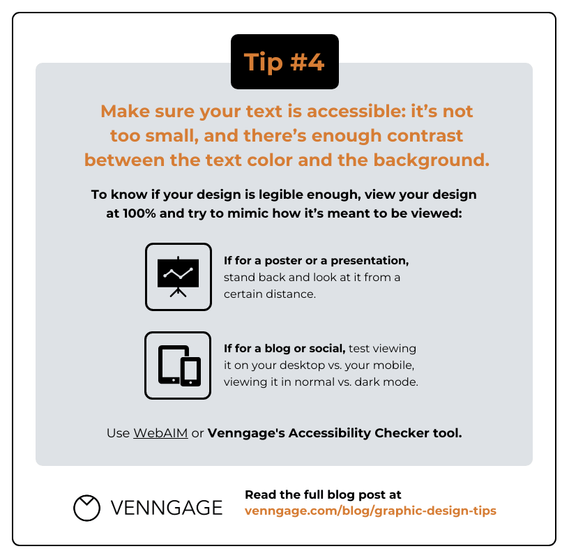
Finally, you should always keep accessible design in mind. Your text won’t pass as accessible if:
- It’s too small
- There isn’t enough contrast between the text color and the background
Here’s a simple example:

As you can see, there isn’t enough contrast between the text and the background. That means, if you were looking at this design from a distance, you probably wouldn’t be able to read it. And it would be especially challenging to read for someone with a visual impairment, like color blindness.
A simple way to check if your design is legible? Set the view on your design to 100% and try to mimic how it would be seen in the wild:
- If it’s a poster, stand back and look at it from a distance.
- If it’s an image for a blog or social media, view it on your desktop vs. your mobile device, and test it in normal vs. dark mode.
Let’s look at another example. What do you think about the text vs. background contrast on this image?

This seems legible at first glance, but I’m not 100% sure there’s enough contrast.
So, if you need a way to guarantee your design has the right contrast…
Use an accessibility checker — coupled with accessibility guidelines.
According to WebAIM, WCAG (Web Content Accessibility Guidelines) 2.0 level AA requires a contrast ratio of at least 4.5:1 for normal text and 3:1 for large text.
You’ll soon be able to check your ratios right in the Venngage editor using our new accessibility tool! In the meantime, you can use WebAIM’s checker. I used this tool to check the contrast between the title text and the background in the template above. This was the result:
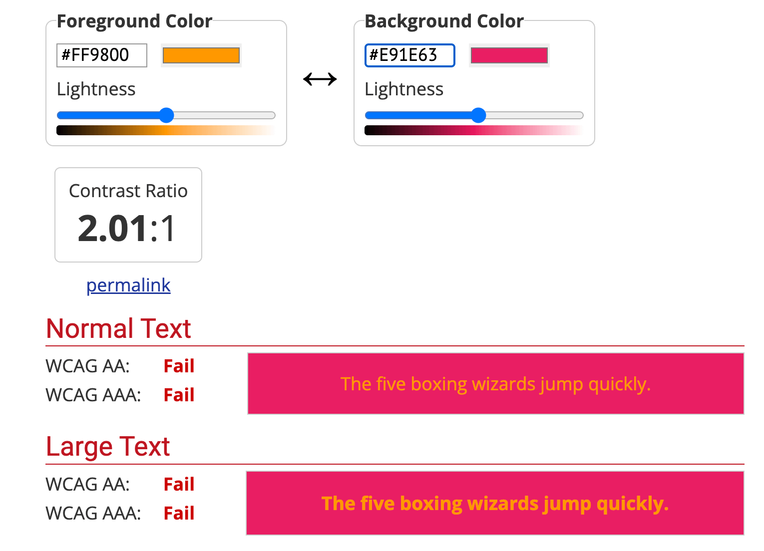
As you can see, the contrast ratio here is 2.01:1 — failing the requirement of 3:1 for large text. So, even though it seemed like this design had enough contrast, for someone with a visual impairment, it would likely be hard to read. In other words, it pays to double check your text. Cue tip number four…
Graphic design tip #4: Make sure your text is accessible: it’s not too small, and there’s enough contrast between the text color and the background.
Color
Let’s kick things off with a simple tip for color…
Graphic design tip #5: Use the right amount of colors to create a harmonious design.
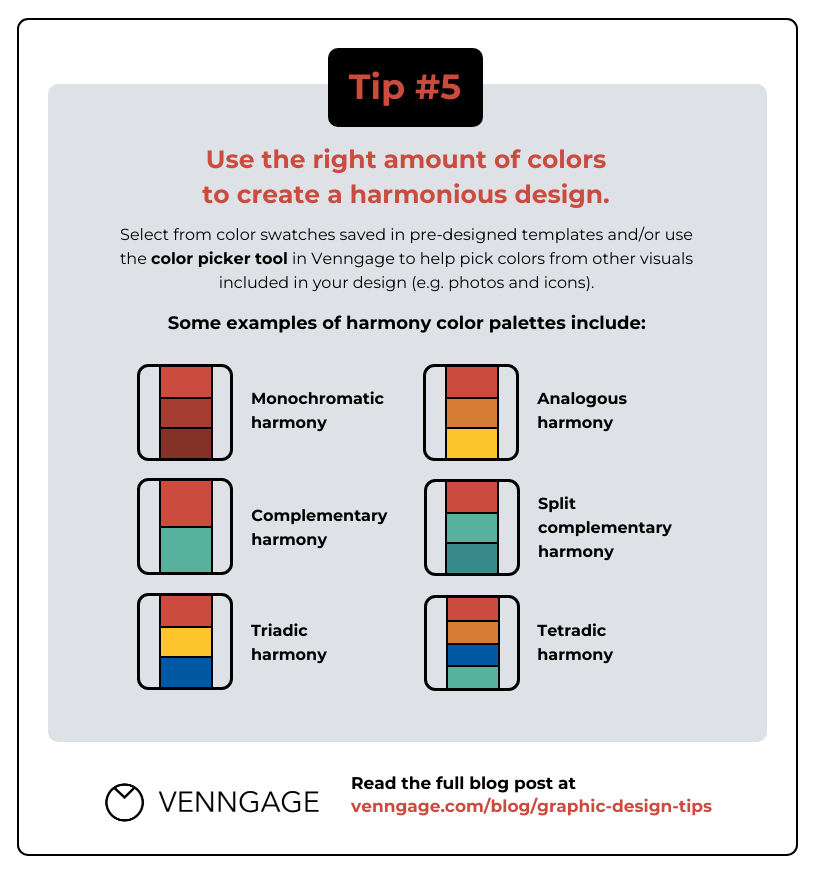
You can use harmony color palettes like the ones mentioned above. For more information on each palette, check out this post: How to Pick Colors to Captivate Readers and Communicate Effectively
But if you don’t have time to come up with a new palette from scratch, a quick trick is to use the color palette in a pre-designed template. You can also sample the colors from the visuals in your design, like images and icons, and apply it to other elements, like title text.
If you’re designing in Venngage, you can use the color picker tool to facilitate both of these approaches. Let me demonstrate…
Let’s say you like the colors in this template and want to replicate them in your design:

First, click the template to edit it. Once you’re in the editor, click on any element of the template — it could be the background color or the text — and click on its color in the top menu:
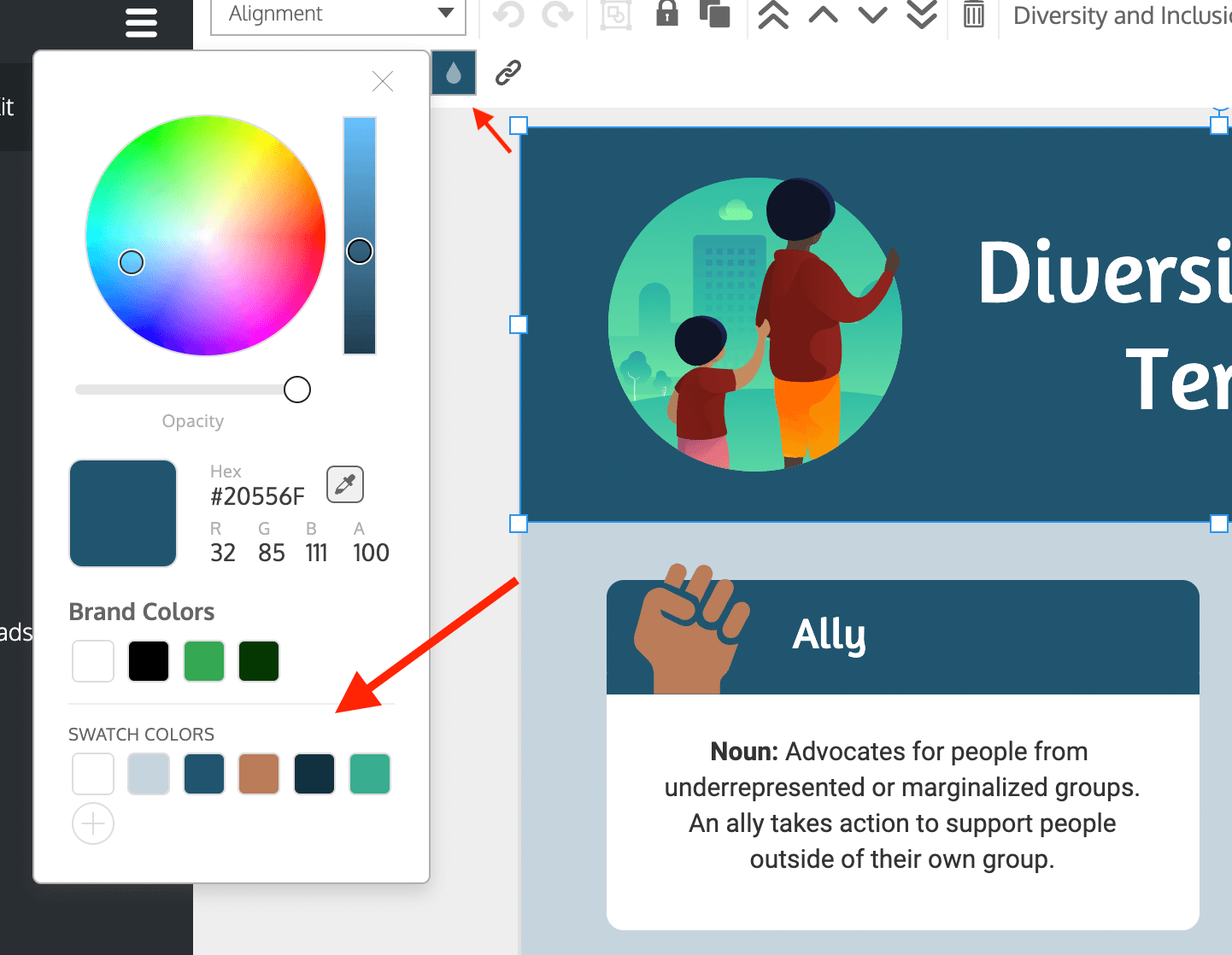
You can then see the color swatches used in this template. If you click on each color, you’ll find the HEX code (i.e. #20556F for the dark blue above). You can use these HEX codes to apply the exact colors from this template to another design.
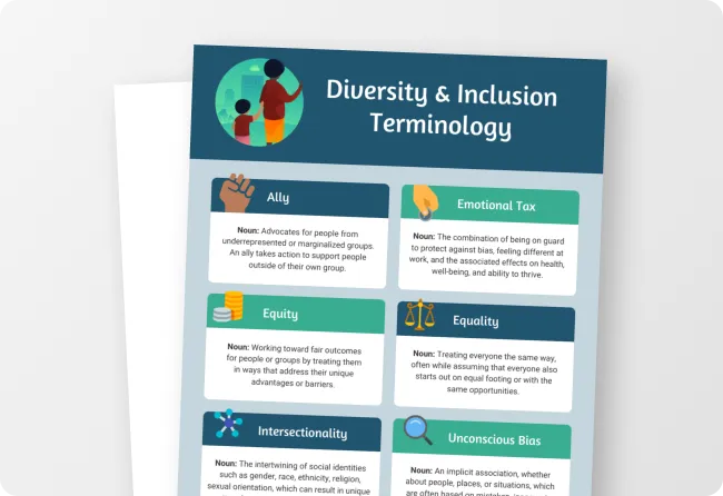
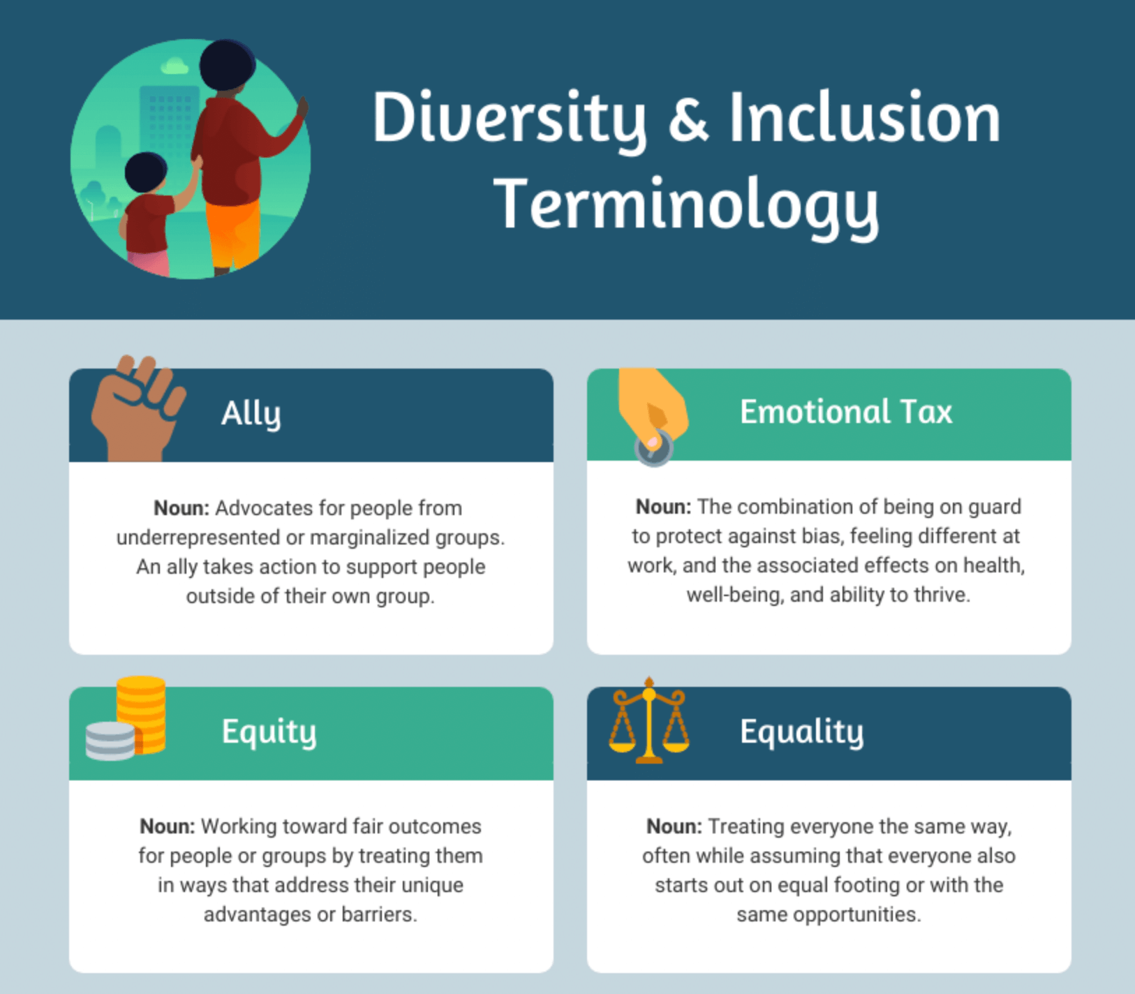
And remember how I said you could sample colors from the visuals in your design? The designer did just that in this infographic. Notice how the colors in the icon at the top repeat throughout the design (i.e. dark blue and green for the heading text background; yellow and brown for the icon color):
In Venngage, you can use the eye-dropper tool to discover the color of icons and more. Then, you can use those colors in your palette to create a cohesive look and feel.
Of course, this advice is most useful when you don’t already have a set color palette. But if you’re designing for your company, chances are you’ll need to stick to your brand style guide.
If you have two brand color palettes, here’s a tip to ensure all of your visual assets look consistent across your design portfolio and your branding is easily recognizable:
When designing in Venngage, you can use My Brand Kit to apply your brand colors to a design in one click:
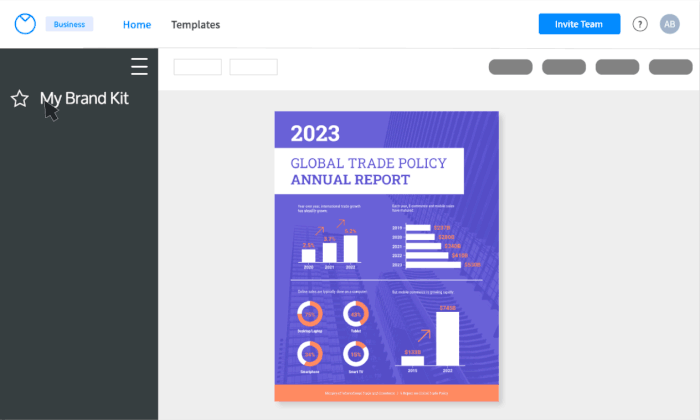
Note, My Brand Kit is available on a Venngage for Business plan.
Of course, with some visual assets like pictures, it’s a little more difficult to keep colors consistent and on-brand. So, our next piece of advice is to…
Graphic design tip #6: Use visuals that complement your brand colors.
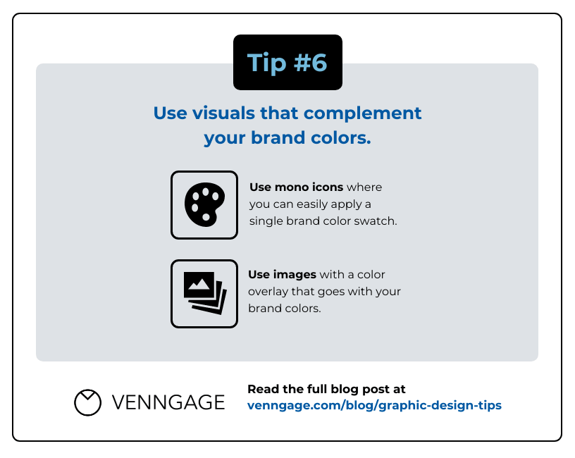
How you apply these colors might depend on your branding guidelines, but here are a few more quick tips:
- Apply color to text sparingly. You can reserve your brand colors for titles, headings, decorative text and pull quotes — and sometimes, subheadings. Body text should be left in black as much as possible for maximum legibility.
- Ensure you have a good contrast ratio if you’re layering colored type on top of a colored background. WebAIM has a contrast checker available on their website, but you’ll soon be able to check your ratios right in the Venngage editor using the accessibility tool, too!
- Applying color to a background can be great in promotional and marketing pieces, but should be used sparingly in long-form documents. This can work well to highlight key pieces of information, but for optimal legibility, you’ll want most of your body copy on a white background.
Imagery and icons
They say a picture is worth a thousand words… but if you use a low-quality image, it may not be worth one.
But what qualifies as a high-quality image? Simply put, a high-quality photo doesn’t appear blurry or pixelated — it’s sharp and clear both online and in print.
Technically speaking, high quality usually refers to high resolution. A photo’s resolution is determined by the number of pixels per square inch (PSI; also referred to as DPI, or dots per square inch). The industry standard for online photos is 72dpi, and 300dpi for printed photos.
Enlarging photos too much can make them pixelated or low-quality. So if you need to enlarge an image, this next tip is for you:
Graphic design tip #7: Always use high-quality/high-resolution photo(s) appropriate to your design.
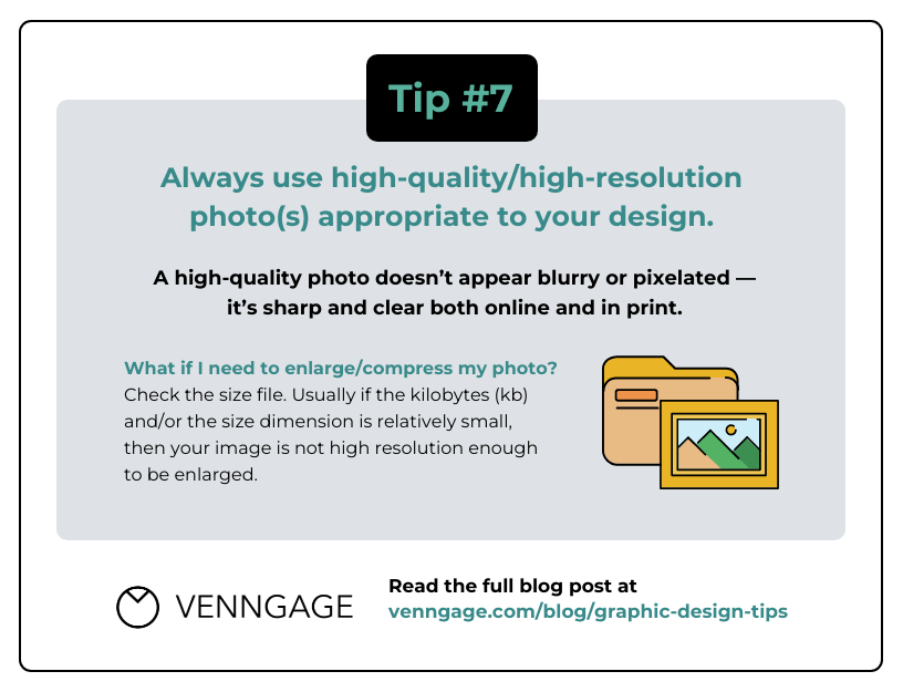
On the other hand, if your image is too high in resolution and the file size is too large, you can use websites like compressor.io to compress your files without compromising the image quality too much.
Now, if you’ve chosen a high-quality photo, you can use it as is or change it a bit to fit your content. For example, you could add an image frame:

Or you could add some special effects, like a sepia filter or color overlay. Venngage makes this simple:

Besides images, icons are an excellent way to visualize your ideas creatively and to create visual hierarchy. How?
Graphic design tip #8: Create visual hierarchy by using different icon styles strategically (e.g. primary vs. secondary).
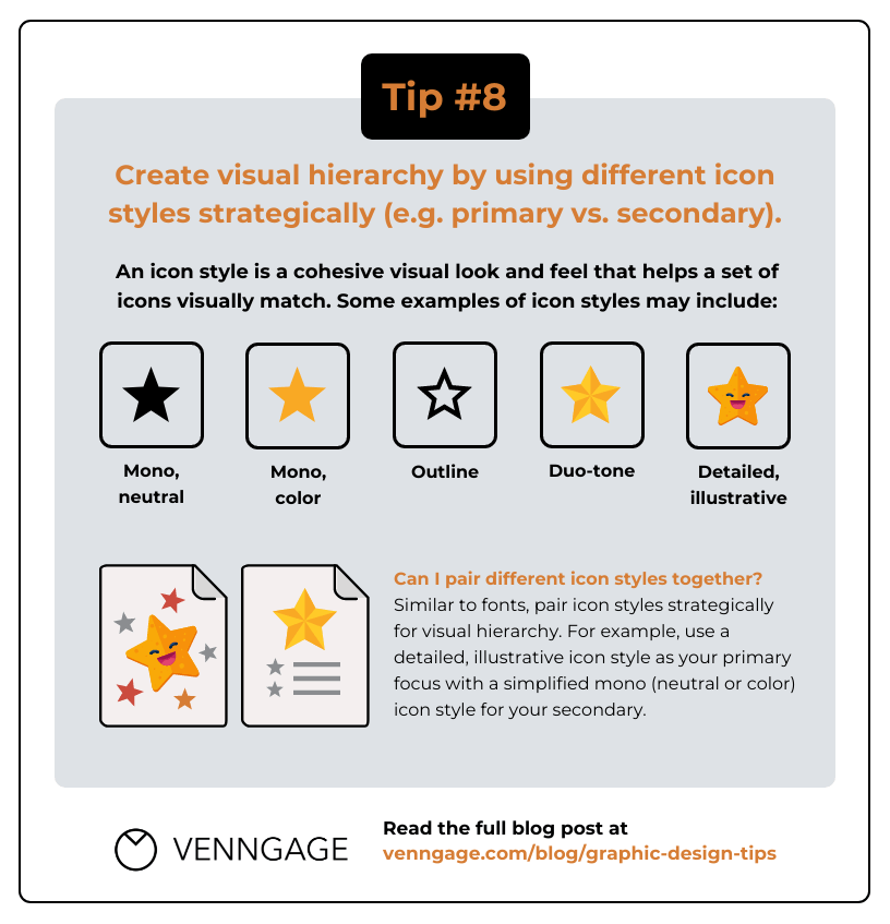
An icon style refers to a cohesive look and feel that ensures a set of icons match. Style factors include color (e.g. color, duo-tone, mono-tone), detailed vs. simplified and specific visual traits (e.g. outlines, gradients, shadows, etc.)
If you want to pair different icon styles together, that’s fine too! But similar to fonts, you should use different icon styles sparingly and pair them strategically to create a hierarchy.
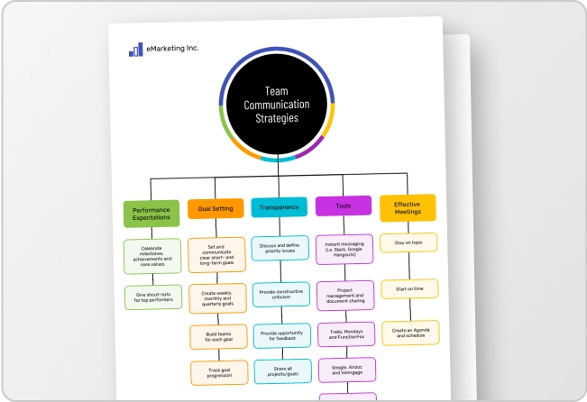
For example, you could use a detailed, illustrative icon style as your primary focus — for your header — and pair it with simplified mono style icons for your secondary focus, like in this infographic:

Besides using individual icons as visual aids, you can combine multiple icons to create “icon stories” that illustrate simple scenes.
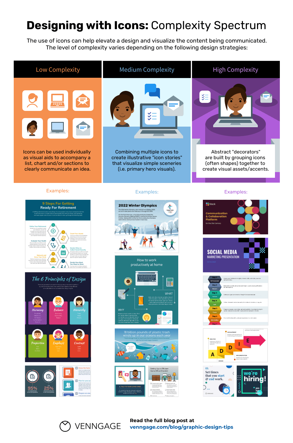
For more information on icon stories and how you can apply them effectively, check out our post: How to Use an Icon Story to Take Your Infographic to the Next Level
Alignment and white space
Alignment and white space are two of the 13 design principles. Alignment is about how elements on a page relate to each other, and white space refers to any blank or empty space surrounding other elements in a design.
I used to make the mistake of not aligning my design elements — the icons and the headers weren’t centered or the image and the body text weren’t left-aligned (even when they should have been).
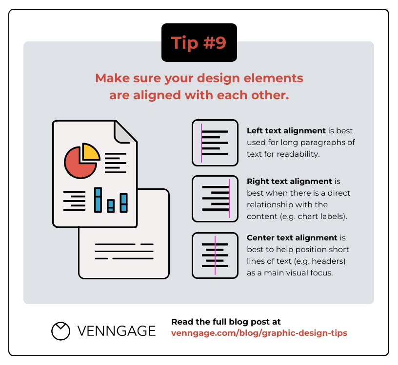
To ensure you’re using proper alignment, here are some guidelines from our design pros:
For text:
- Left alignment: in Western cultures, you’ll want to left-align body text. Since the majority of people read from left to right, it makes sense to left align text. This ensures each line starts in the same position and the text flows naturally.
- Center alignment: you can center-align titles, headers, and in certain instances, body text. Only apply this type of alignment to body text if there isn’t a lot of it (around 4 sentences max). Otherwise, this type of alignment will make it hard to read your text.
- Right alignment: use this type of alignment in diagrams, charts and other assets where your text placement needs to show a direct relationship with the content (e.g. chart labels).
For images and graphics:
- Left/right alignment: if the image/graphic supports the main content.
- Center alignment: if the image/graphic is the main focus of the page.
Here’s an example. Notice how the text and the supporting photos are all left aligned:

To sum things up…
Graphic design tip #9: Make sure your design elements are aligned with each other.
Note, the focus here is text, but these tips apply to visuals like images and icons too.
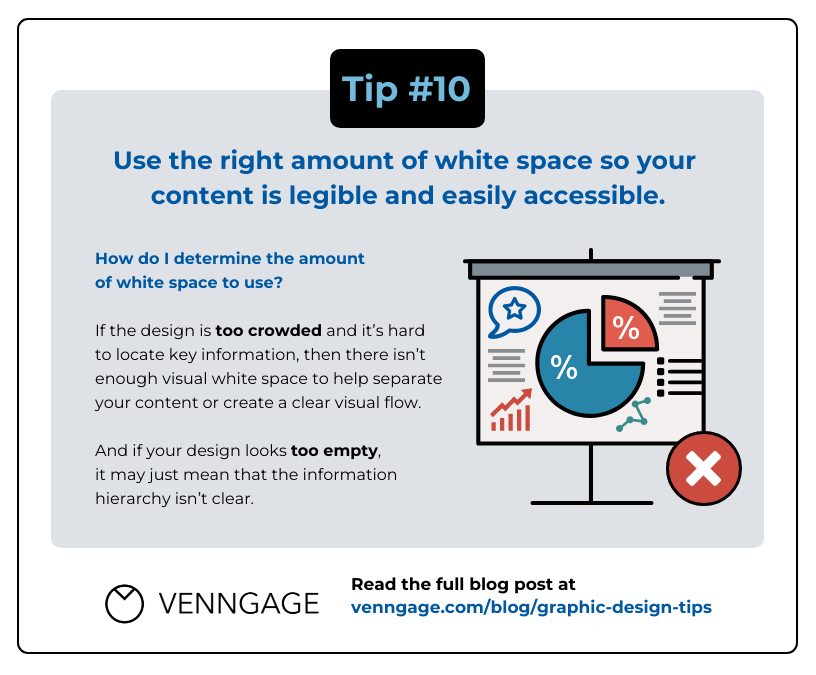
Now, let’s talk white space.
As mentioned, white space is the space between text, images, buttons and other elements that a user can see on a page or a screen.
In this example, all the areas without any text or images are considered white space:

So for any of your designs, make sure there’s enough white space.
To determine the amount of white space to use, here are some quick rules of thumb:
- If the design is too crowded and it’s hard to locate key information, then there isn’t enough white space to help separate your content or create a clear flow.
- If your design looks too empty and the visual hierarchy isn’t clear, then there’s too much white space.
At the end of the day, it’s all about making sure your content legible…
Graphic design tip #10: Use the right amount of white space so your content is legible and easily accessible.
Graphic design checklist for beginners
To make it easier for you, we’ve created a Graphic Design Checklist for Beginners. Make yourself a copy and double check if you’ve followed all these guidelines every time you complete a design:

Now for a bit of a cheat… to create a good design, you can always use a template. With a template, professional designers have already done the heavy lifting for you. All you need to do is customize the content for your needs.
So, our final (actually, extra!) design tip:
Graphic design tip #11: If it’s hard to create a design from scratch, just use a template!
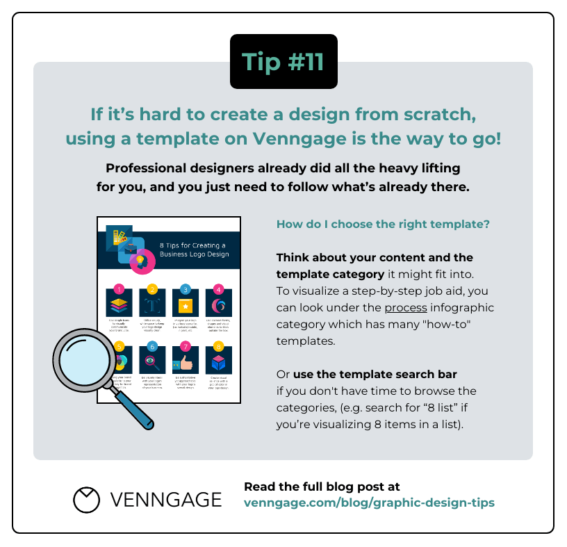
Keep today’s graphic design tips in mind, even when using a template!
Of course, it can still be difficult to customize complicated templates. So make sure you keep all the tips we covered today in mind, and double check your design with the checklist we shared when you’re finished.
I hope this blog will help you achieve the look and feel you want in your designs.
If you’re interested in more beginner design guides, check out our series on the principles of design and how to apply them to your business communications:
- What Are the Principles of Design? A Complete Breakdown
- A Brief Guide to Unity — A Design Principle
- A Brief Guide to Balance — A Design Principle
- A Brief Guide to Contrast – A Design Principle
- A Brief Guide to Emphasis — A Design Principle
- A Brief Guide to Proximity — A Design Principle
- A Brief Guide to Repetition — A Design Principle
- A Brief Guide to Variety — A Design Principle
- A Brief Guide to Alignment — A Design Principle
- What Is Visual Hierarchy & Why It’s Important in Business Communication
- Using White Space in Design: A Complete Guide