Have you ever told what you thought was a funny story, but the listener had the absolute wrong takeaway? Did you consider that the breakdown might be in how you told the story, and not the crowd themselves?
When designing materials for your business, the same thing can happen — the audience fails to grasp the important bits of information you’re trying to give them. That’s why a particular design principle — emphasis — is so crucial.
Just as you want to make sure your friend gets what’s funny about the story you’re telling, you need to use emphasis in the right ways to ensure the audience for your business communications gets the point — whether you’re creating an infographic, a brochure or a job aid.
Read on for a beginner’s guide to the emphasis principle of design, including how to use it to make your business communications clear and compelling.
Click to jump ahead:
- What is emphasis as a design principle?
- Why is emphasis important?
- Examples of emphasis principles in design
- How can you bring emphasis to a design?
- FAQ about emphasis in design
What is emphasis as a design principle?
When talking about these terms as design principles, emphasis is sometimes referred to as dominance. Emphasis is what designers use to draw the eye of the reader to specific elements.
You can use this principle not just to call attention to important material, but to ensure the visuals follow other design principles, like hierarchy, balance and proportion.
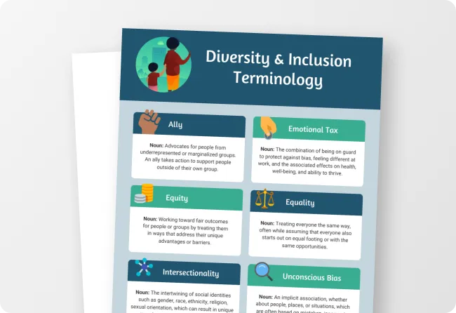
Here’s a simple example of emphasis in action:
This infographic illustrates the basics of emphasis in a couple different ways. Take a look at the title. In addition to color differences, the designer varied the weights of the fonts. This draws the eye naturally to the important bits of information.
Just so you know, some of our templates are free to use and some require a small monthly fee. Sign up is always free, as is access to Venngage’s online drag-and-drop editor.
Why is emphasis important?
Emphasis matters because humans are naturally distractible, and our attention can be drawn to many different places at once. Without emphasis, the eye wouldn’t know where to land or what information the designer felt was most important.
Think about the above example again. Without placing emphasis through color and variations in font weight, the reader might still understand the information, but it would likely take longer.
Using emphasis creates a mental shortcut, so to speak. This helps ensure the information is quick to absorb and sticky, remaining on the mind of the viewer longer than if all elements were given the same weight.
Examples of emphasis principles in design
Emphasis shows up in many ways, even if designers aren’t necessarily intending it to. That’s because the human brain is constantly searching for patterns, so in the absence of something intentional, your brain will usually land on elements it wants to emphasize.
Let’s take a look at some examples of the emphasis principle in action…
In this data-driven infographic, the designer uses large type to emphasize the numbers discussed.
Along with icons, this creates a clear emphasis on the data, allowing this important information to be the star of the show. Additionally, the section headers use the emphasis principle by virtue of being placed in colored boxes.
Especially when dealing with complex information, emphasis can make visual business communication easier to understand. Take, for example, the chart in the infographic above. While the separation of the cells is helpful, without the colored headings, it would be hard to navigate.
Here’s an example of a different way to use emphasis:
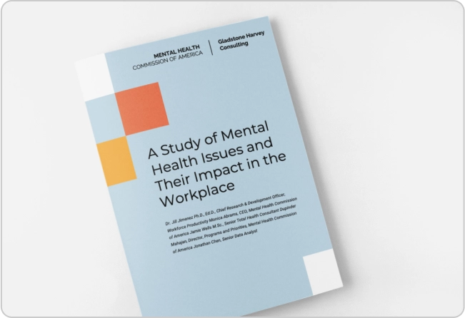
We’ve already touched on how differences in type size can create emphasis, but this report makes this even more obvious.
Not only does the designer call attention to important information by creating emphasis, but this also solidifies the use of another design principle, hierarchy — the varying type sizes clearly demonstrates the order of importance of the information.
How can you add emphasis to a design?
Adding emphasis to a design is one of the simplest ways to make sure important information shines, but there’s no single way to apply it. Here are some tried-and-true graphic design tips anyone can use to create emphasis in their business communications:
Size
Because we’re talking about visual communication, size is one of the most universally applicable ways to create emphasis. Making one element larger — sometimes much larger — than most or all other elements ensures its importance is unmistakable.
The text “50% off” is larger than any other text on this page, and it’s wider than any of the images. Readers’ eyes are immediately drawn to that text. Of course, this is helpful since the point of the ad is to promote a 50% off sale.
Learn more about size and space in your design by understanding the use of negative space.
Color
You can use color in many ways to create emphasis. One of the easiest ways is to put important text on a box in a coordinating or contrasting color (more on contrast in a moment) or to give the text itself the color (depending on its size). In addition to size, color is one of the quickest ways to create emphasis in your design.
This sales flyer uses a couple of different emphasis methods rooted in color. And size-based emphasis makes an appearance as well. Coordinating colors help illustrate the differences between products, which makes the emphasis not just for decoration — it’s utilitarian, too.
Contrast
A close cousin to color, contrast is another way to create emphasis in a design. We’ve separated the two here because there are non-color ways to bring contrast to a design, such as by varying shape or placement, but most of the contrast you’ll apply in your business communication is of the color variety.
This infographic uses color to emphasize the headers and information. But the use of contrasting colors also helps to distinguish the pertinent information at a glance. If the designer chose more similar colors to illustrate Covid-19 and the other conditions, the infographic would have been much less digestible.
Learn more about using contrast in your designs.
Novelty
When used carefully, showing your reader something they haven’t seen before (or at least don’t see very much), can help create emphasis. This could be an eye-catching illustration, graphic or image, an interesting color combination or a unique font choice.
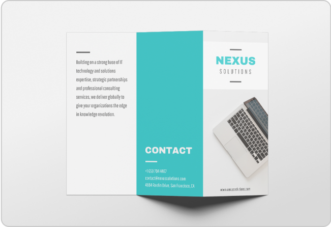
This Valentine’s Day sales flyer template uses novel font choices, pairing a simple sans-serif font with an eye-catching display font that immediately draws attention.
Style
Most of the business communications you’re making will probably be utilitarian — certainly more than art-forward. But style still matters, and your visual communication assets can emphasize a style that creates a unique brand identity for your business.
Consider this infographic, which, while it certainly contains important information, emphasizes a vintage-style illustration of a human heart. This bucks convention by emphasizing not the information contained in the infographic, but rather focusing on a highly stylized and undeniably evocative image.
FAQ about emphasis in design
Why do we use emphasis in design?
Designers use emphasis to guide the eye of the reader to important information. This helps ensure the audience gleans the correct takeaways after viewing the communication.
Is emphasis a principle of design?
Emphasis is one of 13 principles of design, along with unity, rhythm, contrast, proximity, repetition, variety, alignment, proportion, white space, hierarchy, movement and balance.
To understand emphasis, think like a reader
Emphasis is one of the most intimate principles of design because it requires you to put yourself in the minds of the readers and really understand their journey.
Ask yourself: “If I didn’t know this information, what would make me want to read it, and what would make it stick?”
These are the questions you need to answer to use the design principle of emphasis to best effect.
Want a head start? Explore Venngage’s library of professionally-designed templates for plenty of options with perfect emphasis.


