


Space is one of the most important elements of design. It covers everything from the small spaces between text to the big empty areas on a webpage.
The effective use of space can greatly contribute to an attractive, harmonious, and successful design. Using white space can help you balance elements and layout your designs effectively.
In this guide, we will discuss the importance of white space and how to apply it in your designs. We will also explore different examples and design tips using Venngage templates.
What is white space in design?
White space is one of the 13 basic design principles and refers to any blank or empty space surrounding all the other elements in a design composition. It is the space between text, images, buttons and other objects that a user can see on a page or a screen.
In this example, all the areas without any text or image are considered white space:

Also called negative space, white space can be classified according to its size and use in a particular design.
When space is intentionally added to highlight certain elements, it is called active white space. For example, in this poster, the text is purposely put at the bottom right of the page to allot the entire space in the center for the graphic illustrations:

On the other hand, for space that is naturally created like those between words and around fixed objects such as logos, it is called passive white space.
There is also micro and macro white space. Micro white space refers to small spaces between elements like the spaces between lines and paragraphs or the spaces between options in a menu.
Meanwhile, the entire space around and between major layout elements like the spaces between content blocks on a website is called macro white space. It acts as a canvas for all the elements included in your design.
What is the importance of white space in design?
White space is an essential element in any design and provides many advantages when used well. Here are some of its benefits:
It structures and organizes content
White space both separates and groups elements in a design, which shows how elements are related to one another and helps viewers organize visual information better.
According to the proximity design principle, objects that are placed closer together tend to be seen as a single unit rather than individual, unrelated parts. Using white space implements this principle.
By increasing or decreasing space to divide and group elements, viewers will be able to process the information they see in a more logical way.
This infographic is a great example of how white space can be used to section and cluster content:

It improves text readability and legibility
Using white space to separate blocks of text makes content easier to read and digest.
This improves the readability and legibility of your content and contributes to increased comprehension.
Adding a lot of white space around text also makes it easier on the eyes and keeps the reader from getting overwhelmed with too much information. At the same time, you can use variety in colors, shapes and other elements to make sure a design is interesting, even when it’s minimal.
Notice how the content in this infographic has a smooth flow that makes it much more readable even though the text is actually quite long. This is because white space is used to break text into easily digestible chunks.

It increases user interaction
In website design, white space promotes visual hierarchy and helps users easily find the information they are looking for.
Putting a good amount of white space around headers, headlines, buttons and navigation menus can immediately prompt users to do an action.
Using white space properly can prevent distractions that can keep users from their goal, which is to consume content.
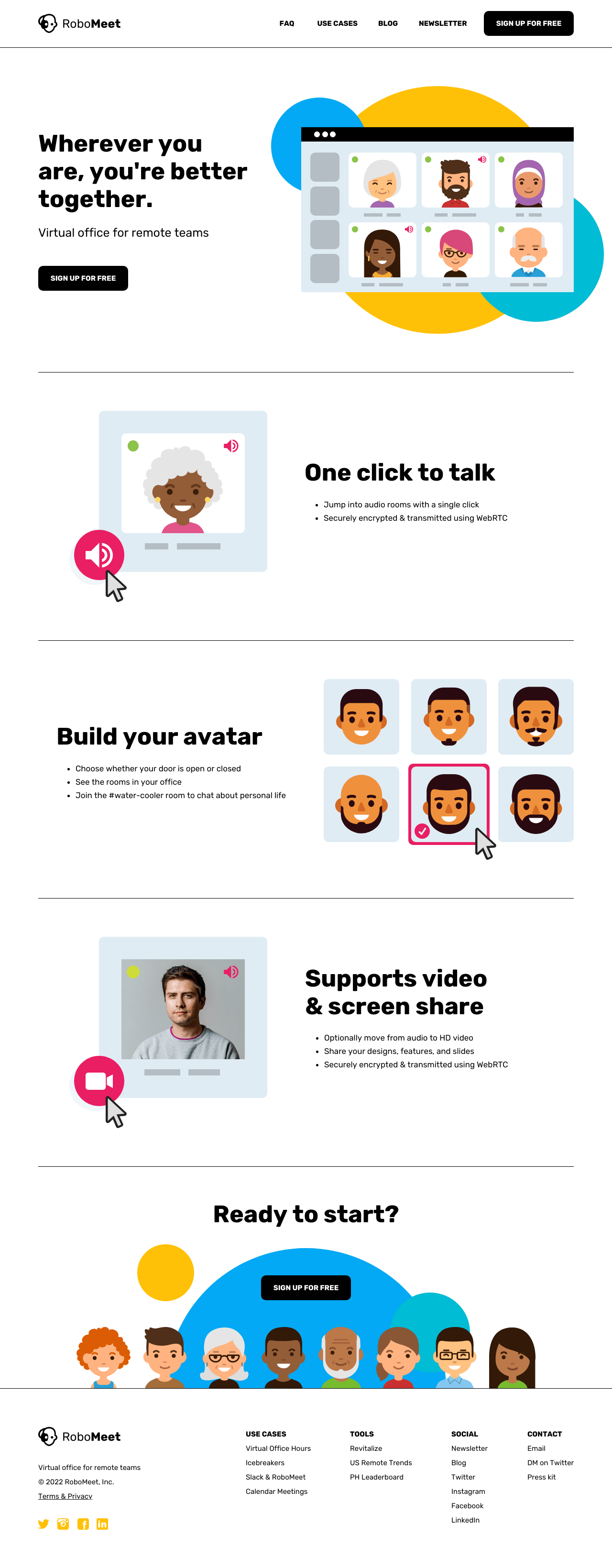
For example, this landing page has dedicated spaces for the logo, navigation bar, main content area and email opt-in bar in that exact order to easily let users interact with the site.

It draws focus on important elements
Usually, when we want to attract attention or make something stand out, we make it bigger and more eye-catching. The same thing applies to white space.
The bigger the white space around certain parts of your design, the more you can put emphasis on them.
In web design, using plenty of white space (combined with proper alignment) can help you highlight CTAs and other areas you want users to place their focus on.
This homepage, for example, is designed with a lot of white space that makes the headlines and graphic elements more prominent:
It promotes balance and visual order
Applying white space ensures the correct proportion and equal distribution of design elements and empty spaces.
Creating balance and visual hierarchy or order not only produces a visually appealing design but also improves user experience. It also contributes the overall unity of a design.
Moreover, maximizing white space can help you create a clean and minimalist design, which is usually associated with luxury and sophistication and can enhance your branding design.
This newsletter shows how the use of white space not only promotes symmetry between elements and spaces but can also be an elegant aesthetic:

How to apply white space in your designs
Here are some tips and best practices for applying white space in your designs:
Consider visual hierarchy when positioning elements
Aside from using white space to separate design elements and content, you can also use it to arrange and position elements.
Adding white space in the right places enables you to guide the viewer’s eyes and direct them to the most important parts of your design.
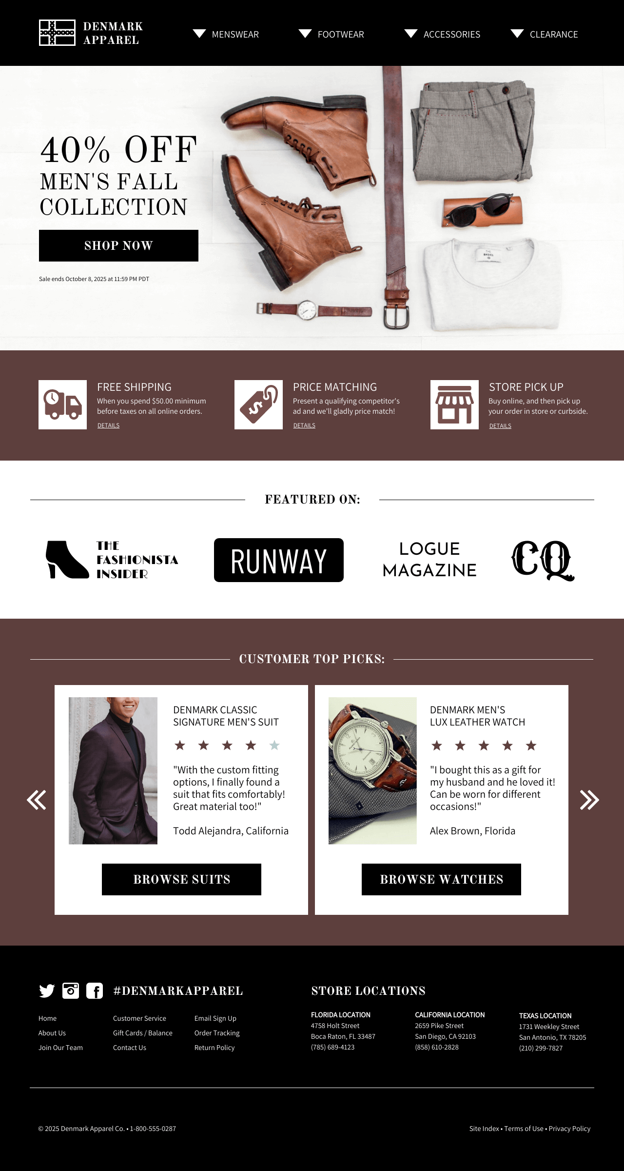
The Z-layout is often used in web design to match the scanning patterns of users, in which the eyes naturally start at the top-left and move to the top-right corner of the page, then down to the center and back to the bottom-left to the bottom-right.
This landing page design is a perfect example of the Z-layout, with the navigation bar positioned at the top, main content area in the middle, and CTA buttons at the bottom.

Using white space with ideal design layouts like the Z-layout can help you achieve optimal design for your website, user interface, or graphic materials.
Using white space with smart design layouts like the Z-layout can improve the clarity and effectiveness of websites, user interfaces, or graphic materials, especially when building a landing page focused on conversions.
Implement proper text formatting
Applying correct margins and ample paragraph and line spacing is one way of using white space to improve the presentation of text.
Aside from using paragraphs for grouping ideas together, you can also draw attention to headlines and titles by increasing the spacing between letters.
Meanwhile, the ideal spacing between lines of text is between 130-150% of the size of your font.
In this example, the content area has just the right margins and the paragraph lines have at least 1.15 spacing for better readability:
Group objects and content logically
Logical grouping is when you group information into logical categories.
For example, you don’t compile product images together in one area and then list the product names in another section.
This is where the use of white space comes in to help you organize elements and content in a way that makes the most sense.
To illustrate, here’s an e-commerce website template that applies logical grouping by arranging product images alongside product reviews and above CTA buttons:
Keep the design clean and minimal
A cluttered design can result in cognitive overload, which occurs when the amount of information that the memory can hold becomes too much, making viewers lose interest.
Keep design elements to a minimum to avoid unnecessary clutter and promote clarity and cohesiveness in your design.
Make sure there is enough white space around text to balance out a content-heavy design and use repetition to reinforce visual hierarchy.
For example, in this poster, the elements are placed only around the edges to make the text the center of attention:

Remember that white space does not mean not using any color
Using white space does not necessarily mean using only white or no colors at all to define the space between design elements and content.
White space can be any color, pattern, texture, or even a background image as long as it functions to bring important elements and content to the forefront of your design.
Using a good image as white space can create contrast and make different elements of your design pop, like in this example:

FAQs about white space
What is the white space rule?
The white space rule in design recommends using enough blank spaces in a design layout. It means maintaining the spaces between lines of text, paragraphs, and different design elements.
How important is white space in design?
White space is extremely important in design as it acts as a glue that holds your entire design together. It promotes balance and harmony and guides viewers toward the focal points of your design.
What is the difference between white space and negative space?
In design, white space and negative space mean the same thing. However, when it comes to art, they may have slightly different connotations.
In art, negative space is the space you create around your subject, whereas white space is where you put content and design elements. Nevertheless, both white space and negative space are concerned with the effective use of space in any composition.
Using white space can improve your design and benefit your users
Applying the principles of using white space in design can help you create more effective and user-focused designs. Use Venngage templates to create well-designed graphic materials that maximize the use of white space.


