You’ve no doubt heard the phrase, “Variety is the spice of life”. As it turns out, variety is also the spice of good design.
As a design principle, variety can help draw readers in, highlight important facts and create visual interest in your business communications.
Let’s learn more about this unique principle, some examples of variety in design and how you can use variety to your advantage in your brand’s communications — from infographics to annual reports. But remember, as with actual spices, a little variety goes a long way.
Click to jump ahead:
- What does variety mean in design?
- Why is variety important in design?
- Examples of the variety principle in design
- Tips for using variety in design
- Variety FAQ
What does variety mean in design?
Variety is one of the most straightforward design principles out there — it means just what it says. By varying colors, shapes, typography and other elements, businesses can ensure their visual communications are engaging and informative.
Variety has the added benefit of helping you achieve other design principles, like repetition, emphasis and movement. That’s not to say you should strive for a design that has variety turned up to 100%. Going too far in the variety direction can make a design feel chaotic.
Case in point:
This satirical website was intentionally designed to break all the rules. But it gets the point across: using too much variety in a design will confuse your audience and may even unsettle them. When I see a design like that, I get the same feeling as when I look around my office and see that I’ve let it get too cluttered.
Why is variety important in design?
Variety is important in design because it can help a designer guide the reader down the page, highlight important information and create or reinforce a visual theme. It also helps keep brand communications from feeling stock or standard, as it clues readers in to the idea that a real person thought about this material.
Varying certain elements in a design can help you follow many of the other main principles of design, too. Let’s take a closer look at some of these related principles:
- Repetition: you might think repetition and variety would conflict, but in reality, variety helps temper repetition. Using these two principles in concert is one of the best ways to create an overall design theme. The reader gets just enough variety and repetition, without being beaten over the head with either.
- Emphasis: Calling attention to important items in your design means using variety (and other design principles) to make things larger, give them a different color or otherwise make them eye-catching.
- Movement: Using variety to help push the readers’ eye down the page can also reinforce the movement design principle, which gives the reader subtle (or obvious) visual cues about the flow of information.
Examples of the variety principle in design
Now that we understand a little bit more about the variety design principle, let’s take a look at some examples of it in action, so you can see for yourself the impact smart use of variety can have.
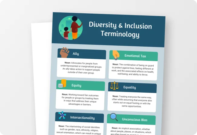
The following infographic has a clear and unmistakable use of variety to bring visual interest to the information. Imagine the boxes in this design were all the same color or the icons were all of the same shade. The eye would have no idea what to do or where to go, and the average reader would tune out this information.
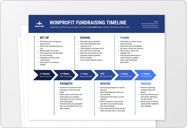
Variety can also come into play with placement of information, as in this infographic design, which varies placement of written content with each new row, swapping from side to side. You can also see how the designer used a variety of shapes and colors to bring movement and rhythm to the design, without going overboard.
Even subtle use of variety can be effective. Consider the top section of this infographic, which uses shapes meant to evoke a Pinterest board. While they’re in a row and it’s clear the three shapes go together, the designer has dropped one slightly lower than the rest, which adds energy and excitement to the design.
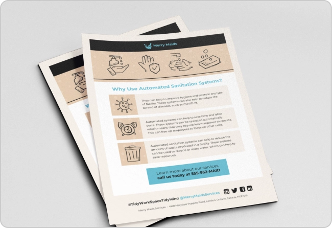
When applying variety to your designs, it’s important to remember some elements should remain consistent. In this infographic, for example, all of the smaller icons throughout are in a similar style, which creates cohesiveness. If the designer had chosen a different style for each icon, the result would be a confusing mess.
Just so you know, some of our infographic templates are free to use and some require a small monthly fee. Sign up is always free, as is access to Venngage’s online drag-and-drop editor.
Tips for using variety in design
Here are some tips and tricks to help you add variety to your business communications:
Use the squint test
I learned to do the squint test when I was studying newspaper design in college, and it basically goes like this: Look at your design and purposefully squint or un-focus your eyes until the design appears blurry. If it looks like one big blob of text, it’s likely there’s not enough variety in it.
The squint test can also help you identify if your design is imbalanced or the wrong elements are emphasized. Sometimes a fix is as simple as varying type treatments, like in the infographic below:
For more simple graphic design tips like this one, check out our blog: 11 Actionable Graphic Design Tips for Beginners, According to Design Experts
Stick to a style
I’ve touched on this already, but using variety doesn’t mean every element in your design should be completely unique… nor should everything be exactly the same.
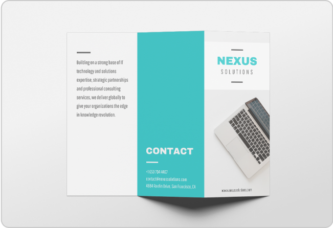
This can be a tricky balancing act. Think of it this way: you’re aiming for siblings, not twins. That means using a consistent color palette, fonts and icons, as in the following annual report template:
Consider color
Varying the colors you use is one of the easiest ways to bring variety to your designs. And you can do this in a number of ways, whether it’s by using different shaded boxes, icons, illustrations or typography.
This infographic uses a couple of different methods, including shaded boxes and varying colors in text, to amp up the variety. But remember that consistent style applies to type as well. Note the designer stuck with a consistent color palette, even though they varied colors from section-to-section.
Variety FAQ
What are the 7 types of principles of design?
There are far more than seven design principles, but the seven often considered most crucial are unity, hierarchy, repetition, emphasis, alignment, contrast and balance.
Is variety a principle of design?
Yes, variety is a principle of design that says you should strive to vary elements like colors, shapes and fonts to hold your readers’ attention and help guide them down the page.
What is unity and variety in principles of design?
In design, unity and variety could seem like they’re at cross purposes, but they actually go hand-in-hand — they’re both about creating visual interest and engagement, without the boring feeling of sameness. Unity is more of a design goal than a principle and variety is an important stepping stone toward that goal.
Too much variety and you’ll overwhelm your reader, but too little and they won’t be interested
There’s no doubt that variety, while it’s one of the most straightforward design principles, can also be one of the trickiest to apply. It can be tough to know when you’ve gone too far or not far enough.
But with business communication in particular, it’s safe to say a little of this design spice goes a long way.
And if you’re looking to achieve the perfect balance of variety and repetition, look no further than Venngage’s library of professionally-designed templates. While you’re practicing this principle, a template can be a great place to start.


