


Early in my career, I had the wonderful experience of working with a number of nonprofit organizations. Often, I was working directly with the founders or executive directors.
I discovered that one of their biggest challenges running a nonprofit was using limited resources to run a successful campaign—externally and internally. Not only did they have to promote their nonprofit’s cause, they also had to align their team around specific objectives and long-term goals.
It turned out that infographics were essential to managing an effective campaign. Whether it was getting an audience to care about an issue or communicating a plan clearly to the team, infographics got the job done.
So what types of infographics does a nonprofit campaign need? And how can someone design nonprofit infographics without any real design experience?
To answer those questions, I’ve put together this simple guide to the different types of nonprofit infographics every nonprofit campaign should use, plus all the nonprofit infographic templates to help get you started.
I’ve also had our team put together a nonprofit social media campaign toolkit. It’s a bundle of design resources that you can use to create infographics and social media visuals for any campaign.
What you get in this nonprofit campaign toolkit:
- A simple, five-step guide on planning a strategic campaign
- How to set SMART goals for a successful nonprofit campaign
- Templates to visually communicate your plan to your team (includes roadmaps, mind maps and timelines)
- 50+ social media templates that you can brand as your own for Facebook, Twitter and Instagram
- Templates include customizable infographics, statistic posts, announcement posts, thank-you posts, newsletters and more.

Here are the 6 types of nonprofit infographics for running a successful campaign:
- Campaign Strategy Infographics
- Awareness Infographics
- Unique Solution Infographics
- Impact Report Infographics
- Annual Report Infographics
- Campaign Infographics
We’ll explain each type of infographic below and show you some real-world infographic examples. We’ll also include tips for you to create your own infographic in Venngage’s nonprofit infographic maker.
NEW! Introducing: Marketing Statistics Report 2022
It’s 2022 already. Marketers, are you still using data from pre-COVID times?
Don’t make decisions based on outdated data that no longer applies. It’s time you keep yourself informed of the latest marketing statistics and trends during the past two years, and learn how COVID-19 has affected marketing efforts in different industries — with this FREE marketing statistics report put together by Venngage and HubSpot.
The report uses data gathered from over 100,000 customers of HubSpot CRM. In addition to that, you’ll also know about the trends in using visuals in content marketing and the impacts of the pandemic on visual content, from 200+ marketers all over the world interviewed by Venngage.
Grab your copy now — it’s not like any other marketing reports out there, plus it’s 100% free!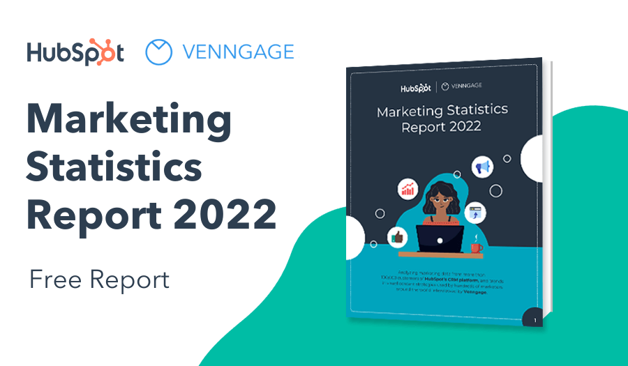
1. Campaign Strategy Infographic
Every campaign has to have a plan. For your campaign to really take off, not only does a strategy have to be in place, but your team needs to be aligned. Communicating a strategy to your team is crucial.
Communicating visually through infographics can help make mundane, dense content really jump out at your audience. During meetings and long after, your team will be engaged and recall exactly what you were talking about.
Marketing Plan Infographic
A marketing plan doesn’t need to be a black-and-white, twenty-page document. It can be colorful, visual and engaging.
This Marketing Plan infographic breaks down the strategy into four very simple components. You’ll likely need supporting content in addition to this infographic. Documents should outline the roles of different team members, individual expectations, milestones and other details. However, a marketing plan outlined in the form of an infographic helps the most important details stick.
Plus, it’s a helpful resource providing a broad overview of the strategy in place that keeps you and your team aligned every step of the way.

Campaign Roadmap Infographics
A roadmap infographic is essential to any project, campaign or set of projects. It’s a visual that aligns your entire organization around your campaign’s goals.
Your campaign roadmap infographic can be structured in several ways. One approach is designing a detailed timeline of how your overall campaign strategy is going to be rolled out.

This infographic template is a fundraising campaign roadmap. The fundraising campaign’s activities are broken down by month. It helps your team understand what tasks need to be completed, when they need to be completed by, and what tasks come next.
Here’s another roadmap infographic that breaks down activities by the month. It’s less detailed, but much more compact.

How you choose to organize your information is up to you. It boils down to how much content you need to communicate, how complex your overall campaign strategy is, how big the team is and more.
2. Awareness Infographics
Awareness infographic are statistical infographics that focus on a particular problem or paint point your nonprofit tackles. However, all good awareness infographics should accomplish three specific things:
- To raise awareness
- To create a sense of urgency
- To encourage an action
A nonprofit campaign’s awareness infographic is the most crucial infographic of your campaign. Your problem or pain statement directly connects an issue with your audience.
But how do you communicate the problem statement clearly, in an impactful way that will engage your audience?
The best way to raise awareness, and present the weight of a problem is with hard-hitting facts. You also need to present these facts in the simplest way possible. That means doing two things:
- Choose the right statistics that people can easily understand and grasp
- Use the right fonts for your infographic to make these statistics jump
Here’s one example of sharing a single devastating statistic that shocks or blows your audience away:

This infographic shares an overwhelming figure with the audience. Once it gets the reader’s attention, it can share more details about the issue. Then it can prompt the reader to take action – in this case, visit the nonprofit’s website.
Another example is Choose Health LA’s awareness infographic about the amount of sugar in soft drinks. They use a disturbing statistic in order to shift your perspective:

It’s alarming and informative, encouraging people to be a bit more conscious of their sugar intake.
Another way to approach your awareness infographic is to share multiple statistics to tell a story. This awareness infographic shares two alarming statistics, and then a small solution with a large impact. It provides an option that almost anyone could act on:


Use Contrast and Comparisons in graphic design
The best way to add context to the problem is to contrast in graphic design with something else for impact. A comparison infographic provides context for your data and helps you communicate pain points.
Let’s say we want to raise mental health awareness, particularly around migraines and cluster headaches. Both are unique, experienced differently and have their own set of effects on people. But simply describing may not be as helpful or memorable. Instead, we can compare them in order to talk about both of them:

It’s a great way to raise awareness around an issue. If you’re an organization that supports people with a variety of mental health issues, an infographic can help raise awareness, increase interest, build support and provide some general education.
Here’s another example that can really support your cause. If you want to highlight the lack of supportive funding for a particular disease, compare it with the funding other diseases receive:

Challenge Your Audience
Challenging your audience’s Three Bs (beliefs, behaviors and belongings) is one of the sure ways to engage them. Sometimes, you have to take people out of their comfort zones.
Here is an example of a nonprofit infographic that highlights the international water pollution crisis. This infographic uses pictograms to help illustrate the problem.

Position the problem in a creative new way
If you can position your problem statement in a manner that is both surprising and unique, you will connect with your audience. This is hard to do, but good infographic copy is all about positioning.
Here is a classic example from the Gates Foundation on the problem of Malaria. It asks a simple question but provides a surprising answer and highlights the problem they are trying to solve.
![]()
This video guide shows you how to create an infographic that identifies and answers a burning problem:
Storytelling through visuals can be done in many ways. Using the right language, framing an issue in a new way, and using attention-grabbing visuals are all key to getting your message across. If you want to see some great marketing ideas for nonprofits, be sure to check out our nonprofit storytelling examples post.
3. Unique Solution Infographics
After everyone knows about the problem you’re solving, the next must-have infographic is your unique solution infographic. How does your nonprofit has a unique solution to the problem (another term commonly used is the unique value proposition). The better you can articulate your organization’s strengths and how unique or different it is, the more compelling your story becomes.
Here’s an example from World Vision, where you can donate a goat as a gift to a needy family. This infographic shows you how much a goat can produce for a family. It’s a unique solution with a big impact (and not something initially obvious, to me at least). Notice how this infographic also uses a pictogram to help readers visualize a big number.

What’s your nonprofit’s unique solution? Think about how you can create an infographic to communicate this to your prospects.
4. Impact Report Infographics
The fourth infographic you need is an impact or success infographic that focuses on the impact your nonprofit has. The main purpose of an impact report infographic is to reassure current and potential donors that contributing to your organization has a real impact on an issue.
There are a few ways to effectively share the impact your nonprofit is having through infographics.
Milestone Timeline Infographics
Milestone timeline infographics highlight every minor and major success your organization has had over a length of time. This nonprofit impact report infographic template highlights milestones for each month of the year:

With successes to report each month, it demonstrates your nonprofit is constantly working to have an impact in its area of focus. This reassures donors their dollars are well spent, and others to strongly consider donating.
Success Stories
Help gain your audience’s confidence by offering some of your greatest successes so far.
For example, this nonprofit infographic template below shows how you can highlight your organization’s success stories by highlighting impressive statistics:

Personal Stories
While aggregate data about your organization’s impact is great, you should also share some personal stories. These views from the frontline allow your users to connect with the people your nonprofit is helping.
They can also be very powerful emotionally, like this nonprofit infographic example from Possible about how they provided care to Nirajan, one of their patients.

5. Annual Report Infographics
Every nonprofit should have a captivating annual report that highlights the strength of their campaigns. While the annual report is not a direct influencer of your campaigns, it’s a great way to highlight the impact of your previous campaigns and improve support for future ones.
However, you want to communicate your successes in a way that’s easy and inviting. Instead of a traditional annual report design, consider designing an annual report infographic. This type of infographic is helpful to donors, board members, and your social media followers.
Here’s one simple example of a nonprofit annual report infographic:
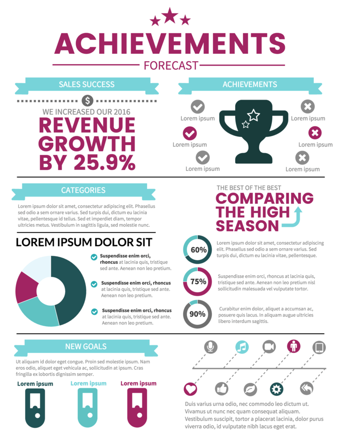
Creating an annual report infographic is super easy!
First, choose key statistics from the previous year that you want to highlight. Every organization will have their own metrics but in general, the metrics should demonstrate the following:
- The impact your organization made (success metrics such as number of people helped, amount donated, positive outcomes, etc.)
- Details about the impact (demographic of people impacted, geography of impact, etc.)
- Relevant financial figures (funding raised, expense categories, effectiveness of delivery, etc.)
Here’s an example of an annual report infographic template that visualizes the past year’s campaign successes:

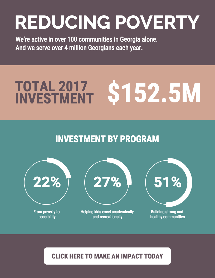
You can also just visualize your traditional, multi-page annual reports.
Here’s an annual report infographic template that makes great use of charts and tables. It maintains a ton of negative space which makes important statistics and figures jump out at the reader. As a result, the information never looks crowded:

Another example of a stellar annual report infographic design is the template below. It uses a landscape page orientation, along with crisp stock photos and bold charts to communicate (otherwise boring) financial figures:

Here’s a final example of how to incorporate infographic elements into a longer annual report. This annual report template uses plenty of charts, icons and fonts to visualize data:

6. Campaign Infographics
The sixth must-have nonprofit infographic type is the Campaign Infographic. These are campaign-specific infographics that can be used to promote your campaigns. The main purpose of the campaign infographic is to get your members to share and spread the word, create some buzz and PR, and hopefully increase your chances of hitting your goals.
Nonprofit social media campaigns should use a series of campaign infographics. This allows you to do several things:
- Build on the campaign narrative by sharing different sets of statistics and visuals
- Present unique perspectives that resonate with different audience segments
- See what works best and double down on it
Any campaign infographic should include the basics of the campaign: what is the campaign about, how do people participate, what is the time frame, how do people share (ie, #hashtags), and clear calls to action like how to donate (if you’re fundraising) and, of course, your nonprofit logo to increase brand awareness.

Here’s an example from ALS’s famous Ice Bucket challenge campaign:

Mastering social media platforms like Instagram or Twitter for nonprofit marketing can be well worth the effort. These kinds of infographics help!
Keep up the Buzz with Periodic Campaign Status Updates
One of the most effective means of doing periodic and continuous communication on the campaign is by creating a campaign dashboard with periodic status updates. Here is an example from Kiva’s Impact Report, which is updated hourly.


Although Kiva updates its numbers hourly, you can update yours within a larger time interval, like weekly. With Venngage, you can link a Google Sheet into any chart and all you have to do is update the spreadsheet and refresh your infographic for automatic updates.
Embed Your Calls to Action in an Interactive Infographic
Don’t forget to include clear calls to action in your nonprofit infographics and throughout your campaign’s marketing collateral.
One of the most surprising things we noticed after looking at hundreds of nonprofit infographics was the lack of calls to action. Remember, just adding your website, email or phone number at the bottom of the infographic is not a clear call to action.
A clear call to action asks the viewer to sign up for a newsletter (you can use our newsletter maker to design one), to donate by clicking on a link, to share the infographic on Twitter (with a #hashtag), or to ask the viewer to go to a specific landing page to get more information.
If you use an infographic tool like Venngage, you can embed these calls to action directly into your infographic with our interactive infographic feature. For example, you can add a form to ask people to sign up for your newsletter, and you can add links or buttons to your website or donation page.
Interactive infographics are the perfect way to display dense information succinctly and get people to act on said information using a well-thought through call to action.
I hope that was useful! Nonprofits are very near and dear to us and that’s why we offer a plan specifically priced for nonprofits. We also like to make our tool easy-to-use, accessible and helpful to the needs of nonprofit organizations with tight budgets and small teams.
How have you used infographics for your nonprofit? Let me know by leaving a comment.
Want a crash course in nonprofit marketing? Check out The Complete Nonprofit Marketing Guide we recently published. The post covers the benefits of nonprofit marketing, how to craft a nonprofit marketing plan, and low-cost nonprofit marketing strategies to try out.
You can also check out these design resources to help you create stunning nonprofit campaign infographics!
How to Create Accessible Infographics With Venngage

10 Do’s and Don’ts of Infographic & Chart Design

How to Import Spreadsheets Directly from Google Drive into Your Infographics and Charts


