


You want to impress shareholders, attract new investors, highlight your brand, engage employees, or file a report with the Securities and Exchange Commission (SEC). For all these goals, you’ll need an annual report.
Today, businesses and organizations don’t just produce one standard version. There are many different types of annual reports, each designed with a specific purpose and audience in mind.
This article breaks down everything you need to know about what is an annual report — its different types, what goes into them, who reads them and how to create one that makes an impact.
Click to jump ahead
- What is an annual report?
- Annual report example
- What is included in an annual report?
- Who reads an annual report?
- What is the easiest way to create an annual report?
- How do you summarize an annual report?
- How do you create an attractive annual report?
What is an annual report?
A traditional annual report is an in-depth, comprehensive overview of a business’s achievements and financial statements from the preceding year. It is produced on a yearly basis, and provided to shareholders, investors, stakeholders and others to communicate the organization’s overall performance, financial status and vision for the future.
Today, annual reports are often used as marketing tools for organizations to impress shareholders, investors, or donors; attract new ones; and to showcase their brand to employees, clients and others.
For example, this annual report template lists business strategy, financial growth and overall performance. It uses a colorful branding style for engagement.
Companies like Mailchimp regularly publish creative annual year-in-review reports to highlight major milestones for that year.

These types of reports are well-designed, fun, and engaging. They share information in a way that’s exciting and easy to understand, and serve as great branding assets.
This isn’t just something businesses do, either. Nonprofit organizations consistently promote their cause and the impact of their organizations. Annual reports, year-in-review reports, or impact reports that highlight the past year’s achievements are all staple nonprofit marketing tactics to gain donors and supporters.
Just take a look at this pages out of Novozymes annual report.


This is an annual report you can actually enjoy reading. The visuals are fun, engaging, informative and reflect the uniqueness of the Novozyme brand. The simple and attractive design is super helpful, since it helps us understand pretty complex information.
Pro Tip: For global companies, include clear currency notes, regional breakdowns and subsidiary disclosures so readers can compare performance across markets.
Annual report example
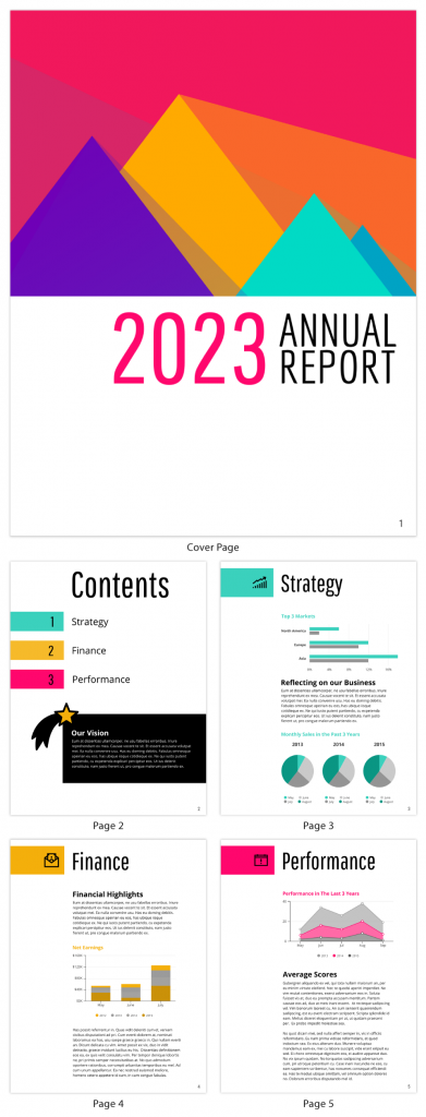
The following annual report template is a great example of a company overview as it includes a cover page, content page, strategy section, finance section, and performance section.
The template is visually appealing and provides a framework to build on, saving you time and effort. The template also features clean graphics, enhancing readability and engagement.

What is included in an annual report?
A typical annual report for a public company must have the following sections:
- A letter from the CEO
- Corporate financial data
- Operations and impact
- Market segment information
- Plans for new products
- Subsidiary activities
- Research and development activities
- Notes & footnotes for full disclosure (accounting policies, risks, contingencies)
- Information for investment decisions (management's discussion and analysis (MD&A), liquidity, risk factors, capital allocation)
These are the barebones expectations for an annual report. Of course, depending on the size of your organization or type of organization, your annual report can range anywhere from 20 pages to 200.
Keep in mind, actual human beings read your annual report. It doesn’t just get filed away in a dusty government basement, never to be seen again. Making it easy to read and review is essential in helping people understand your annual report’s findings and how your business is performing.
So on top of those individual sections, it helps to include things like:
- A cover page
- A table of contents
- Mission and vision statement
- Charts, graphs and tables
- CSR initiatives
- An afterword
- A glossary
These are two examples of reader-friendly annual report designs.
Year end annual report template
This year end annual report template uses a bright color palette, quality stock photos and clear tables to visualize financial data and performance metrics. It includes a brief introduction and a table of contents to set the context and help people find information easily.

Simple nonprofit annual report template
This nonprofit annual report reduces the use of text, and relies more on visuals, icons and charts to communicate data and figures.

Ultimately, you decide how much information to include in your annual report, on top of what’s required. The best way to decide what to include, and how you present your annual report, is to consider the audience you’re creating an annual report for:
- Investors and shareholders: Emphasize financial performance, risks, and long-term strategy to help them assess stability and growth potential.
- Employees: Focus on company culture, milestones, and contributions to highlight their role in the year’s successes.
- Customers and the wider public: Showcase brand values, sustainability initiatives, and innovations to demonstrate broader impact.
- Regulators: Prioritize clarity and accuracy with thorough disclosures, accounting notes, and governance practices.
According to Honeycomb India, "Environmental, social, and governance, or ESG, reporting is now the main body of contemporary annual reports rather than a separate segment."
Honeycomb India, Annual Report Design Trends to Watch in 2025
Who reads an annual report?
An annual report’s primary audience is your shareholders. These people have a legal right to know how your company is performing, how it is changing, what it has planned for the future and other facets of its operational plans.
But shareholders aren’t the only people with an interest in your company’s performance, its products, its projects, and plans for the future. More often, businesses use annual reports to present the organization’s brand as a whole.
Shareholders, investors, employees, donors and journalists want to know your business’s future plans, values, social efforts and goals. Consolidating all the details in the annual report help them understand where your company is going and how it makes a difference.
Annual reports for your staff
Annual reports are great ways for employees to learn more about your business and the brand. They can go through an annual report to see what other projects and initiatives the company has invested in. This is helpful for large businesses with hundreds or thousands of employees.
According to the most recent HR trends, employees care more than ever about employer branding and values. Take a look at the information highlighted in the sharply designed Roche Annual Report.


Among other things, this annual report highlights the value placed on the hard work of employees, teams and entire departments that have helped a business succeed.
In many instances, employees are shareholders within the company and they’re just as interested in how the company is performing. It’s another way to reinforce the value of their work, by showing how their team or department has helped the company to grow.
In the case of nonprofit organizations, annual reports help staff understand the impact of their hard work in the community.
Annual reports for your customers
Findings from Accenture Strategy’s global survey found that customers care deeply about the values and behaviors of major brands. Millennials and Gen-Zers in particular care most about brands driven by a purpose other than profit. According to the survey, nearly 40% of respondents stated they would stop purchasing from brands that appear socially irresponsible or ethically questionable.
You can see in this L’Oreal Annual Report, there are sections dedicated to their ethics and values.

Annual reports allow for a brand to present itself in the best light possible. Businesses can demonstrate the values that set them apart from competitors. They can talk about the types of suppliers and manufacturers they work with, how materials are sourced, the quality of their products, the well-being of their employees, their impact on the environment and more.
Nonprofit annual reports for donors
Nonprofit annual reports are testaments to all the money received and hard work that nonprofit organizations have done throughout the year. Annual reports are essential to nonprofits because they demonstrate transparency, build trust with donors and clearly show the impact of fundraising efforts.
Nonprofit annual reports demonstrate how the support from donors has helped to change people’s lives. After all, donors aren’t purchasing products the way customers do, what they’re “purchasing” is a social good that they want others to receive.
Annual reports highlight exactly how people’s lives are being transformed for the better. Check out the 2018 annual report from Girls Who Code.


Not only do they share the tremendous impact of the organization which donors want to know about - they do it in a visually creative, engaging way.
A nonprofit annual report highlights your organization’s successes, it provides some feel-good fulfillment to your staff who can look back at the fruits of their hard work, and donors know their money is being put to great use.
A nonprofit annual report also helps you make an appeal for more donations, bigger donations, grow your paid staff, and win over more volunteers for the coming year.
How do you summarize an annual report?
There are two simple ways to summarize an annual report. You can create an annual report infographic, or an annual report presentation. Both are great ways to share dense data and information in a way that’s manageable for your audience.
Annual report infographics
Let’s start with the annual report infographic. The advantage here is that you let the data tell the story. Rather than provide pages of analysis, visualize your data through charts, graphs, and icons. Take a look at this simple shareholder report infographic:

The infographic focuses on a single data point. There may be layers of information that explain how that figure was determined, but this summary is practical and direct. For a more detailed report, create a long-form infographic report, by adding multiple sections that highlight individual data points.
You can use a layout like this annual report infographic:

The use of text is minimal. The numbers and data tell the readers everything about the impact of the organization and how it has performed. This is an effective way to share relevant and valuable performance insights with shareholders, investors, or donors.
Annual report presentations
An alternate approach to summarizing an annual report is to create annual report presentation slides. You can share the slide deck on its own, or help it guide your presentation on key findings in your company’s complete annual report.
This simple annual report presentation deck dives right into the content. It’s a great example of how to break up data and make information easily digestible.

Note how the large headings tell the audience exactly what each slide is focused on. Key findings are also highlighted on each slide, to complement the data the charts/graphs show.
If you expect a lengthier presentation slide, include an agenda or overview of your annual report presentation. This lets people know what you’ll be covering and how far along in your presentation you are.

The key to presenting is letting your audience know where they are in your presentation. Are you only halfway through or three quarters of the way done? Even with a summary, preparing your audience helps to keep them engaged, rather than distracted.
Our templates library has an attractive range of annual report presentation templates. Interested in designing your own? Check out our annual report presentation templates page.
What is the easiest way to create an annual report?

The easiest way to create an annual report is to use a design tool like Venngage's Report Maker that offers a variety of annual report templates for different industries and audiences.
As you’ve seen from the actual annual report examples I shared, and our annual report templates, annual reports are packed with a ton of content, including text, visuals, charts, financial figures and more.
Hiring a design agency to design your annual report is one option. The cost for a professionally-designed annual report ranges anywhere from $5,000 to $12,000, and then depending on the types of visuals you need, even more.
Keep in mind, you’ll still need to pull all the content and data together yourself.
To save your organization time and money, without compromising on design, a professional annual report template is the way to go. You can visit Venngage’s annual report templates page today, browse hundreds of unique designs for a number of industries, and use preset layouts and design styles to format your content.

Customizing the templates is straightforward and doesn’t require any design experience. The Venngage editor is a drag-and-drop tool that’s simple to use. With it you can do a number of things like:
- Apply your branding through Venngage’s My Brand Kit, which includes your organization logo, brand colors and brand fonts
- Use chart and graph widgets to visualize financial data, trends, statistics and more
- Add beautiful icons that really elevate your annual report design
- Apply high-quality stock photos directly from Pixabay and Unsplash (or upload your own professional images).
How do you create an attractive annual report?
Annual reports help communicate your brand’s identity by showcasing company values, culture, and achievements—making them valuable resources for employees and customers alike. How you present your organization influences their opinion of you, your values, what you’re all about and all the data you’ve packed in.
Captivating, engaging design provides your many different readers with an enjoyable experience, and helps them walk away with your annual report’s key takeaways. So below, I'll share a handful of annual report design best practices for you to keep in mind.
Create a high-impact annual report cover page with large images
The cover of your annual report should grab readers' attention. This can be hard to achieve without the help of a professional designer.
The workaround?
Use large, high quality images as the focal point of your cover page for a bold, eye-catching effect.
In this annual report example, the image immediately draws the reader in. It conveys collaboration, innovation, and energy — values that align with the brand.

Cover images should not be used purely for decoration. They should tell your customers, stakeholders, and employees something about the culture or values of your organization.
Use cover photos to set the tone for the report and to convey the company spirit that you’d like to project to your readers.
Does your company focus on positive customer experiences?
On company culture?
On high quality, professional products?
Take a look at how each of the companies below uses cover images to project their own, unique narrative focus. Nestle is focused on customer experiences, GE is focused on their employees, and Thermo Fischer Scientific is all about the product:

Source high quality images for a professional touch.
Using low quality or pixelated images can make the report look amateur and reflect poorly on your company or organization.
If you’re going to go with a full-page cover image, it’s worth investing in a professional photographer to take photos of real employees or customers, like L’Oreal has done for their annual report:

Otherwise, try to source high-resolution images from respected sites like Unsplash or Pixabay. You can access Unsplash and Pixabay's complete stock photo library in Venngage's editor as well.
Choose the right charts for your annual report metrics
Annual reports are all about the numbers, meaning that a key ingredient of creating an effective annual report is choosing the right chart for each metric.
There are a few types metrics found in most annual reports, including:
- Financial highlights (revenue, earnings per share, growth, profit margin)
- Month by month financial trends
- Sales breakdown by market and by product
- Year over year financial performance
The type of data you are visualizing should determine what type of chart you use. Let’s review the best visualization types for each type of metric.
Use “big number” charts to summarize financial highlights.
The financial highlights section of an annual report should summarize the most important facts and figures of the year simply and concisely.
The easiest way to show this assortment of different metrics in a small space is to simply write out those numbers in big, bold text. We call this type of visualization a “big number” chart.
In a big number chart, the size of each number should vary based on its importance, as shown in Concho Resources’ 2017 annual report:

As you can see in the example below, big number charts communicate key metrics quickly, clearly, and with impact.

According to Report YAK, companies are using AI-powered tools to create unique graphics and layouts and personalized visuals to increase the appeal of annual reports.
Use line charts to display monthly trends.
Line charts are the standard display for tracking changes over time, which is essential in an annual report. Investors and shareholders will want to see month by month trends for all sorts of financial metrics, including sales, profits, margins, and share earnings.
Line charts are perfect for comparing and contrasting sales trends across competitors, as seen in this annual report example:
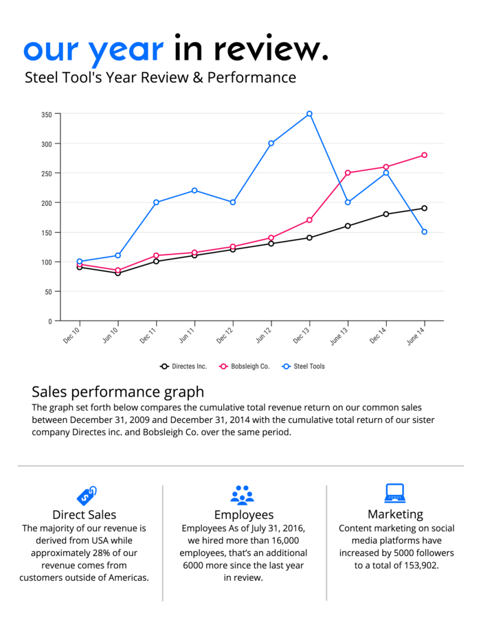
As seen in Adidas’ 2016 annual report, line charts are particularly useful for tracking the growth of share prices over time (compared to market indices):

Use stacked bar or donut charts to show market composition.
Another core component of the finances section of an annual report is market segmentation, which shows the breakdown of annual sales into different categories.
You might break down your sales by geographic region, by product category, by customer profile...whatever helps your business identify opportunities for growth and improvement.
Traditionally, sales breakdowns are visualized with pie or donut charts, a standard method for showing part-to-whole relationships.

Pie charts, while intuitive to read, are notoriously poor data visualization tools. Most people struggle to distinguish between the size of similar pie segments at a glance.
A better choice would be a stacked bar chart, seen in the market segmentation report below.

Use grouped bar charts to compare year-over-year financial performance.
Year over year financial performance is of interest to many potential readers.
Investors, employees, and customers will all want to see how an organization’s current performance compares to that of previous years. It’s arguably the most important metric to be included in an annual report.
The most efficient method for visualizing year-over-year performance is with grouped bar charts, like these ones in GE’s 2017 annual report. The side-by-side bars emphasize the changes from one year to the next.

As seen above, it’s a good idea to use a highlight color to draw extra attention to the year of interest (2017, in this case).
Use bold color accents to highlight key facts, quotes, and figures
Color should never be used simply for decoration in an annual report.
Although aesthetics should be a consideration, color should primarily be used for emphasizing key data, improving readability, or guiding the reader’s attention.
As I just mentioned for the bar charts above, color can be used to highlight key information. It can be used to draw the reader’s attention to particularly important facts, figures, or data points in information-dense displays of text and data.
Check out how the yellow color is used to create visual contrast in this annual report example:
The contrast between the green background and the yellow highlight color draws attention to the most valuable bits of information: the data! The contrast creates points of visual focus, helping us make sense of the information on the page.
When creating your annual report, try to pick one highlight color and apply it to every key data point that you want your readers to pay attention to. The brighter, the better!
To learn more about using contrasting color schemes, check out this guide on how to use colors in infographics.
Create a clear type hierarchy to make your annual report skimmable
Annual reports are typically quite information-heavy, with a great deal of technical information on each page.
To prevent your readers from getting lost (or worse: bored), it’s important to create a clear hierarchy of information on each page. This hierarchy will help your reader navigate through the report, allowing them to easily skim through to the most pertinent information.
You can create hierarchy by altering the size, weight, and placement of various elements. Headings should be larger than subheadings, key figures should be bolder than general body text, chart captions should be small and light, etc.

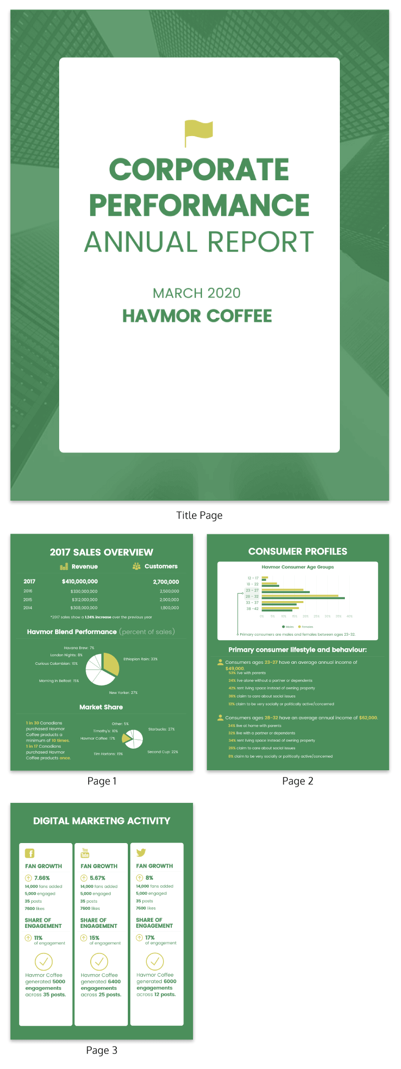
Check out how text hierarchy enhances the readability of the corporate performance annual report below. The titles and key numbers are styled in bold, black, large text, making them stand out from the rest of the page, while less pertinent text, like labels and captions, are smaller and more subtle:

When creating this visual hierarchy, it’s important to be mindful of the principles of typography. You don’t want the typography to distract from the content of the annual report.
Here are a few principles to keep in mind:
- Use a maximum of three different fonts to ensure the text is interesting but not chaotic.
- Use a stylized font for the header text and a minimal font for the body text.
- Use different font weights and styles to create contrast and draw the eye.
Want to learn more about typography for annual reports and infographics? Check out this guide on how to choose fonts.
Create your annual report on a grid for a balanced page layout
I strongly suggest using a grid to format your annual report design.
Building off of an underlying grid framework will ensure consistency from page to page, while allowing you to experiment with different compositions (to keep your report interesting).

Using a grid can also help you create negative space, which is critical to great design. It gives the viewer time to process what they are seeing before moving on to the next section. Negative space is the core design component of most crisp, modern designs, like the one below:
Focus on what’s important with a condensed one-pager annual report
Short, one page annual reports (also known as one-pagers) are gaining popularity as an alternative to extensive multi-page annual reports. These reports cover only the most important metrics, making it possible to grasp an organization’s performance at a glance.
One of the keys to a successful one page annual report is a simple color scheme. Pair neutral greys with a single bright highlight color for a sleek, cohesive look.

FAQs on what is an annual report
1. What’s the difference between an annual report and an SEC filing?
An annual report is a polished overview for stakeholders, while an SEC filing (like Form 10-K) is a legal document focused on detailed financial disclosures and compliance. Annual reports are designed to inform and engage; SEC filings are designed to meet regulatory requirements.
2. Which nonprofits have standout annual or impact reports?
Several nonprofits, such as Charity: Water, the International Rescue Committee (IRC), the American Kidney Fund, the Navy SEAL Foundation, Midwest Food Bank, the Humane Society, and NPR (National Public Radio) are known for publishing transparent and engaging impact reports.
3. What does “full disclosure” mean in annual reports?
In annual reports, full disclosure means providing transparent context behind the numbers. This includes details like notes and footnotes, accounting policies, risk factors and contingencies to help readers interpret financial results accurately and build trust in the organization’s reporting.
4. What is the difference between an annual report and an impact report?
An annual report focuses on financial performance, governance, and overall company health, while an impact report highlights mission-driven outcomes, programs, and social or environmental results.
Conclusion
I hope this guide has answered the question, “what is an annual report”. To wrap up, here are all of the design best practices you should keep in mind when creating your next annual report.
- Create a high-impact annual report cover page with large images
- Choose the right charts for your annual report metrics
- Use bold color accents to highlight key facts, quotes, and figures
- Create a clear type hierarchy to make your annual report skimmable
- Create your annual report on a grid for a balanced page layout
- Focus on what’s important with a condensed one-pager annual report
Now you know everything there is to know about annual reports! If you still have burning question, comment and let us know. We'll share our expertise.
You can also check out more resources on report design examples, templates and tips below.
More report design guides:
55+ Customizable Annual Report Templates, Examples & Tips

7 Business Report Templates You Need to Make Data-Backed Decisions
