


You’ve heard this before: infographics work. In fact, they’re the most popular and helpful visual content marketers used in 2022.
But not all infographics are made equal.
What separates the good ones from the not-so-good ones? They contain all of these nine (+ one!) essential infographic elements:

So, what does each element entail and how can you optimize it to create the perfect infographic? Let’s take a closer look.
Click to jump ahead:
The “+1” element: the audience
First, let’s address the element in the room…

You can’t see “the audience” on an infographic (hence the “+1”), yet it’s the most essential element to make your infographic successful.
Understanding who you’re creating the infographic for and in what context they’ll read and use your design will help you make sure:
- Your infographic is inclusive and accessible — the CDC reports 1 in 4 adults in the U.S. has some type of disability.
- Your infographic is visually appealing and legible online and/or in print.
- And ultimately: your infographic meets your audience’s needs.
How can you do that, exactly? By answering these questions:
- Who is your audience?
- How will this infographic benefit them — or, why would they need the infographic? What kind of problems will the infographic help them solve?
- How will they view the infographic? Is your audience primarily on their desktop, tablet or mobile phone?
- Is the infographic a stand-alone visual or does it accompany a blog post?
- How exactly will they use the infographic?
- Will they save it to their computer and refer to it at a later time?
- Will they print it out as a handout? Will they need space on the infographic to take notes?
- Will they repost the infographic on their social media or blogging platform?
Always think of your audience before, during and even after creating your infographic. This includes asking for feedback after you’ve published your infographic so you can do a better job in the future.
This particular element affects the other infographic elements as well… I’ll explain what I mean in the next few sections!
The information and data
Every infographic sets out to tell a story using the information and data it presents.
For your infographic to tell an effective, compelling story, you need to make sure the information and data you use is:
- Credible — you should use data from credible sources only, like high-authority news sites and research publications.
- Accurate — fact check your data to make sure it’s accurate. That means, double checking all your numbers, especially if you’re doing your own calculations.
- Meaningful — your data should be up to date and relevant to your audience. Make sure you’re using the latest studies and research available.
- Visualized — where appropriate, visualize your data using charts, graphs, diagrams or other visual aids like icons, illustrations and images.
The type of data you’re trying to convey will determine which chart type is best.
So, to decide which type of chart would best convey your data, you first have to determine what kind of data you want to present. A single important number? A comparison between data points? A trend over time? An outlier?
The types of charts most commonly used in infographics are pie chart, bar graphs, column graphs and line charts. For example, a column graph is one of the easiest ways to compare data:

And to convey a trend over time, the most common choice is a line chart:

Another good rule of thumb: your charts should be easy enough to read that they only take ten seconds or less to understand. Check out this article for more info on how to choose the best charts for your infographic. And don’t forget to always cite your infographic data sources!
The title and headings
First impressions count, so make your title clear, concise and compelling. You want to hook your readers and let them know what they’re looking at right away.
Your title doesn’t have to be long. If you’re creating an infographic explaining a concept, for example, the title of your infographic can be the name of that concept:

And you can provide some more context to the title with a short introduction (more on this in a minute):

You can also hook readers in by stating the benefit of the infographic — or the pain points of the audience — in the headline. This infographic, for example, can attract managers who have difficulty managing a remote team as it states their problem and promises solutions right in the title:

For more specific tips on how to write captivating headlines, check out our post: How to Write Great Copy for an Infographic
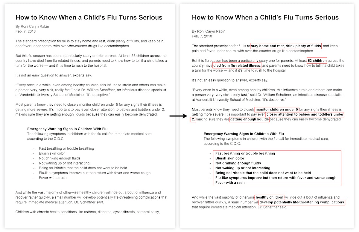
Another important point: if your infographic is long, make sure to include headings and subheadings to break up the content. Surely an infographic like this…

…which breaks up the content into three clear sections — who is most at risk, what to watch for and how to treat — is easier to skim and understand than a wall of text, like this document:
The content
This section covers three elements:
Let’s take a look at each of them.
The introduction
As mentioned before, the introduction adds more context to your title. This helps the readers further understand what the infographic is about and why it matters at a glance:

Of course, not all infographics need an introduction. Sometimes you can skip it if the topic itself is intriguing enough and the title does a good job at presenting it:

Personally, I would recommend always writing an intro. It gives you one more chance to convince the readers to stay and read the infographic, and you don’t need to use too many words either. (Check out our post on infographic writing for more tips on crafting your introduction.)
The body copy
The introduction is a nice segue into the meat of your infographic: the body copy.
Here’s a tip: always try to keep your body copy succinct and to the point. Only include the most important information — you’re not (and shouldn’t be) writing an essay with your infographic.
If you want to learn how to summarize a document and present it visually in an infographic, check out our blog: How to Summarize Information and Present it Visually
Again, if you still have a lot of text left after condensing your content, you can break it up by using:
- Headings and subheads
- Bulleted lists
- Pull quotes
- Charts/graphs
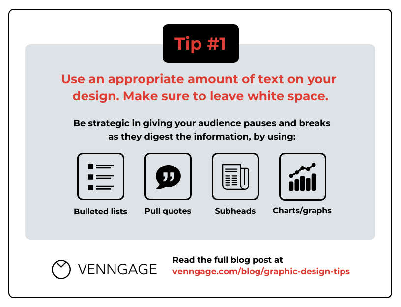
In fact, this is one of the 11 simple graphic design tips you can apply to amplify your design:
For more graphic design tips, check out our post: 11 Actionable Graphic Design Tips for Beginners, According to Design Experts
The conclusion
Your conclusion can include key takeaways, footnotes, recommendations for next steps, calls to action and more.
However, like the introduction, the conclusion is optional. Some infographics look totally fine without it:

Others, not so much. If you removed the conclusion from this infographic, you’d take out an important call to action (plus, the source of the infographic data):

So even though it’s optional, I’d argue the conclusion is still an essential infographic element — you should always consider including it whenever you’re creating an infographic.
The design
In this section, I’ll be addressing the final four elements of an infographic:
Let’s jump into it.
The layout
How you lay out your infographic can have a big impact on how your audience reads and understands it. This includes how you:
- Organize the order of different information on the infographic
- And lay out the infographic as a whole
First, think of the most effective way to present the information in your infographic. This relies a lot on how your audience reads.
In Western cultures, people tend to read from top to bottom and left to right. So if you’re creating a horizontal timeline infographic, for example, a rule of thumb is to present the information chronologically in that order:

The same rule applies if you’re creating a vertical timeline infographic, of course:

You also want to include the most important/striking piece of information closer to the beginning of the infographic:

With the way this infographic is laid out, your eye is most likely drawn to:
- The title “What is Heart Failure”
- The two statistics right underneath the title
In this case, the designer decided to draw attention to the two statistics as they provide important context for the main topic (heart failure). Plus, mentioning striking figures right off the bat helps hook the readers in and keeps them interested in learning more about the topic.
Now, imagine if you reorganized the information so the definition of “heart failure” precedes the statistics, like this:

Even though the definition of heart failure is important, it isn’t interesting enough to catch the audience’s attention right away. The stats are more compelling than a definition by far.
Now that you’ve reorganized your content to hook your audience, start thinking about how you can lay it out on a page.
If you’re comparing two or more items in your infographic, for example, you can use a two-column or three-column layout:


A list infographic, on the other hand, can use a one-column layout:

Or two columns, depending on how long the list is:

Of course, depending on the content you want to visualize, you can get a bit more creative:

Overall, think of your audience and choose the best way to present your infographic content to that audience. Then create an infographic outline before you start putting together different infographic elements on a design canvas.
For more specific guidelines on how to choose the best infographic layout, check out our blog: How to Choose an Infographic Layout (20+ Template Ideas for Beginners)
The fonts
The fonts you choose can impact how your audience perceives your infographic. Check out these two versions of the same infographic — they have the same content, visuals and color scheme, but different fonts:

Style aside, the first version is much more effective because of the fonts used — it’s easier to glean information from the first infographic than from the second.
If you’re designing an infographic for your business, you’ll want to use your brand fonts. But at the end of the day, your infographic fonts should be:
- Legible — it’s easy to make out any given letter in your infographic.
- Readable — it’s easy to read larger passages of text in your infographic.
- Suitable to the content — it looks professional (if you’re creating an infographic for your business) or playful (if you’re creating a fun data infographic), for instance.
For more specific tips on how to choose fonts for your infographic, check out our guide: How to Choose Fonts For Your Designs (With Examples)
The colors
If you’re designing an infographic for your business, chances are you already have at least one brand color palette to use. How you apply these colors depends on your branding guidelines, but here are a few more quick tips:
- Apply color to text sparingly. You can reserve your brand colors for titles, headings, decorative text and pull quotes — and sometimes, subheadings. Body text should be left in black as much as possible for maximum legibility.
- Ensure you have a good contrast ratio if you’re layering colored text on top of a colored background. WebAIM has a contrast checker available on their website, but you’ll soon be able to check your ratios right in the Venngage editor using our accessibility tool, too!
- Apply color to backgrounds strategically. This can work well to highlight key pieces of information, but for optimal legibility, you’ll want most of your body copy on a white background.
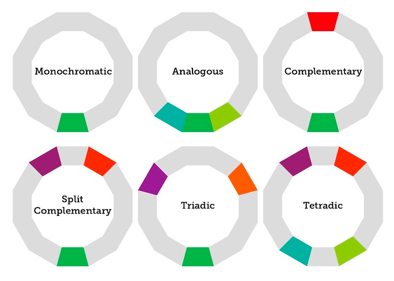
If you don’t have a pre-determined palette to work with, it’s always good to go back to the basics. Use the color wheel:

And you can come up with different palettes:
For more detail on what each palette entails, check out this guide: How to Pick Colors to Captivate Readers and Communicate Effectively
The colors you choose also depend on the theme/topic of your infographic.
For example, this infographic uses different shades of red since the topic is about high blood pressure:

Or this one, which uses different shades of pink, a color we all associate with breast cancer awareness:

The visual aids
Of course, without visuals, an infographic would be no different from a regular document. The kind of visuals you can use in your infographic include:
- Icons

- Illustrations

- Photos

- Data visualizations: charts, graphs, diagrams, maps, etc.

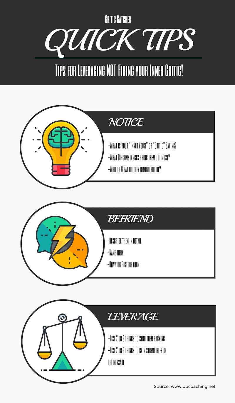
You can (and should) combine different types of visual aids to add variety and visual appeal to your infographics. This template, for example, uses icons and data visualizations:

Or this one, which incorporates both icons and photos:

Besides using individual icons as visual aids, you can combine multiple icons to create “icon stories” that illustrate simple scenes.
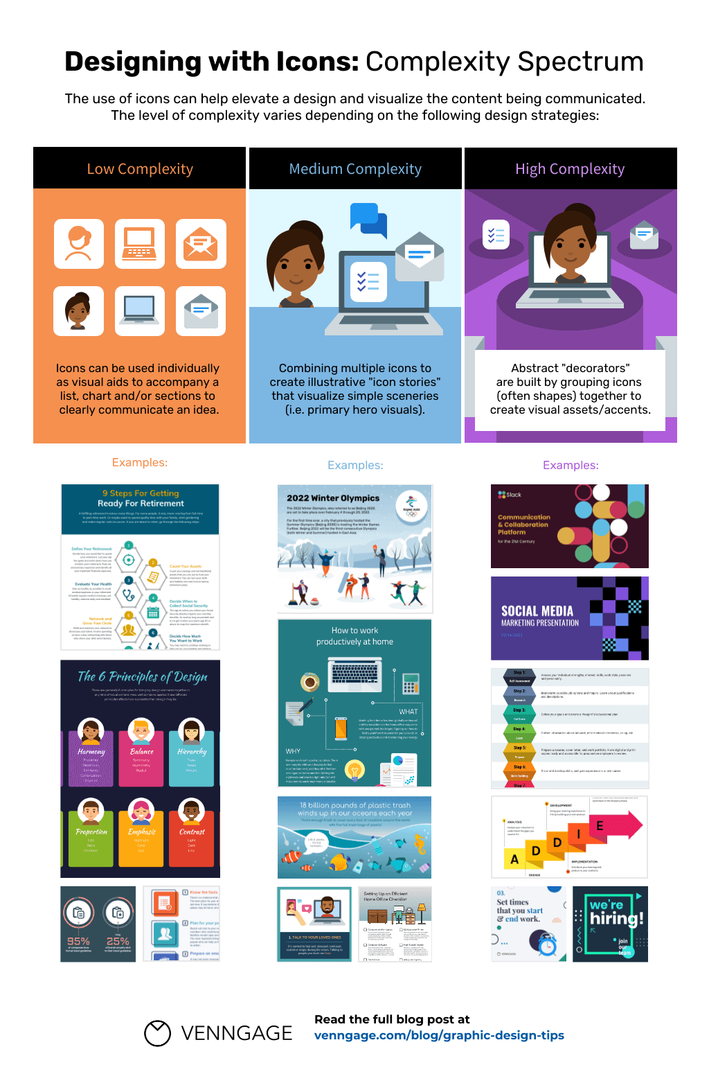
For more information on icon stories and how you can apply them effectively, check out our post: How to Use an Icon Story to Take Your Infographic to the Next Level
The elements of a good infographic fit together like puzzle pieces
When creating an infographic, learning how you can optimize each element is important. But it’s not enough to think about these elements in isolation. A successful infographic design takes a holistic approach where every element fits together like puzzle pieces:

I hope this has helped you jumpstart your first infographic design (or improve your current one)! If you need more inspiration, check out our infographic templates library:


