


Presenting data clearly isn’t as simple as dropping numbers into a chart, it’s a real challenge. In fact, 40% of business professionals often struggle to make sense of their data in spreadsheets.
To make it easier, I’ve handpicked examples from Venngage’s most-used data presentation templates. Without the right visuals, your message risks being ignored, misinterpreted or rejected.
As Carly Fiorina, former CEO of Hewlett-Packard, once said: “The goal is to turn data into information, and information into insight.”
In this guide, you’ll find:
- Practical data presentation examples and methods
- Tips for choosing the right visual style
- Templates designed to simplify complex ideas
- How to use Venngage’s free chart maker to bring it all together
Let’s dive in and make your data stories shine.
10 Essential data presentation examples + methods you should know
Data presentation is a vital skill because it turns raw information into clear insights, helping people make informed decisions quickly. Whether you’re in business, academia or simply want to share ideas more effectively, understanding different ways to present data is essential.
As Ben Shneiderman, Professor of Computer Science at the University of Maryland, put it: “Visualization gives you answers to questions you didn’t know you had.”
With that in mind, here are some essential data presentation methods for impactful storytelling:
1. Bar graph
Ideal for comparing data across categories or showing trends over time.
Bar graphs, also known as bar charts are workhorses of data presentation. Bar charts are one of the most common ways to display information in a visual format, making them a popular choice in business presentations and high school textbooks.
They’re like the Swiss Army knives of visualization methods because they can be used to compare data in different categories or display data changes over time.
In a bar chart, categories are displayed on the x-axis and the corresponding values are represented by the height of the bars on the y-axis.
It’s a straightforward and effective way to showcase raw data, making it a staple in business reports, academic presentations and beyond.
Make sure your bar charts are concise with easy-to-read labels. Whether your bars go up or sideways, keep it simple by not overloading with too many categories.
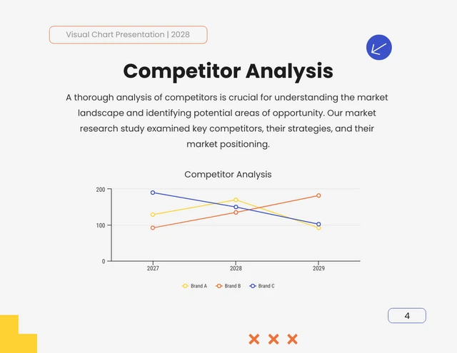
2. Line graph
Great for displaying trends and variations in data points over time or continuous variables.
Line charts or line graphs are your go-to when you want to visualize trends and variations in data sets over time. Line charts are more popular than all other graphs combined because their visual characteristics reveal data trends clearly and these charts are easy to create.
One of the best quantitative data presentation examples, they work exceptionally well for showing continuous data, such as sales projections over the last couple of years or supply and demand fluctuations.
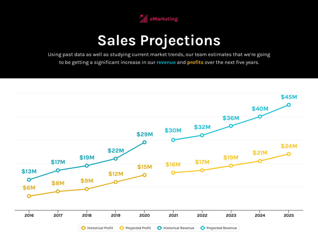
The x-axis represents time or a continuous variable and the y-axis represents the data values. By connecting the data points with lines, you can easily spot trends and fluctuations.
A tip when presenting data with line charts is to minimize the lines and not make it too crowded. Highlight the big changes, put on some labels and give it a catchy title.
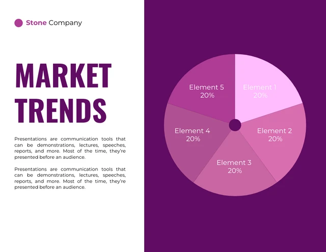
3. Pie chart
Useful for illustrating parts of a whole, such as percentages or proportions.
Pie charts are ideal for showing how a whole is divided into parts, making them one of the most common choices in business presentations for illustrating proportions or distributions.
They’re commonly used to represent percentages or proportions and are great for presenting survey results that involve demographic data.
Each “slice” of the pie represents a portion of the whole and the size of each slice corresponds to its share of the total.
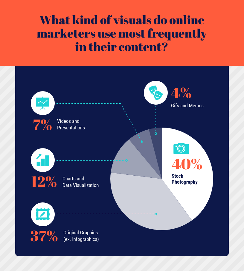
While pie charts are handy for illustrating simple distributions, they can become confusing when dealing with too many categories or when the differences in proportions are subtle.
Don’t get too carried away with slices — label those slices with percentages or values so people know what’s what and consider using a legend for more categories.
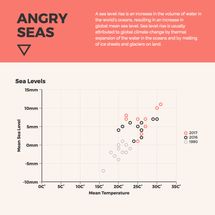
4. Scatter plot
Effective for showing the relationship between two variables and identifying correlations.
Scatter plots are all about exploring relationships between two variables. They’re great for uncovering correlations, trends or patterns in data.
In a scatter plot, every data point appears as a dot on the chart, with one variable marked on the horizontal x-axis and the other on the vertical y-axis.
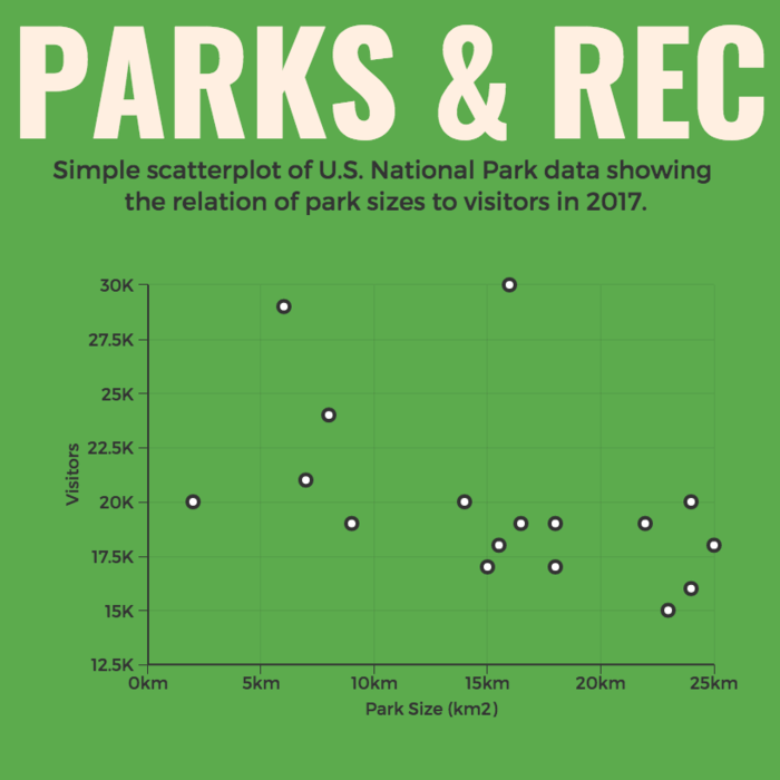
By examining the scatter of points from heat map software, you can discern the nature of the relationship between the variables, whether it’s positive, negative or no correlation at all.
If you’re using scatter plots to reveal relationships between two variables, be sure to add trendlines or regression analysis when appropriate to clarify patterns. Label data points selectively or provide tooltips for detailed information.
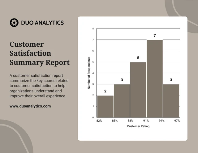
5. Histogram
Best for visualizing the distribution and frequency of a single variable.
Histograms are your choice when you want to understand the distribution and frequency of a single variable.
They divide the data into “bins” or intervals and the height of each bar represents the frequency or count of data points falling into that interval.
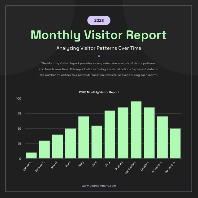
Histograms are excellent for helping to identify trends in data distributions, such as peaks, gaps or skewness.
Here’s something to take note of — ensure that your histogram bins are appropriately sized to capture meaningful data patterns. Using clear axis labels and titles can also help explain the distribution of the data effectively.
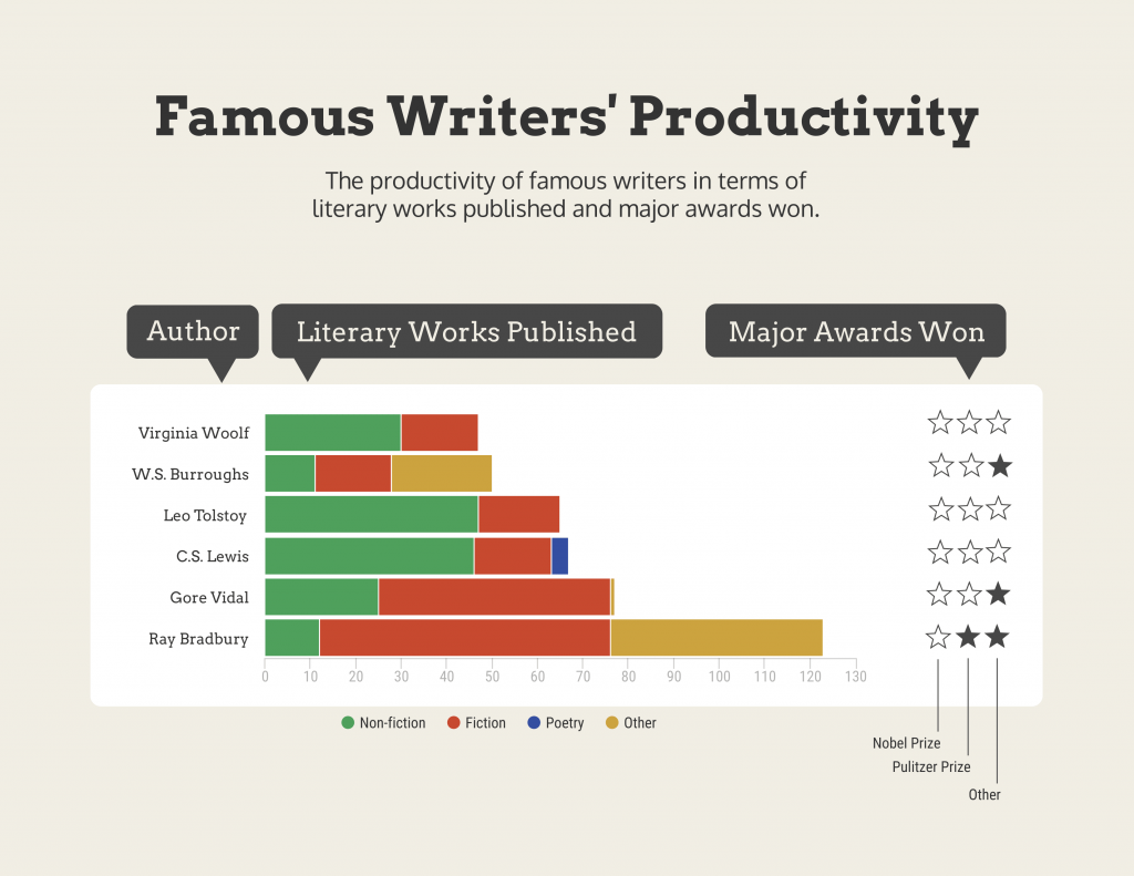
6. Stacked bar chart
Useful for showing how different components contribute to a whole over multiple categories.
Stacked bar charts are a handy choice when you want to illustrate how different components contribute to a whole across multiple categories.
Each bar represents a category and the bars are divided into segments to show the contribution of various components within each category.
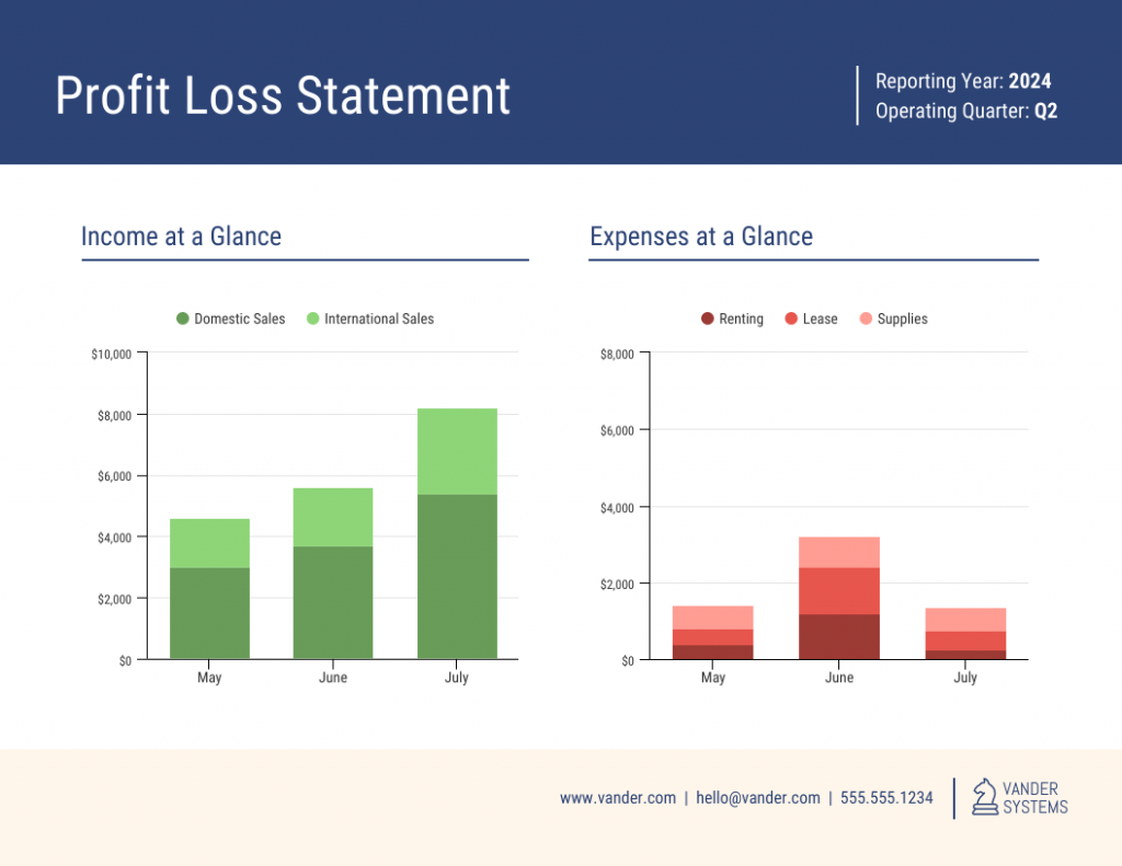
This method is ideal for highlighting both the individual and collective significance of each component, making it a valuable tool for comparative analysis.
Stacked bar charts are like data sandwiches—label each layer so people know what’s what. Keep the order logical and don’t forget the paintbrush for snazzy colors. Here’s a data analysis presentation example on writers’ productivity using stacked bar charts:
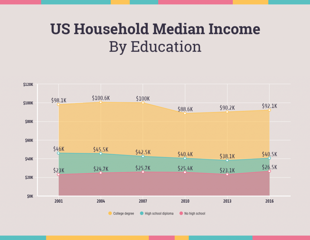
7. Area chart
Similar to line charts but with the area below the lines filled, making them suitable for showing cumulative data.
Area charts are close cousins of line charts but come with a twist.
Imagine plotting the sales of a product over several months. In an area chart, the space between the line and the x-axis is filled, providing a visual representation of the cumulative total.
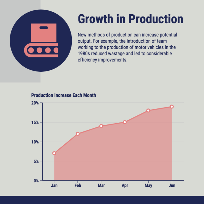
This makes it easy to see how values stack up over time, making area charts a valuable tool for tracking trends in data.
For area charts, use them to visualize cumulative data and trends, but avoid overcrowding the chart. Add labels, especially at significant points and make sure the area under the lines is filled with a visually appealing color gradient.
8. Tabular presentation
Presenting data in rows and columns, often used for precise data values and comparisons.
Tabular data presentation is all about clarity and precision. Tables are often used in research papers to present data, especially when there is enough data to display and it is easy to read the table.
Think of it as presenting numerical data in a structured grid, with rows and columns clearly displaying individual data points.
A table is invaluable for showcasing detailed data, facilitating comparisons and presenting numerical information that needs to be exact.
Leveraging CSPM capabilities can help secure and manage sensitive data in cloud-hosted tables, ensuring safe and compliant presentation of information.They’re commonly used in reports, spreadsheets and academic papers.
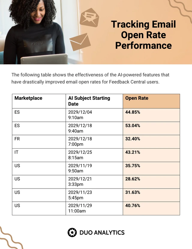
When presenting tabular data, organize it neatly with clear headers and appropriate column widths. Highlight important data points or patterns using shading or font formatting for better readability.
9. Textual data
Utilizing written or descriptive content to explain or complement data, such as annotations or explanatory text.
Textual data presentation may not involve charts or graphs, but it’s one of the most used qualitative data presentation examples.
It involves using written content to provide context, explanations or annotations alongside data visuals. Think of it as the narrative that guides your audience through the data.
Well-crafted textual data can make complex information more accessible and help your audience understand the significance of the numbers and visuals.
Textual data is your chance to tell a story. Break down complex information into bullet points or short paragraphs and use headings to guide the reader’s attention.
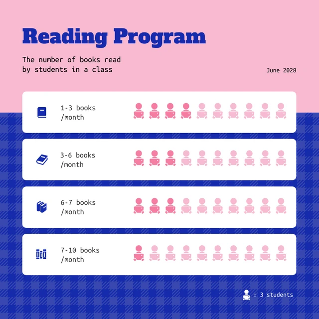
10. Pictogram
Using simple icons or images to represent data is especially useful for conveying information in a visually intuitive manner.
Pictograms are all about harnessing the power of images to convey data in an easy-to-understand way.
Instead of using numbers or complex graphs, you use simple icons or images to represent data points.
For instance, you could use a thumbs up emoji to illustrate customer satisfaction levels, where each face represents a different level of satisfaction.
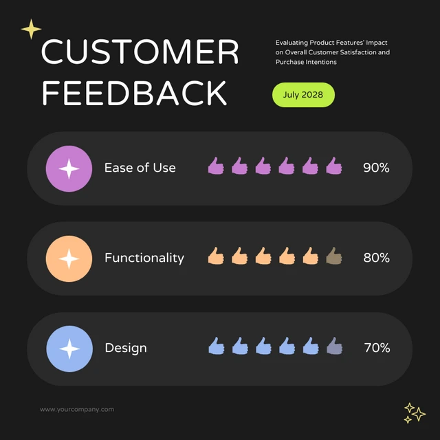
Pictograms work well because they replace abstract numbers with familiar icons, making information easier to grasp at a glance compared to text-heavy charts. Use consistent scaling and a legend to explain the symbols’ meanings, ensuring clarity in your presentation.
Looking for more data presentation ideas? Use the Venngage graph maker or browse through our gallery of chart templates to pick a template and get started!
That said, Strong visuals go beyond charts. For more ways to level up your slides and reports, explore our visual presentation guide.
What should be included in a data presentation?
A comprehensive data presentation should include several key elements to effectively convey information and insights to your audience. Here’s a list of what should be included in a data presentation:
1. Title and objective
- Begin with a clear and informative title that sets the context for your presentation.
- State the primary objective or purpose of the presentation to provide a clear focus.

2. Key data points
- Present the most essential data points or findings that align with your objective.
- Use charts, graphical presentations or visuals to illustrate these key points for better comprehension.
3. Context and significance
- Provide a brief overview of the context in which the data was collected and why it’s significant.
- Explain how the data relates to the larger picture or the problem you’re addressing.
4. Key takeaways
- Summarize the main insights or conclusions that can be drawn from the data.
- Highlight the key takeaways that the audience should remember.
5. Visuals and charts
- Use clear and appropriate visual aids to complement the data.
- Ensure that visuals are easy to understand and support your narrative.
Remember this:
Clutter and confusion are failures of design, not attributes of information.
Edward R. Tufte, Professor Emeritus of Political Science, Statistics, and Computer Science at Yale University
6. Implications or actions
- Discuss the practical implications of the data or any recommended actions.
- If applicable, outline next steps or decisions that should be taken based on the data.
7. Q&A and discussion
- Allocate time for questions and open discussion to engage the audience.
- Address queries and provide additional insights or context as needed.
What are some common mistakes to avoid when presenting data?
Presenting data is a crucial skill in various professional fields, from business to academia and beyond. To ensure your data presentations hit the mark, here are some common mistakes that you should steer clear of:
Overloading with data
Presenting too much data at once can overwhelm your audience. Focus on the key points and relevant information to keep the presentation concise and focused. Here are some free data visualization tools you can use to convey data in an engaging and impactful way.
Assuming everyone’s on the same page
It’s easy to assume that your audience understands as much about the topic as you do. But this can lead to either dumbing things down too much or diving into a bunch of jargon that leaves folks scratching their heads. Take a beat to figure out where your audience is coming from and tailor your presentation accordingly.
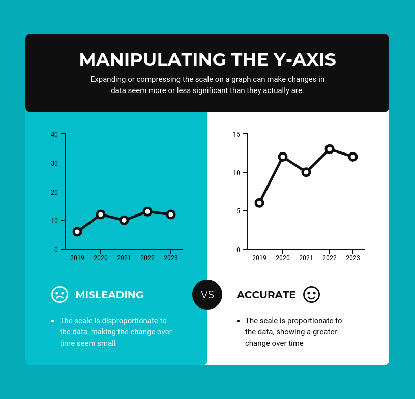
Misleading visuals
Using misleading visuals, such as distorted scales or inappropriate chart types can distort the data’s meaning. Pick the right data infographics and understandable charts to ensure that your visual representations accurately reflect the data.
Not providing context
Data without context is like a puzzle piece with no picture on it. Without proper context, data may be meaningless or misinterpreted. Explain the background, methodology and significance of the data.
Not citing sources properly
Neglecting to cite sources and provide citations for your data can erode its credibility. Always attribute data to its source and utilize reliable sources for your presentation.
Not telling a story
Avoid simply presenting numbers. A clear and engaging story helps your audience follow the path from background to data analytics to insights. Without that structure, it’s easy to lose their attention.
Infographics are great for storytelling because they mix cool visuals with short and sweet text to explain complicated stuff in a fun and easy way. Create one with Venngage’s free infographic maker to create a memorable story that your audience will remember.
Ignoring data quality
Presenting data without first checking its quality and accuracy can lead to misinformation. Validate and clean your data before presenting it.
Simplify your visuals
Fancy charts might look impressive, but if they confuse your audience, what’s the point? The key is to choose the simplest visual that communicates your message clearly.
As Garr Reynolds, author of Presentation Zen, explains: “You can achieve simplicity in the design of effective charts, graphs and tables by remembering three fundamental principles: restrain, reduce, emphasize.”
Still torn between using infographics or data design? This guide on the difference between data design and infographics can help you decide.
Missing the emotional connection
Data isn’t just about numbers; it’s about people and real-life situations. Don’t forget to sprinkle in some human touch, whether it’s through relatable stories, examples or showing how the data impacts real lives.
Skipping the actionable insights
At the end of the day, your audience wants to know what they should do with all the data. If you don’t wrap up with clear, actionable insights or recommendations, you’re leaving them hanging. Always finish up with practical takeaways and the next steps.
FAQs on data presentation examples
Can you provide some data presentation examples for business reports?
Business reports often benefit from data presentation through bar charts showing sales trends over time, pie charts displaying market share,or tables presenting financial performance metrics like revenue and profit margins.
What are some creative data presentation examples for academic presentations?
Creative data presentation ideas for academic presentations include using statistical infographics to illustrate research findings and statistical data, incorporating storytelling techniques to engage the audience or utilizing heat maps to visualize data patterns.
What are the key considerations when choosing the right data presentation format?
When choosing a chart format, consider factors like data complexity, audience expertise and the message you want to convey. Options include charts (e.g., bar, line, pie), tables, heat maps, data visualization infographics and interactive dashboards.
Knowing the type of data visualization that best serves your data is just half the battle. Here are some best practices for data visualization to make sure that the final output is optimized.
How can I choose the right data presentation method for my data?
To select the right data presentation method, start by defining your presentation’s purpose and audience. Then, match your data type (e.g., quantitative, qualitative) with suitable visualization techniques (e.g., histograms, word clouds) and choose an appropriate presentation format (e.g., slide deck, report, live demo).
For more presentation ideas, check out this guide on how to make a good presentation or use a presentation software to simplify the process.
How can I make my data presentations more engaging and informative?
To enhance data presentations, use compelling narratives, relatable examples and fun data infographics that simplify complex data. Encourage audience interaction, offer actionable insights and incorporate storytelling elements to engage and inform effectively.
The opening of your presentation holds immense power in setting the stage for your audience. To design a presentation and convey your data in an engaging and informative, try out Venngage’s free presentation maker to pick the right presentation design for your audience and topic.
What is the difference between data visualization and data presentation?
Data presentation typically involves conveying data reports and insights to an audience, often using visuals like charts and graphs. Data visualization, on the other hand, focuses on creating those visual representations of data to facilitate understanding and analysis.
Transform your message with impactful data storytelling
Now that you’ve learned a thing or two about how to use these methods of data presentation to tell a compelling data story, it’s time to take these strategies and make them your own.
But here’s the deal: these aren’t just one-size-fits-all solutions. Remember that each example we’ve uncovered here is not a rigid template but a source of inspiration. It’s all about making your audience go, “Wow, I get it now!”
Think of your data presentations as your canvas – it’s where you paint your story, convey meaningful insights and make real change happen.
So, go forth, present your data with confidence and purpose and watch as your strategic influence grows, one compelling presentation at a time.


