
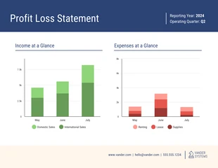
Free Profit and Loss Bar Graph Template
Present data sets with multiple variables or compare clusters of information by customizing this easy-to-use bubble chart template.

 100% customizable templates
 Millions of photos, icons, charts and graphics
 AI-powered editing features
 Effortlessly share, download, embed and publish
 Easily generate QR codes for your designs
- Design styleretro, vintage
- Colorslight, vibrant
- SizeLetter (11 x 8.5 in)
- File typePNG, PDF, PowerPoint
- Planfree
A bubble chart is a type of chart that displays data in a three-dimensional format. The size of the bubbles represents the magnitude of the data. In contrast, the bubbles' color represents the different data categories. Bubble charts are often used to visualize data sets that have multiple variables. You can also use bubble charts to compare data sets. It can help you differentiate the sales of two products. The size of the bubbles represents the total sales for each product. Meanwhile, the color of the bubbles represents the various regions where the products were sold. When creating a bubble chart, you will need to include the data you want to visualize, the different categories of data, the size, and the bubbles' color. You can add other components to your charts, such as labels, titles, and legends. These elements can help you to understand the data that you are displaying. Additionally, refrain from making your bubbles too small or too large. If the bubbles are too tiny, it won't be easy to see the data. If the bubbles are too large, it may obscure
Related Chart Templates
table charts
stacked charts
stacked charts
bar charts
stacked charts
bar charts
mixed charts
bar charts

column charts
stacked charts