


I’ve definitely had moments where I open a spreadsheet, stare at it for a bit… and then quietly close it like it’s going to solve itself.
And it’s not just the spreadsheet. Sometimes the data is coming from everywhere—tools, databases, even pipelines like moving data from Amazon DynamoDB to Snowflake—and by the time it all lands in one place, you’re just left wondering: now what?
If you’re not a data analyst, most visualization tools either feel way too complex or way too basic to actually tell you anything useful. So instead of overwhelming you, I pulled together a curated shortlist of free data visualization tools and broke down who each one is actually for (quick charts, dashboards, polished visuals you can share, etc.).
One thing I wish someone told me earlier: “free” almost always comes with a catch. Some tools need sign-ups, some add watermarks, others make your dashboards public by default, and a few limit exports. I’ll point all of that out so you’re not surprised halfway through.
I looked at each tool based on how easy it is to use, how flexible it feels, how good the outputs look—and whether the free version is actually usable, not just technically “free.”
Let’s get into it.
The 60-second pick: Which free data viz tool should you use?
If you just want a quick answer (no overthinking), start here:
- Beginner + CSV + want a downloadable chart fast → start with Vizdium
- Dashboards + sharing + you already use Google → start with Looker Studio
- Publish-ready charts + strong accessibility options → start with Datawrapper
- Portfolio/public gallery + want to learn a “big” BI tool → start with Tableau Public
If none of these feel quite right, don’t worry. The full breakdown below will help you find a better fit.
What “free” actually means (so you don’t waste time)
Quick reality check: most “free” data visualization tools aren’t fully free. They fall into a few buckets and knowing the difference saves a lot of frustration later.
Free forever (no strings attached)
You can use the core features without paying, usually with minimal restrictions.
Catch: fewer templates, limited customization or fewer export options.
Freemium
Free plan exists, but key features are gated behind a paid tier.
Common limits: restricted exports, fewer chart types, branding, or private sharing.
Free trial
Everything looks great… until the trial ends. Then you’ll need to pay to keep using it.
Here’s what actually matters when you’re choosing a tool:
- Watermarks & attribution: Some tools add branding to your charts or embeds on free plans.
- Export limits: Check what formats you can download (PNG, SVG, PDF) and whether high-quality exports are gated.
- Public-by-default publishing: Some tools (like Tableau Public) make your visualizations public unless you upgrade.
- Sharing & embeds: Not all tools let you generate links or embed charts without paying.
- Privacy & compliance: If you’re working with internal or sensitive data, public-by-default tools may not be a fit.
The short version: a tool can be “free” and still cost you time, privacy or flexibility, so it’s worth checking these upfront.
Top free data visualization tools (with free-tier limits)
I didn’t just skim feature pages, I actually used each tool with the same dataset and tasks to see how they perform in real life (not just in demos).
Dataset used
A simple CSV with ~500 rows (sales data: dates, regions, reps, revenue). Nothing fancy, just enough to reflect what most people actually work with.
What I tested in each tool
- Time to first chart: How long it took to go from upload → usable chart (including figuring out the interface)
- Ease of use / sign-up friction: Did I need an account? Were there onboarding steps, email gates or setup delays?
- Chart creation & flexibility: Could I easily choose or change chart types? How much control did I have over the final output?
- Export options: What formats were available (PNG, SVG, PDF)? Were exports restricted or gated?
- Watermarks & attribution: Did the free version add branding to downloads or embeds?
- Sharing & embeds: Could I generate a link or embed code without upgrading?
- Privacy defaults: Were charts private by default or automatically public (looking at you, Tableau Public)?
The goal wasn’t to find the most powerful tool, it was to find the ones that are actually usable on a free plan, especially if you just want to go from spreadsheet to insight without friction.
9 best free data visualization tools
To appreciate the following list of data visualization tools, it’s helpful to first get aligned on the term “data visualization.”
If you’re picturing a complex SQL model, that’s not the kind of data visualization we’re covering here. In simplest terms, a data visualization is a graphical representation of a data set. So really, this term can apply to anything from a basic bar chart to a complex SQL model.
For our purposes, we’ll be looking at the best free tools for beginners. That means, no SQL! And the data visualizations you can create with these tools are on the simple side, like charts, graphs and scatter plots.
To determine the best tools in this category, we’ll consider three factors: simplicity, functionality and freeness. Let’s get to it.
1. Venngage
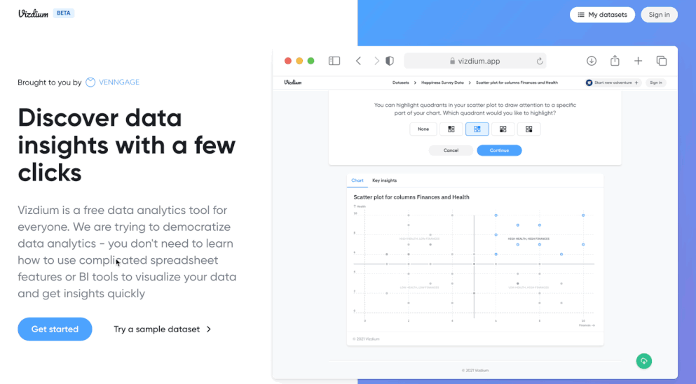
Vizdium by Venngage is a simple data exploration and visualization tool designed to de-complicate the analysis process. Think of it as a smart data analyst assistant! Instead of sifting through a dense spreadsheet or wrestling with pivot tables, you can upload a CSV file and extract insights (almost) instantaneously.
Once you’ve uploaded a spreadsheet, Vizdium analyzes the contents and suggests data visualization options. Alternatively, you can create a custom chart by choosing which columns to visualize. For a full guide, check out this how-to article.
This is where the magic happens. Once you’ve chosen a visualization option, Vizdium guides you through customizing your chart by asking a few simple questions and you can see exactly what a data set reveals.
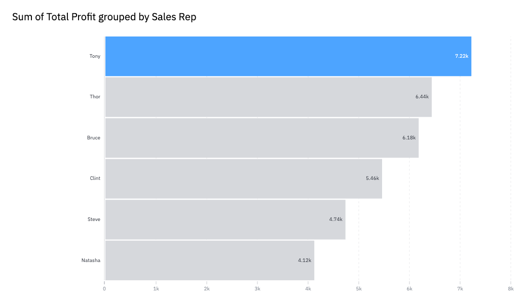
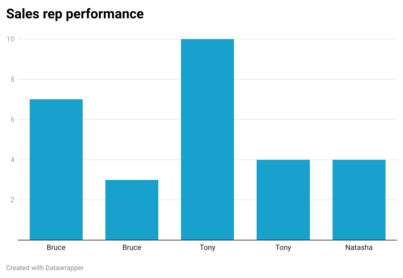
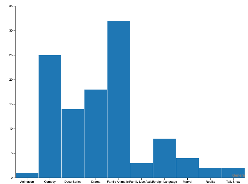
For example, if you were analyzing sales data, you could generate a bar graph showing how many units each sales representative sold. You could further emphasize these insights by highlighting who made the most profit and organizing your chart in ascending order.
Once you’re happy with your data visualization, you can download it in PNG or SVG. And you can accomplish all this in just a few clicks — no need to figure out complicated spreadsheet features or spend days training on advanced BI tools.
Whether you’re an executive, a marketer, an HR professional or any other business professional for that matter, Vizdium can help you visualize data and get insights quickly.
Learning curve
Very low. Beginner-friendly with guided steps and minimal setup required.
How functional is it?
Not only does Vizdium analyze your data, it guides you through the process of choosing and customizing a chart. In other words, it offers the perfect balance of simplicity and functionality for beginners.
Best for
Polished, shareable visuals (reports, presentations, social posts) without needing design or data expertise.
What’s free (explicit)
Free plan available; sign-up required for exports; PNG downloads included; some templates and features limited on free tier.
Data visualization example:
2. Datawrapper
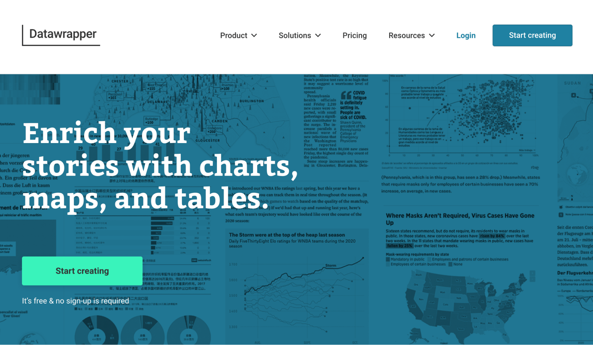
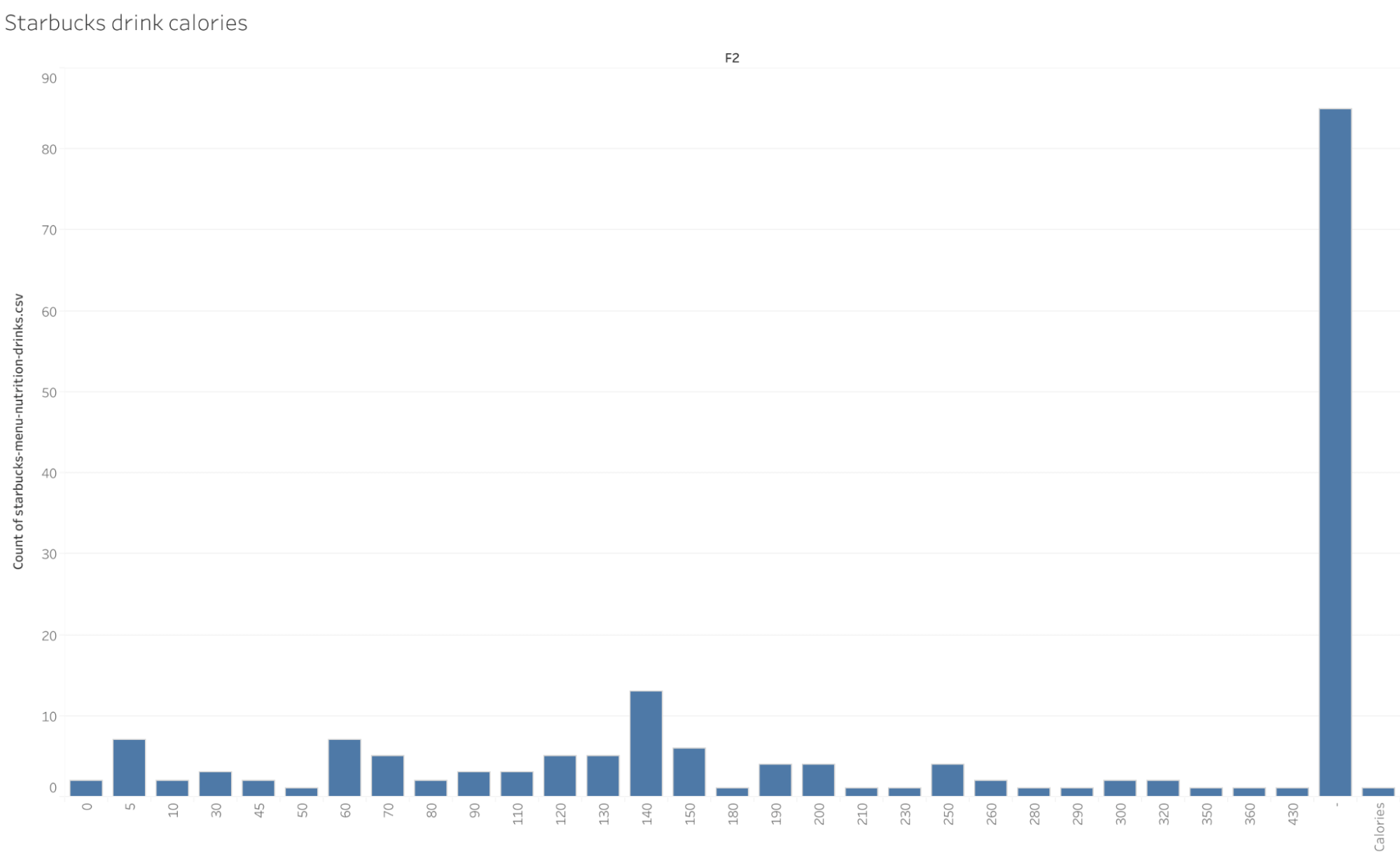
Datawrapper is an interesting tool geared towards journalists and publications who want to supplement their articles with professional data visualizations. But technically, anyone could use this tool. It offers interactive charts, maps and tables to help you tell a story with data.
To get started, you have a few options: simply paste in your data, upload an Excel or CSV file, connect with Google Sheets or link to an external dataset. Once you click proceed, you’ll be able to review your dataset before moving to the next step, visualization.
In this step, you can choose what type of chart to use and customize it in many different ways. Though Datawrapper doesn’t suggest what type of chart to use, it does choose your data points for you.
Notably, Datawrapper offers accessibility features, like a field for an alternative description (ALT) and a color checker to ensure someone with color vision deficiency will be able to distinguish the colors in your visualization.
However, to download your finished chart or get an embed code, you’ll need to provide your email address. Once you sign up, you can grab a PNG or publish your visualization to get that embed code.
Learning curve
Low. Easy to navigate, even if you have minimal data visualization experience.
How functional is it?
With 19 chart types, three map types and data tables, Datawrapper offers lots of options for visualizations and the customization capabilities are great, too.
Best for
Publish-ready charts and embeds (articles, reports, websites)
What’s free (explicit)
Free with sign-up; PNG exports available; embeds included; charts are public by default; attribution (“Created with Datawrapper”) included on free plan
Data visualization example:
3. Looker Studio (formerly Google Data Studio)
Looker Studio is more for creating data dashboards. But it’s worth a mention because you can use it to create simple data visualizations as well. If you’re logged into a Google account, clicking the “Start for free” button takes you right into “Looker Studio.” (Google acquired Looker, a data analytics platform, back in 2020.)
From here, you have a few options: you can create a report from scratch, connect to a data source or try “Explorer.” Any of these options will eventually take you to a platform where you can create a data visualization be it Looker Studio funnel visualization, charts, or any other visual representation.
But if you’re just getting started, try clicking “Create” then “Explorer.” This will take you right into a dashboard where you can select a data source or try a sample dataset.
Once you’ve hooked up some data, you’ll be able to choose from many different visualization options, including charts, tables, maps, scatter plots and more. But like Flourish, the tool doesn’t provide suggestions for what types of visualizations to use or extract insights from your data.
Setting up your data visualization is fairly straightforward. You can apply basic styling to it, like customization the text and colors quickly too. When your chart looks the way you want, the next step is to click “Share.” This will prompt you to add your visualization to a report.
From here, you can invite people to view your visualization, schedule an email with the report, get a shareable link, grab an embed code or download as a PDF. Lots of options! But remember, it’s best to choose this platform if you already know the data insights you want to visualize and how to go about it.
Learning curve
Moderate. Slightly more complex than Flourish, especially when working with dashboards and data connections.
How functional is it?
Quite functional in terms of options for data visualization and customization. But again, you’ll need to do the analysis part yourself.
Best for
Dashboards and ongoing reports connected to live data sources
What’s free (explicit)
Free with Google account; no watermark; sharing via link, embed or PDF export; projects are private by default but can be shared manually
Example:
4. Microsoft Power BI Desktop

Microsoft Power BI Desktop is a powerful data visualization and analytics tool that sits closer to the “advanced” end of this list but it’s still widely used by beginners willing to learn.
Unlike browser-based tools, Power BI Desktop is a downloadable app. Once installed, you can connect to multiple data sources (Excel, CSV, databases), transform your data a,nd build interactive dashboards and reports.
It offers far more control than most free tools here, from data modeling to custom visuals. But with that power comes complexity. There’s no guided “pick a chart” flow, you’ll need to understand your data and how to structure it.
Once your report is ready, you can export it or publish it to the Power BI Service for sharing.
Learning curve
High. Expect a learning curve, especially if you’re new to data modeling and BI tools.
How functional is it?
Extremely functional. Supports advanced data modeling, interactive dashboards and a wide range of visualizations.
Best for
Advanced dashboards and data modeling (especially if you want a stepping stone into BI tools).
What’s free (explicit)
Free as a desktop app (no sign-up required to use locally); sharing and collaboration typically require a paid Power BI Pro plan; exports available (e.g., PDF); no watermark on desktop outputs.
5. RAWGraphs
RAWGraphs is an open source tool for data visualization. That means, anyone can access the original source code and the community can contribute to it, too. As a result, RAWGraphs offers over 30 different types of data visualizations, including more advanced maps and diagrams.
It’s similar to Vizdium in that you start by uploading a data set. The next step is where things differ. Instead of providing suggestions for what type of data visualization to use, RAWGraphs simply prompts you to choose a chart type next. Then, you have to select which data points you’d like to feature in your chart.
Once you’ve figured this out, you can customize your chart further by adjusting elements, like size, color and spacing. And of course, the last step is to download your data visualization in the file format of your choice.
RAWGraphs is a great choice for those who have slightly more advanced data visualization skills. It provides a lot of different visualization and customization options. But if you’re just getting started, there will be a learning curve, as you figure out which type of visualization to use for what and how to properly map variables to a chart.
Learning curve
Moderate. Easier than BI tools, but requires some understanding of chart types and data mapping.
How functional is it?
Very functional. RAWGraphs offers a wide range of customization and chart options — ideal for those who have slightly more advanced data visualization skills.
Best for
Custom and uncommon chart types (especially for slightly more advanced users)
What’s free (explicit)
100% free and open-source; no sign-up required; exports available (SVG/PNG); no watermarks
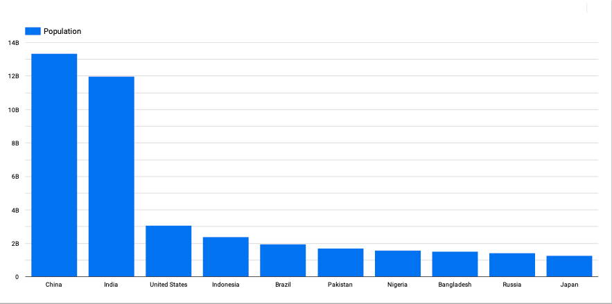
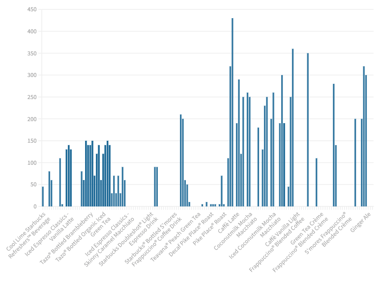
Data visualization example:
6. Flourish
Flourish is a data visualization and storytelling tool that focuses on the design process, rather than on data exploration and analysis. You do need to sign up to start using the tool and go through a fairly involved onboarding process.
Once you’re in, you can choose to start a “New visualization” or a “New story.” If you choose to create a new visualization, you’ll land on Flourish’s templates page, where you can select from different types of charts, maps, scatter plots and more.
This is why Flourish is more of a data visualization tool, than a data analysis tool. It doesn’t analyze your dataset up front and provide suggestions or guidance about which visualizations to use, like some of the other tools on this list. If you use Flourish, you need to go in with an understanding of your data and the type of visualization you’d like to create.
But if you know what your takeaway is and you have a specific data visualization in mind, this tool would be a good choice. Once you’ve picked a chart, you can upload your data and customize your visualization. There are many customization options, so navigating this part is a bit complicated — there will definitely be a learning curve.
When your chart is ready to go, you can download it as a PNG or publish it to get an embed code and a shareable link. For more advanced export options, you need to upgrade to a paid plan.
Learning curve
Moderate. Simpler than BI tools, but more complex than beginner-friendly options due to customization depth and onboarding.
How functional is it?
If you’ve already analyzed your data and know what chart you’d like to create, Flourish is very functional. It offers tons of data visualization and customization options.
Best for
Interactive storytelling and polished, design-forward visualizations
What’s free (explicit)
Free plan with sign-up; PNG export and embeds available; projects are public by default; advanced export formats and privacy controls require paid plan
Data visualization example:
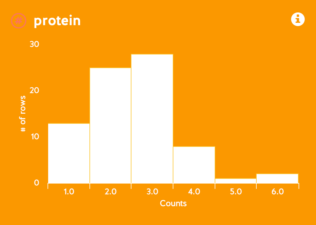
7. WTFcsv by DataBasic
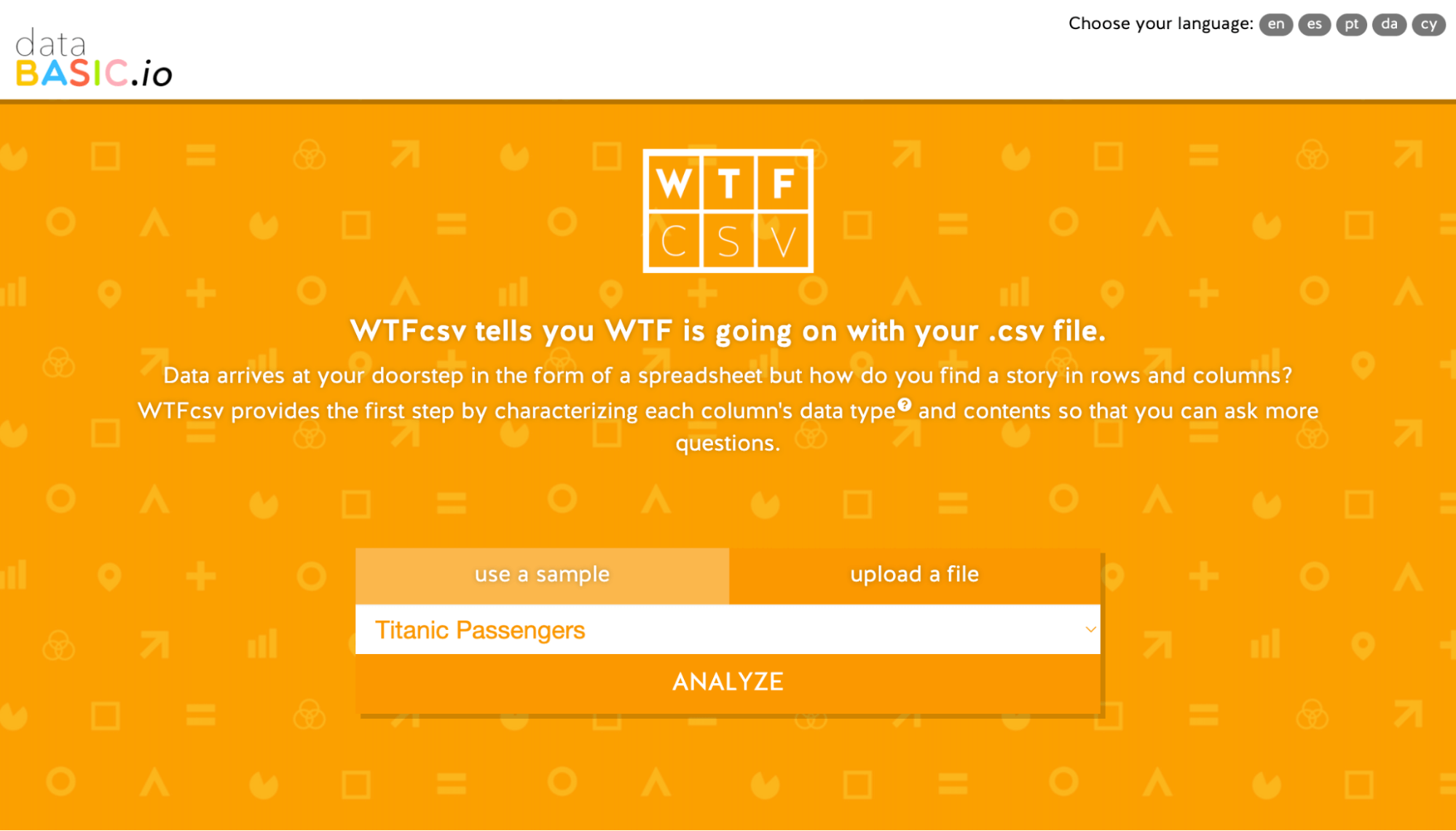
WTFcsv by DataBasic is a neat tool that generates data visualizations for you based on (you guessed it!) a CSV file. It might be more appropriate to call this one a data exploration tool, as you can’t choose what types of visualizations to generate.
WTFcsv chooses for you based on the dataset you upload. You can also use a sample dataset to play around with the tool. Note, you can do this with Vizdium and RAWGraphs too.
It’s quite simple: you don’t have to make any decisions whatsoever. You just upload your CSV, hit analyze and the tool generates a bunch of graphs based on your data. For more information, you can click the “I” button on each graph to see takeaways about the data represented, like the smallest and biggest numbers, the average and the total.
There’s no option to customize the graphs or download them to go. You could technically take a screenshot, but you’d be restricted to the tools styling and chart choices. (See screenshot below.)
All this to say, WTFcsv is a good option if you just want to extract some quick insights from a dataset. But for usable custom data visualizations, you’ll likely want to go elsewhere!
Learning curve
Very low. No setup, no decisions, just upload and view results.
How functional is it?
WTFcsv offers limited functionality. You can’t choose what charts to create, customize them or download them. You can only generate charts based on a dataset.
Best for
Quick, no-effort data exploration (when you just want instant insights)
What’s free (explicit)
Completely free; no sign-up required; no export options; no customization; screenshots are the only workaround
Data visualization example:
8. Tableau Public
Tableau Public is a free data visualization tool, courtesy of Salesforce’s Tableau. This platform focuses on public sharing and features a large gallery of data visualizations created by users. To get started, you’ll need to sign up for an account.
Once registered, you can choose to “Create a Viz” or “Explore Sample Data.” If you go with creating a data visualization, Tableau will prompt you to upload your data or connect to your data source. This is where things get a little complicated…
Without having used Tableau or a related tool before, it’s unclear what you need to do after uploading your data. After some trial and error, you may realize you need to extract your data, which leads you to the data visualization dashboard. Again, this part is tricky.
You’ll need to figure out how to map your data points and values to the correct fields in order to create a visualization. You can customize your chart with labels, colors and additional details at this point as well.
Similar to Flourish, Tableau doesn’t provide recommendations for what data to highlight or chart to use. There is a little tab that says “Show me” with some tips for which dimensions and measures to choose depending on chart type. But still, you’ll need a strong handle on the variables in your dataset before using this tool.
When you’re done, you’ll need to publish your visualization before downloading it in various file formats or getting a shareable link or embed code.
All in all, Tableau’s interface is even more complicated than Flourish — without any of the helpful onboarding tips. It’s not the kind of tool you can just jump into and start using right away. If you want to use Tableau as a beginner, you’ll need to do a lot of reading first.
Learning curve
High. The steepest on this list—expect to spend time learning the interface and data structure basics. There are several easy to use Tableau competitors that you can refer.
How functional is it?
Once you’re up to speed, Tableau does offer a lot of functionality. It doesn’t analyze your data, but you can clean up a dataset and customize many different types of visualizations with this tool.
Best for
Portfolio projects and publicly shareable, advanced visualizations
What’s free (explicit)
Free with sign-up; all visualizations are public by default; no watermark; downloads and embeds available; no private projects on free plan
Data visualization example:
9. Visualize Free by InetSoft
Visualize Free by InetSoft is a tool that’s geared toward building data visualization dashboards, but like Google Data Studio, you can use it for simple data visualizations too. Though it’s technically free, you do need to sign up to access the tool. Once you’re in, you can get started by uploading an Excel or CSV file.
Next, you have the option to clean up your dataset further by opening a “Data Worksheet.” Or, if your dataset is ready to go, you can choose “Visualization Recommender” to explore options for showcasing different data points. If you’re just getting started with data analysis, this is where things get a bit confusing.
Visualize Free doesn’t actually recommend comparing certain data points. It does imply what type of charts to use for your data by only giving you certain options depending on the input you select. But you still need to figure out which option makes the most sense and what to visualize in the first place.
Once you’re happy with your data visualization, you can click finish to add it to your dashboard. From there, you can add another chart or choose to continue to your dashboard as is. There are many different options for formatting and filtering your dashboards as well.
Finally, you can download in different formats or share a link to the live dashboard. So, this tool would be a good option if you’re looking to create a recurring report. Just bear in mind it will take some trial and error to become adept with this tool.
Learning curve
High. There are many options and views, which can feel overwhelming if you’re just getting started.
How functional is it?
If you can figure out how to use it, this tool does offer a lot of functionality! You can create many different kinds of charts and dashboards with interactive features.
Best for
Building interactive dashboards and recurring reports (if you’re okay with a learning curve)
What’s free (explicit)
Free with sign-up; limited features on free tier; exports and sharing available; some functionality restricted to paid plans
Data visualization example:

AI & ChatGPT for data visualization (what it can and can’t do)
If you’ve been staring at a dataset thinking “what chart am I even supposed to make?”, this is where AI can actually help.
I’ve used ChatGPT alongside these tools and it works best as a thinking partner, not a replacement.
What it can do well
- Recommend chart types: Describe your dataset, and it can suggest whether a bar chart, line chart, scatter plot, etc. makes sense
- Write code for charts: It can generate Python (Matplotlib, Seaborn), R or JavaScript (D3, Chart.js) to create visualizations
- Help clean and transform data: From renaming columns to filtering rows or reshaping data formats
- Draft insights and annotations: Useful for summarizing trends or writing captions for your charts
What it can’t do (and where people get tripped up)
- It’s not a BI tool: It won’t connect directly to your databases or live data sources
- It doesn’t “see” your data unless you provide it: And even then, it can misinterpret or miss context
- It can hallucinate or misread data: Especially with large or messy datasets so you can’t blindly trust outputs
A simple (and safe) 3-step workflow
- Ask: Describe your dataset and goal like “I have sales data by month and region, what’s the best way to visualize trends?”
- Run it in a tool: Take the suggestion or code and build the chart in one of the tools from this list
- Verify: Double-check numbers, labels and conclusions before sharing anything
One quick privacy note
Be careful about uploading sensitive or internal data into AI tools. If your dataset includes customer info, financials or proprietary data, it’s better to anonymize it first or stick to secure, internal tools.
Tableau vs Excel vs Power BI (when each wins)
If you’re deciding between these three, it’s less about “which is best” and more about what you’re trying to do.
Here’s the simplest way to think about it:
Microsoft Excel: best for quick, lightweight analysis
- Use case: Fast charts, small datasets, ad-hoc analysis
- Learning curve: Low (you probably already know it)
- Sharing: Easy (files, screenshots, simple exports)
Excel is great when you just need to answer a question quickly or create a basic chart. But once you need interactivity, governance or scalable dashboards, things start to break down.
Microsoft Power BI: best for repeatable dashboards (especially Microsoft teams)
- Use case: Ongoing reporting, dashboards, data modeling
- Learning curve: Medium to high
- Sharing: Strong—but often requires paid plans (Power BI Pro)
Power BI is ideal if you’re working with recurring reports and want something more structured than Excel. It’s especially useful if your team already lives in the Microsoft ecosystem.
Tableau: best for deep exploration and advanced visuals
- Use case: Interactive dashboards, exploratory analysis, presentations
- Learning curve: High (steepest of the three)
- Sharing: Flexible, but Tableau Public is public by default
Tableau is known for its flexibility and visual quality. If you want to explore data deeply or build impressive interactive dashboards, it’s hard to beat—but it takes time to learn.
The quick takeaway
- Start with Excel if you want speed and simplicity
- Use Power BI if you need structured, repeatable dashboards
- Choose Tableau if you want advanced, interactive visuals and don’t mind the learning curve
FAQ about free data visualization tools
What is the easiest data visualization tool to use?
When you consider both functionality and ease of use, Venngage is the simplest data visualization tool to use. All you need to do is upload a dataset and Vizdium will analyze it and provide suggestions for what types of visualizations to create.
It doesn’t require any complicated mapping of data points, and instead of making you figure out a complicated customization interface, it simply asks you a series of questions until you’re happy with your chart.
What is the best tool to visualize data?
This depends on your needs. If you’re just getting started with data visualization and you’re not familiar with more complex tools, Venngage is a great option. It will help you analyze a dataset, choose the right type of chart and customize it in a few clicks.
But if you have a little more experience and you don’t need help analyzing your data or choosing a chart, you may prefer to go with a more advanced option, like Flourish, Google Data Studio or Tableau.
How do you visualize data without coding?
The simplest way to visualize data without coding is to use a data visualization tool, like Venngage. With Vizdium, you just upload a CSV file and the tool will guide you to create the right chart based on your dataset.
If you’re looking for the simplest, most functional free data visualization tool, try Vizdium
As a data visualization beginner myself and after trying all the tools on this list (and many more that didn’t end up fitting the brief!), I can confidently say that Vizdium provides the best balance of simplicity and functionality. And yes, it’s actually free.
Give it a try and see for yourself.


