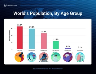
World Population Comparison Chart Template
Compare anything from the complex to the simple by using this comparison charts templates. Just choose your chart type and add your data.

 100% customizable templates
 Millions of photos, icons, charts and graphics
 AI-powered editing features
 Effortlessly share, download, embed and publish
 Easily generate QR codes for your designs
- SizeLetter (11 x 8.5 in)
- File typePNG, PDF, PowerPoint
- Planpremium
Comparison charts are a type of data visualization that helps users compare two or more data points. They are used in a variety of fields, from marketing and finance to education and the sciences. By presenting the same information in different ways, comparison charts help users make sense of complex data sets by making them easier to understand at a glance. Comparison charts often look like tables: they have rows and columns with labels indicating what each section contains. The actual content of these sections varies depending on what kind of comparison you're making—it could be one column for each item being compared, or it could be multiple columns for each item being compared. These comparison charts templates are a great way to provide information in a visual way. Comparison charts are essential in data analysis and reporting, but they can also be difficult to create for those who don't know to design. With the help of Venngage’s comparison charts templates, you can easily create professional comparison charts in a matter of minutes. Our templates
Related Chart Templates
table charts
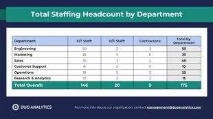
table charts
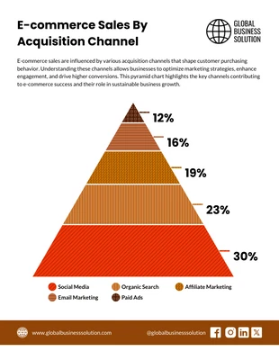
pyramid charts
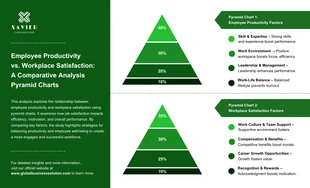
pyramid charts
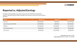
table charts
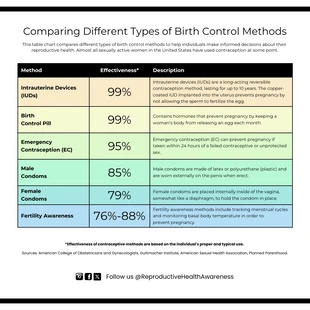
table charts
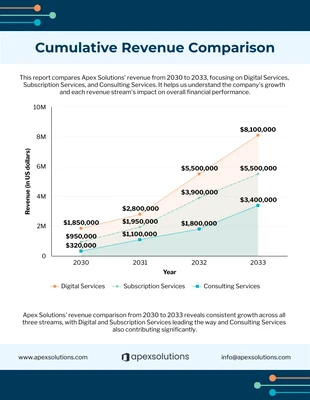
area charts
bar charts
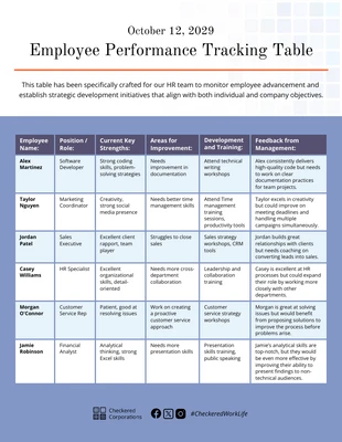
table charts