I’m not going to lie, but pie charts look great.
Not just great. They’re really aesthetically appealing.
With a circular shape and different colors to represent different categories of data, it’s not hard to miss them in reports and presentations.
But in recent years, pie charts have caught flak for being overused or used when they shouldn’t be. So if you’re doubting whether a pie chart is really the way to go, keep reading.
In this post, I’ll show you some basic pie chart alternatives and some unusual options worth exploring.
But if you’re certain a pie chart is the best option for your data, check out our Pie Chart Maker to create stunning pie charts. Or if you want to skip the design work, browse our customizable pie chart templates.
Remember that some of our chart templates are free to use and some require a small monthly fee. Sign-up is always free, as is access to Venngage’s online drag-and-drop editor.
Click to jump ahead:
What is a pie chart?
A pie chart is a circular graph that shows data as slices of a pie. Each slice corresponds to a data category, with its size proportional to the percentage it represents to the whole.
Pie charts are often used to show the distribution or composition of a set of data points.
Here’s an example:

When to use a pie chart?
Pie charts are generally used to show the distribution of different categories of data within a whole.
Here are some situations where a pie chart can be useful:
- To show percentages
If you want to show the percentages of distinct categories, pie charts are a go-to bet. - Present simple comparisons
Pie charts are useful when you need a quick visual comparison of the sizes or proportions of different categories.
Here’s a good example of when to use a pie chart.

When not to use a pie chart?
Though versatile, there are many situations where it makes little sense to use a pie chart and a substitute is required.
- Too many data points
This should be no surprise really. If you have too many categories, a pie chart can become overcrowded and difficult to read.
- When you need precise comparisons
Pie charts are not ideal for exact comparisons as the angles and areas of the slices can be visually misleading, especially when trying to determine small differences between categories.
- Time-based data
If you want to show changes in data over time, skip the pie chart.
- Non-exclusive categories
If your data overlaps or has shared elements, a pie chart is not the best way to represent these relationships.
- Complex relationships
If your data has intricate relationships or requires detailed analysis, a pie chart may oversimplify the information.
Here’s an example of when you’ll want to give the pie chart a skip.

5 alternatives to pie charts
So, I’m sure you’re wondering, if not a pie chart, what are my options?
Well, there’s no shortage of other types of charts to choose from. At Venngage, we’ve developed the ICCOR method to help you choose the best type of chart for your data.
How does it work? First, you’ll need to define a single goal for your chart.
Once you’ve done that, define what the goal hopes to achieve using the following categories.
- Inform = infographics
- Compare = bar charts
- Change over time = line charts
- Organize/visualize patterns = scatterplots
- Reveal relationships = flowcharts
Infographics
Infographics are great alternatives to pie charts because they provide a more comprehensive way to present data.
Unlike pie charts, which are limited to one data set, infographics incorporate multiple data sets, text, images, and icons.
A single data point is most effective when presented as an infographic like in the example below.
Bar charts
Is your goal to compare data across different data categories?
Go with the bar chart.
Why? Well, bar charts allow for easy comparison thanks to the varying bar length or height.
For example, this stacked column chart is a great option if you want to track trends over time.
By letting you plot data over different time periods, bar charts make it much easier to spot patterns, fluctuations, or shifts over time.
Bar charts are also a better option if you want to visualize qualitative data.
In this example, a bar chart lets you showcase different responses or preferences to a question in a visually appealing manner.
Line charts
If your goal is to showcase changes over time, a line chart is a much better option than a pie chart.
With multiple data series, a line chart lets you represent each with a different line which makes it easier to identify patterns or relationships.
Data types that generally work best with line charts include tracking temperature, stock prices, or population growth.
Here’s an example of the graphical nature of line charts. A quick glance lets us know how the quantity of fruits changes over time and also which are more plentiful.
Line charts are especially valuable for tracking sales and revenue data over time.
The example below shows how a business can use a line graph to monitor sales performance and identify peak years to evaluate marketing campaign effectiveness.
Scatterplots
Want to analyze a range of data to uncover clusters, gaps, or hidden patterns? Or perhaps you want to organize patterns
Well, you’ll want a scatterplot rather than a pie chart.
Here’s an example of how they look:
As you can see, scatterplots are effective if you want to spot outliers in your data. since by design, they help highlight data located far from the trend.
This isn’t possible with pie charts because remember, they can only display percentages.
In the real world, scatterplots are effective tools to study relationships between variables such as income and happiness, and crime rates and poverty.
Or in the example below, temperature and sea levels.
Flowcharts
When you want to illustrate a process, sequence of events, or reveal relationships, a flowchart is what you should rely on.
Flowcharts depict the steps, decisions, and paths involved in a process, making it easier to visualize relationships.
In this example, a flowchart allows a company to map out all the possible scenarios and steps employees should take the minute an online order is placed.
How do you decide between a flowchart and a pie chart?
It’s simple! Just remember that flowcharts are a better option when the focus is on visualizing processes or decision-making.
For example, rather than a pie chart showcasing rent vs homeownership rates, a real-estate company can use a flowchart to help guide potential clients to make a decision.
How to make a chart with Venngage
Phew! That’s a lot of charts.
Now that you have more than enough options, let’s explore how you can actually make one of these charts to spruce up your presentation, report, or homework.
Generally, most people gravitate towards tools like Office or Google.
But they are not the best method.
First, the user interface is unfriendly and it’s hard to drag-and-drop elements around like with Venngage’s editor. So, unless you really know what you’re doing, expect some headaches.
But the most important drawback is you won’t find an extensive library of chart templates like on Venngage.
So let’s see how
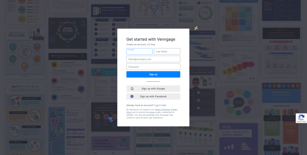
Step 1 – Sign up for a free account
Sign up for Venngage with your email, Gmail or Facebook account.

Step 2 – Select a template from our library
Besides the examples I’ve shared here, you’ll find hundreds of chart templates to choose from.
Remember, all our templates are easy to edit thanks to a smart editor tool so you don’t need to have any design experience.

Step 3 – Edit your chart with our editor
Our chart templates are created with a simple drag-and-drop editor that lets you design in minutes.
Besides inputting your own data, you can replace icons, change the colors, or even layout until the design is exactly how you want it to be.

Step 4 – Bring your charts to life with icons, illustrations and branding elements
Venngage offers 40,000 icons and illustrations to help you bring your charts to life.
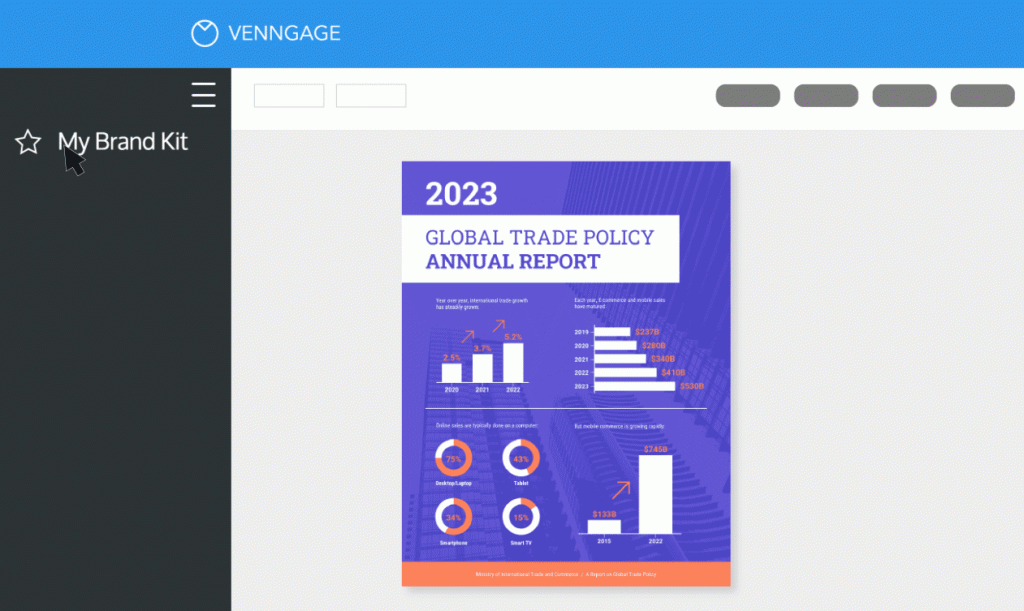
If you upgrade to a Business account, you can also enjoy My Brand Kit — the one-click branding kit that lets you upload your logo and apply brand colors and fonts to any design.

Step 5 – Share a public link for free or upgrade to download
Once you upgrade to a Business account, you can download your charts as a PNG, PDF, or interactive PDF.
But the ability to share your chart online is always free.
In summary: Don’t limit yourself to pie charts when there’s an abundance of better options to help make your point
Embracing pie chart alternatives opens up a world of data visualization possibilities
By understanding the strengths and use cases of different chart types, you’ll be able to create more compelling visuals that communicate the data.
And the best news is that you don’t have to make charts from scratch. Check out our chart templates to find ready-to-be-customized designs.


