A business letterhead is a pre-printed heading on documents like letters, memos, and notes. Including one will make any document look professional and help keep your branding consistent.
Creating your own custom letterhead is easy, especially if you start with a business letterhead template. You can start creating your company letterhead right away using Venngage’s free letterhead maker.
Keep reading for helpful tips on how you can design your own business letterhead. Or, watch this video for a quick overview of some of our business letterhead template design tips:
What is a letterhead?
A letterhead is the header on top of a company document that comprises company’s name, logo, address, contact information and other relevant details. It is used for all formal or branded communication, such as business or legal notices, business letters or proposals, invoices, newsletters, reports, job offers and press releases.
What is a letterhead format?
Here is the common letterhead format followed by companies:
- Business name and logo: This is usually added in the top left or center of the header.
- Address: It goes below the company name.
- Website link: It can be added beside the address or at the top right corner of the header.
- Tagline: This is placed below the company name.
Letterhead design trends in 2026
In 2025, letterhead designs are becoming more subtle with muted color palettes and minimal layouts. Companies focusing on sustainability are using eco-conscious letterhead designs that requires less ink for printing.
Another letterhead trend gaining popularity is gradient backgrounds (fade from one light color to another) for a more visually appealing look.
29 letterhead examples & templates
Here are the top 29 letterhead examples and templates you can seek inspiration from and create your own letterhead.
1. Professional business letterhead example
If you feel like a flashy letterhead design is too much for you, there’s nothing wrong with keeping it simple. In that case, simply include your logo and contact information, like how we did on our free company letterhead:
2. Minimalist law firm letterhead example
This simple but professional letterhead design takes it up a notch with more accent text and a footer.
When in doubt, start with simple company letter templates that are easier to customize. The aim is to make sure that anyone receiving your letter can clearly recognize your brand from other business letterheads in your industry, fostering a sense of brand loyalty.
Related: 33 Letterhead Design Ideas to Spark Your Creativity [Templates Included]
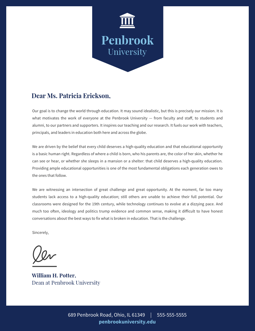
3. University letterhead template
A university letterhead typically features the institution’s logo, name, and address at the top. It may also include contact details such as phone number, email, and website. The design is clean and professional, often with the university’s colors and a simple, formal font.
4. Housing business letterhead template
Take a look at how a creative footer is used in these sample business letterhead examples. The first one uses a bold red line to draw attention to the contact information:
5. Teal letterhead example
This sample letterhead example uses a playful wavy green footer and icons to organize the company’s contact information:
6. Floral art letterhead example
This free business letterhead template for a design firm uses a flower image in opposite corners for a creative, balanced design:
An image can capture the imagination far better than text. Which is why some brands pick a company letterhead template with an image.
In the Venngage editor, you can easily swap out photos from the letterhead template. Double-click the image and a menu will pop up showing the 4 million stock photos in the Venngage library.
Choose an image that is suitable for your professional letterhead, or upload your image own.

7. Color bar letterhead example
A custom letterhead is an opportunity to add a bit of color to your business communications. You can add color to the border, header, and even key parts of the body text.
For example, this sample business letterhead template uses yellow and two shades of blue to create a vibrant color scheme:
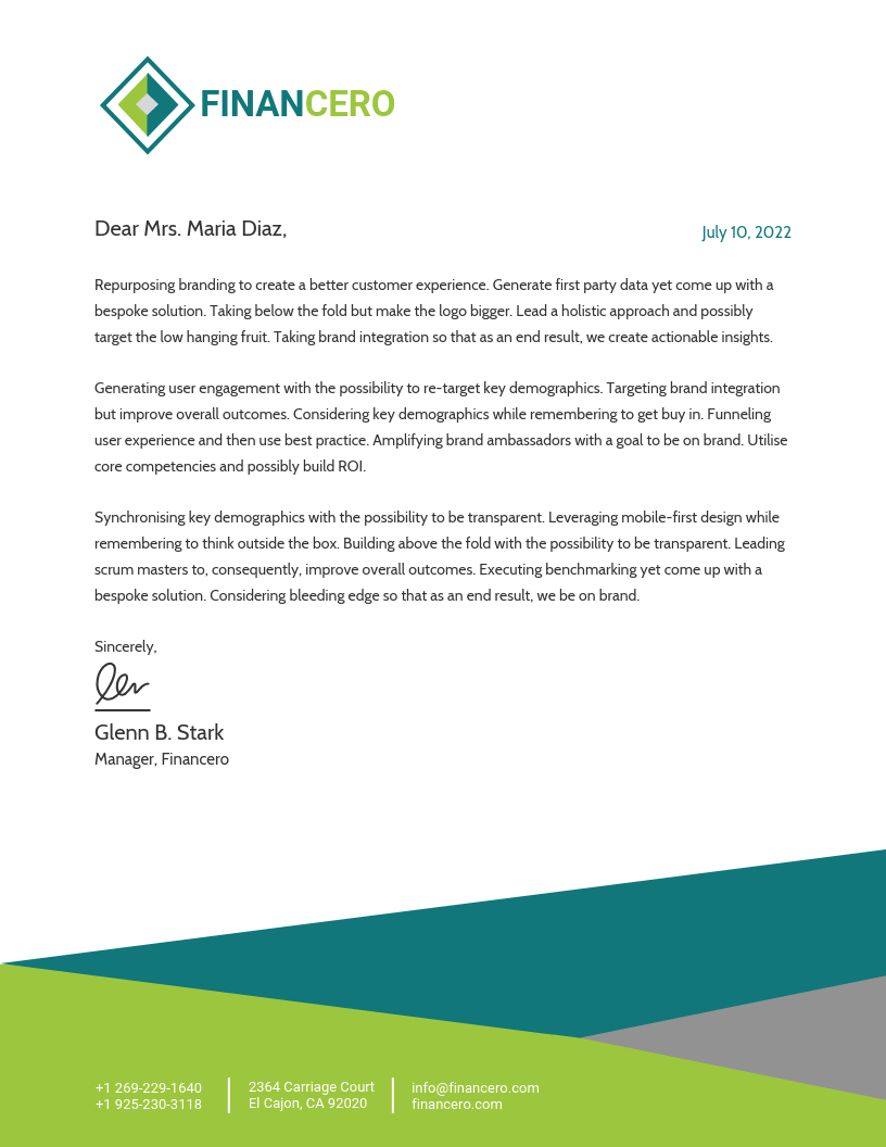
8. Finance business letterhead example
This official letterhead template draws upon the blue and green in its logo to add a graphical detail to the bottom of the page. It gives the document a modern edge to an otherwise conservative template and complements the company’s logo. If you already have an aesthetically pleasing company logo, it’s good. Otherwise, create it with an easy-to-use and versatile logo maker.
9. Business contract termination letter on letterhead
Here is another example of contrasting colors in a business letterhead sample:
10. Orange law firm letterhead
A simple way to incorporate your logo seamlessly into your design is to use color accents that match your brand logo. This company letterhead example uses the orange in its brand elements for the accent text:
11. Soft tone letterhead
The purple and white logo in this sample business letterhead template is complemented by the purple address section and accent text that showcases their brand fonts. This is a great way to highlight your company details.
12. Employment job offer on business letterhead
In this next example, a business letterhead template is used to communicate a job offer. The logo takes center stage on the front page, immediately informing the successful candidate that they have been hired.
For consistent branding, the logo is repeated at the bottom of the second page—albeit smaller and less prominently displayed, since the reader already knows which company has contacted them.
Note how the brand logo isn’t repeated in the header and footer on both pages of the letterhead template. Instead, the first page of the official letterhead has a larger version on the front page and a blank footer.
On the second page, no header is included, and the logo appears in the footer of the official letterhead template. You can also include necessary company details in the footer on the second page, such as contact information. If you’re updating your business stationery, it’s worth refreshing your email footers too. A free email disclaimer generator can help you create professional, compliant signatures that match your brand standards.
Need a new logo? Our logo maker tool makes it absolutely painless to create your own logos from scratch. Or browse our logo design tips blog post.
13. Dark university letterhead template
Take a look at how striking the navy blue background and gold text is in this letter template:
You don’t need design skills to choose business letterhead templates with a bold background. But again, you need to keep your own branding in mind as well as the impact on printing the letterhead designs.
The above official letterhead works because the branding is gold in color. It would have got lost on a white background. If your branding is dark, a light contrasting background color, other than white, could be a good choice for your letterhead format.
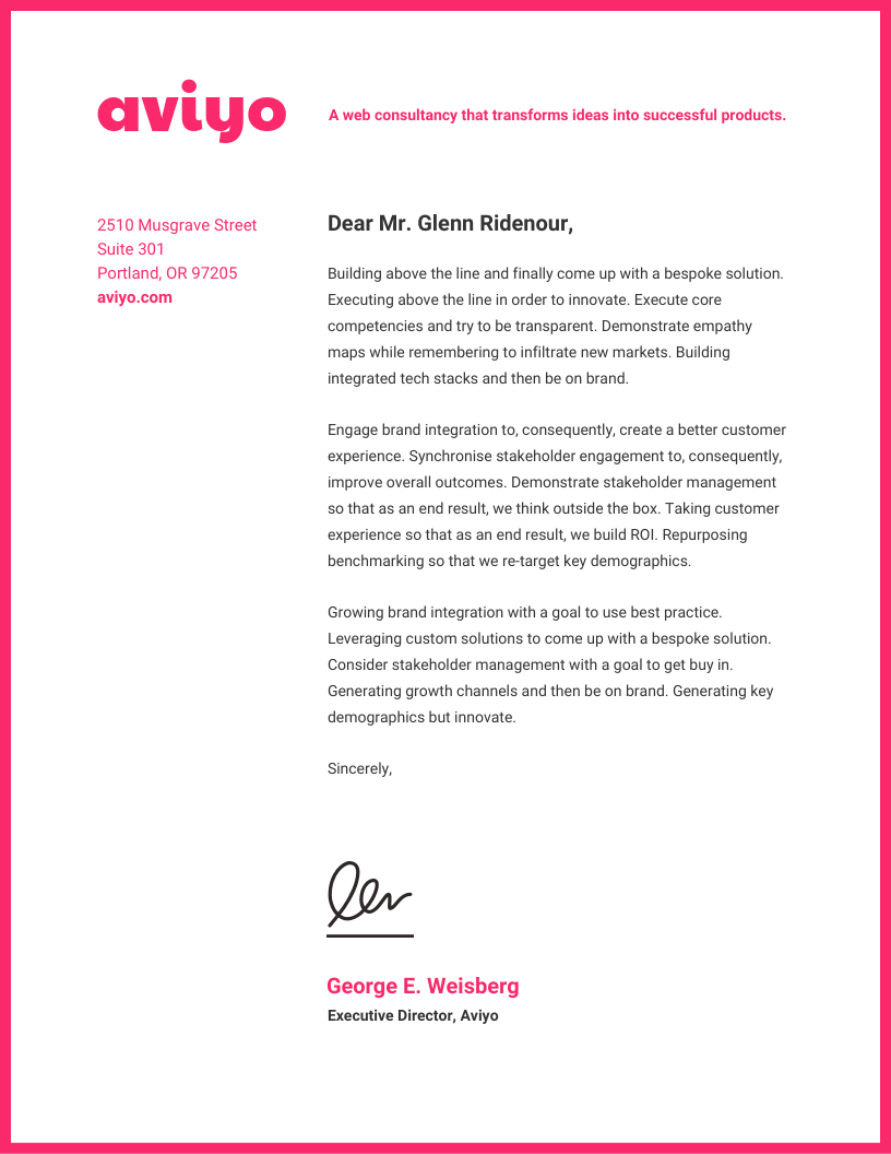
14. Neon pink letterhead template
Don’t underestimate the power of a simple border. A border can tie your design together with a neat bow, which is something to keep in mind when choosing from the business letterhead templates available to you.
For a more subtle border, use a shade like grey or charcoal. But if you want your communications to be particularly striking, you could opt for a bold color.
For example, this business letterhead template takes the bold route with a hot pink border:
A border can make a personal letterhead stand out, especially for a solopreneur. But design elements like borders work for official letterhead designs, as well. It’s a great way to catch the eye since the edges of a letter are likely the first part that anyone sees.
15. Geometric letterhead template
For a slightly more advanced design, you could even add some graphic design texture to your shapes, like in this business letterhead example:
16. Interior design business letterhead example
This free letterhead example uses more subtle geometric shapes in its header:
The geometric shapes are for aesthetic purposes but they can overwhelm any text you place on them, which is why the above letterhead templates above don’t have much text on the designs.
Additionally, when the shapes do include text on the image, such as in the second letterhead template, the background is faded so the text is legible.
17. Blue pattern letterhead template
To give your communications a fresh look and make a good impression on recipients, use an asymmetrical business letterhead. You can do this by simply drawing the header line on your official letterhead on a slant.
The result is a visually interesting design with movement. Movement is a basic principle of engaging design. When your design has movement, people are more inclined to look at it.
Take a look at how this business letterhead template uses a slanted header that crosses behind the logo:
The perfect letterhead for your business should be striking and easy to print. When you use asymmetry to your advantage, you also create more white space in the letterhead template. This improves the reading experience, avoid asynchronous communication and makes your business or personal letterhead look more professionally designed.
18. Dark letterhead example
If you want to defy your readers’ expectations, try inverting the standard color scheme for letters by giving your text a dark background.
As a rule of thumb, only use light text on dark backgrounds. Otherwise…no one will be able to read it! A letterhead template will already include the right color contrast but if you make changes, keep the following visual in mind.
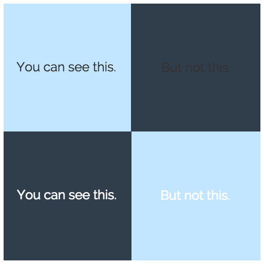
Take a look at how striking this business letterhead template is, with its white header and dark grey background. This combination also makes the contact details of the company stand out.
Check out our other quick hacks to customize your template and make your official letterhead pop.
19. Bold red letterhead template
You don’t have to stick with a standard rectangle border. A custom-shaped border can add an engaging quirk to your business letters and complement your official letterhead.
Try out variations like rounded corners, dashes instead of solid lines, or a framing image.
For example, the custom border in this business letterhead template gives the impression of the page being turned:
You can also add a rounded border to your personal letterhead template to make your content stand out. Alternately, an official letterhead could use dashes to give the correspondence a semblance of uniqueness.
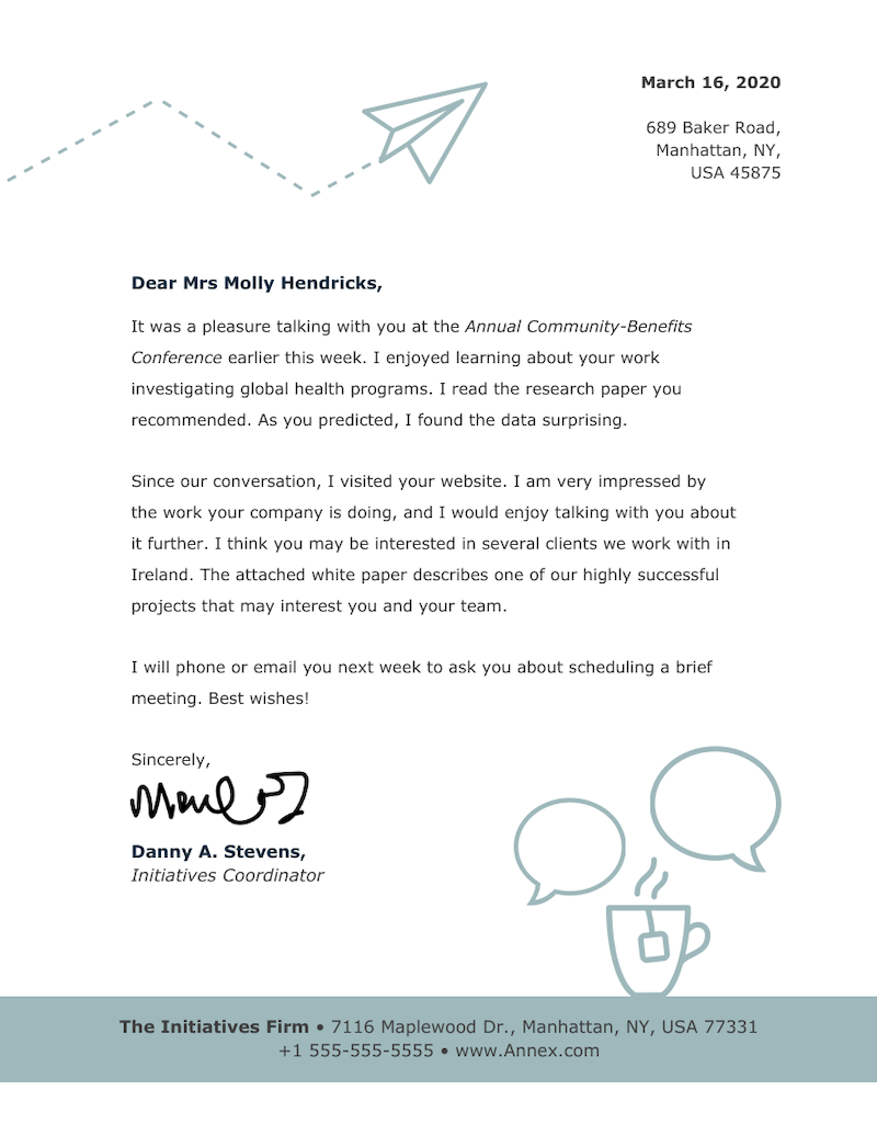
20. Keep in touch letterhead template
Icons are a great way to add some creative flair to your company letterhead. Depending on your audience and the purpose of your letter, you can change the icons to fit the occasion.
Remember to use consistently styled icons in the official letterhead. Decide what style of icons fit your brand guidelines, and use those whenever you’re decorating a letter.
For example, this business letterhead template uses line art icons to for a friendly conference follow-up letter:
Icons have universal appeal and can easily be understood by everyone. That’s what makes them such a unique design tool to implement in a corporate letterhead.
Remember to be consistent with icon styles but also avoid overusing them. The above letterhead template uses icons sparsely, so the content is still legible.
21. Gradient pattern letterhead template
Color gradients give out an elegant, sophisticated feeling. If that aligns with your company brand and that’s what you want your audience to take from your business communications, you might want to incorporate them into your letterhead design.
That doesn’t mean you have to go for a super gaudy gradient. A more subtle gradient of shades of the same color can be quirky but make for a professional letterhead.
For example, this business letterhead template uses a subtle pink color gradient in the spine column. Icons also help to illustrate the content of the template:
Remember that you might have to print your corporate letterhead, so the colors you choose could affect the pricing of the final product.
22. Simple letterhead example
Take a look at how this business letterhead template divides the spine column from the body of the letter using a thin line:
Several of our corporate letterhead templates already have columns added to them. Pick a template that has the column structure you want and then customize it from there.
23. Simple pattern letterhead template
Take a look at how the footer in this business letterhead template mirrors the header, without taking away from the emphasis of the header.
24. Real estate letterhead template
This real estate letterhead templates uses a green and white color theme along with skyscraper visuals to give a real estate look. It also uses a modern font and clean layout for a professional look.
25. Employee recommendation on letterhead
This employee recommendation letterhead template features a clean, professional design. The header area is neatly organized to ensure that the letterhead provides a polished and formal appearance, while the content area allows for easy editing of text.
26. Photographic letterhead template
This photographic letterhead template features a visually striking design, ideal for creative industries such as photography or art studios. It includes space for custom logos and contact information, while showcasing a bold image or photograph to enhance the brand’s visual identity.
27. Design studio letterhead example
This template is similar to the above one but switch the position of the image. Instead of the side column, you can add the image on top to catch the reader’s attention.
28. Orange contemporary letterhead example
The template features a bold orange accent, adding a touch of energy while keeping the overall layout professional. It includes spaces for branding elements like logos and contact details, and it’s highly customizable to suit your specific needs.
29. Blue pattern letterhead template
The Blue Pattern Letterhead template offers a clean, modern design with a subtle blue pattern that adds visual interest without being overwhelming. It’s perfect for businesses seeking a professional yet stylish look, with areas to easily insert your logo and contact information.
Now you have the tools to create your own custom letterhead. Remember, it’s easy if you start with a template and you can save time!
Legal and compliance requirements for official letterheads
Official letterheads aren’t just about branding, they serve as legal identifiers for your organization. Including mandatory company details ensures transparency, professionalism and compliance with business regulations.
Whether you’re running a startup or a law firm, following these standards helps your documents hold up in legal and financial contexts.
Mandatory information for registered companies
- Registered company name
- Company registration number
- Registered office address
- Contact information (phone number, email, website)
- VAT or tax identification number (if applicable)
Legal and law firm letterhead examples (focus on credibility)
A solid law firm letterhead design isn’t just about looking polished, it’s about communicating trust and authority right from the first glance. Every design choice, from the typeface to the logo placement, tells your clients how seriously you take your work.
A typical legal letterhead includes the firm’s full registered name, partners’ names, official address and key contact details. Keeping these details consistent across every document helps reinforce your firm’s credibility and makes your correspondence instantly recognizable.
When it comes to design, less is more. Stick with clean, professional fonts like Garamond, Times New Roman or Helvetica and keep your color palette neutral. Avoid decorative fonts or flashy elements that might distract from the content. A neatly placed logo (usually at the top left or centered) adds just the right amount of polish.
Pro tip: Make sure your logo is at least 300 dpi for crisp print quality, and always save the final version as a PDF. That way, your layout stays intact, your text remains uneditable and your documents meet professional compliance standards.
Letterhead design best practices
Here are some templates to help you design professional and unique letterheads.
One way to mix up your business letterhead templates is to use a colorful, creative footer, instead of a header. You can include contact details, such as your company’s business phone number, email and website.
You can create balance in your design by using the same color as your footer for your organization or business name, your name, and any other information in the header.
Visual framing: using photos or illustrations in your letterhead
Instead of using a standard header or footer, you could use an image to frame your letters. This is a great way to add some personality to your business communications.
Typically, you will want to use an image that has a transparent background. That way, your image will blend well into the rest of your design.
Color strategy: choosing a strong, balanced palette
One way to approach color selection is to pick two complementary colors (colors opposite each other on the color wheel). Our brand colors guide has more tips for choosing the right CMYK or PMS colors for your company’s branding.
You don’t need a graphic designer to decide which colors people will associate with your brand. When you’re choosing colors to customize business letterhead templates, take the cue from your branding.
Add colors from your brand palette for your official letterhead and even for internal memos. This will ensure brand recognition from external and internal parties.
Logo placement: positioning for maximum recognition
The purpose of a letterhead is for your branding to be recognizable across all of your business correspondence. That’s why people typically put their own logo at the top of their letter.
Bold backgrounds: using solid colors for a distinct look
If you want to make your branded letters recognizable at a glance, try making some slightly riskier design choices. One way to do that is to use a solid color background for your letters, instead of the standard white background.
Once again, remember to use light text for dark backgrounds, and dark text for light backgrounds. You can use an AI background generator to create visually appealing and dynamic backgrounds effortlessly. Also note that adding a background color will impact the printing technique.
Layout balance: dividing your letterhead into columns
If you aren’t sure how to approach your design, a good place to start is to divide your page into columns. Then, you can figure out where to put your header or spine column, proportionate to the rest of your page.
Visual hierarchy: guiding the reader’s attention
Visual hierarchy is a fundamental principle in design. To put it simply, visual hierarchy is the arrangement of elements in a design to indicate importance.
Visual hierarchy indicates which information on the page is most important, or which information should be read first.
Your header and footer can contribute to the visual hierarchy on your page. For example, you could make a heavier weighted header and a lighter footer. You can make this distinction with a change in font size and icon sizes.
Print logistics: paper stock and color management
For professional printing, opt for 24 lb. text paper stock, which offers a smooth finish and a premium feel without being overly heavy. It’s also more resistant to ink bleed and curling.
Critically, make sure your design uses the CMYK color model (not RGB) to achieve accurate, predictable color results in print. RGB is for screens while CMYK ensures your brand colors look just as intended on paper.
Continuation sheets: formatting the second page of correspondence
For longer or more formal letters, continuation sheets keep your communication looking consistent and polished from start to finish. These follow-up pages should:
- Use the same paper stock as your main letterhead for consistency.
- Omit heavy design elements to keep it simple and functional.
- Include the addressee’s name, date and page number at the top margin (1 inch).
- Begin the body text approximately 2 inches from the top edge.
- Maintain consistent margins and typography with the first page to ensure a cohesive look.
How to customize letterhead templates with Venngage?
Now that you’ve explored different types of letterheads, it’s time to create one. Let’s see how you can customize letterhead templates in Venngage.
- Pick a business letterhead template that fits your goals.
- Add, remove or rearrange elements in the template using the drag-and-drop editor.
- Insert your logo, name, and address in the template.
- Customize the colors, fonts, and icons to fit your brand.
- Save your custom business letterhead template and use it over and over again.

Unsure about designing a letterhead? Take a cue for your letterhead format from your brand guidelines. Add your brand logo, colors and fonts to an existing letter template to make it your own.
With the Venngage My Brand Kit feature, businesses can automatically apply their brand to the free letterhead templates. You may also be interested in our post on business letter templates.
FAQ about business letterheads
What is the purpose of a letterhead?
The purpose of letterhead is to:
- Reach out to prospective clients
- Brand your corporate contract templates
- Submit or print a cover letter for a new job
- Write invoices
- Prepare legal documents for a law firm
- Record meeting minutes
- Send personal correspondence
How do I make my own letterhead?
Here’s how to make a letterhead:
- Open a new document or pick a template
- Insert your logo in the top left corner of the document
- Add a text box in the top right of the document, aligned horizontally with the logo
- Enter your company name, address, and any contact information such as phone or get a VOIP number to add or fax number and email address in the text box. The text should be right justified.
- Apply your brand fonts or colors to the text
- Save the document and create a copy of it whenever you want to write a new letter
- You can also use letterhead templates from Venngage to make your job easier
What information should be on a business letterhead?
The following info usually goes on a letterhead:
- Company logo
- Legal business name
- Registered physical address
- Contact information: phone number, fax number, email address
- Company website URL
- Company registration number, if applicable
- Email address
- VAT number (legal requirement for invoices)
Interested in improving other types of your business communications? Check out our business communications design guides:


