


Designing a stellar marketing brochure is more than a fusion of fonts and colors—it’s an art form that captures attention, sparks curiosity and beckons action.
Sounds complicated? It really isn’t. Whether you’re shouting about your business, promoting an event or championing a cause, you’re in the right place.
So, stick around as I guide you through the intricacies of color palettes, strategic layouts and compelling messaging all with the help of Venngage’s Brochure Maker.
Plus, I’ll dish out some tried-and-true tips and toss in a few brochure templates that will transform your marketing brochures from good to unforgettable.
Let’s dive in and elevate your brochure game!
What is a marketing brochure?
Marketing brochures help companies market their products or services. They’re traditionally single or multi-fold paper-based documents (although with the advent of the digital age, they also come in digital varieties as well) and come in various shapes and sizes (most often resembling a pamphlet or an A4 size piece of paper.)
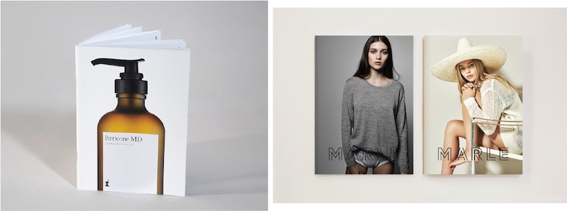
Marketing brochures come in various fold types, namely: single fold brochures, bi-fold brochure (like the one below) and tri-fold brochures and are used interchangeably with the term pamphlet.

How to design a marketing brochure [with examples & templates]
Designing a compelling marketing brochure is a blend of creativity and strategic thinking, so, to help you get started, I’ve made a comprehensive guide which are as follows:
- Define the target audience for your marketing brochure
- Create thoughtful, targeted messaging for your marketing brochure
- Collect unique, meaningful images or illustrations for your marketing brochure
- Design the brochure around your copy, images, and branding
- Repurpose the same brochure design for different products
If you need to see the process in action, here’s a video that walks you through the essential steps of designing a brochure:
1. Define the target audience for your brochure design
Before you start thinking about what your brochure will look like, you need to figure out a few things about your customers and your goals.
Just like any other marketing material, a marketing brochure should be:
- Targeted to a specific segment of your market, and
- Aimed at driving some specific metrics.
Whether you segment your market by age, buying cycle, income, location, or lifestyle choices, your brochure’s messaging and imagery should be designed with a specific customer segment in mind. This is where user personas are helpful, they will guide your positioning and messaging.
A home insurance brochure targeting 75-85 year-old homeowners, for example, should look very different than one targeting 25-35 year old female renters:

Sources: StockLayouts
Start with a clear understanding of who you want to reach with your brochure. It’s okay to have multiple target groups, but focus on one at a time for your initial design. With our brochure templates, you can always repurpose design again and again.
Next, decide what you want your brochure to achieve. Is it store visits, email sign-ups, or something else? Having a clear goal will guide your design and content, and ultimately help you generate leads and write more persuasive and helpful copy. Here’s some examples:
- You want to book more consultations? Show clients the benefits of a consultation and make it easy to book.
- Want to attract trade show visitors to your booth? Highlight new products and offer exclusive deals to boost booth traffic. Pro tip: use our coupon maker tool to generate coupons for extra enticements that’s redeemable during that event.
- You want to drive people to check out your flashy new online store? Your brochure can feature a promo-code for first time visitors.
In any case, the key to creating a successful marketing brochure is to have a focus.
2. Create thoughtful, targeted messaging for your marketing brochure
Once you have a clear focus mapped out, you’ll need to write some copy.
The structure of the brochure should guide this copywriting process. That is, you’ll need to figure out what belongs on the front, middle, and back of the brochure, and write accordingly. Check out this 3 fold brochure template for some inspiration:

Let’s review some strategies for each section in turn.
The front page should have a single clear message
The front page of your brochure needs to grab the attention of your reader. Everything on that page should compel them to turn the page.
That’s obviously easier said than done, but here are a few tried-and-true marketing tactics that might work for you.
Be clear about how you can fulfill your customers’ needs:

Build intrigue by proposing a question:

Keep it as brief and bold as possible:

If you’re promoting a product, let the product speak for itself:

If your brochure is just an informational summary of your business offerings, put your branding front and center (and include a tagline if you have one):

If you’re promoting a special deal, feature it on the front page:

Work in real estate? Check out our real estate brochures.
Different approaches will work better for different goals and businesses, so it’s up to you to choose the right one for you. Whichever tactic you choose, keep your copy succinct.
Limit yourself to one clear message on that front page, and express that message with as few words as possible.
A good rule of thumb? Make sure that front page copy comes in at under 25 words.

The main brochure contents should be concise and skimmable
Moving on from the front page, let’s talk about the main brochure contents.
Assuming you’ve succeeded in catching your readers’ attention, it’s time to give them what they really want–information about your products or services.
To do this, it’s best to write copy that will fit nicely into three sections, each with a header and brief description (a brochure with three sections is known as a tri-fold brochure):

The above tri-fold brochure template is the perfect brochure example. Learn more about our travel brochure templates.
Use headers to state your brand’s offerings up front
Your headers should clearly and concisely state each business offering or product feature, so that readers can see at a glance what you’re promoting.
It’s important that these headings deliver meaning independently without requiring any further explanation. Try to avoid empty words like ‘introduction’ or ‘about’ in favour of more expressive descriptors:

If possible, frame these offerings based on your customers’ needs and wants. Focus less on what your business does, and more on how your business will give them what they want:

Use brief descriptions to backup your headers
Beneath each header, you’ll want to describe the product or service in more detail.
Keep these descriptions as brief and to-the-point as possible. Try to give your readers just enough information to get them interested, and let them use your brochure as a jumping-off point to get to your store or website.
Point form summaries are perfect:

If you use full sentences, limit yourself to two or three sentences per section.
Support your design with charts and graphs when you can
Don’t waste space explaining data, statistics or survey results. Charts and graphs are easier to understand and more pleasing to the eye. They hit your point home and can also save space on your brochure.

For example, explaining that your company’s investment fund increased an average of 8% per year while your competitors were stuck at 4% or 6% may get lengthy. You can support brief headers and sections with a graph format on your brochure instead.
The back of the brochure should include extra details like contact information
After you’ve outlined your offerings, make sure you include anything your customer will need to take action, whether it’s an email address to contact you at, directions to your business, or a link to your website.
This bit can come last–you’ve done your convincing, now you can count on your reader to flip to the back of the page to find this information on their own.
It’s standard practice to put the essential contact information in the middle, check out this trifold brochure template:

That leaves one final section that needs some content. This is a good place to add extra information like pricing, but you can add whatever you like, as long as it includes a descriptive heading and isn’t too much longer than a paragraph. You could also include a QR code to engage your readers.
If you have doubts about your copywriting skills, consider an online copywriting service to get your marketing off on the right foot. Outsourcing copywriting can free up your time and let you focus on designing your content.
3. Collect unique, meaningful images or illustrations for your marketing brochure
With your copy under control, it’s time to collect images to add visual interest to your brochure design.
To ensure your brochure doesn’t feel bare, aim to find:
- One image, icon, or illustration per product offering
- A feature image, icon, or illustration for your title page (optional)
- A few extra images, icons, or illustrations for your ‘about’ and ‘contact’ sections
In a perfect world, you’d have beautifully styled product shots around which to build your brochure:

But we don’t all have a marketing budget that stacks up against Nike’s.
If you don’t happen to have your own product shots, it might be tempting to use stock photos, but try your very best to avoid them!
Some better options? Add a personal touch by using your own headshot as a featured image, or use stylized icons:

Illustration-style images are a great way to add a playful touch:

If stock photos are your only option, do your best to find images that match your brand and fit a single color scheme for a cohesive look:

Prefer something simple? A bi-fold brochure template (a brochure with two sections) should do the trick.
Whether you choose icons, images, or illustrations, consistency is key! Inconsistency in image style and color can make your brochure design look unprofessional and will distract from the real hero – your product and your copy.
4. Design the brochure around your copy, images, and branding
It’s all come down to this–creating your marketing brochure.
At this point you should have copy and images to fill up all six sections of your brochure, front and back. Browse through our beautifully designed brochure templates for one that you like containing a similar amount of copy and visuals:

While it might be tempting to pick a template based on style, focusing instead on finding one that fits your content will make your life much easier (and you can change up the fonts and colors at the end).
Once you have one that you like, paste in your own copy, and swap out the stock photos for your own visuals.
If you’re happy with the design you can call it a day! Congratulations, you just made your first brochure.
But if your content doesn’t quite fit perfectly, or if you want to make your brochure design a little more personal, there are a few key tactics you can use to ensure you end up with something you can be proud of.
Centre your content within each section
The easiest way to make text look good in a brochure is to centre it horizontally within each of the six sections.
This keeps it away from the folds of the brochure especially if you’re using trifold or bifold brochure templates, giving it some room to breathe!
If you centre your text, centre your icons and images too:

Size and crop photos so they match
Make your image choices look deliberate by sizing them all to match. If possible, crop them to the same aspect ratio:

Or use a unique shape like a circle and size them equally:

And if they don’t crop nicely to exactly the same size, create a sense of consistency by lining them up nicely with your text:

Who doesn’t love a snazzy free handout? Want something more unique and edgy?
Make it all about the image by pruning your text to the bare minimum. Leave a ton of white space, or extend your images to fill the entire page:
Sources: Monnet Design, Hannah Souter
Use solid colors and background images to define each section
Once you have your text and images on your page, you might find your brochure design a little lacking in the excitement department. You can inject some visual interest by adding background colors and images.
Create definition between different sections by placing large images in the background of some sections and leaving others blank:

Or use a solid color in the background to brighten things up:

And add texture by adding image overlays on background images. You don’t need to be a designer to do any of this…you can use Venngage to make a brochure.
Dark overlays will help push images into into the background, while bright overlays can bring life to stock photos:

Sources: Venngage, Hillary Jones
Don’t use more than two or three colors
When it comes to color schemes, less is more. My favourite brochure designs tend feature just one single bold color (occasionally more, but two or three colors at most).
How should you go about picking colors to use for your brochure?
This is where your brand colors can come in. If you have them, take cues from your logo or any other marketing materials like your website, business cards, flyers, and carry that styling over:

Sources: Foodora
Don’t have great brand colors to work with?
Fall back on the hot graphic design trends of the moment. Right now, that means bright colors and bold gradients:

Don’t have the design chops to pull off a trending color palette?
Pick a single bright color and run with it! A black and white brochure with a single-color accent is really easy to get right, and can be quite impactful:

Reds and blues are classic, but if you can, pull a highlight color from one of your images for a cohesive look:

Leave space in your brochure layout
Last but certainly not least, leave lots of space in your brochure design. Don’t give in to the temptation to fill up your page with content. Leaving space for your content to breathe will really make that stuff shine:
Similarly, it’s easier to pull off a simple, minimalist design than a flashy one, so don’t hesitate to stick with a white background with black or grey text.
5. Repurpose the same brochure design for different products
Now that you’ve put all of this work into designing a beautiful brochure, get the most out of your design by creating subtle variations for different products.
Keep your layout the same, but swap out colors, images, and copy:

Sources: Rebecca Finn, Gresham Design, Etienne Axelos
Checklist for finalizing a brochure before printing.
Before you send your brochure to the printer, make sure to:
- Double-check all text: Proofread carefully for typos, grammar errors, and factual accuracy.
- Inspect visuals: Ensure all images are high-resolution, properly sized, and visually appealing.
- Verify color accuracy: Make sure colors match your brand guidelines and look correct on different screens.
- Confirm dimensions and folds: Ensure the brochure size and fold style match your printing specifications.
- Review the bleed area: Check if any important elements extend into the bleed area to avoid cropping issues.
- Examine the file format: Save your design in a print-ready format (like PDF) with high-resolution images.
- Get a final proof: Request a physical proof from your printer to check for any last-minute issues.
Do you still need a marketing brochure?
The marketing brochure is one of the oldest tricks in the marketing playbook.
While digital strategies are dominating the modern marketing trends, traditional techniques like the trusty sales brochure aren’t going anywhere.
In fact, physical marketing media may be more powerful than ever. One marketing research firm suggests that physical media is more memorable, more persuasive, and more likely to drive behavior than digital media.
The best marketing strategies of today integrate the digital with the physical, focusing on flyers, brochures, and posters just as much as websites and social media graphics.
That’s a lot to juggle!
I get it.
That’s why I’ve put together this easy 5-step marketing brochure design guide to give you the low-down on how to create a marketing brochure from scratch.
Where and how to distribute the brochure?
The real work starts after you print the brochure. You need to have a smart brochure distribution strategy to make sure it reaches the right target audience and helps you generate leads.
Here’s are a few ways to distribute a marketing brochure:
- Share brochures during sales meetings so prospects leave with a physical reminder of your offer
- Target specific households or businesses with door-to-door or mailbox drops in your service area
- Place brochures in industry-specific locations like clinics, gyms or coworking spaces where your audience is already engaged
- Add brochures to event swag bags or registration kits for guaranteed reach
- Use brochures as inserts in local newspapers or community magazines to extend your coverage
- Train staff to hand brochures out when someone asks about a service or product to turn casual interest into action
What is the difference between a brochure and a pamphlet?
Brochures and pamphlets can often seem similar, but they differ in use cases. A brochure can span multiple pages while pamphlets are often single-paged documents. Brochures are often created with a commercial intent in mind i.e. to promote your products or services while pamphlets are made with an informational intent.
Pamphlets are unbounded while brochures can span multiple pages and hence come bound.
FAQs about brochure design
What is brochure design size?
Brochure designs come in various shapes and sizes (most often resembling a pamphlet or an A4 size piece of paper.)
How do I design a brochure?
1. Define the target market for your marketing brochure
2. Use images, icons, and illustration to support your messaging.
- Keep style and color scheme consistent
3. Layout the brochure around your copy, images, and branding
- Center your content within each section
- Size and crop photos so they match
- Use solid colors and background images to define each section
- Don’t use more than two or three colors
- Leave lots of white space
4. Play with color and content to repurpose the same brochure design for different products
What is the best software to design a brochure?
There are several options of softwares to create a brochure. These include Venngage, Scribus, Microsoft Publisher, etc. The brochure software you use will be determined by the type of brochure you want to design.
How do I start writing a brochure?
- Give your front page a single clear message
- Make main brochure contents should concise and skimmable (3 sections, descriptive headers, point-form)
- Include include extra details like contact information on the back
How much can I charge for a brochure design?
The pricing of a brochure design depends on varying factors, such as your experience, complexity of the design, the client’s budget and even location. So, consider these before sending out that invoice to your client.
Conclusion
This might seem like a long process, but knowing how to put together an effective marketing brochure is an essential skill for any small business owner or marketer, and our pre-designed brochure templates make it easy!
FAQs on brochure design
What paper stock (GSM) and finish should I choose?
If you’re mailing brochures, go with heavier paper around 170–250 GSM so it feels sturdy. Matte is easier to read and holds up better in the mail. For handouts, lighter paper around 120–170 GSM is fine. Use gloss when you want photos and colors to stand out, or matte if the design is more text-focused.
What are the most common brochure folds and when should I use each?
A tri-fold is the go-to for most marketing brochures. A half-fold feels like a booklet and works well for menus or programs. Z-folds are handy for guides and maps. Gate folds open to a big reveal, good for special campaigns. You can use French folds for posters or infographics that fold down small and parallel folds give you more panels, perfect for catalogs or info-heavy brochures.


