


Flyers have been around for decades, but is creating a flyer still effective in 2026? The short answer: absolutely—when they’re done right. A well-designed flyer can grab attention, deliver a clear message, and drive real results, whether you’re promoting a product, event or service.
In this guide, we’ll show you what makes a flyer effective, along with 50+ flyer examples to inspire your next design.
Business flyer examples + 12 must-know design tips
Business flyers are a go-to for small businesses and entrepreneurs looking to promote services, products, or events without overspending. If your flyer is promoting a new digital guide or a free ebook, showcasing the ‘product’ is key to driving sign-ups. Using Venngage AI, you can find the perfect cover design creator with ai to make your lead magnet pop. Similar to the generative features in Canva, this tool automates the process of creating a high-impact book front from a simple prompt, ensuring your promotional materials look expensive and professional.”
In this section, I’ll walk you through practical tips and real examples to help you design flyers that grab attention and get real results.
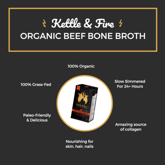
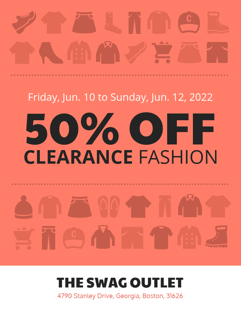
1. Use icons to represent different services or products
Icons – those simple vector graphics that you see everywhere–are handy for packing meaning into a small page. Because they’re simple and recognizable, you can use icons to reinforce (and sometimes even replace) text in your flyer design.
For example, this flyer uses icons with recognizable meanings to represent different service options:
Icons can seem overwhelming if you’re new to design, but once you understand their purpose, icons are super easy to use.
Check out this video for a complete introduction to using icons before you get started:
Related: 15 Customizable Free Flyer Templates & Design Tips
2. Use your brand colors for cohesive branding
One of the easiest ways to recognize a brand is through its brand colors. Incorporating your brand colors into your flyer design will help keep your branding cohesive across all platforms, digital and print.
You can either design your entire flyer in your brand colors, or you can use them as accent colors.
Here’s an example. See that brand colors can be used in your flyer header, in the icons you use, or in the CTAs:

Let’s take a look at another example of brand colors and fonts being applied to a professional business flyer:

Sticking within your brand colors sounds like a daunting task, but Venngage has made it really easy with My Brand Kit.
Business users can upload their brand color palettes and see them automatically applied to their designs.
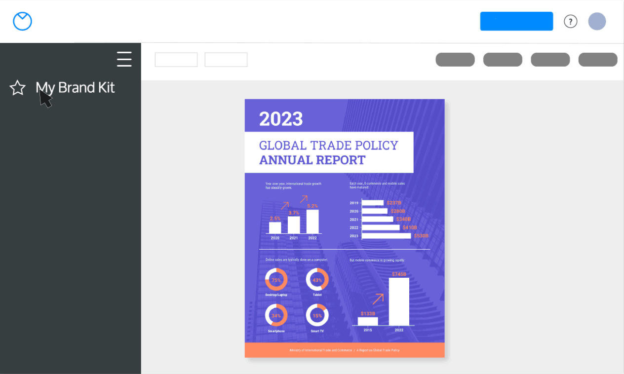
You can even upload your brand fonts and logos too.

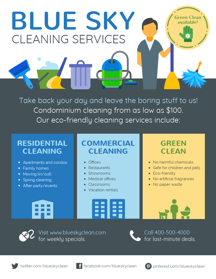
3. Create a custom illustration using icons
Illustrations can make a flyer design feel inviting. But creating an illustration in a pinch and within a budget can be tough — unless you do it yourself using icons.
Think of a scene that illustrates what your business does. Then, arrange icons on your flyer like you would arrange stickers.
Take a look at how this cleaning business flyer template created an illustration of gadgets with Venngage icons cleverly layered on top of each other:
4. Use two to three different fonts to give your flyer design variety
The fonts you choose can make or break your flyer design. Not only does font selection determine how easily your flyer is to read, it also plays an essential role in the look of your flyer.
Combining two or three different fonts can give your flyer some real flare. Try pairing a bold, decorative title font with a more pared-down body font, like in this flyer example:

Here Diamond Cleaners are using a large, eye-catching, elegant font paired with a more simple font for the main bulk of the text.
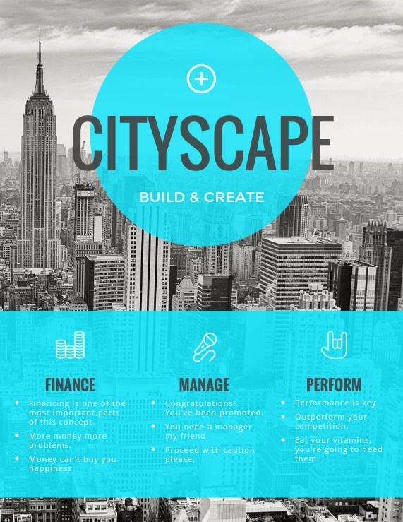
5. Use interesting design elements in your business flyer
Make your business flyer stand out by using interesting photography, shapes, and icons in the flyer background. Flyers are designed to grab attention, so it makes sense to utilize as many clever design hacks as you can.
In this business flyer example the bright blue circle set against the grayscale background helps the design pop.
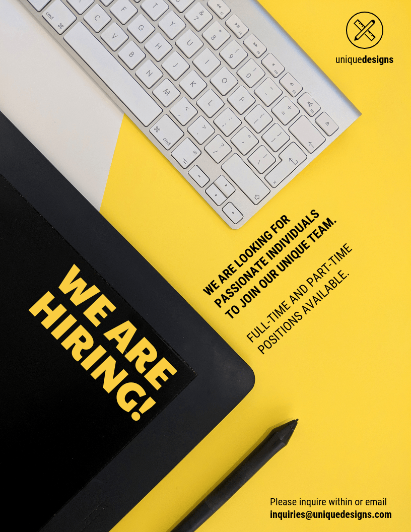
In this example the text has been rotated to sit alongside the tablet and keyboard in the background, showing that this company is fun and forward thinking.
Creating eye-catching flyers can be difficult if your small business doesn’t have a designer on staff, but Venngage’s business flyers are ideal for those without design experience.
6. Use quirky design and bright colors that reflect your brand’s character
For a lot of people, your flyer will their first introduction to your business. That’s why, if you want to appeal to your target audience, you should try to incorporate your business’s personality into your flyer design.
What color scheme reflects your brand? What style–quirky? Sophisticated? Approachable?
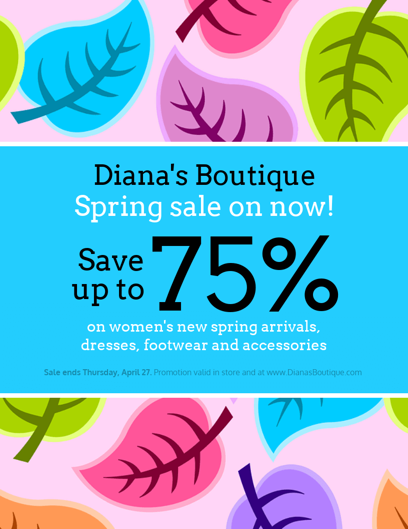
For example, this business flyer template uses bright patterns and quirky design to advertise an upcoming sale. This flyer will no doubt appeal to people seeking hip new spots to shop:
7. Include a call to action that allows you to track the ROI of your flyer
To ensure that distributing a flyer is worth your time, you will probably want to track the ROI of your flyers. Include a clear CTA (call-to-action) that not only prompts people to want to check out your business, but that will also enable you to track how many customers you pulled in with your flyer.
For example, you could include a redemption code, or have your flyer double as a coupon. Check out this business flyer example that tells recipients at the bottom that they can redeem a free drink:

Find out more about our business flyer templates here.
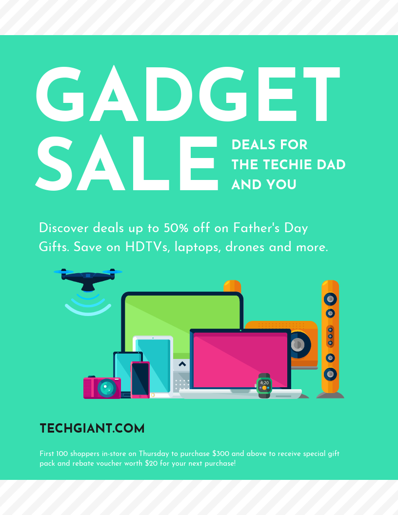
8. Use unique imagery in your flyer
An unusual image (whether it’s a photo or an illustration) helps draw attention and encourages people to take a closer look at your flyer. Try putting a unique spin on your product or blending it with other settings, objects, or people relevant to your business.
Squarespace has used a combination of photography and graphics to create this eye-catching flyer encouraging people to create their own website:

9. Use icons to represent different plan options and pricing packages
Icons can also be used to represent different options offered by your business. Look for a simple icon that illustrates your option, and differentiate the options by using a different colored background.
For an example of what I mean, look at how this travel flyer uses action icons on different colored circle backgrounds to represent different stats about Thailand:
10. Use semi-transparent shapes to make text pop out from the background
If your flyer has a busy background image, it can be easy for text to get lost in it. This is an opportunity to introduce some functional design elements to your flyer.
Try overlaying shapes over your background image and adjusting the transparency so some of the background still peaks through. That way, your text will be able to pop without the background image being obscured.

Take a look at how this flyer template overlays red semi-transparent shapes over a greyscale background image for a cool, modern design:

When in doubt, use a simple background for your flyer design.
11. Use brightly colored shapes to help grab your readers’ attention
Less is always more, except when it’s not. You can use lots of different brightly colored shapes to help break up information heavy flyers so that they are easier to read. Use shapes to help highlight testimonials, quotes, icons, or important information about your business.
Stick to basic shape and 2-3 colors to make sure you don’t overwhelm your reader, or alternatively check out this business flyer template:

12. Include a QR code to encourage readers to take action
You can use a QR code as a CTA to encourage readers to find out more about your business, to get exclusive offers, or even to enter a contest. They’re easy to work seamlessly into your flyer design–just make sure to include a short description in case the QR code doesn’t work.
Look at how this flyer example includes a QR code in the left column to encourage readers to check out the company’s website:

Product flyer examples + 11 must-know design tips
Product flyers are commonly used by retailers, marketers and eCommerce brands to highlight new or featured items in a clear, engaging format.
In this section, you’ll find expert-backed tips and real examples to help you design flyers that showcase your product and drive interest.
1. Compare your product to a competitor or to an older model
There are so many competing products out there, it’s sometimes hard to make up your mind. What makes your product a better choice than its competitor? Why not showcase that in your product flyer.
Divide your flyer into two columns, one for your product and one for a competitor’s (or an older model of your product). Place the features you’re comparing down the middle, so your audience can easily see the benefits of your product.

There’s a reason that websites let you compare products—it’s helpful to have all the information laid out side by side so that consumers can make informed decisions!
2. Use a simple grid layout to showcase multiple products
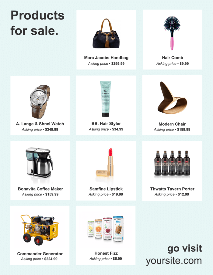
Sometimes, the simplest option is the best option. That can certainly be the case when deciding how to design a product flyer.
If you have multiple products you want to showcase–like a new product line or seasonal products–then a simple grid layout is a good way to approach your flyer design. That way, your products will be organized and easy to skim. In this product flyer example, you can see how easy it is to see all of the products at once, without the design becoming cluttered or hard to read.
Related: How to Apply the Right Layout to Your Flyer
3. Feature items that can be bought together to encourage up-selling
Up-selling is an effective sales technique that you can use to sell multiple items to one customer. If you were trying to sell some leather shoes, you could also sell your customers a shoe shining kit. You’ve probably encountered this at check outs both online and in the real world.
Effective up-selling makes customers feel like they need to buy multiple products together. Help them visualize owning multiple products by grouping them together in your product flyer. In this product flyer example we can see an entire outfit has been shown:
4. Design a header that makes people stop in their tracks
Don’t underestimate the power of a bold header. After all, it’s probably the first thing that someone scrolling through social media is likely to see–and it’s a great opportunity to do something outside of the box.
Your flyer header is an opportunity to use a decorative font, creative visuals, and an eye-catching color scheme. You can also include beautiful photography — Venngage has a whole library of stock photographs you can use for free to make a flyer!

5. Use a picture of your product as the background image for your flyer
Consumers like to know what they’re getting. That’s why it’s a good idea to include a big picture of your product–or even use it as a background image for your flyer.
Just make sure that the text stands out against the background. Using bold, blocky text can help. You could also overlay your image with a transparent color filter.
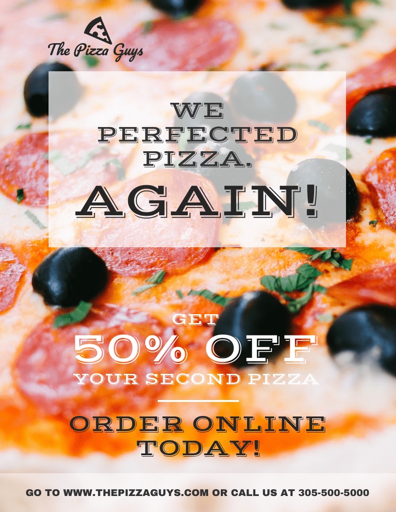
For example, look at how this product flyer example a large photograph of a pizza is used for the background. It would be almost impossible to not know that this company sold pizza! This helps your customers instantly recognize what you’re selling and get them interested in your product. This is especially helpful if your product is something like pizza, because who doesn’t love pizza?!
6. Use color to break up your flyer design
To keep readers engaged, it helps to add surprising elements to your flyer design. You can do this by dividing your flyer into different sections with color block backgrounds, or by applying different color filters to sections of your flyer.
With this product flyer example, the alternating colored blocks help break up the information and keep the reader engaged with the flyer. It’s way more visually pleasing to the eye to use contrasting colors than it is to use all the same colors.
Not sure which colors work? Check out this video for a complete introduction to color relationships:
7. Use borders as a focal design element
Borders don’t have to just be a finishing touch to your flyer–they can also be a key part of your design. Especially if you use a border in an unconventional way.
For example, you could use a border to help your product information stand out, in one of the quadrants of your flyer, or in the center.
This product flyer example uses a border in the center of the page for an unusual design:

8. Pick fonts that convey your brand’s personality
Fonts can say a lot about your business–simple, functional fonts are standard in the tech industry, while more decorative and “classic” looking fonts endure in the print industry.
When designing your product flyer, think about the personality you want to communicate. Is your business fun and easygoing? Is it reliable? Is it innovative, or more traditional?
Since flyers are such an instantaneous marketing material you need to make an impression on potential customers, and fast.
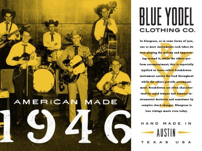
In this example, the designer has picked fonts with a vintage and retro feel to help advertise their heritage clothing brand. By using this font potential customers know exactly what to expect from this company.
9. Show your product in context
Generally, e-commerce product photography falls into two categories: lookbook and in context photography. Lookbook photography showcases your product without distraction, while in context photography shows your product being used.
The benefit of in context and digital lookbook photography is that it helps people visualize their life with the product. It makes the product a bit more tangible, despite being just a photograph.

In this flyer, Nike have shown their products in action which allows customers to see exactly how they should be used, and gives an aspirational image of what they could achieve by buying and using the Nike products.
10. Use a circular layout for your product flyer
Flyer design is an opportunity to play around with unconventional layouts. That means you don’t have to stick to the classic left-to-right layout.
For example, you could position your product in the center of your flyer and circle product details around it. Take a look at how this product flyer example does it:
11. Use image frames to incorporate your product photos creatively
Image frames allow you to crop your photos into decorative shapes. This can make it easier to incorporate photos into your flyer.
Take a look at how this product flyer for yearbooks incorporates photos from the yearbooks into the actual text of the flyer, using image frames:

Event flyer examples + 15 must-know design tips
Event flyers are a go-to tool for anyone planning a concert, fundraiser, party or local gathering—they help spread the word fast. Exploring different layouts and visual styles, such as DesignWiz party flyer templates, can also help spark ideas for creating flyers that feel on-theme without starting from scratch.
Here, you’ll find simple tips and real examples to help you design a flyer that gets noticed and gets people to show up.
1. Divide your flyer into sections using boxes
A simple way to organize the information on your flyer is to divide each section into its own box. For example, you could have one box for the title, one box for the event details, and a box with a description of the event.
This picnic event flyer template makes a good example of using boxes in flyer design. Here each box contains a different set of information:

Here’s another example. This flyer uses boxes turned on their side to highlight the different elements of their event:

2. Give your event flyer a fun and unconventional border
Do you want your event flyer to stand out from the standard designs in your niche? Look for ways to use design elements unconventionally.
For example, this yoga class flyer uses a border around the photograph, but the border sits behind the text block. The result is an unconventional design that is interesting to look at, and shows that this event will be fun and modern.

3. Use complementary colors as your event flyer’s color scheme
Green and red. Yellow and purple. Blue and orange. These pairs are known as complementary colors because they go well together. That’s why, if you’re not sure which colors to pick for your event flyer design, complementary colors are a good place to start.
Take a look at this event flyer example:

When creating an event flyer keep complementary colors in mind so that you can help grab your audience’s attention quickly.
4. Emphasize and time and place of your event
If you’re putting on an event, you want people to show up… right?! While an attention-grabbing design will attract eyes, don’t forget the primary purpose of your event flyer: to get people through the door. Make sure that the event details like location, time and ticketing are easy to read.
For example, this event flyer template uses a bright yellow box to make the event details stand out. Oh, and it helps that blue and yellow are complementary colors too! (See tip number 1)

5. Use classic design effects to make your flyer as fancy as your event
Is your event going to be a celebration of glitz and glam? Don’t be afraid to bring out the glitter in your event flyer. Pick a color scheme that reflects all of the silver and gold guests can expect.
Take a look at how shamelessly fancy this event flyer is. The vintage design elements are used to show that this will be an elegant and fancy anniversary event.

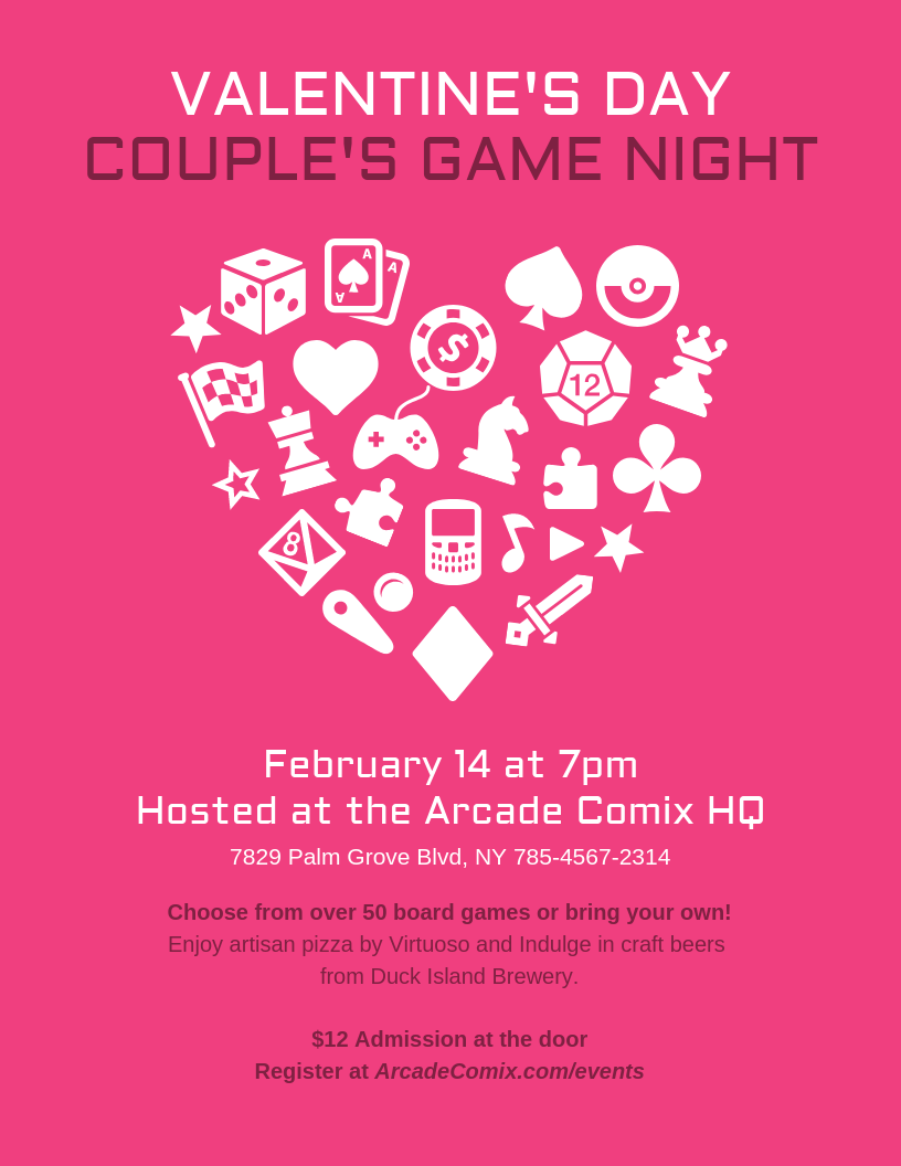
6. Illustrate your event using icons
Set the scene for your event by creating your own custom illustration. Use building and furniture icons to illustrate the event venue. Look for icons to show any props or food that will be there. Let people know what to expect.
In this Drag Brunch flyer template icons have been used to show that you can expect singing, breakfast, and a whole load of lipstick:

You can also arrange icons in a fun pattern to help represent your event, like this Valentines Day Game Night flyer example:
7. Come up with a theme for your event flyer
Before diving into your flyer design, it’s helpful to plan out a concept for your design.
What sort of scene do you want to set? What kinds of visuals are you going to use – icons or a more cartoon-like design? Photos from previous events to show people what they can expect? Something more traditional, or something a bit more abstract?
In this event flyer example, the theme is ‘glitz and glam’. The designer has chosen a background, fonts, and colors that all sit within this theme:

Related: 20+ Customizable Club Flyers & Templates Made For Nightlife
8. Incorporate a few photos for a collage-like flyer design
Here’s a fun design hack: incorporate one or two realistic photos in an otherwise illustrated or flat design to give your flyer the appearance of a collage. This quirky design style is great for flyers advertising events like parties, art shows, and flea markets.
Look at how using multiple photos helps advertise this 4th July event flyer example:

Check out our collage templates here. You can also find out more about our party flyers here.
9. Make sure you incorporate your logo into your flyer design
Flyers aren’t just a way to spread the word about your event–they’re also a way to spread awareness about your brand. Don’t forget to include your logo in your flyer!
You could simply include your logo at the top or bottom of your flyer. But you could also find a creative way to incorporate it into your flyer design. For example, look at how this brand put their logo into the cup of coffee:
With the Venngage and the My Brand Kit tool, Business users can upload their company logo, company colors, and company fonts and see them automatically applied to your flyer design.
10. Use an image to frame your event flyer
An elegant design hack is to use an image as the frame around your flyer. You can do this by using an image that has a blank space and placing it along the edge of the page.
This flyer example uses a silhouette of a person with fireworks in the background to use as a background, with the shadowed areas of the photo providing the perfect blank space for the event details.

You can also use stock photography to create a smaller image frame on your flyer. In this flyer example, the fall leaves and pumpkins create a circle wherever your event name can be written. If you’re not hosting a fall festival, this would be a perfect Halloween flyer template as well!
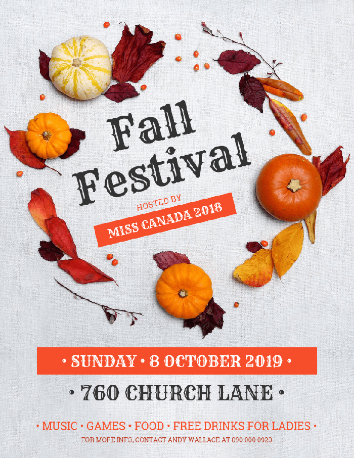
Related: 15+ Customizable Thanksgiving Poster Templates & Design Tips
11. Make your event flyer double as a ticket
Are you planning on handing out physical flyers? If you want your event to be exclusive, you could make your flyers the ticket to enter. Just make sure you state that clearly on the flyer!
If you want to take it a step further, you can even make your flyer look like a ticket, like in this example:

12. Include contact information in case attendees have questions
You only have so much space on an event flyer for information. That’s why it can be a good idea to include contact information where people can go to get more information on things like accessibility and attendance requirements.
All you have to do is put a simple label and contact information in the bottom corner of your flyer, like in this template:

13. Include the price of entry for your event
Let people know how much they’ll have to shell out for your event directly on the flyer. If your event is a bargain, you can emphasize the price in the middle of your flyer. If it’s a little pricier, you may want to include some selling points besides the price.
Putting the ticket prices in a different color font is a great way to help that information stand out, like in this flyer example:

14. List special guests who are you going to be at your event
If you’ve gone to the trouble of inviting a special guest then you should let people know about it! Make your notable guests one of the main features you include in your promotional flyer. You may even want to feature the photo of a keynote speaker as the focal visual.
If you don’t want to include any actual photos of your special guests, then you could opt to simply list their name in a larger font, like in this example:

15 . Leave negative space so your flyer design doesn’t look cluttered
Negative space is the empty space between elements on the page.
When you try to pack too many visuals into one page, it’s easy for your design to become cluttered and hard to read. But if you let your text and visuals breathe with plenty of negative space, it will be much easier for people to read and understand the information.
Take a look at how the use of negative space in this event flyer makes for a sleek, efficient design:

Sales flyer examples + 13 must-know design tips
Sales flyers are a popular choice for businesses looking to promote special offers, discounts or storewide sales to new and returning customers.
Below, you’ll find helpful tips and real examples to design flyers that catch eyes, create urgency and help boost conversions.
1. Pick colors that reflect the mood of your sales event
Are you having a fun spring sale? A festive holiday sale? An exciting flash sale?

The colors you choose for your flyer should appeal to the emotions of your audience. What do you want your audience to feel when they look at your flyer?
This sale flyer example promotes a winter clothes sales, and the designer makes use of the pastel coat colors that allow for a harmonious design as well as giving out a warm, winter-like feeling:

2. Use a visual pun in your flyer design
A visual pun is like the dad joke of the design world: kinda cheesy but also a lot of fun. A visual pun is a design element that symbolizes something, like in this flyer example:
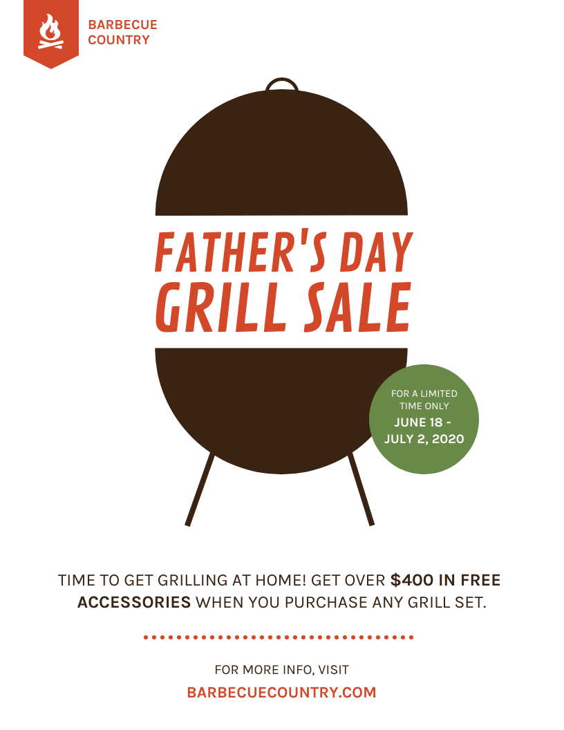
Not only does this advert advertise a grill sale, but it also looks like a grill. Injecting a little bit of humor into your designs like this is a great way to get your audience’s attention. Using visual puns isn’t suitable for everybody, but if you think it works for your company then go ahead!
Do our Venngage designers love a good visual pun? Well, if you mustache… *crickets*
Anyway here’s another flyer template you can use:

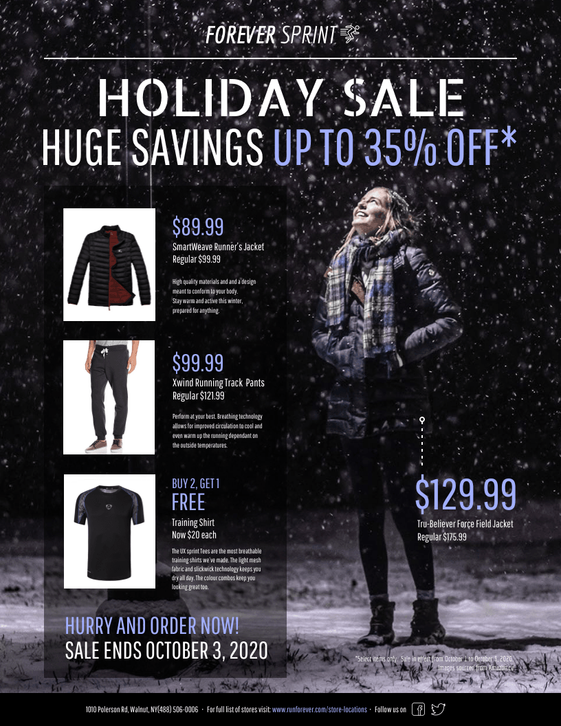
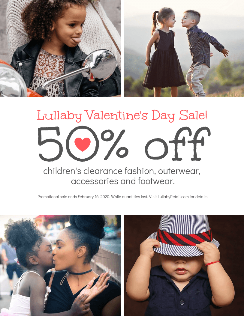
3. Emphasize the numbers on your sales flyer
Most people are going to look for one thing on a sales flyer: how much of a discount are they getting? Make their savings impossible to miss by using big fonts in contrasting colors.
For example, this sales flyer example puts the savings (35% off) right in the header in orange, a very bright and hard to miss color. Orange is also used in the body of the flyer to show individual products on sale:

4. Make your sale flyer a GIF to attract attention
People and animals aren’t so different. We all like shiny, moving objects. If you want to grab your audience’s attention, make your flyer a GIF.
You can do this by making certain elements of the design move or flash with color, like the words, icons, or background. Here’s a neat (and fitting) event flyer for an Arts Festival:

5. Make your discount the focal point of your sales flyer design
Are you offering your loyal customers an amazing discount? You can plan your flyer design so that the discount is the focal point.
This is an opportunity to use a big, attention-grabbing font. You could even mix and match a few fonts, using a more out-there font for the discount number, and a less conspicuous font for the descriptive text.
6. Create an asymmetrical layout for an edgy sales flyer design
To grab your audience’s attention, it’s a good idea to look for ways to make your flyer design original. While many businesses opt for a simple grid layout because it’s efficient, you can set your business apart by using an asymmetrical layout.
Take a look at how this flyer aligns all of the text to the left to create a modern design. Balance is the key to an aesthetically pleasing design:

7. Use fonts as the main design feature of your sales flyer
Using one to three decorative fonts with a solid background can make for a classy, elegant flyer design. The key is to pick fonts that complement each other. You may want to pick fonts of three different styles (thin, thick, abstract) or stick to three similar fonts.
For example, this sales flyer example combines four very different fonts, but they manage to complement each other nicely

If you’re planning on sharing your sales flyer on social media, then it’s a good idea to optimize your flyers accordingly. That means using the best image dimensions for whatever social media platform you’re posting on, and making sure your flyer is easy to read on mobile.
Generally, a 1080 x 1080 flyer is a safe bet for most social media platforms. Refrain from using too much text, as it will be more difficult for people to read on mobile.
You can use a sales flyer to attract our audience’s attention, and then link to your site or blog for more info. Take a look at this simple but eye-catching social media sales flyer:

In fact, Venngage has a whole host of social media templates that you can use so make sure you check those out.
9. Pick visuals for your sales flyer that reflect the season
Are you having a Christmas sale? An easter sale? Or A Halloween sale?
Help get your audience into the spirit of the season by incorporating seasonal icons, background images, and color schemes. It’s ok to go a little overboard when it comes to seasonal flyers–that’s part of the fun!
For example, there’s no missing what season this sales flyer is for:

And this holiday sale flyer is pretty self explanatory too:

A lot of people look forward to the end of summer for great sales, as stores overhaul their products for the winter. Help your audience stay in the sunny, optimistic summer mood with a cheery sales flyer. In this sales flyer template, a stock photo of a pool has been used for the background, alongside icons of a beach ball and waves to emphasize the summer vibes.

10. Create unique flyers with creative typography
Typography isn’t just about the font you choose. It’s also about the space between characters, the boldness of text, and how you arrange text on the page.
Take this flyer as an example. The text is the main focus of the flyer and a combination of different sizes and colors helps make the design pop:

You can even separate the text into different boxes to create a simple but impactful flyer design:

11. Create an email header sales flyer
Do you want your sales announcement to be the first thing people see when they open your promo email? Then create an eye-catching email header.

Generally, an image with a 3:1 ratio works well for email headers. Because there is smaller space, it’s best to not cram too much text into a header.
12. Use visuals that reflect the theme of your sale
Have you taken the time to come up with a clever name for your sale? Do it justice by creating a clever flyer!
Think about how you can use color and visuals like photos and icons to reflect the theme of your sale.

13. Create simple patterns using icons
On Venngage, you can change the colors of icons and adjust their opacity. This makes it easy to create your own patterns using icons.
This sales flyer example uses hot pink and modern shapes to create a really unique pattern which, when layered on top of a background image, becomes an eye-catching flyer.

Real estate flyer examples + 10 must-know design tips
Real estate flyers are a trusted marketing tool used by agents, brokers and property managers to promote listings and attract potential buyers or renters.
In this section, you’ll get expert-backed tips and professional examples to help you design clear, compelling flyers that drive inquiries and interest.
1. Use a patterned background to create an elegant design
If your realtor branding leans towards the more classic and elegant side of things, consider using a subtle patterned background. Here the diamond background has a washed out effect which, when coupled with an elegant font gives the impression of an upmarket service.

2. Highlight your experience with icons
Do you need to sum up a lot of information in very little space? Sounds like you need an icon! Icons are small pictures that represent something else, and they are perfect for flyers. They can work as a section header, or a way to group relevant information. And the more visual your flyer the better–nobody wants to be confronted with a block of text.
3. Bold contrasting colors help make your flyer pop

Blue and green should never be seen, but blue and yellow is a winning combination. By using contrasting colors and interesting shops this flyer has a modern and stylish look, whilst still looking professional.
A good place to start with using color in designs is by using your brand colors. With Venngage’s My Brand Kit you can apply your brand color palette to your designs instantly and expertly.
4. Use multiple photos and image frames to showcase the property

Flyers, though wonderful, are small and it can be difficult to pick just one photograph to feature. Why not use multiple photos on top of each other to create a photo collage-style flyer? By using multiple images you can showcase several elements of the property in just one flyer.
You could even use image frames to put your photos inside a shape. In this example, the image frame is circular but a square, triangle, or even a star would work just as well!
5. Create an infographic flyer to add extra value for your clients

Venngage actually got our start as an infographic software, and whilst we know have other tools such as an excellent real estate flyer maker *cough* we still believe in the value of visualizing data! The real estate market is often difficult to understand for potential buyers and sellers, so by creating a real estate infographic flyer you can help your clients understand important information quickly and easily.
The other benefit of using an infographic real estate flyer is to help you stand out from your competitors–a well designed real estate infographic can provide a lot of additional value for your customers, something that your competitors might not be doing.
6. Pick a theme for your real estate flyer
When starting any real estate business it’s important to drill down on what you want your brand to be. This will help inform all of your real estate marketing including your real estate flyers.
This flyer is playing off the popular saying ‘Home sweet home’ by using a gingerbread cookie in the shape of a house in their marketing materials.

7. Use pops of color to draw attention to key information
In a flyer that is designed to grab attention pops of color can be used to draw the eye towards important or impressive information.
In the example below, the hot pink stands out from the muted black and white background. By putting the date and the prices within hot pink boxes our eyes are able to scan the flyer and identify the important information quickly.
This is a really helpful design hack to keep in mind when you’re first starting out in real estate. Pops of color help you stand out from competitors!

8. Use beautiful photography in your real estate flyer
Selling a beautiful house? You better show it off! Use your best photo as the main feature of your real estate flyer. This could be a photo of the exterior or the interior—you can use your judgment to pick the photo that you think is the most eye catching.
In the flyer example below the realtor has allowed the photograph to take up the most space on the flyer, and has used white space below the photograph to display all of the property details and contact information.

9. Provide homeowners with reasons why they should pick you as their realtor

Real estate is a competitive market and your realtor marketing is important to differentiate yourself. Why not take a leaf out of the consumer brand playbook and tell people exactly why you are the best choice? X company runs adverts that say ‘better than the leading brand’ for a reason!
You could even create an infographic real estate flyer. Learn more about how to create infographics with our beginner’s guide: How to make an infographic in 5 steps:
10. Use a brightly colored shape to shout about your sales
When creating your real estate flyer think about what will grab the most attention and then make that your headline. Here Alex Tomas has gone with ‘JUST SOLD!’ as their headline which is emotive language and helps draw interest from potential clients.
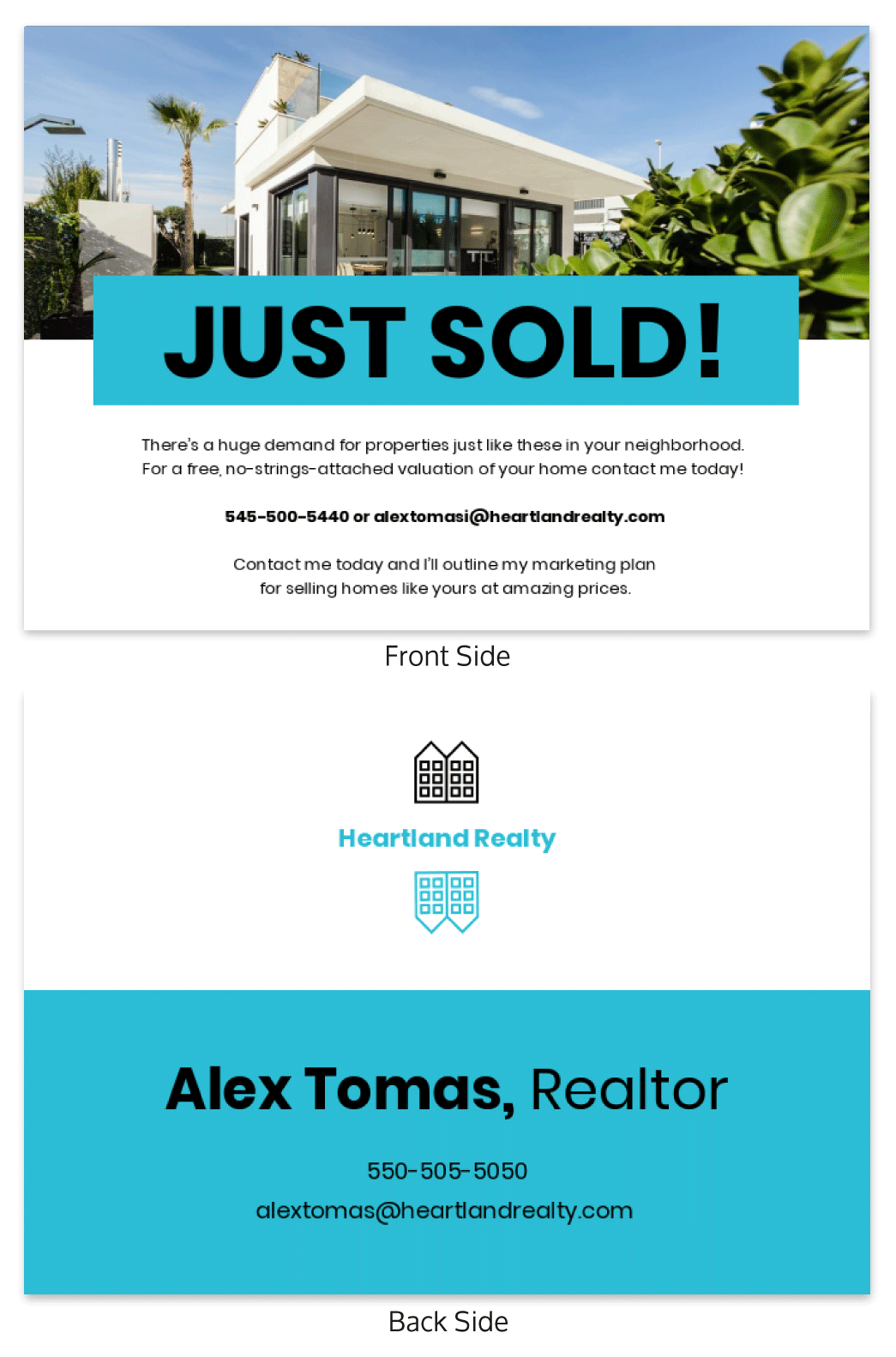
And if the bold font and exclamation point weren’t enough, a blue background box helps the headline stand out even more against the white background.
Advertising flyer examples + 5 must-know design tips
Businesses and marketers often use advertising flyers to promote products, services or deals in a clear, visual format that’s easy to distribute.
This section offers practical guidance and examples to help you design flyers that stand out, communicate value, and inspire customers to engage.
1. Emphasize a compelling offer or incentive
Don’t be shy about showcasing your offer front and center on your flyer. Use eye-catching fonts, colors, and design elements to make it stand out. You want people to see it and go, “Wow, that’s a great deal!”
Clearly communicate the benefits or value that your offer brings. Whether it’s a discount, free gift, or exclusive access, let people know exactly what they stand to gain.
Sweeten the deal with an extra incentive to make your offer even more irresistible. It could be a bonus item, a free sample, or a special upgrade. People love getting more than they expected, so give them something they can’t resist.

2. Create a sense of urgency
Nothing screams urgency like a flash sale or daily special. Create a buzz by announcing a limited-time sale happening only for a few hours or a special deal that changes every day. Let people know that they have to act fast if they want to snag those incredible discounts.
Give people a reason to hurry by mentioning limited quantities available. Use phrases like “While Supplies Last” or “Limited Stock Remaining.” When people know there’s a limited number of items up for grabs, they’ll rush to get their hands on them before they disappear.
Everyone loves feeling special. Create that exclusivity factor by offering a deal that’s only available for a limited time or to a limited number of customers. Use words like “Exclusive Offer” or “For the First 50 Customers Only!” When people think they’re getting something unique, they won’t want to miss out.

3. Simplify and declutter your advertising flyer design
Less is more so don’t overwhelm your flyer with too much information. Stick to the essentials and focus on the key message or offer you want to convey. Remember, simplicity is key!
Instead of cramming everything into one big block of text, break it down into bite-sized pieces. Use headings, subheadings, and bullet points to organize your information. This way, people can quickly scan and understand what you’re saying.
Don’t be afraid of whitespace! Give your content some breathing room by leaving empty space around important elements. This helps create a clean and uncluttered look, making it easier for people to focus on the important stuff.

4. Create a striking visual focal point for your advertising flyer
Use a visually captivating image or a central element as the focal point of your advertising flyer. This could be a product image, an attention-grabbing illustration, or a compelling visual representation of your message. Ensure it aligns with your branding and stands out prominently.
Contrasting colors make your visual focal point stand out. Place it against a background that makes it pop. Bold colors against a neutral background or vice versa can create a striking visual effect.
Grab attention with a clear visual hierarchy. Make the most important elements stand out by using larger fonts, bolder colors or different font styles. Guide people’s eyes naturally from one important piece of information to the next.

5. Play with puns and inject some humor into your advertising flyers
Craft witty and attention-grabbing headlines that make people pause and smile. Use clever word choices or unexpected juxtapositions to create a humorous impact right from the start.
Look for words or phrases related to your product or message that can be twisted or combined in a clever way. Embrace wordplay and create puns that bring a smile to people’s faces.
But don’t limit yourself to just wordplay. Explore visual puns and humorous imagery that support your message. Combine elements in unexpected ways or use illustrations that have a playful twist.
That said, be mindful of your humor and ensure it doesn’t offend or exclude anyone. Aim for light-hearted humor that brings people together rather than causing discomfort.
A well thought out, well-designed flyer should:
- Be simple yet informative: People should know what the flyer is advertising and where they can find out more.
- Have a clutter-free layout and keep it visually appealing: Keep the design simple and avoid cramming too much stuff in. Plenty of white space makes it less overwhelming and using high-quality pictures can keep readers engaged.
- Target the right audience: The flyer needs to speak directly to the audience you’re targeting.
- Tell people what to do next: Whether it’s visiting a website, attending an event, or calling a number, include a clear call to action (CTA) that’s easy to find.
- Focus on the benefits: Highlight what’s in it for the reader. Instead of just listing features, explain how your product, service or event benefits them.
- Match your brand identity: If you already have a brand style guide, use them on your flyer! Trust me, it makes them instantly recognizable!

Follow these 2 simple steps to create your own flyer:
- Look at plenty of flyer examples to get some ideas for how to approach your design.
- Start with our Flyer Maker and customize your flyer template to fit your brand.
Flyer example FAQs
What should I write in a flyer?
To write an effective flyer, include a clear, relevant headline, concise messaging tailored to your audience, and strong visuals that support your goal. Add a specific call-to-action, be it a sales discount, a new product announcement, a service offer or something else. Lastly, follow design best practices—such as clean layout and brand consistency—to ensure your flyer communicates professionally and drives engagement.
What makes a good flyer?
A good flyer should catch the eye, speak to the right people, share key details, and push readers to act. It also needs strong visuals and a clean layout. If you want ideas, browse our blog for flyer examples for business, events, sales, and more, or try an ai flyer generator tool to speed up the process.
Related: Flyer Design: A Complete & Actionable Guide
What is the standard size of a flyer?
The most common standard flyer size is US Letter: 8.5 x 11 inches (21.59 x 27.94 cm). This size offers enough space for text, visuals, and design elements while remaining cost-effective for printing and easy to distribute. However, flyer sizes can vary depending on content, purpose and audience.
Other commonly used flyer dimensions:
- A4: 8.27 x 11.69 inches (21 x 29.7 cm)
- A5: 5.83 x 8.27 inches (14.8 x 21 cm)
- DL (Dimension Lengthwise): 3.9 x 8.27 inches (9.9 x 21 cm)
When choosing a flyer size, consider your layout needs, distribution method and how the flyer will be used. A visually clear, well-designed flyer—regardless of size—has the greatest impact.
In summary: Create the perfect flyer for your marketing campaign from these flyer examples
Flyers are such a valuable offline marketing tool that it’s worth spending some time thinking about your design.
Don’t worry if you’re not a designer, starting with a flyer template is a great way to create stunning designs easily. Don’t underestimate the power of creating flyers for your small business.
I hope these flyer examples have given you some inspiration for your own designs.
See for yourself how you can use Venngage to design flyers even if you don’t have any design experience: start customizing one of our recommended flyers, or creating a free account and browse through our flyer templates. It’s free to get started.


