Brochures may feel old-school, but the right design can still grab attention in a way digital ads can’t. I’ve seen well-crafted brochures leave a lasting impression, because they do more than look nice.
The right design doesn’t just look good, it helps people understand and remember your brand. In this guide, you’ll learn how to put together a company brochure that actually works, plus how to customize ready-made brochure templates with our free brochure maker.
Types of company brochures (with examples)
Not all brochures or business pamphlets serve the same purpose. Over the years, I’ve come across brochures that impressed me instantly and others that barely held my attention.
The difference usually comes down to whether the brochure matched its purpose. Here’s a breakdown of the main types, with examples I’ve seen work in practice.
Corporate brochure
Corporate brochures are designed for big businesses and professional services that want to showcase credibility. They’re often used in meetings or conferences to highlight expertise, achievements, and company values.
Typically, you’ll see law firms, consultancies, financial institutions, and corporate headquarters use corporate brochures. Their purpose is to reassure potential clients or partners that the organization is established, trustworthy, and capable.
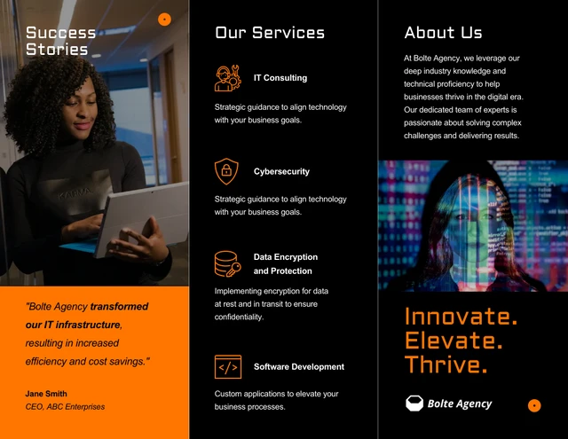
One strong corporate brochure design example is this tech company tri-fold brochure which places a clean layout around company story, services, visuals and contact info.
Product brochure
Product brochures dive into the details—features, benefits, and specs. When I was researching laptops, I picked up a product brochure that laid everything out side by side. That simple comparison chart made my decision so much easier, and it’s a great example of how these brochures support the buying process.
Another good example is this brochure template below, its clean layout makes it perfect for showcasing product lines—whether you’re a retailer highlighting seasonal collections, a tech company comparing models or a small business introducing a new product range. The design balances visuals with concise descriptions so customers can quickly see what makes each option valuable.
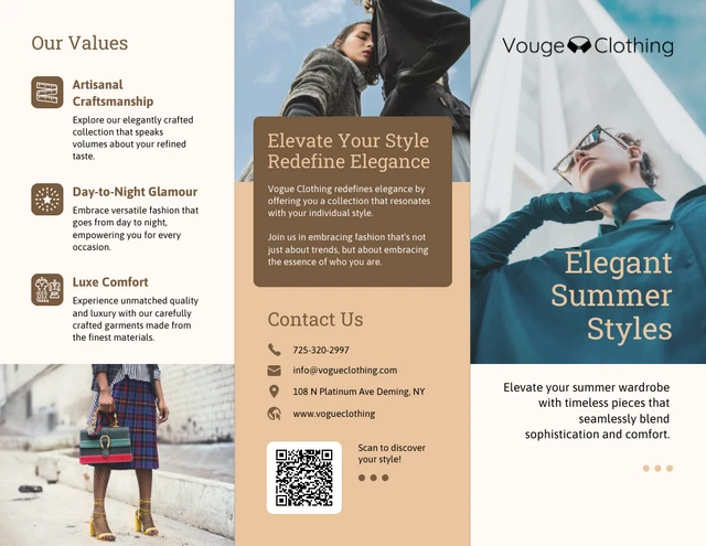
Product brochures are most often used by retailers, electronics companies, and manufacturers to give customers clear, structured information that helps them compare and choose confidently.
Service brochure
Service-based businesses rely on these brochures to explain what they offer, how they deliver value, and why clients should trust them.
Typically, consulting firms, financial advisors, agencies, legal practices and other professional service providers use service brochures. The purpose is to educate prospects, establish credibility and guide them toward contacting you.
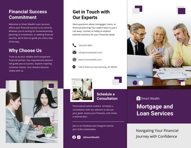
For example, this mortgage and loan services brochure template is designed specifically for financial and professional services. It’s structured with clear sections for outlining service features, highlighting client benefits, showcasing testimonials and adding contact details.
The tri-fold format also makes it easy to hand out at events or send by mail, giving potential clients a polished takeaway they can reference later.
Sales brochure
Unlike a corporate or service brochure, sales brochures are built to spark action right away. They’re usually bold, benefit-driven and straight to the point.
I still remember a SaaS startup that slipped one into my conference tote bag—the design was simple, but the clear headline, quick proof points, and demo link stuck with me long after the event.
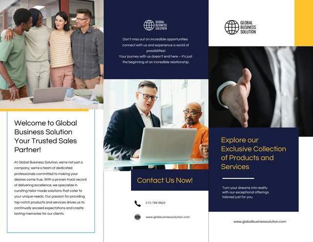
Venngage’s tri-fold sales brochure template is a good example of this approach. The bright palette grabs attention, while the structured layout makes space for value statements, offers and a strong call to action. It’s the kind of brochure a sales rep could confidently use at a trade show, a networking event or even as a follow-up mailer.
Advertising brochure
Advertising brochures are built for speed, they’re designed to capture attention and spark action around a single campaign. I’ve seen them work especially well for short-term promotions, like a gym offering discounted memberships at the start of the year. The bold messaging and clear layout made it impossible to miss the deal.
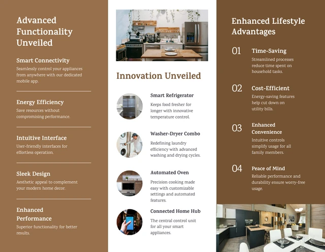
A good example is this home appliance launch brochure template. It’s tailored for product launches, with space for big visuals, key product highlights and limited-time offers. The design makes it easy for customers to see what’s new and why they should act quickly.
These brochures are typically used by retailers, consumer electronics brands and event marketers. The purpose is straightforward: create urgency, deliver key information fast and drive immediate action, whether that means visiting a store, scanning a QR code, or signing up for an event.
Organization brochure
Organization brochures work best when they focus on people and impact. I once received one from a local charity that simply shared the stories of families they had supported. It wasn’t overly designed, but that honesty made it powerful and it made me want to help.
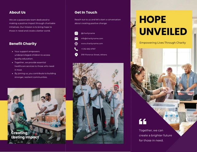
This simple charity brochure template is a good example of how to do this well. The clean layout keeps the spotlight on the mission and provides space for programs, testimonials and a clear call to action. It’s the kind of brochure a school might hand out at an open house or a non-profit might share with new donors to build a deeper connection.
About us / company introduction brochures
These professional brochures use storytelling to introduce a brand—its roots, mission, values and vision. At a pitch event, a founder handed me one that included their journey, their “why,” and even a handwritten note from the team. That kind of personal touch made their company feel far more human than just another logo.
A great example is this minimalist company brochure template. Its understated design directs attention to narrative elements—history, values, team and brand promises without overwhelming readers
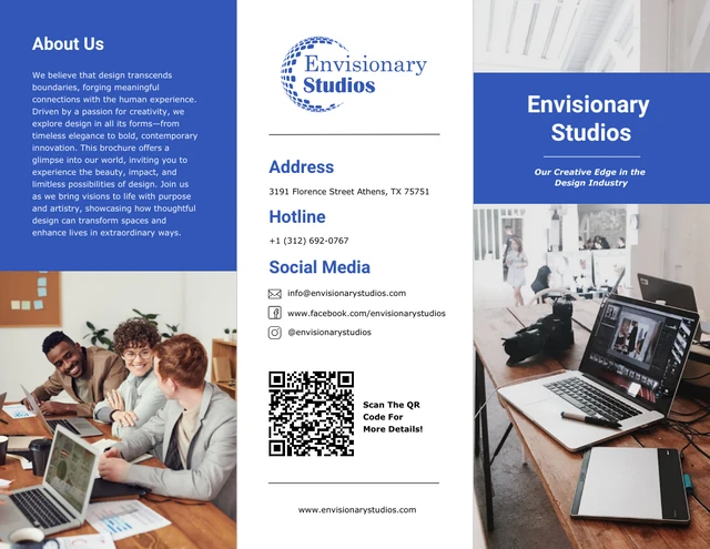
Founders, small businesses and companies entering new markets often use these. The purpose is to build connection, credibility and familiarity, making the reader feel they know who you are, not just what you do.
Program brochure
Program brochures like conference and seminar brochures, act like roadmaps for events. A well-designed one lays out the schedule, introduces speakers and highlights key sessions so participants know exactly where to focus their time. When done right, it keeps people organized and engaged from start to finish.
This leadership conference brochure template is a strong example. Its structured layout balances session times, speaker bios and event highlights in a way that’s easy to follow.

These brochures are commonly used for conferences, workshops and training programs. Their purpose is more than just sharing logistics, they create clarity, set expectations and help attendees get the most out of the experience.
What is the goal of a company brochure?
The goal of a company brochure is to motivate readers to take action. Whether that’s contacting your company or buying your product/service, they first have to give you the time of day to actually pick up and read it! Make sure to keep these goals in mind throughout the design process.
Specific goals of a company brochure can include:
- Act as a reference for the products and/or services your company offers
- Support sales efforts by improving credibility to answer any objections
- Generate leads for your business
- Establish communication channels with potential clients

How to design an effective company brochure step-by-step
As a marketer, I’ve designed and reviewed a lot of brochures, and one thing is clear: the best ones don’t just look good, they serve a purpose.
An effective brochure guides readers, builds trust, and nudges them toward action. Here’s a step-by-step process that blends design best practices with real-world marketing experience.
1. Identify the purpose and strategy of your brochure
The first and most important tip that you should follow is to decide on the central purpose and strategy of your company brochure, such as new product launch, company event or conference promotion, or employee recruitment. Putting in the time now to plan out your layout will likely save you from wasting valuable time and money later to fix any mistakes.
For instance, product launch brochures usually have tri-fold or gatefold layout so you can highlight the features, pricing and benefits of a product.
Planning all this from scratch can feel like a lot. If you know your purpose but not how to turn it into sections and copy, start from a draft instead of a blank page. Feed your company details into the AI brochure generator and you’ll get a structured first version — headline, sections, and flow already in place — that you can rework once you’ve set your direction.
Browse our selection of free brochure templates for ideas. For example, this bi-fold brochure template is clear and simple. Its purpose is to attract new leads, so contact information for the sales team is displayed on every page.
The brochure planning process involves:
- Deciding who your target audience is
- What most needs to be communicated to your audience
- The central message
- Your budget
- Whether or not you need printed copies.
This will help dictate the overall direction of your design and will ensure that the brochure design matches your brand identity.

Lastly, you should have a clear view of your brand personality and apply your company logo, color palette and typography to the brochure. This is to make sure all of your branding materials follow a consistent style.
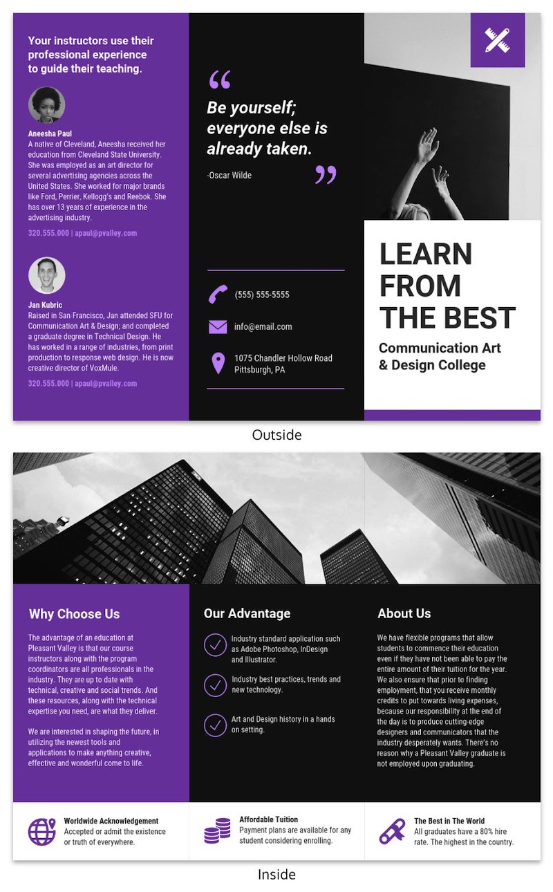
Take a look at the well-planned flow of this trifold brochure template for a college. The first section that the reader sees is an introduction to the college followed up by the value they offer to students. The reader is also shown the bios of the college’s professional instructors before reading the tuition details. This helps to make the tuition cost seem more reasonable by the time the reader gets to that section.
2. Focus on readability
Most people have short attention spans. You run the risk of losing readers if your brochure is too lengthy or difficult to read.
I understand how tempting it may be, but don’t list every single feature of your product or service. Rather, try to focus on your main selling points to grab the attention of your readers. For example, if your company creates electronic devices, you can highlight company’s flagship products or services in a grid form with brief details for each product/service. If you find it hard to trim long descriptions, a paragraph summarizer helps make your message short and clear before adding it to your brochure.
You should also stick to straightforward, simple language, such as ‘Contact us’ or ‘Request for quote.’ Your credibility lowers with an increase in complex language. Don’t fall into this trap!
Here’s one of our company brochure templates that follows this tip. It has clear and straightforward writing that helps to quickly get the message understood easily:
This bi-fold brochure template uses icons as bullet points to make the selling points easy to scan.

3. Plan out the order of information in brochure templates
Trifold brochures have a limited amount of space for information–and bi-fold brochure designs even less so.
If the reader is not impressed by the first section that they read, they most likely will not be compelled to read any further.
That’s why it’s important to only include information that any new potential lead should initially know about your business. For example, this company brochure template mentions the company’s smart investment technology:

What’s so special about your company, product or service? Show it off early to hold their attention.
This brochure template for a travel agency uses gorgeous photography to show off Greece’s natural beauty and its most appealing aspects as a tourist destination to gain readers’ attention. It conveys that the company can help its customers visit such beautiful places. For stronger visuals, check these practical product photography tips.
This brochure template features a computer store selling a line of notebooks. Readers of this type of brochure want to know two things: the features and prices of the laptops for sale.
4. Choose relevant colors
Your choice of colors has a considerable impact on the initial perception your readers have about your company.
A general rule of thumb is to use any brand colors that your company already uses. From there you can incorporate other complimentary colors. This corporate business brochure template primarily uses the color of the company’s logo, plus an aqua color as an accent:
Certain colors just work better for different types of companies. For example, the pastel green used in this professional brochure template perfectly suits a home decor business.
5. Use consistent images
The use of consistent imagery throughout your brochure, similar to your color choice, is crucial to creating a professional-looking brochure design.
You’ll want to use relevant images that incorporate well with the overall theme of your design. Some of our brochure templates make use of illustrations that reflect a theme, like this nature conservancy brochure:
Feel free to use stock images. Many of our professionally designed brochure templates already incorporate stock images.
You can also access our in-editor library of thousands of free stock images if you want to make substitutions. Just make sure the stock images directly relate to any passages of text that they accompany. And groups of images should look like they belong together.
If your stock images are too generic, it is more than worth it to invest in paid images or upload your own images. This may be the first time the reader has learned about your company and you don’t want to ruin your one and only chance to impress them!
Aside from photos, you can also use icons and stock illustrations. We have an in-editor icon library that makes it simple to click and replace icons, like in this brochure design:
It’s also a good idea to make sure your images are 300 dpi if you plan to print your brochure to ensure high-quality standards. Alternatively, you can save your company brochure templates as PDFs and convert your PDFs into digital brochures and share them on your corporate site.
Take a look at the professional brochure template below that uses the same style of images throughout the entire brochure template. It adds to the professionalism of the brochure:
6. Maintain consistent font choice
Have you ever seen an article or printed marketing material that uses multiple random fonts throughout the entire design? Probably not. But if you have, I’m sure you were appalled by the lack of professionalism.
A good place to start is to use your existing company signature font if you have one. If not, check out our blog post on how to choose brand fonts.
You can use it for the entire brochure or you can add a complimentary font but it’s a good idea not to add more than two additional fonts.
Imagine if the following tri-fold template used different font styles for their headings. It would degrade the readability of the brochure.
Brochure templates that don’t make this mistake are easy to navigate through the information. Find out more about our travel brochure templates.
7. Use sales copywriting over technical copywriting
You might be inclined to think you have to include as much information as possible to tell the reader about what you have to offer. However, potential leads can simply visit your website to learn all about your amazing products and services. Your goal is to pique their interest enough to make them want to reach out to your company, like in this professional brochure template:
For most readers, the limited amount of space in your brochure, especially a bi-fold brochure, is your first and only opportunity to capture valuable leads.
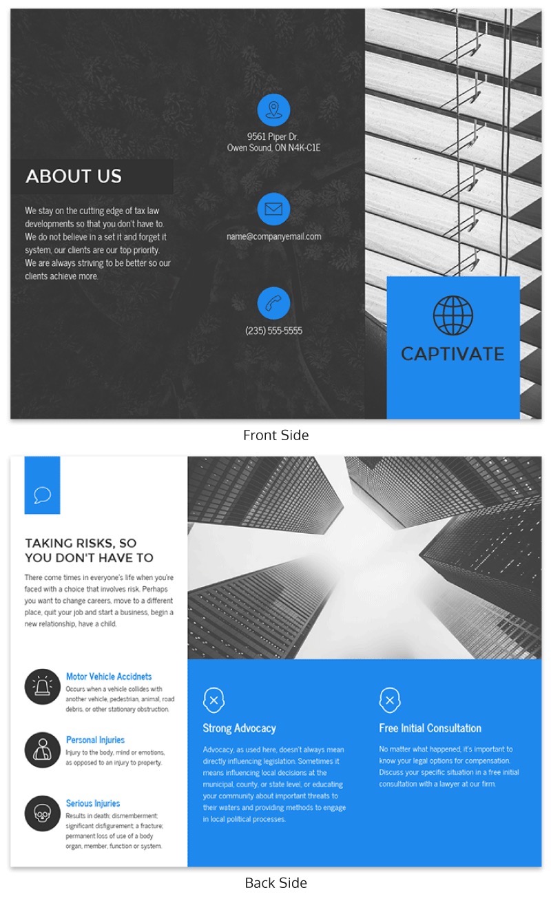
In the following company brochure template, the first sentence that the reader sees is, “Taking risks, so you don’t have to”. Clients look for a “do whatever it takes” mentality when looking to contract tax law firms. This sales copy directly addresses the main concern that their target audience possesses.
8. Embrace white/negative space in your brochure templates
White/negative space is the empty space in your design between different elements. Include white/negative space to make your brochure design less cluttered. Here are some useful tips to increase the amount of white/negative space in your brochure:
- Use lists whenever appropriate in place of text
- Avoid clutters of text, images and other graphics
Some company brochure templates use white space perfectly to their advantage. Take this company brochure template for example. It creates a cleaner layout that feels more approachable to read.
9. Use appropriate headlines
The headline on the first page should instantly explain what the company brochure is all about. Make sure not to simply state the name of your business. If the purpose of the company brochure is for advertising, describe the product or service you’re offering and the benefits that it brings to the user, like in this example:
Don’t be scared to ask your readers to act now. Remember that most people have extremely short attention spans. You don’t want to miss out on a potential sale.
To incentivize your readers to act now, you can try using rebates, discounts or free gifts for purchases by a specific date. You can even inform your customers that your product quantities are small or prices will increase in the future to motivate readers to buy now.
You can take it a step further by offering a money-back guarantee. Depending on your industry, think of the best way to motivate your readers to reach out to your company.
10. Give the reader reasons to respond
Don’t be scared to ask your readers to act now. Remember that most people have extremely short attention spans. You don’t want to miss out on a potential sale.
To incentivize your readers to act now, you can try using rebates, discounts, or free gifts for purchases by a specific date. You can even inform your customers that your product quantities are small or prices will increase in the future to motivate readers to buy now.
You can take it a step further by offering a money-back guarantee. Depending on your industry, think of the best way to motivate your readers to reach out to your company.
11. Make it easy to respond
Be sure to include the following vital contact information in your company brochure:
- Company name
- Website
- Social media accounts
- Phone number
- Address
Some customers might not be able to locate your contact information even if you include everything. Avoid this risk by designing your contact information section to be highly visible.
Take the corporate business brochure template below. Including a bio of the CEO as well as contact information properly listed on the next page makes the company seem more approachable.
12. Add call-to-actions
What’s the purpose of a business brochure if it doesn’t make your readers want to take action?
You can’t expect your readers to take action just because your business brochure is well designed with great content.
It’s important to include CTAs as it motivates users to provide their contact information and take action.
Make sure that the action you want them to take is clear and easily visible. Whether you want them to call you or tear off a piece of your brochure, keep the instructions clear to follow.
You should include a minimum of one CTA on every page of your company brochure.
It never hurts to instill certain emotions into your readers if it’s well-intentioned. This brochure template includes the caption, “Are You Ready? It’s Flu Season. Protect your family and friends.” This creates a sense of fear and guilt on the first page to get the reader to take action quickly.
With the help of powerful layout tools and user-friendly interfaces, you can easily create stunning company brochures and save time. To make it easier for you to find the right design tool, here’s a list of the 10 best brochure design software you should try.
A few more brochure design best practices:
Here are a few quick tips to keep in mind when you start designing your company brochure.
Proofread your work
It goes without saying, but always proofread your work. You don’t want to jeopardize the perceived professionalism of your company because of careless typos.
Make your CTAs the focal point of your brochure design
Most business brochures have CTAs but often times they’re placed in areas of the brochure that are not highly visible. Make any CTAs large and bold to minimize the chance that your readers completely miss them.
Although it’s more effective on web pages, it’s also been proven that a woman pointing to a CTA increases total clicks. Consider following this same strategy to emphasize your CTAs when you customize our free brochure templates.
Print a test copy
It’s an exciting moment when you finish your prized company brochure.
Before you get overly excited and rush it off to the printer, print out a full version and fold it exactly like the finalized versions, whether you’ve chosen a tri-fold or bi-fold brochure template. This ensures that all your text, fonts,and images are optimal and that all panels are in the correct order with the proper content.
Do not make the mistake of assuming your company brochure is print-ready just because you verified everything in the digital version. As a final check, it’s always a good idea to get as many other people as possible to proofread and review a hard copy of your brochure before it’s printed.
Brochure template FAQs
What is a good brochure title?
A good brochure title is clear, concise, and relevant to your audience. Experienced marketers recommend titles that highlight benefits or solutions—for example, “Smart Investing Made Simple” or “Your Guide to Workplace Design.”
What’s the difference between marketing brochures, sales brochures, and product brochures?
- Marketing brochures are designed to build awareness and share your brand’s story.
- Sales brochures are crafted to persuade and support direct selling efforts, often including offers or testimonials.
- Product brochures provide in-depth details about specific products, their features, and their benefits to help customers make informed decisions.
More brochure templates and design guides
- 25+ Marketing Brochure Examples, Tips and Templates
- Marketing Brochure Design Guide: Make a Brochure in 5 Steps
- How to Make a Pamphlet in 4 Steps [+ Examples, Tips & Templates]
- 15 Marketing Infographic Templates and Tips to Boost Audience Engagement
- 17 Essential Human Resources Poster Templates (Updated)


